Wednesday, March 30, 2011

Bishops Cannings, Wiltshire


Leaves, Wilts

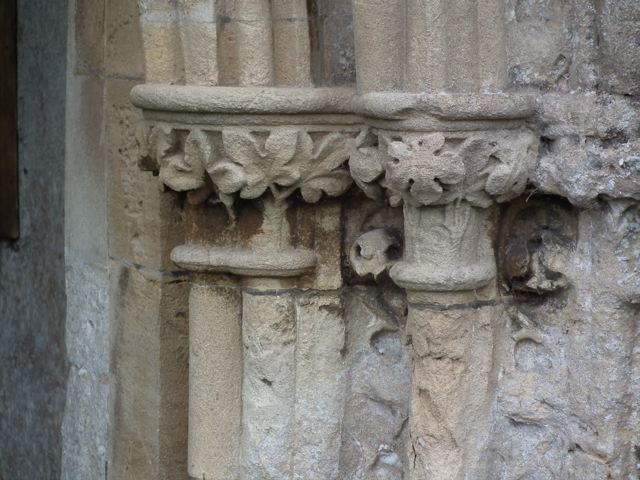
I wanted to visit the parish church of St Mary at Bishops Cannings because I’d read it was an interesting example of Early English Gothic, the style of architecture that became fashionable at the end of the 12th century and remained current for much of the 13th century. And, with its array of lancet windows and stone vaulted chancel, the church certainly is a wonderful example of the style. But, as is often the way, something different caught my eye. This bit of carving, worn but still enjoyable, is on the entrance to the porch. Its leaves are typical not of the 13th but of the 14th century – the kind of architecture the Victorians called Decorated, and that was characterized by, amongst other things, lovely naturalistic carvings of foliage. Below the leaves, there are also some ballflowers, of the type I noticed recently at Ledbury, although the ones in my picture are so eroded it’s difficult to make them out at first.

So the people of Bishops Cannings, having built a substantial and elegant church in the 13th century, carried on improving it and adding to it in the next century, these leaves being among the results. They could afford to do this because the church was at the heart of a large and rich parish held by the bishops of Salisbury. It’s even possible that some of the masons who had built Salisbury Cathedral also worked here – the main body of the cathedral was built between 1220 and 1258, with the famous tower and spire completed later, around 1330. Whoever was responsible for them, these graceful carvings form a delightful addition to the building.

Wednesday, March 23, 2011

Medieval round-up

I've now added to the 'round-up' page I began a couple of weeks ago, taking my very short history of English architecture up to the year 1500, so that it now covers the Saxon and Norman periods, plus the various phases of medieval Gothic architecture. Links in the text of this page lead to posts in the English Buildings blog that cover typical buildings and features of the various style.

You can access the page from here or from the link in the 'PAGES' section in the right-hand column.

Sunday, March 20, 2011

Alcester, Warwickshire


Colour again

Wandering around Warwickshire today, I ended up in Alcester, admiring Church Street, and it occurred to me that the combination of pale colourwashes here wasn’t too far away from the effect John Piper admired in Launceston, as recalled in my previous post. There are big differences of course. This is a row of houses, not a square of shops. And the Cornish town’s granite, brick, and colourwash, is replaced in Alcester by timber framing, brick and colourwash. But I like the effect of these pastel shades on this range of mostly Georgian and early-19th century facades.

In the foreground on the right is a house dating to the beginning of the 19th century with banded stucco on the ground floor and windows topped with curvy consoles and cornices on the middle two floors. Next come two stunning houses. First an off-white Greek revival frontage of about 1830 decorated with a quartet of tall Ionic pilasters and a trio of patterned panels in the style of the great architect Sir John Soane. The chaste triglyph frieze over the door is another Grecian allusion. Next to this house is the grey one with a pair of canted bay windows, plus a round-headed window with Gothic glazing above the door. It’s mid-18th century, but altered a century later. Beyond the rather plain red-brick house is a pale green one. Together with the one beyond it was originally part of an inn, the Angel – the shallow carriage arch is the giveaway. It’s a building of various dates, the frontage perhaps early-18th century but again altered in the 19th. Beyond the inn, just visible at the far left of my picture is a 16th or 17th-century timber-framed house, one of many in Alcester.

And timber-framing, the ‘black-and-white’ effect, was what I’d expected to find in Alcester. The place is indeed full of it, as are many towns and villages in the West Midlands. But as often happens, a different aspect of the town caught my eye. As usual, exploring English buildings is a source of unexpected pleasure and surprise.

Friday, March 18, 2011

Launceston, Cornwall


Colour in buildings

Working on the book of the series Turn Back Time: The High Street last year focused my mind all too clearly on the plight of the British High Street today. Not simply the fallout from the global economic crisis but also the more chronic erosion of distinctiveness and character in the wake of the rise and rise of multiple retailers, with their standardized, and often tacky, approach to shop-front design. I was reminded of this once more by something that happened the other day, when a friend generously gave me a heap of copies of the Architectural Review from the 1940s.

These journals make fascinating reading, and among the first things in them to catch my eye was a series of pieces by John Piper dealing with subject of colour in buildings. These articles are illustrated with a number of drawings by Piper, and the words and pictures alike raise some interesting issues, as relevant today as they were in 1948. Piper’s main point is that the colour of buildings, although generally ignored, makes a huge contribution to the character and distinctiveness of our surroundings, especially town centres. We would do well, says Piper, to look at and look after local architectural colour. Already, in the 1940s, it was being threatened by the standardized colours and designs of chain shop fronts.

Launceston is one of Piper’s examples. It is a town he, says, ‘part granite, part brick, part colour wash’. Granite is represented by the churches (you can see a slender spire and a tower poking up above the shop fronts in Piper’s drawing), the castle (a Norman motte and bailey design rebuilt in stone in the 13th century), and the war memorial. I think the Gothic building to the right of the war memorial (it’s now a bank and maybe was when Piper drew it too) is also granite. There are several brick shops, picked out by Piper in pink, including the turreted building on the left (a Co-op in the drawing, now a Boots), and the tall building four doors along with its two imposing round-headed windows on the upper floor (another bank). Most of the other shops have upper floors colour washed in cream, with the exception of the café next to the Co-op, which has a white art deco frontage, the most outwardly modern thing there in Piper’s time.

A recent photograph (below) shows that the brick fronts, stone bank, and art deco café sign remain. Most of the cream colour-washed walls have been redone in white or, in one case, refaced with modern brick. The older structures – churches, castle, war memorial – survive. At street level, the shop windows and signs are mostly recent. So Launceston has lost some of its mid-century character – the colour wash, the shop fronts – but is still recognisably itself. It could be still more itself if Piper’s advice about standardized shop fronts had been heeded and if some of the expanses of white were broken up by the cream wash of the 19040s. It’s remarkable that familiar complaints about clone towns and standardized high streets should have been made more than sixty years ago. If only we had listened more carefully then.

Photograph John Baker
Used under Creative Commons Attribution Share-alike License 2.0

Monday, March 14, 2011

Great Malvern, Worcestershire


Beguiling tiling

I’ve posted before about the wonderful shop fronts built by the W H Smith chain in the 1920s and 1930s, most of which have now vanished. My recent post about a tiled shop front in London reminded me that I meant to return to this subject, to look at a favourite example of W H Smith tiling, still in situ in Malvern.

Smith’s shop front in the hillside town centre of Great Malvern is recessed slightly from the building line, leaving two narrow strips, like exterior window reveals, at right-angles to the street. The two wonderful tiled panels in my photographs are set at the top of these strips, and so are rather easy to ignore. How typical of the painstaking design of the time that such trouble should be taken with these easily overlooked spaces.

And what amazing images their ceramic artist produced. The car rattling along in the ‘Road maps’ panel conjures up all the optimism of the open road in the 1920s. There’s little hint of where the scene might be set (it could just as well be France as Worcestershire), but the sun is out and the road, we feel, is empty ahead. The driver has read his road map and he’s opened the throttle.


On the other side of the shop front. the bridge, gatehouse, and castle keep that advertise ‘Post cards’ are rendered in an extraordinary palette of purples, browns, and blues. The great tower seems hugely out of scale and oddly positioned in relation to the bridge. But who cares? This expressionist architecture lit by the stars (and the moon, which is presumably somewhere over the artist’s right shoulder) is simply stunning, the buildings reminiscent of the fantasy townscapes of F L Griggs, but with colour poured in, for good measure.

How fortunate that these two images have survived, while the rest of the frontage has been adapted and painted over. Their light is from another age, but still it shines.

Saturday, March 12, 2011

Pulling it together

The joy of blogging is its randomness and variety, and I hope that this blog is no exception. But since the number of posts I’ve done is now up in the hundreds, embracing structures from post boxes to cathedrals and buildings from the Dark Ages to World War II, I thought it might be interesting to organize some of them in a different way. So I have hatched a plan: to write a series of short introductory pages to different periods of English architecture, illustrated with links to relevant posts from this blog.

The first of these currently covers buildings of the Saxon and Norman periods – from the centuries leading up to the year 1200 – and you can access it from here and from a link in the PAGES section over in the right-hand column. As you read it, you will ifnd links to buildings from this era included in past posts.

In a week or two I’ll add to this page, extending the text and links to cover the rest of the medieval period up to around 1500. If this works, I’ll later add further pages on the Tudor, Stuart, and Georgian periods, and so on. I hope what emerges is interesting, and a worthwhile way of linking together some of the posts. Meanwhile, the day-to-day randomness continues.

Wednesday, March 9, 2011

Vauxhall Bridge Road, London


Traditional decoration

The shop front of the former premises of Frederick E. Gillett in Vauxhall Bridge Road is clad in deep green tiles and looks as if it dates from between the two World Wars. Beneath the shop window are these two tiled panels, one of a timber-framed bungalow that looks a world away from inner London and the other of some workmen – a carpenter, a decorator ascending a ladder with a paint kettle, and a man carrying what looks like a wallpaper sample book.


These tiles, with their simple messages of a rural idyll and a job carefully done are evocative. I especially like the interior with its telling touches – the downward glance of the standing man as he appraises the carpenter’s saw cut; the latter’s dangling braces; the handmade wooden ladder. It takes you back to another era as you lean down to shin level to admire the panels while the red buses swish past between Vauxhall and Victoria.

So what did Frederick E. Gillett sell in his shop? My guess was ironmongery and the tools of the decorating trade: saws and ladders, brushes and paint kettles, the kinds of things used by the men in the picture – plus, no doubt, a multiplicity of others kept in drawers and sacks and boxes. But in answer to my query a reader (see comments section) has found a Frederick E. Gillett, 'oil and colourman' , with eight shops mainly in southeast London in 1914. Makers and sellers of paint, then, who by later in the 20th century had expanded north of the river. With beautiful decorative consequences for their shop front on Vauxhall Bridge Road.

* * *

With thanks to Shui-Long for information about Gillett's premises south of the river.

Saturday, March 5, 2011

Victoria Tower Gardens, London


A little roguery

Having admired the façade of St John’s Smith Square the other day, I glanced away from Smith Square towards the river and this wonderful little structure caught my eye. It’s the Buxton Memorial Fountain, and I’ve often noticed the way it adorns the Victoria Tower Gardens near the Houses of Parliament. But I’d not seen it from this angle before, its ornate Gothic arches and pointed roof aligned with the end of the street.

This little building was commissioned in 1865 by an MP, Charles Buxton, to commemorate the work of his father, Thomas Fowell Buxton, and the group of colleagues who had campaigned for the abolition of the slave trade. It originally stood in Parliament Square but was taken down in 1949 and moved to its current happy location in 1957.

The fountain was the work of Samuel Sanders Teulon (1812–73), a Gothic architect who designed a multitude of churches, vicarages, and allied buildings and who was designated by H. S. Goodhart-Rendel as one of the ‘Rogue architects’ of the Victorian era. What Goodhart-Rendel meant was that these architects were original to the point of eccentricity, designing buildings that were Gothic, but not as we know it. They would combine styles from different sources, introduce jazzy patterns, and use vibrant, sometimes brash colours.

The Buxton Memorial Fountain begins like a conventional, if highly ornate, structure of Gothic arches. But the roof is something else – a brightly coloured extravaganza of enamelled iron tiles that sings in the sun and enlivens a dull day. In this part of central London, with its familiar mixture of brick and stone buildings, this jewel-like roof comes as a surprise, and a welcome dose of colour. Sometimes a little roguery is not such a bad thing.

Wednesday, March 2, 2011

Chipping Campden, Gloucestershire


Architecturally incorrect

It’s a happy coincidence that I visited Sunningwell, in the previous post, within a few days of going to Chipping Campden, where in the large 15th-century parish church I found this memorable monument in the chancel. Although quite large, it’s easy to overlook in a church that contains still bigger, more eye-catching tombs not far away. What links the monument to Sunningwell is that it’s from the Tudor period and is another example of the arrival of a particularly eccentric architectural classicism in England.

It’s the monument of Sir Thomas Smyth, who died in 1593, and what concerns me here is not his effigy, recumbent on its tomb chest, the head resting on the knight’s metal helmet, nor the figures of his two wives and 13 children arranged around the base, charming as they are. What I’m interested in is the canopy.


You can tell straight away that this is a classical structure – there are Corinthian columns with their capitals of curly acanthus leaves, holding up a canopy topped with a triangular pediment. But look a bit more closely and the design breaks all the rules. The pediment does not run the whole width of the frontage and is far too high – and there’s half of another pediment on the short side. The carving in the triangle depicts not classical scenes but a coat of arms. Around the frieze beneath run designs that are neither Greek nor Roman but Elizabethan patterns including, near the corners, motifs that look a bit like interlaced strips of leather and are known as strapwork – there are also large versions of these on the underside of the canopy. And another thing – at the front there are three columns, one at each corner and one in the centre. True classical design does not use odd numbers of columns – an even number is used, so that there’s a gap, not a column in the middle.

All of which is enough to tell you that this monument has not been built according to the rules laid down by the architects of ancient Greece or Rome, or of their Italian Renaissance imitators. And this is not surprising, because English builders of this period got their knowledge of classical architecture not from Greece or Rome, where virtually none of them had been, but from France and the Netherlands, where the classical style had already been adopted and developed with the addition of different kinds of ornament. When the English took it over, they put their special spin on it too. The result: architectural hybrids like this tomb canopy.

But what a glorious hybrid! The monument is carved with vigour. It makes you look, but it doesn't dominate the entire church. The blend of Roman details and English ornament is happy. The whole thing has a liveliness that later English Classicism sometimes lacks. It reminds me a little of Shakespeare, its contemporary, who had ‘small Latin and less Greek’, but who put what he had to good use, in order to make something out of it that was special and rich and, occasionally, strange.