Wednesday, April 16, 2014
Bristol
A gentlemen’s to relish
My route to Bath the other day took me around the edge of Bristol. Emboldened by my recent post of an ornate lavatory in Worcester, I decided to seek out an even more interesting example: the late-19th-century gents in the corner of Mina Road Park, in the northern part of Bristol.
The building was made, probably in the 1880s, at the Sun Foundry in Glasgow, a business founded by George Smith in the late 1850s. The Sun Foundry became prolific producers of architectural ironwork, together with such items as drinking fountains and bandstands. They described themselves as ‘Art Metal Workers, Iron Founders and Sanitary Engineers’, so they were clearly well suited to the manufacture of structures like this iron pissoir. They certainly lavished as much attention on its details as they did on projects like ornamental fountains and cast-iron Corinthian columns.
Lovely pierced panels covered with floral ornament line the upper parts of the walls, combining ventilation with decoration. The sprays of flowers, scrollwork motif, and small round finials are similar in design to the terracotta panels on many contemporary buildings. The openwork theme continues in the dome. This is a delicate and intricate network of flowers, leaves, and arabesques.
This tiny gents, practical and elegant, is an asset in the corner of the park, and it was good to see that it has been carefully maintained and painted. It’s not so good inside – the graffiti vandals have been at work – but the view up into the openwork dome, with the resulting view of the sky and breath of fresh air, is uplifting. As in Worcester, this amenity proves that a visit to the lavatory can be interesting, architecturally. It’s a pity the burghers of Bristol did not supply something similar for the ladies.
Sunday, April 13, 2014
Huish Episcopi, Somerset
Foiled again
The quatrefoil. A shape in the form of a simple stylized four-leaf clover, flattened. It’s everywhere: Gothic churches, public buildings, doorways, fabric patterns. It appears over hundreds of years, in many different cultures, in diverse contexts. It can be part of window tracery, a frame for a sculpture, a decorative motif on a wall. It’s on modern jewellery and on Louis Vuitton bags too.
It’s often made out of stone, but it’s harder to carve than a simple square or a circle or a diamond. So it’s most often used on highly ornate, high status buildings. It probably originated in Islamic art but it’s most familiar in Gothic tracery and ornament. So you’ll find it on the great French cathedrals, and on the Doge’s Palace in Venice. And on English medieval churches and Gothic revival buildings of all kinds. One of the first blog posts I ever did was about a 19th-century building in Manchester that’s in the Venetian Gothic style and has quatrefoils all over it. Now here’s an example from a medieval church at Huish Episcopi, Somerset.
My photograph shows quatrefoils used as a decorative motif on the tower of the church. I could no doubt have chosen other towers in this region of stunning towers that use this pattern, but Huish Episcopi is one of the most ornate and beautiful of all the great Somerset church towers and quatrefoils are used lavishly on it – in the horizontals bands that mark the storeys, in a vertical arrangement in the window-like openings that allow the sound of the bells to carry, in the glorious ornate openwork parapet right at the top.
One key reason why the quatrefoil succeeds as a design motif is that it manages to combine the idea of a natural form (it looks like leaves or a flower) with a very precise, reproducible geometry. In other words it’s an abstract pattern that makes us think of nature. In Gothic, the geometry of such patterns is ramified, so that there can be shapes with many different numbers of ‘foils’: trefoils with three lobes, cinquefoils with five, sexfoils with six, and so on. Medieval Christian master masons no doubt saw symbolism in these numbers. If trefoils suggest the Holy Trinity, quatrefoils perhaps remind us of the four Evangelists.
A carver at Huish Episcopi also had another idea: that the quatrefoil could accommodate the shape of Christ on the Cross. As so often in medieval architecture, high seriousness and visual facility are united.
- - -
There’s more about the quatrefoil in an episode of the marvellous 99% Invisible, the tiny but constantly entertaining and informative radio show about design. Presenter-producers Roman Mars and Avery Trufelman discuss the quatrefoil here.
Thursday, April 10, 2014
Preston Capes, Northamptonshire
Projection
It’s an experience that nearly every church crawler must know. You’re standing in a quiet country church on a dull day. Many of the windows have clear glass, with a smattering of stained glass, so the interior is not dark, but it’s not exactly bright either. Soft shadows brush whitewashed walls. Then outside the wind blows, the clouds part, and out comes the sun. Suddenly, inside, everything lights up and here and there patterns of stained glass are projected on to the stone-flagged floors and the white walls.
The moment can be magical, and when it happened to me at Preston Capes the other week the effect was so right it might have been stage managed. The yellows and blues of the glass fell beautifully on the white wall, the adjacent font, and the font cover. Not only that: the design of the glass made the outline of the two window openings clear on the wall, and their shape – tall, narrow, and with cusps pinching the top into a a tiny tear shape – roughly matched that of the tracery panels on the side of the font that was facing me.
The design of the tracery that decorates the font suggests that it’s 15th-century (the spire-shaped font cover may well be later). The font is a nice example of the late-medieval tendency to decorate architectural surfaces of all kinds with the sort of tracery patterns used in windows.* The stonework of the window might be of a similar date to the font (I didn’t check while I was there) but the glass is certainly post-medieval and not the sort of stuff one would spend much time admiring, were it not for this projection effect, that lasted for just a few minutes, before the wind blew clouds over the sun once more.
- - -
* It’s also an example of a later tendency to cover stone surfaces with stone-coloured paint, but we’ll let that pass.
Sunday, April 6, 2014
Worcester
Best foot forward
Last week I gave a talk about the history of shops and shopping, an occasion made especially enjoyable for me because of the variety of questions and anecdotes from audience members afterwards. Several stick in my mind but one of the most memorable was from a man who, now retired, had started his working life in a shoe shop many moons ago. He recalled that the crucial thing was to get everyone entering the shop to sit down and remove their shoes. The assistant could then helpfully bring many pairs of shows for the customer to try on, while the customer, parted from his or her own footwear, was effectively glued to the spot. In this position it was almost impossible for them to escape without buying a pair of shoes – as well as the polish, polishing cloth, shoe horn, or whatever else the enterprising assistant could persuade them that they needed.
A lot of my talk had to do with the way the design of shop fronts attracted the customer, but I didn’t discuss the old-fashioned symbolic shop signs that were widely used until the early-20th century. These signs are not so common now. You’re more likely to find them in a museum than on the High Street, but my photograph shows one still hanging above a shoe shop in Worcester. The golden boot was once a popular sign for a shoe- and boot-maker and golden boots also survive in Launcesron and Maidstone, amongst other places. Others in the trade used a shoe, patten, or slipper, often together with a crown, and cobblers sometimes had a painting of St Crispian, their patron saint. Allied trades, such as saddlers, leatherworkers, and breeches-makers had their own signs – a saddle or horse, for example, or a pair of leather breeches.
A beautiful golden boot like this certainly helped make a shoe-maker’s shop visible and distinctive, and was of course very effective in an era when many potential customers could not read or write. Now that few shops have such signs, and most retailers try to stand out with a more or less well designed two-dimensional sign, the old-fashioned 3D sign once again helps its owner stand out from the crowd.
Wednesday, April 2, 2014
Worcester
Well spent
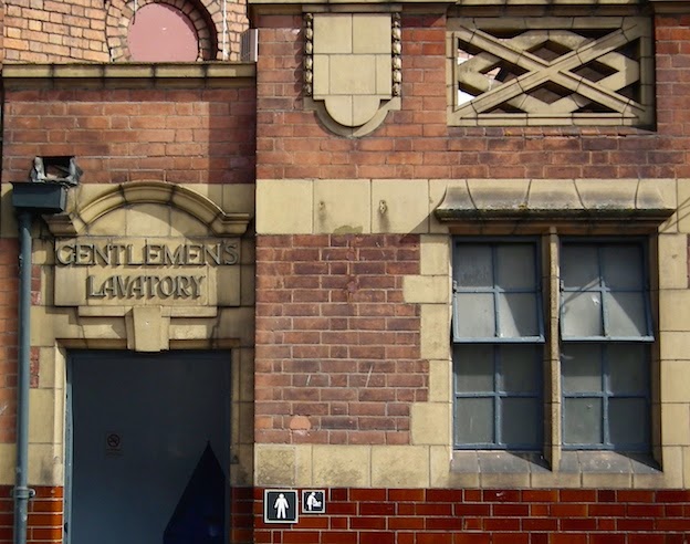
Small things matter. A gents in a city centre, for example. Designed with some care, as if to suggest pride in a civic amenity, rather than shame at bodily functions. Somebody in Worcester made an effort.
So what have we got? A winning mixture of the showy and the practical. Glazed bricks cover the lower portion of the wall (just visible in the photograph above) with a careful curve at the doorway, as if to be kind to stumble-bums who make contact with the masonry while entering in haste. A mixture of red bricks and buff dressings, with their suggestion of richness, articulate the upper area of the wall. Mullioned windows and a decorated parapet are testimony to that blend of influences often found in buildings of the years on either side of 1900. Above the doorway, there’s another mixture – a keystone topped, and trumped, by lettering in a raised panel headed with a curving moulding. The lettering is big, but not too big, ornate, but not too fancy – the curved side of the A and the generous loop of the R seeming to give a hint of a memory of Art Nouveau. Civic pride is reinforced by the coat of arms further along the wall, in its panel that sets it off from the parapet and raises it slightly above.
Modernity, in the shape of a poorly positioned down pipe and hopper head and two little square signs, intrudes, but not too much. This small building is still an ornament to the street. Worcester’s pennies were not so badly spent.
Sunday, March 30, 2014
Boscobel, Shropshire
What we think about when we think about ruins
The other week I found myself not far from the ruins of White Ladies Priory, a medieval house of Augustinian canonesses in quiet, remote country in Shropshire. You walk up a muddy tree-lined track to the ruins and as you reach the site the trees part and the vista opens up so you take in not just the fragmentary walls of the monastery but also swathes of woods, fields, and rolling hills beyond. There’s not a lot here, but the place is so quiet that in the shadow of these few 12th-century walls you can get a sense of the peaceful life that the five canonesses, their prioress, and their few lay servants perhaps lived until Henry VIII closed the monasteries and forced the White Ladies (so called because of their pale linen habits) to leave.
Ruins, I find, encourage such thoughts about the past, and much else. They seem to bring us close to figures of the past – knights, it may be, or nuns, or canonesses, while at the same time, by their very ruination making the past seem remote. They evoke sympathy with their builders and opprobrium for the vandals, enemies, and demolition men who came after them. They warn us of our own mortality, and point to the disappointments with which our endeavours might end, giving us an image of our own melancholy in the process. They embody the confrontation of art and nature, but also remind us of the softening of the edges that time brings to buildings, the softening that Ruskin, for example, preferred to the hard lines of the new. They open up, in short, space for all kinds of Romantic contemplation of the past and present.
Not all of this is pleasurable, but there is a long tradition of the aesthetic and emotional enjoyment of ruins, an attitude that the Germans call Ruinenlust, a term turned into the English Ruin Lust in the title of an exhibition currently showing at Tate Britain in London. The Tate exhibition traces this back to the Romantics with magnificent pictures of Tintern Abbey (by Turner amongst others), and with Constable’s sketch of Hadleigh Castle. Other highlights include works by Piper, Sutherland, and Paul Nash, Jon Savage’s haunting images of Uninhabited London, and Jane and Louise Wilson’s photographs of Nazi fortifications on the Atlantic Wall. From John Martin’s vast canvas of the destruction of Pompeii to Tacita Dean’s Kodak, an elegy for 16 mm film, it’s thought-provoking stuff, of great visual richness.
And yet I longed for more – on the historical background of ruin-watching, for example. This goes back much further than the Romantic period, especially in literature. A scene in John Webster’s play The Duchess of Malfi (c 1614), for example, has Antonio, the husband of the Duchess, meditating on ruins:
I do love these ancient ruins:
We never tread upon them but we set
Our foot upon some reverend history.
And questionless, here in this open court,
Which now lies naked to the injuries
Of stormy weather, some men lied interr’d
Lov’d the church so well, and gave so largely to’t,
They thought it should have canopy’d their bones
Till doomsday; but all things have their end…
In the first three lines of this speech, Antonio is alluding to John Florio’s English translation of Montaigne’s essays, in which Montaigne himself is quoting Cicero, which shows how far back such thoughts can be traced. Countless Renaissance painters, 18th-century poets, and their successors who are chronicled in the Tate exhibition have had similar thoughts and transmuted them into art. At the ruined priory in Shropshire I was not, I thought, too far from them in spirit as I scraped the mud from my shoes and thought of Charles I, who hid here when he escaped after the Battle of Worcester during the English Civil War and, before him, of the White Ladies walking in the lanes around their isolated church and monastery, 500 and more years ago.
Doorway, White Ladies Priory, Shropshire
- - -
Among the books on responses to ruins are: Brian Dillon, Ruin Lust (Tate Publishing, 2014), produced for the exhibition; Christopher Woodward, In Ruins (Chatto & Windus, 2001); and, best of all, Rose Macaulay’s classic, Pleasure of Ruins (Thames and Hudson, 1966).
Wednesday, March 26, 2014
Brockworth, Gloucestershire
The future, once
Here’s another prefab, a different design from the ones in my previous post. It’s one of a kind that I remember seeing when I was a child, and which recalls a particularly distinctive vision of times to come.
The Welsh politician Neil Kinnock spent his childhood living in a prefab in South Wales, and is on record as saying of the experience that it was like living in the future, and that his home produced an abiding impression of cleanliness and newness. Many residents who moved into prefabs in the years after World War II felt something similar. ‘We felt that we were part of something new and exciting,’ said one, quoted in Greg Stevenson’s Palaces for the People. A colleague of mine who as a child had a prefab-dwelling friend said something similar: travelling from his home to the friend’s prefab was like entering the space age.
The prefab in my picture is one of those on the Gloucestershire estate that my colleague was referring to. It’s one of a kind known as the BL8 Aluminium Bungalow, a design produced by the Hawksley Company, which was set up by Gloster Aircraft Company and based in nearby Hucclecote. These BL8s had wall and roof panels made of Duralamin, an aluminium alloy used in aircraft production. The windows have steel frames and inside the buildings had, I think, fitted kitchens and bathrooms that were similar to those in the other prefab types and that so impressed people with their modernity. Modern, that is, for the time – BL8 were made in the late 1940s and early 1950s, so were not part of the Temporary Housing Programme that brought the other prefabs into being immediately after the war. Indeed, they were seen as a higher-spec design and were intended to be longer-lasting.
These aluminium prefabs survive in a few places (there are apparently some in Letchworth, which I’ve not seen), but here in Brockworth nearly all of them have in recent years been clad in more conventional materials, so that brick walls and tiled roofs make them look less industrial and more like conventional bungalows. The example in my picture is one of a very few that retain their original outside walls, roofs, and window frames, although there’s a new door. I remember similar prefabs from my own childhood, which was long enough ago for the painted metal walls to look shiny and for the neat rows of little bungalows to give just that sense of difference and modernity that others noticed.
Subscribe to:
Posts (Atom)