Saturday, May 17, 2014

Cirencester, Gloucestershire


Exit, pursued by a hare, or, Odd things in churches (5)

It started with cows. The first CowParade was held in Chicago in 1999. Artists – established or unknown, amateur or professional, young or old – decorated fibreglass cows, which were then placed at strategic places in the city. After a time on display, the cows were corralled in one place and auctioned, funds being donated to charity. Since then there have been CowParade events in many cities all over the world, from New York City to Prague, Istanbul to Rio.

CowParade, a brand owned by CowParade Holdings Corporation, has raised more than $20 million for charity through the auction of cows bearing the work of more than 5,000 artists. Cows are much liked and, with their gentle curves and generous flanks, have proved fulfilling artistic canvases. But there have also been local endeavours, quite separate from CowParade but very much in its spirit. Bath, taking its cue from the presence of the pig in its foundation myth, held an event called King Bladud’s Pigs in 2008. Now comes Cirencester, with hares. Hares because there’s a wonderful hare on a Roman mosaic discovered on a dig in the town in 1971 – it’s now the symbol of the excellent Corinium Museum. The March Hare Festival is not on a huge scale, but Cirencester is no Chicago – 25 hares are scattered around the town, their decoration ranging from ancient Egyptian in style to modernist-inspired, and hare-spotting has become a favourite pastime for locals and tourists alike. Promoting tourism, indeed, is one of the aims of the project, but money from the eventual sale of the hares will be used for environmental and educational projects in and around the town.

So that’s how this hare comes to be in Cirencester’s glorious late-medieval parish church. This particular hare was decorated by the designer and television personality Laurence Llewelyn-Bowen. At first glance, it seems as if the flamboyant Mr Llewelyn-Bowen has produced a rather muted design, in a restrained palate. But look more closely (click on the image to enlarge it) and one discovers that the découpé images applied to the hare are somewhat provocative. More redolent of the boudoir than the church, they’ll cause a few raised eyebrows – and even more smiles. Sonnez la cloche!

Wednesday, May 14, 2014

Westville Road, London


A mural restored

 I’ve posted before about the architectural illustrator and writer Gordon Cullen, whose books Townscape and The Concise Townscape had a big impact on me when I discovered them in the 1970s and have helped to educate probably hundreds of thousands of architects and planners. In the 1950s and 1960s, Cullen was very influential, not just because of the Townscape books but also because his drawings were everywhere – in the architectural press, in advertisements, in books. At the weekend I had the chance to experience another aspect of Cullen’s work, when I went to Greenside School in West London to see the mural he did for the building unveiled after restoration.

Greenside School is itself an interesting building of the early 1950s, designed with great flair by Ernö Goldfinger and opened in 1952. Goldfinger had designed a structural system for schools, with a reinforced concrete frame, that was intended to be rolled out widely, but only Greenside and one other school were built using the system. When the architect wanted a mural for the school’s entrance hall, he turned to Cullen, with whom he’d worked on a number of exhibitions that had been sent to the troops during World War II. Cullen wrote in a notebook a sentence that seemed to mark a starting point and a challenge: 'Mural. To undulate and intrigue. How?' His response to the challenge was brilliant: a series of colourful vignettes on a range of subjects: history (a medieval castle), the sea (an ocean liner), geography (a world map), the solar system (with a sun like a vast egg yolk), railways, and natural history (a composition of leaves and birds). Brightly coloured, simple, but full of interesting detail, they were clearly designed to appeal to young people and to inspire. Entering the foyer is a bit like stepping into a Picture Puffin book, and one can imagine children responding enthusiastically and teachers incorporating the images into lesson plans.


But the mural wasn’t always popular with the staff. I suppose it began to seem old-fashioned, with its images of the de Havilland Comet airliner (the first commercial jet) and the Britannia steam locomotive that was commissioned by the British Railways Board, both of which came into service in 1951. The current staff, however, are enthusiastic, and see the potential of the mural – as an inspiration in lessons, as an uplifting sight when you enter the school, as something to be proud of.

So a group of parents, staff, and school governors got together to ‘rehabilitate, restore, appreciate, protect and celebrate the Gordon Cullen Mural in the context of the Ernö Goldfinger building to the benefit of the whole school community and enrich the Learning Environment’. Or, as a spokesperson said at the unveiling, ‘simply to love it again’. Now the restoration is complete and colours sing once more, illuminated by natural light coming down from Goldfinger’s cunningly concealed clerestory window above. Warm applause as Jacqueline Cullen, the artist’s widow (top photograph), cut the ribbon to mark the mural’s unveiling, confirmed the project’s success, as well as the appreciation and love that people have for this very unusual* work of art.


Appreciation was also I think, typified by the reaction of one young child looking at the mural afterwards with a small group of us. ‘Which part do you like the best”?’ asked one of the adults. ‘Oh, I like the Fried Egg,’ she replied, with emphasis, looking at the image of the solar system. The knowing expression on her face suggested that she was very well aware of the painting’s real subject.

- - -

*Although unusual, the Gordon Cullen mural is part of a bigger picture, which is that quite a number of schools built in post-war Britain had distinguished decorative artwork of various kinds, much of which has now either vanished or is under threat. A research project under the title The Decorated School has led to greater awareness of these works, and one of the fruits of this project is a book, Catherine Burke, Jeremy Howard, and Peter Cunningham (eds), The Decorated School (Black Dog Publishing, 2013). I hope to return to this fascinating book when it reaches the top of my ‘to read’ heap.

Sunday, May 11, 2014

Fownhope, Herefordshire


Wood and stone

Heading towards the church in Fownhope, I was distracted by this interesting house. I’m attracted by Herefordshire timber-framed houses and this is a substantial one, probably of the 16th or 17th century, with later additions. As is often the way, there are stone chimneys stacks at the end, and these have been extended in brick, probably in the 19th century. It all adds up to a satisfying mix of materials, even if the brick is a bit harsh and industrial in appearance compared with the rest of the building

After admiring the timber frame and the stone stacks I was struck by the low stone structure between them. What is this? A large inglenook? Bread ovens? I don’t recall noticing this type of structure before. No doubt now I’ve noticed it, I’ll be seeing them everywhere.

Wednesday, May 7, 2014

Bridgnorth, Shropshire


Getting the point

A couple of years ago I did a post about a sign in London with one of those wonderful pointing hands, the index finger straight and the wrist delineated with a cuff (both jacket and cuff-linked shirt visible). Although my London example was probably 20th century, the post provoked several interesting conversations (online and off) about the earlier history of graphic pointers, both fingers and arrows, and the ways they’ve been used. I was reminded of this when I came across this winning combination of old signs in Bridgnorth.

The street sign is a lovely cast-iron job, presumably Victorian. It has nice clear Clarendon letters that exhibit a pleasant balance of thick and thin strokes, but what makes it stand out is the pointing hand. From a frilly cuff emerges a long, elegant hand with a slender pointing index finger. I’m not sure the way the little finger bends backwards is very accurate – or even anatomically possible: I can’t seem to make my own finger do this. But the effect is pleasing and sends the pedestrian in the right direction.

Below are much later signs, aimed at the motorist, of a kind I remember from my youth. Clarendon letters have been replaced by the sans serif capitals popular in the mid-20th century and a big black arrow indicates the direction. Signs along these lines came in during the 1930s. There were slight revisions in 1944 and 1957, the latter featuring an improved alphabet designed by David Kindersley. As far as I can see these Bridgnorth signs are pre-1957. There was a major change after 1963, when British road signs were completely redesigned and the style still used today was adopted.

But a few of the old signs remain, like these in Bridgnorth. They still do their job, although, when one looks closely, it’s clear that these examples have not been helped by a rather hasty white paint job on the surrounding wall. The wall paint has messed up the black edges of both the street sign and the directional signs slightly, but all three signs still manage to stand out.

- - -

Succinct information on the history of British road signs is available in Phil Baines and Catherine Dixon, Signs: Lettering in the Environment (Lawrence King Publishing, 2003); the 192 highly illustrated pages of this book comprise the best visual presentation of signs that I know.

Saturday, May 3, 2014

Warwick


Warwick in progress

In Warwick recently, I thought I’d walk a little way out of the town centre to have a look at the gas works, a building of 1822 that was said to be one of the oldest and best preserved early gas works in the country. I found that the builders were in, but that I could still make out the outline of the original building above their bright blue protective fencing.

To say that the gas works is preserved is true, up to a point. The gas holders, once contained in the octagonal towers at either end, are long gone, but the walls that contained them are still there, together with the connecting office building in between, so that one can get a good idea of the front of the original building. The whole is stuccoed and the facade has those concentric semicircular arches that Regency builders so liked. Gothic glazing bars are being replaced in the windows, those in the tower originally being false.

The original builders seem to have gone to a lot of trouble to wrap their gas works in elegant clothing – it’s all a far cry from the more familiar exposed gasometers, all girders and rust, that have an attraction all their own. The result is that the building, now it is a gasworks no more, can have other lives. It was converted to offices, but is now being made over once more to provide housing, with a scheduled completion time of spring 2015. It seems a good solution for a building that has outlived its original use but whose facade and exterior form is certainly worth preserving. A worthwhile work in progress.


Tuesday, April 29, 2014

Bath, Somerset


Another Bath

Walking out of the centre of Bath and up Bathwick Hill, one gradually leaves behind the urban Georgian world of symmetrical crescents and terraces and comes upon another, different Bath, a Bath of asymmetry and greenery. Here, in the 1830s and 1840s, a number of large, Italianate villas were constructed, to bring a breath of the South to these otherwise very English slopes.

These houses wear their Italianate origins on their sleeve. It even begins with the names on the gate piers – Casa Bianca, La Casetta, Fiesole. These villas are essays in the Picturesque, the asymmetrical style of the early-19th century, in which towers, balconies, loggias, chimneys, and overhanging roofs are assembled to produce enticing, rather Romantic houses. Openwork balusters, and ornate chimneys add further ornate notes, although there are also typical classical details such as quoins and large keystones.

All this material was marshalled by architect Henry Edmund Goodridge to produce houses like Fiesole, the one in my photograph. Goodridge, son of a successful Bath builder, built up a large practice in Somerset and Wiltshire. He attracted prominent patrons like William Beckford, whose Lansdown Tower he designed, and this brought him numerous domestic jobs in the area, many of which show this willingness to mix Italianate and Classical styles.

This bit of Italy in Somerset is a little known aspect of Bath and embodies a different architectural approach from those we normally expect to find in the city. The Pevsner city guide to Bath finds their design ‘formulaic, heavy-handed and lacking charm’. True, the concatenation of gables and projections, the jagged roof edges and the unbalanced facades hardly add up to great architecture. But I have a bit more time for them than the Pevsner guide. I’m rather fond of this lumpy collection of varied masses. In addition, my photograph, taken on a sunny afternoon, shows the practicality of the loggias, which are providing shade (on the upper floor) and sheltered sunshine (at ground level), a combination that works as well in England as in Italy. Once the preserve of well-heeled owners, today, these facilities are available to a wider public because Fiesole is a Youth Hostel.
Flaking paint, gate pier, Fiesole, Bath

Saturday, April 26, 2014

Ross on Wye, Herefordshire


Kyrle’s green shoots, or, Odd things in churches (4)

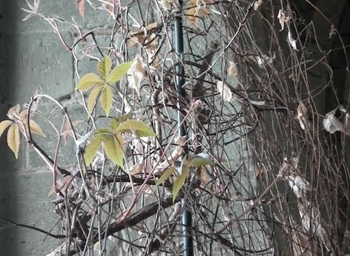
Although one is used to seeing creepers and climbing plants of all sorts growing up the outer walls of buildings, it’s unusual to find them inside, but that’s what happens near the window at the east end of the north aisle in the parish church at Ross. These indoor creepers owe their presence to an ancient tradition.

In 1684, John Kyrle, who, known as the ‘Man of Ross’ had made numerous benefactions to his town, planted some elm trees in the churchyard. Some time later, after Kyrle had died, some shoots from one of the trees grew up through the floor of the north aisle and the parishioners, thinking it a good omen that a tree planted by the great man should be entering the church, let them be. They remained until the parent tree died and was felled in 1878.

These creepers were planted as replacements for Kyrle’s shoots and as a symbol of his good works in the town. Ross should need little reminder of their benefactor, though. Evidence of his works – a plaque in the town, his monument in the church, and enduring benefits such as the public garden known as the Prospect – survive as indications of his achievements.