Friday, April 3, 2015
Long Sutton, Somerset
Turning up the brightness
I have a bit of a preoccupation with the use of colour in buildings. Over the years, in various posts, I’ve noticed the varied colours of shopfronts and other structures in towns such as Launceston, Saffron Walden, and Alcester, have admired the interior decoration of a Tudor building and chronicled the varied delights of medieval church wall paintings. One thing I've not posted about is a subject I was reminded of the other day when visiting the church at Long Sutton in Somerset: the coloured paint applied, or not applied, to church woodwork.
Long Sutton has a beautiful and delicate screen, essentially late medieval but restored, that separates the eastern and western parts of the church. My picture shows the central portion, with its filigree tracery and wooden vaulting crowned by a strip of carved foliage, amidst which sits an owl. The design of the tracery (similar but not identical to that of the East window beyond), the slender shafts, and the ribbed vaulting are all very much in harmony with the late-medieval architecture that surrounds the screen.
But what catches the eye first, of course, is the colour. This screen was restored in the 1860s and it seems to have been then that the woodwork was painted brightly in red, white, blue, green, and gold. These colours are very much along the lines of the decoration that could well have been on the screen when it was first installed. There may even have been medieval traces of colour on the woodwork before the restorers got to work.
I’m sure my readers will have varied opinions about this paint job. Many will lament the covering of what is most likely a wooden surface that’s beautiful in its own right with colour that they’ll see as garish; they might also reflect that Ruskin, Morris, and the modernists were right when they expounded their doctrine of truth to materials. Others will enjoy the vivid impact of the colours, and opine that medieval art was much more colourful than we sometimes admit; they might also like the way the painter has picked out the architectural details so that the details of the tracery, the capitals, the vaulting ribs and bosses are easy to see and not lost in a mass of brown.
Whether or not this colour scheme is historically accurate, it’s still hard to see it as it would have been seen in the 15th century. Context is everything. We look at it now against the background of a church with white plastered walls, exposed stonework (some of it beautifully carved), and glass that lets in lots of light. It stands out. Not, in my opinion like a sore thumb, but like a daring and thought-provoking bit of recreation.
Crewkerne, Somerset
Not out of the woods yet
Some of my readers noticed that my previous post, about the tiny doors that have appeared in tree trunks in a wood in Somerset, was written on April 1st. I thought its unusual subject and slightly tongue-in-cheek tone were appropriate for April Fools' Day. However, the most remarkable thing about the story is that, in substance at least, it's true. There are tiny doors in the wood (though no doubt full-size humans put them there), and they have been proliferating, and those who look after the woodland are indeed putting their feet down. Should my readers be in any doubt, there are accounts – pre-April 1st accounts – of the business in reputable British organs such as The Guardian and (if you prefer) The Telegraph, and on the BBC website too. Only in England...
Normal blogging service will be resumed as soon as possible.
Wednesday, April 1, 2015
Crewkerne, Somerset
Doors to another dimension
In deepest Somerset, the planning system has been sent into panic by the little people. Yes, that’s fairies, not at the bottom of the garden but in Wayford Woods near Crewkerne. It appears the little blighters have been settling down in hollow trees and erecting tiny doors for their homes. And there's the rub – there are scores of doors and they are in variable architectural taste. Some of the doors are Gothic, some vernacular, some just plain odd.
The more garish doors don't appeal to the locals, or to the trustees of the woodland where the small people have taken up residence, and rumour has it that even some of the fairies themselves (they're a shy people, after all) are put off by many of the additions. The last straw came when a fairy playground was also put up amidst the trees. "We're not anti-fairy. But we've got little doors everywhere," lamented one of the wood's trustees. So fairy control has become necessary in the Crewkerne area, and the hope is that, moderation being the best policy, and perhaps also the best planning policy, some of the outré additions will be removed, restoring the woodland to something like its former glory. The time is ripe for change.
- - -
Photograph by Amber Pritchard, sourced from the BBC News website
Saturday, March 28, 2015
Derby
When brick works
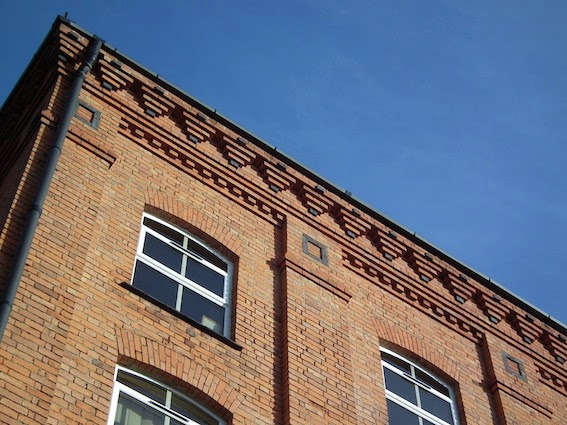
Just a short distance away from the ghost sign I noticed in my previous post is this building. I know a number of my regular readers appreciate a bit of brickwork, and the top of this structure seemed to fit the bill.
Now an office block, it began as Brown’s Barley Kernels Mill – barley-crushing being part of the brewing process – and was built for W. & G. Brown in the late 1880s. Although many of the more ornate Victorian industrial buildings used different colours of brick quite liberally and some are very plain, there are many that look plain at first glance but repay a second glance that allows you to take in the details. The Barley Kernels Mill is a good example. It shows only slight variations in colour – apart from the dark brick plinth and a very small amount of stone dressing, there are just a handful or two of blue bricks among the expanse of red. But up at the top of the walls, at cornice level, these bricks are handled with great vigour. The dentil course and the uppermost corbelled part with its ‘inverted triangle’ details exploit their material with economy but also, I’d say, considerable style. The brickwork seems designed to work well in good light and I was pleased I came across it when the sun was shining.
Wednesday, March 25, 2015
Derby
Morning coffee
I've watched with interest the various initiatives over the last few years to record and appreciate the ghost signs that can still be found in many towns and cities. The way they recall lost businesses and forgotten brands is one reason for my interest; their decorative qualities, whether plain or fancy, are another; the window they open on to the advertising techniques of the past is a third.
This example, fading steadily away on the gable end of a building in central Derby, is actually very plain. But even a sign like this has visual qualities one can admire – its simple lettering and the way in which some of the letters follow precisely the height of a single brick, so that the sign seems to go 'with' the brickwork rather than against it. I'm impressed that a sign-writer took such trouble – and the sign's large size must have meant that he took a considerable amount of time on it too.
The brand the sign advertises, Lever's Morning Glory Coffee, is wonderfully named but presumably long gone. I have come across a reference to the same company selling tea, but I don't know whether they were tea and coffee merchants or retail grocers. Their sign, however, with its enticing slogan, 'Tastes as good as it smells', is still worth a second look.
- - -
Some other ghost signs I've posted over the years:
Landaus and wagonettes
Beer bottlers
Dinner services, photographic film
Saturday, March 21, 2015
London, The Tower and St James's Park
The Tower, the beach, and the park: Illustrations of the Month
The phone rings. It is the Resident Wise Woman, calling me from a charity shop to ask about a book she has spotted. The line is terrible and our call is cut short, and cut short again when she calls back, but she wants to know if we have Looking Round London by Helen Carstairs. We do not. A while later she returns, clutching the most delightful children’s book I’ve seen in a long time, and one, what’s more, that I didn’t know existed. I am more and more fascinated as I turn the pages.
Looking Round London bears no date of publication, but internal evidence suggests that it came out in around 1938. It contains 22 full-page illustrations depicting the ‘sights’ of London – the great churches, the royal parks, the British Museum, the Houses of Parliament, Covent Garden market, and so on. Most of them are brightly coloured and packed with human activity – people feeding the birds, sailing in Regent’s Park, riding in Hyde Park, porters at Covent Garden and Billingsgate. There’s a lovely, free colourful line that sometimes seems to have a touch of Lowry, sometimes even of Matisse. And there’s a bit of whimsy, too, not overdone but very much there, in the form of fish-shaped clouds above Billingsgate and lines like radio waves above Broadcasting House.
My favourites among the illustrations include a lively zoo, a very red St James’s Palace, and St James’s Park, starring plants and pelicans. And the one above showing the Tower of London with children playing on the sandy beach that there used to be by the river. The figures, the colourful trees, the wavy lines in the sky and on the river are all aspects of it that catch my eye. But most of all I’m affected by what’s behind this sunny illustration – that it catches a London that, already, as the presses were rolling, had the clouds of a gathering storm approaching it, and that, in a few years more, would be blitzed.
I get the same feeling from my second example (I’m offering you two illustrations this time, because this book is so little known and apparently so scarce): St James’s Park, with Buckingham Palace in the background, pelicans at the front. The trees, bustling people, and those characterful pelicans make for an engaging image, and I especially like the details caught in a few strokes – those old-fashioned perambulators and the Royal Standard flying above the palace. It’s so moving, this sunny pre-war book, in which so many people have time for leisure and the freedom to enjoy the outdoor city. Its illustrations truly come to us from another age.
There’s another way in which this book seems distant from us. We know (or I know, at any rate) virtually nothing about its author-illustrator. Who was Helen Carstairs? Reference books and the internet tell us very little: that she was around in c 1938 and published this book. No other books seem to be credited to her. Yet she was on to something with her winning illustrations. Did she give up and do something else? Did she survive the war? Does anyone know more?
- - -
Postscript An extended version of this post appeared recently on the culture website The Dabbler. This has elicited a comment from James Leslie Carstairs, the grandson of Helen Carstairs, who confirms that Looking Round London was her only published book and fills in some more details about her life. One striking thing that emerges from this account is how much time this stylish artist of London spent overseas (in Australia, Buenos Aires, and Paris). 'Only the wanderer knows England's graces.'
Tuesday, March 17, 2015
Kidderminster, Worcestershire
Winter warmer
I and many of my readers like a good enamel advertising sign, and I’ve not yet tired of seeing old favourites such as signs advertising Palethorpe’s Sausages or Lyons’ Tea. But here’s one I’d not seen before: a cheerful red sign for the Ronoleke hot-water bottle. It takes us back in so many ways. First of all it recalls the times before central heating when British people slept in unheated bedrooms, a heap of blankets and a trusty hot-water bottle being the first lines of defence against the cold. Was that frost on the inside of the bedroom window? Yes, it was.
The sign also takes us back to a forgotten brand – forgotten by me at any rate. The unique selling point, apparently, memorialized in the name, was the leak-proof top. The Chemist and Druggist explained, in an issue dating back to October 1922:
The patent neck is a great improvement and will give satisfaction to your customers. Instead of wiring, you get a solid rubber neck built in the bottle itself. There is no washer to perish. The flange of the screw top engages with a solid rubber platform shaped in the neck. The Ronoleke is the only perfectly water tight rubber bottle and, of course, it is infinitely stronger and will outlast any ordinary make. In every way, it is a high quality production.
The Ronoleke, says The Chemist and Druggist, was backed up with a national press advertising campaign. They don’t mention enamel signs, but this survivor gives us an idea of the approach: bright colour, bold lettering, and an appeal both to those suffering from a multitude of cold-related ailments and to people who want a bottle that lasts for years and doesn’t leak. It’s a busy sign, full of words, but the red background, striped edge, and clear lettering are effective and the brand name stands out loud and clear in its outlined script.
Hats off, then, to the Severn Valley Railway, for finding this sign and putting it up at their Kidderminster station. The heritage railways do so much good work, in so many ways. As well as restoring track, rolling stock, and railway buildings, their efforts to show their stations in period style result in the preservation and display of countless bits of incidental equipment and visual detail, including many of the old signs that were once all over railway stations. Pacing the platform at Kidderminster or Bridgnorth is a real pleasure for anyone interested in the history of design and graphics, or anyone whose imagination is gripped by the social history of bed-warming or smoking or food and drink. It’s all well worth missing a train for.
- - -
Afterword Where are the hot-water bottles now? They are gone mostly, gone like counterpanes, nylon sheets, Goblin Teasmades, and other bedtime impedimenta, although teasmades, apparently are enjoying something of a revival. Anyone who fancies reading an elegy for such vanished things (digs, Ronco, Meccano, proper banks, proper doctors, Kunzle cakes, the Idea of the University), a taxonomy of loss, no less, should buy a copy of Michael Bywater's Lost Worlds: What Have We Lost, & Where Did It Go? (Granta Books, 2004). The entry on Bottles, Water, Hot is, in my opinion, worth the price of admission alone.
Subscribe to:
Posts (Atom)