Turning a corner, 1
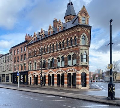
This is one of my favourite buildings that I saw on a stroll around Birmingham’s jewellery quarter a while back. It’s not a factory or anything to do with the jewellery business, however: it was built as a pub at the end of the 1860s, that decade when Victorian architecture became more jazzy, colourful and free than most of what went before. The style of Gothic is described by the Pevsner City Guide to Birmingham as ‘very Ruskinian’. In other words there are lots of pointed arches in rows, built in a polychrome mix of red, white and grey (aka ‘blue’) bricks; there are natty details like the small oriel window at the corner and the octagonal turret just visible in my photograph; and there are twin openings divided by slender shafts with carved capitals. All of these details were in the architectural air at this time thanks to the writings of John Ruskin, whose accounts of Venetian Gothic (in books such as The Stones of Venice, which came out in the early 1850s) were increasingly influential.
So far, so good. Whether Ruskin would have approved of this building is another matter. He seems to have had a downer on the kind of dissipation sometimes associated with pubs and taverns, and on genre artists, such as Jan Steen, who painted tavern scenes. But many of us will take a different view. Why should a pub not have a stunning facade, designed with flair, built with care, and enhancing the streetscape? If places of worship or education can have glorious polychrome brick frontages, why not places of hospitality too? I thoroughly approve, and I approve too of the fact that the building has been restored to make the most of its glorious exterior.
Another thing I admire about this building is the swagger with which it occupies a corner plot that is challenging architecturally. Corner plots are good for business, because a site on a junction allows the building to be seen and approached from several different directions. But a tapering cake-slice of a plot like this one is not always easy when it comes to designing the building – how does the structure ‘turn the corner’ visually, and what do you do with the tiny sliver that faces directly on to the junction? Placing the entrance there can be a good solution. Giving the entrance a bit of emphasis by adding the oriel window above (with its cusp-headed opening to make it extra ornate, a pattern echoed in the window on the upper floor) is highly effective visually. Here’s to Victorian brickwork, ingenuity, and that quality of vigour and distinctiveness they called ‘go’!

No comments:
Post a Comment