The long view
Among the multitude of things that pop up on social media, one I take notice of is a blog produced by Historic England. For each post it takes a theme or an architectural style and gives a handful of outstanding examples. The theme the other day was Art Nouveau architecture in England, and I was pleased to see that Historic England’s gurus had picked four of my personal favourites: the elegant if eccentric Turkey Café in Leicester (all pale stripes and gobblers), the Royal Arcade in Norwich (with its air of Edwardian luxury) and the glorious former printing works of Everard’s in Bristol (with a facade that illustrates two luminaries of the craft of printing, Johannes Gutenberg and William Morris). All of these have featured on this blog in the past and all, by the way, are adorned with tiles designed by W. J. Neatby of Royal Doulton. However, another favourite of mine selected by Historic England was a building I’ve not blogged until now.
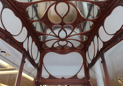
When I last passed by this imposing shop in the centre of Nottingham, it was a branch of the women’s clothes store Zara. It started out as something quite different, because it belonged to Boot’s the chemist – in fact it was their largest Nottingham branch in the early 1900s when it was built. As Boot’s was a Nottingham company, it was what modern retailers might called their flagship store. The upper part of the building at first glance looks like a baroque palace, with a dome to make the corner into a landmark. However some of the detailing, including the youthful figures hat support the balcony and cornices, together with some of the terracotta foliage, and the gently swelling columns that frame some of the window openings, are all of their time. It’s the ground-level shop front, though, that really looks Art Nouveau. This was the style of the sinuous curve, and the wooden window frames have curves in abundance, especially in the transom lights, the upper sections of the window, which have heart-shaped and tear-shaped panes, supported by a framework that’s both curvaceous and richly carved. Looking up as one enters, a similar pattern of glazing bars , this time with mirror glass, fills the ceiling, making the lobbies lighter.
It’s a lavish design, showing how Boot’s and their architect, Albert Nelson Bromley, made a special effort for this important store. The building was subdivided to accommodate the company’s variety of departments – everything from photographic processing to a lending library, as well as Boot’s core business of pharmaceuticals and cosmetics, but this interior was reconstructed in 1972 after the chemists had vacated the building. The shop front remains, showing how it was built to last by a company that, unlike so many modern retailers who put up flimsy frontages because they known everything will be redesigned in a few years, took the long view. Looking up in the lobby, Boots, Nottingham (now Zara)


No comments:
Post a Comment