Friday, December 26, 2014

Winchcombe, Gloucestershire


Snow on stone

Snow is threatened for the Cotswolds, and as we hunker down to continue the family Christmas festivities, I thought I’d share a rather seasonally chilly photograph from a couple of years ago. This is a grotesque from Winchcombe’s parish church, St Peter’s, which was built in the 1460s and has featured on this blog before. No one knows for sure who is portrayed in this carving, but there’s a local tradition that the subject is Ralph Boteler, lord of nearby Sudeley Castle, who provided funds to enable the church building to be completed.

Arguments are rife about this theory of the sculpture’s identity. Some ask whether medieval carvers would depict a local bigwig and benefactor in such a humorous way; others set more store by the old oral tradition. We just don’t know the answer, and it doesn’t matter. This carving, and its neighbours, are an asset to the church and a perennial source of smiling admiration from visitors and from people like me, who pass this building almost every day, snow or shine.

- - -

There’s another of Winchcombe’s admirable series of grotesques here, captured on the same snowy day.

Tuesday, December 23, 2014

Yarnton, Oxfordshire


By Gabriel begun it was, right as the sun shone through the glass 

The church at Yarnton has an outstanding collection of stained glass, mostly quite small pieces, and ranging from 15th-century saints and angels to an impressive number of pieces of 17th-century heraldic glass. Much of this was not made for the church but was donated in the early-19th century by Alderman William Fletcher of Oxford. This lovely feathery angel is one of the earlier pieces. Along with much English medieval glass, he’s paler and less colourful than he probably was originally. But the drawing of the face, hair, hands, and feathers has much charm and the deep red and blue of the glass above and below the figure gives some indication of the rich colours medieval glaziers could produce. He comes with Season’s Greetings to all my readers, and my very best wishes to you all for the coming year.

Although the angel in my photograph is not Gabriel, he reminded me, at this time of year. of the Annunciation, so to go with this medieval panel of glass here’s some 15th-century English music: a carol, “Alleluya: A newe werke”, concerning the Annunciation and the coming of Christ: “By Gabriel bygone hit was, ryzt as the sunne shone thorwe the glas.”

It’s sung by Ruth Cunningham, Marsha Genensky, Susan Hellauer, and Johanna Rose, whose four pellucid voices make up the group Anonymous 4.

Sunday, December 21, 2014

Ross-on-Wye, Herefordshire


Bombarded

Back in March 2008, when I first posted a photograph of this shop in Ross-on-Wye, I felt rather apologetic about my picture, because it had been taken quickly with the camera in my mobile phone. The other day when I was in Ross I did what I’ve always meant to do, and took another picture with a bit more detail and a view of the whole shop and all the signs, from Player’s on the left to Palethorpe’s on the right. This photograph has, as usual, been reduced in size to make it more web-friendly, so you still can’t see all the detail (even if you click on it to expand it), but it does now give a better sense of this wonderful collection of street jewellery.*

I’m impressed by the variety of lettering, from plain vanilla sans serifs (e.g. Goodard’s), through sans serifs with a shadow (Tizer), ornate sans (Sunday Dispatch: extraordinary), various versions of serifed capitals, to curvaceous script lettering (Maynard’s). Text arranged on a curve seems to have been particularly popular, as seen in the Sunday Dispatch, Fry’s, and News of the World signs (I remember the latter being especially widespread in my youth).  Many signs make their effect through lettering alone, though a few bear images that were also familiar long ago – the Black Cat, of course, recalls for architecture buffs the outstanding and feline architecture of the old Carreras factory near Mornington Crescent underground station in London.

And then there are the slogans, not all of which are legible on an internet-friendly, low-resolution photograph. Everyone seemed to need a slogan. There are the enticing: Player's Navy Cut, "Beautifully cool and sweet smoking"; Park Drive: "For pleasure”. The rhyming: Tizer, "Drink Tizer the Appetizer”. The commanding: Goddard's Embrocation, "Rub it in!”. The grand: News of the World, "The largest weekly paper”. The punning: Maynard's Wine Gums, "By gum! They're good”. The mysterious (to me): Tug-o-War Plug, "It's made by the 'Mick McQuaid' people”.† And the assertion of ubiquity: R. White’s Ginger Beer, "Luncheon, dinner & supper".

Pundits are fond of saying that today we are “bombarded with advertising”. But this selection of slogans shows that, in the heyday of enamel signs as now, we can be tempted, cajoled, ordered, seduced,  inveigled, coaxed, and enticed. We can be serenaded and our fancies can be tickled as well as our senses bombarded – the medium is both the message and the massage, as they say.§ Looking at this selection of superannuated slogans and lost brands, I found the whole process, I have to say, rather pleasurable…


- - -

* The various editions of the book The Art of Street Jewellery, by Christopher Baglee and Andrew Morley, are wonderfully enlightening on this subject.

† Mick McQuaid was (and is) a type of tobacco produced originally in Ireland. It's named after a character in a popular Irish magazine, The Shamrock.

§ Marshall MacLuhan was responsible for the phrase "the medium is the message", which, when garbled by a misprint into "the medium is the massage" he let stand as the title of a famous book.

Thursday, December 18, 2014

Pershore, Worcestershire


Two ways with brick

‘What can that be?’ asks the Resident Wise Woman, pointing across the square at a couple of buildings that stick out, more than somewhat, from Pershore’s Georgian townscape.
‘Something civic?’ I say.
‘Or something educational?’ she responds.
Something religious, we suppose, as we approach and discover the place to be festooned with posters issued by the Baptists. It’s actually something educational and religious: a Baptist schoolroom.

Hidden behind this building, it turns out, is Pershore’s Baptist chapel, a structure of 1839–40 by S. W. Daukes. Here in front are two newcomers in brick. To the right, the 1860s polychrome brickwork of the manse and earlier schoolroom, as jazzy and different from Pershore’s prevailing sober Georgian red brick as you could get using nominally the same material. To the left, the freer Tudor-cum-Gothic schoolroom of 1888, with shields bearing appropriate virtues to which pupils might aspire (faith, hope, charity, peace) and big windows to admit light by which the Word might be read. The architects were Ingall and Son, and they did a better job, it seems to me, than whoever designed the jazzy manse. I especially like the line of the gable and the way its pointed protrusions reflect the shape of the dripstone over the window. The lower part of the facade is perhaps a bit busy and unbalanced, but if it's busy it's also businesslike.

And if both buildings stick out rather, in this civil Georgian town, the schoolroom, at least, does it with some style. Is it so bad, after all, to proclaim your differences and to announce values such as charity and peace? ’Tis the season for it.

Sunday, December 14, 2014

Being moved in London


Ian Nairn, Nairn’s London
Reprint, published by Penguin Books


The final book review in my pre-Christmas handful is rather different from the others. It’s not of a recent book, but a reprint, not of a new discovery, but an old favourite. This review, in fact, returns to a subject that has occupied the English Buildings blog before: the writing of architectural critic, topographer, and television presenter Ian Nairn…

Right. I’m going to suggest that you do something rather extraordinary. I am gong to suggest that you buy a guidebook that’s nearly 50 years out of date. More than that, I’m going to recommend that you read it. And more even than that, I’m going to encourage you to start at the beginning, with the insular City of London, and read to the end, with the book’s evocation of the bare landscape around what was in 1966 still called London Airport. Nairn’s London is that different and that good.

Ian Nairn prefaced his guide by saying, ‘This book is a record of what has moved me, between Uxbridge and Dagenham.’ His descriptions of London buildings and London scenes benefit from much architectural knowledge (Nairn can evoke Sangallo and Bramante as he contemplates the Banqueting House in Whitehall; he knows when to compare something to Le Corbusier). He knows some history, but doesn’t dwell on it. What counts is his personal responses – the way he is moved – and what he has to say about the visual and spatial impact of buildings and places.

And when he is moved, Nairn’s language really takes off. In St Mary Woolnoth space is so tangible that ‘you can experience, for the price of a bus ticket to the City, the super-reality of the mystics or mescalin’. The improvisatory interior of St Mary Abchurch ‘looks like the result of a scribble on a menu card, and it works perfectly’. All Saints’ Margaret Street is like an orgasm. St Mary, Ealing, is ‘A rag-bag with enough ideas for a dozen churches: and a splendid place for a boggle.’ It’s not all churches, though, and certainly not all landmark buildings. Nairn is just as happy with obscure corners such as the wonderful Goodwin’s Court off St Martin’s Lane, its Georgian bow windows ’as unexpected as anything in London’, and Lazenby Court, which begins like ‘the end of the world’, continues via ‘an evil stretch of dark brick’, and ends with ‘a more than comforting pub’.

Pubs there are a-plenty in Nairn’s London. Critics are fond of saying that the book includes 27 of them, a figure reached by counting the entries in the thematic index. Actually there are more, because pubs mentioned en passant, like the one in the entry on Lazenby Court (the Lamb and Flag), aren’t listed there. The 27 range from the Red Lion in Duke of York Street, which, thanks in part to its mirror-lined interior, ‘throws you back on your own resources’, to Hampstead’s The Spaniards, which Nairn likes because it is unlike other Hampstead pubs which are ‘like a private society whose performance is not worth the entrance fee  – the intellectual equivalent of the Soho striptease club’.

Pubs did for Nairn in the end, which came too soon when he died of the effects of too much alcohol, in his fifties. There are signs of a decline in his late work, but Nairn’s London doesn’t show this, unless one finds his writing itself intoxicating. The comparisons can be far out, but they’re revealing nonetheless. Often they compare architecture to the other arts. Nash, he was fond of saying, is like Offenbach. The greenhouse at Syon House is a Schubertian frolic. Pubs remind him of Manet or Seurat.

I could go on, quoting his entries for such outré places as the Agapemonite Church in Clapton, Eros House in Catford, Huck’s Chalet in Hampton, or Lululand in Bushey. But even if you don’t know this extraordinary book, you probably have the idea by now. They are very personal responses but not so idiosyncratic that they’re not deeply revealing. They’re open-minded responses too. They celebrate grimy buildings as well as pristine ones, the famous and the obscure, the public and the private, Hawksmoor and Butterfield, modern and antique. And although our likes may not be quite the same as Nairn’s the writing makes us want to get out and see what is being described.

The blurb on the original edition tells us to get out quickly, as some of its subjects were already disappearing in 1966. By now, almost half a century on, quite a bit of Nairn’s London has been demolished, although the book is still worth reading as a guide to what’s left. But more than this, the lost buildings and vanished, scarred streets live on through Nairn’s animating prose.

- - -

To be clear: Penguin have reprinted the first edition of Nairn’s London without changes or revisions, as the classic that it is. (There was, a few decades ago, another edition, with revisions by Peter Gasson which are not included here.) For old time’s sake, my picture shows the cover of the first edition, which has been reproduced for the reprint, but with glowing review quotes replacing the destinations in the white panels on the bus. That’s Nairn himself, at the wheel.

Wednesday, December 10, 2014

On track


Steven Parissien, The English Railway Station
Published by English Heritage


The railway station does not appear prominently in most general histories of architecture. There will be the obligatory reference to the great Victorian train sheds – the cathedrals of steam – and their groundbreaking iron and glass roofs, and a nod in the direction of Charles Holden’s fine London Underground stations, but not much more. Even so, the widespread interest in railway history has produced a ready market for books on railway architecture and on stations in particular, and even I, no steam man, have a shelf of them. Quite a few are reference books that I return to regularly – Gordon Biddle and O. S. Nock’s The Railway Heritage of Britain and Biddle’s Britain’s Historic Railway Buildings, for example. There are wide-ranging works of social history, such as Richards and Mackenzie’s The Railway Station, works of narrower range like John Betjeman’s London’s Historic Railway Stations (with its lovely photographs by John Gay) and Gordon Biddle’s Victorian Stations, a clutch of books about the architecture of London’s Underground, and international surveys such as Carroll Meeks’s The Railroad Station and Steven Parissien’s Station to Station. It’s Steven Parissien who’s written this new book, The English Railway Station. I wondered when I saw it whether we needed another, but perhaps we do.

Parissien casts his net wide across England, covering not just the big termini but also town stations, rural stations, and halts. He covers not just the historic Victorian buildings but the railway stations of the 20th  and 21st centuries (yes, there are a few). Beginning with the origins of the British railways, he shows how the industry, beset by insecurity and financial scandal, had to build up the trust of the public – classical architecture, with its sense of solidity, lineage, and rectitude, helped at first; a Tudor revival style, sometimes homely, sometimes amusing, sometimes reassuringly redolent of old England, went down better later. Other styles were taken on board to express the corporate identities of specific railway companies or the talents of particular architects.

The careers of certain of those architects are highlighted – not just well known heroes such as Brunel and Hardwicke, but also notables like John Dobson (creator of the stunning Newcastle Central), David Mocatta (imposing Brighton), Sancton Wood (Tudor Stamford), George Townsend Andrews (monastic Gothic Richmond, Yorks), and several others. A succession of steep-gabled, Jacobethan, and brick-built structures illustrates an extended chapter on the country station. Still more variety, from Slough’s French Renaissance curves to the wonderful moderne radio cabinet of a station building at Surbiton, punctuates a chapter on the urban station.

Having brought the story up to World War II (via a short detour on to the Underground), there is the expected account of the decline of the country’s rail network, in which Parissien reminds us that Dr Beeching was not the only person to blame – lines and stations were closing in significant numbers well before Beeching’s destructive 1963 report led to still more shrinkage. The contraction carried on afterwards too. But there’s also room in the book for discerning accounts of more recent railway architecture. And it’s not all grim system-built tat, even in the 1960s. Manchester’s Oxford Road, Harlow Town, Barking, and Chichester all come in for praise. And more recently there are new stations as well as the much-lauded recent work at Kings Cross and St Pancras to feel good about.

So there’s a lot to admire here – accounts of unregarded buildings and little known architects, a broad overview of station architecture, and a sense that conservation work, railway preservation groups, creative reuse, and even the occasional recent new build give cause for optimism. The English Railway Station earns its place on the end of the railway shelf, next to Nock and Biddle.

Monday, December 8, 2014

Mind your planguage


Jones the Planner (Adrian Jones & Chris Matthews), Towns in Britain
Published by Five Leaves Publications


Jones the Planner is one of the best blogs about building, planning, and the state of towns in Britain. I’ve been enjoying its thoughtful and well informed perambulations of towns for some years now, and admiring the way it gets the essence of a place. I remember, having followed the blog around Nottingham and Northampton, and read what it had to say about the great cities of Scotland and South Wales, that I began to hope they’d tackle some of my favourites. It was not too long before Adrian Jones and Chris Matthews visited Lincoln, to the sound of cheering from this quarter at least. Other favourites such as Bristol and Exeter followed. Now Adrian Jones and Chris Matthews have turned their extended perambulations into a book, making this reader at least, very pleased indeed.

The portraits of cities in this book are lively, sometimes witty, and the fruit of actual visits. They are informed by an experienced planner’s eye, but don’t degenerate into jargon: most of the time, they watch their planguage. The result is first of all a collection of very readable portraits. Coventry, for example, is seen as underrated, and Jones helps us to understand the virtues of its postwar planning (albeit compromised by later changes), as well as pointing out the striking buildings (the circular market building and Godiva Restaurant), the outstanding murals, and the greatness of the cathedral. I think the book is spot on about the way in which Spence’s design complements the ruins of the medieval cathedral. The virtues of Leicester (Clarendon Park, ‘Jacobean deco’ factories: hoorah!) are highlighted without denying the ‘silly show-off attention-seeking shininess’ of much of the city’s recent architecture. Glasgow is a fine city – one of our very greatest: true – its ‘American’ planning and scale, its staggering early iron-framed buildings, and its brooding tenements are magnificent. But Jones does not lose sight of the city’s problems, from the poor traffic planning to the lacklustre new transport museum; nor does he fight shy of suggesting solutions – he is Jones the Planner after all.

The urban parade continues via Cardiff (some terrific aspects but Cardiff Bay is poor and there is some depressing gated development by the Taff); Bristol (a great city that could do even better); and Southampton (some impressive assets like the old walls and the water, but the city needs to capitalise on them, not just give in to development). The smaller cities are given their due too: Exeter has a lot going for it, Lincoln has done much that is right.

There are several chapters on London. The approach to the capital is via various routes – the importance, and depletion, of the public realm, the vitality of traditional vibrant streetscapes, housing (flats in the Elephant advertised in the Gulf States while hardly any social housing is being built to replace what has been taken away from the area), contrasts of scale (city squares v the Shard), and so on.

Any book on towns has to work on both macro and micro scales, adumbrating the overall effect and specific details, and embracing both planning and architecture. Towns in Britain manages this, time and again. The book lays out clearly the phases of the development of a major city such as Birmingham while also zooming in on specific buildings. And although it’s often at pains to show the reasons why 1960s architecture is the way it is, to justify the ways of Brutalists to man as it were (Jones has time for John Madin’s threatened Central Library), it’s also open to more recent building when it works (Jones also respects the brand new library by Mecanoo).

This book is made up of pithy, arresting accounts of major towns, well illustrated with helpful photographs that are briefly and pointedly captioned. It avoids pat judgements about ‘crap towns’ or ‘concrete monstrosities’, drawing attention to how places actually work. It points to the virtues of planning, and the dangers of laissez-faire development (while also acknowledging that freedom to develop was one of the things that made Victorian cities great). The essays are appreciative of the good aspects (especially of underrated places), sharply critical of the bad, and, above all, alert to the specific character of each place. And this is the point: city authorities need to be sensitive to local character and build on it, and to resist the temptation to bow to the fat cheques and shiny facades of rampant capitalism on the one hand, or to the regurgitated nostrums and generalized principles of big-shot master planners on the other. Jones the Planner, in revealing so much about our towns’ positive qualities and their importance, makes it clear why this is vital.

Friday, December 5, 2014

Book of revelations

The next in my series of reviews is of a 2013 book that I didn't get around to reviewing last year. It covers an aspect of English buildings that's often overlooked...

Alan Powers (ed), British Murals and Decorative Painting 1920–1960
Published by Sansom & Company


Murals are among the largest of paintings, but, attached to the walls of country houses, schools, little known chapels, even ocean liners, they are also some of the least well known. This book showcases some of the most interesting British murals from a period that saw a revival in the art of decorative painting. It is a revelation.

The book begins with an extended essay by Alan Powers on the art of mural painting between 1920 and 1960, showing how various factors – the way fine art was taught, the importance of scholarships at the British School at Rome, the existence of enthusiastic patrons – came together with a generation of highly talented artists to produce many remarkable works. Powers also introduces and discusses a wide variety of mural artists, from Duncan Grant to Gordon Cullen, who deserve our attention. And in extending the common idea of what constituted British art in the early to mid-20th century he sets the stage for what follows: a group of 15 shorter essays by different art historians on key artists and decorative schemes. These too are fascinating and include artists who will be familiar to readers of this blog and others who will be only faintly remembered names, if that.

They include: Winifred Knights, whose mural The Deluge features a highly dynamic composition of running figures; Colin Gill, whose Allegro, a kind of sun-soaked Italian fête champetre, features his beloved Winifred Knights; and Thomas Monnington, who was married to Knights, and whose Allegory, compelling but somewhat mysterious, is in sharp contrast to his later, little known abstract works. Then there are: Mary Adshead, whose An English Holiday sequence was commissioned by Lord Beaverbrook, who then rejected it sight unseen because he was concerned about its light-hearted portrayal of his friends; Edward Halliday, who was influenced in his decorative work by Greek myth, but who later was better known as a portrait artist; Frank Brangwyn, with his monochromatic murals for the Rockefeller Center, New York City; and John Armstrong, who could do a kind of advanced Art Deco, as in his work for the London South Bank Telecinema, and something more fresh, individualistic, and pastoral, as in his work for the Royal Marsden Hospital.

An outstanding artist among these painters is Charles Mahoney, who reflected in his Morley College murals the classical turn in European art of the 1920s and 1930s, contrasting with the medieval, dreamlike quality off his outstanding Brockley school murals based on Aesop and similar fables, and with his murals for Campion Hall, Oxford, which work well with Lutyens' architecture and, to some, recall Piero della Francesca.

I was pleased too to read more about several of my own favourite artists of the period, including Edward Bawden (notably his works for the Festival of Britain and for ocean liners); Alan Sorrell (whose murals, interesting their its own right, also show a natural progression towards his more famous reconstructions of historical scenes); John Piper (the enormous Festival of Britain mural The Englishman's Home that was such a revelation at the V&A's British Design exhibition in 2012); and Barbara Jones (always interesting, always reinventing herself).

This all amounts to a rich visual feast, the more so because many of the murals, rarely if ever seen by the public, are reproduced in excellent colour photographs specially taken for the book. I am sure I will return both to the essays, and to these memorable images, again and again.

- - -

The book's cover, above, shows a detail of Allegro by Colin Gill, 1921

Tuesday, December 2, 2014

Not just white boxes

As I've done in previous years, I'm turning English Buildings into a book blog for ten days or so, as I review a few books in the run-up to Christmas. As usual, I've selected a handful of volumes that I feel enthusiastic about, in the hope that some of my readers might find something to give, or receive. 

Twentieth Century Society, 100 Buildings 100 Years
Published by Batsford


You get the idea: a span of a century (1914–2013) and one building per year, each described briefly and illustrated with photographs. The book was put together by the Twentieth Century Society and the buildings were selected by its supporters. Quite a few of the structures it includes would not exist without the campaigning work of the Society; one or two have, alas, been demolished. Together they make up an arresting selection of what’s most interesting, and sometimes provocative, about 20th-century architecture in Britain.

The book is not, though, intended to showcase ‘the best’ or to be ‘a representative selection’ of 20th-century buildings. It reflects the individual tastes of the selectors, who are well informed about 20th-century architecture but have varied preferences. And this is a good thing, since the architecture of the last one hundred years is the most diverse Britain has produced. It embraces the white boxes of 1920s modernism, Art Deco in its various forms, mid-century modernism, brutalism, postmodernism, hi-tech: all the usual suspects. But more than this, it acknowledges the impact of picturesque, garden-city inspired housing, of the serious Gothic of Bristol’s Wills memorial Building with its great tower, of the century’s neoclassical buildings, and of one-offs (or two-offs) like the vast airship hangars at Cardington or Ernest George Trobridge’s eccentric sort-of-Tudoresque houses in Kingsbury.

Representing all this variety is worthwhile because we get a bigger (if maybe more confusing) picture of modern architecture than the one revelled in many textbooks. And this is important for another reason. Many people and groups campaign for specific types or styles of building – modern movement buildings, say, or Art Deco cinemas. And that’s fine. But the Twentieth-Century Society takes on all of them, from the most modest Prefab to Battersea Power Station. We need this breadth of vision and approach.

Many readers will find favourites here. I was thrilled to find one of my own, Bexhill’s De La Warr Pavilion, on the cover, and a rhapsody (by Piers Gough) in praise of London’s Barbican housing inside. But like me I suspect most readers will also make interesting new architectural acquaintances. I was pleased to be introduced to UMIST’s Renold Building in Manchester and Benton Park School in Leeds, and to be reminded of Farnley Hey, Peter Womersley’s celebrated 1955 house in West Yorkshire. Clearly I should spend more time in the North of England.

An introduction and a series of essays (on Inter-war architecture by Gavin Stamp, on the Post-war period by Elain Harwood, and on Postmodernism by Timothy Brittain-Catlin) punctuate the text and add useful context. The book makes up a stimulating, breezy introduction to the variety of British architecture, with good photographs. A good start for anyone new to the subject, and a worthwhile addition to the bookshelf for anyone who thinks they know all about it: buy a copy for yourself and one for a friend: Christmas is coming.

- - -

There’s an accompanying exhibition, too, at the Royal Academy.

Friday, November 28, 2014

Leominster, Herefordshire


Toujours la politesse

As I left Leominster Priory after looking at the ducking stool that formed the subject of my previous post, the sun came out, warming the mid-18th century red brick of this lovely house on the approach road to the church. I'd admired this house before, and its polite architecture, but I'd not seen it without cars or vans parked in front. The lack of these, and the sun, seemed to demand a photograph.

I'm often taken by the quiet impressiveness of Georgian house fronts like this. None of the heavy effects of the earlier period, none of the filigree decoration or bow windows of the later Regency. Just good honest brickwork and the usual adornments – quoins, keystones, a doorcase with its own curved pediment, a larger, triangular pediment (with nice oil de boeuf window) at the top. As is so often the case, the window frames were renewed, with large panes, in the 19th century, but at least these changes don't destroy the overall proportions.

I don’t know who built this house or originally lived in it – someone of substance, clearly, commissioned the town's best Georgian house. For part of the 20th century it was, I believe, divided into flats, and I read in one place that during World War II troops were billeted there. It is now a care home. Its polite architecture has clearly proved both adaptable and resilient.

Monday, November 24, 2014

Leominster, Herefordshire


Rough justice, or, Odd things in churches (8)

It’s time for another of my odd things in churches, and this one is particularly odd.

The ducking or cucking stool was an instrument of punishment, used in the Middle Ages and later, generally for to those who spread malicious rumours or tradespeople who gave short weight. The term ‘cucking stool’, literally ‘defecating stool’, refers to a chair, sometimes in the form of a commode, fitted with wheels and trundled around the town with the guilty person on board. The aim was to humiliate the malefactor, humiliation being a key part of punishment in the medieval and early modern periods (as with the use of stocks and pillories). A ducking stool took the punishment a step further by incorporating an arrangement of beams so that the person could be dunked in a river or lake.

The town where I live has a street called Duck Street because it was the site of the local ducking stool, which has long vanished. One place where a ducking stool can still be seen is Leominster Priory, where it is kept parked against a wall, looking as if it could easily be trundled out of the church to duck any criminal deemed to need the soggy treatment. According to the information displayed with the Leominster stool, it was last used in 1809, ‘when a woman, Jenny Pipes, alias Jane Curran, was ducked in one of the adjacent streams’.

The ducking stool was often used to punish women. Langland, in Piers Plowman, refers to it as a punishment for wyuen (women), and it is commonly written about as a way of dealing with ‘gossips’ and ‘common scolds’ and dousing the fire in their mouths. In the words of an old poem quoted on a poster next to the Leominster stool:
No brawling wives no furious wenches,
No fire so hot but water quenches.
A sexist punishment, then, in part at least. But I wouldn’t want to have been a butcher who gave gave short weight on the sides of meat.
Leominster: the entire machine

Thursday, November 20, 2014

Savile Row, London


Well suited?

This elegant bit of lettering is an interesting variation on the capital’s standard black and red street name signs. By keeping the usual colours – black for the name of the street, red for the postal district  – the sign recognisably relates to London, but the letterform and layout are completely different from the London norm. The architect of this building, Gordon Jeeves, seems to have had the idea of integrating the lettering more closely than usual with the design of the building, setting the letters in a purpose-designed horizontal slot, and using this slot to mirror the strong horizontal lines of the rest of the design.

The building (essentially an office block, though meant to have shops on the ground floor) was designed in the late-1930s: the Survey of London says in 1937. On the opposite corner is the West End Central Police Station, a pale, stone-clad building of 1938–9, with modernist features (glass bricks, strong horizontals) and similar lettering. So it looks as if the architects of the Police Station (Burnet, Tait & Lorne) decided to follow the lead of their neighbour and include matching lettering.

I like the way the sign sits in its horizontal slot – although the fit isn’t exact: the ‘Savile Row’ and ‘Boyle St’ parts of the slot have been made the same length so there is more white space around ‘Boyle St’. The letterform is strikingly different, too, from the usual Univers Bold Condensed of London’s street name signs. Could it be Futura, or something very like it? My graphic designer readers will no doubt enjoy telling me. I hope the rest of you enjoy the sign too.

Sunday, November 16, 2014

Loughborough, Leicestershire


The exemplary bee

I've noted before how bees have been used as symbols of co-operation for hundreds of years, and as symbols of the Co-operative Movement since its first inception in the 19th century. This plaque, which I came across on a building in Loughborough, no doubt marks the site of Co-op store. The motto it bears, 'Unity is strength', was also adopted early on by the Co-operative Pioneers, although they sometimes used the form 'Union is strength'.

Although this plaque is not quite as beautifully made as the one I spotted in Wiltshire a while back, it scores highly in one key respect. While the Wiltshire example showed just the hive, this one includes actual bees in flight. These long-enduring creatures, here, so the fancy lettering proclaims, since 1865, remain to remind us of their links with industry, cooperation, sweetness, and continuing pollination and life. Whether represented artistically, as in this Loughborough street, or in their living form, they deserve our notice and respect.

Tuesday, November 11, 2014

Hertford


Angles and curves

This former seed warehouse, resplendent with glowing brick and gilded lettering, was built in the mid-19th century for seed merchants Alfred McMullen's and partly rebuilt in 1944 after bomb damage. Tucked away not far from the town’s Mill Bridge, it’s now I think used variously as offices and a store for Hertford Museum. Hertford Town Council also offers this part of the structure – the Mill Bridge Rooms – as a community facility for hire.

There's some lovely brickwork here – mainly yellow brick with some details including a diaper pattern and segmental arches above the windows in red brick. The way the brickwork curves to turn the corner* is striking, especially the way the curves contrast with the varied sharp angles and straight lines of the rest of the structure. This was the feature that caught my eye as I passed – that, along with the way in which the gold lettering shines in the sun.

It's not all brick, though. Typically of central Hertford, which exhibits a variety of brick, stone, stucco, weatherboarded, and timber-framed buildings, there are several different materials on display here – hammered sandstone around the doorway, slates on the roof and cladding the hoist chamber that sticks out above the doors to the right, even a bit of pebbledashing along the eaves course. It's a rich mixture that works, and is a tribute both to the flair of Victorian builders and the efforts of those who have conserved and maintained the building more recently.

- - -

* Regular readers will know that I have a particular liking for buildings that turn tight angles with curved walls, as exemplified here and here.

Friday, November 7, 2014

Didmarton, Gloucestershire


Two views

Thinking back to Ordinary Beauty, the Edwin Smith exhibition at the RIBA, and remembering Smith’s evocative 1961 black and white photograph of the church interior at St Lawrence, Didmarton, I recalled that I’d taken a photograph from a very similar viewpoint a couple of years ago. Perhaps the two images would make an interesting comparison – not in terms of photographic quality (Smith, of course, wins hands down on that front) but as an indication of how the building might have changed over the last half century.

Looking at the two images together, it’s clear that there have been some changes. Both the walls and the woodwork have been cleaned up and repaired. The walls are now white and smooth, in contrast to the rich, crumbly plasterwork of Smith’s time, and the beam in the ceiling looks healthier, if less picturesque. Both floor and stairs seem very similar. Sadly, the lovely curving candle brackets have gone, although the plates to which they were attached remain.

The furniture has changed too. The benches have disappeared, although the chair is still there and there is now a businesslike cupboard against the wall. On the extreme right, there’s an indication that the panelled box pews, a sliver of which is just visible, have been repainted – they’re now a fetching pale green (this goes for the box pews in the nave too).

All this suggests that the church has undergone some much needed repair and conservation work. In the process it has lost a little of its character – the character that comes from the unevenness in the worn walls and woodwork – although the pleasantly cracked and roughened floor, the window tracery, and details such as the hanging weights of the clock still speak of age, history, and use: this place still has plenty of atmosphere. Church-crawlers can be grateful that it has been cared for – but also grateful that the subtle and sympathetic scrutiny of Edwin Smith’s lens has put on record what it was like some 50 years ago.

- - -

Top photograph: Edwin Smith, Didmarton, Gloucestershire
Smith's photographs are © Edwin Smith / RIBA Library Photographs Collection

Ordinary Beauty: The Photography of Edwin Smith is at the Architecture Gallery, RIBA, 66 Portland Place, London W1, until 6 December 2014.

RIBA's online archive of Edwin Smith's photographs is here.

Monday, November 3, 2014

Cheltenham, Gloucestershire


The ladies, vanishing

At some point in the last couple of weeks – I’m not sure exactly when the last bricks tumbled – Cheltenham’s former Odeon cinema, long closed, was finally demolished. It was a rather plain building, on the cusp of Art Deco and modernism in style, and had served the town for decades (first as the Gaumont Palace then as the Odeon) before a more up-to-date cinema opened in the town. It then lay empty for several years and it seems to have proved impossible to find a new use for the building. I blogged about it back in 2008, when I wrote:

It’s an undistinguished Art Deco building, with the redeeming feature of these two naked women tangled in celluloid high up on the façade. Most passers-by see only the boarded-up entrance of the cinema, steadily becoming more and more of a blot on the townscape. I’d lay odds that most of them never notice the silver ladies, two of several reminders of the unregarded past of a quiet Cheltenham side-street.

These relief panels are by Newbury Abbot Trent, a prolific sculptor who produced many war memorials. He was the brother (or, according to some sources, the cousin) of the cinema’s architect, W. E. Trent. The panels are the kind of thing that often adorned cinema buildings of the 1930s, although they were often carved in stone, with a more neutral surface than the shiny metallic finish of these Cheltenham examples. Such sculptures often show female figures – always glamorous, often naked, sometimes, like these, with exaggerated proportions – and were meant to entice us into the magic and seductive world of the cinema, at a time when only a tiny minority had television and cinema-going was a regular weekly recreation for millions. When they were new, shiny, and properly lit, they would have reminded film-goers and passers-by alike of the magical, flickering world inside. It’s a shame they are no longer there.

- - -

Postscript 2018 I can somewhat belatedly report that these reliefs have been preserved. They are now displayed, at ground level, fittingly on the rear of the town's more recent cinema. Here they can be well appreciated and also entertain passing drivers on Chletenham's notorious inner ring road. I have been in a traffic queue next to them several times. 

Thursday, October 30, 2014

Marylebone Road, London


Going somewhere else

Here’s another example of the 1930s ocean liner style, but on a much larger scale than the little tram shelter in my previous post. This building is Dorset House on the northern side of Marylebone Road, near Baker Street. It was built in 1935 to designs by T. P. Bennett & Son, with the prominent modernist architect Joseph Emberton acting as consultant on the project.

I often pass by this block and give it an appreciative upward glance. I like the mix of projecting sections that ensures not only that the vast facade is broken up agreeably but also that the rooms inside are well lit – although the block is south-facing those angled windows bring some eastern and western light into many of the rooms too: a thoughtful touch. The rectilinear geometry of window frames and flat top is offset by the impressive collection of curves displayed by the balconies: curved brickwork, curved concrete floor slabs, curved railings. I doubt that many residents take the afternoon sun on these south-facing balconies: the noise from the traffic in Marylebone Road would limit one’s enjoyment. This must have been less of a problem in the 1930s.

The bright green of the railings is a colour I particularly associate with 1930s buildings. White walls and green roof tiles was a popular colour combination in the period. A big pitched roof of green tiles could be rather strident, but these nautical green railings are more pleasing, especially as they’re combined with a mixture of bricks and white paintwork. An enjoyable effect, even though the balconies look down on the buses and taxis of Marylebone Road rather than a sandy beach and an inviting sea.

Sunday, October 26, 2014

Leicester


Going somewhere

I was once at a literary festival event where a panel that included Joan Bakewell and Jonathan Meades were discussing their favourite buildings. Joan Bakewell, eager to put in a word for Elizabeth Scott, the pioneering woman architect, was making the case for Stratford’s Royal Shakespeare Theatre (this was before its recent remodelling), her most celebrated design. Meades wasn’t convinced, and when Bakewell insisted, ‘Isn’t it like a glorious ocean liner?’ he delivered the coup de grace: ‘Well, maybe. But it isn’t going anywhere.’

‘Ocean liner architecture’ – long lines, strip windows, nautical-looking railings, curves relieving the rhythm of straight lines and right angles – was popular for all kinds of buildings in the 1930s. There are apartment blocks, hotels, and lidos in the style. Here’s a bus shelter (was it originally a tram shelter?) in Leicester that’s in a similar mode. The overall shape, the row of windows, and the overhanging roof give the shelter a strong horizontal emphasis and the lack of pillars at the corners is just the kind of thing modernist architects liked to do to show off. Look, no visible support! The natty angled glass panes at the corners draw attention to it.

Most striking of all, though, are the curvaceous ends of the overhanging roof. As well as providing some extra shelter, they give this little building an overall form not dissimilar to the round-ended city trams of decades gone by. I remember seeing shelters like this when passing through Leicester as a small boy with my parents on trips to visit family in Lincolnshire. Even then they seemed rather special, modern, new (in spite of the fact that they were already maybe 30 years old), and rather like the kind of thing I could build with LEGO. Although I would not have thought to put it like that in those days, they seemed, indeed, to be going somewhere.

Wednesday, October 22, 2014

Cookham, Berkshire


There’s a building there, somewhere

I often look at old photographs – postcards, pictures in mid-20th century books like those volumes about the regions of Britain published by Batsford, Victorian images – and I’m frequently struck by the way in which so many buildings are covered in vegetation. Ivy, Virginia creeper, and other boskage winds its way up walls, clings to window frames, aims for high battlements. Wisteria blossoms are blurred as they move in the breeze. Tendrils tap on window panes.

Today, conservation conscious, we’re more likely to strip away creeper and discourage this kind of threat to masonry and woodwork. Trees keep their distance. ‘Wisteria rhymes with hysteria.’* But flowers against a wall, even trailing ivy, can be good to look at. As the leaves turn in autumnal England, here’s an example I photographed a couple of months ago in Cookham, the town immortalized in the work of the artist Stanley Spencer.

Spencer, famous for his paintings of people, was also an exemplary painter of plants, flowers, fields, even of wisteria (‘Wisteria at Englefield’). I think he might have liked this display, with its splashes of colour that almost completely hide the building that supports them, a memory of summer as the nights draw in.

- - -

* ‘Wisteria (Rhymes with Hysteria)’: the title of an essay by John Russell, The New York Times, 1980

Friday, October 17, 2014

Ford, Gloucestershire


The last pump*

I have faint distant memories of the hamlet of Ford, tucked in a fold of the Cotswolds by the River Windrush, from my youth. I remember it as a rather bleak place, with stone cottages that seemed to be hunkered down against the wind, a transport company called Bowles (buses and coaches I think), and an inviting pub, the Plough. Those were the days when people with cottages in the Cotswolds mostly had their work and their lives among the hills – farm workers, artisans, those offering local services. The outsiders who had cottages were mostly bohemians and people who lived up lanes with fires in a bucket† – a far cry from the retirees and celebrities one trips over today.

Back in the 1960s, many of these locals didn’t run a car. They walked to work across a yard, or cycled, and took the bus to Stow or Winchcombe or Cheltenham to do their shopping. If they did have four wheels, there might still be the odd roadside pump at which to fill up, like this one, surviving thanks to the care of the proprietors of the pub at Ford. My distant memory linked it to the bus company, but here it is by the Plough, together with an old ‘Ring for service’ sign, to suggest that this is where’s it has always been.

The wedge-shaped top and the lines of the pump’s body are straight out of the Art Deco school of design. How good a pump like this would look outside an Art Deco garage. But it looks good here too, against a stone wall and framed by flowers. The top to the pump brings back memories: of Shell pumps topped with shells, Esso’s oval “globe”, National’s diamond, BP’s shield – a whole form of advertising design that’s gone now, save from the world of museums and private collectors with space to spare. It’s nice to see this one still in its original home, even though the only thing that’s pumped hereabouts now is beer.

- - -

*For now, at least
†Phrase copyright Philip Larkin, “Toads”

Tuesday, October 14, 2014

On the arterial road...


…pumpery revisited

One of my readers reminded me, after the previous post about corrugated-iron garages and roadside petrol pumps, that such structures were widely disliked and criticised when they appeared back in the 1930s and 1940s, much as we might appreciate them now. He is of course quite right. These makeshift structures are a good example of the way attitudes and fashions and the ways in which we see things change, sometimes radically, over time.

In the 1930s there were frequent protests about the unchecked rise of shacks, garages, and other unplanned buildings. These structures were often seen as unpleasant to look at, badly built, and part of the inexorable ribbon development that threatened to swamp the countryside around Britain’s towns and cities, joining settlements together so that no countryside would remain at all. Quite a few people wrote about this, attacking plotlands, garages, and ribbon development as part of the same problem. Take Sheila Kaye-Smith, for example, writing in the 1937 collection Britain and the Beast, edited by Clough Williams-Ellis. Here she compares modern buildings with the much-loved traditional buildings of Kent:

Compare [Kent’s traditional buildings] with the modern villa set up stiffly like a match-box on end, with the bungalow coloured a pink that can be seen nowhere else save in boiled crustaceans, with the garage of corrugated iron, the catsellated shop-front, and then address yourself to time, in your hopes no longer the preserver but the destroyer.

J B Priestley also had a go at such things in his book English Journey and the CPRE even suggested that motorists should boycott garages made of corrugated iron or sporting “garish, multi-coloured petrol pumps”. A whole world of sorry roadside development was captured in an illustration in another book by Clough-Williams-Ellis, The Adventure of Building, which I reproduce above: as well as corrugated iron, ubiquitous overhead wires and intrusive advertising posters are also part of the view.

Even back then, the objections were inspired by all kinds of motivations. For many, it was a genuine anxiety about the countryside and about the way our settlements were being planned – or not planned, but just thrown up, willy nilly along the highways. For others, it was snobbery about low-status building materials, discontent with structures that could be erected by unskilled labour, or a dislike of untidiness.

As far as corrugated-iron garages went, they got their way in the end – most have long vanished. Ribbon development, too, has been controlled by the planning system, as have, by and large, big advertising hoardings. And now, encouraged by writers like Jonathan Meades and Iain Sinclair, we are more likely to find something to admire or interest us in old garages, plotlands, and sheds. it might be the ingenious bricolage practised by their amateur builders; it might be the layers of history the represent. It might be – and this is where I come in – their contribution to, and absorption in, the character and life of specific places: a plotland bungalow softened by cow parsley or surrounded by shingle, a corrugated-iron roof turned over to nature, a barn rusting in the summer sun. Such things encourage us to look, and think, unearth stories about the past, and reassess what is still there in the present.

Friday, October 10, 2014

Rhydd, Worcestershire


Pumpery

By the side of a road a few miles outside elegant, hilly Malvern, in the flat country between the villages of Guarlford and Rhydd, is this small corrugated-iron building, now partly surrounded by grass, weeds, and elderberries. Driving past many times, I took it to be a farm outbuilding, but then I noticed the way it faces right on to the road and the presence of a very old petrol pump at one corner. There’s an enamel warning sign about the dangers of petroleum spirit too, its red lettering still clear against a white background, now partly obscured by the elder. I assume, then, that this was once a small garage, supplying fuel to cars on the way to and from Malvern and also to vehicles associated with the neighbouring farm.* Like so many early garages and pumps, it is right by the roadside (the tarmac is just out of shot), so that the motorist had just to stop and refuel. Since Malvern is the home of the Morgan Motor Company, I have mental images of early three-wheelers and 4/4s pulling up…

In 1927, as car ownership increased in Britain, the Roadside Petrol Pumps Act was passed, giving local councils the power to licence petrol pumps. To start with, these pumps were hand-cranked, but by 1930, electric pumps were being installed on roadsides. World War II brought petrol rationing and the demise of many rural garages, but once the post-war period of austerity was over, there was a steady increase in car ownership again and many new purpose-built garages and filling stations were built. More and more, these were substantial buildings with proper forecourts, on to which one pulled, and eventually safety considerations meant that the old roadside pumps disappeared. The occasional survivor, either rusty like this one or more consciously preserved, remains to remind us of a very different era of motoring.

- - -

*And since this is an assumption, I’d be very interested to hear from anyone who knows more about the history of this building.


Monday, October 6, 2014

Thorpe Mandeville, Northamptonshire


Brief encounter

On my way to an important meeting over lunch in a pub, my eye was caught by this small church, dating mostly to the early-14th century. The thing that particularly attracted me was the tower. This has a small pitched roof, a design known in archi-speak as a saddleback tower. But while the saddlebacks that I’m used to (on the Cotswolds, like this example) have a roof that overhangs the walls like any other pitched roof, this one is tucked behind a parapet. The masons who built it also added a small collection of rather large pinnacles, richly ornamented with crockets, in typical 14th-century style. 14th-century style, but some of the details may be Victorian, as the tower was restored in 1898.

These pinnacles, together with corner gargoyles and a tiny carved figure on the tower’s east wall, just above the nave roof, set this tower apart and help what is otherwise a simple-looking little church stand out. My appreciation is only from the outside, however. The church was locked on the day I passed by and I didn’t have time to contact the keyholder. One day I must return and try to get inside. Returning to old buildings, after all, is usually a good idea. You nearly always see something that you missed the first time round.

Friday, October 3, 2014

Wareham, Dorset


Here for the bear

One of the pleasures of having this blog is the comments and messages and information I receive from readers. I’ve benefitted, recently, from interesting information and conversations about (among other things) the similarities between a rectory and a town house in Leicestershire, 20th-century school architecture and decoration, and the filmic activities of Michael Winner in Herefordshire – as usual, the comments confirm my conviction that writing about buildings involves much more than architecture. Now, having read my previous post about the Unicorn at Deddington, reader John Hartley has sent me some images of further three-dimensional inn signs: both the Dolphin Hotel at Chichester (which I blogged about long ago) and this, the Black Bear at Wareham, which is new to me.

So here’s a lovely 18th-century inn frontage, bow-windowed and parapeted, with a fine statue of the eponymous bear sitting on top of the porch. The pose, with one paw raised, is charming. However, I take it also to be a reminder that, here in Britain as elsewhere, bears were once trained to dance and perform, as well as being subjected to the practice of bear baiting. In spite of all this, Wareham’s black bear manages to maintain a certain dignity. When, one of these days, I make my way to Wareham, I look forward to making his acquaintance.

Photograph of the Black Bear Hotel, courtesy of John Hartley

Tuesday, September 30, 2014

Deddington, Oxfordshire


This is the creature that was never seen…

Looking rather soulfully down at potential customers is this three-dimensional sign on the Unicorn Inn in the Oxfordshire town of Deddington. I’m kicking myself for not having noticed it before, as it’s an appealing sign. But perhaps these days it’s not as affective an eye-catcher as it was – driving past, you are apt to be dodging other vehicles in the town’s busy market place, which is made narrow by parked cars. Walking along the pavement, the sign is easy to miss as you pass, being tucked on its ledge, its white body set against the pale background of the wall behind.

When you do see it, though, it’s arresting, the golden bits helping its white body to stand out against the white wall, and it’s one of those bits of folk art that’s worth admiring. And what a fine and distinctive creature to put on your inn – mythical, enigmatic, elusive (‘This is the creature there has never been,’ begins Rilke’s sonnet on the beast, in J B Leishman’s translation), and yet instantly identifiable all the same.

I’ve managed to miss the Tate Gallery’s exhibition of Folk Art in London, but intend to catch it at Compton Verney soon. I’m hoping that it includes some pub signs – both painted and three-dimensional – along with the marvellous ships’ figureheads, shop signs, felt pictures, and other delights I’ve seen illustrating reviews of the show. Traditional inn signs, it seems to me, offer a terrific opportunity to display works of art out of doors, and the nature of the genre dictates that they be clear, easy to read, and characterful. Even though I found it hard to spot, Deddington’s unicorn makes up in character what it lacks in other ways: it seems to fit the bill.

- - -

If you like this sort of thing, I’ve noticed a few other three-dimensional inn signs on my travels. They include: the uniquely named Dying Gladiator at Brigg, Lincolnshire; the splendid, gold-maned White Lion at Upton on Severn, Worcestershire; the Old Sugar Loaf at Dunstable, Bedfordshire; and the Swan at Wells, Somerset (with musical bonus).

Thursday, September 25, 2014

Clifton, Bristol


Old orders changing

Over the years that I have been writing blog posts about England’s buildings I’ve naturally come across a huge number of buildings in the classical style, using one or more of the orders that were originally developed, as the basis of an adaptable architectural and decorative vocabulary, by the builders of ancient Greece and subsequently borrowed, adapted, and added to by later generations. On the blog in the past I’ve shared my appreciation of English versions of the Doric, Ionic, and Corinthian orders in buildings as diverse as shops and railway stations. I’ve also come across some more unusual versions – Borromini’s baroque, inverted form of the Ionic capital, for example, and the peculiar but decorative ammonite order developed by the appropriately named architect Amon Wilds.

Strolling around Clifton one evening not long ago, I came across another, with a capital that has two rows of leaves – acanthus at the bottom, and taller leaves rising above them and curling over at the top. It does not belong to the accepted group of orders, but with its mouldings and acanthus leaves is unmistakably classical. What can it be? I took it to be a version of the Pergamene order, an uncommon order named after Pergamon in Turkey, where it’s used on the Temple of Trajan; it’s also found on the Stoa of Eumenes on the Acropolis at Athens (Eumenes was a king of Pergamon). In its rare ancient outings, this order usually has a capital with one ring of gently curving leaves; these are said by architectural writers to be like palm leaves, but, like many architectural leaves, they are very much altered and stylized.

Now I think this order is another less well known neo-classical order, the Spalato order, derived by Robert Adam from the buildings of the emperor Diolcletian at Spalato (now known as Split) in Croatia. This was one of the details Adam drew from Diocletian's palace, where he was also much influenced by the spatial handling of the interiors (especially the use of adjoining rectangular and semi-circular spaces). Adam published his Ruins of the Palace of the Emperor Diocletian at Spalato in 1764, and the book helped spread these ideas. These Clifton columns, and the frieze they support with its band of swags, is very Adam-like, but presumably post-Adam in date.

Well, whatever the date, the order is decoratively used on this building, harmonizing well with the swags above it. Also these curved forms – leaves, capitals, columns, swags, and so on – help the structure turn the corner gracefully and gave masons and stone carvers an interesting opportunity to show off their skill. On a sunny evening – how classicism benefits from a dose of sun! –  they come crisply into their own.

Sunday, September 21, 2014

Louth, Lincolnshire


Fifty years on

Looking at a cast-iron street sign in Bridgnorth recently, I was reminded of other places where I’ve seen such signs and one of these is the market town of Louth in Lincolnshire, a town that still retains a lot of its Georgian and Victorian buildings as well as a late-medieval church which boasts what I think is England’s most graceful spire. Something that struck me when I visited relatives in Louth as a child was not the buildings but the street names – Louth is one of the places, like York, that has many names ending in ‘gate’, a suffix that derives from a Nordic word for ‘street’ and dates back to Viking times. Louth has streets called Eastgate, Northgate, Upgate, Kidgate, Chequergate, and Gospelgate. I’m sorry I don’t have a photograph of one of the signs to share with you, but anyone who has a copy of Peter Ashley’s More From Unmitigated England will find a couple reproduced there.

Gospelgate was where as a small boy I went to visit an elderly great aunt, who lived in one of the Bede Houses, a small group of tiny dwellings around a courtyard on a corner. I did not know it at the time, but these houses for the aged were designed by James Fowler, one of Lincolnshire’s most celebrated Victorian architects. Fowler of Louth designed churches in numerous Lincolnshire villages and restored still more. Many local vicarages, houses, hospitals, and schools also began life on his drawing board. He liked Gothic, and did shops and houses in a vigorous Gothic, as well as churches.

For the Bede Houses, though, Fowler turned to a kind of brick Tudor revival style, with tall chimneys and stone dressings, matching the nearby Grammar School, which he also designed. The upper houses are accessed via very un-Tudor balconies held up on slender columns. Are these columns made of cast-iron? I think they might be. I remember the interiors of the houses as very small, but adequate. I hope they have been modernised inside by now, but I’m pleased that the exterior is very much as it was. It reminds me of visits long ago, plentiful supplies of sweets produced from my aunt’s cupboards, and puzzling over odd street names, some fifty years ago.

- - -

Photograph of the Bede Houses by Richard Croft, used under this Creative Commons licence.

Wednesday, September 17, 2014

Malmesbury, Wiltshire


What we see, and when we see it

Standing next to a friend who’s a professional photographer, I know he’s aware of everything that’s going on in front of him – and quite a bit that’s happening behind, too. The wind is blowing this way, which means that in a minute the clouds will part and the sun will shine. It’s worth waiting, even if you're backed into a prickly bush to get the right viewpoint. When it comes, the sun will shine over there, setting this door surround into rich and picturesque shadow while making the paintwork of the door shine beguilingly. There’s a telephone wire over there, so we’ll move a little to the left so that it doesn’t form a distraction in the frame. On the other hand, there’s a woman in a red polka-dot dress up the road: in a minute she’ll walk into shot and her dress will make that green door glow all the more as she passes it. The pulse increases. Sun, shadow, door, dress, all in perfect alignment. The decisive moment. The Leica makes its barely audible click. And on we go to the next shot.

Naturally I try to learn from this example, but it’s slow going. I am still apt to make the beginner’s mistake of concentrating too closely on the main subject, to the exclusion of all else, and ignoring intrusive distractions at the edges of the frame. Of course, back in the studio (formerly the darkroom) even the professional photographer discovers unexpected things lurking in the shadows or on the edges, as the film Blow Up showed.

Not, I’m glad to say, that I’ve ever discovered anything as sinister as the corpse that the David Hemmings character in Blow Up discovers when he starts enlarging his prints. But even so, odd things crop up. One freezing afternoon in Malmesbury, my thoughts frankly on finding a warming cup of coffee or getting back in the car, I couldn’t resist defying the bitter wind and pointing the camera at this Gothic gateway, leading into the abbey churchyard. A bit of Georgian semi-gothic, with Y-tracery in the windows but a semicircular archway: a picturesque mishmash, in fact. Very satisfactory. Click. When I got home I saw, in the right-hand side of the frame, on this bone-chilling day, a chap erecting a folding chair. It really is remarkable what you see in photographs.

Sunday, September 14, 2014

Worcester


More of the black stuff

As a brief follow-up to my post of a butcher’s shop from Ashby de la Zouch, here’s a jeweller’s in Worcester in a similar style. Again black cladding has been combined with these rather classical letters – here surviving in full apart from a pesky detached bracket. There are very effective and no doubt early display units in the window too. And I especially like the black and white striped blind that complements the colour scheme of the shop front.

The whole ensemble – which continues around the corner – creates a facade that is eye-catching, drawing in the window shopper to admire the watches and jewellery on display. Perhaps this attractive and shiny frontage, which must surely be very effective at stopping passers-by and drawing them in, is one reason why the business has survived so long.

Tuesday, September 9, 2014

Ashby de la Zouch, Leicestershire


Hygienic, high-style

As the traffic moved slowly along Ashby’s main street, my eyes raked the side of the road, looking for a parking space, and found one slot with just enough room to get in. And when I parked, straightened the wheel and glanced beyond the cars front and back, I caught a glimpse of shiny black on a shop front.

This is what it turned out to be. A lovely shining example of a black-clad art deco style frontage. I don’t know whether this is 1930s deco or if it dates from just after World War II.* The shiny cladding is probably the black glass called Vitrolite, which was very popular in the 1930s, not just because of its contemporary look but also because it maintained its shine, didn’t craze, and was easy to keep clean. Food retailers especially liked its hygienic qualities and the kind of treatment here – with a narrow frame of stainless steel, a contrasting grey band at ‘skirting board’ level, and a recessed central doorway – is typical of the style, but rare now.
The lettering of the shopkeeper’s name is in that classical-influenced style that one might otherwise associate with neo-Georgian buildings such as Post Offices. I’ve noticed a similar letter form before, above the window of a bookshop-library in Wantage. It looks effective against the black background, but it’s sad that it is starting to come adrift from its moorings. I hope the missing O has not been lost, and that the N can be reattached. Even in its current precarious state, it’s effective and elegant and better than most of the poorly designed plasticky signs seen on High Streets now.

- - -

* I’d be very interested if any reader can tell me the age of this shop front.

Monday, September 8, 2014

Portland Place, London


The essence of place

‘Who,’ people sometimes ask me, ‘is your favourite photographer?’ Maybe Eugène Atget, with his photographs of Paris, hailed as pioneering works of documentary but with an atmospheric stillness that helps them transcend that label. Or Henri Cartier-Bresson with his decisive moments. Or Walker Evans, especially his images of run-down buildings, usually empty of people but full of their former presence. But great as all these are, I keep a special place for British photographer Edwin Smith, whose work I’ve loved for years.

Much of Smith’s work was architectural, and was commissioned to illustrate books on subjects such as parish churches, cottages and farmhouses. Smith’s wife Olive Cook often wrote the text and publishers Thames and Hudson ensured that Smith’s images got the airing they deserved. His work was in other places, too, from Vogue to the Shell Guides. And yet Smith, who worked between the 1930s and 1960s, is not that well known today – his photography seems to have been overshadowed by the contrasting kinds of work (street photography, different modes of documentary) that came along in the 1960s and 1970s. All to the good, then, that the RIBA, who hold Smith’s vast archive (20,000 prints, 60,000 negatives), have put on an exhibition of his photographs.

Ordinary Beauty: The Photography of Edwin Smith looks good in the RIBA’s new architecture gallery at 66, Portland Place. It embraces his early commissioned work (some fashion shots, portraits, wonderful photographs of the circus), but is soon on to the typical stuff, the images of places and buildings that he made from the 1950s onwards, using old large- and medium-format cameras and black and white film. They reveal his obvious virtues and talents – a flair for composition, an eye for detail, a penchant for capturing the way shafts of sunlight illuminate things and make us look anew.

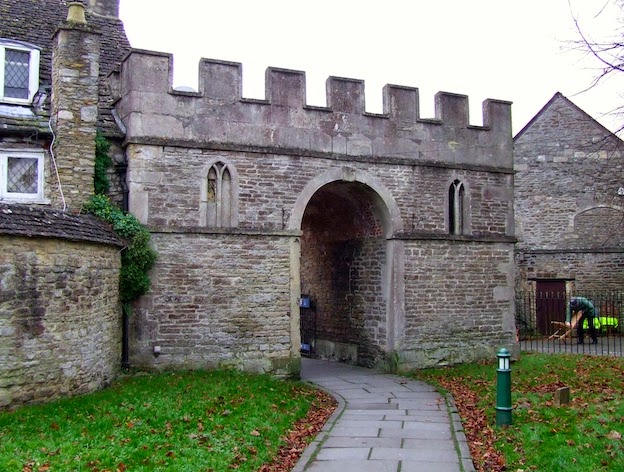
More important, though, is Smith’s genius for showing us the essence of a place. Similar qualities to those that I try to hold up for examination and comment on this blog – the texture of stone and its regional variations, the differing qualities of walls and fences, the lettering on an old Irish shop front, or the regional variations of roofing (slate, stone, tile…) – fascinated Smith. And above all the unregarded details that summon up a place and seem to paint a portrait of it. How typical, for example, that Smith should turn his back on the lovely Georgian box pews in a church like Didmarton and produce a photograph of the transept with its wooden stair. Likewise how moving that he should photograph, as well, no doubt, as the statuary and garden buildings at Rousham, some nettles growing through the slats of a bench – they make a beguiling pattern of leaf and timber.

For Smith, this portrayal of places was the heart of the matter. It was the kind of thing, he felt, that we needed, if we were to save things from the planners. In the 1950s, when Britain was being rebuilt after World War II, such bits of local distinctiveness and traditional craftsmanship were vanishing, fast. A raft of movements and publications, from the Victorian Society to Pevsner’s Buildings of England books, were coming along in the 1950s to put the case for preservation. Smith was there, alongside them, with his bellows cameras. Robert Elwall, author of the excellent book Evocations of Place: The Photography of Edwin Smith, put it well:

‘The recurring themes of Edwin Smith’s work – a concern for the fragility of the environment, both natural and man-made; an acute appreciation of the need to combat cultural homogenisation by safeguarding regional diversity; and, above all, a conviction that architecture should be rooted in time and place – are as pressing today as when Smith first framed them in his elegantly precise compositions.’

That message is tied up, not just with the great compositions, but also with the telling details. Often, these are human traces – washing on a line, farm equipment in a barn, a milk bottle on the table in Furlongs, Peggy Angus’s house in Sussex – traces of people who, apparently, have just walked out of shot. They’re humble traces – ‘Ordinary Beauty’ indeed – but full of significance, and they produce an effect that’s not dissimilar to that in some of Eugène Atget’s Parisian photographs: a generosity, a lost past captured, a haunting presence hinted at, a gentle but revealing light. Atget’s was the one photographic influence Smith would admit to. I can see why.


Top photograph: Edwin Smith, Great Coxwell Barn, Berkshire
Lower photograph: Edwin Smith, Didmarton, Gloucestershire
Note: These images are taken from books. Readers should refer to original prints – in the exhibition and in the RIBA Library – to appreciate the true quality of the work. Smith's photographs are
© Edwin Smith / RIBA Library Photographs Collection


Ordinary Beauty: The Photography of Edwin Smith is at the Architecture Gallery, RIBA, 66 Portland Place, London W1, from 10 September to 6 December 2014.

Saturday, September 6, 2014

Bridgnorth, Shropshire


On the wall, on the ball

There are certain small towns that I’ve ofter visited and that, no matter how many times I return, seem to yield further visual interest, and the occasional wonder. Cirencester, Malmesbury, Ludlow, Stroud, are all examples. And there are others, further from my home patch, like Uppingham in Rutland and Louth in Lincolnshire, that I always find rewarding when I get there. Bridgnorth, a characterful hill and valley town with a distinctive townscape overlaying its hilly landscape, is becoming another favourite.

My last visit to Bridgnorth was on the train, and this took me into the town by an unfamiliar route, taking me straight past this cast iron street sign. It was probably the sunshine that made me notice it – the light, producing just the right shadows, was showing off the letters to their best advantage and making them look bright and crisp.

And pretty good letters they are, too. They’re quite well proportioned, there’s plenty of contrast between thick and thin strokes, and they stand out well (helped by the good natural light when I took my photograph) from the background. Maybe a lettering maven would adjust the spacing slightly here and there, but I think they do their job well. The corners of the plate, with their concave curves, are a nice touch too.

I’m always pleased to see these old – often 19th-century – street name signs surviving. They are simply many times better than modern, mass produced signs, fit well into historic settings, and have an elegance of their own. I suppose some councils don’t like them because they need painting periodically, but I’d say that they’re worth the effort. I hope Bridgnorth hangs on to them.

Tuesday, September 2, 2014

Yarnton, Oxfordshire


The real thing

After Jacobean revival doorway of the previous post, here’s an example of a genuine Jacobean manor house. It’s Yarnton Manor, not far from Oxford, and it was built in around 1611 by Sir Thomas Spencer, altered in later centuries, and restored in 1895. The facade that’s visible today is restrained – curvy gables,* but quite small ones, projecting bays that don’t project very much, minimal classical detailing around the doorway – but lovely. It looks an attractive, welcoming house, without aspiring to the grandeur or extravagance of the great ‘prodigy houses’ of the 16th century.

The building was not always home to lords of the manor. By the 19th century it was a farmhouse and it then passed through various owners, institutional and individual. One owner well known around Oxford in the mid-20th century was George Alfred Kolkhorst, university Reader in Spanish, who moved in after he came into his family fortune, having previously lived in rooms in Oxford itself, where he famously entertained students at Sunday-Morning salons. Kolkhorst was known to generations of undergraduates as ‘Colonel’, though he held no such rank: the name was probably applied ironically because he was the least martial of men. The writer and cartoonist Osbert Lancaster, in his autobiographical book With An Eye To The Future, recalls his time at Oxford, when he attended Kolkhorst’s salons in the Oxford rooms, which were full of questionable antiques, or, in Lancaster’s words, ‘objects of dubious virtue’. Lancaster goes on to say that when the ‘Colonel’s’ father died, Kolkhorst ‘moved into what he hoped was a Jacobean manor house’. Clearly, in spite of the later modifications, the hopes were justified.

After Kolkhorst died in 1958, the house was used as a dormitory by a local school before becoming the home of Oxford University’s Postgraduate Centre for Hebrew Studies. The Hebrew Studies centre is now relocating, and the manor house was put on the market earlier this year. In its quiet setting, so near the city but removed from it, it looks good for another 400 years.

- - -

* Some sources say that these are the result of later remodelling.

Friday, August 29, 2014

Northampton


A ‘sort of Jacobethan’

This doorway in the middle of Northampton, sandwiched between two shops, is easy to miss. Easy to miss, that is, until you look up, when you realise that it’s part of quite a large corner building full (above the modern shopfronts) of big windows, banded masonry, and curvy gables. But what kept my eye engaged, and my mind boggling, was the busy collection of carved stone motifs above the doorway. Pevsner describes this 1902 structure as being ‘in a sort of Jacobethan manner’ and notes that the architect was J P Sharp of Birmingham.

The architect certainly threw the kitchen sink at this entrance. The carved crosses, roundels, and nail-heads certainly seem to be straight out of the pattern-book of standard Tudor-Jacobean patterns – but perhaps you’d be as likely to see them around a 17th-century fireplace as framing a doorway. There are classical motifs too and some of these, like the little Ionic capitals, are highly ornate, again in the manner of Jacobethan builders, who got their classicism as much from Renaissance buildings in France as from Greece or Rome. Put all these elements together and you have a very ornate, turn-of-the-century sort of Jacobethan.

This is confirmed by the lettering, which has eccentric touches (the bulbous lower portion of the B, the rather oddly proportioned M) that don’t look Jacobean at all. These forms are very much of their time: not quite Art Nouveau, but very nearly. This, and the curious cornice above, which comes to a sharp point but does not quite turn into a pediment, are the crowning touches – eccentric, to be sure, but offering a welcome bit of visual incident amidst the more commonplace shop fronts on either side.