Showing posts with label sculpture. Show all posts

Saturday, June 27, 2026

Kirkburn, East Yorkshire


Beasts, chevrons, and scrolls

I apologise to any readers who have been frustrated at my previous post, which illustrates a notable Norman church but discusses the flowers in the churchyard. If that’s a little perverse for an architecture blog, I’d argue that a building’s context is often as important as the building itself. However, as St Mary’s, Kirkburn, is a Norman churches with some memorable carvings, I’m not going to let it pass without a few words, and a couple of pictures, of its memorable entrance.

This is the south doorway of the church, and it’s a star example of the kind of entrance that the builders and sculptors of 12th century England liked to produce when they had the time and money to do so. The overall design will be familiar to many people who like to visit old churches: a semi-circular opening featuring several more or less concentric bands of decoration, known as orders because they sit on a series of miniature columns (known in the business as shafts). The inner orders are recessed, leading the eye towards the door and the interior of the church. The capitals at the heads of the shafts and carved with scrolls, which give a distant hint of the Roman Ionic or Corinthian, reminding us that the style of architecture in Britain known as Norman is also termed Romanesque.

Kirkburn’s south doorway has three orders, the inner one decorated with chevron ornament, the second also of chevrons, with some carved decoration on each triangular outer surface, and the third of beakheads. There’s a fourth, outermost, band that has no shafts supporting it. This is known as the label and this one is unusual in that it bears quite striking figurative carving – labels are often quite plain.


My second photograph shows the central part of each ornamental band, so that you can see them in detail. The first, innermost, band has multiple rows of  finely cut chevrons, both on the front face of the arch and the underside. This is high quality work by someone at home with mallet and chisel – and it’s a standard pattern of this period so you’d expect it to be done competently. Before the next order comes a band of stones carved with mostly abstract patterns (chevrons, squares, scrolls and one crudely cut head); this band tapers towards the sides, to accommodate the difference in curvature between the lower order (segmental, to fit the door) and the upper orders (semicircular). The carving here is much less assured, almost as if it had been left blank and a less skilled mason had later decided to decorate it.

The next order up is again made of chevrons, but exceptional ones because there are carved motifs on the upper surfaces. These motifs range from stylised stars, leaves and spirals to beasts – on the far left there’s what looks to be a serpent. Next comes the outer order of beakheads, crisply carved, with the usual features of these creatures: pointed beaks and furrowed brows. With both these orders, we are back to more confident work.

Finally, there are the carved stones of the outer band or label. It’s mostly difficult for the 21st-century eye to identify the subjects of these. The excellent website of The Corpus of Romanesque Sculpture in Britain and Ireland (CRSBI) tries hard.* This site is compiled by people who are used to looking at and studying Romanesque sculpture, so if their conclusions are surprising, they’re at least based on knowledge of the subject that spreads broad and goes deep. From left to right they identify the subjects in the close-up picture as: a sheep; two serpents with foliage sprays in their mouths; two lions; a horse; a woman holding a torch (sideways on to fit the stone); a dragon among stars; three birds with their eggs; and two animals with foliate tails and tongues.

If one could be sure of the animal identification, one could no doubt draw conclusions about the moral or spiritual lessons to be drawn from the creatures illustrated. But I hold back from trying to do this when the ‘sheep’ is so elongated and stylised, when the ‘lions’ have tufted tails but not a lot else lionish about them, and when some animals are not identified at all. I prefer to marvel at the skill of the carvers (even work we might describe as ‘crude’† is graphic and effective), at the good state of preservation (apart from the odd chipped beak) and the strong sense of design. There’s plenty here to scratch one’s head about, but much to give pleasure too.

- - - - -

* I cannot stress enough what a useful resource this site is. It’s here.

† If, looking at the ‘sheep’, you’re tempted to say that a child could have done it, remember Picasso’s remark when accused of a similar lack of sophistication: ‘Once I drew like Raphael, but it has taken me a whole lifetime to draw like children.’ There are various variations on this remark of Picasso’s online, but the one I give is the one I believe to be most accurate. 

Thursday, June 11, 2026

Somerton, Oxfordshire


A moment of confusion

Standing in St James’s church, Somerton* recently, I was amazed, Why was this not more famous: a 14th-century reredos consisting of a depiction of the Last Supper, with intact figures of Jesus and the apostles in a row of niches. The architecture of the niches is exactly right and the carving has that element of wear that is testimony to the age of the piece. This is as rare as hens’ teeth, I said to myself. And the figures are characterful and ooze charm – Jesus sits with the head of the apostle he loved best (normally said to be St John the Evangelist) on his lap; one diner seems to be refusing a drink; another pours from a jug; yet another gesticulates, as if in conversation. The faces, some with curly hair and beards, are delightful. The story is that the reredos was removed from its place behind the altar at the time of the Reformation and hidden away. It was, say different accounts, reinstalled during a restoration of the church in 1822, or after another in the later-19th century.

And in the back of my mind there’s a nagging doubt. If something seems too good to be true, as they say, it probably is. Setting aside such normally authoritative sources as Pevsner and the listing description of the church, I do another Google search. This time I find a short piece on a website called The Antiquary. Here, the historian Dr Allan Barton gives a different story. That the figures, damaged beyond repair during the Reformation, was at some point restored. The restorer remade the faces and other details (handles, vessels, etc) using plaster of Paris attached to the surviving 14th-century stone (the arches, table, the bodies of the figures) by means of wooden dowels.

Barton does not give a source for his account, although it would no doubt be possible to tell the difference between stone and plaster on very close examination. But this version of events seems plausible. It would account for the style of the facial sculpture, which is rather more like Romanesque sculpture than 14th-century Gothic. And it would account for the good condition of the faces, which are surprisingly crisp for medieval survivors that had been removed, hidden and reinstalled.

There are problems with this kind of restoration. It is, of course, going against longstanding principles of historic buildings conservation to replace old work with new, and if damaged medieval carving was destroyed in the process, this would be cause for great regret. However, if the iconoclasts of the Reformation had hacked off whole faces and limbs, one’s attitude to a later sculptor adding new work would be more accepting. Even so, disguising the difference between old and new is also a problem. It should be clear what has been done and where the original ends and the repair begins. 

The usual 21st-century attitude to such items is to condemn them as fakes or forgeries. But we are where we are. Simple pleasure at what we are left with now is also a legitimate response.† It would be fascinating to know more, however. How does Barton know what material the additions are made of, and how they’re attached? Who modelled these faces and when, and was their intention to pull the wool over our eyes or just to renew something in their own way? What did the reredos look like in its damaged state? Oh to know more.

- - - -

* The Somerton in Oxfordshire; there are others.

† Albeit with questions about what if any medieval work was sacrificed during the restoration. 

Thursday, April 16, 2026

Swinbrook, Oxfordshire


Shelved

About 13 years ago I did a post on this blog about some tombs in the churchyard at Swinbrook. a delightful village on the edge of the Cotswolds in Oxfordshire. I implied that I’d write another post about something inside the church, but I wasn’t very happy about my photographs of what I wanted to write about, so I put the post on hold…and then forgot my original intention. A few weeks back, I returned to Swinbrook, looked at the monuments to members of the Fettiplace (sometimes Fettisplace) family, and took some rather better, though far from perfect, photographs. The surprising tombs of this important landowning family deserve their long-awaited blog post. Here it is. 

They lie, says John Piper in his Shell Guide to Oxfordshire, ‘on slabs like proud sturgeon’. Most of us, though, look at the enormous monuments, which cover most of the north wall of the chancel, as sets of shelves, supported by columns and topped by canopies of an architectural magnificence that’s somewhat at odds with the humble surroundings. As I’ve remarked before, if there are relatively few English churches of the 16th and 17th centuries compared with the vasts numbers of medieval churches, architectural features on church monuments abound from the Tudor and Stuart periods, and these two grand memorials make use of the panoply of classical orders (Corinthian here), pediments (semicircular with heraldry) and other devices.

On the left as we look at the wall of the chancel, are the effigies of the earlier three generations of Fettiplaces: Sir Edmund (d.1613) at the top, then William (d.1562) and Alexander (d.1504). They look very similar and wear similar, but not identical, suits of armour. They are rather stiff and somewhat stylised figures and although they’re provided with stone cushions for the elbows on which they lean, this doesn’t seem to make them very comfortable. The architectural framework is impressive, but I remember that my instinct when I first saw them very m any years ago was to laugh. It was the combination of the shelves, the grand architecture, and the stiff but imposing figures that provoked this reaction I think. The sculptor is unknown, and authorities agonise over whether it was some local ‘primitive’ or the same craftsman who produced the Seymour monument at Berry Pomeroy in Devon, on which three figures recline in a very similar manner.

The second monument (above) is to another three male members of the same family, Sir Edmund (d.1686) and two Johns. The work here is more sophisticated. The faces are more individual, the bodies seem more naturally posed and more relaxed, and the stonework’s mix of pale and grey marble, together with gilding for the capitals and other details, is more confidently handled. This time, the work is signed, by William Byrd of Oxford. Byrd did many jobs for Oxford’s university and colleges, including the carving of the original emperors’ heads that surround the Sheldonian theatre, on which he would have worked with Sir Christopher Wren. No mere provincial he. The conjunction of these impressive sculptures with their less sophisticated neighbours made me smile this time rather than laugh, and itv was a smile of pleasure: I’m glad I returned.

Thursday, April 2, 2026

Aston Somerville, Worcestershire

Looking more closely

I like to think I’m good at taking in a building when I visit it, at getting straight not just the overall architectural history§ but also the details – all those tombs and carvings and incidental oddities that fill my numerous blog posts on country churches. But when I found myself near Aston Somerville in Worcestershire and stopped to have a second look at the church, I found something I’d not noticed before. Aiming a long lens at the grotesques at the top of the church tower, I found the creature in my photograph. I say ‘creature’ because I’m not sure what it is – if those protrusions at the top are ears, then it’s not human, something that the muzzle-like face also suggests. Is it a bear? An ape?

But the species doesn’t particularly matter. What matters, of course, is the pose. This is what’s described in serious writing about this sort of thing as a ‘male exhibitionist carving’, the masculine equivalent of the Sheela na gig.* To modern eyes it’s odd, to say the least, to display this sort of sexually explicit imagery on a church. But anyone who has visited a lot of medieval churches will know that the grotesque is far from unusual in medieval church decoration. Dragons, monsters, foxes dressed as bishops, people showing off their private parts – it’s all there, whether we like it or not. Mostly, this kind of exhibitionist carving is outside the church, but there’s the occasional example inside, including one in a church roof in Hereford.†

Various reasons have been suggested for this sort of thing. To some, it’s a protection against evil spirits. To some, it’s a warning against lust. To yet others, exhibitionist carvings and other grotesques form a more general reminder of the wicked ways that threaten us when we allow ourselves to veer away from the protection of the church. There’s also undeniably a sense of humour here too – people could laugh at this sort of carving while also appreciating the moral message, just as monks could giggle at the lewd or humorous images in the margins of otherwise highly serious medieval manuscripts. People knew the difference between what was on the ‘margins’ of a building and what went on in the sacred spaces inside.¶

If there were lessons here for the original medieval users of the church, there are lessons today’s church-crawlers too. Look more closely, look up, take a pair of binoculars or a camera with a long lens on your travels. And if you’ve done all these things, revisit anyway, because everybody misses things first time around. You may be surprised at what you find.

- - - - -

§ Well, fairly straight – unpicking the history of ancient buildings is rarely simple.

* See my post from back in 2009 on the famous Sheela na gig at Kilpeck. There are some interesting further remarks and interpretations in the comments to this old post too.

† This is a human figure and is now easy to see because a mezzanine floor, part of a church café, has been installed, brining the viewer closer to the roof.

¶ My go-to reference for medieval ‘marginal’ imagery is Michael Camille, Image on the Edge (Reaktion Books, 2019), which I have recommended before on this blog.

Sunday, March 15, 2026

Manchester, London Road


When size matters

I have marked my recent visit to Manchester with a series of posts on three of the city’s small architectural gems – a cinema, a chop house and a library – structures that many people might miss in a city full of buildings that are on such a large scale that they command the view. For my next couple of posts, then, I turn to some seriously big Mancunian buildings.

Hardly has the visitor emerged from Manchester Piccadilly station than the parade of architectural juggernauts begins. In London Road, straight opposite the railway hub, is this Edwardian baroque monster, which housed police, ambulance, and fire stations, together with a coroner’s court, for much of the 20th century. It’s an enormous structure, and the part visible in my first photograph is just one facade of a building with four unequal sides surrounding a large courtyard. In 1906, when it was completed, Manchester was a prosperous city that wanted to give the emergency services a home that was architecturally magnificent and the design, by Woodhouse, Willoughby and Langham,* fits the bill. There’s the full Edwardian panoply of towers, turrets, domes, classical columns and grand entrances, all in a combination of red brick and glazed terracotta. Rows of windows are testimony not only to the various offices occupied by the emergency services and the coroner’s staff, but also to the many apartments provided. Workers such as firemen, on call night and day, often lived on site, in this case in homes that were better than most of those in the surrounding, rather poor, area. Whatever one feels about the design as a whole, the architects made a noble effort to compose the diverse elements – the large entrance arch, the rows of windows, the recessed section with its pairs of columns, the various towers – to create a convincing composition.

The decorative details, for those with the time to give them the attention they deserve, are likewise impressive. Among the best are above the largest entrance on London Road. Above the great central arch are two groups of allegorical figures. On the left are three figures representing fire: they bear torches and thunderbolts, and their hair is aflame. Opposite are three water-carriers, who offer the solution: at their feet are fishes and foliage grows prolifically above their heads, representing the life that can thrive when the danger of fire has been averted. Figures with similar iconography are set above the central window and within the arch, near the ‘FIRE STATION’ plaque.

This extraordinary building served the emergency services through much of the 20th century, most of it closing when the fire-fighters moved out in 1986. With the closure of the coroner’s court in 1998, the place was finally empty. In spite of a plan to convert it to a hotel, it was left abandoned and deteriorating until recent years and now a new scheme is underway for a mixed-use conversion. I believe work on this is still ongoing.

- - - - -

* A short-lived local partnership of three architects who practised with various partners and in different groupings. Manchester, a large and growing metropolis, was able to sustain numerous architects – most of the Manchester buildings that I’m posting were designed by firms based in the city.

Sunday, June 22, 2025

Wichenford, Worcestershire


Local colour

Monuments like this – a large 17th-century altar tomb commemorating four members of the same family – make me smile. I find them delightful because they’re colourful (and parish churches often lack colour, aside from the stained glass which not all churches have anyway) and because of the way that they connect us with the people of the past. The people in this case are John Washbourne, whose effigy is placed above that of his father, Anthony, and beneath those of his two wives, Mary (née Savage) and Eleanor (née Lygon). I do not pretend that these rather stylised portraits by a presumably local artist capture the subjects’ features with great precision – only those rich enough to hire a top-rank London sculptor could expect that, the rest had to make do with something more approximate or stylised. But the monument does tell us something about how they wished to be remembered, or more exactly how John Washbourne, who commissioned the monument when he was 84 years old, wanted them to be remembered. The delineation of the armour and the women’s clothes, as well as of their faces, has been done with care and the formality or stiffness of the figures is very much of its time.

So is the decoration – the array of foliate motifs, scrollwork, and strapwork. The bright colour is restored but must come near to the original. Very much of its time too is the heraldry. The arms of at the upper centre of the monument are of the Washbourne family. Lower down and also in the centre are the same arms quartered with those of two other related families, Poer and Dabitot. To the left these arms are combined with (or impale, to use the heraldic term) those of Savage on the left and Lygon on the right. Portraits and visual identifications and ornamentation combine to make an effect I find both impressive and charming. True, you had to be rich and powerful to have a monument like this and to be allowed to occupy quite a large part of a small church with it. But personally I don’t grudge them the space. 

Wednesday, February 12, 2025

Halesworth, Suffolk

Not quite lost

My interest in medieval art and architecture has taken me into churches by the score, from cavernous cathedrals in big cities to tiny, unregarded parish churches, sometimes in remote locations up tracks or in fields. So often in these buildings, I’m reminded of the numberless images that have been lost or partly lost to the depredations of the Reformation, to vandalism, to time. The paintings and carvings in English medieval churches, fading to nothing or brighter, but with faces hacked or scratched away, are some of the most tantalising works of art anywhere. Now and then, however, I’m pulled up short by secular imagery in a similar state, like the woodcarvings on the exterior timbers of medieval houses, from Stratford-upon-Avon or Tewkesbury in the west to Lavenham in the east, or, also in the east, at Halesworth.

What a shock to the innocent shopper in Halesworth is the carving on this otherwise unremarkable shopfront. A pair of lions, stretched out horizontally to fit both the available space and heraldic convention, flank a shield that must have borne a coat of arms (please click on the image to enlarge it). On either end are smaller scenes with beasts. The small carving on the left (in my picture below) depicts an eagle holding in its talons a human figure with something in its right hand. This scene may be the abduction of Ganymede, cup-bearer to the gods, by Zeus. The corresponding subject on the right looks like an episode out of the story of Reynard the fox and has been interpreted as Reynard n his role as physician, holding a basket of herbs, while the goose holds a flask. One theory about the coat of arms is that it was that of the de Argentein family – Margaret de Argentein was said to have been a medieval resident, and the family held the role of cupbearers to the royal family until 1424, which gives relevance to the image of Ganymede.

The combination of high-status heraldry and more folkish images of foxes and geese is interesting, but should not be surprising to anyone who has visited a few medieval churches. Church art often combines or juxtaposes carvings or paintings of saints and angels with imagery that’s earthy, comic, or sometimes simply lewd. All human life was there, along with heavenly life too. Cherished survivors like these Suffolk carvings add yet more to the diversity.


Thursday, October 10, 2024

Chester

Strangely compelling

Back in August, I posted about an extravagant garden ornament at Peckforton, Cheshire in the form of a large stone carving of an elephant bearing a turreted castle on its back. I mentioned that the symbol of the elephant and castle was a medieval motif (which survives, for example, in the names of some pubs) and that one example of the medieval period was a wood carving in the choir stalls of Chester cathedral. Going through my photographs today, I found an image of this carving and thought it was worth a post of its own.

The stalls at Chester were made in the late-14th century (1380 is the usual date given by historians) and, although they were restored in the Victorian period by George Gilbert Scott, still retain much of their medieval woodwork, including misericords and striking carvings at the ends of the rows of seats. It’s clear straight away that whoever carved the elephant in my photograph knew a lot about contemporary stonework and fortifications – as how could they not, working on high-status buildings such as Chester cathedral. The carved castle has a clearly delineated entrance arch with portcullis and corner buttresses; this rests on a substructure adorned with a pair of cusped blind arches – just the sort of forms that the carver could see all around him in the cathedral. Beneath this a strap extends around the animal’s girth to secure everything place. If you were a medieval artist carving the castle-like howdah on an elephant, this is pretty much what you’d come up with. But how would you think an elephant should look if you’d not seen one, and had been told that it was a beast of burden big and strong enough to carry a castle on its back? This carver conjured up a body that looks rather horse-like, a strange smallish head with an outsize eye, and a trunk looking like an overgrown worm. The creature is bizarre, but not quite in the way that an elephant is bizarre.

How did contemporaries see the elephant? No doubt the monks who commissioned the carving knew how medieval bestiaries describe the elephant as chaste, courteous, and helpful to mankind. He was also seen as a symbol of Christ because of his ability to raise men up, but he was a worldly helper of humankind too, because he could carry men at arms into battle in his castle. Chester’s elephant keeps good company with the dragons, wyverns, unicorns and wodwoses that can be found nearby, placed there either for instruction or simply for delight.

Thursday, August 15, 2024

Peckforton, Cheshire

Elephant and castle

The image of an elephant with a castle on its back is an ancient one. The Romans famously used war elephants that could carry soldiers and medieval manuscripts show elephants with howdahs that take the form of castles, with turrets and narrow windows. Few Europeans back then had actually seen an elephant and some of the illustrations are very fanciful, but the 13th-century English king Henry III had an elephant in his collection of animals at the Tower of London, a gift from his French counterpart Louis IX. Today, we’re most likely to know the Elephant and Castle from the signs of pubs and from the name of the eponymous area of South London, with its pub sign, shopping centre, and underground station.

Inn signs bearing elephants with castles would have been found in the 19th century too, and antiquarians would have been familiar with their use in heraldry. Uses like these may have given the Victorian stonemason John Watson the inspiration for the large stone elephant and castle that he carved in Peckforton, Cheshire. The first documentary evidence for this carving comes from 1860 and says that the work was made about two years before. Why did he carve it? Did it have any practical use? What was the inspiration? No one knows the answer to these questions. There’s a story that the castle was originally a beehive, but this seems highly unlikely – any beekeeper would find it hard to climb up and get the honey and the windows were originally glazed, making access difficult for keeper and bees alike. I think it’s just a rather large garden ornament that could have been inspired by a coat of arms or an inn sign – or perhaps by the carving of the same subject in the choir stalls of Chester Cathedral.

There’s something joyous about the sheer size of this garden sculpture. I wonder how many people turn off the A534 to find it in the village of Peckforton? I’m rather glad that I did.

Thursday, November 2, 2023

Strand, London

Tea break

The last few months have seen me wind down my paid work as part of my preparation for retirement. This process has involved saying farewell to my time as a teacher of courses – I did my last in August – and I have just done what is probably the last of my various talks and lectures. I’ve enjoyed this activity hugely. One of the drawbacks of life as an author is that writing is a solitary activity. Getting out and speaking and teaching means I get out and meet people, mostly people I’d never have met otherwise. I’ll miss that, but I’ll not be sorry to give up the travelling. In the past, driving to a venue to teach or speak has had the bonus of taking me to new places and countryside too. But increasingly it is feeling like hard work.

My last talk happens to be one I call ‘Great British Brands’, a brief introduction to the history of a number of famous food and drink brands, a subject that caught my interest when I wrote a book about the history ofd shops and shopping, years ago. Among the companies featured in the talk is Twining’s, one of the most celebrated British tea brands, which has been going strong for more than 300 years, albeit these days as a part of a larger conglomerate. So here’s a picture of the entrance to Twining’s premises in London’s Strand, the site where the founder, Thomas Twining, set up Tom’s Coffee House in 1706.

Tom, who was from a family of Gloucestershire weavers, came with his family to London to find work, did his weaver’s apprenticeship, but decided that he’d prefer to work for one of London’s merchants instead. The merchant was handling shipments of tea, and Tom eventually went it alone in the tea trade. He succeeded because tea was newly fashionable and because he sold dry tea to women, who were not allowed into conventional coffee houses in London, which were men-only. This doorway is later than the original coffee house, and was built for Tom’s grandson, Richard Twining, in 1787. The two men in Chinese dress refer to the source of the tea and the lion symbolises Twining’s dry tea and coffee shop, which was known as the Golden Lion.

And so you see even a talk on food brands has been an excuse to show people memorable bits of architecture and design – from Cadbury’s factory at Bournville to shop signs advertising Hovis bread. For now, I’m not retiring from sharing similar things on this blog, for those who are interested enough to look and read about them over a cup of tea, and, I hope, go and see for themselves.

Tuesday, August 8, 2023

Northampton

Lasting well

My time in Northampton the other day was spent in the centre of the town, and so I did not take in the remains of the town’s most famous industry, shoe-making. But on one street corner I came across a building that did relate to the business of shoes and leather goods. Being an enthusiast for architectural carving, I lingered by this doorway, fascinated by its combination of bulls’ heads, elegant women, fishes, stylized trees, and meticulously carved lettering. What on earth, I wondered, did it all mean? 

A little research told me that Malcolm Inglis and Co were leather factors, dealers in the material that was crucial for the town’s shoe manufacturers. What more appropriate business to be based in the centre of Northampton? The fact that Malcolm Inglis and Co could set themselves up so impressively – their building is mainly of stone, with a little brickwork here and there – suggests that they were doing very well here. The structure was their showroom and offices, so the unashamedly showy entrance, strategically placed on the corner of Fish Street and The Ridings, both looks good and makes sense.

A Glasgow architect, Alexander Anderson, supplied the design in 1900. The sculptor of the magnificent portal was Abraham Broadbent, a Yorkshireman from a family of stone masons. He won a studentship at the South London Technical School of Art in 1895. Once he was in London, it did not take him long to become a prominent architectural sculptor. Among other work, he produced sculpture for the facade of the Victoria and Albert Museum in London. In his carving for Malcolm Inglis, he shows the influence of the then-fashionable Art Nouveau style – the stylized trees and female figures are very Art Nouveau, while his clear lettering is more sober (and more legible) than Art Nouveau’s more elaborate examples. The result is a good bit of street-frontage art, of which Glasgow and Northampton (and indeed Yorkshire) should be proud.


Saturday, July 15, 2023

Devizes, Wiltshire


Now showing…

Entranced on previous visits to Devizes by such buildings as the delightful stone-fronted Parnella House and the massive Victorian red-brick brewery, I’d overlooked the cinema, which stands between these two landmarks. When I did look at it, I found it pleasant but rather enigmatic. There are Art Deco things about it – notably the very plain pilasters or piers, which run right up to the parapet, where the central ones pierce the skyline. But the facade also has the look of an earlier era – the swags and the various curved dripstones feel to me Edwardian. Likewise the rather demure torch-bearing statues that stand on brackets above the cinema’s name: they’re a far cry from the celluloid lasciviousness of some Art Deco cinema decoration, while also avoiding the stylization or symbolism common in other 1930s cinemas, although the faux-flaming torches do feel to me a bit more akin to Art Deco.

The Devizes cinema, in its first incarnation, was an early one, opening, according to the excellent Cinema Treasures site, in 1912 as the Electric Palace. The same website also tell us that the cinema was enlarged in the late-1920s – could this be the date of this white, rather chaste facade? The latest edition of the Pevsner Wiltshire volume actually gives the date of the building as 1932 and the architects as Satchwell and Roberts of Birmingham. So what I think we have here is something very much of the Art Deco period but in a style that fits the more restrained setting of a country town better than the sometimes brash, sometimes stylish full-blown Art Deco efforts of the architects who worked for the Odeon or Gaumont chains. The current owners, according to press reports earlier this year, are said to be intending to upgrade the building. One hopes that they produce plans that are both viable and respectful of the frontage and setting, so that this modest but elegant cinema can serve the town once more.

Monday, July 10, 2023

Devizes, Wiltshire

Boot’s Corner

One result of spending some time thinking and writing about the history of shops is that one becomes aware of the way different multiple stores liked to design their shop fronts – the light oak window frames of W. H. Smith, the muted, modernised neo-classicism of Marks and Spencer, and so on. Among the best of the bunch were a number of Boot’s branches in town centres, which were often placed on corner sites and sometimes adorned with statues of famous historical figures with a local connection. When I looked up at the corner of St John’s Street and Wine Street in Devizes, it wasn’t long before I guessed I was looking at a former branch of Boot’s.

In the 19th century, Boot’s began to diversify their range beyond the company’s core pharmaceutical products, taking in everything from cosmetics to photographic processing. As a result, they needed larger stores, often with room for an upper sales floor. They also chose corner positions to take advantage of higher footfall and shop windows facing in two different directions. The Devizes branch was one such corner shop, with the added feature of a round tower to emphasize the building and turn it into something of a landmark.

Then there were the portrait busts in roundels on the upper walls. Some of the more spectacular Boot’s stores (for example, in Newcastle, Derby, and Bury St Edmunds), boasted full-length statues. The Devizes branch, in a smaller town, made do with busts, but they’re still impressive. The busts form part of a decorative scheme involving very fancy window surrounds, running even to putti beneath the top-floor windows, and pilasters that extend up the full height of the building. The busts, set in garlands, are at the tops of the pilasters. The two busts in my photograph portray Hubert de Burgh and Edward I. Hubert de Burgh, Earl of Kent in the early 13th century, fought alongside Richard I during the third crusade, encouraged King John to add his seal to Magna Carta and became chief Justiciar of England. However, his enemies brought about his removal from office and he found himself imprisoned – in Devizes Castle, which is how his portrait came to be displayed on the walls of the Boot’s store in the town. The reason for Edward I’s presence here may be that the town sent two representatives to this king’s 1295 parliament, the so-called Model Parliament, because it set the precedent of boroughs sending two representatives to Westminster; for some historians, this makes the Model Parliament the first such representative assembly in England’s history.

One gets the impression, looking at the decoration on this building’s facade, that it was built to last and that Boot’s intended to occupy the store for an extended period of time. Although they no longer do, the facade remains as a reminder of the times when retailers put real effort into the design and construction of their shops, making the country’s numerous ‘Boot’s Corners’ a pleasure to look at.

Thursday, July 6, 2023

Stourhead, Wiltshire

The great indoors, 2

The other day I did a Google image search of ’Stourhead’ and eight of the first ten pictures it produced featured the Pantheon, the garden’s great domed and porticoed temple. For many, the Pantheon is the climax of the garden, a visual focus whether viewed from near or far; seen across the lake from the end of the garden nearest the house, it is a goal for anyone about to walk around Stourhead’s glorious landscape.

‘Pantheon’ means a temple dedicated to all the gods, not just one deity as was the norm in the classical world. The Stourhead version is modelled loosely on the much larger Pantheon in Rome, one of the best preserved of all Roman buildings. The Roman Pantheon has a large dome and a portico with eight massive Corinthian columns. Stourhead’s version is smaller and its portico has six columns and unlikle the Roman prototype does not stretch right across the front of the building. This leaves room for a large niche at either end of the facade, containing a statue of a deity, Bacchus, god of wine, on one side, Venus, goddess of love, on the other. To be more precise, the love goddess appears in the form known as Venus Callipygos, Venus of the beautiful buttocks. Apart from her physical appeal, Venus is probably here because she was the mother of Virgil’s hero Aeneas – when laying out the garden, Henry Hoare made several allusions to Virgil’s epic, The Aeneid, although the scholarship in this case was in part an excuse for the male gaze to linger over an image female beauty.

For many, the point of the Pantheon is what it looks like from the outside and how it enhances its garden context. But of course the building also has an interior and a use – the family held supper parties there and used it as the setting for picnics. These forays away from the dining room in the house took place in a stunning interior. Beneath the coffered ceiling of the dome are panels of classical scenes in relief, but the walls of the circular building are dominated by a series of seven large niches containing statues of deities. The most famous is a Hercules by Michael Rysbrack but for a change I show his statue of Diana, goddess of the hunt. The others are: Livia Augusta, a Roman empress (she was Virgil’s patron and her statue at Stourhead is an ancient one, acquired by Hoare from another collector); the ancient Greek hero Meleager; Flora, goddess of fertility, flowers, and gardens; Isis, the Egyptian mother goddess (also worshipped by the Romans); and St Susanna (a saint connected to the city of Rome). Livia is an ancient Roman statue, acquired by Hoare from another collector. They seem a miscellaneous collection, but several have garden or country connections, a couple are heroes like Aeneas, and Livia has a close link to Virgil; they also, in different ways, reflect Hoare’s interest in collecting and in commissioning art. Like so much at Stourhead, they also embody Hoare’s liking for a mix of scholarship and the pleasures of beauty, nature, food, and wine. I’ll drink to that.

Saturday, July 1, 2023

Stourhead, Wiltshire


The great indoors

I’ve visited several gardens this summer. Lest anyone think this represents time off from historic architecture, my recent posts about Painswick and Warwick will be proof of the opposite – gardening, from Renaissance Italy to Victorian England, is also a chance to build more not less and gazebos, summerhouses, temples and sheds abound. So garden visiting is not all about the great outdoors; the great indoors has its role to play too. In England, garden buildings might be ornamental but are also practical – they provide shelter from the wind and rain; in warmer climes (how quaint that phrase seems now), they also provide welcome shade and cool.

One kind of structure that afforded a retreat from hot weather in Italian Renaissance gardens was the grotto. A subterranean, cave-like grotto, with water trickling through, is just the thing on a baking hot day. When Henry Hoare, cultured banker and owner of Stourhead, laid out his famous landscape garden, he was particularly pleased with his grotto, and was not above taking a dip in its pool: ‘A souse in that delicious bath and grot, filld with fresh magic’ pleased him greatly. He called it an ‘Asiatick luxury, and too much for mortals, or at least for subjects’ – after a session in the grotto, Henry Hoare felt like a king.

Stourhead’s grotto is also an example of the way in which visiting a landscape garden can be a journey of discovery and surprise. We enter a dark passage, lined by rough-hewn stones – the atmosphere is of something dark and mysterious. But on our journey through we encounter, as well as the expected cool flowing water, two classical figures. One is the River God, who is probably meant to represent Tiber, the god of Rome’s river – ancient Rome being a key inspiration for the gardens at Stourhead. The god points us on our journey. The other figure is the nymph whose grotto this is. She reclines in a lighter space, lit by a skylight from above. This figure, recumbent by her pool, is probably meant to evoke the nymph and grotto in the Aeneid, where the Aeneas and Queen Dido of Carthage fall in love. An inscription from Virgil’s epic is from this part of the poem; translated, it reads: ‘within, fresh water and seats in the living rock, the home of the nymphs’. Another inscription, in the floor in front of the pool, imagines the words of the nymph: ‘Ah spare my slumbers, gently tread the cave And drink in silence or in silence lave’. This is not Virgil but a translation by Alexander Pope of a 15th-century poem. The lines remind us that this magical space, in which the statue and the cascading water are caught in light from above, was also seen as eminently practical. Drink, or bathe, or sit and take your ease…then continue on your journey…

Friday, May 26, 2023

Banbury, Oxfordshire


Brush up your Shakes

Some time ago I remember wondering why a shop in Parsons Street in Banbury had a bust of Shakespeare above the window. On my most recent visit, I wondered again, while also smiling at the lucky combination of an old sculpture of Shakespeare next to a sign saying ‘Sheila’s Shakes’: shakes, clearly, without peer.

The answer to my question is the obvious one: there used to be a pub here and it was called the Shakespeare. And so this bust of the bard is added to my collection of three-dimensional pub signs, along with all the White Harts, Swans, Lions, Elephants and Sugar Loaves I’ve noticed over the years. There’s not much to say about the sign. It’s rather crudely made – although generations of paint have probably obscured some of the details, but it has a certain charm about it. And after all, the available early images of the English national poet are hardly great works of art – this one looks as if it has been based on his monument in the chancel of Holy Trinity church at Stratford, a bust which the literary critic John Dover Wilson said made him look like a ‘self-satisfied pork butcher’. The Banbury bust could perhaps do with some of the care and attention lavished on the one in Stratford.

One can trace the pub through various 19th-century directories and census records, which list the innkeeper’s name and mention additional jobs as well as that of publican. For example in 1871 the main occupant was William Reed, stonemason and beer seller; in 1881 it was John Sole, coach builder and innkeeper; in 1901, Maurice Horan, beer house keeper and groom. This range of activities may be an indication of 19th-century Banbury entrepreneurship, but is more likely the result of this being a small pub or beer house, not a big enough business to support a family. One hopes that the business of ’shakes’ is a more prosperous one.

Monday, April 24, 2023

Evesham, Worcestershire

Abbey fragments

My awareness of what’s left of Evesham’s once-great abbey was limited in the past to a few fragments. First, the impressive free-standing bell tower, the work of Abbot Lichfield and completed in about 1530, just a few years before the abbey was dissolved by Henry VIII. This tower is to the right in my photograph. Little else remains apart from the Great Gateway and the Almonry, which now houses a museum that contains, among much else, some fragments of carving from the old abbey buildings. What I’d missed until my visit the other day was this arch, which originally led from the abbey’s cloister (to the left in my photograph) into a passage that led beneath the monks’ dormitory into the chapter house – in other words, it formed the approach to the second most important space in the monastery after the church itself.

This arch is much older than the bell tower, and was probably built in around 1290. There are two tall niches at the bottom, from the top of which the arch springs into a curving form decorated with figures in canopied niches. These figures are discernible although very knocked about and worn. Through the arch the spire of the adjacent church of St Lawrence, one of Evesham’s parish churches, is just visible. The arch must have been magnificent when it was new and protected from the weather. Entrances to monastic and cathedral chapter houses are often beautiful pieces of masonry – think of the one at Wells, up its glorious stone steps, or that at Southwell Minster, with some of the best stone carving of the 14th century. This one must have been impressive too.

Work is currently underway on the cloister site to the left of the arch, with much levelling and earth moving going on; the to the right is a well used public park. One hopes that when the work is done and the various temporary security fences are taken away, we’ll be able to appreciate this bit of medieval masonry again and that, for all its decay, it will have a setting worthy of its quality.

Saturday, December 17, 2022

Daglingworth, Gloucestershire

Under snow and in hiding

The heading above could be about me. Gloucestershire has been snowbound for days, the temperatures have dipped to new lows, and I’m hardly venturing out at all, let alone looking at buildings. So I thought I’d find an appropriately chilly photograph: one from some years ago of the church at Daglingworth, near Cirencester, seems to fit the bill.

Looked at in passing, there seems to be nothing unusual about this little building. Apparently it’s a medieval church with a short version of the plain and simple west tower so common in the Cotswolds, and a later chancel, which turns out to be a Victorian rebuild of 1850–51. Look closer, however: long and short quoins and a doorway with a semi-circular arch of great simplicity suggest that the nave is Anglo-Saxon. Inside is a Saxon chancel arch and a group of four carved reliefs – two Crucifixions, a Christ in Majesty, and a St Peter – that also look pre-conquest.

The better preserved of the Crucifixions is the most striking of all. Set in the nave very close to a south-facing window, it’s difficult to photograph at all well, but the image above will give you the general idea. The crucified Christ wears a loincloth and his head is surrounded by a circular nimbus with a cross. On either side stand two Roman soldiers, one with the spear that pierced Jesus’ side, one with the vinegar-soaked sponge. Scholars argue about when and where it was carved – the late-10th or early-11th century seems to be the most likely guess for its date.

What’s certain, however, is that this relief and two of the others spent years hidden from view. They were only discovered when Victorian workers took apart the nave’s east wall during the rebuilding of the chancel. They found the stones reused in the masonry, their carved faces turned inwards so that they could not be seen. Were they hidden during the iconoclastic period of the Reformation, their images concealed by someone who revered them too much to destroy them? The Victorians had other ideas, removed them from their hiding place and displayed them on the walls. Although damaged, the carvings are still strong and moving images and although the church has been empty whenever I’ve visited, I’m sure people come many miles to see them. Historians of early medieval art and church-crawlers certainly know about them. Others should too.

Saturday, March 19, 2022

Othery, Somerset

Confusion

If I’d been a member of what was called in my youth the Boy Scouts, perhaps I’d be more mindful of their once much quoted motto: ‘Be prepared’. As it is, I am quite capable of being unprepared to the extent of not putting the relevant volume of Pevsner’s Buildings of England series in the car when I set off on a trip. I made this very omission when going to Somerset the other day. The trip was not concerned primarily with observing or exploring buildings, but wherever I go, architectural observation is inclined to take over, and so it was when, with time on my hands, I stopped to look at the church in the village of Othery, set on the Somerset levels. The building, at least, didn’t seen difficult to grasp: a cruciform church with a tall central tower, not as flashy as many in Somerset but with attractive openings in the upper stage where the bells are and below that some statues in niches – Christ enthrones and Saint Mary, Saint John, and Saint Michael, to whom the church is dedicated.

But when I got inside, the furnishing got me baffled. Other church contains a striking collection of wooden benches with carved ends. Carved bench ends are speciality in Somerset. Some churches have outstanding ones, dating from the 14th to the 16th centuries, carved with depictions of symbols, animals, plants, saints, even satirical depictions. Anyone who likes church woodwork should visit Somerset.* Othery has some excellent bench ends, but they struck me as varying somewhat in style. Some looked medieval, some exhibited a certain formality or treatment of details that made me wonder if they were Victorian reproductions. Some were carved with vigour and had slight and not disagreeable roughnesses of surface, some were much smoother. In the end I abandoned speculation and enjoyed the carving for the visual feast it offered – multiple portrayals of foliage, tracery, curious beasts, King David playing his harp, grapes on the vine, a saint or two. The latter include more than one depiction of St Michael the Archangel dispatching the devil, who takes the shape of a dragon.

Back home, with the Pevsner Somerset: South and West volume in front of me, I read: ‘BENCHES. A confusing collection because of the interventions of the antiquary William Stradling of Cholton Polden in 1848–50. Some are C15–C16…Many are Victorian…by William Halliday, Stradling’s carpenter. Stradling copied originals, including some with small figures (St. Margaret, St Michael) that seem of separate provenance.’ In other words the church contains original medieval carvings by at least two differing and distinguishable hands, as well as Victorian ones by Stradling. An article in the useful essay collection, Pews, Benches & Chairs† agrees, and points to the image of St Michael in my photograph above as one of the medieval originals (there’s a contrasting Victorian one, below, with a much more detailed, scalier dragon). There’s just enough detail in the medieval one: the saint’s angelic form standing astride the creature’s back, the dragon’s neck curving upwards to suggest that it still has life in it, but not much strength, the canopy with its crocketed finials topping the image and filling the available space above. It’s a slightly naïve bit of work, but there’s still much to like about it. What I take to be the later version is much more artful.The devil is part dragon (with a tail that curves beautifully) and part human (with torso, head, and arms). The saint’s sword is poised; his wings fill the space above artfully; much work has been put into capturing the drapery of his clothes. There’s a lot of action in this carving. I wouldn’t want to express a preference for one over the other. It’s good that the church has them both.

- - - - -

* See, for example, an earlier post, here, about bench ends at Brent Knoll.

† Trevor Cooper and Sarah Brown (eds), Pews, Benches & Chairs (Ecclesiological Society, 2011)


Friday, January 28, 2022

Curry Rivel, Somerset

No gauze here

One of my favourite sketches featuring the comedians Peter Cook and Dudley Moore takes place in an art gallery. Among the pair’s most memorable remarks is something Peter Cook says about paintings of naked people in the Renaissance: ‘Of course you don’t get gauze floating around in the air these days like you did in Renaissance times. There was always gauze in the air in those days.’ Meaning that many Renaissance nudes have tastefully placed pieces of diaphanous material draped about those parts of their bodies that might otherwise cause offence, as if the gauze had just floated to rest there by accident. Indeed they do, although in some cases, the gauze was added later, as opinions about what was acceptable in images – particularly images in churches – changed.

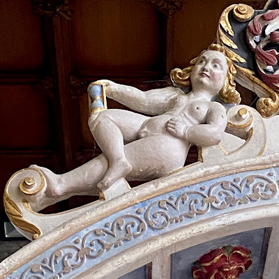
And this was my observation when I looked at the figures on the canopy of the tomb of the brothers Marmaduke and Robert Jennings (died 1625 and 1630) in the church at Curry Rivel, Somerset. There are actually two of these reclining figures, one on each side of the coat of arms that tops the canopy so that they act as informal supporters of the arms. Their real pupose, though, is not heraldic but to hold hourglasses, symbolic of passing time and the end that hastens towards us all.

Many people are surprised or even shocked by such displays of human flesh in church. My grandparents, who would have countenanced no ‘graven images’ of any kind in any chapel where they worshipped, would have looked the other way; some Victorians would have hated such secular and classical excesses; and puritan iconoclasts of a little later in the century when this monument was built would not have liked it, although their destruction seems to have been aimed mainly at images of saints, bishops, and Jesus himself, representations that they considered ‘Popish’. My mind is broader, but that is my point: tastes and ideas change.

And that is one of the best things about so many English churches. Having been there for centuries, they bear the marks of changing tastes. It’s a shame some of those changes have brought destruction, but every remaining fragment, every surviving piece of 17th-century oddity, tells us something about altering and enduring attitudes and about where we have come from. These fragments of our past mark time – as the naked ladies of Curry Rivel are meant to do with their hourglasses – and tell us something about what we have been, and who we are.