Thursday, October 29, 2020

Wallingford, Berkshire*

Railwayish

Pevsner says that the old Wilders Foundry in Wallingford has ‘a railwayish look’. Very true. It immediately made me think of the former locomotive works in Worcester. If the Worcester works is on a large scale for a sizerable city, this foundry looks outsize in a back street in this small town. Thirteen arches line each long side and the brickwork gives a chunky effect, though not without charm.

As well as being ‘railwayish’, this building is also typical of the 1860s, when English architecture was enjoying a period of anything-goes diversity, with vibrant patterns and colour in abundance – in some ways the 1860s were not unlike the 1960s in this respect. This example was built in 1869, by which time there was plenty of polychrome brick around and many builders and architects had the style down pat: red brick for the walls, pale cream or white for what in an earlier era might have been stone dressings; blues for plinths and for emphasis elsewhere, perhaps around the arches; stepped or corbelled brickwork to stand for mouldings, capitals, dentil courses. Add big windows to bring plenty of light into the work space and suitable roof trusses for a wide roof span, and you have a large flexible space for whatever job is being done inside – carpet-making in Kidderminster, locomotive building in Worcester, casting in Wallingford or Leiston. Job done, stylishly, on a budget.
- - - - -  

*Now in Oxfordshire, but I stick to the old counties for reasons previously explained. 


Monday, October 26, 2020

Wallingford, Berkshire*


Venetian windows, English brick

Wallingford is a town with a long and distinguished history: it was a Saxon borough, and still to a degree adheres to the ancient town plan, with some of the ramparts extant. But the overall feel of Wallingford’s central area is that of a small Georgian town, with brick houses – many now shops – around a central market place. This is one of the houses, and it shows the kind of building materials used in the town in the 18th century, a combination of red and ‘blue’ bricks (the latter in a colour range between grey and purple) laid with the headers facing outwards.

This house is not huge but has pretensions. The carefully laid angled red bricks (with matching red pointing) that line the windows have some style, and I for one find the grey colour of the rest of the brickwork pleasing. There’s a generous array of Venetian windows – usually one finds them set singly, to emphasize a building’s central bay or topping a portico as they are in Wallingford’s Town Hall across the road from here. In this house, though, the builder went to town with Venetian windows, to create an effect of extra lavishness. I’ve posted a house with a similar effect in Ludlow. The pattern of glazing bars in the upper window is closer to what would originally have been there than the plate-glass on the ground floor, but the overall effect is pleasant enough.

This is just one of a number of brick houses – many now with shop fronts on the ground floor – in the centre of Wallingford. They give the place its character: small-scale, polite, and civilized. 

- - - - -   

* Since 1974 in Oxfordshire, but I use the old counties to conform with the volumes in the Pevsner Buildings of England series. 

Friday, October 23, 2020

Craswall, Herefordshire


The edge of the world 

On the far western edge of Herefordshire, up in the hills that dominate the border between England and Wales, lie the ruins of Craswall Priory, one of the most remote of English monasteries and the highest above sea level. Not easy to find, the ruins are on private land (which the owners open to the public) and in the Middle of Ages the place would have felt even more remote than it does today. The occupants were members of the Order of Grandmont, also known in France as the Bonshommes. They were highly austere (they were silent, ate very simple food, wore coarse habits, based their rule closely on the Gospels) and described themselves as hermits – not in the sense that they lived alone, but because seclusion from ‘the world’ was very important to them. This lonely place must have suited them.  

The ruins today are fragmentary but fascinating and atmospheric. The rounded walls of the church’s apsidal east end are visible, as are some of the walls of the chapter house and bits of foundation and wall of other monastic buildings. Everything is on a small scale – Grandmontine communities were limited in size. Most of the extant walling looks fragile, with gaps rather than mortar between many of the stones. Grass and other flora is establishing itself in the masonry. Yet there are signs of former splendour. ‘Look! Architecture!’ I cried, as I caught sight of the remains of the chapter house, shown in my photograph. The moulded base of a circular pier (one of two that would have held up a vaulted ceiling) and quite an ornate set of mouldings at the bottom of the chapter house’s doorway were what caught my attention. They look 13th century, which ties in with the priory’s foundation in around 1225. 

As one of only three Grandmontine priories in England, Craswall’s ruling or mother church was in France, where the order was founded. As such it was known as an ‘alien priory’ and English kings, suspicious of the influence of (and even spies from) enemy countries, made several efforts to remove or ‘suppress’ religious houses of this kind. Most alien priories had gone by 1414, but Craswall managed to survive until 1462. The buildings must, then, have been gradually deteriorating for well over 500 years. What is left is fragile indeed, and looks as if it needs some serious conservation work. One hopes that this will be possible – without totally losing the feeling of unkempt remoteness which is one of the things that makes the place so special. 

- - - - - 

There is more on Craswall Priory here.

Long ago I did a post about conservation work at Wigmore Castle, which wonderfully maintains the balance between building and environmental conservation. 

Monday, October 19, 2020

Chard, Somerset


Old and new

So you build a cinema in 1937 in the latest pared-back moderne style, all straight lines, plain brickwork, and strips of metal-framed windows. You decorate in a similiar style inside, with a stepped ceiling and concealed lighting, so that cinema-goers could imagine for a moment that they were in the latest picture palace in London, or Honiton anyway. And you call your cinema the Cerdic, after the first king of Wessex. It seems an odd mixture, but cinema was like that in the 1930s – and still is, one could say – using the latest technology and style, but equally at home in the worlds of science fiction and historical romance.

The Cerdic cinema was one of a small West Country chain run by the Wessex Kinema Company. There were others in Wellington, Somerset, and – yes – Honiton, Devon and, according the the excellent Cinema Treasures website, the buildings were almost identical. The architect was Edward de Wilde Holding (1886–1958), who was based in Northampton and form the evidence of this frontage had the idiom at his fingertips. The building doesn’t seem totoally out of place in the centre of the town of Chard – a place after all of old factories built of red bricks. As with so many cinemas, the exterior architecture is all about the facade. As you can see from my photograph, the rear of the building is a simple shed with a monopitched roof.

The Cerdic closed in 1962 and after a spell as a DIY store it was taken over by the Wetherspoon pub chain, who no doubt liked the combination of usable space and a long street frontage. Their popular pubs occupy numerous buildings (from old offices to spas) that might otherwise have struggled to survive in England’s town centres. This one was already filling up on the morning I passed by, as people took advantage of the building’s enduring mix of the old and the new.

Friday, October 16, 2020

Painswick, Gloucestershire


Varieties of architectural experience

How could a delightful building like this ever be controversial? It seems unlikely that this pretty structure, part vernacular building, part classical belfry and entrance, could excite disagreement in an apparently peaceful Cotswold village like Painswick, but the church of Our Lady and St Thérèse came in for criticism on two separate occasions. The original church, a very plain stone building with rectangular windows, partly visible on the lefthand side of my photograph, was converted from a slaughterhouse for use as a Catholic church in 1934. It’s said that the building was a decaying mess before its conversion and one would have thought the locals grateful to the Catholics for taking it in hand. There seems to have been, however, quite a bit of anti-Catholic feeling in the area in the 1930s. The vendor, a local butcher, was not at first keen to sell to a Catholic buyer and an account of the history of the building says that ‘Catholics at that time were virtually non-existent in the village and all were regarded with great suspicion’. In the end though the church’s founder, Alice Howard, got her way and the building was converted discreetly into a church.

In 1941, the church was damaged by a bomb. When rebuilding took place in 1954–56, architect Eric Hill (of Ellery Anderson, Roiser and Falconer) built the beautiful Classical entrance, with its circular window and cupola supported by eight rather dainty columns.* There was no trouble getting planning permission for this, but the Parish Council criticised the County Planning Committee for agreeing to the building, on the grounds that a structure in the classical style was ‘out of keeping’ with Painswick’s mostly traditional Cotswold architecture. Defenders of the church pointed out that two scheduled buildings in the town were in the classical style; they might have added that there were several others that had some classical features and that the building was in a Cotswold limestone that was and is very much in harmony with the rest of the village.

These controversies died down – as, one hopes, did the anti-Catholic sentiments that surrounded them – and I should think the little church looks as good now as it ever has, a visual as well as a religious asset to an unregarded back street in one of the most beautiful of Cotswold villages.

- - - - -

* For information about this church, I am indebted to Brian Torode and Richard Barton (eds), Ursula Usher, The Story of the Catholic Church in Painswick, 1990, accessed here. However the second surname in this architectural partnership is Roiser, not Rosier as Usher’s history gives it.


Tuesday, October 13, 2020

Euston Road, London


A fire station – with knobs on

I’ve always admired the Fire Station in London’s Euston Road. It’s something to do with the restrained irregularity of it – all those canted bays sticking out at different heights, and the irregular roofline, and the variety of window sizes and shapes, the whole ensemble held together by the unifying and very Londonish palette of red brick and white Portland stone. Two openings below the delightful lettering (classic stuff, down to the substitution of V for U in ‘EVSTON’) originally marked the entrances to a pair of bays where the fire engines were housed. Later the building was given a single-storey extension to the right containing more such garages, and the two visible in the photograph were turned into offices.

There is more of the same winning mix of brick and stone round the corner on the left – it’s an L-shaped building, but I don’t have a photograph that shows this front. That’s because this is not an easy building to photograph. It’s tall, and demands that you stand back a long way to get it all in the frame. It’s also bounded by major roads – there’s nearly always a big red bus going slowly along Euston Road and blocking the view. And if you step back any further, the fire station starts to disappear behind the buildings on either side of Upper Woburn Place to the south (one such late-20th century block is just visible on the right of the frame).

So to take a photograph that does some justice to the architecture one has to step back – but not too far back – and wait for the buses to pass. I also found it helps to ‘lose’ the rest of the traffic in shadows as much as possible, when the red brick glows against a border of blackness. Who was responsible for this bit of architectural wizardry? The fire station was the work of the London Country Council Architects’ Department at the very beginning of the 20th century. Around this time there was a whole sub-department dealing with fire stations, which were being built in many parts of London. The man on this job is said to have been either H. F. T. Cooper or Percy Erskine Nobbs, who the year after this fire station opened moved to Montreal, where he taught in the university and worked on some major Canadian buildings. If Nobbs was involved, this was Canada’s gain and London’s loss.


Saturday, October 10, 2020

Coventry, Warwickshire


1950s dinosaur?

I was struck a couple of weeks ago by an article in Apollo magazine by Otto Saumarez Smith about Coventry’s city centre. Coventry, as many readers will know, was bombed with more than usual Nazi ferocity in November 1940. The post-war rebuilding programme renewed the city centre, the heart of which was an extended shopping precinct carefully aligned with a view of the spire of the old cathedral. The new centre was built in the mid-century modern style, and Saumarez Smith makes a spirited defence not just of its architecture but also of its thoughtful planning and of the works of art (sculptures, murals, and so on) that were placed around the site. The writer laments the fact that Coventry is embarking on a plan to demolish tracts of the city centre and replace them with ‘banal retail’ development.

I have a lot of sympathy for this view, although I know it will not be shared by all my readers. The post-war buildings were not perfect – one problem with the shopping precinct, for example, was the lack of footfall on the upper levels (a familiar issue in precincts and malls), an issue partly addressed by ramps in the Lower Precinct. But the precinct was far better than many later malls, and we are at a time in history when we need to reconsider town centre design. The high-street retail business is changing under the twin pressures of online and out-of-town shopping. And of course now there’s another problem: coronavirus. Suddenly old-fashioned streets and open precincts and squares like those of Coventry (once criticised as ‘windswept’) seem airy and attractive. One thing that improved the city’s 1940s and 1950s buildings – and that still enhances them – is the quality of public art that I’ve already mentioned.

A favourite of mine is a long tile mural, designed by the architect and illustrator Gordon Cullen, which originally lined one of the Lower Precinct’s ramps. The mural illustrates Coventry’s history (and prehistory), from the dinosaurs to the 1950s, featuring trades and professions (ribbon-making, bicycle manufacture), the old cathedral, some of the city’s surviving Georgian houses, and modern buildings including the new cathedral. Sadly the mural was damaged in the 1970s (it lost a lot of the section depicting medieval Coventry) and has been relocated in a less prominent position. But it’s still worth seeking out. Taking a look will reveal something that is more interesting and admirable than the ‘1950s dinosaur’ that Coventry is sometimes said to be.

- - - - -

There’s more of the mural on the cover a book about Coventry here, and a photograph of a concrete mural by William Mitchell, from one of my earlier posts, is here. Bull Yard, the site of the William Mitchell mural, is, alas, scheduled for demolition.

Tuesday, October 6, 2020

Elkstone, Gloucestershire


Making a rackett?

Many medieval churches have gargoyles or grotesques along the parapet and at the top of the tower. Elkstone, a Norman church with a later medieval (Perpendicular Gothic) tower has these, but there are also grotesques halfway up the corner buttresses, adding an extra element to this building’s varied adornment.* Two of these grotesques are musicians and one of these in particular provoked my curiosity. What, exactly, is the instrument that this figure is playing?

I know a little bit about medieval instruments, but not enough. One source describes the instrument as a shawm, which is an early reed instrument and ancestor of the oboe. This seems unlikely. A shawm, like most wind instruments, has a single row of holes along the body. This instrument has a double row of holes, which puzzled me. Two rows of holes in a single tube? How would that work? I asked some musician friends and various suggestions emerged. One idea was that there were actually two tubes, and that this is some kind of double flute or pipe – but the sculpture seems to have only one tube. The other was that this could be an instrument like the rackett.¶ Racketts are fat woodwind instruments with an internal tube that doubles and redoubles back on itself, allowing for a long column of air in a short space. A rackett is a reed instrument, and on some racketts the reed is visible from the outside – but not necessarily when it is being played. So I think what we have here is a depiction of a rackett.

The carving may not be totally accurate but, as one of my musician friends put it, it was probably carved by someone with poor knowledge of musical instruments. Or perhaps by someone for whom literal accuracy was not the main aim. After all, the people in medieval carvings aren’t always very realistic – literal realism was not always the goal. For example, many medieval carved musicians are angels, in which case any talk of realism has to be on a very different level. Some provincial medieval carvers probably couldn’t achieve precise accuracy anyway; others were after something else – qualities of vigour, humour, piety, whatever. If an orchestra of angels playing among the timbers of a church roof stands for harmony among the company of heaven, a human musician or two on the exterior of a church might be seen to extend that harmony into the earthly realm outside the building; or they may simply be caricatures, designed as much as anything to make the beholder smile.

- - - - -

* For more on Elkstone, see this post.

¶ Or racket: the second ’t’ is optional. There are pictures of rackets here (the text is in German, but the images alone are informative) and a video clip of racketts being played here


Saturday, October 3, 2020

The Strand, London


Tea up the Strand

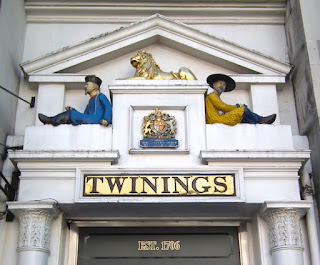
I’d worked in the Covent Garden area of London for years before I noticed this doorway on the Strand. It’s a bit of architecture – small in scale but grand in conception – that celebrates one of the most famous brands of the quintessentially English drink. Twining’s tea has a long history. The company was founded by Thomas Twining, who was born in Gloucestershire and came to London make his fortune when his family’s business – they were weavers – took a downturn. In London he worked for an East India merchant who bought and sold tea and made enough money to set up in business in his own right, buying Tom’s Coffee House in the Strand in 1706. Tom’s became a coffee house with a difference – tea, a beverage that had been made fashionable by Queen Catherine of Braganza, was sold there and although it was costly it proved popular.

In the 18th century, coffee houses usually served only men. But women liked tea too, and many upper-class ladies wanted to serve it at home. So they’d turn up in the Strand in their carriages and send a footman in to buy tea leaves. Word soon got round that you could buy tea here and Twining’s were made: they expanded the business, acquired a royal warrant, fulfilled orders using horse-drawn vans, and, by the end of the 19th century, were using the tea clippers – famously fast sailing vessels – to import tea from China.

Throughout their history, Twining’s stayed faithful to their original premises in the Strand. The company still occupies the building and you can still buy tea there. The street frontage is not large, but the entrance is magnificently decorated. It is topped by an array of ledges and panels supported by a pair of columns topped by acanthus capitals. This arrangement stretches classical architecture to its limits. The ledges provide a place for a pair of sculptures of Chinese gentleman, to remind customers of one source of the precious leaves. A royal coat of arms and a gilded Coade-stone* lion complete the picture. This delightful if eccentric collection of sculpture and ornament was reconstructed in the 1830s – the columns and capitals were apparently moved here from another building. The result, architecturally, is a memorable mixture of classicism and Chinoiserie, with a twist on the classical orders provided by the unusual acanthus capitals. The lion belongs to neither tradition but is very much part of Twining’s history: Thomas Twining was already using a lion as his shop sign in 1717. The brand’s heritage shines on. 

- - - - -   

* For some background on the use of this artificial stone, see my post on a Coade stone royal arms in Bath