Wednesday, December 29, 2021

Stowe, Buckinghamshire


Buildings in a landscape, 1

Stowe is one of the biggest and most magnificent of English landscape gardens. It’s a 400-acre masterpiece that bears the stamp of great 18th-century gardeners such as Lancelot ‘Capability’ Brown, who sculpted terrain using earth and water and trees to create scenery that was deemed to be more ‘natural-looking’ than the formal gardens that were fashionable in earlier ages. These landscapes were punctuated by dozens of buildings, statues and other monuments that formed focal points for vistas. And at Stowe, men of the calibre of William Kent, James Gibbs and Sir John Vanbrugh all contributed to the architecture.

This array of talent was at the service of the estate’s owners, the Temple family, and of these, Sir Richard Temple (1675–1749), who inherited Stowe in 1697 and was made 1st Viscount Cobham in 1718, was probably the most important. It was he, building on work done by his predecessors, marshalled the talent and provide the funds to create the gardens largely as we know them and to commission the buildings that are one of its major glories still. As is well known, Cobham chose and influenced the architecture to reflect his philosophical and political views, and these views were determinedly Whig, and drew on the ideas of the Enlightenment and of authors from Francis Bacon to Alexander Pope.

To be a Whig in the 18th century meant, so Cobham argued, supporting the British constitutional monarchy, opposing notions of absolute monarchy propounded by the Stuarts and their supporters, and standing up for political freedom and liberty. Cobham saw Whig virtues embodied in certain British heroes, some historical, some contemporary, some people of action, some contemplatives. Many of these qualities were, it was said, embodied in figures such as Elizabeth I, William Shakespeare, John Locke, and John Milton, whose busts are displayed in the Temple of British Worthies, one of the buildings at Stowe.

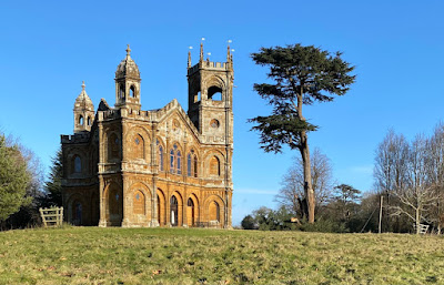
Another large building in the garden is the Gothic Temple, designed by James Gibbs and part of a campaign of building and gardening that took place at Stowe in 1739–42. Unlike the Temple of British Worthies, the Gothic Temple’s connection to Whig values is less obvious. It’s easy to see it as an exception (most of the architecture in the garden is classical) and interesting as a piece of self-conscious Gothic on a large scale that predates Horace Walpole’s house Strawberry Hill, so often cited as the structure that kick-started Britain’s Gothic revival.

But from Cobham’s point of view, the Gothic Temple could be seen as symbolising virtues that Whigs valued highly. For him, Gothic meant vigour, hardihood, and a love of liberty, and was valuable as a style with north-European roots, standing at a remove from the ‘southern langour’ symbolised (allegedly) by, say, baroque buildings. It is, from this standpoint, thoroughly Whiggish.* And the building is certainly there to stand out, catch the eye, and stimulate thought and conversation. It’s huge, it’s unusually triangular in plan†, it occupies a prominent, elevated site, and is the only one of Stowe’s structures to be built of glowing orange ironstone. One might ask, seeing it for the first time, ‘Whatever is that?’¶ I’ve tried to suggest the sort of answer its creator might have given to this question. 

- - - - -

* Although of course looking at it another way, none of these virtues belong exclusively, or even at all, to Gothic any more than they do to other artistic styles. I am simply trying to describe what Cobham and his Whig friends found in the style.

† Had Cobham or Gibbs got Sir Thomas Tresham’s earlier Triangular Lodge in Northamptonshire in mind?

¶ Nowadays it is also a holiday home, restored and managed by the Landmark Trust.

Thursday, December 23, 2021

Long Melford, Suffolk


Adoration

Holy Trinity church, Long Melford, is one of those vast East Anglian churches of the 15th century for which the term ‘awe-inspiring’ is for once quite appropriate. The craftsmanship of its masons and of the other workers who constructed it, the wealth of the local merchants and others that made it possible, the sheer size of a building that serves what is now a small Suffolk town – all make us pause. Not only that, but in this case the identities of the principal patrons are known and in many cases inscribed into the stones of the church. ‘Pray for ye sowlis of William Clopton, Margy and Margy his wifis*, and for ye sowle of Alice Clopton and for John Clopto’, and for alle thoo sowlis’ yt ye seyd John is bo’nde to prey for,†’ reads the inscription over the North porch. Several others have their inscriptions too, and some of these inscriptions are dated, so we know that work was underway in the 1480s and 1490s.

However, my photograph shows a panel of alabaster that must have survived from the church that existed before Holy Trinity got its costly rebuild. It has been dated to the late-14th century, which makes it very early for an alabaster sculpture, and it shows the Adoration of the Magi. It may be a lone survivor from an altarpiece, in which case it’s a marvel that it has escaped destruction. Most images of this kind were destroyed during the Reformation period, particularly when England’s religion turned to an austere variety of Protestantism during the reign of Edward VI. But this panel was removed from whatever position it occupied and was hidden beneath the chancel floor, where it was rediscovered in the 18th century.

There’s much to like in this relief of the Holy Family and the Magi. Mary reclines – a traditional pose much used by the artists of the Byzantine empire, and also in the Christian west. On her lap is a standing, unbabelike Jesus; again, medieval depictions of babies often use this convention, often portraying them almost as miniature adults. He reaches out his hand to the leading Magus to accept the gift, and the giver hastily removes his crown. The other two Magi look on – or do they? They have the hieratic, abstracted expressions and poses characteristic of a certain strain of medieval statuary. There are lovely touches to the left of the panel. A woman (a midwife?) plumps up Mary’s pillow. And the animals in the stable get a look in too: a pair of heads peep from low down beneath the head of the couch.

I find this panel a delight, and I offer it to my readers with season’s greetings and the very best of wishes for the coming year.

- - - - -  

* He seems to have had two wives who happened to share the same name.

† In other words, he is asking us to pray not only for his own soul but for certain others for whom he has promised to pray.

Monday, December 20, 2021

Ely, Cambridgeshire


Logistics, Regency style

Although repainted and sliced off on one side, this old sign is still worth pausing to look at. It begs several questions. How did it come to be missing its right-hand edge when the windows on either side look old? How old is it? Who were Isaac Marsh and William Swan? Answering the last question gives a hint of an answer to the second, at least.

There was a Marsh and Son operating wagons out of Cambridge in 1808, but by 1814 the company is called Marsh & Swan. They covered a range of Cambridgeshire and Norfolk towns, as well as operating their service to London’s Bull Inn, Bishopsgate Street, a major destination for London coaches and for vehicles carrying goods such as the flies, vans and wagons* that Marsh and Swan operated. But by 1845, the company was called Swan and Sons. So this sign must date to the period between the 1800s and the early-1840s.

They’d be called a logistics firm today and run a fleet of trucks and they were as essential to commercial life as the companies whose trucks carry everything from food to pharmaceuticals now. However, their modern equivalents do not leave behind them such well crafted signs as this one, which compares more than favourably not only with the lettering on most lorries but also with that on the modern sign below it.

The sign-writer who restored it seems to have done a good job of recreating the letterforms and ornaments of the original. The balance of thick and thin strokes in the capital letters, the fancy curlicues on the ornamental ’T’, ‘Y’ and ‘B’ , and the decorative arrangement of the ‘and’ between the proprietors’ names – all these, I hope, will meet with well deserved admiration .

- - - - -

* Wagons or waggons were large four-wheeled horse-drawn vehicles for carrying goods. A fly was a smaller wagon, although the term could also be applied to a horse-drawn passenger vehicle – the main feature of both was the ability to travel quickly. Vans were smaller still, with a permanent covered structure.

Friday, December 17, 2021

Stratford-upon-Avon, Warwickshire


A bed for Bacon?

The day I saw a copy of an old book in a charity shop; it was No Bed for Bacon (1941) by Caryl Brahms and S. J. Simon, and it’s a kind of proto-Shakespeare in Love, a comic novel about the trials and tribulations of our greatest dramatist as he acts (badly) in a revival of one of his plays, supports his company as they face competition from their rival, Philip Henslowe, falls in love with a woman (who’s disguised as a boy, naturally), tries to placate fellow actors, and struggles to write a play for performance in front of Queen Elizabeth I while also trying (unsuccessfully) to start writing a sequel to one of his most popular comedies, to be entitled Love’s Labours Won.

All of this made me think of the myths that cluster around Shakespeare. Not so much that the plays ‘must have’ been written by someone else, Francis Bacon perhaps. No, Brahms and Simon fortunately have no truck with that. More the ideas of Olde Englande, all roast beef, good cheer, and half-timbered buildings. The sort of thing embodied by structures such as Stratford’s delightful, early-20th century faux-Elizabethan shop front of W. H. Smith, about which I’ve posted before.

These days most of the other surviving early-20th century shopfronts built by this company are mostly bland modern facades. The buildings’ interiors have been refitted at least once since the shops were built, and features such as plaster ceilings and Gill lettering are nearly all long gone. Newtown in Powys is the best place to to see what we have lost in these shop interiors.

But at Stratford, one trace remains, in the shape of a series of coloured glass roundels on the stairs. Here, among the suspended ceilings and modern shelf units, are portraits of British writers. These days they depend for their effect on being lit from behind, and not all were illuminated the other day – Shakespeare himself was as dark as the mysterious lady. But three were glowing with backlit colour: Richard Brinsley Sheridan, Charles Dickens, and, wonderfully Francis Bacon. Not a bad selection: Sheridan was a theatrical star, Dickens loved the theatre and was a virtuoso public reader of his own novels, Bacon was a contemporary of Shakespeare.

These portraits in glass speak of a time when Smith’s were committed and successful booksellers as well as stationers. They remind us that for this company at least, the Olde England myth was more than a fancy front – William Henry Smith loved the idea that he could help people educate themselves with cheap editions of the literary classics, and the idea lasted well beyond his time. You could still buy novels by Thomas Hardy and Charles Dickens in my local WHS last time I looked, although such classics were in the minority on the shelves. And I doubt they’d have a copy of Francis Bacon’s Essays. Back in the 1930s, though, Smith’s might well have provided, if not a bed, a shelf for Bacon.

Monday, December 13, 2021

Moreton Corbet, Shropshire


Gorgeous and stately

Looking at this end-on view of the ruin of Moreton Corbet Castle’s south range, you’d not think it was a castle at all, in the strict medieval sense . The same would be true of a view across the fields taking in what is left of the long south front of which my photograph above shows one corner. What is here are clearly the remains of an Elizabethan country house, and one of some grandeur. It was built by Robert Corbet at the end of the 16th century, who was extending the work done by his father, Sir Andrew, who had begun to transform the structure of his family’s ancestral medieval castle.

Sir Andrew turned his castle into a more fashionable residence by building new rooms against the old curtain wall. Ruins of these are still seen on the other half of the site, to the left of the building in my photograph. Sir Andrew died in 1578, and Robert was more radical, adding this new south range to create what Camden called a ‘gorgeous and stately house’. Its curvy gables, classical pilasters and large, rectangular mullioned windows will be familiar to anyone who’s seen more famous houses of this period – Blickling in Norfolk, for example has similar gables and windows; so does Montacute in Somerset.

So this is high-status building, and the amount of effort and expense involved in its construction is confirmed by the details, especially the pilasters and attached columns, together with the friezes they support (photograph below). These feature a variety of roundels, bits of strapwork, and carved animals of various kinds, some from the standard repertoire of the time (decorative flourishes influenced, like the house’s gables, by contemporary Flemish architecture), but also the heraldic beasts of the Corbet family.

Why is this marvel of late-Tudor architecture now a ruin? During the English Civcil Wars there was much fighting around the house (which was then occupied by Sir Vincent Corbet, who was on the royalist side). As a result, the house was badly damaged, and although the family continued to live in it, they abandoned it in the 18th century. There were plans to build a new house on the site but these came to nothing and the building was left to decay. It is a magnificent, if tantalising, ruin.


Wednesday, December 8, 2021

Ilminster, Somerset

Meeting place

When I was told that one name for this building in Ilminster was the Old Meeting, my first thought was that it was rather showy for the Quakers, who often favour domestic and unobtrusive buildings for their meeting houses. But it wasn’t a Quaker building but a meeting house for the Unitarians, who built it in 1719 and set it proudly towards the top of the hill on which the town centre stands. The structure has been modified several times since, with the addition of a schoolroom behind in the mid-19th century. Julian Orbach, in the Pevsner volume for Somerset: South and West, thinks that the large windows and the pedimented doorcases on either side may be 19th-century additions too – there are records of alterations to the meeting house in 1851, 1894, and 1913.

Whatever the precise history of the building, it still makes an attractive structure and if it looks a bit of a stylistic mishmash, such mélanges of Tudor gothic and simplified classical produced some attractive results in provincial town architecture of the 17th, 18th, and 19th centuries. I’d call this example attractive too, although might some might prefer a more ‘correct’ mastery of detail – the pediments of the doorways conceal shallow segmental arches: an odd mix. But I’m pleased to say the building has found a fitting use as a local arts centre, with exhibitions held in the main space and the schoolroom behind converted to a café. The café spills out into the garden at busy times – and was still doing so in the summer when I was last there, with customers taking advantage of the fresh air to mix and enjoy a coffee in relative safety. A local asset, in good and bad times alike.

Tuesday, November 23, 2021

Market Harborough, Leicestershire


Feel free to admire

Sometimes the purpose of this blog is just to point out things that I like – and I don’t necessarily have much more to say about them than that. This is an example, a former fire station that I passed one morning when walking through the centre of Market Harborough. It was built in 1903 (and then extended, hence the asymmetry of the sign’s position) by Johnson and Coales for Market Harborough District Council and they did a pleasing job on the street frontage. The segmental arches to admit the fire engines have a satisfying curve that’s mirrored in the form of the four upper windows, which must front some beautifully light rooms. The combination of good looks and practicality – the green tiles above a granite base combining toughness with a wipe-down surface, the mix of green and red colouring – is also admirable.

The structure has been converted to a café, and it’s good to see that the building has a useful future now no longer needed by the fire service. And that, from shiny red doors to gleaming green tiles, it’s still looking good after almost 120 years of use. And there’s a bonus across the road: an ambulance station by the same firm of architects with black tiles, white lettering, and a Diocletian window of enormous proportions. The emergency services of early-20th century Market Harborough seems to have been very well provided for.

Friday, November 19, 2021

Hereford

What a cheek, or, Odd things in churches (15)

My occasional series, Odd things in churches, is dedicated to showing that it really is very surprising what one can find inside the places of worship of the Church of England. From instruments of punishment to fire-fighting equipment, items of whimsy to testimonies to obscure traditions, they’re all to be found, left behind by our ancestors and now regarded with a range of attitudes from indifference to notoriety. Today’s example is the embodiment of notoriety. Sometimes the more notorious features built into the fabric of churches can seem to us distinctly odd, nowhere more so than the numerous grotesque and rude carvings that seem to have been tolerated in medieval places of worship. Perhaps the most famous of these are the female figures known as Sheela na Gigs, but there are also male exhibitionists, like this man, carved high up in an aisle roof in Hereford’s medieval church of All Saints.

The All Saints exhibitionist has raised quite a few eyebrows in recent years – in part because he’s now more visible to the public since the church started serving coffee and provided seats and table in an upstairs gallery below the roof from which he moons down on us. He’s unusual in all kinds of ways. Although grotesques, even obscene ones, are not uncommon on medieval churches, they most often occur on the outside. When they do appear inside, they’re usually above doorways, arches, or entrances, and for many, this helps to explain their presence: they’re there, it’s said, to ward off evil spirits attempting to enter a sacred space. They do this, it is argued, by means of a kind of homoeopathy perhaps best summed up in the phrase ‘like cures like’. This kind of protective notion does not explain this figure’s presence high in the roof. Neither does another theory, that they are there to dissuade us from the sins they represent – before the construction of the gallery the exhibitionist was very difficult to spot.

Many like to suggest that he’s simply a carver’s joke. In one corner of the roof, he could have been done as the carver was finishing his work, and the scaffolding swiftly removed before the priest or the parish bigwigs had had the chance to inspect the roof too closely. We’ll never know whether this was the case. To modern eyes he just seems to be attracting attention of a particularly saucy kind. Something to ponder over the next cappuccino and cake.

Tuesday, November 16, 2021

Hereford

Pigs in blankets

Strolling around Hereford cathedral the other week, once again impressed by the richness of detail almost everywhere, we came across a monument consisting of a recumbent effigy set in a niche. The style of the arch and the ballflowers decorating it suggest a date somewhere in the first half of the 14th century, but the ballflowers are outnumbered by tiny carved pigs – sixteen of them – each wearing on its back a heraldic blanket and each snuffling its way towards a carefully carved acorn. These contented swine suggest that the monument commemorates a member of the Swinefield or Swinfield family. There was a Bishop Richard Swinfield, successor to the famous and saintly Thomas Cantelupe and a man who successfully prepared the case for Thomas’s canonisation. But it’s not this Swinfield: he has his own monument elsewhere in the cathedral.

The monument of which I show a detail is said to belong to John Swinfield, who died in 1311 and was the cathedral’s Precentor. Clearly a member of the bishop’s family, he may have been one of Richard’s nephews, real or metaphorical. The precentor was the member of the chapter responsible for overseeing the musical side of worship.* He was thus a very important figure in the daily life of the cathedral, and could also deputise for the dean on occasion.§ Swinfield’s position, then, certainly merited a monument as large and prominent as this one. Few monuments, though, have such charming details as this. 

- - - - -

* And, sometimes, for wider respsponsibilities in the organisation of worship in the cathedral.

§ The heraldry on the pigs relates to the arms of the Deanery.


Sunday, November 14, 2021

Ely, Cambridgeshire


Remember

This bomber is flying over Ely Cathedral in a memorial window in that building commemorating the contribution of Bomber Command during World War II and remembering the airmen who were lost. Lincolnshire and East Anglia were the home to many squadrons of bombers during the war, and even when I was growing up in the 1950s and 1960s the landscape was punctuated by control towers and fenced-off airfields. Hangars and a windsock can be seen below the cathedral in the window, representing the bases to which the airmen hoped to return.

Friday, November 12, 2021

Leominster, Herefordshire


Incidental pleasures, 2: Old news

The things we have lost. In the increasing list of things that have vanished or are vanishing as the world becomes ever more reliant on digital media, communications, commerce, and the rest are local newspapers. Long ago, when I was growing up, my parents took a national newspaper in the morning and a local newspaper in the evening. There were lots of national papers to choose from, but there was also a choice of locals – not just our town’s own paper, but one from the neighbouring city too. Even small towns had a newspaper of their own, containing a mix of local news plus advertisements, announcements of births, marriages and deaths, the results of the local sports matches, and announcements for forthcoming meetings of every local group from the Young Farmers club to the Literary and Philosophical Society. Most of these publications have gone, some completely, others to some sort of online presence.

Often, they’ve vanished without trace. Occasionally there are small, fragile traces, like this door (now belonging to a shop), glazed with engraved glass bearing the words ‘Leominster News’. That, plus another nearby, is such a trace of what was once The Leominster News and North West Herefordshire and Radnorshire Advertiser, a paper that covered not just the Herefordshire hinterland of this small market town but also the neighbouring Welsh border county of Radnorshire (itself another thing long gone, having been absorbed in the 1970s into the large county of Powys*).

This kind of engraved glass is the sort of thing I associate mostly with pubs – used for windows advertising a local ale or the availability of ports and sherries.† But it works just as well for a printing or newspaper office. Both would have doors that were beacons for people, and engraved glass with a light behind it was a good on-street advertisement. In the evening, through such doors local reporters would rush with their latest copy about a council meeting or some unexpected police report that simply had to be squeezed in somewhere. Out in the early hours of the morning would come weary printers, pleased to have got the latest edition printed and sent on its way in waiting vans to take the news to Herefordshire apple growers and Radnorshire sheep farmers. Later in the day, in would go members of the public wanting to place an ad or insert an announcement. Such places were at the heart of the community, and the light behind a door like this a sight that would be taken for granted.

From a little research online, this newspaper was around in the late-19th century and still going during World War II. How much longer did the light behind the door bring to mind the light shed on people’s breakfast or tea tables and the illumination brought by local news? Just the incidental pleasure of an old sign now, but back then, an essential part of life.

- - - - -

* The name lives on, though, to denote the district of Radnorshire, the ‘Radnorshire part’ of Powys.

† There is much about engraved, embossed and other ornamental glass in Mark Girouard’s excellent Victorian Pubs (Studio Vista, 1975; Yale UP, 1984).

Monday, November 8, 2021

Leominster, Herefordshire


Incidental pleasures, 1: Fan mail

Are you are a fan of fanlights? I’m sorry, but the pun seems to want to be made.* I have always admired the semi-circular fanlights of the Georgian period, noticing the satisfying, cobweb-like layout of their glazing bars, dividing the little window in a way that justifies the name. And also reflecting how the entrance hall of a house can be its darkest area, and that a generous fanlight can help bring in some welcome natural light. So I’ve done posts about fanlights more than once before.

Scrolling through my pictures looking for something else, I came across this small gem. Not semicircular at. all, and not fan-like either, but more interesting than the simple rectangular windows that were often inserted above Victorian doors. The cue for the shape comes from the door’s canopy, with its shallow segmental curve, giving the fanlight a curved top too. And the pattern of the glazing nods towards this curve with four straight glazing bars radiating outwards, forming shapes that look as if they have been inspired by the tracery in Gothic stained-glass windows. So the shapes are all ogees and cusps, making a contrast with the simple, straight-sided panes of glass in the door below.

It’s modest, but visually satisfying. I have my doubts about how much light it lets into the interior, especially with the canopy producing shade as well as shelter. But if your front door faces directly on to the street, it’s pleasant to offer the street a bit of visual uplift, something to warm the heart of the observant passer-by.

- - - - -

* If it seemed so to me at least, perhaps it’s because I’m a bit of a paranomaniac at heart.

Friday, October 22, 2021

Hereford

Happy pigs

Walking along a street in Hereford, a city I’ve visited a number of times, I saw this tile panel, clearly one produced for a butcher’s shop, that I’d never previously noticed. How can I not have seen this before? I have walked along this street more than once, on at least one other occasion noting the features of other old shop fronts hereabouts. Could it possibly be that this tile panel was covered by some later decoration, and has been revealed relatively recently? Maybe. But whatever its recent history, it’s now visible, delightful, and an asset to the streetscape, even though the premises no longer belong to a butcher, having been made over to the business of selling boots and shoes.

I find the panel charming – and charm, I’d say, is a quality that is appropriate for retail architecture, the object being to charm customers so much that they go inside and buy things. So here, five happy-looking pigs chomp and root away by a stream, while a sixth seems to have decided to lie down in contentment. The foliage of the trees is not depicted realistically, but made up of a series of impressionistic shapes and splodges in various shades of green and brown, a style that looks more 20th century than Victorian. The chequered border and angular lettering point that way too – I wonder if the tiles were designed and made in the 1920s. I couldn’t find anything about them in my favourite tile reference book, Lynn Pearson’s Tile Gazetteer. So for now I’m left to speculate and admire.

Entering the shop, I found one more tile panel (below), showing another group of pigs just inside the door. This time they seem to be in a farmyard setting, and this, together with the fact that the pigs are depicted in more detail, has given the artist a little more scope to be realistic. The grey wall in which the tiles are now set has a surface slightly proud of the panels, and this may well conceal a tiled border. The adjacent display of wellington boots, perfect for the well dressed farmer or swineherd, made me smile. It’s a while since I’ve seen such good butcher’s tiles, and these are rivals to my local favourites, which adorn the shop of Jesse Smith and Co, butchers of Cirencester. There they have attracted me inside to buy a pork pie. Although I didn’t buy any shoes in this Hereford shop, I may well return – tiles are still, for me, a powerful attraction.


Monday, October 18, 2021

Bridport, Dorset

Chapel in a garden

Bridport’s Unitarian chapel was built in the 1790s after a group split from an existing independent congregation in 1742. The then minister, Thomas Collins, refused to affirm the divinity of Christ, leading some 200 people to leave and set up their own congregational chapel elsewhere in the town. Those who remained continued under Collins’ ministry, and in 1974 they agreed to build a new chapel, then called the New Meeting, the building that survives today.

The building is a standard 18th-century chapel, with symmetrical front, round-headed windows, hipped roof, and central porch, the latter given a touch of elegance by its semi-circular shape and Ionic columns. But the most distinctive thing about it today is its position, set back from the street and fronted with greenery and flowers. It’s hard to imagine a better setting for a chapel in the middle of a town. The congregation invites passers-by to sit and enjoy the green space, where they can find rest, relaxation, and, perhaps encouraged by the gentle cooing of the doves, spiritual enrichment.

The doves have their own miniature building, which can be seen on the left in my photograph. It’s ornate, octagonal, and painted the same white as the bricks of the chapel’s facade. The occupants perched obligingly and eyed me as, taking welcome relief from Bridport’s busy main street, stopped to take the photograph. Christians have long used the dove as a symbol of the Holy Spirit. Unitarianism rejects the Trinitarian notion of the deity, so have no place for that symbol. However, doves have long been linked with peace and purity, and few, in this tranquil setting, would take issue with that.

Thursday, October 14, 2021

Sudeley, Gloucestershire


Hidden treasure

A few miles from where I live, hidden in a wood on a slope of the Cotswolds, lie the fragmentary remains of a Roman villa. The site was excavated in 1882, when some mosaics were uncovered, the remains of a few walls were noted, and the plan of a courtyard villa, which had developed from an earlier corridor-based structure, was made out. The ruins did not fare well in the years after the excavation. Damage due to frost, burrowing rabbits, and visitors occurred, and Emma Dent, the owner of the land on which they stood, removed one of the mosaics to her home, Sudeley Castle.* She had part of the site protected by wooden sheds to help preserve it, but those sheds have long rotted away and most of the remains are now all but enveloped in undergrowth and concealed by trees. One mosaic is protected by a low shelter roofed in corrugated iron. By bending down into the shelter and peeling back some sheeting held down by stones, one can see the mosaic, fragmentary but beautiful, its patterns of loops, curves and diagonals standing out in the gloom.

It’s not known for sure how old the villa is. Coins of the 3rd and 4th centuries were found on the site, and I’d guess that the building goes back well before that. That this much has managed to survive in its isolated and quiet location, in spite of animals, weather, and the removal of tesserae by ignorant 19th-century visitors, is heartening, and to me at least, somewhat moving.

- - - - - -

* She justified this removal because it was necessary to protect the mosaics from locals, who walked up to the site and removed handfuls of tesserae. A panel of the mosaic, having been removed to the castle, was apparently subsequently lost: its present location is unknown. A mosaic from another Roman site that Miss Dent removed had a happier fate: she had it restored and reinstalled in its original position.

Sunday, October 10, 2021

Burnham-on-Sea, Somerset

Light the lights

The facade of the Ritz cinema in Burnham-on-Sea looked somewhat the worse for wear when I passed it the other day – but, no matter, the place is still open and still showing films, on three screens now I believe, unlike the single screen that it had when it opened in 1936. It presents to the street a very plain front, rendered in cream, with a central section breaking forward slightly and accommodating three simple rectangular windows and the sign bearing the name above. It’s Art Deco, in other words, of the most pared-down kind.

The lettering in the sign is pretty simple too. Four capitals, with all the strokes more or less equal in width and all the characters very square-looking, including even the initial R, which has been made to do some rather alien things in order to eliminate its usual curves. It’s not the most pleasing of letters, this R, but in the context of the plain, simple, rectilinear building it makes sense. Imagine the neon tubes of the sign lit up at night, as one must with such a cinema building, and the whole thing works – even though we lose what caught my eye on the sunny Sunday afternoon I was there: the lucky similarity between the colour of the lettering and the blue of the sky.

Wednesday, October 6, 2021

Daventry, Northamptonshire

Genuine imitation

This building is nicely sited at one end of Daventry High Street, facing up the street. Its frontage therefore acts as an attractive focal point as one looks towards it, and the white stucco finish draws the eye. What I thought I was looking at was the 18th-century idea of a Tudor-period gothic house front. The battlements, octagonal corner turrets, friezes with quatrefoils, and windows with dripstones and ornate glazing bars all point to this. Even the white stucco feels right: Horace Walpole’s famous faux-gothic house, Strawberry Hill, Twickenham, is similarly white – he called it his ‘paper house’, referring both to the white finish and the fragility conjured up by the style. This example, more four-square and turreted, doesn’t look particularly fragile, but is no less striking, and a pleasant surprise to come across among the modern shop fronts and market stalls.

But there’s a twist. According to the description in the listing entry of this house, the core of the building actually is 16th or 17th century. So there’s a genuine Tudor or Jacobean house lurking underneath this handsome sham. Little do the ’Tiny Uns’ who attend day care here today realise what a cradle of history they occupy.

Saturday, October 2, 2021

West Camel, Somerset


The joys of the wriggly stuff

Up there in the list of my obsessions are various things that are not strictly architecture, but which are adjuncts to architecture and often make buildings interesting or give them interesting contexts – lettering on buildings, three-dimensional pub signs, post boxes, wooden shacks, obsolete petrol pumps, and, somewhere near the top of the heap, corrugated iron. Aficionados of this versatile but low-status building material often refer to it as ‘wriggly tin’, which is a misnomer as far as the ‘tin’ goes, but is amusing enough and highlights its salient quality, the corrugations that both make the stuff strong and give it its characteristic appearance, helping it to look good when the sun comes out.

Wriggly tin is cheap, lightweight, easy for low-skilled people to build with, and highly versatile. If you hit the term ‘corrugated iron’ in the tag cloud in the right-hand column, you’ll find posts about barns, a house, a boat house, Nissen huts, workshops, and even churches built of the material. Here in West Camel there’s a multiple whammy of corrugated iron – not just a modest green-painted shed but a row of houses with great curving roofs with a corrugated covering. If the houses resemble Nissen huts, there’s a reason. They were built by John Petter and Percy J Warren, who took their inspiration from the Nissen huts designed by Lieutenant Colonel Peter Nissen. The pair of architects set up a company to produce the houses and acknowledged their debt to Nissen by calling their firm Nissen-Petren Houses and appointing Nissen to the board of directors.

The idea was to market the houses to local authorities, who were building homes in the 1920s in the wake of the First World War. The return of soldiers not only increased the demand for affordable housing, but caused a shortage of materials and skilled labour, and the design of the Nissen-Petren houses was a way of overcoming these problems by creating structures of non-traditional materials that were straightforward to erect. The houses had a steel frame, concrete end walls, and a roof covered with corrugated steel. They could be built much faster than brick houses and the hope was that the cost would be slightly lower too. However, the houses weren’t taken up widely – there were concerns about the cost, the appearance of the houses, and that fact that some roof leaks were reported. A few were built in the West Country, but not enough to make the Nissen-Petren company viable and it closed in financial difficulties. The row in West Camel, visible from the A303, are, as far as I know, the largest group to survive.

Wednesday, September 29, 2021

Edithmead, Somerset

Tin tabernacle

As regular readers will know, I’m a great fan and regular user of Nikolaus Pevsner’s Buildings of England books, to which I refer all the time and which also inspire many of the explorations of English buildings that lie behind this blog. I am in no doubt that the series, with its comprehensive coverage of architecture – first in England and then in Wales, Scotland, and Ireland – is one of the greatest works of art history ever, in any country.* If I have a reservation about the books it’s that, even in the fat revised volumes that are still appearing, they often stop short at even passing coverage the more modest buildings that in many places play a huge part in defining local character – the lookers’ huts of Romney Marsh, maybe, or the hovels of the Vale of Evesham, or plotland bungalows, or minor industrial buildings in some towns.† Or corrugated iron buildings, a personal obsession of mine, even though buildings made of this material are widely seen as minor and often temporary. There are, though, plenty of corrugated iron structures that are vital to their community and that have histories going back over a century.

I was pleased, therefore, when browsing in the Somerset: South and West volume of Pevsner to find a corrugated iron church mentioned at Edithmead, close to Burnham-on-Sea. Recently I was nearby, and stopped to have a look. What I found was a charming, white-painted ‘tin tabernacle’ not especially churchlike in appearance, except for the miniature spire and the bell at one end, but attractive nonetheless. If the rectangular windows and tiny structure without a separate chancel look unecclesiastical, there’s a reason. This building began life on another site, at East Brent, where it was an ‘Adult School’. It was brought to Edithmead in 1919 to serve the small local community as a daughter church to the one in Burnham-on-Sea. The congregation look after it well – although maintenance of a building like this is easier that the upkeep of a stone building; the main jobs recently have, I think, been painting the building and replacing the wooden window frames.

Thanks to the congregation, the tiny church with its modest spirelet and delightful cresting along the ridge of the roof, still looks good and locals were able to celebrate its centenary on the site in 2019. Hats off to the people of Edithmead – and to the authors of the Pevsner guide for pointing me towards a place of which, until the other day, I’d not even heard.

- - - - -

* The revised volume for Wiltshire is the latest one I’ve acquired, and I plan to review it shortly here.

† All of which may be built in part of corrugated iron.

Tuesday, September 21, 2021

Buckingham

Hunting the Hart

During our recent stop in Buckingham, the town’s White Hart Hotel was looking particularly attractive with its hanging baskets, so I paused to take the photograph above. I wanted to show not just the flowers but also some detail of the Doric porch, which acts as a platform for the statue of the eponymous white hart with the traditional gold coronet around its neck. Although the White Hart is a very common name for an in or pub in England, relatively few have a three-dimensional image of a stag as their sign. I’ve seen a number of these in my time – a splendid standing stag in Okehampton, for example, with a magnificent pair of outstretching antlers, and another high up on the White Hart Hotel in Salisbury, which can, in the right light, be dramatically silhouetted against the sky.*

The White Hart symbol became well known during the reign of King Richard II (reigned 1377–99), who adopted it as his badge. He is said to have based it on the heraldry of his mother, Joan, Countess of Kent, whom the chronicler Froissart called ‘the most beautiful woman in all the realm of England, and the most loving’. The king’s retainers and followers would have worn the badge, and it appears several times on the Wilton Diptych, the superb portrait of the ruler now in the National Gallery.

Like many White Hart Hotels (and indeed numerous other urban hotels), the one in Buckingham is early-19th century in appearance – the flat front, symmetrical facade, and classical porch are all standard features of the coaching inns of the late Georgian and Regency periods. In those days Buckingham was a good stopping point on the journey between the Midlands and London, or between Oxford and Cambridge, and the White Hart was one of several inns in the town. And it was in earlier times too – the inn’s history is said to go back further than the Georgian era. It’s still a good place to pause when making the cross country journey from Oxford to Cambridge – or, as it was for us the other day, from the hills of the Cotswolds to the flatlands of the Fens.

- - - - -

*See my Instagram account, @philipbuildings and scroll past recent posts, to see images of these.

Friday, September 17, 2021

St Neots, Huntingdonshire

Stand-out steeple

When it comes to skylines in small towns, it’s often a church that dominate the scene, not necessarily a large industrial building like the flour mill in my previous post. But here in St Neots, where I noticed that flour mill, is a fine Victorian church tower that makes another notable contribution to the skyline. Like the mill, it’s also (mainly) in brick, and it turns out to be the work of the same architect, Edward Jabez Paine (1847–1926). The Paine family owned the mill that Edward J. Paine designed, and they were religious nonconformists, worshipping at what was then a Congregationalist church (now a United Reformed church), so there was a close personal connection between architect and client here too. In fact the architect’s father was actually a deacon of the church, so Edward Paine was a natural choice for architect.

Paine built a good gothic church, with a spacious interior, well lit with big windows, and with a west gallery for extra seating. But the striking feature is the tower. This starts as a square structure and turns into an octagon part-way up. At the point where the metamorphosis takes place there are pairs of square pinnacles at each corner, and there are single eight-sided pinnacles at the corners of the octagon too. The octagon is topped with a short spire. The spire is slightly stocky, but this doesn’t detract form the overall effect – to my mind it sets off the octagon, showing off the brickwork and dressed stone of this part of the tower. St Neots was fortunate to get this building in 1888, a time when many dissenting churches were benefitting from the wealth of the successful business- and tradespeople in their congregations. In my opinion, the Paines did their church – and their town – proud.

Friday, September 10, 2021

St Neots, Huntingdonshire

‘Go’ in St Neots

Although I like to think I am good at spotting small, unregarded buildings, sometimes my attention is drawn irresistibly to the large and showy structures that stand out, whether in a rural landscape or in a town. Pulling into a car park in St Neots recently, there was one such building that I couldn’t miss, because its massive tower with corbelled top and striking tiled roof dominated the skyline in that part of town. The tower seemed to be an essay in polychrome brickwork, built to stand out, but what was the building that it was standing proud above? And how old could it be – was it from the brash 1860s or maybe somewhat later?

A stroll in its direction revealed a structure every bit as showy and massive as I’d expected from the tower. It was Paine’s Flour Mill, and its exterior walls are a riot of yellow brick, gothic arches, diaper patterns, and something resembling a Star of David beneath the arches of the upper stage of the tower.* Paine’s were a well established St Neots company founded by James Paine. They began as brewers and built their brewery into one of the town’s biggest businesses. But James’s entrepreneurial son, William Paine, expanded and diversified into all kinds of areas – flour milling, timber, and dealing in everything from building materials to coal. The interest in flour milling seems to have started when he bought a mill on this site, where he also built maltings for his brewing business. The mill was rebuilt in the 1880s, but the building that survives seems to be later than this one – there was a fire in 1905 and a rebuilding. A photograph online shows the present structure, with its gothic arches, under construction; this image is dated 1910, although according to Lynn Pearson, the mill reopened in 1909, so the actual date of the photograph is probably just before this.†

Another image of c. 1920 shows the mill complete with the tall corner chimney, which has now been taken down (its stump is visible in my photograph). Even in its current state, converted to flats, it’s still an imposing building and testimony to the industrial flair of the Victorians and their successors, who saw that a striking factory could be an effective advertisement. The architect was Edward J. Paine, grandson to the founder of the firm, suggesting that the building is also a memorial to a lineage that had in spades that active, strong-willed quality of movers and shakers that the Victorians called simply, ‘go’.

- - - - -

* It’s not a perfect star but in any case the symbol was not, for the Victorians, associated only with Judaism; I’ve seen such stars in brick on 19th-century nonconformist chapels.

† See Lynn Pearson, Victorian and Edwardian British Industrial Architecture (Crowood Press, 2016).

Saturday, September 4, 2021

Puddletown, Dorset

Here comes the Sun, or, Odd things in churches (14)

People who look carefully at old buildings will know all about the Sun Fire Office. It was an insurance company, founded in 1710, and it’s still going in a different form. It’s familiar to devotees of old houses because the company’s clients used to fix a metal plaque bearing the company name and symbol (the Sun in splendour, naturally) to the fronts of their houses. Then when the Sun sent out their fire-fighters, they would know you’d paid for the service and would attack the blaze with whatever equipment they had.

One aid to fire-fighting was provided by fire buckets filled with water or sand. One often sees bright red metal ones hanging on the platforms of stations on preserved railway lines. But back in the days when the Sun Fire Office first started, canvas buckets were also in use. I’d never seen these in a church before, but at Puddletown several remain, hanging from hooks under the west gallery. There are many more hooks than buckets, so perhaps originally there were more. More would be a good idea, as they’re not very large and a couple would not go very far when extinguishing a fire of any size larger than a smouldering pipe left in an absent-minded church warden’s pocket. These fire buckets now go on an informal list I keep in my head of fire-fighting equipment I’ve spotted in churches – fire hooks for removing burning thatch and the occasional rare hand-pumped fire engine are also included. All a far cry from today’s enormous fire engines with their turntables and ladders, but as welcome in extremis as their diesel-powered descendants can be today.

Sunday, August 29, 2021

Buckingham


For filling up

A recent visit to Buckingham, en route for a destination further east, saw us taking a stroll along Well Street, a way I’d never gone before. It wasn’t long before we passed this building, which I immediately wanted to photograph, although this was not easy because the street is not very wide. It’s a facade that’s wearing at least part of its history with pride. The building has most recently housed a restaurant, although this business seems now to have closed. The preservation of a pair of petrol pumps shows how the restaurant took its name and branding from the previous use – it was a garage and the restaurant was called The Garage. They even changed the globes atop the pumps to a pair bearing the letter G, specially made for the change of use, no doubt.

But the garage business cannot have been here much before the beginning of the 20th century; more likely it dated to some time after 1900. What was it before? The design of the front, with its symmetrically arranged windows and plain but decent brickwork, suggested to me a nonconformist chapel and that’s what it originally was. It looks early-19th century and a little research reveals that the structure was first a Presbyterian Meeting House. Although the frontage is Regency, the building behind it actually dates to 1726, with numerous further alterations in the 19th and 20th centuries. At some point after it ceased to be a chapel, it housed a school, before the wide doorway was fitted, no doubt part of the conversion to a garage. I’ve seen a chapel converted to a garage before (there’s one, for example, at Upton-on-Severn), but not one quite as elegant as this – the central doorway, though large, far from ruins the visual effect. Even the changes to the ground-floor windows do not completely destroy the symmetry.

In recent years many garages have closed, especially small town ones where a street-side site can make filling up with petrol an activity that holds up traffic. Country filling stations have been closing too as the profit margins are so narrow and the trade is now so dominated by the supermarket chains. So a few years ago this one closed and the restaurant arrived. Now it appears that the building is on the market again and conversion to residential use is one the cards. I hope its new owners will not erase the layers of its history that are still on show.

Wednesday, August 25, 2021

Sherborne, Dorset


Surprised in Sherborne, 2

Sherborne’s Cheap Street is a very attractive jumble of architectural styles – from late-medieval timber framed structures to stone buildings from virtually every later date: a hotch-potch, mostly with recent shop fronts, but much of it given unity by the glowing stone. Even in this good company, the bow-fronted building above is outstanding. Living near Cheltenham, I’m used to stucco-covered Regency buildings decked out with classical cornices, columns and iron balconies, but even so this one made me pause. It’s small, with just a single window on the upper floor of its curvaceous facade, but what a window – the full Venetian, with a pair of rectangular sections bookending a round-topped central portion, the whole surrounded by elegant mouldings and highlights picked out in white. A neat cornice and parapet, balustraded in the centre, complete this upper floor, which rests on four stone Ionic columns that frame the modern shop window. The iron balcony is the finishing Regency touch, vital for the safety of those inside who want to open the big window, which extends down to the floor.

As with the shop front in my previous post, I wondered what this building was used for when it was first put up in the early part of the 19th century. The upper room looked to me like the spacious drawing room of a middle-class house, the sort of thing that wouldn’t look out of place in Brighton. But there was no clue to what was originally where the modern shop window is now. The answer turns out to be that the building belonged to the Sherborne Savings Bank, who erected it in 1818. 

This was the formative period for savings banks in England. These banks were set up to provide banking facilities for poorer people – those who were not normally the customers of the established banks, whose accounts did not normally bear interest at this time. Savings banks welcomed small investors, including those who could save only intermittently, as their incomes were unreliable and varied according to the seasons or the availability of work.* Although savings banks did not help the very poor, who found it impossible to save any money at all, they were attractive to those such as artisans, small farmers, shopkeepers, and domestic servants, among whom were many who had a little money to save and who liked the idea of self-help. Savings banks were not perfect: in an era before elaborate state regulation of financial institutions, some folded as the result of fraud or incompetence. But for many they played a useful role.

Whoever designed the Sherborne bank’s building did their best with what was clearly a confined site. Ideally, the sweep of the bow front should stick out over the pavement area, so that it can make an impression whichever way you approach it. But the building to the right already sticks out, so this wouldn’t have worked without invading too much pavement space. So here it sits, standing proud of one neighbour and slightly in the shadow of the other, making its impression nonetheless.

The delicate architecture of this frontage is not what I normally associate with banks. The banks I’ve admired on this blog in the past have been rather chunky buildings, with the kind of solid-looking masonry that suggests strength and security. They seem to tell you that your money will be safe here. This building is very different. It’s impressive, but in a gentler, more domestic way. Its columns and the overhang they make possible offer shelter from the rain and seem inviting. ‘Come in,’ they say, ‘and you’ll receive a warm welcome.’ The effect seems wholly appropriate for a savings bank set up for those not previously used to dealing with the estanlishged banks or money markets. It still works its charm, on one passer-by, at least.

- - - - -   

* Small investors could also entrust their money to Friendly Societies, but these had regulations – often requiring members to deposit money regularly, that did not suit those with irregular incomes. Savings banks did not have such rules. 

Sunday, August 22, 2021

Sherborne, Dorset


Surprised in Sherborne, 1

Ever since I wrote a book linked to a television series about the history of Britain’s high streets, I’ve been interested in the architecture of shops, and when I visit a town I’m often agreeably surprised to find old shopfronts still intact and fronting valued local businesses. This frontage in Sherborne was one that caught my eye. It looked to me late Victorian and the array of paired columns, wooden panelling, generous overhang, and slightly Gothic gablets poking out on top seemed to be from the more showy end of the retail spectrum. What could it have been, I wondered to myself: a high-class grocer’s, or maybe something more outré such as an oil and colour merchant or a specialist in well made leather goods? A sign painted on to the glass above the door gave a clue to a business that had been here once: ‘The Old Cycle Shop’. Could that have been the original business?

Not at all, it turns out. The other clue is above the doorway to the right, with its sign saying ‘Tavern Cottages’. A place of refreshment, then? Yes, but not the alcohol-selling place one would expect. This building began life in 1881 as the Sherborne Coffee Tavern. The late-19th and early-20th centuries saw a vigorous anti-alcohol movement. In churches and chapels there were sermons warning against the effects of the ‘demon drink’, campaigners and some nonconformist preachers persuaded people to ‘sign the pledge’ not to touch the stuff, and both campaigners and canny business people founded places where pub-goers could find alternative entertainment – from temperance billiards rooms to coffee taverns.

Coffee had been widely drunk since the 16th century and had gradually evolved from the costly luxury chosen by a few to an inexpensive drink enjoyed by many. Back in the 18th century, coffee houses had been popular among the professional classes in Britain’s large cities. Lawyers, medics, and even writers had their coffee house of choice, where they’d go to drink coffee, read the newspapers, meet friends, and discuss the day’s news. But coffee taverns were never as popular as their ancestors of the Georgian period, perhaps because they were mostly started by middle-class reformers who wanted to encourage the working class to stop drinking and give up the unruly habits of the drunk. The intended customers weren’t keen, and many coffee taverns closed after a few years.

Sherborne’s coffee tavern was bought in the 1890s by a local man, Edwin Childs, who moved his bicycle sales and repair business there. Childs prospered – this was, after all, the heyday of the bicycle – and by the early-20th century was also repairing cars. As the car business expanded, he first converted the shop, removing the big windows, and eventually put up a purpose-built garage elsewhere in the same street. Subsequently the attractive 1880s shop front was restored, and it still looks well in its dark red paint with details picked out in gold, an asset to Sherborne’s rich and varied streetscape and a survivor in an age when a liking for both wine and coffee no longer seems some kind of contradiction.

Wednesday, August 18, 2021

Hughley, Shropshire


Wood works

The church at Hughley looks charming from the outside – it’s very small, without any architectural separation between nave and chancel, and has a wooden medieval porch and one of those timber-framed bellcotes that nearly always make a small church look picturesque. None of this compares one for the building’s great treasure: the internal division between nave and chancel is effected with a wooden screen of great craftsmanship and beauty, a work of art more delicate and sophisticated than one would normally expect in such a modest building.

The panelled lower section is topped by bands of lace-like carving below the row of larger openings. Above this is more lacework in wood and at the very top of the coved section that would have once supported a rood loft. This curving support is carved with a pattern of radiating ribs in imitation of stone vaulting. Looking at all this more closely (below), one becomes aware how much fine detail there is in the carved portions. The central parts of the ‘vault’ are carved with ornate quatrefoils. The openwork sections a little lower down have tracery like windows, and the horizontal carved bands at the top of the screen and lower down feature more quatrefoils, tiny arches, fleurons, and even one or two faces in roundels. It’s outstanding workmanship and has survived well since it was made in c. 1500, albeit with a few small breakages and missing bits.

Pevsner’s Shropshire volume tells us that this remarkable high-class screen has siblings in three churches in the adjoining counties of Cheshire, Denbighshire and Herefordshire. More churches beckon, then, to pursue the work of this fine carver (or group of carvers), who in a time when many people traveled hardly at all, worked their way up and down the English-Welsh borders doing marvellous work that’s familiar mainly to specialists now. It deserves to be known more widely.

Sunday, August 15, 2021

Bishop’s Castle, Shropshire


On tap

On my previous visit to Bishop’s Castle I saw much to catch my attention, but I missed the Three Tuns Brewery, a stone’s throw from the town centre. I was pleased to find it when we returned to the town the other day because it’s a nice example of a small late-19th century tower brewery. There are still quite a few Victorian breweries around,* but many smaller ones like this have disappeared, prey to takeovers and the large-scale corporatisation of Britain’s brewing industry which was turned from one of small-scale local distinctiveness to one of big business greed – a change which also entailed a sorry deterioration in the quality of the beers served in many of the country’s pubs. Already in my late teens I was cottoning on to the fact that there was something better than the ubiquitous Watney’s Red Barrel and appalling ‘lager’ that was only made remotely drinkable with the addition of lime juice. Surely there was something better than this. A friend was was a member of a local Morris side† and a consummate folk fiddler, took me to one side and pointed me in the direction of a pub that served Wadsworth’s 6X: proper beer. I was converted.

Thankfully, some small provincial breweries have survived these upheavals and still brew decent beer with its own distinctive character. Three Tuns is one such, and its origins go back far beyond the Victorian period. The first brewing licence was issued here in 1642, making this, so it’s said, Britain’s oldest brewery – architecturally too, since part of the structure is 17th century.§ The tall central section that now dominates the site was the result of an expansion when the Roberts family bought the business in 1880. In the Victorian period the tower became the standard form for a brewery. As the brewing process demands shifting the liquid from one container to another through several stages, it makes sense to hoist (or pump) the ingredients to the top, start the brewing there, and let the force of gravity do the lion’s share of the work involved in moving the beer from one vessel to the next.

I didn’t realise until I looked at the company’s website that in the early 2000s the brewery was in difficulties, with a proposal to convert the site to housing. But it’s now refurbished and very much alive and kicking, and the tower is resplendent with its hand-painted sign. I didn’t sample the goods in my recent visit to the town,¶ but in line with the times its beer is available not only in the adjacent Three Tuns brewery tap, but also in a number of pubs in Wales and the English border counties, as well as via the brewery’s online shop. So now there’s no excuse.

- - - - -

* See, for example, most posts about Hook Norton, Lewes, and Devizes.

† Morris dancing, of course, often takes place near pubs. For obvious reasons.

§ There is, of course, more than one claimant to this distinction.

¶ Too much driving to be done.

Thursday, August 12, 2021

Upton Cressett, Shropshire

At end of the road

Frustrated at driving miles along a narrow windy lane, negotiating a tractor towing a long trailer and opting for the purgatory of scratched paintwork to avoid the ditch of despair and damnation, only to find Upton Cressett church firmly locked and no one, apparently, around to open it up, we consoled ourselves with a partial sight of Upton Cressett Hall and a slightly closer view of its beautiful gatehouse. The Hall is one wing of what must have been a large house of 1580 in glowing Tudor brickwork. The gatehouse, shown in my photograph, is of the same material and probably the same date. Looking from the lane, one can glimpse the symmetrical entrance front – the entrance itself obscured by the bushes and a flank wall. At the far left of the picture is an octagonal corner turret, one of a pair on that side, which is on the ‘inside’ of the gatehouse, suggesting that these turrets are more ornamental than defensive.

Indeed the entire effect of the gatehouse is ornamental: there’s diapering (two-coloured brickwork laid in lozenge patterns) between the two rows of windows on the entrance front, and the windows themselves and framed by nicely moulded bricks. The chimneys lack the frenetic spiral brickwork of some Tudor designs, but are still attractively set at 45 degrees to the stacks. Pevsner speculates that the turrets, which now have little roofs of tile, were once topped with ‘something shapelier’ – ogee cupolas, perhaps.

The effect of the whole, surrounded today by trees and foliage, the bricks now turned pleasantly pale – probably due to lichen – is certainly handsome. The owner commemorated with his initials on painted panelling inside the house, Richard Cressett, local lord who served a term as Sheriff of Shropshire, must have been proud of his home.

Saturday, August 7, 2021

Bradford-on-Avon, Wiltshire

Going wild in Bradford-on-Avon

I recently had a walk around Bradford-on-Avon, admiring the architecture, scaling the town’s sometimes precipitous slopes, and quenching my thirst with copious amounts of tea. I did of course admire much of what makes the town famous – churches, houses, mills, the lovely bridge with its tiny chapel – but found things to make me think that weren’t architectural: how well, for example, the place was handling social distancing and how people expressed their thanks when one gave way on a narrow pavement or moved aside a shade more than usual on a wide one. Nobody made this feel like a chore and everyone I came into distanced contact with was welcoming.

Another non-architectural thing I admired was flowers. Walking round to the bit of the town that contains both Holy Trinity church and the small Saxon chapel of St Lawrence, I found that wildflower planting was in evidence in places where I might expect lawns. One such is in Holy Trinity’s churchyard, so that one could look towards the chapel of St Lawrence across the colourful swathe of glowing ox-eye daisies shown in my photograph. I thought this miniature meadow looked really good, and raise my hat to those who made it possible.

There’s a lot to be said for wildflower verges and other patches of these flowers in towns. They can encourage bees – as well as other insects and invertebrates in need of a niche, they can be colourful additions to the local scene, local authorities like them because they don’t have to be cut every five minutes like lawns. Ecologically, it is best if they contain only native species – introduced species can be colourful and quick-growing, but are sometimes invasive and attract fewer beneficial species. Native plants attract a greater variety of insects; they may take a bit longer to establish, but they’re worth the effort. Bradford-on-Avon’s Holy Trinity church has made caring for the environment part of its mission. Part of its work as an eco-church is ‘managing the churchyard to optimise nature conservation and biodiversity’. There’s a lot to be said for that too.

- - - - -

* The ox-eye daisy, native to this country and to Europe generally, is considered to be an invasive species in some countries where it has been introduced. It does dominate here, but in reality this patch of ground does host a number of wildflower species alongside it. Is it an ideal plant to include in a selection in this kind of context? It’s better, surely, than a manicured lawn in which nothing is allowed to flower.

Tuesday, August 3, 2021

Battlefield, Shropshire


More tiles, Maw tiles

In the great transformation in church buildings that took place during the 19th century, a key element was the revival of medieval architecture, especially Gothic architecture. Although Gothic buildings had been erected in every century since the end of the Middle Ages,* the Gothic churches of the mid- to late-Victorian periods were Gothic in more thoroughgoing and self-conscious ways. The style became part of the movement to make churches more visually attractive, more moving, more full of symbolic meaning, more redolent of what members of the high-church Oxford movement referred to as the ‘beauty of holiness’. Central to this was the encouragement of church art – carving, metalworking, mural painting, and ceramic tiles. Architects and designers studied the tiles in medieval churches like the ones in my previous post about Buildwas abbey, and copied them or designed similar ones.

Among the companies that made these tiles, combining different coloured clays ands glazes to often beautiful effect, were Minton, Godwin, Craven Dunhill and Maw. Maw and Company started in Worcester but moved to Benthall in Shropshire (not far from Ironbridge) in 1852 and were soon one of the biggest tile-makers.† Maw’s made many of the tiles laid when the church at Battlefield near Shrewsbury (originally built after the Battle of Shrewsbury in 1403), was restored – indeed virtually rebuilt – in 1861. It had originally been a grand collegiate church in the fields, very near to the site where the battle was fought during the Wars of the Roses. Now its 19th-century wooden roof timbers, carved stalls, stained glass, and tiled floors give it the atmosphere of a grand Victorian college chapel.

These tiled floors combine secular and religious symbolism – coats of arms of numerous English kings, motifs such as crosses, and heraldic symbols of the Corbet family, one of whose homes was in a nearby castle (now vanished) and who paid for the church’s restoration. The tiles in my photograph feature charming squirrels, not just a favourite of those who like English mammals but also one of the Corbets’ heraldic beasts. A squirrel forms the family crest – the beast at the top of the coat of arms, just above the shield. Here on the floor of the Corbet chapel in the church at Battlefield, squirrels sport in quartets, occupying roundels made up of four tiles. This use of four tiles to make a roundel was a medieval trick, and the little crosses in the corners of the tiles and the cross-like motifs that abound in this floor were also drawn from medieval sources.

If the imagery has a distinctly medieval feel to it, the crispness of the tiles, their deep colours, and the hard, complete surfaces make them unmistakably Victorian. So does another feature that we do not usually see in medieval work – the name of the tiles’ makers, ‘MAW’, in beautiful ornate lettering, the ends of the cross strokes of the ‘M’ and ‘W’ elegantly looped, the strokes terminating in not a bifurcated but a trifurcated shape, and the ends of the word filled out with curlicues. The company’s pride in their work is understable, I think. Our Victorian predecessors, painstaking and brilliant when they were given scope to shine, deserve to be remembered.

- - - - -

* For convenience, I take the Middle Ages to end in 1500. Another date used is 1485, when the Wars of the Roses ended and the first Tudor king, Henry VII, began his reign.

† With Maw and Company at Benthall and Craven Dunhill in nearby Jackfield, the encaustic tile industry was strong in Shropshire. Craven Dunhill still make tiles in their works at Jackfield, where the factory and the adjacent tile museum can be visited. The museum is a cornucopia of tile history and visual delight.

Saturday, July 31, 2021

Buildwas, Shropshire

Well floored

Buildwas Abbey, where the Resident Wise Woman and I were pleased to find ourselves on our own in an atmosphere of almost monastic quietude recently, is an enchanting monastic ruin. It’s best known for the almost intact ruins of its church, built in the second half of the 12th century in a transitional style that bridges Norman and Early English Gothic – chunky round stone piers, arches that look semi-circular at first glance but which actually come to a very subtle point. The other glory of the place is the chapter house which, with its more slender columns, seems to be moving still more towards the Gothic.

If the columns and vaulting of the chapter house are admirable, even better to my mind is the collection of medieval tiles that paves part of the floor. These are not I think in their original place, but have been brought here and arranged in a pleasing jumble after excavation elsewhere on the site. Some of these tiles are fragments, some have been broken and pieced together, some of them are whole; all are faded. Yet even in this condition they have a serene beauty and as one looks across the floor one can see an engaging range of decorative touches and motifs – birds, flowers, leaves, grotesques, abstract designs from roundels to chequerboards, and elements such as the fleur de lys.

A few of the tiles give an idea of the richness that the colours must have had when they were new: strong terracotta ‘flower-pot’ reds, darker reds, rich ochres. A reminder that if the lives of the Cistercian* monks at Buildwas were austere, the visual stimulation they enjoyed was not only a matter of the natural beauty of the nearby countryside or the sight of an occasional richly illuminated manuscript. Even when their eyes were cast down, they had something interesting to look at: art and craftsmanship, indeed, to look up to.

- - - - -

* Buildwas began as a Savignac foundation, but like its ‘mother’ house, Furness, Lancashire, it became Cistercian in 1147 when the two orders merged.

Tuesday, July 27, 2021

Much Wenlock, Shropshire


Not quite doomed

We know it’s all fleeting now, don’t we? In these times of pandemic and climate change we know that things we’ve taken for granted are no longer the certainties we thought. To mourn the demise of long-distance air travel or petrol cars might seem trivial when human life itself is so fragile or when swathes of houses and alas their occupants succumb to floods and mudslides in Germany or wildfires in Australia or North America. But briefly, and because I came across it the other day, here’s a building that seems to be symbolic of the loss of a kind of ‘motoring’ that’s already long gone. It’s a garage on one of the roads into Much Wenlock, a structure of wood and corrugated iron that cannot have cost much to build but must have serviced cars and small commercial vehicles for decades.

The main body of the building is a large workshop, with glazed sides to admit plenty of light – at the front it has a bright blue door to the right, behind the furthest petrol pump, big enough to admit a car or largish van. This side of the door is a lean-to containing a small shop full of old cans, oily rags and Ferodo fan belts, and next to the shop, also under the lean-to roof, is a trio of petrol pumps. These represent three generations of pump: an early slender-topped pump,* a later tall one with an analogue, clock-face style dial probably dating to the 1940s or 50s, and in the centre one (of the 1970s perhaps) with a mechanical digital display in which slowly turning numerals register the amount of petrol and the cost. None of these have their globes to show the brand of fuel on sale, and all have flaking paint but look restorable.

From the well painted but slowly vanishing lettered sign to the humblest rusting file inside, this garage is a bit of motoring history, testimony to thousands of fill-ups, oil changes, and repairs. Clearly, as the paint flakes and the corrugated iron on the roof acquires another layer of rich iron oxide patina,† its decline continues as it becomes another vanished thing people once took for granted. And yet. The day after I took this photograph I passed by again to discover that someone had come along and wrapped those three pumps in a protective tarpaulin. To what end? To help preserve them in situ ahead of a restoration job? Or in preparation for a move to a place where they’d be cared for? I don’t know. But perhaps it’s a lesson not to assume too much. Not quite everything that seems to be going is necessarily rotting away. Let’s cling on to that.§

- - - - -

* I’m not sure of the exact dates of these pumps; I’ve seen ones similar to this early one dated to the 1920s.

† Iron oxide patina. Yes, that’s rust to most of us.

§ The best book on the architecture of motor vehicles is Kathryn A Morrison and John Minnis, Carscapes, (Yale UP, 2012); for a brief treatment of the small out-of-town garage see also Llyn E Morris, The Country Garage (Shire, 1985)