Showing posts with label stained glass. Show all posts

Saturday, May 30, 2026

Liverpool, Lime Street

Second among equals

The Vines* is in many ways similar to Liverpool’s magnificent Philharmonic Dining Rooms – it was built for the same brewery, Robert Cain & Sons, and designed by the same architect, local man Walter Thomas. It has a similarly dazzling exterior, although the Vines is baroque, rather than the Philharmonic’s freestyle. The corner site is a gift to a pub architect, and Thomas responded with an eye-catching round tower featuring a dome that seems to grow organically from the masonry below; both tower and dome are festooned with curvaceous frames around windows and pediment-like features that proclaim the design’s baroque heritage. The gables are fancy too, with more curves and finials – it’s a shame that neighbouring buildings mean that it’s hard to see much of this skyline against a background of sky.
Fireplace with beaten metalwork surround and panel depicting Viking ships.

Inside, the pub is very much a sibling of the Philharmonic, with much carved mahogany, polished metalwork, and a mix of stained and etched glass. Some of the metalwork is outstanding – the relief featuring Viking ships above the fireplace in my photograph is a good example.
Privacy screen with oval of stained glass. An original bell push is visible on the wall beyond. 

One feature of the layout is a number of wooden privacy screens with Art Nouveau stained glass panels and lamps mounted on metal uprights set into wooden columns. There are also telling memories of a kind of table service not seen in pubs much now (if at all): small bell pushes that enabled customers to call for service without getting up and going to the bar.
Copper-clad bar front, carved mahogany column and elaborate plaster ceiling

Dating from 1907, this pub is a few years later than the Philharmonic, but they clearly have much in common. One difference is the style of plasterwork in the ceilings. While the Philharmonic recalls the Jacobean era (early-17th century), that at the Vines looks to be inspired by designs from later in the same century. It’s no less impressive, and worth a stop to anyone seeking visual or alcoholic refreshment.†

- - - - -

* The name comes from one Albert Vines, who ran an earlier pub on this site.

Sunday, August 24, 2025

Arlingham, Gloucestershire

All about line

I’d planned to go over to Frampton-on-Severn, stroll along the enormous village green, and look at some favourite buildings. But as I approached the place I saw signs saying in large letters, ‘FRAMPTON VILLAGE FEAST – FUN FAIR’ and when I arrived the village green was full of roundabouts and dodgems ready for the big day. So I decided to push on to Arlingham, a village set deep in the River Severn’s most dramatic loop, and look at the church, which until now I’d not managed to get inside.

When I got there I found the church locked, but a telephone number on a noticeboard put me in touch with the key’s helpful custodian and I was soon inside. To me the most engaging of the many delightful things in the church were four panels of mid-14th century stained glass. Each panel shows a standing saint and the two in the photograph above* are St Mary and St John, both set against a rich red background within ornate white architectural frames. Both saints, especially John, display the slightly sinuous form of the body typical of the period: his head is tilted to the left, his upper body slopes slightly to the right, his abdomen is straighter, and one foot points to the right. This is not quite the stylised S-shape of some 14th-century figures, but definitely tends that way.

However, the feature of the figure drawing that particularly struck me was the depiction of John’s right-pointing foot and Mary’s hands. The foot has exaggeratedly long toes, unrealistic in their proportions but so carefully enough drawn that each toe has its nail delineated. Mary’s hands likewise have very long fingers and they are drawn with one continuous line to produce the effect of interlocked digits. I like this carefully executed but rather eccentric effect, as I do the other linear details, the face, the headdress, and the architectural adornments – crockets and finials.

And in this window there’s a lovely bonus. High up in the quatrefoil that fills the top of the window is a tiny but beautifully formed image of St Catherine, with her wheel (see my second photograph). This little portrait has more interesting line work, including the face (with its somewhat scornful glance at the instrument or torture), the patterns, and another long-fingered hand, holding the wheel. How pleased I was that my avoidance of preparations for the fun fair and feast and had led me to a small feast for the eye in these windows at Arlijngham.

- - - - -

* Please click the photograph to see the details more clearly.


Thursday, September 5, 2024

Clifton, Bristol

Life force

All Saints church, Clifton, was a Victorian building that was hit by an incendiary bomb in 1940. After World War II, a plan to rebuild the church ran out of steam after delays and the death of the architect, W. H. Randoll Blacking, and in the 1960s, Blacking’s partner, Robert Potter, produced a new design for a nave and sanctuary connecting the surviving parts of the old church (the tower, sacristy and narthex). I was especially eager to see the interior of the building when I read that it contained a large window by John Piper.

The Piper window, at the west end of the church, is huge and magnificent. It shows Piper’s familiar use of strong colours, but is different from other Piper windows I’ve seen – the design is very simple and bold, portraying two powerful symbols, the Water of Life and the Tree of Life with a directness that reminded me a little of the late work of Matisse. In the Tree image, especially, there is a lot of almost-flat colour – red, blue and yellow mainly – together with a slightly more varied range of green shades. The Water of Life, which emerges from a stylised yellow urn, flows down the window in a blue stream to the right of the urn and two sinuous orange rivers to the left. These orange streams, particularly, have a rich variation of hue and texture that I associate with the more typical work of the artist. The combination of flat and varied colour, together with the contrast between the upward thrusting branches and the downward flowing water, all on a background of deep blues, is to my eyes very successful.*

There’s something unusual about these windows that’s not at all obvious from my photograph above. They are not made of glass at all, but of translucent fibreglass, to which Piper applied coloured resins. The artist worked on the panels in situ, making the process completely different from the production of stained glass. The usual method in stained-glass work is for the artist to produce a drawing (the cartoon) and pass this to the glass-worker, who creates the window in their workshop before assembling it on site. The very different process with fibreglass – one artist working on site directly on the material of the window – may well have emboldened Piper to create this image of sweeping gestures and vivid colours, which suits the plain interior so well, a space that might have felt rather austere without it.

- - - - -

* One area in which the window is less successful is that its material s not as durable as glass. There are already some signs of deterioration, and I hope these do not create a maintenance headache for the church.

Thursday, December 21, 2023

Huish Episcopi, Somerset


With my best wishes

Casting around for something seasonal to post, I found this picture in my files. I’ve actually posted it before, but so long ago that I doubt anyone reading this now will remember it from back then. It’s a stained glass window designed by Edward Burne-Jones and made in the workshop of William Morris and it shows the Nativity scene in the stable at Bethlehem. As well as being a prominent member of the Pre-Raphaelite Brotherhood, Burne-Jones was also a founder member of Morris’s firm and the window is one of many wonderful examples of their bringing together of art, craft and design.

The host of angels, crowding beneath the roof of the stable and into the foreground, focus their gaze on Mary and Jesus. Mary is recumbent, as she often is in ancient images of the scene, and so she and the child form a long centre band across the window, with angels above and below. On the left-hand side of the picture, the Magi wait to present their gifts. I like everything about this window, from the colours and the composition to the tenderness with which the mother holds her baby and the way in which the heads of the figures in the side panels lean in towards the holy family. I hope you like it too.

Have a happy Christmas and may the new year bring peace, not least to the part of the world where this scene took place.

- - - - -  

Note You may be able to see a little more detail if you click on the photograph.

Wednesday, November 8, 2023

Ledbury, Herefordshire

Sweet 

This beautiful sign in Ledbury has a special resonance for me, because I had a much-loved relative who was a confectioner. R, a cousin of my mother’s, could do the lot, from chocolate work to making boiled sweets, from seaside rock to luxurious coconut ice or fudge. For a while he had a shop next to a venue – a combined cinema and theatre – where famous stars performed. Many of them dropped in for something sweet and some came back whenever they were performing next door. The demise of live gigs there was a blow, and he moved on.

His wares were good enough to sell without advertisement, and his shop didn’t have a wonderful glass sign like this. But what a joy it is.* That graceful lettering with its gradually widening and narrowing stroke widths is a delight: how difficult it must have been to do that in glass. Just as good is the crazy-paving style background, made up of glass so richly coloured it reminds me of Fruit Gums.¶ I know, I know: there weren’t blue Fruit Gums. But the raspberry red, lemon yellow, lime green, and orange seem to fit the part.

Not knowing for sure the date of this glazing, I’m going to suggest a vague ‘early 20th century’. I like to imagine glazing like this lit from behind on a dark night, so that the colours glow. Bulbs placed behind the sign could also shine their light downwards, to illuminate the goods in the window, drawing the eyes of passers-by, making their mouths water, and luring them inside. Delicious!

- - - - -

* It will be even clearer if you click on the picture to enlarge it. 

¶ Rowntree’s Fruit Gums: fruit sweets that were part of my childhood and which turn out to be still available, in the UK at least.


Friday, December 17, 2021

Stratford-upon-Avon, Warwickshire


A bed for Bacon?

The day I saw a copy of an old book in a charity shop; it was No Bed for Bacon (1941) by Caryl Brahms and S. J. Simon, and it’s a kind of proto-Shakespeare in Love, a comic novel about the trials and tribulations of our greatest dramatist as he acts (badly) in a revival of one of his plays, supports his company as they face competition from their rival, Philip Henslowe, falls in love with a woman (who’s disguised as a boy, naturally), tries to placate fellow actors, and struggles to write a play for performance in front of Queen Elizabeth I while also trying (unsuccessfully) to start writing a sequel to one of his most popular comedies, to be entitled Love’s Labours Won.

All of this made me think of the myths that cluster around Shakespeare. Not so much that the plays ‘must have’ been written by someone else, Francis Bacon perhaps. No, Brahms and Simon fortunately have no truck with that. More the ideas of Olde Englande, all roast beef, good cheer, and half-timbered buildings. The sort of thing embodied by structures such as Stratford’s delightful, early-20th century faux-Elizabethan shop front of W. H. Smith, about which I’ve posted before.

These days most of the other surviving early-20th century shopfronts built by this company are mostly bland modern facades. The buildings’ interiors have been refitted at least once since the shops were built, and features such as plaster ceilings and Gill lettering are nearly all long gone. Newtown in Powys is the best place to to see what we have lost in these shop interiors.

But at Stratford, one trace remains, in the shape of a series of coloured glass roundels on the stairs. Here, among the suspended ceilings and modern shelf units, are portraits of British writers. These days they depend for their effect on being lit from behind, and not all were illuminated the other day – Shakespeare himself was as dark as the mysterious lady. But three were glowing with backlit colour: Richard Brinsley Sheridan, Charles Dickens, and, wonderfully Francis Bacon. Not a bad selection: Sheridan was a theatrical star, Dickens loved the theatre and was a virtuoso public reader of his own novels, Bacon was a contemporary of Shakespeare.

These portraits in glass speak of a time when Smith’s were committed and successful booksellers as well as stationers. They remind us that for this company at least, the Olde England myth was more than a fancy front – William Henry Smith loved the idea that he could help people educate themselves with cheap editions of the literary classics, and the idea lasted well beyond his time. You could still buy novels by Thomas Hardy and Charles Dickens in my local WHS last time I looked, although such classics were in the minority on the shelves. And I doubt they’d have a copy of Francis Bacon’s Essays. Back in the 1930s, though, Smith’s might well have provided, if not a bed, a shelf for Bacon.

Thursday, March 18, 2021

Aldeburgh, Suffolk


Clothes from the Butcher

This is a special sort of shop in Aldeburgh, a business that has been in the town since the 19th century with a fine shop front dating to the 1930s. It’s an old-fashioned Ladies and Gentlemen’s outfitters. Not a clothes shop, or a boutique, or a purveyor of leisure wear: an outfitters. The sort of place where you could buy a proper waxed jacket, or a tweed overcoat, or just a pair of braces. Traditional clothes that will last for years – and when they do start to wear out, you can mend them, or even send them to be mended. There’s much to be said for such places although it also has to be said that these days, they’re mainly the preserve not simply of the old, but of the rich.

But, to the architecture. I like this shop front because it exemplifies something that was once the latest trend in retailing: the deep lobby. The idea was that there would be a broad opening along which you can walk, but instead of reaching the front door immediately, you’d pass more display windows, showing yet more goods to tempt you. There might even be a central island display, fully glazed, in the middle of the lobby, around which you’d be forced to walk, seeing yet more tempting goods as you went. All of which meant that the further you went in, the more likely you were to push the door and enter the shop proper and spend money.

Marvellously, at O. and C. Butcher’s of Aldeburgh all this is still here, and it culminates in separate doors for Ladies and Gentlemen, so that the former can cut straight to the chase without getting tangled up in shirts and braces, while the gents can avoid thinking about ‘foundation garments’ and find what they want with ease. The lettering in stained glass above the doors is Art Deco and very characterful, both the slightly stretched capitals of ‘Shoes’ and the pleasant mixture of ramrod-straight uprights and generous curves on display in ‘Gentlemen’s Outfitting’. It really was almost enough to make me blow my savings on a tweed overcoat.


Monday, August 17, 2020

Harrogate, Yorkshire


High up in Harrogate 1


Although Harrogate was established as a spa by the early-18th century, it had its great boom in the late-19th century, when it became a favoured resort of the upper classes from Britain and abroad. This boom is reflected in the town’s architecture, with various grand buildings put up for the benefit of the rich who frequented the place, and for the profit of the locals – improved spa facilities, theatres, shops, all featured. Many of these buildings were architecturally ornate, and one way for a building to make its mark in this hilly town of dramatic prospects and skylines was for it to incorporate at least one tower. When you walk around Harrogate and look up, the chances are that one of these towers will punctuate the view.

This one is a wonderfully effective piece of architectural advertising. Stained glass lettering that is designed to be lit up at night immediately alerts us to the presence of the Grand Opera House – it’s the Harrogate Theatre now, but the old name survives on the tower. The opera house opened on 13 January 1900 and was designed by Frank Tugwell, who was also the architect of Scarborough’s Futurist Theatre.

Original front-of-house fittings survive inside the building, but what particularly interested me was this tower. It’s a combination of diverse elements – a bit of an eclectic mixture – but the brick parapet, tapering slate roof, lantern with its stained glass, curvy cupola, and wrought-iron crown combine to happy effect, with just the right amount of swagger for a theatre in a prosperous town at the dawn of the famously optimistic Edwardian era.

Architecturally, the tower has another role. Drawn to the building by the lantern, one finds that the tower is actually on a corner, where two merging streets force the building into quite an acute angle.* The octagonal tower, made still more memorable by stone quoins and some pretty circular windows on the upper floor, helps the building turn this tight corner with grace and flair. On the skyline and on the street, it’s a winning bit of Edwardian whimsy.

- - - - -

* There’s a picture of the corner view here.


Thursday, November 29, 2018

Into the light


Adrian Barlow, Kempe: The Life, Art and Legacy of Charles Eamer Kempe
Published by Lutterworth Press


Most people who visit churches admire the stained glass, but how many of us know more than a smattering about the people who designed and made church windows? Stained glass certainly isn’t my own area of expertise, and like many others, my knowledge is limited mostly to those who are famous for doing something else – people like Edward Burne-Jones or John Piper. Many stained glass artists are shadowy figures, even if we know their names. One figure whose name is familiar (from countless church guidebooks, from Pevsner) but whose life is little known is the Victorian designer and maker of stained glass Charles Eamer Kempe. Adrian Barlow’s new biography is here to put us right.

Kempe: The Life, Art and Legacy of Charles Eamer Kempe tackles the life in the opening chapters . Barlow leads us through his subject’s upbringing: the unhappy prep school years of a shy and stammering boy, the happier times at public school and university. It was a good time for a young man interested in church art to be up at Oxford, with G E Street’s office in the city, William Morris and his friends around (and painting the murals in the Oxford Union library), the study of ecclesiology rife, and the Oxford Movement that worked towards a more ritualistic approach to worship getting going. Oxford also gave Kempe the chance to make visits to churches such as Fairford, across the county border in Gloucestershire, with its stellar late-medieval stained glass. His time there also forced on him the realisation that his stammer would make him unfit for his chosen career in the priesthood. Following Oxford, there are accounts of post-university travels, including Kempe’s discovery of the 15th-century stained glass of Normandy, which influenced his own, and his early work, especially with the great architect G F Bodley, and the setting up of his own studio.

From then on, the studio became Kempe’s life, and the life is one of friendships with colleagues and patrons. Kempe never married, but he was a good friend, and the book deals at length with his relationships with three people who became (if not by name at least in practice) his chief draughtsmen: Wyndham Hope Hughes, John Carter, and John William Lisle. This is where the book is variously illuminating, because these three, and Kempe’s final notable colleague, Walter Tower, all get the attention they deserve. Barlow is able to correct several misconceptions about them. Until recently for example, even the identity of Wyndham Hope Hughes was unclear – he’d long been confused with the Pre-Raphaelite painter Arthur Hughes. Barlow is also able to be more even-handed in his assessment of Walter Tower, who has not had a good press in some quarters, and that’s a useful and revealing redress of the balance.

More that all this, there is the glass. These biographical accounts bring out much about how it was produced, and by whom. Kempe is given his considerable due as a creative artist, but so are the other people in his studio – one should not, as the book makes clear, run away with the idea that being a ‘draughtsman’ involved merely the mechanical skills of the copyist. These people were creative, and Kempe’s relationships with them were creative, as were those with Bodley, and with various patrons. Barlow’s assessment of the work is further clarified by case studies of some key projects, backed up by some excellent photographs by Alastair Carew-Cox.

One comes away with a sense of the shape of Kempe’s life, an interesting set of insights into his working methods, and, above all, the sense that he’s a considerable artist. There’s no doubt that Kempe has been undervalued. My own view of him had been tainted by no less a person that Sir John Betjeman (whom I revere, generally), who proclaimed that Kempe’s glass was green and gloomy and, apart from some of the early work, not very good. A rare slip, and a great shame given Betjeman’s prominence and influence. Adrian Barlow’s Kempe will send people back to the work, with much more background knowledge, with a clearer understanding of how his big Victorian studio worked, and, above all, with new enthusiasm and new eyes.

- - - - -

* Kempe chose Pembroke College, Oxford (or failing that, Corpus, he said, but Pembroke took him).

† Betjeman did not slip up that often, but he did sometimes speak too quickly. He could change his mind though. He began, in his early years at the Architectural Review, as a thorough modernist, but then ditched the white boxes when he realised how wonderful Victorian architecture could be. That change and his subsequent campaigns for threatened Victorian buildings were to his and our lasting benefit, and showed a kind of courage when architects and architectural writers had turned away from everything Victorian. This engagement with the Victorians makes his lapse regarding Kempe both puzzling and sad.

Saturday, November 4, 2017

Tixover, Rutland


A church, a meal, a view   

Shared experiences, and the common frames of reference that they create, are among the boons of friendship. Sharing particular memories – of an event that happened long ago, a book, a piece of music, a place – with someone else strengthens social bonds and makes vivid recollections brighter still. There are times when the merest allusion can click the connection firmly in place. Mentioning to the right person one surname from childhood, a single line from a book, a specific image from a description, can do it.

Something like this happened chez my friend Mr A the other day. ‘Where haven’t you been, round here?’ he asked, wondering what architectural delights, in his neck of the woods, he could introduce me to. I replied: ‘You know that bit in The Shell Guide of Rutland where the author, W G Hoskins, says that the churchyard at Tixover is a good place for a doze? Well, I’ve not been there.’* Mr A is the only person I know who would respond to this allusion with instant recognition and approval, so off we went to Uppingham, to buy food, including an excellent pork pie from Culpin and Son,† and made our way through the October sunshine to Tixover.

It is obviously one of those villages that relocated centuries ago, leaving the church isolated and the few houses along a lane a few fields away. So when you arrive in the village you pick up the key to the church from a farmhouse and drive on, through a farmyard, along a track, and across a field. You come to a halt in front of a small church with a squat Norman tower and a nave and aisles with rectangular, Tudor-looking windows.‡ There’s no noise apart from a distant mechanical whine¶ that could be an aeroplane but may also be some sort of farm machinery; other than that nothing, apart from an intermittent, faint tapping coming from one of the trees, as if of a woodpecker who couldn’t be bothered to peck really hard. The ideal setting for an alfresco meal of pork pie, samosas, and ginger beer in the churchyard.

Inside the church we enjoy medieval carved capitals of various dates, a Jacobean monument, and the pattern of quatrefoil windows projected by sunlight on to the walls. And some interesting 17th-century stained glass panels, which we admire and scratch our heads over – they look imported from elsewhere.§ Then the bonus – a view of the church from the other side of the River Welland. This view involves another trip across a field, this time on foot – to appreciate its setting among farmland, trees, tussocky grass, and water. It was all even better than I’d imagined from Hoskins’ description in the old Shell Guide that had set us on our way.

- - - - -

*If it seems to you eccentric of two grown men to be reading an old guidebook to England’s smallest county, think again. The Shell Guide to Rutland, being by the great landscape historian W G Hoskins is very well informed and well written. Rutland has changed less than most English counties in the last 50 years too, so the traveller can still learn much from this guidebook’s account of the place and its descriptions of its towns and villages.

†This butcher does produce seriously good pork pies. As someone born in Lincolnshire, a county that prides itself on its pork products (especially its outstanding sausages), I know what I am talking about.

‡ There’s a debate about these domestic-looking windows. They could be Tudor or Jacobean; they’re unlikely to be 13th-century, which was the date proposed by the antiquary Thomas Rickman.

¶ It’s rarely perfectly quiet in the English countryside. There’s usually someone not far away driving a tractor, using a chainsaw, or shooting pheasants: people at work, and a good thing too.

§ Pevsner says nothing about them.

Friday, June 17, 2016

Brockhampton-by-Ross, Herefordshire


More musicians

When my recent post on the medieval carvings at Adderbury provoked some interest, I found myself being rather apologetic about the lack of precision in some of those vigorous, if rustic, sculptures. One carving of a person playing a stringed instrument, probably a rebec, showed the musician holding it in a rather odd way. But how do you hold a rebec, anyway? As with skinning a cat, there's more than one way, apparently.

Questions such as these sent me rummaging in my archives for other images of medieval musicians – or musicians portrayed in a medieval style. Then I remembered Christopher Whall's windows in the wonderful Arts and Crafts church at Brockhampton-by-Ross, one of which shows angel musicians. I'm not going to apologise (again!) for the somewhat moppet-like faces of these young angels (the most recent Pevsner volume for Herefordshire calls them 'somewhat sentimental'). There's too much else to like – the beautiful drawing and rich colours for a start. And then the way one suddenly realises, having studied the details for a minute, that these angel musicians are perched in the branches of trees.

So I offer you a string player and an angel blowing at a woodwind instrument. I'll try not to get tied into too many knots trying to decipher what the instruments are. The stringed one has the indented waist and sideways-protruding pegs of the viol family; the wind instrument to me has the look of a shawm (an ancestor of the oboe). I expect Whall took them from earlier depictions of instruments in medieval art – from other stained glass windows or from carvings. I think they're worth celebrating for themselves.
- - - - -
For readers who have not heard a shawm, and would like to know what it sounds like, there's a recording of a shawm here.

Tuesday, December 23, 2014

Yarnton, Oxfordshire


By Gabriel begun it was, right as the sun shone through the glass 

The church at Yarnton has an outstanding collection of stained glass, mostly quite small pieces, and ranging from 15th-century saints and angels to an impressive number of pieces of 17th-century heraldic glass. Much of this was not made for the church but was donated in the early-19th century by Alderman William Fletcher of Oxford. This lovely feathery angel is one of the earlier pieces. Along with much English medieval glass, he’s paler and less colourful than he probably was originally. But the drawing of the face, hair, hands, and feathers has much charm and the deep red and blue of the glass above and below the figure gives some indication of the rich colours medieval glaziers could produce. He comes with Season’s Greetings to all my readers, and my very best wishes to you all for the coming year.

Although the angel in my photograph is not Gabriel, he reminded me, at this time of year. of the Annunciation, so to go with this medieval panel of glass here’s some 15th-century English music: a carol, “Alleluya: A newe werke”, concerning the Annunciation and the coming of Christ: “By Gabriel bygone hit was, ryzt as the sunne shone thorwe the glas.”

It’s sung by Ruth Cunningham, Marsha Genensky, Susan Hellauer, and Johanna Rose, whose four pellucid voices make up the group Anonymous 4.

Thursday, April 10, 2014

Preston Capes, Northamptonshire


Projection

It’s an experience that nearly every church crawler must know. You’re standing in a quiet country church on a dull day. Many of the windows have clear glass, with a smattering of stained glass, so the interior is not dark, but it’s not exactly bright either. Soft shadows brush whitewashed walls. Then outside the wind blows, the clouds part, and out comes the sun. Suddenly, inside, everything lights up and here and there patterns of stained glass are projected on to the stone-flagged floors and the white walls.

The moment can be magical, and when it happened to me at Preston Capes the other week the effect was so right it might have been stage managed. The yellows and blues of the glass fell beautifully on the white wall, the adjacent font, and the font cover. Not only that: the design of the glass made the outline of the two window openings clear on the wall, and their shape – tall, narrow, and with cusps pinching the top into a a tiny tear shape – roughly matched that of the tracery panels on the side of the font that was facing me.

The design of the tracery that decorates the font suggests that it’s 15th-century (the spire-shaped font cover may well be later). The font is a nice example of the late-medieval tendency to decorate architectural surfaces of all kinds with the sort of tracery patterns used in windows.* The stonework of the window might be of a similar date to the font (I didn’t check while I was there) but the glass is certainly post-medieval and not the sort of stuff one would spend much time admiring, were it not for this projection effect, that lasted for just a few minutes, before the wind blew clouds over the sun once more.

- - -

* It’s also an example of a later tendency to cover stone surfaces with stone-coloured paint, but we’ll let that pass.

Tuesday, October 15, 2013

Burford, Oxfordshire


Fragment

Prevented as I am by back pain from sustained sitting at the computer, here's a fragmentary post about a fragment of medieval stained glass.

In quite a few of our medieval churches, the odd bit of medieval stained glass has survived time, iconoclasm, and breakages caused by such things as poorly maintained supporting ironwork. At first glance these patches of colour, broken and removed from their context, appear rather sad, but look closer and the light that shines through them illuminates hidden worlds. Here, at St John the Baptist, Burford, one of my favourite parish churches, are the head of lady, a patch of blue sky, some Gothic script, a few tantalizing scraps of pattern. The colour alone of that wedge of blue and the drawing of that face are enough to make one pause and marvel.

I wrote at more length, here, on some more preserved shards of glass, bearing images of the head of a saint and a fragment of architecture, from the same church.

Monday, July 30, 2012

Burford, Oxfordshire


Fragments

I sometimes feel sorry for archaeologists. They can spend months digging for a couple of potsherds and a post hole, and then face the task of fitting this sparse and fragmentary evidence into some kind of pattern. I know that archaeology is about much more than digging. But even so, when it comes to material evidence, architectural historians have it better: enormous structures that can be read like books, even when there is no documentary evidence, for literal reading, to back up the stories told by the stones.

But sometimes it's not so simple. Medieval buildings can be as complex and enigmatic as any excavation. And as for their decoration – battered by time, alteration, and iconoclasm, it can be as challenging to reconstruct as buried foundations or shattered pottery. Medieval stained glass is a case in point. So much of it has gone, thanks to neglect and decay and the activities of image-smashing vandals. In many churches, there are just a few fragments of ancient glazing, like this one in a window in the large and beautiful medieval church at Burford.

So what can we make of this tantalising panel of medieval stained-glass bits and pieces? Staring at the central figure, I was struck by the hat. Wasn't that a pilgrim's hat? Yes, or more specifically, it's the hat of St James the Greater, with his cockle-shell badge, the disciple of Jesus who, having ended up in Spain made medieval Compostela the greatest place of pilgrimage after Rome itself. The bearded head of St James must have figured in many medieval windows, and here just his head has survived. Perhaps that's the top end of his staff, just to the right of his head.

Most of the other fragments on either side of St James and immediately above him are images of bits of architecture – niches, pinnacles, and spires. Their ornate crocketed tops mark them as late-medieval, and they're typical of the use of architectural motifs in so much late-medieval art. W R Lethaby, the great Arts and Crafts architect, writer, and teacher, expressed this use of architectural forms charmingly in his book Medieval Art:

The folk had fallen in love with building, and loved that their goldsmiths' work, and ivories, their seals, and even the pierced patterns of their shoes should be like little buildings, little tabernacles, little 'Paul's windows'.

'Paul's windows' refers to the rose windows in Old St Paul's Cathedral, London, and the reference to the pierced patterns of shoes recalls a description of a snappy dresser in Chaucer's Miller's Tale, 'With Paule's windows carven on his shoes'. Reliquaries, boxes, furniture, yes, even shoes, were made to look like little buildings in the 15th century. And figures in churches, whether carved in three dimensions or painted in windows, were frequently set in a context of decorative architectural detail. How wonderful that some of this detail should have survived here, flanking the venerable, curly-bearded, beady-eyed face of St James, the saint who inspired men to go on pilgrimages.

Thursday, April 5, 2012

Fairford, Gloucestershire


Focal point

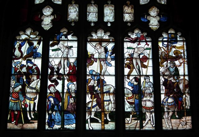
This stained glass window comes from Fairford church in Gloucestershire, a building that was rebuilt between about 1490 and 1510. The set of windows here is the most complete ensemble of late-medieval windows in any English parish church and is probably from the workshop of Barnard Flower, who worked on such high-profile projects as Henry VII’s Chapel in Westminster Abbey and the chapel of King’s College, Cambridge. These windows are among the glories of English art.

Jesus is shown in the central panel. The Roman centurion (called Longinus in some traditions) pierces his side with his spear, an incident described in the Gospel of John, who records that both blood and water flowed from Christ’s side. There is no trace now of blood and water (symbolic among other things of Jesus’ humanity and deity, and of his sacrifice and baptism) in the image in the window – the point of the spear seems to be entering the flesh, though, and perhaps the blood and the water have been lost to time.

In the panel to the left of the centre is the first thief, who is repentant, and on whom an angel looks down. At the base of his cross is the Virgin Mary, supported by Mary the wife of Clopas. Mary Magdalen, with her long hair and pot of ointment, is with them, and gazes at the figure of Jesus. In the panel to the right of the centre is the second, unrepentant, thief, who is accompanied by a devil, a figure with red skin (the devils in the Last Judgement window at Fairford are also red) and grayish, bat-like wings, hovering above the thief’s head. More Roman soldiers occupy the outer panels, and the bearded gesticulating figure on horseback in the left-hand panel is Pontius Pilate (another lower panel, not shown in my photograph, depicts him washing his hands).

There is one other important figure in this window, the foot soldier with the red hose on the bottom left, who is made to stand out with his patterned and brightly coloured clothes. Like many other figures in the window, his gaze is directed straight at Christ. Unlike the others, his collar bears an inscription: ‘IO SAVELE’, which is likely to be a shortened form of Sir John Savile, an associate of King Henry VII. His naming and his position suggest that he was the donor of the windows. His was a noble gift.

This beautiful window is a lovely example of the stained-glass-maker’s art at the point in history where, in England, the Middle Ages are waning and the Renaissance is arriving at last. It combines the traditional rich colours of medieval glass (the blues of Mary’s dress, the deep reds of the some of the solders’ garments, and so on) with sensitive drawing of the faces and lively poses. From the pointing Pilate to the hovering devil, from the observant soldiers to the caring Maries, there is a lot of life in this scene of execution. There is also a careful focus on the main figure, with the pointing hands, the spear, Savile’s gaze, and even the tilt of the flanking crosses, leading our eye towards Jesus. This is also, of course, the church’s east window, in the prime position above the altar, so the architecture and layout of the church draws us to this focal point in the building and the Christian story.

Thursday, December 23, 2010

Huish Episcopi, Somerset


Season's greetings

The more medieval parish churches I visit, the more I’m struck by the way their architecture and decoration varies form region to region. Often this is a matter of building materials, but just as frequently it’s a question of some local preference for a specific kind of feature or visual effect. And sometimes, this preference produces work of such quality that it stands out from the crowd – the graceful stone spires of Northamptonshire, the extraordinary decorative carving of the small Romanesque churches of Herefordshire, the woodwork – screens, font covers, angel-crowded roofs – of East Anglia are all memorable examples. So are the wonderful late-medieval towers of Somerset, of which Huish Episcopi is one of my favourite examples.

These tall and elaborate towers, built in the 15th century, dominate town centres and sometimes surprisingly small villages. They mostly follow a similar pattern, on which the masons played subtle variations. There is a large window above the doorway; above that, storeys are separated by bands of carving, and the upper levels have openings that look like windows but contain pierced stonework to allow the sound of the bells to carry. There are sometimes niches for statues. The tower is crowned with a lace-like openwork parapet and slender pinnacles. The tower at Huish Episcopi has all these features, arranged in a beautiful balance, so that we look up in admiration. The 100-foot tower is rather big for the church it crowns, but, no matter, it takes the breath away.


The interior of this church has one treasure from a later era that also stops visitors in their tracks. This is the stained-glass window of the Nativity, designed by Edward Burne-Jones and produced in the workshop of William Morris. Crowded round with onlooking and music-making angels, Mary reclines on the straw of the stable, cradling the infant Jesus in her arms. The Magi wait on the left to present their gifts. It’s an unusual composition, dominated by the pale robes and pinkish wings of the host of angels, topped by the stable roof and the hint of a starry sky, and the elongated figures are very much of their time. If the recumbent Mary seems odd to our eyes, she has a long pedigree: there are examples of this posture in Nativity scenes in medieval stained glass in Chartres and Cologne, worthy sources of inspiration for a window in this noble building crowned with its wonderful tower.

I hope you’ve enjoyed the blog this year. Season’s greetings to you all.

* * * *

Note: A commenter has pointed out that the Mary is often portrayed in a recumbent posture in Byzantine art. There are a couple of examples here.

Wednesday, July 21, 2010

Norwich


Colour and light

Here’s a rare survival. Victorian shop windows could be a riot of colour and lettering, and examples like Smith’s umbrella shop in London, subject of an earlier post, hold the attention of anyone interested in the history of lettering or retailing. This Norwich shop is different. Instead of the lettering, what remains to catch our eye here is some of the old stained glass. Victorian shop designers were aware that there was a ‘dead’ area of the window at the top. Goods displayed too high would not be noticed, so how did one use this upper area of the window? One solution was to divide it off with a horizontal glazing bar (called a transom) and glaze the upper section (known as the transom light) with stained glass. So it could glitter with colour, and catch the eye in a different way.

The Victorians used stained glass a lot – not just in churches, where we’re used to seeing it, but also in domestic front doors, in schools, and in shop windows, where it must have glowed beautifully at night. Much of this glass has vanished as features have been replaced and facades made over. What remains might not be the best of the Victorian glazier’s art (that usually was reserved for churches) it’s good to see this example still pleasing the eye. Pleasing it rather more, perhaps, than the rather routine display of stickers and notices in the main part of the window.

* * *

Apologies to readers who saw a discarded version of an older post, which was here, briefly, in error. Those wishing to read this post, about a house in Stratford, can find it here.

Friday, March 12, 2010

Tudeley, Kent


Through the paths of the seas

I usually blog about buildings I’ve seen or visited recently, but today I’m breaking this rule to turn your attention to a church I visited years ago, but which I’ve been reminded of a couple of times in the last few weeks. It’s the church of All Saints, Tudeley and this unassuming building is remarkable because it contains a complete set of twelve windows designed by Marc Chagall.

In 1963, Sarah, the daughter of Sir Henry and Lady d’Avigdor Goldsmid, was killed in a sailing accident at the age of 21. The family commissioned Chagall to create an east window for the church as a memorial to Sarah, and it was installed in 1967. Subsequent commissions led to all the other windows in the building being reglazed with magnificent Chagall glass.


In the east window, a girl floats among blue waves, almost as if cradled on the water. Mourners are beside her, and there is a vision of the Crucifixion and angels above. To the right, a ladder connects the two parts of the scene, and a figure climbs the ladder towards Christ. There’s a tremendous strength here – the figures don’t flirt with sentimentality as Chagall sometimes seems to me to do – and the way the artist has used the shapes of the individual pieces of glass to suggest the swirling waves works superbly. You’d not think that Chagall turned to glass design towards the end of his life. These windows are the work of a master.

The combination of blues and yellows in the east window sets the tone for the rest of the glass, which is predominantly blue, and, in the nave’s south wall, yellow, to invite and complement the sun’s rays. It’s impossible to describe the effect of the Chagall windows, with their birds, figures, and angels. You have to visit the place yourself and experience the visual immersion in blue, and, if you are fortunate, the warming yellow rays of the sun.

Further illumination and interest can also be had from visiting an exhibition, currently on at Mascalls Galley in Paddock Wood, which includes Chagall’s designs for the Tudeley windows and a number of representations of the Crucifixion by British artists from Eric Gill to Tracey Emin.

There is more information about the exhibition here and about the church here.

Tuesday, December 29, 2009

Great Malvern, Worcestershire


A cold coming

Although England has thousands of churches dating from the Middle Ages, very few of them have more than a handful of fragments of medieval stained glass. The few places where there are substantial amounts of medieval glass – such as York Minster and the parish church of Fairford in Gloucestershire – are famous. One of the less well known places to admire the art of the Gothic glaziers is Malvern Priory.

The 15th-century stained glass in this building is some of the best English medieval glass to have survived. We do not know who made it, but similarities have been spotted with one of the windows in York Minster, the work of a glazier called John Thornton of Coventry. Whoever created the Malvern windows, they are the work of a master.

This Adoration of the Magi is one scene from the collection. It is a good example technically because it shows the way the 15th-century glaziers used lots of pale glass, so that plenty of sunlight got into the building, but highlighted these areas with rich accents of more deeply coloured glass, especially red and blue.

Mary sits with the Christ child on her lap and one of the kings, dressed in a rich red, fur-trimmed mantle over a blue tunic, kneels before them. He has removed his crown, which lies on the ground at the Virgin’s feet, and has taken off the lid of the cup he carries, revealing his to be the gift of gold. The infant Jesus reaches out for the gift with his left hand while raising his right in blessing. Behind, the other two Magi wait their turn, one in the act of removing his crown, the other raising his left hand. Joseph stands behind Mary and the thatched roof of the stable and the distant towers of a city make up the background. Shining with irregular rays that suggest its twinkling, the star completes the composition.

There is so much in this image, so many details that engage the viewer and encourage one to look for more. The faces, the interesting forms of the headgear of the Magi; the different-shaped vessels in which they bring their gifts; the way in which a cross has been concealed in the detail of the stable roof covering; the ermine trimming of many of the garments; the architecture of the distant city – all these are details to ponder in this moving depiction of a familiar subject, one that takes us straight back to the medieval world.