Showing posts with label Yorkshire. Show all posts

Tuesday, October 14, 2025

Hull, East Yorkshire

Church side, market side

On the street called North Church Side, hard by Hull’s impressive medieval Minster, is the city’s Edwardian Market Hall. The building houses a market behind the row of ground-floor arches while the upper floor was designed to accommodate a corn exchange and a venue for concerts. In adopting this multi-purpose structure, the building is in the line of countless much older market buildings with an open market below and a meeting room or council chamber above. This Hull example also has a landmark tower – market proprietors and stallholders like towers that guide customers to the goods on offer. This tower, with its open upper section, concave curved cornice, cupola, and tiny lantern, has a baroque feel to it.

However, the main market building leaves the Edwardian baroque behind. Here the architect called on an array of motifs – the large windows with iron balconies, carved panels and cartouches, an area of banded stone and brick, a parapet with a segmental dip in each bay, and above all a doorway with an extraordinarily tall and etiolated keystone (see my photograph below), which, listed like this, suggest a mish-mash but which come together to make a satisfying whole. The person responsible for the design was Joseph Henry HIrst, a prominent local architect who could do grandiose baroque when required (his design for Hull City Hall is an example), but could also produce quaint half-timbered work (as at Carnegie Library, Hull).

The sort of mish-mash he devised for the market is usually referred to as ‘Edwardian Free Style’. It’s not as over the top as full-blown Edwardian baroque can be, not as restrained as the Jacobean revival that’s sometimes used for large buildings of the period. It has an unbuttoned quality that combines with the practical, usable market space to produce a good working building, something a great mercantile city could be and still can be proud of. A century ago, it must have buzzed with business; when we were there it still seemed well used.
Hull, Market Hall, doorway, serene in spite of notices and barriers


Wednesday, October 8, 2025

Hull, East Yorkshire


Names and textures, 1

One of the first things I noticed on arriving in Hull back in July is that the city has some attractive old street name signs. I quickly learned that it also has an extraordinary variety of styles of these signs, probably representing every period from the 19th century to the current decade. This is hardly surprising. For one thing, Hull sustained severe damage from bombing during World War II. For another, it has been a dynamic, developing place, responding to highs and lows, for much of its history. Here’s one example of an early sign in a street I walked along very soon after I arrived.

What a characterful sign this is, and how well it complements the texture of the brick wall to which it’s attached. Its shape, a long rectangle (naturally), cut off at the corners by concave curves, is one that was popular in the 19th and early-20th centuries in many British towns. I’ve noticed signs of a similar shape in places such Louth in Lincolnshire. But signs like the one in Louth are heavy objects, made of thick cast iron, which project visibly from the wall surface and are attached to it by screws that pass through the sign into the brickwork. This one in Hull, by contrast, is much flatter and is fixed in place by screws and washers set around the edge of the sign.

What really caught my eye, though, was the lettering, Most of the letters are of a standard form used by the Victorians on signs, capital letters that have serifs* with a slight curve where they join the main strokes of the letter. The letters also display a notable contrast between the widths of the strokes – thick verticals and thin horizontals. This style gives the letter-designer or sign-writer a particular challenge when it comes to the most curvaceous letters, especially ’S’. In this sign both examples of the letter ’S’ have small serifs that rest slightly above the base line while the lower part of the curve sits a fraction below, giving the letter a slightly free-floating look that I find charming.† The whole sign, I think, looks good on a background of brickwork and sash windows, providing a small asset that’s worth more than a passing glance.

- - - - -

* A little lettering terminology. Serif: the tiny strokes at the ends of the main strokes of letters. Base line: the imaginary line on which the bottom of each letter sits.

† It’s traditional in sign-writing it was and is normal to place the bottom of a curvy letter such as S or O very slightly below the base line; if it sits on the base line itself, it looks in practice as if it’s floating a little too high. The details of the sign will be clearer if you click on the image to enlarge it. 

Saturday, October 4, 2025

Hull, East Yorkshire

Suit you, 2

In the centre of Hull, strolling around on my visit back in the summer, I found Hepworth’s Arcade, a small shopping development of 1894–5. It’s modest, but well detailed, from the glass roof in the form of a barrel vault supported on openwork iron arches (one such arch is visible in my photograph), through the decorated frieze and fluted pilasters of the upper floor, to the small shop fronts at ground level. The name of the arcade is displayed inside as well as out, to remind us that the development was built for Joseph Hepworth, the tailor from Leeds who pioneered the business of supplying reasonably priced made-to-measure suits using a national network of shops.

This is not a grand interior like the magnificent one in Hepworth’s home city designed by the theatre architect Frank Matcham, but local firm Gelder and Kitchen did a good job that has stood the test of time. The development was no doubt a business venture for Hepworth, but he would also have liked the idea that his name would be remembered for more than his large chain of clothes stores. Perhaps this was shrewd, since in the 1980s the Hepworth business metamorphosed into the chain now called Next, while the arcade still bears the Hepworth name.

There is still a men’s clothes shop in the arcade too. It’s called Beasley’s and it has a separate hat shop opposite its main premises. A hat shop: these are rare beasts nowadays. I celebrated its presence by buying myself a straw hat to replace one I’ve had for about 40 years. On my way out into the street I noticed a bit of Hepworth memorabilia: the large and colourful sign advertising their company. I don’t know the age of the sign but its range of traditional letterforms, its lavish scrolls, and the pointing hand (neatly jacketed and shirted of course), suggest some time fairly on in the history of the arcade. It’ll suit me.


Wednesday, October 1, 2025

Hull, East Yorkshire

Suit you, 1

My visit to Hull back in July turned out to be rather provisional. Faced with just a day in a very large city, I concentrated on strolling around, looking at as much as I could, but resisting the temptation to linger too long or to visit museums. I soon decided that this was a place I’d have to come back to. Nevertheless, a number of buildings, large and small, held my attention. Here’s one that did so by sheer size.

As readers will immediately see, this building began life as a branch of Burton’s, the tailor, in the 1930s. I have gone for a photograph showing the whole thing, in all its vastness, but even so the sign at the top of the building displaying the company’s name can be seen clearly (you can click on the image to enlarge it). By 1935, the year this branch opened, Burton’s already had a history going back several decades. Its founder, Meshe David Osinsky, was born in what is now Lithuania and emigrated to the UK in 1900. He eventually changed his name to Montague Burton, and was one of the entrepreneurs who revolutionised the business of men’s outfitting – like his forerunners Hepworth’s, he offered made-to-measure men’s suits at affordable prices. A customer would come to one of his shop, get measured up, and select a fabric and style, then the suit would be made at one of Burton’s factories. The business expanded quickly, because Burton made a deal to manufacture military uniforms during World War I – and his success continued when his branches became a go-to source of the suits soldiers bought when demobilised from the army. By 1939 he had 595 shops.

Burton knew that impressive shop fronts were good advertising. It wasn’t just the long shop windows, but the tall buildings, mostly specially designed by an in-house architect – Harry Wilson in the case of this Hull branch. By the 1930s, Burton had fully embraced Art Deco, and his stores often came with polished black granite facades, tall, metal-framed windows, and jazzy details like the V-patters above the upper windows, the pair of central gold pilasters, and the moderne balconies of the middle section of windows. The company name takes pride of place. Though hard to see in my photograph, there’s a diagonal line of script to the left of the ‘B’, which is the owner’s first name, so that the whole panel reads, ‘Montague Burton The tailor of taste’. What was behind all those upper windows? Not men’s clothes. Burton had all the retail space he needed on the ground floor. Upstairs in a large Burton’s there was usually a room with billiard tables, to attract potential customs to the building. The rest of the upper floors were let out as offices, bringing in more revenue.

When I saw the building, it was obvious that it had recently been restored, but I wasn’t clear how much of this impressive facade had been replaced. It turns out that a lot of the granite had been damaged and has been replaced with material from the same quarry as the original stone. Defective window frames have been renewed and shop fronts reconstructed. And it does look impressive, and an improvement on the tired frontage that it had become. At the time of writing, the building is on the market, to let for retail or restaurant use (the ground floor) and for ‘mixed use’ (the upper floors). One hopes that the old Burton’s will be successful in its new life.

Wednesday, June 18, 2025

Saltaire, West Yorkshire

Well schooled

The industrialist Titus Salt planned his workers’ village with public buildings that were both visually impressive and well designed for their intended purpose. If they proved less than adequate, Salt and his descendants tried to put things right, something that’s exemplified by one of the most impressive of all the village’s structures, the school on Victoria Road, built in 1869. From the outside, the architecture is palatial – there’s a statement being made here about the importance of eduction. Inside, the classrooms were well appointed and there was space for 750 pupils, with the older girls and boys taught separately in rooms on either side of the building and ‘mixed infants’ in a room in the middle, in accordance with the ideas of the time.

The Italianate architecture is kitted out with a full complement of columned loggias, round-headed windows, overhanging eaves, and an imposing bell turret (with a rather small but no doubt effective school bell). What’s more, this structure is richly carved. The central section displays Salt’s coat of arms within a roundel surrounded by laurel leaves and scrolls; to left and right of these elements are relief carvings of woolly creatures. These are alpacas, a reminder that Salt was one of the first in Britain to work with alpaca wool, creating alpaca cloth that became much sought-after. The use of this wool was the key to Salt’s success. No wonder he wanted to celebrate the Peruvian creatures, but in doing so he was providing an instant lesson for the school’s pupils – that’s where the wool comes from, that’s what gives your father employment, that’s why you live here. The bell turret is also richly carved – a boy, a girl, and a globe can be made out beneath its roof.

This imposing building with its lovely carvings was soon outgrown by Saltaire’s burgeoning population. The Salt family lobbied for a new school, and by 1878 a new one had been built, not as magnificent architecturally, but big enough to cope with the demand. The original school remains in use and is now part of Shipley College.
Saltaire school, detail of bell turret and pediment

Thursday, June 12, 2025

Bradford, West Yorkshire

Packing a punch

Among the merchants’ buildings of Bradford’s Little Germany, the Thornton, Homan warehouse in my previous post stands out as one of the most imposing and ornamental. I thought I’d post a slightly less ornate, but still impressive, example, now known as Caspian House but originally built as the headquarters of Delius and Company. The Delius family had lived for several generations in the German Rhineland before Julius Delius moved to Bradford to develop his career as a cloth merchant, going into partnership with Charles Speyer to form Speyer, Delius & Co in 1853. Julius is best known today as the father of Frederick Delius, who gave up a place in the family firm to become one of England’s most famous 20th-century composers. By the early 1870s, Julius was a successful businessman who could build a substantial new warehouse* on a corner site in East Parade. It was constructed in 1873 to designs by Eli Milnes (1830–99), a local architect who, with his partner Charles France, was responsible for numerous buildings in Little Germany and the wider city of Bradford.

Like several of the Little Germany warehouses, the Delius building has a corner door embellished with rich carving – a roll-moulded arch covered with carved leaves, a tympanum with a fan-like design, and scrolls filling the spandrels above. The door itself has seen better days, but its scale gives one an idea of how impressive the entrance once must have been.† The doorway is by far the most ornate part of the building and the upper floors are very plain indeed. But a considerable effort was expended on the masonry of the lowest floor, in effect a semi-basement that diminishes in apparent size because of the building’s sloping site. This masonry is made up of alternate courses of pulvinated (i.e. convex-profiled) and reeded (vertically marked) stone. This is very striking when viewed from the pavement. Because the street is narrow, it’s actually not easy to look at the upper floors without standing in the middle of the road, so, as in many Little Germany buildings, the architect concentrated on the lower levels, which are most able to make a visual impact. The geometrical designs of the wrought-iron window grilles add to the effect. From the pavement level, Mr Delius’s building packs a punch.

- - - - -

* I call these buildings warehouses, although they actually also included office accommodation.

† Click on the image to enlarge it. Yes, that seems to be Mr Bean on the door. I think he is left over from a time when the building was used for exhibitions and installations.

Delius building, Bradford, lower wall detail

Saturday, June 7, 2025

Bradford, West Yorkshire

Palace of commerce

Architecturally one of the most rewarding areas of Bradford is the enclave in the city centre known as ‘Little Germany’. This is a network of narrow streets lined with Victorian warehouses that were originally occupied by companies in the textile business. Many of these buildings are five or six storeys high, so they make a dramatic impression in the narrow streets; their size also makes them difficult to photograph. Many of the owners were of German heritage and sent cloth across the Channel to their homeland and to other European countries. But this was not always the case. The corner block in my first photograph was the premises of Thornton, Homan, a local firm that was proud of its extensive trading network – its goods went as far afield as America and China.

Thornton, Homan’s building is typical of the more imposing warehouses in this part of the city. They commissioned Bradford’s most prominent architectural firm, Lockwood and Mawson, to design it and it was built in 1871, towards the end of the main building phase in this district. The style is broadly Italianate, producing something of the effect of a Renaissance palazzo, with a carefully detailed ground floor, reducing amounts of ornament further up, and a heavy overhanging cornice at the top.

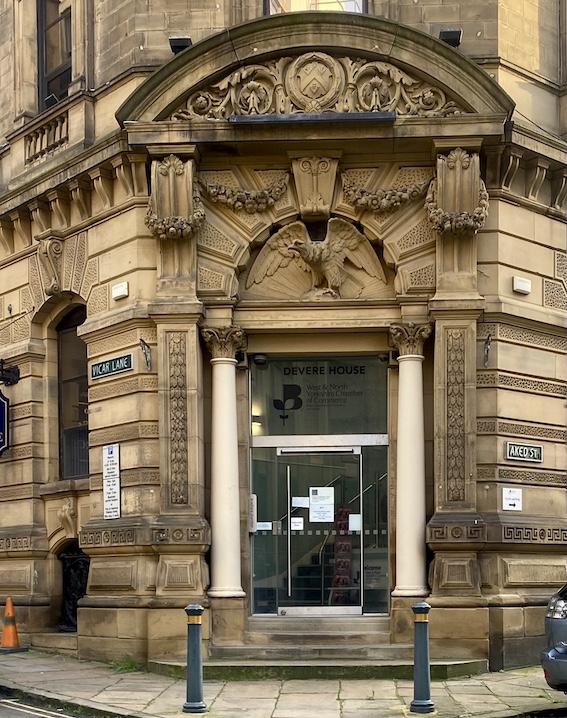
The doorway is the most outstanding feature. This was not only a utilitarian building for storing cloth, but also a showcase, where customers could come and inspect the wares, and so the entrance is designed to impress. As in several other buildings in Little Germany, this entrance is set on the corner, making it highly visible as you approach it. The doorway is dominated by the semi-circular tympanum above the door with its large carved eagle, a reminder of the company’s close relationship with the USA. But the rest of the entrance is a riot of carved decoration – vine leaves in the panels on either side of the entrance, classical columns next to these panels, massive blocks making up the arch above the door (partly obscured by carved swags of fruit and flowers), foliate scrolls and a coat of arms in the curved pediment above.

My lower picture also shows the way in which the ground floor walls are built with large rusticated* blocks of stone punctuated by horizontal bands carved with vermiculation.† The windows have massive blocks to the arches (smaller versions of those above the doorway) and a band of Greek key decoration lower down. Not all the Bradford warehouses were as grand or as decorative as this one – the example in the foreground is much plainer. The Thornton, Homan building shows what Bradford’s architects are builders could do with a generous budget and a client who wanted to make their architectural mark. They succeeded.

- - - - -

* Rusticated: masonry with extra deep joints between the blocks of stone.

† Vermiculation, part of the vocabulary of classical architecture: carved ornament designed to make the stone look as if parts of it have been eaten away by worms.
Thornton, Homan building, Bradford, main doorway

Tuesday, November 12, 2024

Halifax, West Yorkshire

Looking up in Halifax

Looking up in the centre of Halifax, you quickly realise that many of the town’s shops were rebuilt, on a grand scale in the late-Victorian period. I was particularly struck by a number of streets such as Southgate and Market Street. The clue is in the latter name – this is a block that contains the town’s covered Borough Market. From the streets (especially the two streets I’ve named) the architecture is very imposing, punctuated as it is with turrets, big semicircular windows, tiny windows topped with pediments, variations on the classical orders, and arches with rusticated stone blocks. There’s more than a touch of French Renaissance about all this, but it’s pumped-up French Renaissance, and Nikolaus Pevsner, in the first edition of his Buildings of England volume on West Yorkshire, was rather snooty about it: ‘in an undisciplined French Renaissance style,’ he noted.

And yet Pevsner was a greater invoker of the Zeitgeist. He often praised architecture than reflected the moods and manners of its time and this building surely reflects the confidence and flamboyance of the era in which it was built. When you get inside the market, though, the place lacks the size and theatricality of, say, the great arcades in Leeds. Everything is on a smaller scale, but there’s still an impressive iron and glass roof, with a dome in the middle, which does a good job of getting light into the market, bounded as it is on all four sides by the French Renaissance shops. Those who look up see clear glass (5850 square metres of it), fan-shaped windows with iron tracery, the octagonal dome itself, and a small forest of iron columns holding everything up. This is where the discipline is in this building – the discipline of good engineering that makes everything fit together in a neat and well balanced way and where the Vitruvian virtues of firmitas, utilitas and venustas (strength, utility and beauty) are very much in evidence. The local architects, Leeming and Leeming, did a good job in the 1890s, and their building has stood the test of time: it still seems well used.*

- - - - -

* There’s more on the history of the market here.


Saturday, November 9, 2024

Huddersfield, West Yorkshire

Attention! Authority!

Regular readers of this blog will be aware that the signs of yesteryear are one of my perennial obsessions. Old signage, especially in the form of signs attached to buildings, has cropped up in my posts many times over the years, whether on shop fronts, in railway stations, or down dark alleys. As a pendant to my previous post about the goods warehouse next to Huddersfield station, then, here is a sign (clicking on it should enlarge the picture) attached to that building.

As on previous occasions, I’m struck by the design and materials as well as the language of the message. Here the material is cast iron and the letterform is a plain, bold, sans-serif, all in capitals. That’s just what one expects on a blunt, no-nonsense Victorian notice, and the language too is in some ways very much of its time. Only the ‘PROPERLY APPOINTED COMPANYS SERVANTS’ (no bothering with apostrophes here, no pausing to question whether some of the company’s servants are improperly appointed) may work all the impressive machinery used in and around the station. The company’s servants may operate the capstans and cranes, but if the rest of us go anywhere near them we’ll be interfering with them, and woe betide us. And this decree is made ‘BY ORDER’, the once all-pervasive invocation of nameless and imperious authority. No point in asking (as I remember doing as a small boy) ‘Whose order?’. That sign-off means ‘obey, or else’. The sneer of cold command. The shadow of the omnipotent factory owner or railway company director. I took my photograph and withdrew with dignity, looking most unlike someone who would dream of interfering with a hydraulic crane.

Wednesday, November 6, 2024

Huddersfield, West Yorkshire

The great and the goods

Huddersfield station (see my previous post) had imposing buildings for passengers, but a lot of its traffic carried goods. As a result, its goods yard acquired two warehouses, the first, a plain stone building, conventionally built with load-bearing stone walls, and the one in my picture, an enormous structure held up by internal cast-iron columns with an outer ‘skin’ of red and blue bricks.

This monster storage facility was built in 1885, cost £100,000,* and came with its own built-in wagon hoist. The part of the building that protrudes from the facade at the far end, supported by large cast-iron Doric columns, contained this hoist. The mechanism used hydraulic power to raise railway wagons to an upper floor for loading and unloading. Once at the upper level, the wagons could be moved around on internal tracks using electric power, thanks to overhead wires like those supplying modern electric trains. There were also internal hoists and capstans for moving the unloaded goods around, and separating it on to the different floors, each of which was allocated to a particular commodity – textiles, grain, potatoes, miscellaneous goods.

The building has an interesting past but a challenging future. Recent years have seen a roof replacement, and works such as window and door replacements to conservation standards, and work on the interiors with the aim of making them fit for office accommodation and other uses. Marrying such diverse requirements as UK Net Zero targets, thermal efficiency and conservation standards is part of the challenge. But at least the building is being cared for and plans are being made for its future life.
 
- - - - -

* There are different ways of calculating the value of historical sums of money, but the Bank of England’s inflation calculator puts the value of goods and services costing £100,000 in 1885 at £10,764,769.09 in 2024.

Wednesday, October 30, 2024

Huddersfield, West Yorkshire

Statement station

Railway station architecture developed during the rail boom of the 1840s and its heyday ended as the 19th century came to its close. It thus spanned the high Victorian period, when British architecture was at its most varied and eclectic. So railway stations, which after all range from vast termini in major cities to tiny halts in the middle of nowhere, can be in any style, especially when we think of the buildings beyond the standard railway structures of train sheds and platform canopies, which developed their own kinds of shapes and forms. Stations can be Gothic extravaganzas like London’s St Pancras or pared-down engineering masterpieces like King’s Cross; they can be cottagey creations like Matlock Bath, fantasias of decorative ironwork like Great Malvern, or tiny corrugated-iron huts like many stations on Great Western branch lines. Or they can be like Huddersfield, statement stations, pinnacles of proprietorial pride in the most correct classical style.

John Betjeman called the front of Huddersfield station the most splendid station facade in England. It was designed by the York-based architect J. P. Pritchard, and opened in 1847. The frontage is actually much longer than what can be seen in my photograph above: on either side of the grand porticoed central structure are nine-bay Corinthian colonnades to which are attached end pavilions, much smaller than the central bock and of one storey, but still impressively classical (see photograph below). The central block itself, with its giant Corinthian columns and rows of windows, would not look out of place as a country house surrounded by acres of parkland.

There are two reasons for the size and elaboration of this station. Firstly, it originally served two separate railway companies whose lines met here: the Huddersfield and Manchester Railway and the Lancashire and Yorkshire Railway.* The end pavilions were built as booking offices for these two companies, while the central section was originally a hotel. Eventually the combined booking offices were accommodated in the central building and the pavilions were given over to buffets and bars. Second, the centre of the town was being largely rebuilt when the station was being planned, and the owners of the manor of Huddersfield (the trustees of the Ramsden family), apparently wanted a grand station to complement the large square that was planned – the facade extends all the way along one side of this open space. Its neighbours on the square include Britannia Buildings, a palazzo-like block designed as a warehouse, showroom, and offices for woollen manufacturer George Crosland, and the Italianate George Hotel, built soon after the station, no doubt as it became clear that the accommodation in the station building was not adequate to meet the demand. The station’s other famous neighbour is a statue of celebrated Labour Prime Minister Harold Wilson – a local man portrayed striding purposefully along. He’s in silhouette in my photograph,† because on this blog, it’s the architecture that matters.

- - - - -

* For the full story of the amalgamations and taker-overs involved as these lines evolved, see standard reference books. One of the most helpful for those interested in railway architecture is Gordon Biddle, Britain’s Historic Railway Buildings (Oxford University Press, 2003).

† There are plenty of photos of the statue online, for example here.


Sunday, August 23, 2020

Harrogate, Yorkshire


High up in Harrogate 3

Harrogate’s Royal Hall, my third striking skyline structure in the Yorkshire spa town, actually has three towers topping its entrance front, a rather squat square one in the middle and two round ones, one at each end. I like the design of the circular end towers – they’re actually quite plain, but the ring of windows offers ventilation, light – and, presumably, could be illuminated at night too, to add interest to the evening skyline.

This large building fulfilled several functions, as hinted by its original name, still carved into the face: Kursaal. If you look up the word ‘kursaal’ in a dictionary, you’ll find it defined as ‘a public room at a spa’. The word comes from the German, and is made up of words for ‘cure’ and ‘hall’. But curative functions were far form the only ones in most kursaals – balls, entertainments, theatrical performances, those were the kinds of things that might take place there, and today buildings known as kursaals are given over to all kinds of uses, cinemas and theatres being the most common, although the most famous kursaal, the one at Southend-on-Sea, is the main building of an amusement park and was designed to house a range of activities from balls to billiards.

The Kursaal at Harrogate houses a large theatre and performance auditorium. This is surrounded by an ambulatory, a space around which people could stroll and socialise, not the least important function of the building. You could also take the waters here. This multitude of functions, and the building’s size, made it an important one for Harrogate when it was erected in 1903. A competition was organised to find the best design, and well known theatrical architect Frank Matcham was hired to assess the entries and act as consulting architect. He chose a design by an architect called Robert Beale. However, the council judged that Beale’s design wasn’t entirely practical – it couldn’t be built with the available budget – and Matcham was asked to revise the designs. It’s said that the final result owes more to Matcham than Beale.

Matcham is best known for his theatre interiors, which are typically highly ornate and admirably practical. The Royal Hall is certainly both of those things – its highly decorative auditorium is looking good after a lengthy restoration in 2000–2008, and its entrance front is certainly inviting and striking. Like my other Harrogate towers, those of the Royal Hall pinpoint a building that’s both interesting to look at and an asset to the town.


Thursday, August 20, 2020

Harrogate, Yorkshire


High up in Harrogate 2

For the second in my trio of Harrogate towers (all of them from the town’s heyday at the end of the 19th century), I’ve chosen the Westminster Shopping Arcade. When this was built in 1898, shopping arcades were enjoying something of a golden age. The Victorians loved arcades, because they gave pedestrians an escape route from the noise, smell, and bustle of the streets. By presenting themselves as elegant or exclusive, arcades shunned the lower classes and did their best to keep out anyone who might be a pickpocket. Middle-class and upper-class shoppers felt safe and able to shop and window-shop in comfort and at ease. 

An arcade was an interesting challenge for an architect. Inside there would be elegant shopfronts (think rich, dark woods, gilded lettering), and a well-lit central walkway (often achieved with an iron and glass roof). But outside? The frontage was often quite small, and the challenge was to make it look at once inviting and upmarket. Norwich’s Royal Arcade (blogged long ago here) is a small masterpiece in this regard, with its curving frontage and colourful tiles. The architect of the Westminster Arcade, perhaps inspired by the name, with its hint of the Houses of Parliament, went for a faux late-medieval look – stone walls, vaguely Gothic (or Tudor Gothic) windows, battlements, protruding corner turrets, and a wooden ‘belfry’ topped with a pointed spire-like roof. Quite a lot of care was given to the details of the belfry. Openings, shafts, crenellations, and the pattern of the roof slates and leadwork are all designed with care, and the whole thing is topped with a wrought-iron crown and finial, a detail seen on several buildings in these parts. No doubt few shoppers even glanced at all this detail once they’d got used to the building. But it turns what could be an anonymous plain frontage into something memorable. It’s an entertaining addition to Harrogate’s varied skyline and well worth an upward glance.

Monday, August 17, 2020

Harrogate, Yorkshire


High up in Harrogate 1


Although Harrogate was established as a spa by the early-18th century, it had its great boom in the late-19th century, when it became a favoured resort of the upper classes from Britain and abroad. This boom is reflected in the town’s architecture, with various grand buildings put up for the benefit of the rich who frequented the place, and for the profit of the locals – improved spa facilities, theatres, shops, all featured. Many of these buildings were architecturally ornate, and one way for a building to make its mark in this hilly town of dramatic prospects and skylines was for it to incorporate at least one tower. When you walk around Harrogate and look up, the chances are that one of these towers will punctuate the view.

This one is a wonderfully effective piece of architectural advertising. Stained glass lettering that is designed to be lit up at night immediately alerts us to the presence of the Grand Opera House – it’s the Harrogate Theatre now, but the old name survives on the tower. The opera house opened on 13 January 1900 and was designed by Frank Tugwell, who was also the architect of Scarborough’s Futurist Theatre.

Original front-of-house fittings survive inside the building, but what particularly interested me was this tower. It’s a combination of diverse elements – a bit of an eclectic mixture – but the brick parapet, tapering slate roof, lantern with its stained glass, curvy cupola, and wrought-iron crown combine to happy effect, with just the right amount of swagger for a theatre in a prosperous town at the dawn of the famously optimistic Edwardian era.

Architecturally, the tower has another role. Drawn to the building by the lantern, one finds that the tower is actually on a corner, where two merging streets force the building into quite an acute angle.* The octagonal tower, made still more memorable by stone quoins and some pretty circular windows on the upper floor, helps the building turn this tight corner with grace and flair. On the skyline and on the street, it’s a winning bit of Edwardian whimsy.

- - - - -

* There’s a picture of the corner view here.


Tuesday, November 6, 2018

Harrogate, Yorkshire


Hotel town (3)

Seasoned visitors to this blog will know about my liking for three-dimensional inn signs and for swans. These two interests have collided at several places (including Wells and Leighton Buzzard†). Here they are again in Harrogate, in the form of this beautiful 3D sign, nicely posed and modelled. I don’t know how old the sign is: it stands on a post well distanced from the facade and most ‘vintage’ images of the Old Swan Hotel in Harrogate zoom in close and miss out the sign completely.

The inn itself goes back at least to 1777, but much of the current building probably dates from a remodelling during Harrogate’s boom years in the late-19th century. This was when the hotel was upgraded as the Harrogate Hydro and fitted with Turkish baths and other luxuries. Today, as the Old Swan, it looks very spruce and more welcoming than the rearing swan on its sign which, feathers up and bill at the ready, still pleases the swan-loving bystander.

- - - - -

† This avian combination makes me wish that the village of Hanley Swan in Worcestershire had a Buzzard Inn; alas it does not.

Friday, November 2, 2018

Harrogate, Yorkshire


Hotel town (2)

Harrogate’s Crown Hotel, in my previous post, straddles the mid- and late-19th centuries in style, with the restrained classicism of the first period topped and tailed by the more elaborate architecture of the end of the century. The Majestic is from the very turn of the century, and isn’t just grand, but very grand. It’s huge, but the design avoids the impression of any sort of tedious uniformity because the architect, G. D. Martin, packed the facade with architectural incident – bays, balconies, fancy gables, and a great central dome.

Whether you’re in a suite with a balcony, the building seems to say, or in a smaller room up in the mansard roof, you’ll be aware that you’re sharing the experience of staying in a landmark building that makes its mark on the skyline. Placed solidly on a rise behind an expanse of greensward and beside trees and shrubs, it must make you feel that when you arrive here, you’ve really arrived.*

- - - - -

* A short post, this, as some may well be for the next month or so, as I wrestle with work commitments, deadlines, and the gloom of cloudy wintry days and lengthening nights. But the photograph is enough: just look at this pile – it’s almost as wide-angle-lens-defying a monster as the vast civic buildings of Leeds.

Saturday, October 27, 2018

Harrogate, Yorkshire


Hotel town

Harrogate is well supplied with large hotels, many dating to the town’s boom in the late-19th century – or even before, the spa being well established by the early-18th. One witness to the town’s earlier life as a watering places was the traveller redoubtable Celia Fiennes, who visited in 1697 and recorded that she could not force her horse to come near the ’Sulpher or Stincking Spaw, not improperly term’d’.* She tried a couple of quarts of the noxious water and found these doses to be ‘a good sort of Purge if you can hold your breath so as to drink them down’. The hotels are variously classical, Italianate, or a sort of free style with many bays, prominent gables, and mansard roofs. My photograph shows the Crown, which is in a mixture of styles, and has a long history.

Before the current building was put up, there had been a hotel here for a long time, even before the Crown was owned by the Thackwray family form 1740. Lord Byron, who stayed in 1806, was one of the best known guests, and he recorded that his beloved dog Nelson§ had to be put down after attacking a horse in the hotel’s stable yard. The Crown was very convenient for the town’s sulphur well, which only a few yards away and available to all. Joseph Thackwray, however, sunk his own private well in a building adjoining the Crown, greatly reducing the flow from the public well. There was an outcry from other innkeepers, and when a group took legal measures against him, he relented. It is said that this case actually alerted the town to the value both of its wells and of its pleasant environment generally, and so preserved the generous public green spaces that distinguish the place to this day.

In 1847 the Crown was rebuilt in the classical style, and this building remains the core of what’s there now – the 3-bay central section (pilastered, with rectangular windows), flanked by slender 1-bay side wings. This was extended in the Italianate style (bay windows, with round-topped central openings) in 1870, when the two parts were unified by building the balustered parapet across the top of the whole front. almost concealing the low hipped roof behind. There were yet further elaborations, including extensions to the sides in around 1899, including the tower visible on the right. The result is an impressive ensemble, near the centre of the town and not far from the greenery of The Stray. In short, an excellent venue for the festival† I attended two weeks ago and no doubt a fine centre for visitors who’ve been coming for hundreds of years.

- - - - -

* Christopheer Morris (ed.), The Journeys of Celia Fiennes (The Cresset Press, 1947)

§ A mastiff, apparently, not the poet’s most famous dog, the Newfoundland Boatswain.

† The Raworths Harrogate Literature Festival


Tuesday, October 23, 2018

Harrogate, Yorkshire


Yorkshire philanthropy, Yorkshire grit

Last week I spent an enjoyable couple of days in Harrogate, speaking at the excellent Raworth’s Harrogate Literature Festival and spending a lot of time just standing and staring at the architecture. As someone who grew up Cheltenham and has a particular affection for Bath, both spa towns, I’ve always liked the spa town of Harrogate too – though I’ve not been there for years. I was struck by the stone: Harrogate is a stone town, like Bath (and unlike Cheltenham, where the buildings are predominantly stucco). But whereas Bath’s local stone is creamy limestone, the builders of Harrogate used mainly sandstone from the surrounding area, the various millstone grits with picturesque names (Follifoot Grit, Addlethorpe Grit, Upper and Lower Plompton Grit, and Libishaw Sandstone) that give the place its characteristic look. These stones vary in colour from grey to brown, and many look darker than the southern limestones typical of places like Bath. They’re also often finished less smoothly – sometimes rock-faced, sometimes with a flat face but with the chisel’s tool marks left very much visible.

The other thing that marks Harrogate out from those other two great spas is its date. In contrast to Georgian Bath and Regency Cheltenham, Harrogate came into fashion in the second half of the 19th century, so much of its architecture is Victorian. This building, for example, is of dark stone in a mix of masonry finishes – mainly rock-faced stone for the walls, with smooth ashlar around the windows and doors. The trefoiled upper windows and the clock tower with its short spire take their cue from the Gothic style, as is not unusual for for almshouses of the Victorian period. They were built in 1868 by textile manufacture George Rogers, whose business was in Bradford but who had a close connection to Harrogate and intended as houses for elderly people from either place.
Rogers's emblem of hard work, the bee and its hive, is placed above the central doorway. Bees must be in evidence, too, in the courtyard’s lovely garden, which was still showing a little colour in the late-October warmth. That garden, together with the architectural flourish of the spire, suggest that a decent environment was (and is) being valued here, not just a necessary minimum. Victorian values weren’t all bad.

Thursday, May 11, 2017

Brodsworth, South Yorkshire


The privy corner of the garden

It’s not long since we had a lavatory on the blog, but these matters have been in the news recently. English Heritage have just restored a garden privy at Brodsworth Hall, Yorkshire, one of their country houses. Brodsworth is a grand Victorian building that has a place in my affections because the architect was a man called Philip Wilkinson, an otherwise little known figure. I don’t know who designed this privy, though, a brick structure that has been submerged in ivy for years but has now been given a new lease of life by English Heritage.

The simple brick building now has a fine pergola-style porch with a lovely concave roof. Inside the wooden seat seems to be ready and waiting. The big house had flush lavatories by the time this privy was put up in 1864, but the owners, the Thelluson daily, clearly felt the need for a little extra convenience in the garden. They clearly valued their garden and spent plenty of time there. The little building is sheltered by a yew hedge and is now surrounded by sweet-smelling plants – roses, orange blossom and so on – to mask any unpleasant odours. 

This privy was for the use of the family and guests. The only time the servants went in (officially that is) was to clean it and empty the bucket.  No doubt the garden benefitted from what was collected. Buckets of congratulations to English Heritage for preserving this special little building.

- - - - -

The photograph is from the English Heritage website and is presumably Copyright © English Heritage 2017

For more photographs, visit EH’s website here.

Friday, March 4, 2016

Dentdale, Yorkshire


God is in the textures

This week I attended a fascinating day of talks by Suzanne Fagence-Cooper on British neo-Romantic art, particularly the work of Eric Ravilious and John Piper. I was struck especially by the way she brought out Piper’s spiritual quality (his stained glass designs were crucial to this) and how she related the artist’s early abstract work to the later paintings and prints, noting how very often shapes and forms that Piper worked out in abstract pictures in the 1930s underpin his later realistic images of landscapes, buildings, and so on. The same is true, I think, of a lot of Piper’s designs for work in other media, from fabrics to ceramics, a theme Suzanne Fagence-Cooper also touched on.

I came back thinking (yet again) how much I’d learned from Piper’s pictures of buildings. He was fascinated by textures – of stone, plaster, wood, brickwork – and depicted these brilliantly. And his appreciation of texture fed his love of what he called ‘pleasing decay’. ‘Pleasing Decay’  is the title of an article he wrote for the Architectural Review and later reprinted in his lovely book Buildings and Prospects.* Piper wrote other articles that he didn’t reprint, including one on colour and texture in architecture, again published in the Architectural Review.† In it, he describes how one can see the far-gone effects of weathering ‘where derelict and half-derelict buildings become almost one with the flora and geology of the landscape’.

Among the illustrations Piper produced for his article was this one of a ruined cottage in Yorkshire.¶ As ever, Piper tells us a lot with economical means. In a scattering of strokes and lines and a few patches of wash, he depicts areas of peeling render, courses of old stones, bits of rubble masonry, and the chunkier quoins that reinforce the door openings and the corners of the porch. Other lines suggest a diagonal crack in the masonry of the chimney and the weathered edges of the slates. The areas of coloured wash suggest that the left-hand end of the house may be an addition, built partly in brick or perhaps a darker stone.

The Architectural Review’s wartime printing doesn’t do full justice to the picture – and maybe Piper wasn’t fully satisfied with it, because there seems to be another version with brighter light on the front wall and perhaps more subtle textures in the foreground. But with its occasional shimmering highlights and murky sky, the image as printed is still powerful, showing how, in the least regarded, most disposable of buildings texture can be key to appearance and impact. The quality of a surface – its roughness or smoothness, its materials, its tactile presence – mattered to Piper, and his image makes one think about these small but crucial details.

- - - - -

* John Piper, Buildings and Prospects, The Architectural Press, 1948
† John Piper, ‘Colour and Texture’, Architectural Review, Vol 95, No 566, February 1944, pages 51–2
¶ The ruined cottage is a Wordsworthian theme, and Piper quotes Wordsworth's Guide to the Lakes: ‘The dwelling-houses, and contiguous out-houses, are, in many instances, of the colour of the native rock, out of which they have been built...’ and later, ‘whitewash, which...in a few years acquires, by the influence of the weather, a tint at once sober and variegated.’