Showing posts with label pub. Show all posts

Saturday, May 30, 2026

Liverpool, Lime Street

Second among equals

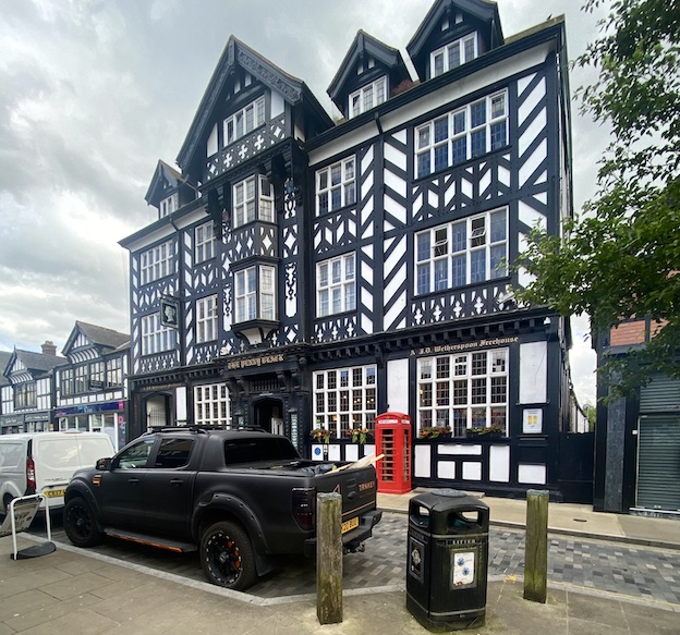
The Vines* is in many ways similar to Liverpool’s magnificent Philharmonic Dining Rooms – it was built for the same brewery, Robert Cain & Sons, and designed by the same architect, local man Walter Thomas. It has a similarly dazzling exterior, although the Vines is baroque, rather than the Philharmonic’s freestyle. The corner site is a gift to a pub architect, and Thomas responded with an eye-catching round tower featuring a dome that seems to grow organically from the masonry below; both tower and dome are festooned with curvaceous frames around windows and pediment-like features that proclaim the design’s baroque heritage. The gables are fancy too, with more curves and finials – it’s a shame that neighbouring buildings mean that it’s hard to see much of this skyline against a background of sky.
Fireplace with beaten metalwork surround and panel depicting Viking ships.

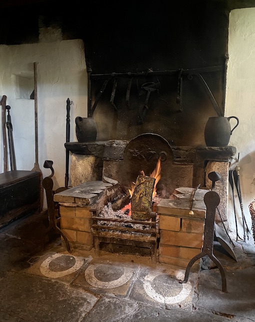
Inside, the pub is very much a sibling of the Philharmonic, with much carved mahogany, polished metalwork, and a mix of stained and etched glass. Some of the metalwork is outstanding – the relief featuring Viking ships above the fireplace in my photograph is a good example.
Privacy screen with oval of stained glass. An original bell push is visible on the wall beyond. 

One feature of the layout is a number of wooden privacy screens with Art Nouveau stained glass panels and lamps mounted on metal uprights set into wooden columns. There are also telling memories of a kind of table service not seen in pubs much now (if at all): small bell pushes that enabled customers to call for service without getting up and going to the bar.
Copper-clad bar front, carved mahogany column and elaborate plaster ceiling

Dating from 1907, this pub is a few years later than the Philharmonic, but they clearly have much in common. One difference is the style of plasterwork in the ceilings. While the Philharmonic recalls the Jacobean era (early-17th century), that at the Vines looks to be inspired by designs from later in the same century. It’s no less impressive, and worth a stop to anyone seeking visual or alcoholic refreshment.†

- - - - -

* The name comes from one Albert Vines, who ran an earlier pub on this site.

Tuesday, May 26, 2026

Liverpool, Hope Street

Listed

When visiting a city I don’t know very well, I make lists of major buildings that I want to see, but once I arrive I’m constantly on the lookout for unexpected delights – the assorted unregarded shopfronts, pubs, sheds and shelters, many of which make up the subject matter for blog posts. In Liverpool, I made a bee-line for two pubs that can hardly be described as ‘unregarded’ – they’re among the most memorable drinking-places in Britain, a must for anyone who revels in the excesses of Victorian or Edwardian architecture and decoration.

The first is the magnificent Philharmonic Dining Rooms, a pub so ornate that my usual blog formula of one (or sometimes two) pictures and a commentary simply isn’t enough. You can see it’s a remarkable place before you enter. The exterior is a riot of freestyle details of 1900, the work of architect Walter Thomas for Liverpool brewers Robert Cain & Sons. Stepped gables, finials, turrets, balconies, and a big protruding corner feature all vie for attention – but somehow manage to cohere into a whole. You see the stand-out feature as you go in: a set of Art Nouveau gates in black iron and gleaming gilded copper.
Gates: by Henry Bloomfield Bare; Liver bird, gazelles, women’s heads, and the motto of Cain’s brewery, Pacem amo (I love peace).

Step inside, and you’re in another world. An intricate plaster ceiling, carved mahogany fittings, a mosaic-fronted bar counter and stained glass panels immediately catch the eye. The sheer quality is obvious at once – the crisp lines of those ceiling pendants, the beauty of the woodwork (many of the joiners also worked on the interiors of great ocean liners, swapping between architectural and marine jobs according to the availability of work). 
Mosaic-fronted bar, mahogany fittings, heraldic stained glass, and Jacobean revival ceiling. The interior work was supervised by George Hall Neale and Arthur Stratton of Liverpool’s School of Architecture and Applied Arts.

Repoussé copper panel by Henry Bloomfield Bare, reflecting the pub’s musical links. 

Then as you grasp your pint and settle at one of the tables, you take in a variety of other decorative touches that go in quality and quantity way beyond what anyone has any right to expect in even an elaborate Victorian gin palace. Repoussé copper panels, etched glass, decorative mirror glass, tiles, a vast room (referred to as the Billiards Room, though some say it may have been a restaurant) with a plaster frieze, even the marbles and tiles of the gents toilets* – there seems to be no end to it.
Plaster frieze in the Billiards Room. Major figure work is by the sculptor Charles John Allen (his friend, a Mrs Ryan, modelled for the caryatid figures); other plasterwork was by a talented Irishman, Pat Honan.

This magnificent pub surpassed the expectations I had when I put it on my list. It’s a testimony to the huge prosperity of Liverpool, which was at its height in 1900 when the Philharmonic was built. I noted when I read about the building in Geoff Brandwood’s excellent book Britain’s Best Real Heritage Pubs, that it was listed by English Heritage at Grade II* – an exceptional rating for a pub. However, I noticed on checking the current listing that it’s now actually listed at Grade I, the top listing reserved for the country’s most exceptional buildings. Rightly so. I’d encourage anyone who likes this kind of thing to put it on their personal list, head to Liverpool, stand themselves a pint, and toast Robert Cain & Sons and the team of architects and craft workers who made this place possible.

- - - - -

* There’s an old post about the lavatories here.

Thursday, May 7, 2026

London, Marylebone Lane


The pub on the corner

Corner sites are favourites for any business that relies on walk-in trade – shops of course, but also pubs. I passed this glowing example on a recent walk from New Bond Street to a meandering, roughly northwestward drift along Marylebone Lane. Every so often the narrow lane opens out at a crossroads or junction and here, at the corner with Bentinck Street was an ideal inn site, with an attractive looking pub catching the afternoon sunlight in pole position.

It’s the Coach Makers Arms, named in honour of a trade once prevalent hereabouts in Marylebone and, as opposed to the only vaguely Jacobean revival architecture of the shop in my previous post, it represents something from the same period (in this case 1901), in a free but more obviously Jacobean style. The early 17th century influence makes itself felt in the proportions of the windows (but not the sashes on some of them); the curving pediment at the top of the Bentinck Street frontage, with the little architectural flourish that pops up at the very top; the entrance canopy with the chubby baluster columns that help to support it; and the flourish of ornament in low relief on the corner of the building above the ground-floor window.

The use of red brick with stone dressings is typical of many buildings in this part of London, so the pub very much looks at home. There was evidence as we passed that there were still plenty of people drinking there at around 4 p.m., sometimes a quiet time after the lunchers have departed and before the after-work early doors trade begins. In this time of challenges for pubs, in terms both of architecture and hospitality, it seems as if this one is getting something right.

Saturday, March 7, 2026

Manchester, Cross Street


Steaks and ale

How good to find, in central Manchester’s Cross Street, a building that looks small but punches above its weight. It’s Mr Thomas’s Chop House, and Geoff Brandwood, in the excellent handbook Britain’s Best Real Heritage Pubs, describes it as ‘an exuberant example of fin de siècle architecture in an ornate Jacobean style’. The walls are a mix of buff terracotta and dark red brick, and the curving bow, the mullioned windows and the elaborate gable all speak of the Jacobean revival. The front of the structure was originally a shop and offices, with the chop house behind, but now the whole of the ground floor is made over to eating and drinking – and indeed must have been so for much of the building’s history, as the interior looks unified in its decoration, down to early features such as tiles.

Looking at the details more closely, a beguiling combination of Jacobean and Art Nouveau becomes apparent. The decoration above the corner entrance, for example, combines a coat of arms topped with a helmet as crest, with a lot of curlicues: so far, so traditional. The mythical birds on either side of the coat of arms could be heraldic but also fit nicely with the Art Nouveau style. So, above all, do the heart-shaped motifs higher up, with the curvaceous bands that enclose them, which curl this way and that in a style that was highly fashionable when this building was designed in 1901.

What a delicious entrance to a chop house. But what, exactly, was a chop house? The usually definition is a pub or restaurant where the main item on the menu was meat in the form of steaks or chops. Originally, there seems to have been a sense of something downmarket about such establishments. In his great 18th-century dictionary, Dr Johnson defined a chop house as ‘a mean house of entertainment, where provision ready dressed is sold’. But by the time Thomas Studd set up in business in the 1860s, things were different. Chop houses were where Manchester’s merchants and factory owners came to meet and discuss business over a nourishing meal. As a form of pub, they were very much male-only premises in the Victorian period.

By the time the current building was put up, Thomas had died but his wife Sarah carried on the business with great success. She also transformed it by admitting women – a revolutionary move which must have caused much discussion. Many women were no doubt grateful, and this has a special resonance in Manchester, home of the Pankhursts. I have read that on International Women’s Day in 2019, the building was renamed Sarah’s Chop House in honour of Sarah Studd, but when I visited last month, the original name had been reinstated. Steaks and ale, I’m pleased to say, are still on the menu.

Monday, September 29, 2025

York Way, London

The ‘Theophrastus effect’

It happens every now and then: you’re walking round a town or district that’s unfamiliar to you, and you notice something – an architectural detail, a combination of colours in the paintwork, a type of sign – that seems more common here than elsewhere. It can be a bit of local distinctiveness like a preference for certain patterns in pargetting, or evidence of a craftworker with notable skills, or just a fashion that has taken hold in a few neighbouring streets. Or maybe it’s just that, as you look, something strikes you and your eye and brain are alerted to other examples nearby. My personal name for this is the Theophrastus effect, because years ago I had to write something about the ancient and some would say obscure Greek writer Theophrastus and suddenly, because I was thinking about him a lot, I began to see references to him everywhere.

Walking around some of the streets near Euston Station the other week, the Theophrastus effect came into play when I started to spot metal lettering positioned over entrances to courtyards, a housing complex, and even a pub. Some of these signs incorporated fancy wrought-iron decoration and a particularly good one, the sign above the entrance to the Lincoln Arms pub, has some superb metalwork.

This is a lovely way to mark the entrance to a hostelry, drawing you into the oddly angled doorway or making a memorable impression if you’re just passing by. The letters aren’t at all bad – maybe the curved ones are less assured than the other letters, but they’re good enough to hold their own. The surrounding wrought-iron spirals, scrolls, and foliage are outstanding, in my opinion. Their inventive curves, some of which scroll, then bend in a different direction, are redolent of Art Nouveau and the way in which the foliate forms overlap the ends of the lettering slightly I find particularly appealing.

This memorable sign certainly made me want to go in, although I had a commitment elsewhere that made this impossible. I intend to go back though, not least because the building next door was covered in scaffolding, making a decent photograph of the whole pub impossible. And because, according to CAMRA,* the Lincoln Arms, which had a phase as a ‘trendy bar’ is now a traditional pub again. How pleasing that this sign has survived the various changes.

- - - - -

* The Campaign for Real Ale, the organisation that has done much to improve the quality of the beer available in British pubs, as well as encouraging improvements in the quality of pubs as a whole.

Friday, July 25, 2025

Hexham, Northumberland


Grapes and glazing

I read online that in Britain the rate of pub closures continues to be high: on average one pub is closing every day. Apart from the loss of places to eat and drink and the disapearance of jobs, this also has an impact on architectural heritage. The more important or spectacular pub buildings are protected by listing, but there are many that, while not significant enough for listing still retain interesting or pleasing features that can disappear with a change of use. So when old pub fittings or decorations survive, I’m usually pleased, and sometimes my pleasure finds expression on this blog.

In Hexham, my eye was caught by some good embossed glass in the windows of the Grapes. Sure enough, the decoration features among other things…grapes. It also bears an unusual wording, ‘Family Department’, which may be clearer if you click on the picture to enlarge it. I’d not seen this wording on a pub before. I wonder if any of my readers know of pubs that describe their separate bars or rooms as departments? I’d be interested to hear from them via the comments page if so.

I assume that these glass windows date to the late-Victorian period. They’d be ruinously expensive to install today, especially the curved glass pieces – there are actually two of these, one on either side of the door. Their imagery (mythical beasts, vases containing plants, scrolls and the eponymous grapes) were produced by a skilled craft worker. In his excellent book Victorian Pubs,* Mark Girouard quotes a remark from an 1898 textbook of glass decoration that shows how common this kind of work once was: ‘there is scarcely a warehouse, a bank, a shipping office, or public building throughout our great towns in which embossed or ornamental glass in some shape or another is not used.’

So much of this has vanished over the years; much of what remains is in pubs. There were at least two different ways of producing these designs on glass. Both involved masking part of the design and applying acids to the unmasked portion. In some more elaborate designs, additional techniques such as brilliant cutting the glass, or applying gilding or coloured paints, were also used, but these were expensive techniques and many pubs, like the Grapes in Hexham, made do with the basic embossed decoration. The result, while calling attention to the pub and also restricting the view in from outside, can be elegant, engaging, and well worth preserving. It says ‘pub’ almost as clearly as a swinging hanging sign.†

- - - - -

* Mark Girouard, Victorian Pubs (Yale University Press, 1984)

† If you’re interested in another example of this kind of glass, see my post of some ten years ago on the Albert pub in Victoria, London.

Wednesday, July 16, 2025

Wooler, Northumberland


In(n) admiration

At first glance the main Wooler seemed, how shall I put it, a somewhat plain vanilla place, but refreshment drew us here and as we made our way across the street towards a coffee shop I was brought up sharp by the Black Bull Inn. There was nothing ordinary about that enormous double-height bow window nor, now I came to think about it, was the whole facade at all bad – those many-paned upper sashes seemed redolent of Arts and Crafts and the careful contrast between the ashlar stonework around the windows and the rougher masonry surrounding it was also quietly impressive. I began to revise my opinion.

Other details confirm that something creative was going on here in c. 1900. The very good downpipe – fancy brackets, elaborate hopper head with relief decoration – is notable. As are the details in the metalwork on the bow window – the gilded nailheads, Tudor rose and fleur de lys, the ornate but not to showy lettering and mongram, and (yes) the date, 1910.* Pevsner confirms that the inn was remodelled in 1910 by George Reavell, a local architect (he went to school in Alnwick and opened his first office there), who was clearly in touch with current fashions. I don’t know much about him but I see from the Northumberland Archives website that his daughter, Mary Proctor Cahill, trained as an architect and joined him in his practice. So as well as a competent designer he was also one of those who opened up a male-dominated profession to women.

I sipped my coffee reflectively, thinking that I should know better than to underestimate a small English town. I recalled the wise words embossed on the cover of Jonathan Meades’s book Museum Without Walls: ‘There is no such thing as a boring place”.† I will return to Wooler and the work of George Reavell in my next post.

- - - - -

* Click on the image to seew the details more clearly. 

†  Jonathan Meades, Museum Without Walls (Unbound, 2012), first hardback edition.

Tuesday, March 18, 2025

Hastings, East Sussex

Local heroes

I have strolled around Hastings on numerous occasions, on my own and with local friends, but in a town of any size there are always things you miss, or things that for what ever reason, your hosts don’t show you. So it was that this time, I was ushered into an unassuming pub, the General Havelock, where I had not been before, to find some of the best Victorian pictorial tiling you could hope to see anywhere. There must have been lots of pubs once with tiled interiors, just as there were many butchers, fishmongers and grocers who favoured this kind of decoration. But changing fashions have seen most of them undergo remodelling and redecoration. The General Havelock has seen many changes too, but four outstanding tiled panels survive.

These pictures in ceramic were produced by a firm called A. T. S. Carter, of Brockley, southeast London, who helpfully signed their work in more than one place. One is a portrait of General Havelock himself, who was well known in the 19th century for his role in recapturing Cawnpore during the Indian Rebellion in 1857. As a result of this action he became a Victorian hero, and there are quite a few streets and pubs named after him. The other panels take local themes, with depictions of the ruined Hastings Castle, of the Battle of Hastings, and of a sea battle between French and English forces, the latter represented by the crew of a Hastings ship called Conqueror.

In the image of the Battle of Hastings, swords, spears, and axes are wielded and arrows fly through the air. Saxons and Normans confront one another fearlessly, and when we look towards the ground we see that they are trampling on those who have fallen. The pub’s layout has changed since the tiles were fitted, with a corridor and small rooms being knocked into one large space, as is so often the case. I believe the tile panels (with the exception of the portrait of Havelock, which is at the entrance) were originally in a corridor. Now they’re the dominating feature of one long wall in the bar and not everyone will find this dramatic stuff entirely relaxing to contemplate when downing beer. But the draughtsmanship and the sheer teaming richness of it is impressive. I’d urge anyone who likes late-Victorian art and decoration to take a look.


Thursday, July 18, 2024

Northwich, Cheshire

When wood works

This building stands out on Northwich’s main shopping street like no other. It’s very large and exhibits the timber-framed structure that is so often seen in other Cheshire towns, such as Nantwich and Chester itself. It has the typical Cheshire elaborate magpie pattern of posts, beams and struts, and there’s a jetty, the arrangement by which an upper floor sticks out above the storey below. It doesn’t take long, though, for one to realise that this, like the pub in my previous post, is not an ancient structure of the Tudor period or earlier. The regularity of the timber work, the windows with their pivoting openings, the tell-tale uniform quality of the timber work – all point to a building of the 19th or 20th-century timber-frame revival, a way of building sometimes called ‘Tudoresque’.

It’s a pub now, but whatever was this dazzling structure originally built for? The clue is in the pub’s name, the Penny Black, the name of the first adhesive postage stamp. This building was originally the the town’s Post Office and it was built in 1914, although it did not actually open until the end of World War I, in 1918. The timber frame was not only a visual homage to this traditional Cheshire style of architecture. It was designed this way so that it could be ‘liftable’.

If liftability is a new concept to you, I should explain that Northwich was one of the centres of England’s salt industry. Underground brine was extracted and boiled in vast pans so that the water evaporated and the remaining salt crystals were gathered and processed for sale. Removing the brine caused voids to appear beneath the ground, and buildings subsided as a result. Suitably built timber-framed structured could be jacked up – lifted – and stabilised, whereas masonry buildings were at risk of severe damage or even complete collapse.

What a triumphant building for an early-20th century Post Office. How unlike Post Offices today, which tend to share space with other retail premises – even in large towns the Post Office occupies some counter space at the back of a shop such as a branch of W. H. Smith. This trend to downsize happened before the current scandals surrounding the false prosecutions and convictions of hundreds of Post Office staff, but these days it looks almost as if the organisation is trying to hide away in these low-budget, low-profile locations. How unlike the situation in 1914, when a building like this could act as a landmark on the high street, a three-dimensional piece of publicity and a premises that was built, in the most challenging geological situation, to last.

Sunday, July 14, 2024

Farndon, Cheshire

In black and white

There are countless timber-framed black and white buildings in Cheshire, some of them late-medieval, some much later. This one, The Raven in Farndon, is said on some websites to have been ‘originally built’ in the 16th century, but the excellent Farndon history website points out that the earliest documentary evidence for the pub is in 1785 and that it does not appear at all on a map of 1735. It’s likely to have 18th-century origins, then, but the present building is clearly late-19th century. Its ‘timber frame’ is actually decorative, being attached to solid walls of brick. People will say it’s a fake, but it’s a very engaging fake, with its pattern of cusps on the three sections between the upper windows (and elsewhere on the building) and its jazzy diagonal timbers in the gable.

My favourite part, though, is the sign. The pattern of plasterwork scrolls and straight lines around the name panel suggests similar patterns in Jacobean ceilings and above 17th-century fireplaces. The stylised raven, though is something else, the plasterer’s or architect’s own idea of conjuring up the eponymous bird in a simplified but graphic form. In its stylised, almost cartoon-like quality, t’s unlike anything I can remember in an inn sign, though my readers might know similar examples. It’s clear, simple, and effective, and it’s odd with such a distinctive sign that after a refurbishment in the late-20th century, the building should have had its name changed to The Farndon. Now it The Raven again, and its sign, not to mention its half-timbered design, look the business.


Wednesday, January 17, 2024

Fulham High Street, London

Still going on

Writing about Hadleigh’s Coffee Tavern in my previous post brought to mind the host of buildings that owe their existence to the temperance movement of the late-19th and early-20th centuries. Coffee Taverns, ‘pubs’ selling Bovril, temperance billiards rooms. And I was reminded that more than a decade ago I’d done a post on this blog about such a building in West London. I re-read my post and thought it was interesting enough for a repost. It’s about the former temperance billiards rooms in Fulham High Street, London, and here’s what I wrote about it in 2012:

It must have been in the 1970s, when Philip Larkin’s Oxford Book of Twentieth Century English Verse came out, that I first read and was moved by a poem by P J Kavanagh called ‘The Temperance Billiards Rooms’. In it, the poet remembers how he used to walk past the Temperance Billiards Rooms with his wife, who died tragically young. Aged just 33, the poet salutes the Billiards Rooms alone. He makes the building stand for continuity, in this moving poem about carrying on after a disaster: ‘it just goes on, as I do too I notice’. But it’s also fragile (‘something so uneconomical’s sure to come down’) and so is the grieving poet. It’s a touching poem, and Kavanagh’s description of the place, ‘in red and green and brown, with porridge-coloured stucco in between and half a child’s top for a dome…it’s like a Protestant mosque!’ has a melancholy humour.

I wonder if this is Kavanagh’s building. It’s now a pub (The Temperance), is repainted a rather sorry dark grey and is offering special deals on cocktails. There’s still a dome, still bits of stucco decoration, still stained glass in red and green, still the hall to the right which must have contained the billiard tables. If it’s not the building in the poem, it’s one very like it. Designed in 1910 by Norman Evans, it was one of several such buildings, built for Temperance Billiard Halls Ltd in northern England and the suburbs of London. Their art nouveau glass and decoration, and the chance of a game of billiards, were meant to attract punters away from the temptations of the demon drink, part of a movement that began in the middle decades of the 19th century and saw a late resurgence in 1900–1910. As late as 1908 there was a bill in Parliament to reduce the number of licenses to sell alcohol and ban the employment of women in pubs, a bill that was vigorously supported by temperance campaigners, and equally loudly decried by others, especially those, such as the Barmaids’ Political Defence League, who stood up for the barmaids who were to lose their jobs. The bill was defeated in the end, and the temperance movement declined.

This billiards hall, at any rate, is still there, although the dark paint spoils what looks it had. It’s also fiendishly difficult to photograph, hemmed in by road signs, wires, aerials, railings, and continuous traffic along the Fulham High Street. The best I could do was to include one of the most interesting vehicles that went past as I stood outside, a Mercedes Benz 280SL that takes us just about back to the 1960s, when Kavanagh wrote his poem. Like him, I’m glad the building is still there, although I cannot, like the poet, say that there are, ‘for all I know men playing billiards temperately in there’.


To which I’d add that a quick look at Google Earth shows that the building still has its dark grey exterior paintwork. Although the colour is far from ideal as a replacement for the ‘porridge’ of Kavanagh’s poem, at least the new use (yes, still a pub called the Temperance, how absurdly wonderful is that?) means the building is still there. To use Kavanagh’s language, I salute the Temperance Billiards Rooms. I salute those who restore and maintain beautiful bits of machinery like the Mercedes 280SL in my photograph. And I salute those who, like the poet, have suffered a bereavement, find themselves going on, and manage to make art in the face of their loss. I’ll drink to that.

* * *

For more about architecture and temperance, see Andrew Davison’s essay ‘”Worthy of the Cause”: The Buildings of the Temperance Movement’ in Geoff Brandwood (ed), Living, Leisure and Law (Spire Books, 2010).

For P J Kavanagh’s account of his loss, see P J Kavanagh, The Perfect Stranger (1966)

The picture at the top of this post may be a little clearer if you click on it to enlarge it.

Saturday, September 16, 2023

Birmingham

Turning a corner, 1

This is one of my favourite buildings that I saw on a stroll around Birmingham’s jewellery quarter a while back. It’s not a factory or anything to do with the jewellery business, however: it was built as a pub at the end of the 1860s, that decade when Victorian architecture became more jazzy, colourful and free than most of what went before. The style of Gothic is described by the Pevsner City Guide to Birmingham as ‘very Ruskinian’. In other words there are lots of pointed arches in rows, built in a polychrome mix of red, white and grey (aka ‘blue’) bricks; there are natty details like the small oriel window at the corner and the octagonal turret just visible in my photograph; and there are twin openings divided by slender shafts with carved capitals. All of these details were in the architectural air at this time thanks to the writings of John Ruskin, whose accounts of Venetian Gothic (in books such as The Stones of Venice, which came out in the early 1850s) were increasingly influential.

So far, so good. Whether Ruskin would have approved of this building is another matter. He seems to have had a downer on the kind of dissipation sometimes associated with pubs and taverns, and on genre artists, such as Jan Steen, who painted tavern scenes. But many of us will take a different view. Why should a pub not have a stunning facade, designed with flair, built with care, and enhancing the streetscape? If places of worship or education can have glorious polychrome brick frontages, why not places of hospitality too? I thoroughly approve, and I approve too of the fact that the building has been restored to make the most of its glorious exterior.

Another thing I admire about this building is the swagger with which it occupies a corner plot that is challenging architecturally. Corner plots are good for business, because a site on a junction allows the building to be seen and approached from several different directions. But a tapering cake-slice of a plot like this one is not always easy when it comes to designing the building – how does the structure ‘turn the corner’ visually, and what do you do with the tiny sliver that faces directly on to the junction? Placing the entrance there can be a good solution. Giving the entrance a bit of emphasis by adding the oriel window above (with its cusp-headed opening to make it extra ornate, a pattern echoed in the window on the upper floor) is highly effective visually. Here’s to Victorian brickwork, ingenuity, and that quality of vigour and distinctiveness they called ‘go’!

Friday, May 26, 2023

Banbury, Oxfordshire


Brush up your Shakes

Some time ago I remember wondering why a shop in Parsons Street in Banbury had a bust of Shakespeare above the window. On my most recent visit, I wondered again, while also smiling at the lucky combination of an old sculpture of Shakespeare next to a sign saying ‘Sheila’s Shakes’: shakes, clearly, without peer.

The answer to my question is the obvious one: there used to be a pub here and it was called the Shakespeare. And so this bust of the bard is added to my collection of three-dimensional pub signs, along with all the White Harts, Swans, Lions, Elephants and Sugar Loaves I’ve noticed over the years. There’s not much to say about the sign. It’s rather crudely made – although generations of paint have probably obscured some of the details, but it has a certain charm about it. And after all, the available early images of the English national poet are hardly great works of art – this one looks as if it has been based on his monument in the chancel of Holy Trinity church at Stratford, a bust which the literary critic John Dover Wilson said made him look like a ‘self-satisfied pork butcher’. The Banbury bust could perhaps do with some of the care and attention lavished on the one in Stratford.

One can trace the pub through various 19th-century directories and census records, which list the innkeeper’s name and mention additional jobs as well as that of publican. For example in 1871 the main occupant was William Reed, stonemason and beer seller; in 1881 it was John Sole, coach builder and innkeeper; in 1901, Maurice Horan, beer house keeper and groom. This range of activities may be an indication of 19th-century Banbury entrepreneurship, but is more likely the result of this being a small pub or beer house, not a big enough business to support a family. One hopes that the business of ’shakes’ is a more prosperous one.

Monday, April 10, 2023

Shipston-on-Stour, Warwickshire

Endangered species

The White Bear in Shipston-on-Stour is one of those old inns with large bay windows and an elliptical arch to one side, leading to a yard where there would have been stables for patrons’ horses, or for horses to draw coaches if the inn served the coaching trade. It’s not, perhaps, one of the most outstanding of such buildings, but it occupies a prominent position in the middle of the town and it’s memorable to me for having this three-dimensional sign, a characterful carved-wood bear, who at the moment is placed on ground level, near the door to welcome guests. The bear no longer does duty as the sole identifying sign: the Donnington Brewery, who own the premises these days, have seen to it that the building also has one of their ‘house style’ black-and-white painted signs too. The old wooden bear stands as a memorial to the time when a simple wordless sign was the best advertisement an inn could have.

As far as I can remember over the years I’ve been passing through Shipston or pausing in its High Street, the bear has spent time out of view, and also time outdoors in a brown, unpainted state. Pavement level is a good place to appreciate the deeply cut lines of his carved fur, and the purposeful pointed cut of his snout. However, he seems to have got knocked about a bit, and I hope his owners find a way of looking after him before he loses more legs, paws, or other appendages. It must be worth conserving him, because a sign like this is still a good advertisement, as well as the kind of thing people like me, who appreciate old buildings, their distinctive details and the folk art that produced great pub signs, both two- and three-dimensional. And because carved animals like this are now an endangered species.

Wednesday, October 5, 2022

Bretforton, Worcestershire

The old ways

Finding myself in the Worcestershire village of Bretforton at a few minutes past 12 noon, I decided to take a quick look in the local pub, The Fleece. It’s a pub I knew about already, because it is owned by the National Trust and very old. The timber-framed building was originally constructed in the 15th century as a farmhouse – online accounts call it a longhouse, that’s to say a traditional type of small farm house with accommodation for humans at one end and for animals at the other, although it could just as likely have been fully occupied by the farmer and his family. It’s not clear to me exactly when it became a pub, but it was enlarged in the 17th century and much of what remains dates to that time. The building was still in the same family, the Byrds, and their descendants remained there until the last of the family, Lola Taplin, left the inn to the National Trust in 1977. It was, I believe, the first working pub in the Trust’s care.

The building was nearly destroyed in 2004, when a spark set alight the thatch that then covered the roof. Such a fire can take hold very quickly and destroy a building with a wooden structure. However, no one was hurt in the blaze and a rapid response from six fire brigade crews, from the landlord, from locals who rallied quickly to remove most of the building’s precious contents, and from the staff of the National Trust, saved much of the building’s structure and many of the contents. It was restored, but with a tiled rather than a thatched roof, and hospitality, which had continued meanwhile in the adjacent barn, was restored too.

The building’s exterior still looks striking, with its simple old sign and ancient woodwork, but the interior is even more special. In many ways it doesn’t look as if it has changed much for a hundred years. There are open fires, old furniture including a marvellous curved settle, and a remarkable collection of old objects – copper jugs, pots, andirons, even a set of handbells. There’s also a fine array of 17th century pewter that reputedly belonged to Oliver Cromwell – he is said to have exchanged it on the way to the Battle of Worcester, but I’m inclined to treat such stories with a pinch of salt.

One extraordinary tradition that I’ve seen in no other pub has been kept up at The Fleece: that of chalking or painting white circles in front of the hearths, to protect the building from witches, who were said to enter down chimneys.* If this seems even more unlikely than the story about Cromwell, I can tell you that such beliefs were prevalent in earlier centuries and in rural areas old traditions died hard. I have a book from the 1940s showing a photograph of a woman adding more whitening to the circles in The Fleece – perhaps it’s Lola Taplin herself. As another drinker observed to me, with a humorous grin, ‘I’ve been coming to this pub for years and I’ve never seen a witch in here, so they must work!’

All in all, The Fleece is a lovely pub, a fine and unique place to while away a little spare time over a pint or I’m told, to come for an evening meal. I have a feeling I’ll be back soon.

- - - - -

* This kind of belief is, of course, a historical can of worms. Prejudice against women who were accused of being witches, often with no grounds at all, sometimes simply because they professed knowledge of traditional healing practices in times before modern, scientific medicine, was rife in earlier centuries.

Saturday, March 26, 2022

Chesterfield, Derbyshire


The way to do it

The Punch Bowl in Chesterfield is a pub, like the White Horse, Chichester in my last post, that uses coloured glass in its decoration. It was built by Chesterfield Brewery in 1931, in a period when street alterations led to a number of new buildings in the town centre. Quite a few of these are half-timbered and the Punch Bowl has a large timber-framed window and gable above its stone ground floor.

But the coloured glazing in a couple of the windows was what really caught my eye. My favourite is this pub sign in glass, a depiction of the traditional glove puppet Mr Punch lying inside a shallow bowl, a personification of the pub name that I’ve seen on the painted signs of other pubs called the Punch Bowl, although I’ve not seen the image done in glass elsewhere. In this window, Punch’s protruding nose and chin, his pointed hat, and his legs and feet are all discernible. Legs and feet are unusual in a glove puppet – the ‘glove’ that conceals the puppeteer’s hand usually renders them irrelevant or inconvenient. Punch always has legs, however, and they hang in front of the glove and if the puppeteer is skilful, he or she can make Punch wave them around in suggestive or amusing ways. Colour and the varying textures of variopus kinds of glass distinguish the different parts of the image. It would be even more striking if there was a strong light behind it – perhaps this was the intended effect when the building was lit up at night.

As more and more pubs close, or modernise away their old decor and character, pub glass gradually disappears. But there are still numerous examples of both coloured and engraved glass in the windows of pubs and former pubs. I hope building owners don’t trash it all – what’s left enlivens our streetscapes, enhances pub interiors, and reminds us of a time when pubs were brasher and often more colourful than they are today. Cheers!

Tuesday, March 22, 2022

Chichester, Sussex


Don’t look up!

I’m always telling people to look up in towns – look at old facades above shopfronts, look at windows, look at old signs, look at roof lines, and so on. But what I should really say is ‘Look everywhere.’ In other words, one is liable to make a mistake if one becomes too preoccupied with looking in a single direction alone. I was reminded of this when walking along South Street in Chichester and admiring the White Horse, once a pub, now a Prezzo. Of course, I’d noticed that the brick frontage of the upper storeys looked Georgian (the building turns out to be much earlier, having been refronted in the 18th century). As I was taking this in, the Resident Wise Woman prompted me: ‘Have you noticed the glass?’. I had not, because I was looking up. From yet another era come the late-19th or early-20th century windows, with coloured glass used to delineate white horses.

This use of glass to decorate or advertise the name of licensed premises was quite common in the late-Victorian period and just after.* Coloured glass was also used to advertise the drinks available – sometimes you can find ‘Beers’ or ‘Wines and Spirits’ picked out in coloured glass lettering. Here it’s just white horses, in various depictions – here, on the move (trotting perhaps) in the fanlight; elsewhere at full gallop, or stationary. There are also white horses with flared legs, to indicate they’re shire or ‘heavy’ horses; there are even horses’ heads in some of the windows. They’re all in a white, almost opaque glass, but are mostly surrounded by patterns and scrolls in a mix of colours including amber, dark red and deep blue: the windows must lookl very appealing when the interior is lit up at night.

So when you’re walking along an urban street, by all means look up, but also look sideways, straight ahead, and down. And try not to do this while on the move – it can lead to pedestrian collisions, and worse! And if you start colliding, people might think you’ve had one or more too many at the White Horse…

- - - - -

* Pub architects also specified elaborate engraved glass. For an example of this, see a post I did a few years ago, here.

Tuesday, September 21, 2021

Buckingham

Hunting the Hart

During our recent stop in Buckingham, the town’s White Hart Hotel was looking particularly attractive with its hanging baskets, so I paused to take the photograph above. I wanted to show not just the flowers but also some detail of the Doric porch, which acts as a platform for the statue of the eponymous white hart with the traditional gold coronet around its neck. Although the White Hart is a very common name for an in or pub in England, relatively few have a three-dimensional image of a stag as their sign. I’ve seen a number of these in my time – a splendid standing stag in Okehampton, for example, with a magnificent pair of outstretching antlers, and another high up on the White Hart Hotel in Salisbury, which can, in the right light, be dramatically silhouetted against the sky.*

The White Hart symbol became well known during the reign of King Richard II (reigned 1377–99), who adopted it as his badge. He is said to have based it on the heraldry of his mother, Joan, Countess of Kent, whom the chronicler Froissart called ‘the most beautiful woman in all the realm of England, and the most loving’. The king’s retainers and followers would have worn the badge, and it appears several times on the Wilton Diptych, the superb portrait of the ruler now in the National Gallery.

Like many White Hart Hotels (and indeed numerous other urban hotels), the one in Buckingham is early-19th century in appearance – the flat front, symmetrical facade, and classical porch are all standard features of the coaching inns of the late Georgian and Regency periods. In those days Buckingham was a good stopping point on the journey between the Midlands and London, or between Oxford and Cambridge, and the White Hart was one of several inns in the town. And it was in earlier times too – the inn’s history is said to go back further than the Georgian era. It’s still a good place to pause when making the cross country journey from Oxford to Cambridge – or, as it was for us the other day, from the hills of the Cotswolds to the flatlands of the Fens.

- - - - -

*See my Instagram account, @philipbuildings and scroll past recent posts, to see images of these.

Monday, May 24, 2021

Grantham, Lincolnshire

Stone and angels

As a follow-up to the jeweller’s shop window in my previous post, here’s another rich bit of symbolic decoration, spotted in the same town on the same afternoon. The Angel and Royal Hotel is one of Grantham’s most famous buildings. It’s among England’s most celebrated inns, a stone structure in the form of a gatehouse, with a central archway. Before the Norman conquest, the site was occupied by a manor house belonging to an Anglo-Saxon queen; it was subsequently a hostel of the Knights Templar. When the knights’ order was dissolved in the 14th century, the hostel was rebuilt as an inn, and there was a further rebuilding in the 15th century, plus numerous additions in later eras. Quite a lot of the frontage is from the 14th and 15th centuries – the central flattened pointed arch is said to be 14th century.

Among several bits of medieval secular Gothic detailing (stone parapet, string courses and hoodmoulds, for example) is this carving, over the central arch. It’s testimony to the way in which Gothic, a style seen most obviously in churches, was also adapted for secular use. For this is very much a Gothic detail – a carved Christian symbol – adopted for secular use as the identifier of an inn. Back then, houses in towns and cities were often known by carved or pictorial symbols near the front door. When no house numbering system was in place and few people were literate, it was the obvious thing to do. Innkeepers, who were in the business of welcoming strangers, found this as useful as anyone, and the custom of calling inns with a name that could be represented by a sign has continued.

What is now the Angel and Royal was originally the Angel, tout court. It had a long history of royal connections, starting with that Anglo-Saxon queen and continuing with numerous rulers (from King John to Charles I) who put up there, journeying southwards or northwards on the Great North Road. More humble travellers on the coaches that went along the road in the 17th and 18th centuries also stayed here, increasing its popularity. But it remained the Angel until the visit of the future king Edward VII when he was Prince of Wales in 1866. Only then was ‘and Royal’ added to the name. The Great North Road (aka the A1) bypasses the centre of Grantham now, but the Angel and Royal remains, its angel glittering as effectively as the jeweller’s glazing in my earlier post.

Friday, March 13, 2020

Dartmouth, Devon


Star turn

I was instantly drawn to the brightly coloured tiles on the outside walls of the Dolphin Inn, Dartmouth. I don’t know much about the building or the tiles, except that it’s a 19th-century inn and was clearly made over in the late-19th or early-20th century.* I’ve posted about tiled pubs before. The dominant colour of the tiles is often bottle-green, but here there’s a different palette – dark blue, a paler blue, turquoise, yellow, and a splash of red around the white star that symbolises Star Ales.

The lettering is striking, and there’s a daringly vertical arrangement for the brewery name. Why daring? Because when you stack the letters on top of each other, thinner letters like the ‘I’ have empty space on either side of them, risking an unpleasing effect. This kind of layout works better with the chunkier Bs, Rs, and Es. I especially like the ‘R’, with its large loop and curvy diagonal leg, and the ‘E’ with its lively serifs and slightly curved cross-bar.

The framing tiles on either side of the lettering are very architectural – they’re pilasters, essentially, from the vocabulary of neoclassicism, but with extra decoration provided by the diamond-shaped panels and all that colour. I’d love to know which company produced the tiles that make this facade sing out, catching the eye – probably even the eye of people who spot them, glistening, from across the market place as they shop, do business, or pass idly by.

- - - - -

* The Plymouth Breweries company name was first registered in 1889, so the tiles must be after this date.