Showing posts with label lead. Show all posts

Wednesday, July 16, 2025

Wooler, Northumberland


In(n) admiration

At first glance the main Wooler seemed, how shall I put it, a somewhat plain vanilla place, but refreshment drew us here and as we made our way across the street towards a coffee shop I was brought up sharp by the Black Bull Inn. There was nothing ordinary about that enormous double-height bow window nor, now I came to think about it, was the whole facade at all bad – those many-paned upper sashes seemed redolent of Arts and Crafts and the careful contrast between the ashlar stonework around the windows and the rougher masonry surrounding it was also quietly impressive. I began to revise my opinion.

Other details confirm that something creative was going on here in c. 1900. The very good downpipe – fancy brackets, elaborate hopper head with relief decoration – is notable. As are the details in the metalwork on the bow window – the gilded nailheads, Tudor rose and fleur de lys, the ornate but not to showy lettering and mongram, and (yes) the date, 1910.* Pevsner confirms that the inn was remodelled in 1910 by George Reavell, a local architect (he went to school in Alnwick and opened his first office there), who was clearly in touch with current fashions. I don’t know much about him but I see from the Northumberland Archives website that his daughter, Mary Proctor Cahill, trained as an architect and joined him in his practice. So as well as a competent designer he was also one of those who opened up a male-dominated profession to women.

I sipped my coffee reflectively, thinking that I should know better than to underestimate a small English town. I recalled the wise words embossed on the cover of Jonathan Meades’s book Museum Without Walls: ‘There is no such thing as a boring place”.† I will return to Wooler and the work of George Reavell in my next post.

- - - - -

* Click on the image to seew the details more clearly. 

†  Jonathan Meades, Museum Without Walls (Unbound, 2012), first hardback edition.

Tuesday, August 11, 2020

Weston-super-Mare, Somerset


Click on image for more detail
More than skin deep

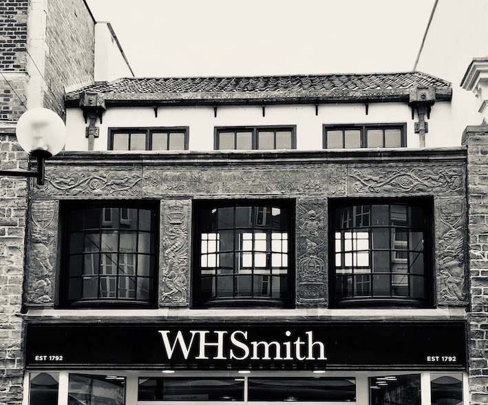
Not long ago the building housing W H Smith’s shop in Weston-super-Mare was listed. That, in my opinion, is a cause for celebration, because it’s a rare example of how magnificently this company decorated their shops in the interwar period, a time when they were expanding and upgrading many branches, using a repertoire of techniques that included tiling and classical style lettering, the latter designed by Eric Gill. The Weston shop is a rare remaining example of the decorative leadwork they sometimes used – the upper floor is covered with leadwork coats of arms and heraldic symbols representing Bristol, Bath, Taunton, and the county of Somerset – everything, you might say, except for Weston itself, which didn’t have a coat of arms until 1928, two years after this shop was rebuilt. The facade includes the same Shakespeare quotation (‘Come and take choice of all my library / And so beguile thy sorrow’ from Titus Andronicus) that was used on the branch at Stratford. The lending library in this branch was upstairs, and the room that housed it still has decorative plasterwork featuring figures such as a man carrying a leather-bound book, another reason for preserving the building.

All this decoration was of course a very effective piece of advertising. But it’s also testimony to the quality of the goods Smith’s sold. Many branches of Smith’s are today dominated by stationery, newspapers, and magazines. They have always sold goods like these (the Smiths made their first fortune out of railway stalls selling newspapers), but they were just as committed to bookselling, as well as to their lending libraries. Even when I was growing up in the 1960s, the local W H Smith’s was a good place to go for books. I had quite a few children’s books that came from Smith’s (Ladybirds, Observer’s books, that kind of thing) and later I bought a few shelves of Penguins and Pelicans from Smith’s, some of which I still have. The range was wide, and the attractions for a book lover with little money who didn’t live in a place with a big specialist bookshop were obvious. So if you look up at the fancy leadwork and the Shakespeare quotation and think it’s all a bit much for a shop stocking mostly magazines, stationery, and a few mass-market paperbacks, remember that once upon a time, you could almost educate yourself at Smith’s.

- - - - -

Note on the photograph The last time I visited Weston it was a dull day and the light wasn’t very good. I’ve therefore increased the brightness and contrast in the picture, in an attempt to make the design of the leadwork clearer. Clicking on the picture will enlarge it and make it clearer still.

Tuesday, March 1, 2016

Bristol


Café and curves

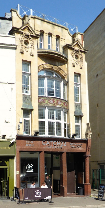
The Resident Wise Woman and I have a habit of parking in Park Street in Bristol and either climbing up the hill to browse in the Oxfam bookshop or going a bit further to find something to eat or drink. One day I wandered down the hill to College Green and, turning my back on the cathedral and library to my right, had a look above some of the shop fronts. This one stood out in particular: a study in turn-of-the-century classicism with a hint of baroque. There’s a mix of traditional details (the little pediments trailing stone carving down the wall) and elements that could only be from this period: above all the windows – the shallow bow; the segmental (curve-topped) window just above it; the tall, narrow openings right at the top; and those tiny round windows (oils de boeuf) below the pediments. All these are features straight from the school of turn-of-the-century English design.

But there’s something more. A mosaic frieze of stylized plant forms running in a band across the bow window. The pale-green stems twist and turn in curves that are more art nouveau, as if whoever designed this frontage wanted a hint of the continent, a breathe of French air, to enliven the building. On either side of this frieze are perhaps the best bits of all, a pair of lead canopies, flaring slightly and adorned with art nouveau pomegranate reliefs. The stems here form those multiple curves doubling back on themselves (‘whiplash curves’, in design-speak) that are so redolent of French and Belgian art nouveau. Such curves are not that common in England, but you find them occasionally on shop fronts that wanted to look highly fashionable between 1890 and 1910.
This little gem of a building was built as the Cabot Café. The architects were La Trobe and Weston, but the art nouveau decoration was created by the owner’s daughter, Catherine Hughes. Pevsner sources the mosaic from an 1891 bookbinding design by Charles Ricketts. He further observes that there are traces of the original interior inside, although these certainly weren’t in evidence when I peered through the door. I must return, buy myself fish and chips, and investigate further.

- - -

In previous posts I’ve noted a full-blown art nouveau shop front in Cambridge and a hint of one in Leamington Spa.

Friday, December 16, 2011

Isle Abbots, Somerset


Rubble rouser

Back at the beginning of the year I did a post about the church at Isle Abbots, which has one of the graceful late-medieval Gothic towers for which Somerset’s parish churches are justly famous. Around the side of the church I was fascinated to find a few masonry fragments that had been removed from the building at some stage, probably during a restoration. One of them is the part of a pinnacle shown in my photograph, and what’s particularly interesting about it is that it has a piece of metal sticking out of the top. This is a rod, probably made of lead, that was used to help hold this piece and another, now vanished, stone together.

Medieval masons used lead in their joints quite often, especially when building intricate, willowy structures such as window tracery, narrow shafts (mini-columns), and pinnacles. They did this by drilling vertical holes through the pieces of stone and lining them up. Then they called in the plumber – the man who worked with lead – and he undertook the painstaking task of pouring the molten lead in from the top. When the lead set, the pinnacle had a solid armature, adding greatly to its strength.

Working with molten lead in this way must have been a perilous business, especially if you were at the top of a 200-foot tower at the time. But it seems to have been a common occurrence in the Middle Ages, and helped architectural details such as this pinnacle survive from the 15th to the 20th or 21st century. Now some of these parts of the building have been renewed, it’s good to find some bits of the originals near ground level, so that one can look at them closely. Another medieval pinnacle seems to have found a new role in the garden of a nearby cottage.


Displaced pinnacle, Isle Abbots, Somerset

Saturday, March 7, 2009

Bath, Somerset


Plumb good

Now I’ve started, here is a little more plumbing from Bath. Literal plumbing, since plumbers were originally those who worked with lead (Latin plumbum). Those with sharp eyes will spot that this is a branch of W H Smith’s. Smith’s went in for rather beautifully designed stores in the 1920s – the shop fronts often featured stone, rich oak finishes, windows with small panes, and, sometimes, beautiful tiles. Here, though, it was the down-pipe and associated plumbing that caught my eye.

You quite often get the date embossed in rainwater fittings like this, perhaps mainly because it’s not difficult to do, lead being a soft metal that takes this sort of decoration and information with ease. But the openwork ‘WHS’ monogram is a special treat here, as are the scallop shells, the kind of thing that on a medieval building would symbolize a pilgrimage to Santiago de Compostela. Why are they here, on a 1920s shop front? Maybe it’s enough that they look right.

Look at the way, too, in which the pipe in recessed into the stonework, so that its outer edge is flush with the wall. This was shop design that was conceived as a whole, and built to last. How refreshing compared to the ephemeral, here today, revamped tomorrow retail design that’s common now. Here’s to the stationers, and their plumbers, and their long view.