Alas: Smith and Jones…
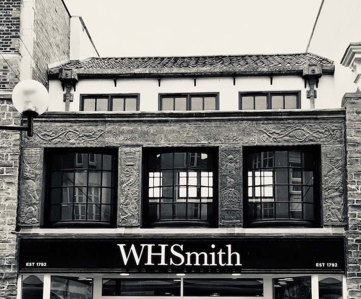
In Chester in June last year I was trying to do what I do in a city I don’t know well: drifting around taking things in and trying not to focus too much on the obvious. This involves looking up, as we’re always told to do (by people like me, for example) above shop fronts, but also looking down towards semi-basements and cellars, and looking horizontally, down alleys and along back streets. Drifting is not easy in a busy city centre in the middle of summer, but when looking up I did manage to catch sight of some interesting details without bumping into too many people. One such was this old sign for W. H. Smith, newsagents and booksellers, a name about to disappear from Britain’s high streets after more than 200 years.
Smith’s was founded by Henry Walton Smith in 1792, but its great expansion occurred under his grandson, William Henry Smith, who had the idea of station bookstalls during the railway boom of the 1840s and turned the business into a nationwide multiple retailer. By 1905, when this hanging sign was designed by artist Septimus E. Scott, there were branches of Smith’s in hundreds of locations, both high streets and stations. The sign shows a Smith’s newsboy, who sold newspapers, magazines and the occasionally book from a large basket, crying his wares as he went along, as did many other on-street newspaper sellers in days gone by.*
There are still a few newsboy signs hanging above what are still, at the time of writing, branches of Smith’s. They’re not all exactly the same – many were standard enamel signs but others seem to have been hand-painted – so it’s worth giving each one a good look. The brackets vary too, with different combinations of wrought-iron curlicues, some also featuring the name of the business, others incorporating the company’s oval-shaped ‘WHS’ device. Now the shops they adorn and advertise are being sold, as W. H. Smith undertakes the most drastic of the various restructures that have marked its recent decades. Because selling books, newspapers and magazines from high-street locations have all been hit by online sales, the role of a bricks and mortar newsagent is a tough one to play. Smith’s say they make most of their money from their travel agency business (mostly in separate shops). So another owner is buying the traditional Smith’s stores and they’ll be rebranded as ’T G Jones’.†
It’s a sad end to a long history and one hopes that the new owners are able to run the stores profitably. In spite of the effects of rival online trading, there seem to be plenty of customers in my local branch, some buying newspapers, books, or stationery, some using the Post Office counter the store contains. I also hope that the signs that still hang above such shops as those in Cirencester, Stratford-upon-Avon, Worcester, Chester and elsewhere, are retained and looked after, to remind us of the long history of retailing by this once-pioneering business,.
- - - - -
* I remember as a boy listening to a street newspaper seller in Lincoln repeatedly chanting a mantra that sounded to me like ‘Hurry up, folks’. When I got nearer, I saw the name of the newspaper he was selling: the Nottingham Post.
† T G Jones (which will probably be written ‘TG Jones’), is not named after a real person. It’s a name chosen, according to a piece in the Financial Times, to reflect ‘these stores being at the heart of everyone’s high street’. Hm.
Showing posts with label W H Smith. Show all posts
Friday, April 11, 2025
Friday, December 17, 2021
Stratford-upon-Avon, Warwickshire
A bed for Bacon?
The day I saw a copy of an old book in a charity shop; it was No Bed for Bacon (1941) by Caryl Brahms and S. J. Simon, and it’s a kind of proto-Shakespeare in Love, a comic novel about the trials and tribulations of our greatest dramatist as he acts (badly) in a revival of one of his plays, supports his company as they face competition from their rival, Philip Henslowe, falls in love with a woman (who’s disguised as a boy, naturally), tries to placate fellow actors, and struggles to write a play for performance in front of Queen Elizabeth I while also trying (unsuccessfully) to start writing a sequel to one of his most popular comedies, to be entitled Love’s Labours Won.
All of this made me think of the myths that cluster around Shakespeare. Not so much that the plays ‘must have’ been written by someone else, Francis Bacon perhaps. No, Brahms and Simon fortunately have no truck with that. More the ideas of Olde Englande, all roast beef, good cheer, and half-timbered buildings. The sort of thing embodied by structures such as Stratford’s delightful, early-20th century faux-Elizabethan shop front of W. H. Smith, about which I’ve posted before.
These days most of the other surviving early-20th century shopfronts built by this company are mostly bland modern facades. The buildings’ interiors have been refitted at least once since the shops were built, and features such as plaster ceilings and Gill lettering are nearly all long gone. Newtown in Powys is the best place to to see what we have lost in these shop interiors.
But at Stratford, one trace remains, in the shape of a series of coloured glass roundels on the stairs. Here, among the suspended ceilings and modern shelf units, are portraits of British writers. These days they depend for their effect on being lit from behind, and not all were illuminated the other day – Shakespeare himself was as dark as the mysterious lady. But three were glowing with backlit colour: Richard Brinsley Sheridan, Charles Dickens, and, wonderfully Francis Bacon. Not a bad selection: Sheridan was a theatrical star, Dickens loved the theatre and was a virtuoso public reader of his own novels, Bacon was a contemporary of Shakespeare.
These portraits in glass speak of a time when Smith’s were committed and successful booksellers as well as stationers. They remind us that for this company at least, the Olde England myth was more than a fancy front – William Henry Smith loved the idea that he could help people educate themselves with cheap editions of the literary classics, and the idea lasted well beyond his time. You could still buy novels by Thomas Hardy and Charles Dickens in my local WHS last time I looked, although such classics were in the minority on the shelves. And I doubt they’d have a copy of Francis Bacon’s Essays. Back in the 1930s, though, Smith’s might well have provided, if not a bed, a shelf for Bacon.
Tuesday, August 11, 2020
Weston-super-Mare, Somerset
Click on image for more detail
More than skin deep Not long ago the building housing W H Smith’s shop in Weston-super-Mare was listed. That, in my opinion, is a cause for celebration, because it’s a rare example of how magnificently this company decorated their shops in the interwar period, a time when they were expanding and upgrading many branches, using a repertoire of techniques that included tiling and classical style lettering, the latter designed by Eric Gill. The Weston shop is a rare remaining example of the decorative leadwork they sometimes used – the upper floor is covered with leadwork coats of arms and heraldic symbols representing Bristol, Bath, Taunton, and the county of Somerset – everything, you might say, except for Weston itself, which didn’t have a coat of arms until 1928, two years after this shop was rebuilt. The facade includes the same Shakespeare quotation (‘Come and take choice of all my library / And so beguile thy sorrow’ from Titus Andronicus) that was used on the branch at Stratford. The lending library in this branch was upstairs, and the room that housed it still has decorative plasterwork featuring figures such as a man carrying a leather-bound book, another reason for preserving the building.
All this decoration was of course a very effective piece of advertising. But it’s also testimony to the quality of the goods Smith’s sold. Many branches of Smith’s are today dominated by stationery, newspapers, and magazines. They have always sold goods like these (the Smiths made their first fortune out of railway stalls selling newspapers), but they were just as committed to bookselling, as well as to their lending libraries. Even when I was growing up in the 1960s, the local W H Smith’s was a good place to go for books. I had quite a few children’s books that came from Smith’s (Ladybirds, Observer’s books, that kind of thing) and later I bought a few shelves of Penguins and Pelicans from Smith’s, some of which I still have. The range was wide, and the attractions for a book lover with little money who didn’t live in a place with a big specialist bookshop were obvious. So if you look up at the fancy leadwork and the Shakespeare quotation and think it’s all a bit much for a shop stocking mostly magazines, stationery, and a few mass-market paperbacks, remember that once upon a time, you could almost educate yourself at Smith’s.
- - - - -
Note on the photograph The last time I visited Weston it was a dull day and the light wasn’t very good. I’ve therefore increased the brightness and contrast in the picture, in an attempt to make the design of the leadwork clearer. Clicking on the picture will enlarge it and make it clearer still.
Saturday, July 4, 2020
Stratford-upon-Avon, Warwickshire
There’s something satisfying about the fact that the Stratford-upon-Avon branch of W. H. Smith, newsagents, stationers and booksellers, should be housed in a timber-framed building that looks very much at home in this town of famous timber-framed structures. But this shop isn’t one of the celebrated ancient buildings of Stratford (Shakespeare’s Birthplace, Harvard House, Hall’s Croft, and the rest): it’s only about one hundred years old. So what’s the story?
In the early-20th century, W. H. Smith had its own Estates Department, led by the architect Frank C. Bayliss, which designed and developed new shops, refurbished old ones, and was responsible for such things as lighting, heating, and decoration.* By the early-1920s, when the Stratford shop was built, they’d developed a house style, with shopfronts in light oak, with many small panes of glass, classic Roman lettering (designed by Eric Gill) for the signage, and the frequent use of colourful tiling. The red ‘newsboy’ hanging sign (the work of Septimus Scott) was ubiquitous and the half-timbered look was often employed for the upper floors of the building. The 1920s were a busy time for Bayliss, so he often commissioned local architects to work on specific branches. The firm of Osborn, Pemberton and White was responsible for this one and they followed the house style.§
Smith’s weren’t new to Stratford when they built this shop. In fact they had occupied the property next door, a building once home to Shakespeare’s daughter Judith, before they moved to these larger premises. The architects added a couple of appropriate touches that have survived recent modifications to the frontage.† A panel above the shop sign contains a quotation from Shakespeare’s early play Titus Andronicus: ‘Come and take choice of all my library and so beguile thy sorrow’ – spot on for Stratford, of course, but also used by the company on their Kingsway branch in London. William Henry Smith, the man who built up the business in the 19th century using the profits he made from station bookstalls, was on a mission to sell good literature to the masses; his company produced pioneering cheap editions of literary classics and liked literary quotations – the branch in my home town, Cheltenham, used to have a line of Wordsworth on the shop front. The other unusual touch is provided by the carved heads on the consoles (the brackets at either end of the shop sign). One, the head of a jester (below), feels just right for the town of Shakespeare, whose plays often include a jester or ‘fool’. Shakespeare’s fools generally prove wiser than the kings, queens, and aristocrats that they serve. In this age of anonymous, plastic-fronted retailing, W. H. Smith’s are wise to have preserved shops such as this.
* I’m indebted for my information on the history of W. H. Smith’s shops to Kathryn A. Morrison’s excellent book, English Shops and Shopping (Yale University Press, 2003).
§ The best surviving example of this house style is the branch at Newtown, Powys, technically outside the scope of this English Buildings blog, but it’s so outstanding that one of these days I’ll have to post it anyway.
† The sign uses Smith’s current letterform, and I think there would originally have been small panes of glass lower down the window too.
Monday, January 20, 2020
Bury St Edmunds, Suffolk
High Street heroes
At first glance, this striking shop front is confusing, first because it’s not the 17th-century building it might appear to be and secondly because the premises are occupied by W. H. Smith, a company once known for ornate facades. But it wasn’t built by Smith’s. Originally, this was a branch of Boot’s the chemist, who could also put on a bold front. In the early years of the 20th century, Boot’s did a number of revamped shop fronts using timber framing with ornate plaster infill, and some of these were festooned with eyecatching details such as carved bargeboards, fancy brackets, and even statuary.
I’ve long been a fan of the large former Boot’s in the middle of Derby, which is on a prominent corner site and has a succession of statues of local Derbyshire worthies that must be almost life-size. The former Boot’s in my photograph, in Bury St Edmunds, is smaller, but equally ornate, with a full compliment of woodcarving, pargetting, and four large statues. The design dates to 1910 and was the work of the company’s in-house architect, Michael Vyne Treleaven, who set this style for their shopfronts in this period.*
The statues set in decorated niches across the facade were the work of a London sculptor, Gilbert Seale & Co of Camberwell, who did more than one job for the company. They feature, from left to right, Agricola, St Edmund, Edward I, and Edward VI. These figures all have local relevance as well as their wider significance: Edmund was the local saint, Edward I held parliaments here, Edward VI founded a local grammar school, and the Roman general Agricola led his people’s conquest of Britain and crushed the uprising of Boudica, local queen of the Iceni; one source suggests that this figure is actually another Roman general, Trebonius, who accompanied Caesar on his Gaulish and British campaigns. Boot’s the chemist, under its gifted owner Jesse Boot and his successors, was well aware of the benefits of local publicity, and was keen too that his premises should be assets to the towns where they were located. It would be wonderful if today’s retailers took such care over their architecture.
- - - - -
* Thanks to the reader who confirmed that the design of the Bury shopfront was Treleaven’s.
Thursday, January 21, 2016
Jackfield, Shropshire
Guides to a better world. . .
I’ve noticed that some of my most popular posts (finding many readers and numerous comments by email and in person) are those I’ve done about the tiled decorations once used by W H Smith on their shop fronts. Few of these now survive in the shops where they started out. I’ve reported before on a glorious duo of examples, one on either side of the W H Smith shop window in Malvern, showcasing postcards and maps, and a single panel on a shop in Bath (this one no longer occupied by Smith’s), depicting Nature Books.
The excellent Jackfield Tile Museum on the site of the Craven Dunnill factory at Jackfield near Ironbridge has a few more of these wonderful panels. Today I’m sharing two of these, both, like the others, produced by Carter and Co of Poole in the late-1920s, to designs by an unknown artist. One is a further, rather different panel advertising guidebooks. This one is less dramatic than the Malvern Postcards panel (which has a looming castle tower and stunning night-time colours). Instead it has a more restrained, perhaps faded, palette, and shows a couple looking across a stylised landscape of hills and trees. There’s enough detail on the woman’s dress to suggest elegance; her male companion is delineated in a few simple touches of brown. They look out over blue and green hills, as if they’ve found their way using one of Smith’s guidebooks and are now drinking in the view. The overall effect is like a faded Brian Cook book jacket: redolent of England between the World Wars and full of topographical promise.
My second example from Jackfield, Ladies' Papers, is another epitome of narrow-waisted poise. The turned head, the waving arm, the hand lifting the dress just enough to show the heel stepping out across the grass, the point of the other shoe just visible – there’s plenty to catch the eye. Once more, the setting is very sketchily drawn, but the pale colours set off the figure well.
As you can probably tell, I like these panels a great deal. Combined with Smith’s classical lettering (by Eric Gill), they project a sort of accessible sophistication that must have been right up Smith’s street. W H Smith’s were then, as now, more than just newspaper merchants. They sold books and maps, and their range of magazines was a large one. They hoped to remind potential customers that you could buy more than your Daily Express and a packet of cigarettes at their counters. There was self-improvement on sale here, and books that could guide you on a route to history or literature, or could tell you about the most interesting places to visit. Their shops could be windows into a better world.
Monday, November 2, 2015
Great Malvern, Worestershire
Postcards from England
I’m fascinated by the way in which shop designers used tiles to make a colourful splash on street frontages, a type of decoration that enlivened many a shop front from the Victorian period until well into the 1930s. One of my favourite examples of this is on the front of a branch of W H Smith in Malvern, and one of its tile panels came to mind the other day when, in my previous post, I used the phrase ‘postcards from England’ to describe my blogging activities. This is a building I’ve posted before but one of its tile panels* is so beautiful, and, I think, so mysterious, that’s worth sharing once more.
This panel, set into a narrow reveal to one side of the shop window and so very easy to miss, advertises postcards – clearly, in a much visited spa town like Malvern, postcards were an important thing to stock. The view it depicts is a bit of fantasy architecture by moonlight. A medieval stone bridge leads across a river towards a gatehouse in what looks like a town wall. In the background is a looming tower, that seems to exist in a space that’s separate from the rest of the picture. Or not quite. In the foreground, the corner of this tower seems to grow out of the bridge, but in the background it appears to be behind the city wall. It’s also drawn, to seems to me, to a much larger scale than the bridge or gatehouse.
None of this matters very much, because the image, with its varied shades of blue and purple and its eery moonlight is a lovely confection that seems to invite us into a world of night-time mystery and make-believe. It certainly draws you in, although a postcard with a run-of-mill photographic view on it might be a bit of a come down after seeing it.
The other wonderful thing about the tile panel of course is that (together with another opposite it advertising maps) is still there. It must have been installed in the 1920s or 1930s and it takes us back to a time when shop fronts were designed for a life of decades rather than a year or two, when businesses weren’t expected to reinvent themselves every six months, but traded on their history and reputation. My readers can decide for themselves whether or not the change to a less long-term outlook is a good thing. But I’m glad at least that the old ways produced bits of occasional art like this.
- - -
*Made by Carter's of Poole, as one of my fastest-off-the-mark readers has reminded me.
Sunday, September 16, 2012
Bath, Somerset
Bird spotting
A while back I posted some decorative tile panels advertising post cards and road maps, from the front of a branch of W H Smith in Malvern. Here is one still more colourful panel, this time from a former W H Smith shop, spotted by me in Bath today. As with the Malvern panels, the tiles were made by Carter and Company and the letters were designed by Eric Gill. No doubt there were originally more panels on the Bath store, perhaps illustrating different kinds of books. Now only 'Nature books' survives on the shop facade, which now fronts a branch of Patisserie Valerie. As a reminder of the shop's previous role, this toucan, leaning down from its branch, fits the bill.
Sunday, March 18, 2012
Winchester, Hampshire

A coat of arms
On several occasions on this blog I’ve noticed premises belonging to W H Smith, and looked at the various telling ways at which this company, one of the first multiple retailers, has decorated its shops over the years. I’ve looked at tiles, hanging signs, and even drainpipes. This time, it’s heraldry, and my post is as much a query as an observation.
A while back I passed the branch of Smith’s in the centre of Winchester and admired this coat of arms adorning the corner of the shop. I’m often struck by the ways in which buildings turn corners, and this bit of corner colour naturally caught my eye. But no one could tell me whose coat of arms this is, or was, and why it’s here. I’d love to know the meaning of the three roses, why the supporting lions are standing on the sterns of sailing ships, and why the female figure, presumably Justice with her sword and scales, is included at the top. There was no one around to ask about this on the quiet evening when I passed last year, and I can find no similar arms online. If anyone has the answer, I’d be fascinated to know.
* * *
The answer has come. These appear to be the arms of Southampton. Many thanks to the anonymous commenter who provided the information and link.
Monday, March 14, 2011
Great Malvern, Worcestershire

Beguiling tiling
I’ve posted before about the wonderful shop fronts built by the W H Smith chain in the 1920s and 1930s, most of which have now vanished. My recent post about a tiled shop front in London reminded me that I meant to return to this subject, to look at a favourite example of W H Smith tiling, still in situ in Malvern.
Smith’s shop front in the hillside town centre of Great Malvern is recessed slightly from the building line, leaving two narrow strips, like exterior window reveals, at right-angles to the street. The two wonderful tiled panels in my photographs are set at the top of these strips, and so are rather easy to ignore. How typical of the painstaking design of the time that such trouble should be taken with these easily overlooked spaces.
And what amazing images their ceramic artist produced. The car rattling along in the ‘Road maps’ panel conjures up all the optimism of the open road in the 1920s. There’s little hint of where the scene might be set (it could just as well be France as Worcestershire), but the sun is out and the road, we feel, is empty ahead. The driver has read his road map and he’s opened the throttle.
On the other side of the shop front. the bridge, gatehouse, and castle keep that advertise ‘Post cards’ are rendered in an extraordinary palette of purples, browns, and blues. The great tower seems hugely out of scale and oddly positioned in relation to the bridge. But who cares? This expressionist architecture lit by the stars (and the moon, which is presumably somewhere over the artist’s right shoulder) is simply stunning, the buildings reminiscent of the fantasy townscapes of F L Griggs, but with colour poured in, for good measure.
How fortunate that these two images have survived, while the rest of the frontage has been adapted and painted over. Their light is from another age, but still it shines.
Wednesday, December 1, 2010
Cirencester, Gloucestershire

A substantial world
Having in 1848 got the job of running book stalls on the stations of the London & North-Western Railway, W H Smith have a claim to be England’s first retail chain. Their move on to the High Streets of Britain came rather later – there was a major expansion at the end of the Victorian period, some further growth in the first decade of the 20th century, and a series of outstanding shop makeovers between the two world wars.
By this time Smith’s were well known for their combination of news, books, stationery, and other sales, together with lending libraries at some stores, and their shops stood out. Window frames in light oak and careful decorative details (including even distinctive rainwater goods) were their hallmarks, along with this lovely newsboy hanging sign. There are still a few of these signs around. This is one I pass regularly, a small landmark in the Cotswold town of Cirencester. Peter Ashley, chronicler of Unmitigated England, spotted another at Hull’s poetically named Paragon station.
So many of the telling details of Smith’s interwar shops have vanished. A number bore literary quotations in ornamental lettering. A favourite was Shakespeare’s line from Titus Andronicus, ‘Come and take choice of all my library,’ and in my infancy my local W H Smith shop was emblazoned with Wordsworth: ‘Dreams, Books are each a World and Books we know are a substantial World both pure and good.’ Amen to that.
Subscribe to:
Posts (Atom)