Sunday, December 22, 2019

Worcester


Sun and the city
In Worcester the other day, I paused briefly as the afternoon sun went down, moved out of collision range of passing Christmas shoppers, and spent a few moments admiring the impressive array of buildings on the city’s main street. It’s a row of varied structures including a house, a couple of banks, a church, and a hotel, and positioned as it is in the centre of the city it’s surprisingly easy to walk past, dodge other pedestrians most of whom are heading resolutely for the shops, and not give any of it a second glance.

But, as regular readers will know, it’s one of the points of this blog to linger over architecture that’s most often unregarded or taken for granted. So what have we got here? First, in the foreground, my photograph shows half of an early-18th century brick building that I take to have been built as a house. This shows the decorative grace that Georgian classicism can achieve – acanthus keystones above the windows, swags below, neat quoins and cornice, and a finely detailed Ionic doorway. Next to it is a former bank, designed in the Edwardian baroque style by Charles Heathcote of Manchester in 1906. Although smaller than its neighbours, it manages to be very grand, its Portland stone frontage oozing telling details like those columns on the upper floor, the circular window above the doorway, and the iron balcony on the side wall, as if to enable the manager to look down on the hoi polloi below and calculate their credit ratings by eye before they even reach the front door.

Beyond that building is the other bank, dating to 1861–2. Its detailing is a little more restrained than that of its smaller neighbour, more Renaissance palace than baroque, as Pevsner observes. It was built for the Worcester City and County Bank as their headquarters, and this local business fittingly chose a local architect, E. W. Elmslie, who made such a mark on Malvern.

Next in line is St Nicholas Church, now, like the first bank, given over to eating and drinking. The architect of this building of the 1730s is not known but Pevsner tells us that the landmark tower is taken from a design by James Gibbs, one he did but rejected for the church of St Mary Le Strand in London. Its recessed stages culminate in an octagonal cupola with a delicate circular columned lantern at the top. At ground level this striking tower is set off by tall Doric pilasters and a pediment and the whole thing is a grand climax to this part of the street. Its stone catches the sun beautifully too, as it did on the cold winter’s afternoon when I took the photograph.

Visible beyond the church is part of a brick building, also warmed by the sun and partly striped with pale Doulton terracotta. This is a long block, originally housing the Hop Market and Commercial Hotel, built in two stages between 1899 and 1907. The visible end is the later part of the structure and has a striking open lantern topped with another small dome on the street corner, a colourful counterpart to the tower of St Nicholas.

Each of these buildings provides much to take in for anyone with the time to stand and stare. But even the casual passer-by can appreciate how well they work together: a coming together of periods, building materials, and styles that both enlivens a city street and gives it a sense of grandeur. It’s one of those bits of a provincial city not at all where time has stood still but where something of the quality attainable by local architects and builders has been preserved. We should be grateful for that.

Saturday, December 14, 2019

Worcester


The room now standing on Platform 2

The Resident Wise Woman tells me that in her youth, taking the train home to the Cotswolds from Oxford, she would hear the guard on Oxford station announce her train: ‘Calling at Charlbury, Kingham, Moreton-in-Marsh, Evesham (Capital of the Vale), Worcester Shrub Hill, and Worcester Foregate Street’.* And so it was that the litany of stations on the ‘Cotswold Line’ traced the train’s journey across the hills, down to the Vale of Evesham and on towards the River Severn at Worcester. And being a hill person, the Resident Wise Woman knew that, as she stepped up from the windy platform on to the chugging diesel multiple unit, she’d soon be on her home turf.

Worcester Shrub Hill, back then, was just a name to her and to me too. So we didn’t know that this station, perched high among factories on the edge of the city centre, housed a rare and unexpected bit of Victorian luxury. In the 19th century, it was not unusual for railway stations to have a ladies’ waiting room where female travellers could sit in comfort and safety before their train arrived. And the lucky ladies who travelled from Worcester Shrub Hill station could wait in the magnificent setting of this room on platform 2. Built in c.1864, the ladies’ waiting room is clad on the outside in glorious majolica tiles made by Maw & Company of Broseley (originally the firm was based in Worcester). The rich red columns and arches surrounding them are part of the room’s cast-iron facade, made by the Vulcan Iron Works of Worcester. The overall effect – especially since the waiting room was restored about ten years ago – is one of polychromatic magnificence outside, clean pale walls inside.

No one knows the full story of this structure. No comparable waiting room, with iron walls and tiled facade, has survived. It seems to have been a one-off, and an informative notice on the station speculates that it may have been built for exhibition purposes, to show what could be done with the most up-to-date Victorian materials. The mid-19th century, after all, was a golden age of ironworking, with foundries supplying all kinds of building materials, from enormous columns and beams for giant train sheds to delicate shop fronts. And tiles were becoming increasingly popular for facades – soon, there would be tiled shops, tiled pubs, even office blocks with ceramic cladding. Maw’s were pioneers of using these brightly coloured tiles for architectural use.

The stylistic inspiration is a typically Victorian hotch-potch. Some of the ornament looks Islamic, some Classical, some medieval. But the decoration does hang together visually, while also giving travellers – and potential clients – a sense of what can be achieved with these materials. For waiting passengers, the room is more than fit fo purpose, and must raise, at the very least, an appreciative smile.

- - - - -

* Evesham, by the way, is pronounced by local people as something like ‘EEV-uh-shum’, with three syllables, and this is what I hear in my mind’s ear when I remember this story.

Thursday, December 12, 2019

Building touched with emotion


Annette Carruthers, Mary Greensted, and Barley Roscoe, Ernest Gimson: Arts & Crafts Designer and Architect

Published by Yale University Press

The time is ripe for a new study of Ernest Gimson, a man whose multiple careers as architect, designer and craftsman, seem to exemplify the Arts and Crafts movement. Three scholars who have long been deeply immersed in Gimson’s world and work have obliged, and the resulting book, drawing on Gimson’s buildings, designs, extensive archive of drawings, and on the writings and work of contemporaries, fulfils its promise.

The first section deals with Gimson’s life. His upbringing in Leicester is covered, together with his time articled to a local architect, followed by a longer period in the office of J. D. Sedding in London. Already interested in such progressive ideas as Secularism, Gimson is brought through Sedding’s office into contact with luminaries such as William Morris, and he soon shows interests in socialism and in the work of the SPAB. Still a young man, he travels to Italy and France, widening his visual education like many a young architect of the time, and designs both houses and furniture, but he also starts to learn craft skills such as plastering.

The book next describes how Gimson becomes one of those young architect-designers who follows the example of Morris and moves to the country – not merely by finding a rural retreat, as Morris had done at Kelmscott, but by going the whole hog and setting up house and workshop in the Cotswolds. The book’s account of his life at Sapperton in Gloucestershire is full and absorbing. We learn about his marriage, his friends and colleagues the Barnsleys, who also move to Sapperton, and his houses. Above all, we learn about the variety of his work.

Never let it be said that a country life is a quiet one. Gimson soon became occupied practising a range of arts and crafts – architecture, design, plastering, chair-making – and of creating the conditions where related activities – furniture workshops, a smithy – could flourish. He found himself running workshops, managing numerous employees and apprentices, sorting out accommodation for single workers, and arranging for everyone’s work to be exhibited both in Gloucestershire and in London. He was pricing jobs, overseeing work, ensuring that high standards of craftsmanship were maintained, and balancing the requirements of designers, makers, and clients. And then there were houses to design, architectural competitions to enter, and projects for various churches and historic buildings.

Further light is shed on all this by a fascinating chapter on Gimson’s approach to design. This highlights they way he saw design as being integrated with every other concern of an architect – in other words, a design should emerge from a project’s construction and materials, and the tools and techniques used to produce it. This chapter also has illuminating things to say about Gimson’s love of drawing, his use of natural motifs and patterns, his interest in craftsmanship and building materials, and his Morris-like ideals of work. At the end of the chapter, the story of the chance survival of many of Gimson’s drawings. Daniel Herdman, Librarian Curator at Cheltenham, rescued them when they were on the point of being consigned to a bonfire. They remain a part of the outstanding Arts and Crafts collection in Cheltenham’s museum, The Wilson,* and are beautifully reproduced in the book, as are the many photographs of Gimson’s buildings and the objects he designed.

The second part of the book consists of a series of stunningly illustrated chapters on the various aspects of Gimson’s work – from plasterwork and metalwork to interior design and architecture. All are fascinating, but those on interiors and architecture will most interest readers of this blog. Nearly all his buildings use traditional materials and draw on vernacular architecture in their design. Yet the authors of this book show their unusual qualities too – innovative house plans, dramatic roof frameworks, meticulous workmanship, and occasionally unexpected choices of colour. The buildings range from small workers’ cottages to large middle-class homes to still larger houses, like Waterlane House, a Cotswold residence that Gimson enlarged seamlessly. Not everyone will know the striking hall and gorgeous library that Gimson designed for Bedales School – the latter a feast of interior woodwork. Fewer still will be familiar with the ambitious proposals he entered for the competition for a plan and design for the city of Canberra, all towers, domes, and Byzantine-looking arches. The proposed HQ for the Port of London Authority is also unknown to most non-specialists. Whether it is these grand schemes or little known cottages, Ernest Gimson does its subject a service by bringing them and their architect to wider notice.

Gimson himself was noticed by his contemporaries, by colleagues who carried on the tradition, like Peter Waals and Harry Davoll, and by members of groups like the SPAB, with which Gimson worked. W. R. Lethaby, architect, writer, and teacher, was one of those whose judgement continued to be respected when he described Gimson’s work approvingly as ‘building touched with emotion’. If time has been less kind to the ethos of craftsmanship that Gimson lived by and fostered, the buildings and craft objects remain – houses still lived in and loved, the Bedales library still in use, furniture and metalwork still cherished or admired in museums. The authors of Ernest Gimson deserve congratulation for making this legacy more widely known and more deeply understood.

* The Wilson is hosting a special exhibition, Ernest Gimson: Observation, Imagination and Making, until 25 February 2020.

Tuesday, December 10, 2019

Before and after


Eric Musgrave, Leeds Then and Now
Published by Pavilion Books

Leeds Then and Now is one of a stable of books featuring paired photographs of buildings and streets from great cities, each pair accompanied by succinct and informative text. They’re not the first books to take this approach, but they are certainly among the best. The quality comes through most immediately in terms of the visuals, well chosen historical images from a range of dates, some as old as the 1860s, some as recent as the 1970s, twinned with excellent photographs of the same scenes today taken by David Major. The text for each pair of images is succinct and informative. Both author and photographer have local roots and their knowledge of and pride in Leeds shines through.

The range of subjects extends from the city’s major buildings – such as the Corn Exchange, Town Hall, and City Market – to lesser structures that form part of the complex mix that makes up most of the central streets of Leeds. Impressed on a recent visit how well the greatest of the buildings are standing up to the trials of modern life, I turned to the pages on the Town Hall. Here, a photograph of 1905 shows Cuthbert Brodrick’s monumental urban temple substantially the same, less hemmed by signs and bollards than it is today, but without the trees that now soften its corners. The Corn Exchange is likewise slightly encumbered with signs compared to earlier, but the great sweep of street that runs up to it is still largely clear, and similar to how it was apart from one modern interloper. Another big building, the mock-Egyptian Temple Works, was looking dark and soot-blackened in 1935, but at least you could see it – when the ‘now’ photograph was taken the main block was hidden behind scaffolding and protective plastic; the frontage has also acquired railings that weren’t there in the 1930s. One hopes that the works will be restored and thrive, as have most of the city’s fine arcades like the Grand, Cross, and County, the latter a masterpiece of the great architect Frank Matcham, normally at work designing theatres. An image of 1949, however, shows the striking Victoria Arcade, one that has been lost.

I can get annoyed with a plethora of intrusive modern signs, but a look at the some the street views shows how much interesting signage we have lost. The losses range from Victorian and Edwardian monsters to more elegant bits of Art Nouveau, not to mention some jazzy signs from the 1930s onwards. A stretch of Briggate, for example, displayed enormous signs, with letters almost six feet high, across the upper floors of the Cash Boot Company in 1944. These signs are long gone, and the part of the front that remains has been cleaned so that its bricks and stone gleam; also gleaming is a facade of 2010 fronting one shop, a completely glass-clad front butting comfortably up against brick, stone and terracotta.

So Leeds Then and Now shows us some of what has been lost – stretches of Gothic or Renaissance shops demolished in the 20th century, 16th or 17th century merchants’ premises knocked down by the Victorians, Dickensian enclaves such as Rotation Office Yard, a striking Victorian market hall, the dazzling timber-framed premises of the Universal Furnishing Company, and so on and on. But it also makes us look more closely at what is still there, from details of 19th century shops to the City Markets (still fulfilling their function) to the Third White Cloth Hall, which is now a Pizza Express. Meanwhile we can weigh up for ourselves whether we’re grateful for some of the new building or in mourning for demolished architectural glories; sad about the vanished Victorian shop signs or pleased that the buildings beneath them can be more clearly seen. Either way, the book is a feast, and will encourage readers not only to study its engaging images further, but also to look carefully at what’s left – in my case by making further visits to Leeds.

Saturday, December 7, 2019

Deco displayed


Elain Harwood, Art Deco Britain 
Published by Batsford, in conjunction with the Twentieth Century Society

Art Deco is fashionable now. For decades the jazzy and decorative design style encapsulated in many cinemas, factory fronts, apartment blocks, shops, and office buildings had been out of favour. So many Deco buildings have been knocked down that it’s sometimes hard to know where to look to find the survivors. It’s even a challenge to define exactly what Art Deco is.

Elain Harwood’s new book certainly helps a lot. It’s got an elegant picture-book format – at its heart are about 115 double-page spreads with one building each and one stunning colour photograph per building. But don’t let that fool you. The text is packed with information about the buildings, which are arranged by type, making it easier to compare wonders such as the Carreras cigarettre factory in London (all black cats and “Egyptian” lettering) and the more stripped-down but magnificent India tyre factory in Renfrewshire; or to weigh-up the virtues of the interiors of the Midland Hotel in Morecombe with the Regent Palace of Hotel in Westminster. All this provides a colourful picture of Art Deco buildings. They can vary from highly ornate structures that allude to the past, like the jaw-dropping interior of the Granada Cinema, Tooting, made over in around 1930 by émigré theatre designer Theodore Komisarjevsky, to the stripped-down architecture of buildings like the Saltdean Lido.

Can structures as different as these all be Art Deco? Well, yes, they can. One of the best bits of Harwood’s book is the Introduction, which explains how in the 1920s and 1930s architecture in Britain came under an array of influences – decorative developments in France, a leaner architecture in the Netherlands, a new appreciation of Viennese turn-of-the-century design and the closely related work of Charles Rennie Mackintosh, the theatre sets and costumes of the Ballets Russes, a fresh awareness of certain historical sources (notably ancient Egypt), the advances in building materials happening at that time. This rich soup of influences helped designers in Britain develop in different but parallel directions, creating a range of styles from the full-blown cinematic Art Deco to the plainer mode sometimes called jazz moderne or streamlined modern or just moderne. None of the latter was quite as plain and spartan as the purer architectural functionalism of white boxes and strip windows, though some came close.

It’s not all about classification, though. A joy of the book is the stories that some of these places throw up. Harwood entertains her readers with tales of firemen making covert use of light sockets to run wireless sets at Heston and Isleworth Fire Station; of the beehives and putting green once on the roof of Adelaide House in the City of London; of an intrepid flight across the Atlantic in a Puss Moth in 1931. And she reminds us of the not always obvious visual effects of Art Deco architecture. Some buildings, like Osterley Underground station, need to be seen lit up at night to reveal their full glory; some have details undreamed of (by me, at least), like the unaltered manager’s flat in Blackpool’s White Tower Casino.

Art Deco Britain is a cornucopia of buildings, although there could, as Harwood herself says, easily have been twice as many. I’m grateful for the hundred-odd that are here, and that the appreciation of these buildings will be extended and enhanced by this beautiful and informative book.

Tuesday, December 3, 2019

The joy of Essex


For the next ten days or so, I am offering a small clutch of reviews of recent books that might appeal to readers of this blog. First of all...

Gillian Darley, Excellent Essex
Published by Old Street

There used to be lots of county books: county histories, county guidebooks, meandering accounts of counties by bellettrist old “countrymen” full of clichés about nestling villages and “delightful churches”. There’s not so much of this about now, and some say we think less about counties than in the days of before local government changes messed about with county boundaries and names in the 1970s. That’s debatable, but people certainly have prejudices about counties, and none more so than about Essex – Essex Man and The Only Way is Essex are familiar parts of Britain’s media landscape. Gillian Darley’s Excellent Essex blows all this out of the window, and wafts some welcome fresh air into the idea of the county book.

Excellent Essex does a good job of evoking the great variety of Essex, which is part rich countryside, part London fringes, part absorbing towns, with a very long coastline thrown in too. And of confronting the contradictions of a place that’s widely pro-Brexit but has always welcomed newcomers. Darley knows her Essex, and gives us absorbing nuggets of history and topographical fact about all these aspects of the county. Essex is full of memorable architecture, much of it there thanks to the wealth coming in from local industries – whether it was Courtauld’s textiles, Bata footwear, or Tiptree jam. Interesting and sometimes highly influential ideas have been born, or at any rate bred, in Essex, which has been home to future American Pilgrims, Tolstoyan anarchists, and women’s suffrage campaigners.

Darley, who has an honourable track-record of writing about architecture and its contexts, is the ideal author for all this, and is alert to the county’s sometimes surprising buildings and their stories. Essex is where we will find historical wonders like Thaxted Guildhall and the pargetted quaintness of Saffron Walden. It is home to Critall metal-framed windows, the Bata buildings of East Tilbury, and the glorious “seaside modern” houses of Frinton – all at the heart of English modernism of the 20th century. The county is also, of course, the site of the memorable and wonderful House for Essex, created by the architectural practice called FAT along with Essex man and artist Grayson Perry. The county also has its share of plotlands and the various offbeat joys of Canvey Island. All human culture, oner might say, is here, from the music of Gustav Holst (who spent a lot of time in Thaxted) to that of Sandie Shaw and Wilko Johnson, from the art of the Great Bardfield painters to that of Alfred Munnings or, yes, Grayson Perry.

Essex is, then, as diverse in its combination of old and new, high and low art, idealism and entrepreneurship, inventiveness and conservatism, as England as a whole. Gillian Darley does a superlative job of portraying this, and her account, rich with history and anecdote, also makes the trip to Essex a highly entertaining ride.

Friday, November 29, 2019

Snape, Suffolk


Was it for this the clay grew tall?

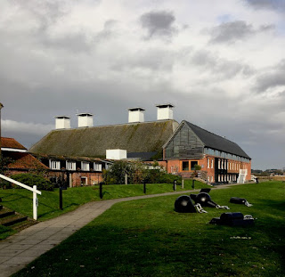
Another memorable visit we made when in Aldeburgh for the poetry festival was to Snape Maltings, five miles up the road from Aldeburgh itself. We went to Snape not for the music for which it is now so famous but for the architecture, for a coffee, and for an exhibition which made a deep impression on us both. The architecture is on such a large scale that I managed to drive past the entrance, in anticipation of yet more wonders of brick, slate, and weatherboarding. But I soon managed to turn round, park, and take in this complex site – there are about seven acres of buildings, apparently.

The place owes its scale to Newson Garrett, son of the Garrett engineers of my previous post. Newson Garrett bought the site in part because of its position on the Alde estuary: there was a port of some significance in the Victorian period. By the early 1850s he was in the business of malting, and was shipping huge tonnages of malt to breweries around the country, especially to those in London. Garrett throve, and the business continued for just over 100 years, finally running out of steam in the 1960s. That left a large group of vacant buildings – maltings, storage buildings, offices, and so on – in the middle of what was a mainly agricultural area of Suffolk. A local farmer, George Gooderham, bought the site and began to find uses and users for the buildings, and then Benjamin Britten turned up.

Britten lived at Aldeburgh and had been running the Aldeburgh Festival since 1948. The festival’s concerts took place in local churches and halls, but such was the quality of the events – featuring a galaxy of Britten’s starry colleagues from all over the world, as well as premiers of many Britten pieces – that these venues were often far from ideal. Britten and his partner Peter Pears quickly saw the potential of the big malthouse at the heart of the site: it would make an ideal concert hall. The maltings was converted by Derek Sugden of Arup Associates, who kept as much of the building as he could and refrained from embellishing what was left. The structure is visible inside in the form of bare brick walls and the framework of the enormous roof. Outside it’s also all about the roof, which sweeps dramatically down almost to the ground in a manner that would take my breath away if it wasn’t so familiar from Britten record sleeves. As is well known, the triumph of the concert hall turned quickly to a disaster when the structure caught fire in 1969, but the work of restoration was redone and one of the most successful concert halls of its time has continued to flourish.

Also apparently flourishing are numerous shops, eateries, and art galleries dotted around the Maltings site. We visited quite a few of these, and what stuck in our mind was the exhibition War Requiem by Maggi Hambling, in the Dovecote Gallery. This compact installation, in a single room plus mezzanine, consists of a couple of dozen paintings by Hambling portraying human heads (the victims of war) and devastated landscapes, done in oils with Hambling's characteristic thick impasto. These are hung in the most spartan of settings – a windowless room with walls lined with plywood. The Lacrimosa movement of Britten’s War Requiem* plays through concealed loudspeakers. This is bleak stuff, which I’ll not attempt to describe further. I merely want to add that we found it utterly compelling. The exhibition has closed now, but has been shown before in other venues, and may reappear: if you have the chance to see it, here or elsewhere, go.†

- - - - -

* Containing a setting of Wilfred Owen’s poem ‘Futility’, from which my heading is a quotation.

† There’s more on the exhibition here.

Monday, November 25, 2019

Leiston, Suffolk


At the Long Shop

The idea was to head for Aldeburgh. I’d been there before, but it was the Resident Wise Woman’s first visit and she was keen to go Poetry at Aldeburgh, the annual poetry festival there. For that matter, so was I. Over a long weekend, between poetic events we managed to do some exploring and I was eager to pop into the church at nearby Leiston, a masterpiece of Victorian architect E. B Lamb, but so dark inside it was virtually impossible to photograph. While we were in Leiston, however, we came across this building, the factory of Richard Garrett & Sons.

The name Garrett seemed to ring bells with me – and I soon realised that it was familiar in at least three ways. Most relevant to the bricks and mortar in front of me was the Garrett engineering company, manufacturers on this very site of agricultural machinery, steam engines, and, in later years, trolley buses. The trolley buses were electrically powered but what Garrett’s were mainly about was steam – steam engines, traction engines, steam-powered lorries. The 1850s structure in my photograph, the Long Shop, was where they made portable steam engines. It was well known in the Victorian period, because it had a very up-to-date layout. In 1851, Richard Garrett* went, like so many of his contemporaries, to the Crystal Palace in London to see the Great Exhibition. Among the things that impressed him there were some of the ideas about manufacturing that were being taken up in America – in particular the concept of what we now call an assembly line. So his Long Shop was designed to house a production process in which the embryonic engines began at one end of the lengthy building and were gradually moved along the floor as parts were added. This process happened in the centre aisle of the shop, and some of the parts, produced in galleries above, were craned down at the appropriate point on the line and fixed to the engine as it took shape.

The layout is expressed architecturally on the outside by the large middle window, lighting the central assembly line area, and the smaller windows on either side, which illuminate the upper galleries. The whole building was much admired in the 19th century, has great historical importance, and combines functionality and a certain ornamental polychromatic quality in a typically mid-Victorian way. It is rightly listed at Grade II*. My only frustration was that when we were free the museum was closed, so we didn’t get the chance to go inside.† Clearly the enticing mix of Victorian architecture and old machinery will have to wait for another visit.

- - - - -

* He was actually Richard Garrett III, the grandson of the company’s founder.

† You may wonder what my other two reasons for recognising the name of Garrett were. They were two famous pioneering women, Elizabeth Garrett Anderson, the first woman to qualify as a doctor in Britain, and Millicent Garrett Fawcett, political activist and campaigner for women’s suffrage, both daughters of Newson Garrett, who was a son of one of the engineering Garretts but did not go into the family business.


Thursday, November 21, 2019

Poole, Dorset


Joining and splitting

Columns and pilasters on the facades of buildings can be made of many different materials – wood, stone, plaster, even cast iron. But many are simply made of wood, like this example in Poole that I spotted during my visit last year, with the paint stripped away during a restoration. Multiple accumulated coats of paint, applied over years, can seriously blur the carved details on facades and it pays to remove the paint and start again, for a crisp, fresh finish.

Door surrounds, like this lovely Classical example, were often the job of the joiner, who was a woodworker skilled in fine work and trained to do the accurate cutting and fitting involved in making snug joints, hence the name. A joiner of the Georgian and Regency periods could expect to be asked to do this sort of job, based no doubt on a widely available pattern book, whose designs he would follow closely. Cutting flutes, carving capitals, and producing mouldings from the varied and adaptable vocabulary of classicism would be meat and drink to him.

But as James Ayres points out in his excellent book Building the Georgian City (Yale University Press, 1998), there could be drawbacks to doing this kind of work in wood. Splits in the timber, for example. Or mitre joints that proved less than durable – Ayres describes mitre joint as ‘little more than a slippery slope to disaster’, because it involved the use of unreliable glue, applied usually to end-grain. This particular bit of woodwork has a bad split, which I seem to have caught mid-repair. Perhaps it will all look better when tidied up and repainted. I must remember to look out for it when I next visit the town.

Thursday, November 14, 2019

Bridgwater, Somerset


Keying in

While admiring the brick-built houses in Bridgwater, I noticed this interesting bit of brickwork. It’s on one side of King Square, a development that was meant to form the climax of Lord Chandos’s work in the town, but was never finished. Many of the houses here are rather plainer than those in Castle Street, without the segmental-arched windows or fancy pilasters to the doorways, and quite a bit later. But they’re still admirable. What my picture shows are protruding corner bricks at the end of a facade, left like this so that when building work was resumed, the builders could ‘key in’ their courses to those that were already there.

People may think this all looks a bit untidy now, and indeed someone has grown some creeper up part of the corner to soften the effect. However, I think it’s interesting evidence of a bit of history. Lord Chandos sold off the redevelopment area of the town in 1734 and thereafter building in the square proceeded sporadically. Most of the square dates to the early-19th century, after which things came to a stop, rather as they did as funds dried up after the financial crisis of the late-18th century in places such as Bath. What’s left, though, is still some of the best town housing one could hope to see.

Sunday, November 10, 2019

Bridgwater, Somerset


Bridgwater brick

I’m impressed by the quality of some of the houses in this Somerset town. This is an example, from maybe the best street of all, Castle Street, which Pevsner calls ‘one of the finest early Georgian streets outside London’. It contains ten well proportioned five-bay houses built of brick – lovely local brick, which became the material of choice in the town from the late-17th century onwards. The brick walls are set off with white-painted quoins and, visible in my picture, segmentally headed windows. These windows are surrounded by moulded architraves; bracketed sills are another pleasant touch.

The doorways, in particular, stand out. There are several variations – some have Doric pilasters, some Corinthian, some, like number 10 in my photograph, Ionic.* The illustrated doorway also has a Gibbs surround, that band of alternating protruding and recessed blocks that gives it special prominence and goes with the ornate keystone at the top of the arch. The Duke of Chandos, who built this street as part of a larger development also featuring many brick houses of this period, must have been pleased. It’s not known who the architect was, but Pevsner and others point to the involvement of craftsmen who worked for the Duke on his properties in London and his famous, long demolished, country house, Canons in Middlesex. The houses they produced in Bridgwater still deserve our admiration.

- - - - -

* I recently posted this doorway and a couple of its neighbours using different classical orders on my Instagram page, @philipbuildings ; scroll down the Instagram page to find them.

Wednesday, November 6, 2019

Cheltenham, Gloucestershire


In situ

Theme and Variations, 1969–72 is a sculpture by Dame Barbara Hepworth fixed to the facade of a building in the centre of Cheltenham that was originally the headquarters of the Cheltenham and Gloucester Building Society. The 25-foot long piece was made especially for the building, has been part of the Cheltenham scene for well over 40 years, and was the artist’s last public commission. She made the sculpture to exploit the slightly curving frontage of the building – the relationship of the groups of semicircles is revealed more clearly as one walks along appreciating the artfulness of the way they are stacked. I think the work enhances the street and deserves to stay there.

However, a while ago the sculpture’s owner (not the same as the company that occupies the building) announced a plan to remove the piece and replace it with an exact replica. Many objected to this proposal, not because the appearance would change but on the grounds of integrity: Hepworth made Theme and Variations for the building and it should remain where it is. It is one of very few works Hepworth created to be attached to a building, which makes it still more important that it continues in situ.† Fortunately, Cheltenham Borough Council and the Twentieth Century Society agree. As a result of the Society’s work, the facade of the building with its integral sculpture have now been listed. It’s with pleasure that I report that this Hepworth is not going anywhere.

- - - - -

† The Twentieth Century Society says that her Winged Figure from ten years earlier, attached to the facade of the John Lewis store in London’s Oxford Street, is the only other work by Hepworth designed to be fixed to a building and still in its original position. It is listed at Grade II*.

Saturday, November 2, 2019

London, Western Avenue, travelling westwards


A different angle

I’ve read two recently published books that mention the old Hoover factory in Perivale, West London. Both books were good ones, but neither author had had the chance to cover at any length the building’s fast-changing fortunes. After Hoover left, Tesco eventually acquired the building and ran a supermarket there for some years. This is the stage it had reached when I lasted posted about it in 2010. Tesco pulled out and in 2017–18 the building was converted into 66 flats.

I’m all for finding new uses for old buildings – it’s often a way of saving therm from demolition. But when I passed the other day on the coach from London to Oxford, I thought the price of this change of use was a rather intrusive alteration – it seemed that the developer had very slightly increased the building’s height by adding a pitched roof behind the original sleek, white parapet. Looking into the history of the Hoover Building, however, I discovered that the roof line has been changing almost since the beginning. The Hoover factory was built in 1932 as a two-storey building with a front topped by a long white parapet, with a centre portion slightly taller than the rest. As early as 1935, the building was enlarged by adding another storey, its front windows set well back from the parapet. Soon after that, a gently pitched glazed roof was added, to let more natural light into the top storey, and some time later still, this roof became more substantial, reaching the form it takes today. Various photographs exist of these stages, and the first version of the pitched roof was there early on. But it’s not clear to me quite when the roof reached its current form.

The fact that I could see this roof so clearly, its grey slope detracting from the effect of the original white parapet, was due mainly to the fact that I was looking at it from an elevated position on the top deck of the Oxford Tube,* when I took the photograph above. I’m much more used to seeing it from the position of the driver of the silver car, or from pavement level. When the Hoover factory was designed in the early-1930s by Wallis, Gilbert & Partners, the last thing the architects were thinking about was what their building looked liked from the top of a bus. Their main thought would have been for the result when seen at ground level – that and the host of other things that preoccupy the designer of a large industrial building: everything from getting the interior spaces to work for their intended purpose to making sure the building is completed on time and within budget. They might even be surprised that their building, years after Hoover moved out, having undergone two changes of use, is still, triumphantly, there.

- - - - -

*The name of a coach service that runs between Oxford and London

Tuesday, October 29, 2019

London, on the overground, southbound


Scene with cranes

Back in October 2008 I wrote a post about Battersea Power Station, then in sore need of care, which I spotted as I passed it on a train. I began my post with these words:

It would take a Piranesi to do justice to the shell of London’s Battersea Power Station, vast, roofless, and decaying by the side of Chelsea Bridge. I was reminded of it recently as I crossed the bridge in a train from Victoria on my way to a meeting, and I photographed it hastily through the dirty window of the carriage. Hence this picture, as far a cry from Piranesi as possible.

After lamenting the building’s condition, I described it and its history very briefly, dwelling on the huge size of its brick structure, the role of Sir Giles Gilbert Scott in designing its Art Deco details, its influence on later power stations, and the various schemes that had been hatched to restore it.* The other day I passed it again on the overground and aimed the camera of my mobile through the window. This time my photograph was a little brighter, even though the weather that day was far from sunny and I had just missed being drenched in a downpour.† As I looked at the building with the various bright new structures appearing around it, all surrounded by a forest of cranes, I wondered if its prospects were similarly bright.

What I could make out as the train accelerated towards Clapham Junction was the power station’s four fluted chimneys, made of pre-cast concrete blocks, and one stretch of brick wall, recessed in a pattern of verticals. Everything else is hidden by scaffolding and other buildings, completed or under construction. I was glimpsing a work in progress then, which will see the power station as the heart of new ‘mixed-use neighbourhood’ incorporating shops, offices, and apartments, a mega-scheme that is clearly proceeding apace. The power station itself is being redeveloped by architects WilkinsonEyre (no relation) to provide some of the most prestigious apartments in the complex. Many of the essential elements of the building will be preserved, others will go, but the new work will, we are told, “pay homage to its history”. A lot will be different – there’ll be a bit poking out at the top, for a start§ – but the corner towers and chimneys will remain, at least, and buyers are promised interiors that “resonate with [the original building’s] irrepressible character”.

Well, I hope the character won’t be repressed. We’ll see. But looking at the plans and the buildings that are already up, it seems unlikely that I’ll be seeing much of it from the train, though I might from a river boat. In the meantime I’m crossing my fingers that the noble structure is not totally subsumed by new build, and that the resulting flats are bought by people who actually live in them.

- - - - -

* There had been a clutch of such schemes, involving everything from flats to a theme park.

† At least some of the brightness is due to the better quality of smartphone cameras these days.

§ There is so often a bit poking out at the top. Sometimes, aesthetically, it is a disaster.

Friday, October 25, 2019

Further into the past


Space, time and wallpaper, 2

If the Architectural Review was often looking forward, in January 1947 it also allowed itself a backward glance. That month marked the magazine’s 50th anniversary. A long article summarizes its editorial approach throughout this period, and then switches its gaze forward to how it might look at things in the new half century. Over those first 50 years, the Archie Rev had welcomed the opportunities provided by new technologies, chronicled the rise of modern design, and praised the work of pioneers such as Perret, Loos, and Le Corbusier. But it had also paid tribute to the great figures who were in a different tradition: Gothic revival architects or Cuthbert Brodrick – or William Morris.

So it is that this issue of the magazine has a William Morris wallpaper on the cover – or at least one produced by the Arts and Crafts leader’s firm, Morris, Marshall and Faulkner; the actual designer of the paper was Morris’s friend Philip Webb. After all, as the caption to the cover points out, it was high time in 1947, that Morris’s firm became the subject of proper historical research, and the magazine contributes to this with an article on the firm’s work at St James’s Palace. This very paper, in fact, was produced, in olive green and gold, for the Armoury at the palace. Often looking to the future, sometimes shocking the bourgeoisie, but generally offering hope, the Architectural Review could also pay tribute to tradition.

Sunday, October 20, 2019

Into the past


Space, time and wallpaper, 1

Stuck at home meeting a deadline, I found myself taking a break by looking through some of the old copies of The Architectural Review that had been passed on to me by a friend, who’d found them during that melancholy but necessary process of clearing her parents’ house. The magazines’ original owner had already done a discerning job of removing the parts of the magazine that didn’t interest him – the casualties included many of the advertisements, which in retrospect is understandable but a pity: some of the ads that survived are fascinating.

What struck me in this ceaseless journey into the past was the feeling of hope that kept emerging in the early-1940s, a sense that in spite of the bombing, the deaths, and the relentless destruction of buildings, there was a future that architects could plan for. Indeed many architects must have been fighting or engaged in other war work, and those left in their offices would have been shoring up tottering structures or designing shadow factories or buildings on air bases.

To some, the idea of producing an architectural magazine at all must have seemed like a luxury in such troubled times. And what got printed was sometimes austere – the printing was in black and white, and the contents presented a telling blend of hopeful reports on new buildings in places like Sweden with stark – though often hauntingly beautiful – photographs of bombed buildings, from Hove to Hull. Occasionally, they were allowed a splash of colour on the cover, though even here it could be a single colour, meaning just one more plate on the press.

And so it was that readers in July 1945 were greeted with this striking cover when their Archie Rev flopped on to the doormat. Some of them must have wondered what parallel universe they strayed into now. This unusual pattern (yes, it is a pattern, although the cover is not big enough to show this), commemorates an exhibition of wallpapers held in London. A caption inside the magazine answers the reader’s bafflement:

Four pages of this issue are devoted to the Wallpaper Exhibition recently held in London. One of its major sections consisted of designs for post-War wallpapers and several of these were by Graham Sutherland. This month’s cover is a full size reproduction of one of his designs – a pattern which combines the strange animation of root or cartilage forms with the pleasant liveliness of traditional all-over designs. It is good to see that we can have busy, unostentatious, small-scale pattern without having to rely entirely on the chintzy flora of the past. The colouring on the cover is one of several suggested by the artist and shown at the exhibition.

Inside are more images – in black and white, alas – of other recent patterns on display. They are mostly made up of stripes, spots, and other abstract elements, some arranged in regimental columns, others more freely drawn. A couple of the more successful foliage designs are also illustrated. In 1945, none of these papers had much chance of getting produced. There were tight controls on the production and supply ofd paper, and few people, I’d guess, were papering walls. The designs were a glance towards a better future. People needed something new to look forward to, and in 1945 hopes that the war would end soon were at last realistic. But it would take another six years, and the Festival of Britain, for Lucienne Day’s bright and popular fabric designs to lead the way towards brighter interiors.

Thursday, October 10, 2019

Hook Norton, Oxfordshire


The Sentinel, or, odd things in churches (12)
In 1671, the justices of Oxford ordered all parishes in the county to keep a fire engine. This one is a survivor from that period – or at least from the 18th century – and is thought to have been made by Richard Newsom or Newsham of Cloth Fair, London.* Nowadays the church seems an odd place to keep a fire engine, but in the 17th ands 18th centuries it made a lot of sense. Everyone knew where the church was, it would probably have been left unlocked (or the key holder would be widely known), and churches were often, though by no means always, in the middle of the village. In any case there were few alternatives in most parishes: the church was the only public building. So fire engines, consisting basically of a handful-operated pump and tank on wheels, were often stored in churches, along with other equipment, such as metal hooks on long poles that were used to pull burning thatch off roofs.

Church records often show expenditure on maintaining a fire engine. At Hook Norton there’s also a record of money paid to buy a fire hook for the village. One wonders how effective these devices would have been. But in isolated rural parishes there was little alternative to whatever basic aid the locals could give. And in many places that no doubt involved a few men and a hand pump. This one at Hook Norton, known apparently as the Sentinel, was still in use in the 1890s. Now it seems to be used mainly as a stand for leaflets and hassocks. But at least it is still there, along with a fire hook and bucket, glowing resplendently red after a restoration a few years ago.

- - - - -

* This engineer made a similar fire engine in Wiltshire that I’ve come across previously.

Friday, October 4, 2019

Bridgwater, Somerset


Domes and silk stockings

I make occasional trips to Somerset and sometimes, having left the house early, stop off for a coffee somewhere en route. Bridgwater is one of my occasional stopping places. To some, it’s an unassuming town with a rather nondescript High Street, but there are plenty of architectural discoveries to be made (one of the best early Georgian streets in Britain, a Victorian concrete house) for anyone prepared to look. This building, with its square dome, is a landmark at one end of the town and it quickly caught my eye. ‘An early-20th century theatre,’ I thought to myself, and I was partly right. What was originally the Empire Theatre opened in 1916 with a performance of a play called A Pair of Silk Stockings. But the venue showed movies as well, making it one of the first wave of cinemas in Britain, a wave that was turning into a steady stream by 1916, as more and more people began to want to see ‘moving pictures’.*

If some of the very first purpose-built cinemas were rather anonymous-looking buildings with little to identify them apart from large boards for posters advertising what was showing, some adopted a theatrical look, or were indeed converted theatres or dual-purpose buildings like the Palace. Already, some people were starting to realise that a showy or glamorous looking facade with features like the Palace’s tower and dome, and its round window, decorative swags, and classical pilasters, helped draw the eye and bring in the customers.† A good 700 people per screening were accommodated in the interwar period, followed by many members of the armed forces when it became an ENSA venue during World War II.¶ But afterwards it was less successful, as going out to a film was steadily replaced by staying in and watching television. After a long period unused in the 1980s and 1990s, the Palace became a night club, like many of its kind. It may look a little dishevelled, but it’s still an eye-catcher.

- - - - -

* Britain’s first cinema opened in London’s Regent Street in 1896. By 1909 the wave was starting to break, with cinemas in places as diverse as Birmingham and Colwyn Bay.

† It was said originally to have been in the Moorish style; I wonder if that means the interior. The outside seems solidly Classical.

¶ ENSA: Entertainments National Service Association, set up to provide entertainment for members of the forces during the war.

Saturday, September 28, 2019

Leeds


Gigantic Leeds (3)

In his book Historic Architecture of Leeds, Derek Linstrum begins his entry on this building with the words, ‘One of the best-known exceptions to the rule of simple functional buildings for industry is Temple Mills.’ Which is true, though it doesn’t tell the whole story. Little could be further from the usual functional brick walls and repeating rows of regular windows of the normal Victorian textile mill than this facade, with its slightly sloping walls, massive columns with papyrus or lotus capitals, and winged solar discs. It’s riding a wave of the ancient Egyptian revival, and it’s the work of Joseph Bonomi, who came from Durham but had Italian ancestors on his father’s side. That father, also Joseph, was an architect, and there was a brother, Ignatius, who was a prominent architect too. The young Joseph was better known as an artist and Egyptologist. He would have been familiar with the temple at Edfu, on which the facade of Temple Mills was based. Massive and weatherbeaten, his building is one to stop you in your tracks, and no doubt the mill’s owner, John Marshall, wanted to make just such a memorable statement. In a city of big buildings, it more than holds its own.

But a factory is more than a statement, and this mill were unusual in another way. Inside, it’s laid out very much along up-to-date lines for 1838, with rows of iron columns well spaced to accommodate machines for spinning linen yarn. In addition, as a single-storey building, it can be top lit, so Bonomi, or perhaps the engineer with whom he worked, John Combe, specified row upon row of glazed domes set in vaults, an brilliant and original way to spread natural light on to the factory floor beneath. In a final bravura touch, grass was grown on the roof, and a flock of sheep ranged across it, stepping between the domes and cropping the greenery to keep it short. This too is a functional feature – the grass roof helped maintain the humidity that was beneficial to flax-working, keeping the thread supple – and the sheep helped maintain the grass. As sheep don’t take to climbing stairs, a hydraulic lift was installed to get the creatures up to their aerial grazing grounds. Add to this steam heating and baths for the workers, and you have the model of a 19th-century functional mill, albeit in an ancient Egyptian package.

‘You couldn’t make it up,’ as they say. But Bonomi, Combe, and Marshall did make it up, all 18 Egyptian columns and 66 glass domes and what was, when it was built, the largest room in Europe. So the mill was much admired, but it was never as successful as Marshall hoped. A slump in textile prices, together with a period of poor management and poorer industrial relations, saw the business decline and the mill was sublet in the 1870s. Empty and fragile now, it remains a memorial to the optimism and flair of its creators and the city as a whole, a place I’ve called Gigantic Leeds.

Sunday, September 22, 2019

Leeds


Gigantic Leeds (2)

My second gigantic and over-the-top building in Leeds is the Corn Exchange, another enormous structure by Cuthbert Brodrick and, like the Town Hall, a design that won a competition. Brodrick based it in the Halle au Blé in Paris, a domed circular building that had already inspired a major structure in London, the Coal Exchange by John Bunning, a masterpiece that John Betjeman tried unsuccessfully to save from demolition in the 20th century. Brodrick’s Leeds building, though, is elliptical with three semicircular protrusions that mark the entrances. While the Halle au Blé had a classical design with quite plain detailing, the Corn Exchange in Leeds is probably closer to baroque, with its gigantic size, its varying curves, and the monumental treatment of its masonry.

The exterior is of sandstone ashlar and the masonry is imposing, if not almost overwhelming in its finish. Most of the blocks are rusticated and carved to form diamonds pointing outwards; decoration includes swags and paterae; the clock is surrounded by garlands. The identifying inscription, by contrast, is in a dead plain sans serif letterform that seems to mean business.

And this was also, when it was originally completed in the 1863, a highly practical, businesslike building, housing a ring of offices for the corn factors around the perimeter and a large open market space accommodating stands for the factors in the centre. A balcony running around the walls half way up gives access to a further collection of offices, and above that is the vast dome, its structure largely visible from within and its great sweep dominated by two openings – a huge oval window that forms part of Brodrick’s design and an additional window like a vast curving slit, that is a later modification and adds another touch of eccentricity to this highly original building.

Since the Corn Exchange ceased to be used for trading in grain in the 1980s, it has undergone two restorations to attempt to adapt it for retail use. On the face of it, the result seems successful. The rings of offices convert easily to small shops without destroying the integrity of the building, and the open areas lend themselves well to café or restaurant use. However, the trading areas seemed very quiet when I visited and I do hope they weather the current difficult time for retailing in Britain. Brodrick’s building deserves to survive and deserves to be used.


Sunday, September 15, 2019

Leeds


Gigantic Leeds (1)

Visiting Leeds recently, I found the experience fascinating, and in a way overwhelming. Some of the civic buildings are so large, they’re almost impossible to take in, and are difficult even to cram into the confines of a camera viewfinder. This phenomenon is not unusual in the large cities of northern England, the ones that saw their greatest expansion in the 19th century, but Leeds seems to take the effect to extremes. It’s a place I’ll have to return to, but for now, I’d like to record my impressions of a couple of the city’s most vast and remarkable structures – yes, for once on the English Buildings blog, after the telephone boxes and public lavatories, some truly grand and commanding architecture, structures obvious to the eye and compelling to the attention.

In 1852, a competition was announced for a new town hall building for the centre of Leeds. The demands were extraordinary: a public hall with standing room for 8,000 people, function rooms, reception rooms, a large suite of municipal offices. The whole caboodle was supposed to cost a mere £35,000, and just £200 was offered as the prize for the winning design. So much for so little: the job looked like a poisoned chalice and not many bothered to enter the competition. Charles Barry, who was hired to pick a winner chose the entry from Cuthbert Brodrick, a young unknown architect from Hull.

Brodrick didn’t have much experience, but the burghers of Leeds were impressed by his proposal – a vast complex surrounded by giant classical columns and set on a high plinth. In planning such an important building, the authorities might have insisted that Brodrick work with a more experienced architect, but they accepted him alone and merely asked for some modifications to the design, including the addition of a landmark tower, for which they undertook to provide a few more thousand pounds.

As the new building began to rise, it became clear that Leeds had chosen well. Photographs (imagine me, dear reader, jammed into a doorway opposite in an attempt to stand far enough away to get the whole thing in the frame, and straining to hold the camera high in order to avoid distorting all the columns out of the vertical) do not do it justice and cannot prepare one for the reality. It is enormous. The giant order – perhaps inspired by examples in France, perhaps by Vanbrugh’s giant columns in his country houses – dwarf passers-by, street furniture, double-decker buses. Even visitors from Bradford, which had recently acquired its own large Town Hall, or Liverpool, where St George’s Hall was monumental but smaller, might be impressed. The tower is more or less in proportion with the whole, unified with it by its own order of columns, and topped (after various suggestions by Brodrick) with a baroque eight-sided dome. The whole thing made contemporaries’ jaws drop, and has a similar effect today.

- - - - -   


On the story of this building and its architect, see Derek Linstrum, Towers and Colonnades: The Architecture of Cuthbert Brodrick (Leeds Philosophical and Literary Society, 1999)

Thursday, September 5, 2019

Avoncroft, Worcestershire


Plain, simple, and solid

Before I leave the subject of telephone boxes, a recent visit to the excellent Avoncroft outdoor museum in Worcestershire reminded me that I have never featured an example of the first standard telephone kiosk, the design that became known as the K1. This is in part because K1s are rare: the survivors are mostly in museums – and they are baffling because there are variations in the design from one box to another.

Before the 1920s, telephone boxes were not standardised at all. Telephone services were provided by various local companies, who adopted their own designs for kiosks. But in 1912 the General Post Office took over most of these companies (Hull in Yorkshire was a notable exception*) and soon looked for a standard design. Kiosk No 1 (later known simply as the K1), a plain, simple, solid box on a square plan with a pyramidal roof, was the result, and was introduced in 1923. Some K1s were made of wood and some had concrete walls, metal glazing bars, and a wooden door. Some of the variations in appearance were linked with this difference in materials – the concrete boxes, for example, have a different pattern of glazing. Some were also given a roof sign saying ‘Public telephone’, which concealed the top of the pyramid roof and its finial.

This example at Avoncroft, part of the National Telephone Kiosk Collection,† which is housed there, is a concrete K1, painted in the combination of grey and red that was usual at the time. The design was simple, but not much liked visually. At Eastbourne, the local authority even insisted that the boxes on the sea front should have thatched roofs! K1s were therefore superseded when a design competition of 1924 produced Sir Giles Gilbert Scott’s popular K2 design, which is most people’s favourite telephone box. We have to be grateful to Avoncroft for giving less illustrious but historically important kiosks a home.§

- - - - -

* My mother, who was born in Hull, told me with a certain puzzled pride that the telephone system in her home town was run by an independent company, and that the telephone boxes on Hull’s streets were painted cream, to mark this difference. They still are. Yorkshire: another country, it sometimes feels like, and in one corner of it they do things differently there.

† K1s, ‘Vermillion giants’, AA boxes, even a lovely Morris Minor telephone engineer’s van – they have it all in the National Telephone Kiosk Collection.

§ I am indebted to Gavin Stamp, Telephone Boxes (Chatto & Windus, 1989) for information about the history of these useful, interesting, and tiny buildings.

Saturday, August 31, 2019

Bath, Somerset


The red box ten years on

I can hardly believe that it was ten years ago that I blogged about the Gallery on the Green in Settle, Yorkshire, an admirable example of finding a new use for one of the redundant red telephone boxes that used to abound in Britain and are no longer as common as they were. The gallery, which launched itself as ‘probably the smallest art gallery in the world’ is just one example of this creative repurposing, and there are now many more.*

And just as well for people like me, who admire these fine bits of British design, because the numbers of red boxes have continued to go down. There were once 70,000 red boxes on Britain’s streets. There are now only 10,000 of the famous classic boxes, designed by Sir Giles Gilbert Scott,† left, plus a further 20,000 public phone boxes of other designs. Only about 30,000 calls are made per year from all of these 30,000 boxes, so more will vanish. But a scheme allows local councils to ‘adopt’ a redundant box if they can find a new use for it. A number of the boxes in my local area (the Cotswolds) now house defibrillators. Others are miniature galleries, book-swapping facilities, or even small businesses (there’s one in London where smartphone screens are repaired which I pass from time to time). In Cheltenham the local museum took over a couple of adjacent boxes for a while, although these now seem to be empty again. My photograph shows one of several boxes used as planters that I recently saw in Bath, another clever reuse in which, back in July, red geraniums were blending pleasingly with the paintwork of the box itself.

Most of these conversions are of the familiar K6 design of telephone kiosk. The earlier and slightly larger K2 boxes, which are scarcer, represent the original successful version of Scott’s design so are doubly precious; these are all listed and so will survive. Many of the K6s are likely to be removed in this age of mobile telephones, unless more new uses are found. I think their total removal would be a shame as Scott's is a beautiful design and such a recognisable part of the British scene, in both town and country. So I hope that as many red boxes as possible will be repurposed, and that those who adopt them continue to look after them, keeping their shiny red paintwork both shiny and red.

- - - - -

* There is a good article about reusing red boxes in The Guardian, here. I suppose purists might object to the reuse as planters, given that it involves alterations such as removing the glass. But better this than the scrapyard.

† Sir Giles Gilbert Scott is also famous for his work on the Anglican cathedral in Liverpool (still happily with us), Bankside Power Station (in large part preserved thanks to its conversion to Tate Modern), and Battersea Power Station (which has fared less well, but is currently being redeveloped).

Monday, August 26, 2019

Chard, Somerset


Statement in stone

Chard’s impressive Guildhall was opened in 1835. The building was designed by Taunton architect Richard Carver to combine the roles of town hall and market, and was a replacement for an old building on another site. Its grand double order of classical columns – Tuscan below, Doric above – dominates this stretch of the street and the very plain classical design of Ham stone columns and pediment could perhaps look a trifle sombre. But it’s topped by a little clock tower and cupola that set a different mood – still classical in design but slightly less straight-laced – and useful, originally, as few passers-by would have worn a watch.

One can imagine this building as the heart of the town, when the market was the focus of everyone’s shopping. I can also imagine the platform on the upper floor being a perfect stage for proclamations and election speeches. Something akin to the mixture of farce and seriousness that attends the election at the memorably named Eatanswill in Dickens’s Pickwick Papers comes to mind – though perhaps in real life there would have been less of the farce… Elections or no, this facade certainly makes a statement. Few towns the size of Chard can boast such a memorable building as their town hall, set among the shops of its main street.

Wednesday, August 21, 2019

Shepperdine, Gloucestershire


Ready for service

Perhaps if the vegetation had been a bit less lush and a bit more wintry, and the road had been somewhat less bendy, I’d have seen the corner of the tiny corrugated iron church at Shepperdine behind its hedge, but as it was, I completely the missed the track that leads to to it. So I had to stop, check the map, and retrace my steps. Having found the right place, I followed the track and turned left through what was little more than a hole in the hedge, there it was – and, to make things better still, the sun came out, throwing the corrugations of its dark walls into shadow and highlighting the green paint on the bargeboards, down pipes, and window frames.

I have a liking for ‘tin tabernacles’, those little churches made of corrugated iron that were put up, mostly before World War I, usually from flat packs. A parish on a tight budget would get hold of a catalogue from a company such as Boulton & Paul of Norwich, find the design they wanted, and check the dimensions and the number of seats it would accommodate. Then they’d order it up, carriage paid to the nearest railway station, and organise a local carrier to bring the components to the site. Once they had prepared a suitable solid base, the framework could be erected and the walls and roof fitted in short order.

This kind of building was ideal for urban communities that were expanding fast. This was not the case here. Shepperdine is quite remote, near the River Severn in the region of Oldbury, and the community is one of farms and scattered houses, and before 1914 was well away from the nearest church. So in that year, an agreement was made to buy an existing church, which was moved here by a group of local men. The little building is said to have come from somewhere in Wales, and the locals transported it to Shepperdine, presumably in sections, and reassembled it here.

Only a small church was needed, and this one has a plain design design (some others have pointed, Gothic style windows and even small bellcotes or spires). Here the main decorative elements are the curvy bargeboards and the trio of roof finials.† There’s a single tiny bell, hanging free above the small upper window, a light above the door, and that’s about all. But it was enough, and it looks as if it still is. The church remains in use, and a hand-painted name board on the side of the porch announces its dedication and the name of the vicar. It’s one of the few tin churches still regularly used for services.

- - - - -

* I’ve posted about another plain but colourful corrugated iron church here, and a more ornate one here, and one with a tower here.

† These and the tiled roof may be later additions. Most tin churches had iron roofs.

Friday, August 16, 2019

Chedworth, Gloucestershire


Nissen and his huts

The other day I was driving to Cirencester and the route was blocked by roadworks in a village. I took the prescribed diversion, but turned off the signed route after a short distance, to take a back road that I didn’t know, but which the Resident Wise Woman and I both thought would take us closer to our destination. As we rounded a bend, a shout of delight rang out from the passenger seat: we had spotted the building in my photograph, probably the longest Nissen hut I’ve ever seen. A convenient gate provided a temporary parking space and I was soon out of the car and zooming in to this amazing enfilade of corrugated iron and developing rust. It was going to be a good day.

There was no one around to ask, but we guessed that the hut was a building associated with a former airfield nearby, itself not far from the current RFC Rendcomb Airfield. RFC.* That's RFC as in Royal Flying Corps, which is to say before the RAF. Suggesting that the area was home to a World War I airfield. If that’s the case, I thought we could be looking at quite an early Nissen hut. but it turns out to be a World War II hut, part of Chedworth airfield.¶

It was in 1916, that Lt Col Peter Nissen had the idea of combining a metal frame and sheets of corrugated iron to produce cheap, easily assembled huts for the Allied armed forces.† The army acted quite quickly on Nissen's idea because, they needed huts: like many a good inventor, Nissen had seen a need – for cheap huts that could be made quickly to house an expanding army – and set out to solve it. Although the idea of the hut is very simple, the finished design was not done in a day, because Nissen had to refine it, thinking of everything from an easy, watertight way to joined the iron sheets to a set of simple illustrated assembly instructions that could be followed by unskilled men working at speed.

And so it was that these strange rounded structures began to appear. The Daily Mail, being cheerful in terrible times, described what it must have been like they they emerged on to the field of conflict, without any apparent preparation and in magically short order:

‘At about the same time as the tanks made their memorable debut on the battlefield, another creature, almost equally primaeval of aspect, began to appear in conquered areas. No one ever saw it on the move, or met it on the roads. It just appeared! Overnight you would see a blank space of ground. In the morning it would be occupied by an immense creature of the tortoise species, settled down solidly and permanently on the earth, and emitting green smoke from a right-angled system at one end, where its mouth might be, as though it were smoking a pipe.’

The huts caught on, at first to house troops, kit, and even field hospital beds, after the war for all sorts of civilian uses. They're not uncommon on airfields§ and many have also ended up on farms, or used as factory extensions. But I have not seen one as long as this  – even the lon huts I saw on TV making up a former prisoner of war camp were not, I think, as big as this one. It must need its many windows, as the standard layout for the shortest huts, with just a pair of windows in each end, simply would not work in a structure as long as this. But work this one must have done, for years, for whatever purpose it is now used, and although somewhat rusty, it shows signs of care and recent repair. Long live Nissen’s huts!


- - - - -


* Wingwalking is one of the activities pursued here. For a fee, you too can get strapped on to a framework on the upper wing of a lovely Boeing Stearsman biplane and zoom and bank above the Cotswolds. I find it a frightening idea, but many love it, and someone was enjoying the experience as we drove past.

¶ Thanks to readers who supplied information via the Comments section.

† For much of my information on the origin of these ingenious huts, and the Daily Mail quotation, I am indebted to Fred McCosh, Nissen of the Huts, BD Publishing, 1997.

§ Back home, I checked the OS map and saw that the airfield indeed extended in this direction – and that maybe even the road I was driving along was originally part of it.

Sunday, August 11, 2019

Wick, Worcestershire


Other times, other walls

One evening earlier this year, I came across this cottage on my way to give a talk. I was early, having as usual given myself more than enough time for my journey, so pulled in and took a look. I was attracted initially by the cruck frame – the pair of big diagonal timbers, making a large upturned V-shape, in the end wall. Worcestershire, along with other western counties, is a good place for spotting crucks: they were always more common here than in the south and east, where rectilinear box frames were preferred. A structure of this size would have several crucks, one at each end and others, concealed at stages between to make up a number of structural ‘bays’. Vertical walls would then be erected on either side, to accommodate windows, support the eaves of the roof, and provide enough height inside at the edges of the building.

At first glance, the white infill between the dark timbers is the wattle and daub (a plaster made of mud, straw and other ingredients) that was traditionally used. That is true of the end with the cruck. But the side wall is different. If one looks closely, it's possible to see that the infill here is actually made of brick painted white. This use of brick between timbers is not uncommon in Worcestershire, and the look was so popular that there was a Victorian fashion for imitating timber-framed construction by painting a brick wall black and white. That is not the case here: it’s the real thing.

Those brick side walls may have started out infilled with wattle and daub, like the end. The plaster may have failed at some point and the repairers substituted brick – this certainly happened on occasion. So although crick frames themselves had to be very carefully planned, with timbers of the right size sourced and prepared, the actual structure may be an accident of history. Another thing that will be the result of change is the upper floor – this building would have started life as a house on one level, probably with a central hearth and a hole in the roof for the smoke to exit. The big brick chimney is likely to be a later addition, as are the upstairs rooms and windows. Houses like this are the result of years of changing priorities, their early owners as keen to adapt to the times as people of today who put in central heating or the latest thermal insulation. Houses like this might seem timeless, but they are as subject as any to changes in fashion, expectation, and need.

Saturday, August 3, 2019

Torbryan, Devon


Community of saints

There may be a few loyal readers of this blog who remember a post I did back in 2013 about the beautiful Devon church of Torbryan. On that occasion I reported the recent theft of two panels from the church’s late-15th century painted screen. This was a damaging crime in several ways. The screen is precious because few medieval screens have survived with their painted images intact, and even fewer have paintings of the quality of those at Torbryan. In addition, the thieves vandalised the screen not only by removing two of the panels but also by badly damaging another panel in the process of the removal. It was a cause for celebration, therefore, when the police recovered the stolen panels in 2015, enabling the Churches Conservation Trust, who care for the building, to have them reinstalled, and to restore the damaged panel too.

All this was very much in our minds when the Resident Wise Woman and I visited Torbryan a couple of weeks ago, so that I could introduce her to this wonderful church and have a close look at the restored paintings. The visit was one of the highlights of our recent short trip to Devon, given us the time and opportunity to marvel at each image. They’re an impressive collection. Not all the saints can be identified, but a number have attributes that help put names to the images. St Peter has his keys, St Luke his ox, St Matthew his angel, St Andrew his saltire cross. St James the Great, apostle and pilgrim, holds a staff; St Catherine of Siena, who bore the stigmata, wears a crown of thorns; St Dorothy carries the roses and apples that figure in the story of her execution; St Apollonia, the patron saint of dentists, has pincers and a tooth. And so on. The stolen and retrieved panels, which are in the northernmost section of the screen, have images of St Margaret holding a cross and an unusual saint, Victor of Marseilles. Victor was an officer in the Roman army* and holds a windmill, which is both charming and nice reference for anyone who wants to know what a late-medieval post mill looks like.
It’s good to see them back in place, and they remind us of the may ways in which such paintings have value above their monetary worth. They're historical evidence (of how the saints were seen and what they symbolised and for such details as that windmill). They depict saints who were revered – and who should command at least respect for what they endured for their sake of their beliefs. They are vigorously drawn, appealing, and cherishable works of art.

And above all, they’re part of a whole. Painted panels of saints might be nice things to have on one's wall at home, but they work best when they are where they were meant to be. Here, they form part of a screen of which the design (beautiful tracery, elegant proportions) and carving is transparently effective and right. They are members of a whole community of saints, of which the thirty-odd in the screen are representative and shining examples. And they are part of a wider context, that of the whole church, which in the Middle Ages would have been further adorned with wall paintings and stained glass (gone now), to make a complete and glowing world – a cosmos even – in which the flesh and blood worshippers, the people of Torbryan, once formed the vital, animated part.

Of course, much of that decorative community – the frescoes, the stained glass, other three-dimensional images – was taken away after the Reformation. Even the screen has lost its upper part and its crowning Rood. The painted saints are yet more precious because they are still right there, still in their original setting. They are windows into this lost world.

- - - - -

* St Victor, who served in the Roman army in Marseilles in the 3rd century, denounced the worship of idols, and was tortured and martyred for his beliefs. After Victor refused to make an offering to Jupiter, kicking over the god's statue, the emperor sentenced him to be put to death by being ground beneath a millstone, hence the windmill.

Top picture St Luke, St Matthew, St Andrew, possibly St Philip

Second picture St Victor of Marseilles

Bottom picture St James the Less, possibly St Thomas, St Simon the Zealot, possibly St Matthias