Showing posts with label concrete. Show all posts

Wednesday, July 1, 2026

Gloucester

On celebrating your heritage

I live in Gloucestershire, so Gloucester is my county town and one of the two big towns near me. Whenever I go there these days I try to take a minute to walk around the bak of Northgate Street to look at the concrete mural on the old Sainsbury’s building, which is currently empty pending redevelopment as apartments. I have always liked this mural and I hope plans to remove it before the redevelopment starts and display it somewhere else come to fruition. I think it’s an object lesson in making something memorable out of a blank wall and using the opportunity to commission talented artists.

The artists concerned were Henry and Joyce Collins and 40 or 50 years ago they were quite well known for this sort of decorative work. Henry Collins married Joyce Pallot in 1938 and from 1948 on produced a number of public artworks in Britain. They are best known for murals made of concrete, the first of which was for Sainsbury’s in their home town of Colchester in 1969. The Gloucester mural followed in 1970. The couple produced about 30 such murals during the ensuing decade.*

They were well aware that many people found concrete dull and grey, so countered this both by the vigour of their designs (the concrete is often deeply cut to produce strong patterns of light and shade) and by using colour, especially brightly coloured mosaic tiles, to enliven their designs. They were also keen to make their murals express something specific to their location, often the history of the town where they were located. This explains the subject matter of the Gloucester Sainsbury’s mural, which features that city’s rich Iron Age, Roman, Medieval and later history.

The section in my photograph, which represents slightly more than one quarter of the whole artwork, shows how they did this using patterns, symbols, heraldry, and figurative art. Starting at the far left, the vertical band of zig-zag pattern is taken from prehistoric Beaker Period pottery. The small roundel next to it and the octagon just above and to the right are motifs from a Gloucester Roman mosaic and recur at other places in the mural. The larger roundel with a sun-like design is a device they used on murals for Sainsbury’s. Beneath are two coats of arms, both for the city of Gloucester, the first granted under Henry VIII, the second from the time of Oliver Cromwell. Beneath the coats of arms is a plough, with the inscription, ‘Success to the cultivation of waste lands,’ in honour of the area’s rich agriculture, a point also made by the wheatsheaf to the right. The roundel next to this shows a coin from time of William the Conqueror. Above, and dominating this section of the mural, are two figures against a background of vibrant orange† mosaic tiles: a medieval abbot of Gloucester (the building that’s now the cathedral was an abbey before the time of Henry VIII) and a Norman soldier. To the right of the soldier are images that allude to Gloucester’s maritime and riverine history: a Severn coracle and paddle, and a sailing ship. The latter is based on a token produced in 1795 to mark the start of work on the Gloucester and Berkeley Canal. The bell-like object to the right of the token is based on a cup illustrated in a local Roman mosaic, but turned upside-down to symbolise the town’s bell-founding industry. Above the sailing ship and cup-bell are the words ‘GLEAWE CEASTRE’ the city’s Saxon name.¶

The mélange makes for an engaging mix of images, and forms in my opinion a fine tribute to the city’s history in the idiom of the 1960s and 1970s. It’s bold, well designed, and its use of colour works well. It has livened up a dull part of the city (it overlooks a car park) for over 50 years. Removing this fine piece of public art from the wall it’s attached to is going to be a delicate operation that needs to be done by experts. One hopes that this process, when it happens, is successful, and that the mural is properly resited. I have a certain anxiety over all this because another work of Henry and Joyce Collins, from Gloucester’s branch of British Home Stores, has been similarly removed and now languishes in storage ‘awaiting a suitable site’. It has been there for some years. 

- - - - -

* For more about this artistic couple, see the Henry and Joyce Collins website.

† Orange is a colour used in Sainsbury’s corporate identity, but it works well visually, giving the mural a welcome warmth.

¶ I am indebted to the website of the Gloucester Civic Trust for information about the iconography of the mural.

Friday, January 14, 2022

Great Malvern, Worcestershire

There is nothing like a dome

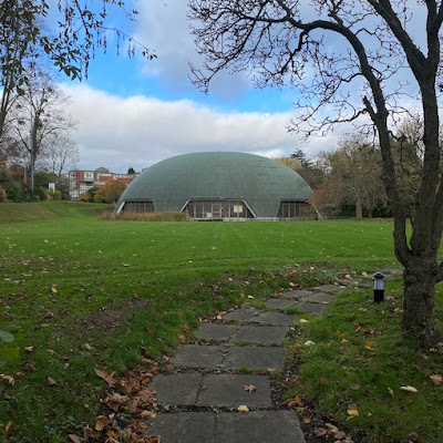
I thought I knew Great Malvern well. I visit it quite often, have inspected it beautiful, late-medieval priory, admired its splendid Victorian railway station, walked its leafy, genteel streets, trekked up – or part-way up – its hills in search of wells and views, and have poked around its secondhand bookshops in search of more things to add to my shelves. So the other day, walking down one of its streets for the first time, I looked to one side and saw the surprising structure in my photograph.

So what is it? Fortunately for me, a lottery-funded scheme to put up plaques explaining bits of Malvern’s history obliged with some information. It turns out to be something rather unusual. It is one of the very few surviving Binishells (named after their inventor, the Italian Dante Bini, and sometimes called Bini domes) in the UK. What distinguishes such a dome is the way it is built. The structure starts with a base, which takes the form of a concrete ring beam. On top of this is laid a large circular sandwich, in which the bread is two sheets of neoprene, while the filling is a mesh of expanding steel coil and a lot of wet concrete. When all this is in place and lying flat on top of the base, the builders pump air into the space between the base and the sandwich, inflating the neoprene, stretching the skin and expanding the reinforcing coil. In the case of the Malvern dome, which is 36 metres across, an hours’ pumping inflated the dome to 11 metres high. The air and stretched neoprene were then kept in this position, supported by air pressure, for three days, by which time the concrete would have set. Result: one dome, for use as a school sports hall..

In this example, eight windows were cut into the lower part of the dome once it had set solid, to provide natural light. When it was completed in 1978, the Duke of Edinburgh† came to open it, and it has been used for its original purpose ever since. Although it looks rather an interloper amongst Malvern’s greenery and mainly 19th-century architecture, its green curves are not entirely out of place among the trees. I hope it continues to be used and maintained – I know of only one other Bini shell in England, in Mildenhall, Suffolk, also a sports hall, though there may well be others. Here’s to Dante Bini and his domes.

- - - - -

* Dante Bini, architect and industrial designer, born 1932, admirer of such innovative engineers as Frei Otto and Buckminster Fuller, the latter famous for his pioneering work on geodesic domes. Bini has also been involved in designing rapidly built housing for the victims of disasters, making his designs available to others royalty-free.

† The dome is called the Edinburgh Dome in his honour.

Friday, April 23, 2021

Rochester Row, London


Built to last?

When I first passed this piece of 1960s concrete sculpture in London’s Rochester Row, I’d no idea who created it. A while later I found out about the sculptor William Mitchell, who made a specialism of creating abstract sculpture out of concrete. I’ve since encountered his work in Coventry and elsewhere. However even then I didn’t make the connection because it slipped my mind that I’d taken this photograph (I got carried away with a nearby fire station, not to mention the famous Blewcoat School just up the street.) Much later, looking for the image of the fire station, I found this picture next to it in my files, and thought, ’Surely, that must be by William Mitchell.’ And so it proves to be.

What the image shows is actually only part of the artwork, which is too long to photograph in one go because it stretches all the way along the concrete beam that links the building’s main structural columns. So I photographed a bit that I particularly liked. Even when I found the picture again, I didn’t realise its full significance. William Mitchell told a friend: ‘This was the first integral piece of concrete art ever produced.’ It’s a ‘ring beam’ which linked all the columns and on which the remainder of the structure depended. ‘I designed it, made the moulds and the builder poured the concrete,’ said the sculptor.

Now William Mitchell’s work is better known, in spite of the fact that much of it has disappeared because it forms part of buildings that have fallen out of use and been demolished – like the northern part (about one third of the whole) of this very building. I think that’s a shame, and I hope plenty of Mitchell’s remaining sculptures do survive. I think they often enliven streetscapes and buildings that are otherwise dull, and that they show a true artist responding to a 20th-century material in creative ways. They are very much of their time, but also, in my opinion, deserve to outlast their time. I’m glad the work of William Mitchell is appreciated at last.


Tuesday, October 29, 2019

London, on the overground, southbound


Scene with cranes

Back in October 2008 I wrote a post about Battersea Power Station, then in sore need of care, which I spotted as I passed it on a train. I began my post with these words:

It would take a Piranesi to do justice to the shell of London’s Battersea Power Station, vast, roofless, and decaying by the side of Chelsea Bridge. I was reminded of it recently as I crossed the bridge in a train from Victoria on my way to a meeting, and I photographed it hastily through the dirty window of the carriage. Hence this picture, as far a cry from Piranesi as possible.

After lamenting the building’s condition, I described it and its history very briefly, dwelling on the huge size of its brick structure, the role of Sir Giles Gilbert Scott in designing its Art Deco details, its influence on later power stations, and the various schemes that had been hatched to restore it.* The other day I passed it again on the overground and aimed the camera of my mobile through the window. This time my photograph was a little brighter, even though the weather that day was far from sunny and I had just missed being drenched in a downpour.† As I looked at the building with the various bright new structures appearing around it, all surrounded by a forest of cranes, I wondered if its prospects were similarly bright.

What I could make out as the train accelerated towards Clapham Junction was the power station’s four fluted chimneys, made of pre-cast concrete blocks, and one stretch of brick wall, recessed in a pattern of verticals. Everything else is hidden by scaffolding and other buildings, completed or under construction. I was glimpsing a work in progress then, which will see the power station as the heart of new ‘mixed-use neighbourhood’ incorporating shops, offices, and apartments, a mega-scheme that is clearly proceeding apace. The power station itself is being redeveloped by architects WilkinsonEyre (no relation) to provide some of the most prestigious apartments in the complex. Many of the essential elements of the building will be preserved, others will go, but the new work will, we are told, “pay homage to its history”. A lot will be different – there’ll be a bit poking out at the top, for a start§ – but the corner towers and chimneys will remain, at least, and buyers are promised interiors that “resonate with [the original building’s] irrepressible character”.

Well, I hope the character won’t be repressed. We’ll see. But looking at the plans and the buildings that are already up, it seems unlikely that I’ll be seeing much of it from the train, though I might from a river boat. In the meantime I’m crossing my fingers that the noble structure is not totally subsumed by new build, and that the resulting flats are bought by people who actually live in them.

- - - - -

* There had been a clutch of such schemes, involving everything from flats to a theme park.

† At least some of the brightness is due to the better quality of smartphone cameras these days.

§ There is so often a bit poking out at the top. Sometimes, aesthetically, it is a disaster.

Saturday, March 30, 2019

Ilminster, Somerset


‘The war’

In 1940 long defensive lines were constructed running across southern England to hold up an enemy advance in the event of an invasion. These lines, made of barbed wire defences, tank traps, and thick-walled concrete pillboxes, were extensive, but they had weak points where access routes crossed them. One such point was at Ilminster in Somerset, where, in those days, the A303 passed through the middle of the town. Ilminster itself was therefore fortified, with a ring of barbed wire and tank traps, some earthworks, 17 pillboxes (each with a machine gun), and a heavy gun emplacement.  As well as the machine gunners, there would be riflemen dug in, and altogether about 400 people (up to half of them local home guard members) were needed to man this complex, defend Ilminster, and, so it was hoped, play their part in repelling the invading force.* Parts of this defensive line still exist. This pillbox is on a public footpath that once formed part of one of the long entrance drives to Dillington House, connecting the mansion to the town. The thick concrete has survived well, and the polygonal structure still looks fit for purpose. Eighty years’ growth of moss, plus some ivy, only help to camouflage the box.

When I was a boy in the 1950s and 1960s, local pillboxes in Gloucestershire were somewhere to play. We all knew they had been built ‘for the war’, but the reality, that, if we’d been boys 20 years earlier and things had gone differently, our own fathers, or, more likely, grandfathers, might have been risking their lives defending them, hardly impinged.† Seeing such boxes now (and experiencing briefly the temptation to ‘play’ with them in another way, imagining not the brutality of war but the origins of brutalist architecture) brings one up short, as I’ve been brought up short by reconstructions of the First World War trenches in Piccardy or by exploring the formidable defences put up in Czechoslovakia, to no avail, in the late 1930s in the hope of protecting the country from invasion by the Nazis. I hope I’ll never have to confront this brutality in person, and that neither my son nor my nieces will either. All politicians should look at such buildings, use their sometimes limited imaginations, and reflect.

- - -

* Information panels on site tell the story of these defences. I’m indebted to them.

† Back then, c. 1960, memories of World War II were close for adults; everyone knew what you meant when you said ‘the war’.

Tuesday, January 8, 2019

Bridgwater, Somerset


An Englishman’s home…

A few weeks ago I was in Bridgwater and wondered if Castle House, long hidden under scaffolding and protective sheeting, was at last visible again. I decided to have a look, but I was a few days too early. I’ll explain…

I first came across Castle House in 2004, when I was writing the book for the second series of BBC2’s programme Restoration. I learned that the house was built in 1851 and is a very rare early example of concrete construction. It was conceived and built by John Board, a cement manufacturer, and was designed as a showpiece for the material – in particular a way of showing that concrete was as good as conventional masonry at producing the kind of ornamental architecture that the Victorians loved. So the concrete was designed to look like stonework, and it was covered with ornamental flourishes – bands of interlocking circles, Tudoresque dripstones over the windows, scrolls over doorways. The building was designed as a family house, but it  also contained rooms for Broad’s offices: no doubt he was keen to show clients the potential of the material he manufactured and championed.

By 2004 the building was fire-damaged, derelict, decaying, and propped up with scaffolding. It had been empty for years and Historic England once called it ‘the most endangered historic building in the South West’. Its importance was championed by SAVE Britain’s Heritage,* and slowly, over many years, the plans and funds for its restoration came together. When the action got going, the painstaking work went on behind a swathe of scaffolding poles and sheeting.† And now the work on the walls and roof has been completed and the covering has been removed. The interiors are still to be completed, but the building is sound and watertight, and can at least be seen from the outside. I’ll have to return to Bridgwater and have a look for myself in the New Year.

- - - - -

* The photograph at the top of this post comes courtesy of SAVE Britain’s Heritage.

† The architects for the restoration are Ferguson Mann Architects, who have been involved with the project since 2009.

Saturday, June 23, 2018

The Brutalist world


The second of my quartet of summer book reviews is a massive work of reference on an architectural style that, having fallen out of favour, now seems to be fashionable again.

Oliver Elser et al (eds), SOS Brutalism: A Global Survey
Published by Park Books 


I’ve been impressed by a number of the recent books that have helped us to look with a more informed eye on the concrete buildings of the 1960s and 1970s and have led to a new appreciation of the architectural style known as Brutalism. One of these books has already been reviewed here; others have got me thinking too. I lived through the period when these buildings went up and was educated in a school designed by one of the most celebrated (and occasionally reviled) architectural practices of the period, but these books have told me more about the period and the interest of its architecture.

But I’ve been left uncertain of the wider context, and of the definition. What exactly is Brutalism? Every book seems to have a different perspective on this, and much of what I’ve read covers Britain, but doesn’t set this country in the wider picture of world architecture. How unlike books about 1930s modernism, which can’t wait to tell us about Le Corbusier, Watler Gropius, and Ludwig Mies van der Rohe, and rightly so.

SOS Brutalism helps with this context. It’s a global survey in two large volumes of Brutalist architecture, combining the views of one hundred authors, several of whom have written extended essays and case studies published here. The first of the two volumes, the big fat one, begins with a short series of essays and case studies. British readers will be especially interested in two contributions by leading authorities: ‘British Brutalisms: New and newer’ by Barnabas Calder and ‘British Universities: Opportunities for a rising generation’ by Elain Harwood. But there are also pieces looking at varieties of Brutalism, and at the style in places from Japan to the former Yugoslavia.

The rest of the fat volume consists of a generous coverage of 120 buildings from all over the world. This gives a broad picture of Brutalism across the world, with enough illustration in the form exterior and interior photographs, details, and, sometimes, plans or cross-sections, to give a sense of each example. This reader was pleased to be introduced to a variety of interesting buildings in South Asia and Latin America, and to be reminded of the Brutalist architecture of Eastern Europe (and by a writer ready to admit the elasticity of the term ‘Eastern Europe’* and keen to stress that generally architects in this region did not use the term ‘Brutalism’ at all). Concrete addicts will not be able to get enough of all this, and some of us will marvel at the depth of interest in parts of the world we’ve not visited, from Africa to South Asia.

This volume is bundled with a second, slimmer but still substantial, of contributions to a symposium held in Berlin in 2012, and published under the auspices of the Wüstenrot Foundation. This material consists of a further 17 essays, some on specific buildings such as Hunstanton School and the Czech embassy in East Berlin, some on particular countries (Italy, the USA, Japan, Germany), still others on more general themes, wrapping up with studies of New Brutalism’s relevance today and on the issue of giving these buildings the status of historical monuments. This whole project, which includes a huge amount of previously unpublished material, is impressive, monumental, and far too large to be done justice in a short review like this. This review is simply a pointer. If you’re at all interested in the subject, find a copy of this impressive double volume, look at it, and decide: it will almost certainly be for you.

- - - - -

*Many Czechs. for example, insist that their country is in Central Europe, and they have a point. Vienna is more easterly than Prague.

Friday, November 11, 2016

The white stuff


It's that time of year again. As winter sets in and Christmas approaches, I post a few reviews of recent books that have struck a chord with me this year. I begin with a new book on Brutalism and, especially, on concrete – subjects that I've only rarely touched on here...

Barnabas Calder, Raw Concrete: The Beauty of Brutalism
Published by William Heinemann


Over the last few years, Brutalism, the architectural style of the 1960s par excellence, has begun to be described, discussed, and appreciated more than ever since the building boom in which these boldly massed and often controversial structures were built. In this new book, Barnabas Calder nails his colours to the mast. He likes these buildings, has always liked them, and likes, more than likes, loves the material most of them are made of. The book’s first sentence is, ‘I am a lover of concrete.’

Over 300-odd pages, Calder presents a detailed account of a clutch of Brutalist buildings, documenting their history, anatomizing their design, and explaining what’s good about them. Several are the usual architectural suspects in London – structures such as Ernö Goldfinger’s Trellick and Balfron Towers, the vast Barbican development by Chamberlain, Powell and Bon, and Denys Lasdun’s National Theatre. There are also less well known and more far-flung but equally interesting buildings, like New Court, Christ’s College, Cambridge, and buildings I’d not thought Brutalist at all, like Stirling and Gowan’s Engineering Building for Leicester University. And there’s the commercial Brutalism of Richard Seifert, the architect of London’s Centrepoint block. 

They all throw up memorable stories. We meet the rebarbative Goldfinger getting angry that someone in his office isn’t working and sacking him on the spot; the victim turns out to be a visitor. We get insights into the struggles between architects and builders at the Barbican. We marvel at how Denys Lasdun coped with multiple and contentious committees when building the National Theatre. And we meet Sir Leslie Martin, the quiet man of Brutalism, overseer of so many projects for the LCC and mentor to so many young architects.

Along the way, Calder tells us a lot about concrete. That, after all (and notwithstanding Jim Stirling’s red buildings, which flaunt their red brick and problematic glazing) is where Brutalism begins, with béton brut, the raw concrete of the title. Calder loves this material but his is not an unquestioning love. He loves it most when it is good quality concrete. And although many people think of concrete is a cheap material, good concrete isn’t cheap. His accounts of the hammered concrete at the Barbican make this clear. Bush hammering produces the artistically roughened surface that makes much of the Barbican so impressive. You get it by hammering off the topmost layer. But that doesn’t mean you can pour the concrete any old how. Concrete destined for hammering has to be just so before you set to work with the hammers – if it’s not, the stuff breaks off unevenly and you have a mess. And the hammering itself takes a lot of time, noise, and dust. It’s a tough job. Similar pains went into the production of the concrete at the National Theatre. Here it was poured in situ into wooden shuttering. But the shuttering had to be just right, and only reused once – more than that and it would not produce the crisp image of the wood on the concrete surface that is such as feature of the building. Structures like the National required as much craftsmanship as good brickwork or stone masonry. All this is conveyed with the author’s winning mixture of clarity and zeal.

Calder talks about how the buildings work, too. And he’s honest about this. While thoughtfully explaining how well planned most of the structures are, he also admits some of their shortcomings, such as their energy consumption – they were built at a time of relatively cheap electricity. Even so, for Calder, these buildings are about as good as it can get. He’s always their advocate and his book is an enjoyable, informative, and entertaining read.

Wednesday, September 7, 2016

Coventry, Warwickshire


Set in concrete

Egged on by my reading of the recent Historic England book on Coventry,* I wanted to use my visit to the city to have a look at something I’d missed before, the concrete mural (actually an entire structural wall playing the additional role of public sculpture) outside the former Three Tuns pub in the city centre. I came away glad I’d done so, and full of admiration for its creator, the sculptor William Mitchell.

Mitchell was in the forefront of finding new ways of casting concrete for sculptures, including the use of polystyrene and polyurethane moulds. He worked widely and closely with architects, notably in new town developments such as Harlow, for the London County Council, and on new buildings in places such as the Barbican in London. For this mural in Coventry, Mitchell employed polystyrene sheet cut with hot wire set against the shuttering before the concrete was poured. The concrete incorporates pebble aggregate and was cast in one piece, with rectangular spaces left for the window openings.

The forms Mitchell created in the Coventry mural (made in 1966) are bold and abstract – and I think they work well as a succession of engaging abstract forms. But they also suggest all kinds of possible visual interpretations. People have seen in them the sun and its rays, mechanical components such as gear wheels, or bits of a city viewed from above. The mural’s listing refers to the sculpture as an example of Mitchell’s Aztec style and it certainly does have a Meso-American feel to it, although I don’t know whether the artist saw it in those terms.

Looking at it took me back to an evening years ago at an exhibition of mostly abstract paintings by an artist friend. Standing next to me was a middle-aged woman with a small girl, perhaps her granddaughter or niece. Together they were imagining the trees, rivers, and animals that they could imagine in these works of art. I quickly dismissed from my mind any thought that this was a rather naive way of looking at abstract painting – these things were there sure enough, if one applied a little thought to them. I feel rather the same about these William Mitchell murals – you can look at them on more than one level, and that’s a sign the artist is on to something, especially when it’s public art, and bound to be seen by anyone and everyone.

I know some people look down on work like this, done in concrete, a substance that they find dull and grey. If there were a hierarchy of sculptural materials,† concrete would be near the bottom, well below marble, bronze, and wood. And it’s true that a concrete work, in strong relief like this one, ideally needs some strong light to set off the forms with defining shadows. As it is, the front of the pub is in a shady spot, though perhaps the sun would have moved around later in the day to give it some welcome sideways illumination. But there’s still something to see here, and something, I’d say, to celebrate – the artful arrangement of shapes, the way the linear quality of the relief encourages your eye to follow the design across the wall, the texture of the material. I’m glad this relief is listed and unlikely to go the way of so many other William Mitchell pieces,¶ cut down and chucked away, because nobody wants to look at concrete art.§

*Jeremy and Caroline Gould, Coventry: The Making of a Modern City 1939–73
Published by Historic England; see my review here.

†I’ve mentioned this idea of hierarchy in terms of building materials a few times in blog posts; the notion won’t go away.

¶Mitchell continued to make concrete works into the 1970s, and helped develop a special formula, called Faircrete, that would hold relief patterns drawn into it while also setting very hard. However, by the mid-1970s British architects had turned away from his style and he worked increasingly abroad. The 1990s saw him involved with various projects for Harrods owner Mohammed Al Fayed.

§Those still not convinced might prefer to look at my recent post about a Georgian building in Coventry, here.

Monday, January 18, 2016

Kennington Road, London


Growing complex

Just when we think it’s all concrete boxes, post-war architecture surprises us again. This concrete screen, with its surface that bends organically in and out and up and down, is set within a five-storey building in Kennington Road, not far from North Lambeth underground station. Most of the building, a standard modernist flat-topped box, all straight lines, is an office block. The screen signals a different function: this part of the structure is a church and was built in 1958–60 to replace an earlier bombed-out building. The architect of both the box and this extravaganza set within it was Peter J Darvall. When I shared this picture on Facebook, one friend said it made him feel slightly queasy. Perhaps the facade’s fluidity induced a seasick feeling; or maybe it just seemed to resemble a sinister growth. It does, it’s true, combine an organic quality with a weirdly mutant one. The veined twisting and turning forms make me think of a hosta gone wrong; the way the structure ducks and dives under and above itself is also faintly disturbing. A bad trip?

And yet. There’s something compelling about it, something that makes your eye follow the facade up and down, in and out, and something that makes you admire the architect’s use of concrete to create more than just another box. It made me look twice at it – made me turn round, go back, and look a third time, actually. It’s a reminder, too, that at around this time architects were experimenting with all kinds of fluid forms in building. A reminder that this is a period when anyone who writes about buildings needs to resort to metaphor: sails in the harbour, or nuns fighting (Sydney Opera House), a pair of wings (New York’s TWA Flight Center), Paddy’s Wigwam (Liverpool’s Roman Catholic cathedral). The last is woefully inaccurate, of course, and all these descriptive attempts are limited in their usefulness. But they remind us that buildings can both define places and suggest other places or things entirely, creating paradoxes that twist and turn like the undulating surface of this facade.

Thursday, October 30, 2014

Marylebone Road, London


Going somewhere else

Here’s another example of the 1930s ocean liner style, but on a much larger scale than the little tram shelter in my previous post. This building is Dorset House on the northern side of Marylebone Road, near Baker Street. It was built in 1935 to designs by T. P. Bennett & Son, with the prominent modernist architect Joseph Emberton acting as consultant on the project.

I often pass by this block and give it an appreciative upward glance. I like the mix of projecting sections that ensures not only that the vast facade is broken up agreeably but also that the rooms inside are well lit – although the block is south-facing those angled windows bring some eastern and western light into many of the rooms too: a thoughtful touch. The rectilinear geometry of window frames and flat top is offset by the impressive collection of curves displayed by the balconies: curved brickwork, curved concrete floor slabs, curved railings. I doubt that many residents take the afternoon sun on these south-facing balconies: the noise from the traffic in Marylebone Road would limit one’s enjoyment. This must have been less of a problem in the 1930s.

The bright green of the railings is a colour I particularly associate with 1930s buildings. White walls and green roof tiles was a popular colour combination in the period. A big pitched roof of green tiles could be rather strident, but these nautical green railings are more pleasing, especially as they’re combined with a mixture of bricks and white paintwork. An enjoyable effect, even though the balconies look down on the buses and taxis of Marylebone Road rather than a sandy beach and an inviting sea.

Wednesday, June 25, 2014

Lawn Road, London


Flats and curves

In 1934 the Lawn Road flats, designed by Wells Coates for the Isokon Company, were completed. They were the fruit of the joint vision of their architect and Jack Pritchard, who worked for the plywood manufacturer Venesta and had got to know Coates a few years before because they shared an interest in the use of plywood in furniture and building construction.

The block was very different from anything else built at the time. Coates and Pritchard conceived it as accommodation for young single professionals – the kind of people who in the 1930s normally expected to rent a room in ‘digs’. Most of the flats in the block were therefore very small, consisting of a living room with bed space, a tiny kitchen, bathroom, and small dressing room where there were wardrobes and cupboards for clothes. Fitted furniture helped make these small spaces both agreeable and efficient. As well as these ‘minimal flats’ there were also some larger ones with room for two people.

Just as remarkable as these interiors were the structure and exterior of the block. Made of reinforced concrete finished in white with the palest hint of pink, the block is quite unlike the neo-Georgian norm for flats at the time. The sculptural access balconies dominate the side of the block visible from Lawn Road, defining the building’s shape from curving corner at one end to protruding staircase tower at the other. As well as looking good, the balconies work structurally too – an underground tunnel under the front of the site restricted the footprint of the foundations, so cantilevering out the balconies made practical sense.

Embodying a ‘modern’ way of life in an up-to-the-minute design, the Lawn Road flats gained a lot of publicity. Coates hoped that they would be copied, providing much needed compact accommodation in many other places. This seems not to have happened, perhaps because developers could make more money in other ways. And the Lawn Road flats themselves seem to have attracted more upmarket residents than the architect envisaged – Agatha Christie and Adrian Stokes had flats there, the block attracted architects and designers including, for a while, Walter Gropius and László Moholy-Nagy, and a surprising number of the residents were once involved in the world of espionage.* Nowadays, under the auspices of Notting Hill Home Ownership, the block has been restored and its flats are mostly home to key workers who are closer to the constituency that Coates originally imagined.

- - -

*There’s more on this building and its inhabitants in David Burke, The Lawn Road Flats: Spies, Writers and Artists (Boydell Press, 2014).

Wednesday, September 25, 2013

Preston, Lancashire


Listed and classified

It was announced this week that the bus station at Preston, built in 1969 to designs by Keith Ingham and Charles Wilson of Building Design Partnership, has been listed, making demolition or major alteration much less likely.

This has been a controversial building. It has been called an 'eyesore' and the local council have pressed for its demolition (that pressure was all the stronger when there were plans to build a large shopping mall on the site, plans that fell through when the recession hit). But in a survey, eighty per cent of local residents said that they felt attached to it and organizations such as English Heritage have campaigned for its preservation. I am on the side of the preservers here. I like the way the building combines the double-eight space for buses and passengers on the ground floor with the floors for parking above. The curving balconies of the parking floors are stunning, making a kind of sculptural impact that is head and shoulders above most multi-storey car parks, or most modern buildings for that matter. Inside the bus station, the public areas are well designed and retain many of their original features – white tiled walls, dark hardwood fittings, modernist clocks.

One of the interesting things, architecturally, about the bus station is that it's usually referred to as a Brutalist building. But Brutalism, the bête noire of haters of modern architecture, is actually rather hard to define. Penguin's Dictionary of Architecture and Landscape Architecture, for example, defines it primarily in relation to the architects that influenced it and pioneered it – late Le Corbusier, the Smithsons, Stirling and Gowan. It goes on to say, 'Brutalism nearly always uses concrete exposed at its roughest (béton brut) and handled with overemphasis on big chunky members which collide ruthlessly.' Preston Bus Station hardly matches this description. The concrete's curves are the opposite of rough and the elements don't collide, they are combined with care and flair. The building seems to me to embody a kind of softened modernism that is very British. But Preston Bus Station is very big, and built from concrete: it gets tarred with Brutalism's broad brush.* 

Like it or not, then, it's listed, but that's just the beginning of the story. A building like this comes with huge challenges. Maintaining it, adapting it so that it's properly integrated with the city centre, even keeping those uriniferous stairwells clean – all this costs money and requires determination. I hope English Heritage will support the council in finding ways to meet these challenges.

- - -

* Gothic, the name of a barbarian tribe; Baroque, an imperfect pearl; Brutalism; we do beat ourselves up, rather, with our designations for architectural styles.

Thanks to Jack Meacher for permission to use his photographs.

Wednesday, May 22, 2013

Hullavington, Wiltshire


Backward glance (1): Beyond the perimeter fence

In this post last year I looked at an aircraft hangar at Hullavington and mused on my boyhood interest in airfields.

As a small boy I was fascinated by airfields. Airfields (not airports, which in the 1950s and 1960s were for the rich to travel from, and therefore out of bounds) were quiet, empty places, mostly, and oddly spacious in a countryside that, even then, was quite intensively farmed. I longed to see aeroplanes taking off and landing, but hardly ever seemed to be there at the right moment. So I had to be content with the purposeful impedimenta of the airfield, most of it unfamiliar to me but not too difficult to understand from its names alone. There was a perimeter fence (chain-link), a control tower (concrete), runways (ditto), grey parked vehicles (various), and a windsock (brightly coloured). For much of the time the windsock seemed to be the most animated thing around. Also occasionally on the move was a long grey low-slung truck, a low-loader in fact, sometimes spotted on neighbouring roads, apparently for moving bits of aircraft around.

And then there were hangars,† long and low, hugging the ground. Some even tried to blend into the ground with their grass-covered roofs. They had broad, sliding doors but these were usually closed and anyway were too distant for me to have seen what was inside. Still, when I see hangars, I’m fascinated by their tantalizing doors and their functional, often ground-hugging form. I’m still very ignorant of their history and complex typology – I see from a Ministry of Defence website that there are at least 56 different types in use in Britain alone, ranging from temporary portable structures to vast warehouse-like sheds that can take airliners or transport aircraft.

This one is a Type E hangar at RAF Hullavington in Wiltshire. Its design was introduced in 1937 – no doubt lots of hangars were being built around this time – and has a curving steel frame supporting a concrete shell roof, covered by the all-important camouflaging grass. It’s huge, and very functional, but also rather elegant, and from a distance it blends into its surroundings so that it seems hardly there at all. Whenever I pass by the door still seems to be closed.


* * *


Looking back at this post, I'm struck by the many different reasons I might have found, even then, to be interested in places like this. Back in c. 1960, World War II was still recent history – it was usually referred to, without ambiguity, as 'the war', reruns of not-so-old war films appeared very often on TV, and war themes loomed large in playground games and parental memories alike. The first airfields I saw, in Lincolnshire, had played a key part in that war, and looking at them, even from the wrong side of the perimeter fence, gave me an insight into this history.

I was also learning about the differences between places. The open spaces and distinctive buildings of airfields, so different from the small garden and tiny interiors of my childhood home, provided a dramatic demonstration of just how varied places could be – in the quality of their architecture, their use, their atmosphere, their sense of space. If this seems obvious, it's worth remembering the shock of the different that a five-year-old child, who'd not travelled very much, must have experienced. The fascination of what 's different, and local, and distinctive, has been holding my attention ever since.


* * *

Hangar: not a self-explanatory word. Were there lightweight, World War I biplanes hanging up in there? I wondered. No, hangar’s etymology is far from certain, according to the OED, but comes from French (and probably also Germanic) words meaning shelter. Our hamlet has the same roots. The dictionary’s first example comes from Thackeray’s Henry Esmond and has nothing to do with aircraft at all: ‘Mademoiselle, may we take your coach to town? I saw it in the hangar.'

Wednesday, May 15, 2013

Lydney, Gloucestershire


In the shadows, in the sun

Unassuming, isn't it? This utilitarian building, part of a very large industrial complex near the harbour in Lydney, is now at least partly empty. Walking past it on my way to look at the front of Naas House, something struck me about the way it is built, and I wanted to know more about it: above the plywood doors, those concrete walls, the imprint of their shuttering visible on the surface, seem like something out of the 1960s. Industrial Brutalism? They turn out to be earlier, an example of the ways in which the industrial and military architecture of World War II, simply by being utilitarian and hastily built, seems to anticipate what became high fashion later.

This building (I think: I've not found much information about it) is part of a factory, the Pine End Works, built in 1940 to make plywood for the fuselages of the Mosquito aircraft and for the Horsa gliders that were used in the D-Day landings. It was one of a host of factories built around the country, in places off the regular routes of the Luftwaffe bombers, to produce military aircraft (and later other hardware required during the war). These were facilities called "shadow factories" and they were built both to increase production and to guard against problems caused by the loss of existing facilities that might more easily be bombed. The staff, many of whom were women, were ordered to keep secret what they were producing and the outfit running this one, to maintain secrecy, was called simply and enigmatically Factories Direction Limited.

The works was well sited to receive the large quantities of timber required, which came up the Severn from the Bristol port of Avonmouth – Lydney's harbour and canal are nearby. After the war the factory continued to produce plywood, but as far as I know has been empty for a while. It's bleak and unregarded now, but I'd like to think that with some care and attention, the vast spaces inside could again hum with the activity of people making things. Meanwhile, there it stands, to remind us that the least elegant of structures can have an interesting history.

Wednesday, January 30, 2013

East Tilbury, Essex


Bataland

Deep in eastern Moravia, in the Czech Republic not far from the border with Slovakia, lies Zlín, the factory town of the Bat'a shoe company, built in the period between the two world wars. It's the brainchild of the shoe magnate Tomáš Bat'a, who was expanding his business on the back of rich profits from supplying boots for the Austro-Hungarian army and wanted his workers to live in comfort in a modern environment. So Zlín has tree-lined streets of flat-roofed houses in the modernist mode. The city is zoned – houses here, civic centre there; parks here, factories there. It all owes something to the utopian ideas of the garden city movement, and something else to the modernist Cité Industrielle proposed by the great architect and urbanist, Tony Garnier of Lyon. In spite of this, though, Zlín is Czech through and through. Its principal architects were František Gahura, and Vladimir Karfik.

Bat'a's business boomed and Zlín spawned satellite cities around the world, in Canada, India – and Essex, where at East Tilbury a concrete, steel and glass factory was constructed and streets of flat-roofed houses were put up for the workers. Whereas the houses in Zlín are mostly brick, in East Tilbury many of them are pale concrete, so the place looks even more modernist than its Moravian parent. It still surprises me that this place not far from London, where thousands lived in the kind of modernist planned town that is often said to be alien to Britain, is not better known.

The first Bata factory at East Tilbury was built in 1933, and it was soon followed by shops, a cinema, sports facilities, a school, and streets of houses for the influx of workers who came to live and work here. As at Zlín, the style of the buildings was modernist – in fact it was the work of the company's own Czech architects including Gahura and Karfik, and it's said that even many of the components for the houses were shipped in specially from Central Europe. The people who lived here in the early days were a mix of Czechs who relocated to the UK and locals who were pleased, in the hard times of the 1930s, to find a job with a decent wage and a house. After World War II and the coming of communism, the Bat'a business was nationalised in Czechoslovakia but the rest of the company continued independently around the world. The factory at East Tilbury continued making shoes until 2005, when it closed as the company moved production closer to its main export markets. By this time this odd modernist town had functioned for over 70 years.

East Tilbury, though never as big as Bat'a intended, and nowhere near the size of the large city of Zlín, was a viable factory town in its day. With the factory gone and many buildings unused, it's a shadow of its former self. But it's a fascinating, and early, example of modernism in Britain, and an interesting example of a coming together of two cultures, Czech and British, that had previously had few close encounters. There is nowhere else in the country quite like it.

- - - 

East Tilbury was featured in Jonathan Meades's latest television programme, The Joy of Essex (BBC4), available for a few more days to those who have access to the BBC's iPlayer site.

Linguistic note: In Britain, the company was always known as Bata and is therefore not incorrectly pronounced by Brits as "barter". In Czechoslovakia, and now in the Czech Republic, however, it is spelled Bat'a and the pronunciation comes out as something like "BAT-ya". 

Monday, September 24, 2012

Campden Hill Road, London


The white stuff

When I lived in Notting Hill I occasionally walked past this block of flats on Campden Hill Road. As one often does when passing half-familiar buildings in one's own neighbourhood, I noticed them, but did not look closely. "That modernist block of flats," I thought to myself. "How well they did things in the 1930s." After all, many of the features of 1920s and 1930s modernism were there: the white walls, the flat roof, the long balconies, the strip windows, and the modernist arrangement of balconies, windows and stepped-back corners on one side.

But this block was not built between the two world wars. It was actually put up in 1965, to designs by Douglas Stephen. In the mid-1960s, British architecture was developing in many different ways – the era gave us Brutalist multi-storey car parks, steel-framed houses, the disciplined poise of some of Denys Lasdun's work, the sculptural concrete of the Barbican. But very little quite like this, a throwback to another era: modernist revival, if you like, or the 1930s revisited, showing the influence not only of Le Corbusier's interwar villas but also of the Italian "rationalist" architects of the pre-war era (long shunned for their links with fascism). There's nothing fascist about this design though. Poised on its leafy corner of west London, it represents a way of building that has endured rather well.


Monday, April 9, 2012

Hullavington, Wiltshire


Hardly there

As a small boy I was fascinated by airfields. Airfields (not airports, which in the 1950s and 1960s were for the rich to travel from, and therefore out of bounds) were quiet, empty places, mostly, and oddly spacious in a countryside that, even then, was quite intensively farmed. I longed to see aeroplanes taking off and landing, but hardly ever seemed to be there at the right moment. So I had to be content with the purposeful impedimenta of the airfield, most of it unfamiliar to me but not too difficult to understand from its names alone. There was a perimeter fence (chain-link), a control tower (concrete), runways (ditto), grey parked vehicles (various), and a windsock (brightly coloured). For much of the time the windsock seemed to be the most animated thing around. Also occasionally on the move was a long grey low-slung truck, a low-loader in fact, sometimes spotted on neighbouring roads, apparently for moving bits of aircraft around.

And then there were hangars,† long and low, hugging the ground. Some even tried to blend into the ground with their grass-covered roofs. They had broad, sliding doors but these were usually closed and anyway were too distant for me to have seen what was inside. Still, when I see hangars, I’m fascinated by their tantalizing doors and their functional, often ground-hugging form. I’m still very ignorant of their history and complex typology – I see from a Ministry of Defence website that there are at least 56 different types in use in Britain alone, ranging from temporary portable structures to vast warehouse-like sheds that can take airliners or transport aircraft.

This one is a Type E hangar at RAF Hullavington in Wiltshire. Its design was introduced in 1937 – no doubt lots of hangars were being built around this time – and has a curving steel frame supporting a concrete shell roof, covered by the all-important camouflaging grass. It’s huge, and very functional, but also rather elegant, and from a distance it blends into its surroundings so that it seems hardly there at all. Whenever I pass by the door still seems to be closed.

* * *

Hangar: not a self-explanatory word. Were there lightweight, World War I biplanes hanging up in there? I wondered. No, hangar’s etymology is far from certain, according to the OED, but comes from French (and probably also Germanic) words meaning shelter. Our hamlet has the same roots. The dictionary’s first example comes from Thackeray’s Henry Esmond and has nothing to do with aircraft at all: ‘Mademoiselle, may we take your coach to town? I saw it in the hangar.’

Sunday, November 13, 2011

Atherstone, Warwickshire


Forgotten industries (2): Where you got that hat

I know, I know. Today’s building is hardly a beauty. An abandoned, brick-and-concrete factory, built probably at some time in the early-20th century, looking as if it’s waiting for what is tamely known as “the economic downturn” to come to an end before the speculators get busy on another canalside development. But even such unloved lumpen-architecture has its history and its interest.

Look at some film footage of a busy city centre in the early-to-mid 20th century – the period between the two World Wars, perhaps, or even the 1950s. Look at the men and at what’s different about their appearance: nearly every one is wearing a hat.† A sea of trilbies or flat caps in most towns, the occasional fedora or Homburg, endless bobbing bowlers in the City of London. Hats had long been part of the male wardrobe and were long part of the economy – a multitude of hat shops and, in the background, people and companies making hats. So where did they all come from, these hats of yore? If you were rich or upper class or both, you could buy your hats from one of the upmarket hatters in town. But the masses were more likely to wear mass-produced hats made in factories, and for centuries there were several of these factories in the town of Atherstone in Warwickshire.

Hats produced in Atherstone found their way all over the world. Billycock hats for slaves in the southern states of the USA, military headgear for British troops, trilbies by the million for everyday wear, they were all made in Atherstone, which had been a centre for hatting since at least the 17th century. When some of these markets disappeared, there was a decline in the industry, and some firms closed. The legion of hat-wearers, however, those British men who wore hats to keep their heads warm and to shade their eyes from the sun and because wearing hats was what men did, kept some of Atherstone’s hat-makers going. But in the end, hat-wearing fell out of fashion and there was just one firm, Wilson and Stafford, who took over a couple of their rivals and carried on making hats in this building by the canal until 1999.§

So there it is. Rows of broken windows (facing roughly northeast, to give useful working light, I suppose); purposeful if dingy brickwork and concrete framework; the Coventry Canal. A building that’s not important enough to be listed, or beautiful enough to be looked at by many except disaffected stone-throwers. But a vital part of history and everyday life for past generations of local people. As vital and everyday as the hats on their heads.

* * *

† They’re in books, too. Once you start looking, hats are everywhere in the literature of the not-so-distant past. From the headgear of James Joyce’s Leopold Bloom, which bears the worn inscription “Plasto’s high grade ha”, to the “disreputable” hat of John Mortimer’s Rumpole of the Bailey, they are rarely items of glamour, but often revealing of their wearers. For treatments of hats and what they mean to their owners, I’d recommend searching out the elegiac piece on “Hats” in Michael Bywater’s glorious Lost Worlds and the short memoir “The Homburg Hat” in Richard Cobb’s People and Places, in which Cobb recalls a train journey to his public school and evokes the cringing embarrassment that can ensue when a teenage boy is not dressed exactly as his peers expect and require him to be.

§ And now if you buy a hat in the UK from anywhere other than a prestige hatter like Lock, it’s likely to have been made abroad. As an occasional hat-wearer myself, I can report that two of the three in my own wardrobe were made in South and Central America.

Thursday, March 25, 2010

Purton, Gloucestershire


Strangers on the shore

The British have been building boats for millennia, and sailing them, and wearing them out. When boats are no longer sea-worthy, they end up on the shore, getting recycled in interesting ways. Benjamin Britten’s Peter Grimes lived in a hut made of an upturned boat, like the fishermen’s huts of Lindisfarne. Masts become maypoles. Figureheads are made into garden ornaments. Countless wood-framed houses are said to be built of ‘old ship’s timbers’. As the salmon-fishers at the end of Andrew Marvell’s poem Upon Appleton House knew (who ‘like Antipodes in shoes, Have shod their heads in their canoes’) there are many things you can do with a boat as well as sailing it.

Near Purton, on the eastern bank of the River Severn (there’s a Purton over on the western bank, too, just to confuse us all) old boats have been used in a remarkable way. The Severn, with its great tidal range, challenging currents, and acres of mudflats, is a huge changing ecosystem. It deposits silt here and washes away banks there. In some places the banks need reinforcing, and here, it is old boats that have been used over the years to bring some stability to the shore.

At Purton, more than just the river bank was at stake. The Gloucester and Sharpness Canal, built to cut out some of the more difficult and winding stretches of the river on the way up to Gloucester, runs here parallel to the Severn and very close to its bank. In 1909, when the canal bank was threatened, a small fleet of old lighters was beached at Purton to reinforce the land and protect the inland waterway. As the years went by, more and more redundant vessels were beached here. Purton is now Britain’s largest ships’ graveyard.

Full or half-full of silt and tussocky vegetation, some 81 vessels reinforce the bank here. Timbers stick up from the ground; sometimes entire hulls remain, sometimes odd posts and tangles of ironwork. There are concrete boats too, and chunks of metal superstructure, and bits of old gearing.


They make a poignant collection ranging from Island Maid, built in Plymouth in 1863 and beached some time before May 1945, to the unpoetically named FCB 75, built in concrete by the Wates Building Group at Barrow in Furness in 1941 and beached in 1965. They were probably all as tough and utilitarian as FCB, but they had a job to do and they did it. And now they have another job, they do that too.