Showing posts with label modern. Show all posts

Monday, October 19, 2020

Chard, Somerset


Old and new

So you build a cinema in 1937 in the latest pared-back moderne style, all straight lines, plain brickwork, and strips of metal-framed windows. You decorate in a similiar style inside, with a stepped ceiling and concealed lighting, so that cinema-goers could imagine for a moment that they were in the latest picture palace in London, or Honiton anyway. And you call your cinema the Cerdic, after the first king of Wessex. It seems an odd mixture, but cinema was like that in the 1930s – and still is, one could say – using the latest technology and style, but equally at home in the worlds of science fiction and historical romance.

The Cerdic cinema was one of a small West Country chain run by the Wessex Kinema Company. There were others in Wellington, Somerset, and – yes – Honiton, Devon and, according the the excellent Cinema Treasures website, the buildings were almost identical. The architect was Edward de Wilde Holding (1886–1958), who was based in Northampton and form the evidence of this frontage had the idiom at his fingertips. The building doesn’t seem totoally out of place in the centre of the town of Chard – a place after all of old factories built of red bricks. As with so many cinemas, the exterior architecture is all about the facade. As you can see from my photograph, the rear of the building is a simple shed with a monopitched roof.

The Cerdic closed in 1962 and after a spell as a DIY store it was taken over by the Wetherspoon pub chain, who no doubt liked the combination of usable space and a long street frontage. Their popular pubs occupy numerous buildings (from old offices to spas) that might otherwise have struggled to survive in England’s town centres. This one was already filling up on the morning I passed by, as people took advantage of the building’s enduring mix of the old and the new.

Monday, July 1, 2019

Varieties of architectural experience


Susannah Charlton, Elain Harwood, and Clare Price (eds), 100 Churches 100 Years
Published by Batsford


Lots of people like visiting churches, but the image of the traditional ‘church crawler’ is of someone who likes old buildings – and often old buildings in the countryside. That range of interests excludes most 20th-century churches, which are widely seen as assertively modernist and are most frequently in towns. So 20th-century churches tend to be neglected by visitors, except for experts and the growing number of enthusiasts for the art and design of the last 100 years. This new book, published under the auspices of the Twentieth Century Society, presents a fresh look at British church architecture between 1914 and 2015, revealing the field to be rich and full of surprises.

The range is enormous. The period is not all about rebarbative modernism. It embraces such fine buildings as St Alphege, Bath (designed in the style of an early Roman basilica by Sir Giles Gilbert Scott) and St Mary the Virgin, Wellingborough (Ninian Comper’s masterpiece, in a style that blends Gothic and Renaissance); or St Saviour, Eltham, London (by Cachemaille-Day, Welch & Lander, under the influence of German expressionism) and neo-Byzantine St John the Baptist, Rochdale (by Hill, Sandy & Norris, with glittering mosaics by Eric Newton). There’s modernism aplenty too, like St John the Baptist, Lincoln, where architect Sam Scorer and engineer Kálmán Hajnal-Kónyi contrived a hyperbolic paraboloid roof of breathtaking sweep, or, yes Brutalist-fanciers, the sad, decaying corpse of St Peter’s Seminary, Cardross, a concrete masterpiece (‘already British modernism’s most spectacular and erudite ruin’) that’s quietly rotting away.

One hundred of these diverse examples, each glowingly photographed and briefly described, make up the body of the book. There’s also a series of short chapters on notable architects and practices – including Edward Maufe, H. S. Goodhart-Rendell, George Pace, and Gillespie, Kidd & Coia (the latter the progenitors of the ruin of Cardross). And in addition the editors have called into being specialist chapters including revealing surveys by Jane Brocket on stained glass and by Alan Powers on the art and artefacts, from fonts to altars, murals to lettering, that enhance many of these buildings.

It’s often the art that lingers longest in my mind when I visit these 20th-century churches, but the book is more than a series of portraits of single buildings and fine artworks. It also gives a sense of how changing ideas about religious practice, different artistic influences from Europe, and varying social and economic conditions have influenced the architecture.  So we get a sense of the variety of architectural choices – but also the monetary constraints – at play in the 1930s, of the moves towards liturgical reform in the late-1950s and 1960s, of the influence today of the changing landscape of faiths (the subject of another specialist chapter, by Kate Jordan). And so the change and variety continue, and along with them the plenitude of artistic and architectural interest. 100 Churches 100 Years will inspire many to seek these qualities out.

Monday, August 13, 2018

Poole, Dorset


Carter’s Cavalcade (2): Hunting the hart

‘Now we’re going to go into Halford’s,’ said Jo, leading our surprised group* into a building which was the scene of what seemed to be the last stages of a closing-down sale: the shop is one of those branches of Halford’s that is to cease trading. Diverting our gaze away from the cut-price car accessories, Jo pointed up the stairs, and this panel is what we saw.

It is the work of Tony Morris for Carter’s of Poole. The White Hart Hotel commissioned the sign in the 1960s and when the hotel closed, Halford’s took over the building. Later they moved, and took the finely drawn ceramic stag with them, displaying him in their High Street premises, where he has been delighting people buying car batteries, windscreen wiper blades, and adjustable spanners ever since. For now, though, we were taking advantage of the last chance to see this rare tiled species, staring at us (is he apprehensive, defiant, or just vigilant?) from atop his pedestal. We were assured that the Hart would remain in position when Halford’s move out. One hopes that the new tenants of the building will display this striking piece of ceramic art with pride.

- - - - -

* We were on a guided walk. See the previous post for details.

- - - - -

Update, November 2019 I am told that the new tenant of the building has boarded over this sign. How sad that a fascinating and rather beautiful bit of Poole’s heritage should be concealed in this way.

Friday, November 11, 2016

The white stuff


It's that time of year again. As winter sets in and Christmas approaches, I post a few reviews of recent books that have struck a chord with me this year. I begin with a new book on Brutalism and, especially, on concrete – subjects that I've only rarely touched on here...

Barnabas Calder, Raw Concrete: The Beauty of Brutalism
Published by William Heinemann


Over the last few years, Brutalism, the architectural style of the 1960s par excellence, has begun to be described, discussed, and appreciated more than ever since the building boom in which these boldly massed and often controversial structures were built. In this new book, Barnabas Calder nails his colours to the mast. He likes these buildings, has always liked them, and likes, more than likes, loves the material most of them are made of. The book’s first sentence is, ‘I am a lover of concrete.’

Over 300-odd pages, Calder presents a detailed account of a clutch of Brutalist buildings, documenting their history, anatomizing their design, and explaining what’s good about them. Several are the usual architectural suspects in London – structures such as Ernö Goldfinger’s Trellick and Balfron Towers, the vast Barbican development by Chamberlain, Powell and Bon, and Denys Lasdun’s National Theatre. There are also less well known and more far-flung but equally interesting buildings, like New Court, Christ’s College, Cambridge, and buildings I’d not thought Brutalist at all, like Stirling and Gowan’s Engineering Building for Leicester University. And there’s the commercial Brutalism of Richard Seifert, the architect of London’s Centrepoint block. 

They all throw up memorable stories. We meet the rebarbative Goldfinger getting angry that someone in his office isn’t working and sacking him on the spot; the victim turns out to be a visitor. We get insights into the struggles between architects and builders at the Barbican. We marvel at how Denys Lasdun coped with multiple and contentious committees when building the National Theatre. And we meet Sir Leslie Martin, the quiet man of Brutalism, overseer of so many projects for the LCC and mentor to so many young architects.

Along the way, Calder tells us a lot about concrete. That, after all (and notwithstanding Jim Stirling’s red buildings, which flaunt their red brick and problematic glazing) is where Brutalism begins, with béton brut, the raw concrete of the title. Calder loves this material but his is not an unquestioning love. He loves it most when it is good quality concrete. And although many people think of concrete is a cheap material, good concrete isn’t cheap. His accounts of the hammered concrete at the Barbican make this clear. Bush hammering produces the artistically roughened surface that makes much of the Barbican so impressive. You get it by hammering off the topmost layer. But that doesn’t mean you can pour the concrete any old how. Concrete destined for hammering has to be just so before you set to work with the hammers – if it’s not, the stuff breaks off unevenly and you have a mess. And the hammering itself takes a lot of time, noise, and dust. It’s a tough job. Similar pains went into the production of the concrete at the National Theatre. Here it was poured in situ into wooden shuttering. But the shuttering had to be just right, and only reused once – more than that and it would not produce the crisp image of the wood on the concrete surface that is such as feature of the building. Structures like the National required as much craftsmanship as good brickwork or stone masonry. All this is conveyed with the author’s winning mixture of clarity and zeal.

Calder talks about how the buildings work, too. And he’s honest about this. While thoughtfully explaining how well planned most of the structures are, he also admits some of their shortcomings, such as their energy consumption – they were built at a time of relatively cheap electricity. Even so, for Calder, these buildings are about as good as it can get. He’s always their advocate and his book is an enjoyable, informative, and entertaining read.

Wednesday, May 4, 2016

Whose austerity?

https://www.amazon.co.uk/Ministry-Nostalgia-Consuming-Austerity-Carry/dp/1784780758/ref=sr_1_1?ie=UTF8&qid=1461924171&sr=8-1&keywords=Owen+Hatherley
The next in my Springtime clutch of book reviews is something different: a polemic about how the past is being misused. It’s by a writer who always has something interesting to say about architecture...
 
Owen Hatherley, The Ministry of Nostalgia
Published by Verso


‘KEEP CALM AND CARRY ON’. The slogan is everywhere: mugs, tea towels, post cards. It has spawned punning variants and look-alikes too. It’s so ubiquitous that we often forget (if we knew) that the original poster was never actually used by the government – the fact that we know about it at all is due to the chance survival of a single printed proof discovered and reproduced (and badly imitated)…ad nauseam. Owen Hatherley, for one, is nauseated by it because for him, as he explains in The Ministry of Nostalgia, its revival is part of a falsification of history perpetrated in order to bolster the austerity of our own times. The ‘austerity years’ of the 1940s and 1950s, the ‘make do and mend’ ethic (and aesthetic), are being repackaged, he argues, and offered to us as a consolation for neoliberalism’s violence, the deprivations of today, and ‘the privatisation of our common wealth’.

It’s not just the poster of course. Hatherley finds traces of this sort of misuse of history in all kinds of places, from retro-chic to Jamie Oliver’s The Ministry of Food (the latter, he opines, one of a succession of examples of members of the middle classes condescendingly telling the lower orders how to run their lives). He sees it in books like Alexandra Harris’s Romantic Moderns, which he views as sanitizing the interwar and mid-century periods with its appreciation of artists such as John Piper and Eric Ravilious and its inclusion of writers such as Elizabeth Bowen and Evelyn Waugh, conservative writers whose love of country houses comes in for particular scrutiny.*

Hatherley makes some good points in the course of his polemic. The 1940s and 1950s austerity years were very different from our own. While recovering from a world war, the country constructed a welfare state and, growing up in the 1960s, I for one have reason to look back gratefully to the housing and educational provisions that it created. To sum up the 1950s as all bland art, sans-serif posters, stylish but old-fashioned clothes, and a bit of suffering, and to identify it with the very different austerity of today, with its selling off of public assets and its increasing (rather than decreasing) gap between the rich and the poor, is crass, and Hatherley is right to point that out. He's interesting, too, on the way both ‘blue Labour’ and ‘red Tory’ movements have drawn on the sort of selective nostalgia that this view of the post-war period represents.

I reserve my right, however, to look back at the good aspects of the period with a clear conscience. Eric Ravilious, of all people, was continuously portraying the hard edges to country life – the chalk downs with their thin soil, bare cottage rooms, tin huts, junk in corners, telegraph wires. And interwar graphic design was often outstanding – even if it was, as Hatherley revealingly explains, not just put to the service of fine organizations like London Transport but also made to serve the sometimes racist agenda of the Empire Marketing Board.

And then there’s the architecture. As one has come to expect from Hatherley, there’s an enthusiasm for post-war concrete buildings created by people who wanted to bring good design to the masses. But there’s also a willingness to see the good in ‘austerity’ building – and I’m impressed that he admires not just the rebarbative constructions of the Brutalists but also neo-Georgian LCC flats, civilized and durable as they are. There are well designed Brutalist buildings and decent neo-Georgian ones: if we can only see good in one or the other we should get the blinkers off. Hatherley also has important points to make about the revamping of formerly public housing for sale to private owners – while architecture enthusiasts cheer at the preservation of blocks such as Denys Lasdun’s Keeling House, he mourns their passing out of the public sector as yet more of the less well off find it impossible to get a toe-hold in London.

So I’ll offer three cheers to Hatherley for raising these points, while also lifting a glass to the things from the 1940s and 1950s that we rightly admire: the Penguin book covers, the better council flats, the good state schools, the paintings of Eric Ravilious, London Transport’s graphics, the health service. Let’s see all these things clearly – and not let go of the good that still survives.

 - - - -

*I must say that when I read Alexandra Harris's book I did wonder what Bowen and Waugh were doing in it. By concentrating on the rather obvious target of their country house writing I think too that Owen Hatherley misses a lot, from Bowen especially.

Friday, December 5, 2014

Book of revelations

The next in my series of reviews is of a 2013 book that I didn't get around to reviewing last year. It covers an aspect of English buildings that's often overlooked...

Alan Powers (ed), British Murals and Decorative Painting 1920–1960
Published by Sansom & Company


Murals are among the largest of paintings, but, attached to the walls of country houses, schools, little known chapels, even ocean liners, they are also some of the least well known. This book showcases some of the most interesting British murals from a period that saw a revival in the art of decorative painting. It is a revelation.

The book begins with an extended essay by Alan Powers on the art of mural painting between 1920 and 1960, showing how various factors – the way fine art was taught, the importance of scholarships at the British School at Rome, the existence of enthusiastic patrons – came together with a generation of highly talented artists to produce many remarkable works. Powers also introduces and discusses a wide variety of mural artists, from Duncan Grant to Gordon Cullen, who deserve our attention. And in extending the common idea of what constituted British art in the early to mid-20th century he sets the stage for what follows: a group of 15 shorter essays by different art historians on key artists and decorative schemes. These too are fascinating and include artists who will be familiar to readers of this blog and others who will be only faintly remembered names, if that.

They include: Winifred Knights, whose mural The Deluge features a highly dynamic composition of running figures; Colin Gill, whose Allegro, a kind of sun-soaked Italian fête champetre, features his beloved Winifred Knights; and Thomas Monnington, who was married to Knights, and whose Allegory, compelling but somewhat mysterious, is in sharp contrast to his later, little known abstract works. Then there are: Mary Adshead, whose An English Holiday sequence was commissioned by Lord Beaverbrook, who then rejected it sight unseen because he was concerned about its light-hearted portrayal of his friends; Edward Halliday, who was influenced in his decorative work by Greek myth, but who later was better known as a portrait artist; Frank Brangwyn, with his monochromatic murals for the Rockefeller Center, New York City; and John Armstrong, who could do a kind of advanced Art Deco, as in his work for the London South Bank Telecinema, and something more fresh, individualistic, and pastoral, as in his work for the Royal Marsden Hospital.

An outstanding artist among these painters is Charles Mahoney, who reflected in his Morley College murals the classical turn in European art of the 1920s and 1930s, contrasting with the medieval, dreamlike quality off his outstanding Brockley school murals based on Aesop and similar fables, and with his murals for Campion Hall, Oxford, which work well with Lutyens' architecture and, to some, recall Piero della Francesca.

I was pleased too to read more about several of my own favourite artists of the period, including Edward Bawden (notably his works for the Festival of Britain and for ocean liners); Alan Sorrell (whose murals, interesting their its own right, also show a natural progression towards his more famous reconstructions of historical scenes); John Piper (the enormous Festival of Britain mural The Englishman's Home that was such a revelation at the V&A's British Design exhibition in 2012); and Barbara Jones (always interesting, always reinventing herself).

This all amounts to a rich visual feast, the more so because many of the murals, rarely if ever seen by the public, are reproduced in excellent colour photographs specially taken for the book. I am sure I will return both to the essays, and to these memorable images, again and again.

- - -

The book's cover, above, shows a detail of Allegro by Colin Gill, 1921

Tuesday, December 2, 2014

Not just white boxes

As I've done in previous years, I'm turning English Buildings into a book blog for ten days or so, as I review a few books in the run-up to Christmas. As usual, I've selected a handful of volumes that I feel enthusiastic about, in the hope that some of my readers might find something to give, or receive. 

Twentieth Century Society, 100 Buildings 100 Years
Published by Batsford


You get the idea: a span of a century (1914–2013) and one building per year, each described briefly and illustrated with photographs. The book was put together by the Twentieth Century Society and the buildings were selected by its supporters. Quite a few of the structures it includes would not exist without the campaigning work of the Society; one or two have, alas, been demolished. Together they make up an arresting selection of what’s most interesting, and sometimes provocative, about 20th-century architecture in Britain.

The book is not, though, intended to showcase ‘the best’ or to be ‘a representative selection’ of 20th-century buildings. It reflects the individual tastes of the selectors, who are well informed about 20th-century architecture but have varied preferences. And this is a good thing, since the architecture of the last one hundred years is the most diverse Britain has produced. It embraces the white boxes of 1920s modernism, Art Deco in its various forms, mid-century modernism, brutalism, postmodernism, hi-tech: all the usual suspects. But more than this, it acknowledges the impact of picturesque, garden-city inspired housing, of the serious Gothic of Bristol’s Wills memorial Building with its great tower, of the century’s neoclassical buildings, and of one-offs (or two-offs) like the vast airship hangars at Cardington or Ernest George Trobridge’s eccentric sort-of-Tudoresque houses in Kingsbury.

Representing all this variety is worthwhile because we get a bigger (if maybe more confusing) picture of modern architecture than the one revelled in many textbooks. And this is important for another reason. Many people and groups campaign for specific types or styles of building – modern movement buildings, say, or Art Deco cinemas. And that’s fine. But the Twentieth-Century Society takes on all of them, from the most modest Prefab to Battersea Power Station. We need this breadth of vision and approach.

Many readers will find favourites here. I was thrilled to find one of my own, Bexhill’s De La Warr Pavilion, on the cover, and a rhapsody (by Piers Gough) in praise of London’s Barbican housing inside. But like me I suspect most readers will also make interesting new architectural acquaintances. I was pleased to be introduced to UMIST’s Renold Building in Manchester and Benton Park School in Leeds, and to be reminded of Farnley Hey, Peter Womersley’s celebrated 1955 house in West Yorkshire. Clearly I should spend more time in the North of England.

An introduction and a series of essays (on Inter-war architecture by Gavin Stamp, on the Post-war period by Elain Harwood, and on Postmodernism by Timothy Brittain-Catlin) punctuate the text and add useful context. The book makes up a stimulating, breezy introduction to the variety of British architecture, with good photographs. A good start for anyone new to the subject, and a worthwhile addition to the bookshelf for anyone who thinks they know all about it: buy a copy for yourself and one for a friend: Christmas is coming.

- - -

There’s an accompanying exhibition, too, at the Royal Academy.

Monday, November 3, 2014

Cheltenham, Gloucestershire


The ladies, vanishing

At some point in the last couple of weeks – I’m not sure exactly when the last bricks tumbled – Cheltenham’s former Odeon cinema, long closed, was finally demolished. It was a rather plain building, on the cusp of Art Deco and modernism in style, and had served the town for decades (first as the Gaumont Palace then as the Odeon) before a more up-to-date cinema opened in the town. It then lay empty for several years and it seems to have proved impossible to find a new use for the building. I blogged about it back in 2008, when I wrote:

It’s an undistinguished Art Deco building, with the redeeming feature of these two naked women tangled in celluloid high up on the façade. Most passers-by see only the boarded-up entrance of the cinema, steadily becoming more and more of a blot on the townscape. I’d lay odds that most of them never notice the silver ladies, two of several reminders of the unregarded past of a quiet Cheltenham side-street.

These relief panels are by Newbury Abbot Trent, a prolific sculptor who produced many war memorials. He was the brother (or, according to some sources, the cousin) of the cinema’s architect, W. E. Trent. The panels are the kind of thing that often adorned cinema buildings of the 1930s, although they were often carved in stone, with a more neutral surface than the shiny metallic finish of these Cheltenham examples. Such sculptures often show female figures – always glamorous, often naked, sometimes, like these, with exaggerated proportions – and were meant to entice us into the magic and seductive world of the cinema, at a time when only a tiny minority had television and cinema-going was a regular weekly recreation for millions. When they were new, shiny, and properly lit, they would have reminded film-goers and passers-by alike of the magical, flickering world inside. It’s a shame they are no longer there.

- - -

Postscript 2018 I can somewhat belatedly report that these reliefs have been preserved. They are now displayed, at ground level, fittingly on the rear of the town's more recent cinema. Here they can be well appreciated and also entertain passing drivers on Chletenham's notorious inner ring road. I have been in a traffic queue next to them several times. 

Wednesday, March 26, 2014

Brockworth, Gloucestershire


The future, once

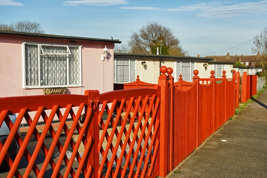
Here’s another prefab, a different design from the ones in my previous post. It’s one of a kind that I remember seeing when I was a child, and which recalls a particularly distinctive vision of times to come.

The Welsh politician Neil Kinnock spent his childhood living in a prefab in South Wales, and is on record as saying of the experience that it was like living in the future, and that his home produced an abiding impression of cleanliness and newness. Many residents who moved into prefabs in the years after World War II felt something similar. ‘We felt that we were part of something new and exciting,’ said one, quoted in Greg Stevenson’s Palaces for the People. A colleague of mine who as a child had a prefab-dwelling friend said something similar: travelling from his home to the friend’s prefab was like entering the space age. 

The prefab in my picture is one of those on the Gloucestershire estate that my colleague was referring to. It’s one of a kind known as the BL8 Aluminium Bungalow, a design produced by the Hawksley Company, which was set up by Gloster Aircraft Company and based in nearby Hucclecote. These BL8s had wall and roof panels made of Duralamin, an aluminium alloy used in aircraft production. The windows have steel frames and inside the buildings had, I think, fitted kitchens and bathrooms that were similar to those in the other prefab types and that so impressed people with their modernity. Modern, that is, for the time – BL8 were made in the late 1940s and early 1950s, so were not part of the Temporary Housing Programme that brought the other prefabs into being immediately after the war. Indeed, they were seen as a higher-spec design and were intended to be longer-lasting.

These aluminium prefabs survive in a few places (there are apparently some in Letchworth, which I’ve not seen), but here in Brockworth nearly all of them have in recent years been clad in more conventional materials, so that brick walls and tiled roofs make them look less industrial and more like conventional bungalows. The example in my picture is one of a very few that retain their original outside walls, roofs, and window frames, although there’s a new door. I remember similar prefabs from my own childhood, which was long enough ago for the painted metal walls to look shiny and for the neat rows of little bungalows to give just that sense of difference and modernity that others noticed.

Sunday, March 23, 2014

Catford, London


Far from ordinary

‘The glory of the ordinary’ was one reader’s comment on this blog and its subject matter, especially the parts of it that concern themselves with shacks, corrugated iron barns, battered factories, and other unregarded delights. But I didn’t always pay attention to this kind of architectural ordinariness – extraordinary buildings, from English cathedrals to Italian palazzi, once seemed more worthwhile, and years ago, when I lived not far from southeast London’s Excalibur prefab estate, I didn’t look at the place very closely, pausing only to be amused by the Arthurian street names (Ector Road, Pelinore Road) and to notice the similarities between the prefabs that lined these streets and the ones I remembered not far from where I lived as a child. There had always been prefabs around, ‘war prefabs’ as my parents and their friends called them, built en masse to relieve the housing shortage (and to give the suddenly underemployed aircraft industry something to do) after World War II.

Back in the 1960s, when I was a boy, the thing that my parents said about these prefabs were that they were meant to be temporary dwellings, with a life of ten years or so, and that the little houses had done well to last twice that time already. Now, 60 or more years after their construction, there are very few of these prefabs left: most have been demolished to make way for more modern housing, often at a higher density to take advantage of today’s high city land values.

So prefabs are no longer ordinary. The Excalibur Estate is now the only surviving prefab estate left, and is itself threatened with demolition. English Heritage have listed a handful of the prefabs (and the estate’s curious prefabricated church), but the council want to pull down the other 180 prefabs and replace them with a larger number of more modern dwellings. My feelings about this are mixed. On the one hand, London needs more good social housing and the prefabs would prove costly to preserve. On the other, the prefabs are a unique bit of social and architectural history. The residents, when polled, voted for demolition and redevelopment, by a narrow margin of 56 to 44 per cent.


The estate was built in 1945–6, and consists of prefabricated Uni-Seco bungalows, which have a timber frame supporting panels of asbestos cement. There are metal-framed windows and roofs with a very gentle pitch that look flat. The Uni-Seco was one of 13 different types of prefab built in Britain in the 1940s under the government’s Temporary Housing Programme, which eventually saw some 150,000 prefabs built to help relieve the housing shortage. More would have been built, but the prefabs (whether in wood, aluminium, concrete, or asbestos cement – there were examples of all these forms of construction) were actually quite costly to produce, so traditional, permanent, brick-built houses eventually prevailed.

Most residents liked their prefabs, not least because they came with modern features such as fully equipped bathrooms,  indoor lavatories, and fitted kitchens with hot and cold water and something that most British houses lacked in 1948: a refrigerator. This was the kind of specification that many Brits could only dream of in the post-war period and the buildings, with their almost-flat roofs, white walls, and large windows, looked modern too. If they cared about such things, the original tenants might have reflected that at last their were getting a bit of the modern design that had been such a hit in Europe. But the generous gardens were probably just as important to them.

And there, for now, they stand, their chivalric street names (actually a continuation of a theme used to name streets in a neighbouring estate) evoking both post-war patriotism and 21st-century defiance. In this age of austerity, these far-from ordinary little buildings are worth a thought and, it seems to me, some admiration too.

- - -

With thanks to Caroline, of the excellent blog Caroline’s Miscellany, for the pictures. Her own piece on the Excalibur Estate is well worth reading.

There is an ongoing project to record the history of prefabs here.

The best books on prefabs are Greg Stevenson, Palaces for the People (Batsford, 2003) and Brenda Vale, Prefabs: A History of the UK Temporary Housing Programme (E & F N Spon, 1995)

Monday, December 9, 2013

Barbican, London


Turned on
The other week I walked up London's Farringdon Street, hoping to find and photograph a series of tile murals made by Dorothy Annan for the Central Telegraph Office, a building housing a large telephone exchange that was built in about 1960. When I got there I found nine boarded-up spaces along the ground floor of the building: the murals had gone and the building, empty, dusty, and forlorn, looked ripe for demolition. I soon discovered that the tile panels, thanks no doubt to the recent campaigning on behalf of such architectural art by the Twentieth Century Society, had been saved. They have been installed on one of the High Walks in the Barbican complex and I quickly found them, not far from the Guildhall School of Music and Drama, which was emitting seductive high-pitched flute and violin sounds as I settled down to have a good look.

Overseas Communication Showing Cable Buoys
 
Annan's tile panels have names like Cross Connection Frame and Lines Over the Countryside. They make evocative compositions out of arrangements of aerials, cable buoys, switches, wires, and bits of circuit diagrams, all of which Annan researched carefully before turning them into semi-abstract compositions which – as the accompanying caption remarks – are part Ben Nicholson, part Joan Miró. Looking at the panels (the two most clearly visible in the photograph at the top of this post are Radio Communication and Television and Cables and Communications in Buildings) it would be easy to make remarks about the optimism of the 1960s and the then Prime Minister Harold Wilson's famous enthusiasm for 'the white heat of technology'. But in the restrained palette and artful rhythms of these panels (the Ben Nicholson aspect of them, as it were), there is something less insistent, less frenetic. Their lovely handmade textures are beautifully crafted, too. There is tension in the spiralling wires and chunky aerials in these panels, it's true. But there is also landscape in them, hints in the colour and texture of the tiles of grass and sea and sky; cables that flow like rivers or rise and dip like hills and valleys. I think they're turned on to nature as well as to technology. And for that reason they seem to me to sit rather well in the Barbican, where water and planting complement the chunky hammered concrete, where your feet are always on tiles, and where intriguing sonic signals emerge from student musicians in their practice rooms to captivate the ear.

 Cable Chamber With Cables Entering From Street, detail

* * *
Thanks to one of my readers for pointing out that the blog Spitalfields Life has also covered these panels. I was pleased to see that the Gentle Author, proprietor of the Spitalfields Life blog, also appreciates the combination of technology and organic forms that's evident in these works. The Gentle Author illustrates all the panels here.


Wednesday, November 13, 2013

Berwick Street, London


The red and the black

The multiple name sign in my previous post reminded me of this conjunction of old and newish in Soho. I mostly associate street names made of individual ceramic tile letters with Hampstead (London NW3), although they also appear in other places, including Ilfracombe, I believe. In NW3 they go back well into the Victorian period, and help create the pleasing coherence of the street design in that part of North London.

In my picture, however, similar letters were used in Berwick Street, Soho, and now they are a little the worse for wear. What to do, when two letters fall off and no replacements can be found? Resisting the idea of renaming the street Erwic Street and being done with it, the solution seems to have been to install one of the City of Westminster's more recent sign designs. These enamelled steel plates are now ubiquitous in Central London and so familiar that the overused word iconic might be applied to them by the unwary. The design was produced in around 1968 by Chris Tinings (and/or Misha Black: sources vary) of the consultancy Design Research Unit. The lettering is in Univers Bold Condensed with a careful use of red and black to make the information really clear.

So while the standard metal sign tells us where we are, the remains of the old tiled sign remind us how we might once have found our way around. Once more, graphic clutter reveals a bit of the past.

Tuesday, October 1, 2013

Potsgrove, Bedfordshire


Out of place?

It has recently been announced that the Royal Mail, the service that delivers letters in the UK, is about to become a private company. This state-owned letter-delivery service can trace its history back 497 years to the reign of Henry VIII, although in its present form it could be said to have had a new beginning in 1840. This was the year when, with the introduction of the penny post and the first pre-paid postage stamps, the service guaranteed to deliver any letter posted to an address in Great Britain for a uniform rate, paid by the sender.

An essential element in the postal system is the mail box, and I've blogged before about some of the various kinds of box found in England, including pillar boxes and wall boxes of various types. Here's another kind, the compact metal container known as a lamp box because it is designed not to be inserted into brickwork, as in my photograph, but attached to a lamp post or telegraph pole by means of  pair of metal loops fixed to the side of the box. Lamp boxes originally had steeply curving metal tops, but this design, with a shallower curve, came in the time of George V and lasted into George VI's reign (1936–52) – the later king's monogram is cast into the front of this example. The gently curving top reminds me slightly of the roof of a telephone box and harks back to the time when telephone and postal services were both run by the same body.

If this lamp box is rather out of place with its side loops removed and set into a brick pillar, it's clearly still doing its job. And how often have I seen the happy blend of a red rural post box and a growth of green ivy working its way around the metal, to be cleared away occasionally but never obliterated? Will the postal service be out of place in the public sector or manage to accommodate itself to the demands of shareholders, pressing around its edges like the invasive ivy around this box? Time will tell.

Wednesday, September 25, 2013

Preston, Lancashire


Listed and classified

It was announced this week that the bus station at Preston, built in 1969 to designs by Keith Ingham and Charles Wilson of Building Design Partnership, has been listed, making demolition or major alteration much less likely.

This has been a controversial building. It has been called an 'eyesore' and the local council have pressed for its demolition (that pressure was all the stronger when there were plans to build a large shopping mall on the site, plans that fell through when the recession hit). But in a survey, eighty per cent of local residents said that they felt attached to it and organizations such as English Heritage have campaigned for its preservation. I am on the side of the preservers here. I like the way the building combines the double-eight space for buses and passengers on the ground floor with the floors for parking above. The curving balconies of the parking floors are stunning, making a kind of sculptural impact that is head and shoulders above most multi-storey car parks, or most modern buildings for that matter. Inside the bus station, the public areas are well designed and retain many of their original features – white tiled walls, dark hardwood fittings, modernist clocks.

One of the interesting things, architecturally, about the bus station is that it's usually referred to as a Brutalist building. But Brutalism, the bête noire of haters of modern architecture, is actually rather hard to define. Penguin's Dictionary of Architecture and Landscape Architecture, for example, defines it primarily in relation to the architects that influenced it and pioneered it – late Le Corbusier, the Smithsons, Stirling and Gowan. It goes on to say, 'Brutalism nearly always uses concrete exposed at its roughest (béton brut) and handled with overemphasis on big chunky members which collide ruthlessly.' Preston Bus Station hardly matches this description. The concrete's curves are the opposite of rough and the elements don't collide, they are combined with care and flair. The building seems to me to embody a kind of softened modernism that is very British. But Preston Bus Station is very big, and built from concrete: it gets tarred with Brutalism's broad brush.* 

Like it or not, then, it's listed, but that's just the beginning of the story. A building like this comes with huge challenges. Maintaining it, adapting it so that it's properly integrated with the city centre, even keeping those uriniferous stairwells clean – all this costs money and requires determination. I hope English Heritage will support the council in finding ways to meet these challenges.

- - -

* Gothic, the name of a barbarian tribe; Baroque, an imperfect pearl; Brutalism; we do beat ourselves up, rather, with our designations for architectural styles.

Thanks to Jack Meacher for permission to use his photographs.

Saturday, September 14, 2013

Eastleach, Gloucestershire


More festive letters

As a follow-up to my post about the lettering on the Woolpack pub in Slad, here's an example of something along the same lines, also in a Cotswold location. They're similar letters, with curved, or bracketed, serifs, but in the Roman rather than the Italic form. Rather than being made of thin sheet metal, they have a slight depth and a narrow raised outline, which you can see if you click on the photograph to enlarge it. The depth means that the letters cast a satisfying shadow. I like the wide spacing between the letters, which allows them to make their presence felt without detracting from the stone masonry between and around them. What a mixture – warm Cotswold stone walls of coursed rubble, old mullioned windows and dripstones, 19th-century sash windows, mid-20th century lettering, rambling roses, and hanging baskets. The perfect setting for an evening pint.

Tuesday, September 10, 2013

Slad, Gloucestershire


Associations

There are buildings that are more important for their associations than for their architecture. The Woolpack, the village pub in the hillside Cotswold village of Slad near Stroud, is such a building for me. It means several things to me and, sadly since it's a pub, none of these have anything to do with me drinking there – it's a building I've been past, often, and that brings to mind various kinds of memories and associations when I see it.

Apart from the fact that it's a roadside landmark that tells me I'll soon be in Stroud, it makes me think of Laurie Lee, the author of various books of poetry and of memoir, most famously Cider With Rosie, which nearly everyone of my generation in Britain read at school. Slad was Lee's village, the home of his childhood, the setting of that celebrated book, and his home again when he returned later in life. So the Woolpack was his local, and I think I remember friends, long gone, who lived not far away telling of encounters with him, well oiled and charming, within. It's a very long time since I read Cider With Rosie, and in truth I can't remember that much about the book, except that it was able to create a warm glow of reminiscence without denying some of the deprivation of the times or the penetrating winter cold which, on the Cotswolds, can be very cold and penetrating indeed.

It may be rather fanciful of me, but I also associate this building with the Festival of Britain, that curious all-embracing celebration of British culture and achievement that was organised as a tonic to the still austerity-troubled nation in 1951. In part, I make this link because Laurie Lee had an important part to play in the Festival exhibitions in London – he was chief caption writer, and also did other jobs, such as helping to organise the Eccentrics Corner in the Lion and Unicorn Pavilion.

The lettering on the end wall of the Woolpack makes me think of 1951 too. Those rather chunky italic capitals seem to me to be very much in the graphic style fostered by the Festival of Britain, although in fact the principal Festival sign lettering was slightly different. The Festival used Egyptian lettering, with plain slab serifs (there are some examples of the italic form of these letters in the picture below).

Festival of Britain display letters, italic form

On the Woolpack letters, on the other hand, the serif is linked to the main stroke by a curve (known as a bracket, in the trade). But still, the chunky proportions of these letters do give them a 1950s feel and I suspect they've been here for some 60 years. They're big, and clear, and stand out from the wall so that they cast a welcoming shadow too. When the travelling local arrived from Stroud, or Spain, or Chelsea and saw them, he knew he was home.

Friday, September 6, 2013

Bromsgrove, Worcestershire


What goes round…

Once upon a time we all sent lots of letters. Often we'd run out of postage stamps and the Post Office and shops would be closed, but we'd still want to get the letter in the mail. So there were stamp machines. You stuck a penny (or a higher value coin) in the slot, and a stamp, or a book of stamps, popped out, and you could send your letter on its way. Stamp machines were found in the walls of Post Offices, next to mail boxes, or set into the side of a special kind of stretched phone box, like this one: the K4 telephone kiosk introduced in 1927 as a sort of Post Office in miniature. An enlarged version of the much-loved red telephone box designed by Gilbert Scott, the K4 was sometimes known as the vermillion giant.
Comparatively few of these giants were made (I think about 50), supplementing the thousands of wall-mounted stamp machines outside Post Offices. This rare survivor is at Avoncroft, which houses the National Collection of telephone boxes. Both K4s and stamp machines disappeared when the price of stamps began to make coin-in-the-slot vending impracticable – when stamps increased in cost and the standard stamps weren't priced in convenient multiples of £1. At the same time email was replacing real mail in many cases, further accelerating the demise of stamp machines. And it was a similar story with other kinds of coin-in-the-slot vending. The only time I usually put a coin in a slot theses days is to pay for parking.  With the rise of the mobile phone, many standard red phone boxes in Britain (the ones without stamp machines and mail boxes) have disappeared too, although there are worthy efforts to preserve them. So, once-loved pieces of street furniture become less useful (or less generally useful), and die out or acquire new uses.

And yet. Automatic payment systems are on the rise. Supermarkets are getting us used to scanning our own groceries and paying for them with our plastic cards, without (in theory) the intervention of supermarket staff. I have very mixed feelings about this, but it's happening and we have to deal with it. Maybe a new building type will emerge to handle some as yet unthought-of automatic transaction. I hope it will be as elegant a solution as the red phone box, and its slightly cumbersome, but still impressive, cousin, the vermillion giant.

Sunday, August 18, 2013

Lyme Regis, Dorset


Lyme flavoured

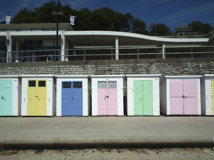
Small, colourful wooden buildings sitting on the boundary between land and sea, beach huts have been with us since the end of the 19th century. They have their origins in the movable 'bathing machines', the sheds-on-wheels that could be pulled out into the sea to give the Victorians the ability to change and to bathe in privacy. Since then, stationary beach huts have become a familiar sight at seaside resorts all over Britain. Prized by owners for their convenience and by passers-by for their appearance, beach huts are much loved.

The huts are often brightly coloured and usually have gables and pitched roofs, but these simple examples with mono-pitch roofs caught my eye as I walked along the beach at Lyme. I admired the paint colours too – pastel shades that are gentler and more subtle than the seaside norm. Especially appealing are those with pink, green, and yellow doors, shades that reminded me of the strawberry, mint, and vanilla bands of Neopolitan ice cream. Simple, clean, and stylish: perfect for a sunny day at the seaside.