Showing posts with label Dorset. Show all posts

Wednesday, August 24, 2022

Sherborne, Dorset

The full nine yards

The interesting variations on Classical capitals in my previous post jogged my memory of something I’d seen last summer in Sherborne, Dorset. It’s a corner building, dating from some time at the end of the 19th century, designed as either s short row of shops or as a single shop. I’m inclined to suspect the latter: one large shop, owned by someone with a penchant for elaborate decoration. It was originally a single-storey structure, but within that limited scope its builder threw the decorative kitchen sink at it. A series of plate-glass windows are framed by pairs of attached shafts, each supporting floral capitals and, above that, a richly moulded entablature with some carving above the capitals. Higher up still are rectangular terminations that would probably have acted as finials before the upper floor was added. The lintels above the windows are carved too.

The capitals are a mass of flowers and fruit – so much of it that the vegetation spills into the middle, completely filling any space between the pair to link the area above the twin columns with leaves and blooms. Most shop owners did not run to anything this lavish carved in stone. Late Victorian shop fronts are more often made of wood, or occasionally cast iron, and these less costly materials can look highly decorative and eye-catching. Whoever built this wanted something a cut – or two – above the average. Later owners preferred a more more modern front on the more prominent end facade of the building, but the long range that faces on to the side street is still there, reminding us of what the Victorians could do when they tried. The full nine yards, as they say – and a little more still.

Note See the Comments section for interesting extra information about this building, which began as a draper's shop before developing into a department store. Thank you to my readers and commenters.

Monday, October 18, 2021

Bridport, Dorset

Chapel in a garden

Bridport’s Unitarian chapel was built in the 1790s after a group split from an existing independent congregation in 1742. The then minister, Thomas Collins, refused to affirm the divinity of Christ, leading some 200 people to leave and set up their own congregational chapel elsewhere in the town. Those who remained continued under Collins’ ministry, and in 1974 they agreed to build a new chapel, then called the New Meeting, the building that survives today.

The building is a standard 18th-century chapel, with symmetrical front, round-headed windows, hipped roof, and central porch, the latter given a touch of elegance by its semi-circular shape and Ionic columns. But the most distinctive thing about it today is its position, set back from the street and fronted with greenery and flowers. It’s hard to imagine a better setting for a chapel in the middle of a town. The congregation invites passers-by to sit and enjoy the green space, where they can find rest, relaxation, and, perhaps encouraged by the gentle cooing of the doves, spiritual enrichment.

The doves have their own miniature building, which can be seen on the left in my photograph. It’s ornate, octagonal, and painted the same white as the bricks of the chapel’s facade. The occupants perched obligingly and eyed me as, taking welcome relief from Bridport’s busy main street, stopped to take the photograph. Christians have long used the dove as a symbol of the Holy Spirit. Unitarianism rejects the Trinitarian notion of the deity, so have no place for that symbol. However, doves have long been linked with peace and purity, and few, in this tranquil setting, would take issue with that.

Saturday, September 4, 2021

Puddletown, Dorset

Here comes the Sun, or, Odd things in churches (14)

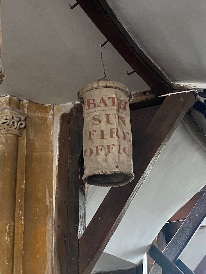
People who look carefully at old buildings will know all about the Sun Fire Office. It was an insurance company, founded in 1710, and it’s still going in a different form. It’s familiar to devotees of old houses because the company’s clients used to fix a metal plaque bearing the company name and symbol (the Sun in splendour, naturally) to the fronts of their houses. Then when the Sun sent out their fire-fighters, they would know you’d paid for the service and would attack the blaze with whatever equipment they had.

One aid to fire-fighting was provided by fire buckets filled with water or sand. One often sees bright red metal ones hanging on the platforms of stations on preserved railway lines. But back in the days when the Sun Fire Office first started, canvas buckets were also in use. I’d never seen these in a church before, but at Puddletown several remain, hanging from hooks under the west gallery. There are many more hooks than buckets, so perhaps originally there were more. More would be a good idea, as they’re not very large and a couple would not go very far when extinguishing a fire of any size larger than a smouldering pipe left in an absent-minded church warden’s pocket. These fire buckets now go on an informal list I keep in my head of fire-fighting equipment I’ve spotted in churches – fire hooks for removing burning thatch and the occasional rare hand-pumped fire engine are also included. All a far cry from today’s enormous fire engines with their turntables and ladders, but as welcome in extremis as their diesel-powered descendants can be today.

Wednesday, August 25, 2021

Sherborne, Dorset


Surprised in Sherborne, 2

Sherborne’s Cheap Street is a very attractive jumble of architectural styles – from late-medieval timber framed structures to stone buildings from virtually every later date: a hotch-potch, mostly with recent shop fronts, but much of it given unity by the glowing stone. Even in this good company, the bow-fronted building above is outstanding. Living near Cheltenham, I’m used to stucco-covered Regency buildings decked out with classical cornices, columns and iron balconies, but even so this one made me pause. It’s small, with just a single window on the upper floor of its curvaceous facade, but what a window – the full Venetian, with a pair of rectangular sections bookending a round-topped central portion, the whole surrounded by elegant mouldings and highlights picked out in white. A neat cornice and parapet, balustraded in the centre, complete this upper floor, which rests on four stone Ionic columns that frame the modern shop window. The iron balcony is the finishing Regency touch, vital for the safety of those inside who want to open the big window, which extends down to the floor.

As with the shop front in my previous post, I wondered what this building was used for when it was first put up in the early part of the 19th century. The upper room looked to me like the spacious drawing room of a middle-class house, the sort of thing that wouldn’t look out of place in Brighton. But there was no clue to what was originally where the modern shop window is now. The answer turns out to be that the building belonged to the Sherborne Savings Bank, who erected it in 1818. 

This was the formative period for savings banks in England. These banks were set up to provide banking facilities for poorer people – those who were not normally the customers of the established banks, whose accounts did not normally bear interest at this time. Savings banks welcomed small investors, including those who could save only intermittently, as their incomes were unreliable and varied according to the seasons or the availability of work.* Although savings banks did not help the very poor, who found it impossible to save any money at all, they were attractive to those such as artisans, small farmers, shopkeepers, and domestic servants, among whom were many who had a little money to save and who liked the idea of self-help. Savings banks were not perfect: in an era before elaborate state regulation of financial institutions, some folded as the result of fraud or incompetence. But for many they played a useful role.

Whoever designed the Sherborne bank’s building did their best with what was clearly a confined site. Ideally, the sweep of the bow front should stick out over the pavement area, so that it can make an impression whichever way you approach it. But the building to the right already sticks out, so this wouldn’t have worked without invading too much pavement space. So here it sits, standing proud of one neighbour and slightly in the shadow of the other, making its impression nonetheless.

The delicate architecture of this frontage is not what I normally associate with banks. The banks I’ve admired on this blog in the past have been rather chunky buildings, with the kind of solid-looking masonry that suggests strength and security. They seem to tell you that your money will be safe here. This building is very different. It’s impressive, but in a gentler, more domestic way. Its columns and the overhang they make possible offer shelter from the rain and seem inviting. ‘Come in,’ they say, ‘and you’ll receive a warm welcome.’ The effect seems wholly appropriate for a savings bank set up for those not previously used to dealing with the estanlishged banks or money markets. It still works its charm, on one passer-by, at least.

- - - - -   

* Small investors could also entrust their money to Friendly Societies, but these had regulations – often requiring members to deposit money regularly, that did not suit those with irregular incomes. Savings banks did not have such rules. 

Sunday, August 22, 2021

Sherborne, Dorset


Surprised in Sherborne, 1

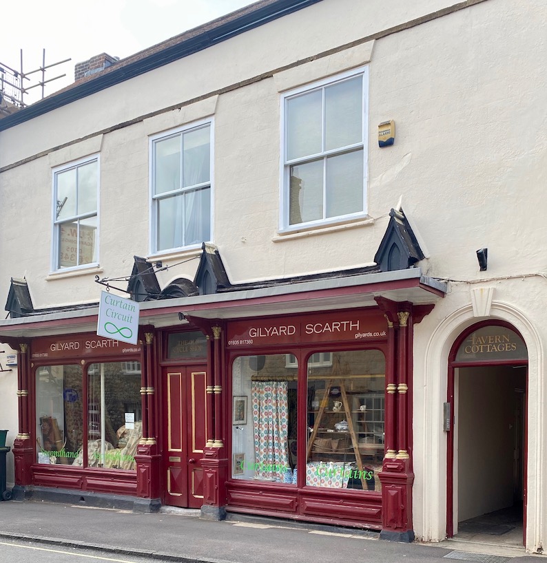
Ever since I wrote a book linked to a television series about the history of Britain’s high streets, I’ve been interested in the architecture of shops, and when I visit a town I’m often agreeably surprised to find old shopfronts still intact and fronting valued local businesses. This frontage in Sherborne was one that caught my eye. It looked to me late Victorian and the array of paired columns, wooden panelling, generous overhang, and slightly Gothic gablets poking out on top seemed to be from the more showy end of the retail spectrum. What could it have been, I wondered to myself: a high-class grocer’s, or maybe something more outré such as an oil and colour merchant or a specialist in well made leather goods? A sign painted on to the glass above the door gave a clue to a business that had been here once: ‘The Old Cycle Shop’. Could that have been the original business?

Not at all, it turns out. The other clue is above the doorway to the right, with its sign saying ‘Tavern Cottages’. A place of refreshment, then? Yes, but not the alcohol-selling place one would expect. This building began life in 1881 as the Sherborne Coffee Tavern. The late-19th and early-20th centuries saw a vigorous anti-alcohol movement. In churches and chapels there were sermons warning against the effects of the ‘demon drink’, campaigners and some nonconformist preachers persuaded people to ‘sign the pledge’ not to touch the stuff, and both campaigners and canny business people founded places where pub-goers could find alternative entertainment – from temperance billiards rooms to coffee taverns.

Coffee had been widely drunk since the 16th century and had gradually evolved from the costly luxury chosen by a few to an inexpensive drink enjoyed by many. Back in the 18th century, coffee houses had been popular among the professional classes in Britain’s large cities. Lawyers, medics, and even writers had their coffee house of choice, where they’d go to drink coffee, read the newspapers, meet friends, and discuss the day’s news. But coffee taverns were never as popular as their ancestors of the Georgian period, perhaps because they were mostly started by middle-class reformers who wanted to encourage the working class to stop drinking and give up the unruly habits of the drunk. The intended customers weren’t keen, and many coffee taverns closed after a few years.

Sherborne’s coffee tavern was bought in the 1890s by a local man, Edwin Childs, who moved his bicycle sales and repair business there. Childs prospered – this was, after all, the heyday of the bicycle – and by the early-20th century was also repairing cars. As the car business expanded, he first converted the shop, removing the big windows, and eventually put up a purpose-built garage elsewhere in the same street. Subsequently the attractive 1880s shop front was restored, and it still looks well in its dark red paint with details picked out in gold, an asset to Sherborne’s rich and varied streetscape and a survivor in an age when a liking for both wine and coffee no longer seems some kind of contradiction.

Friday, January 8, 2021

Lyme Regis, Dorset


Summer days, 1 

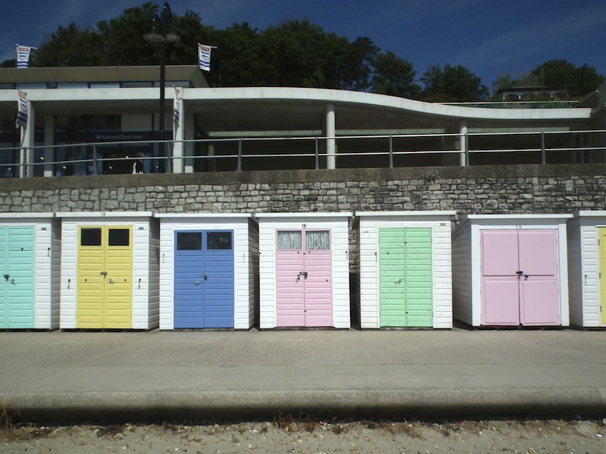
As the sleet came down in late December, I found myself looking through my files of photographs and came across a number taken near the English coast when the sun was out and the sky was blue. In one way it was good to look at images of summer days at a rather bleak moment, though in these times of confinement it’s not easy to imagine being able to jump in the car and decide, spontaneously, to head to the coat and visit somewhere like Lyme Regis. Looking at the photograph above, though, also reminded me how the houses in so many coastal places have a recognisable ‘seaside look’. What does it mean to say this, and how is it expressed, architecturally? It’s a combination of things, not all present in the picture, not all constant, for seaside houses as much as the homes in an inland town are built for different people with different needs, priorities, and budgets. But a few features of these Lyme houses can point the way to an answer. 

One thing is colour. A lot of seaside houses are finished in stucco or other render that’s painted, either white or in pastel shades. Here there are pale pink, green, and blue houses, along with the ubiquitous white. There might be several reasons for this. A lot of seaside houses were built in the 18th and, especially, 19th centuries as stays beside the sea became fashionable, first for the leisured classes, then for poorer people. Sometimes these houses were built quickly, and stucco was a way of hiding rough masonry beneath a civilised surface. This sort of finish was anyway popular in the late-Georgian and Regency periods, when many such houses were built. Lyme developed as a spa in the 18th century and was still popular when Jane Austen visited in 1804. A lot of Lyme still has a late-Georgian or Regency feel to it and these houses reflect that. As well as walls with a pale finish they have another typical seaside feature: bow windows. These curvaceous windows were very much a Regency fashion – there are lots of them in the Prince Regent’s favourite town, Brighton. They’re used at the seaside because they let in lots of light and offer good views. I think there’s also a ventilation benefit. If you want some air, but there’s a stiff breeze blowing, some part of a bow window may well be out of the line of the wind, so you can get some ventilation without having all your papers blown off the table – most advantageous to writers, as I have found.*  

So far, so practical. But it may simply be that the reason for these features, along with such elements as the fancy ironwork around the porches and the elegant fanlights with their nicely curving dripstones, is that they look good, and look good in a celebratory way. They’re meant, I think, to make you smile, to lift the spirits. This is informal beauty, too. The houses make a virtue of being asymmetrical – it doesn’t matter that they’re not the matching, carefully proportioned Georgian boxes or terraces that you might see in the ‘best’ streets in London or Bath. Again asymmetry was popular in the Regency period more general, but add all these features together and I don’t think it’s fanciful to see this as relaxed, kick-your-shoes off architecture, where sitting outside on the pavement in front of your house is acceptable, and where you won’t be scorned if you’re engaged in the idle enjoyment of summer days. 

- - - - - 

* Of course, you might be a ship-owner and have more than a passing interest in the vessels in the bay; a good view is useful for you too.

Thursday, November 21, 2019

Poole, Dorset


Joining and splitting

Columns and pilasters on the facades of buildings can be made of many different materials – wood, stone, plaster, even cast iron. But many are simply made of wood, like this example in Poole that I spotted during my visit last year, with the paint stripped away during a restoration. Multiple accumulated coats of paint, applied over years, can seriously blur the carved details on facades and it pays to remove the paint and start again, for a crisp, fresh finish.

Door surrounds, like this lovely Classical example, were often the job of the joiner, who was a woodworker skilled in fine work and trained to do the accurate cutting and fitting involved in making snug joints, hence the name. A joiner of the Georgian and Regency periods could expect to be asked to do this sort of job, based no doubt on a widely available pattern book, whose designs he would follow closely. Cutting flutes, carving capitals, and producing mouldings from the varied and adaptable vocabulary of classicism would be meat and drink to him.

But as James Ayres points out in his excellent book Building the Georgian City (Yale University Press, 1998), there could be drawbacks to doing this kind of work in wood. Splits in the timber, for example. Or mitre joints that proved less than durable – Ayres describes mitre joint as ‘little more than a slippery slope to disaster’, because it involved the use of unreliable glue, applied usually to end-grain. This particular bit of woodwork has a bad split, which I seem to have caught mid-repair. Perhaps it will all look better when tidied up and repainted. I must remember to look out for it when I next visit the town.

Wednesday, November 21, 2018

Dorset reperambulated


Michael Hill, John Newman, and Nikolaus Pevsner, The Buildings of England: Dorset
Published by Yale University Press


Another year, another small clutch of revised volumes in Pevsner’s revered Buildings of England series. I’ve chosen Dorset for review because, although it’s not a county I know intimately, it’s a fascinating part of England and one that has given me a lot of pleasure, from its coast and coastal  towns such as Poole and Lyme Regis to inland places like Blandford Forum. I have therefore used the old 1972 edition of Dorset (in which Pevsner himself wrote about the churches while entrusting the secular buildings to John Newman) quite a bit over the years. Dorset has so much interesting architecture: great houses and historic castles, some terrific churches, and a lovely coast – lovely both scenically and architecturally, from Lyme Regis to Poole.

To reflect this richness and like every recent revision in the series, Pevsner’s Dorset has grown considerably (from just over 500 small pages in 1972 to 780 larger pages today), thanks to the addition of new buildings, more detail on those already covered, and the inclusion of structures that lay outside the original remit or that Pevsner and co simply missed – for even Homer nodded, and the busy compilers of the Pevsner epic, especially in a rich county like Dorset, a place of shady nooks and sunken lanes, may be permitted to have nodded in their turn. But Michael Hill, reviser of Dorset, can have left few stones unturned. A major centre like Poole now has a substantial section, incorporating various changes to the built environment and the generally beneficial effect of the conservation areas designated after the 1972 edition came out. The town’s new development is treated with discrimination – the Dolphin quays development criticised for its too-large scale (seven storeys dwarfing the nearby historic buildings), the RNLI College given praise. Poole is also a place to note what Pevsner does not cover. I’ve recently become fascinated by the use of architectural ceramics in Poole. Some of this is mentioned (the Poole Arms on the Quay, with its glowing green tiled gabled front, for example), but some isn’t.

Hill, like the other revisers of books in this series, treads around the original text with care. Gems from the old book remain, like the opening of the entry on Shaftesbury with its yearning quotation from Thomas Hardy’s Jude, all ‘vague imaginings’ and ‘pensive melancholy’, and the 1972 book’s comment on this: ‘Hardy was easily thrown into a pensive melancholy, but these are the right thoughts with which to approach Shaftesbury’. The original description of the famous Gold Hill is retained too, but in the new volume it merits a photograph, and a mention of Gold Hill Museum and its extension of 2011.

Some places, such as Lyme, benefit from large amounts of new detail. Lyme now has three perambulations instead of one, and some of the new detail makes me want to return to the town and look again. There’s apparently a 1930s cinema, unremarkable outside but with an interesting interior (a ’minor Art Deco gem’) and several other older buildings that the original edition did not notice. Hill also updates the coverage of Eleanor Coade’s wonderful house Belmont, with its ‘frenzy of decoration’, covering its recent restoration and the alterations to it which are controversial, but through which Hill tiptoes with tact. When new scholarship is available, Hill is informed by it. In Blandford, for example, Hill is sceptical of the role of the Bastard family as architects of the rebuilt 18th century town and notes that master mason Nathaniel Ireson may well have been responsible for the baroque touches in the town’s Georgian architecture.

The new Dorset is illuminating, then, and manages to incorporate the essence, and much of the text, of the old volume while adding much to it. The photographs are good as usual and there are several of the maps and plans that make the revised volumes still more useful than the old ones. Dorset, then, does well by this small but enchanting county and confirms that the old series in its new guise it still very much alive and kicking.

Saturday, September 1, 2018

Poole, Dorset


Fine detail

It occurred to me after I did my previous post about the threshold mosaic in Hereford that I had a recent picture of another, which is better preserved and more artfully put together. On my recent trip to Poole I noticed the entrance lobby of Morton’s jewellers.* I was struck at first glance – and when I looked at it more closely, it seemed better still.

On this shop front the lobby starts at right-angles to the street before deviating to the left, making an odd shape for the mosaicist to work on. However, the result here is actually very impressive. One immediately notices a stylish border with groups of three short vertical lines that recall the triglyphs of Classical architecture. also clear to see is a very effective piece of lettering, with elongated Art Deco influenced forms and an extra-long central T. But look closer (clicking on the image to enlarge it will probably help) and you can see the careful way that the pale background tesserae have been laid. Those closest to the letters follow the lines of the strokes. Those outside the lettering area form fan-shaped swirls.

The whole thing is an impressive piece of work. It’s not strictly necessary, of course, to have an entrance floor like this. A few large tiles would have done the job. But advertising helps any business and intricate decorative work is appropriate for a jeweller’s premises. It suggests that the company cares about details, quality, and style.

- - - - -

Like my Poole tile finds, this was thanks to an excellent walk guided by The Tile Lady

Sunday, August 19, 2018

Poole, Dorset


Carter's cavalcade (4): Showpiece

Here’s one last piece of outstanding tiling from my recent visit to Poole, and in many ways, it is the greatest star of them all. The Swan Inn is a pub of 1906, built to designs by the architect C T Miles, who had a long-established practice in Bournemouth (in which he was soon joined by his son, S C Miles). The facade would be a fairly standard turn-of-the-century design, were it not for the tile cladding, which covers the entire ground floor level.

The Swan is one of three surviving late-Victorian tiled pubs in Poole and is the most decorative. That is thanks not just to the strong tiled lettering giving the names of the brewery (Marston’s) and the pub, in brown on a cream background, not just for the two-tone green of the wall tiles, not even for the telling details such as egg and dart moulding or the little dolphin in the keystone of arch, but above all for the pair of beautiful swans to each side of the entrance archway. Each bird’s cloud of plumage floats among lakeside plants and its beak holds one end of a swag, the other end of which is tied to one of the letters of the pub’s name. This bit of whimsy links the realistic drawing of the swan and its setting to the graphic world of the lettering. That lettering itself has an element of whimsy – the ornate capitals and overlapping strokes recall the sort Art Nouveau lettering I noticed on another Carter’s panel.

This building has been empty for a while. A few years ago a proposal was made to demolish it and redevelop the site, citing a ‘statement of significance’ that declared it to be of ‘little historic or architectural interest’. Fortunately this has been overruled (after objections from the Victorian Society, among others), and the frontage will be retained. The building’s historical value is clear – it’s an outstanding pre-World War I tiled pub facade, a stone’s throw away from the works where the tiles were made. It is also of architectural interest in the way the architecture and ceramics are artfully integrated. You can’t separate the architecture of this period from its decoration. The architectural work of designing spaces, creating plans, and visualising elevations was done, in a building of this type, with the architect collaborating closely with the decorators. The architect, C T Miles, would have liaised closely with Carter’s and their artist over the layout and appearance of the tiles, just as architect George Skipper did with ceramic artist W J Neatby of Doulton when designing the great Royal Arcade in Norwich. That lovely swan means much more here, in the place it was designed for, than it would in a museum.

Workers from Carter’s and Poole Pottery must have passed this pub every day, and many of them no doubt drank here. Managers could bring clients here and say, ‘This is the sort of thing we do’. They were probably proud of the examples of their firm’s work that they saw here and on other buildings around Poole. And if they were proud, they were right to be.

Wednesday, August 15, 2018

Poole, Dorset


Carter’s Cavalcade (3): Not just seed potatoes

The third (and final, for now) highlight from my visit to Poole is this panel, one of a pair, that originally came from the shop of W H Yeatman & Sons, corn and seed merchants. Yeatman’s, whose former corn mill I’d noticed when I was walking along Poole Quay earlier in the day, had a shop in the town’s High Street. These colourful tile panels decorated the shop from the late-1920s or early-1930s: clearly the owners wanted to remind people they sold more than produce for the farm or vegetable patch. The black background helps the vivid flowers stand out beautifully (there is probably Art Deco influence in this use of black), and the colours are contained within very narrow boundary lines. These were produced using tube-lining, a technique that involves applying wet clay from a syringe, rather in the way that someone icing a cake uses a piping bag. You can feel how the tube lines are raised above the rest of the surface if you run your finger across the tiles.

When Poole’s old town was redeveloped in the 1960s, these memorable panels were saved and mounted on the end of a building that is now an ice-cream parlour. Although sited at a road junction with plenty of pavement in front of them, they’re actually quite easy to miss, and I was grateful to have them pointed out to me by Jo, leader of the guided walk that brought them to my attention.* It’s fortunate that this bit of shop ornament, from a time when such decorations were expected to be in place for decades (unlike so many of today’s ephemeral plastic shop signs), were rescued. As well as serving a local business for years, they have now outlived their original raison d’être for even longer. Built to last: modern retailers please note.

- - - - -

* Anyone wishing to take part in one of these excellent walks should follow Jo Amey on her Facebook page, The Tile Lady. The page has many pictures of beautiful tiles and she also posts information about the walks there.

Monday, August 13, 2018

Poole, Dorset


Carter’s Cavalcade (2): Hunting the hart

‘Now we’re going to go into Halford’s,’ said Jo, leading our surprised group* into a building which was the scene of what seemed to be the last stages of a closing-down sale: the shop is one of those branches of Halford’s that is to cease trading. Diverting our gaze away from the cut-price car accessories, Jo pointed up the stairs, and this panel is what we saw.

It is the work of Tony Morris for Carter’s of Poole. The White Hart Hotel commissioned the sign in the 1960s and when the hotel closed, Halford’s took over the building. Later they moved, and took the finely drawn ceramic stag with them, displaying him in their High Street premises, where he has been delighting people buying car batteries, windscreen wiper blades, and adjustable spanners ever since. For now, though, we were taking advantage of the last chance to see this rare tiled species, staring at us (is he apprehensive, defiant, or just vigilant?) from atop his pedestal. We were assured that the Hart would remain in position when Halford’s move out. One hopes that the new tenants of the building will display this striking piece of ceramic art with pride.

- - - - -

* We were on a guided walk. See the previous post for details.

- - - - -

Update, November 2019 I am told that the new tenant of the building has boarded over this sign. How sad that a fascinating and rather beautiful bit of Poole’s heritage should be concealed in this way.

Saturday, August 11, 2018

Poole, Dorset


Carter’s cavalcade (1): Very Art Nouveau

I’m going to devote the next couple of posts to some of the things I saw on a visit to Poole the other day, when I went on a guided walk through the centre of the town led by Jo Amey, known online as The Tile Lady. The subject of the walk was the legacy of Carter & Co, the ceramics company that was once based in Poole and which produced a range of tiles, a number of which can be found on buildings around the town. Not all of these are in their original positions, and not all of them are easy to find, which was one reason I was very grateful to go on this walk.*

One of the tile gems we saw on the walk was this glowing panel bearing Carter’s name. It dates to around 1905 and was originally on a wall of the company’s East Quay works. When the works closed and the quayside was redeveloped, several examples of tiling from the old works were displayed on the walls of the new building: this is one of them. It’s prized for its rich reds and its beautiful lustre glazes. A lustre glaze is a metallic glaze that shines with iridescence, an effect produced by metallic oxides. Lustreware was produced in the great civilisations of early Islam, but its most famous exponent in the west was William de Morgan, who revived lustre glazes in the 1870s. The iridescent tiles in this panel were made under the influence of de Morgan, and they make a sumptuous border for the central area of the imposition, framing the company name.

The artful lettering of the Carter’s name is the other reason why I particularly like these tiles. Their expressively curvaceous lines are the essence of the Art Nouveau style, as many readers will recognise. The way the letters are full of curves and loops, the manner in which they break free of the base line, and their habit of overlapping and interlacing – all these are typical of Art Nouveau. But the most typical feature of all is the collection of multiple curves, many doubling back on themselves like waves or whips – hence the term ‘whiplash curve’, by which they’re known. Wherever there is Art Nouveau lettering of the curvaceous kind†, from the posters of Afons Mucha¶ to the early Paris Metro stations, you will find whiplash curves.

Now when I do talks and lectures I can show people instantly what architectural Art Nouveau is about. And one couldn’t wish for a more beautiful or memorable way to explain this.

- - - - -

* Another reason is Jo’s wealth of knowledge of the subject; I’d advise anyone who might want to go on one of her walks to follow her Facebook page, The Tile Lady . The page has many pictures of beautiful tiles and she posts information about the walks there too.

† The other dominant form of Art Nouveau, the style of the Secessionist movement that prevailed in Germany and Central Europe, is much more rectilinear.

¶ Also known as Alphonse Mucha. His many French posters, his long residence in Paris, and this spelling of his name lead many people to assume he was French (or perhaps Belgian). Actually he was born in Moravia, which is part of what is now the Czech Republic. 

Monday, August 17, 2015

Bridport, Dorset


Line and liveliness: Illustration of the month

This month’s illustration is by Barbara Jones (1912–78), one of my favourite illustrators, whom I like for her eclectic interests, her love of the byways of architecture, and her lively line. But she was much more than an engaging illustrator: she crammed a lot into her life. After school in Croydon she went to Croydon Art School and then the Royal College (first in the Engraving department then in Mural Decoration, which she preferred). She graduated in 1937 and began work as both a mural painter and a commercial artist when the war came. She contributed paintings to the wartime Recording Britain project (subjects ranging from fairground horses to the Euston Arch), worked as both an author and illustrator (Watercolour Painting, The Unsophisticated Arts), put together the exhibition ‘Black Eyes & Lemonade’ at the Whitechapel Art Gallery as part of the Festival of Britain, and pursued a tireless interest in eccentric and unusual architecture, resulting in her fat book Follies and Grottoes. And this is just a selection: her working life seems to have been a beguiling combination of interesting jobs, from more Festival of Britain Work, to designing exhibitions, pageants, and book jackets, and embracing interests that ranged from the decoration of canal boats to the design of tombstones. Popular or vernacular art – barge-painting, signwriting, fairground ride-making, the art of advertising, the creation of seaside amusements, etc, etc – was always close to her heart.

One book series including work by Barbara Jones is Visions of England, edited by Clough and Amabel Williams-Ellis. Her illustrations for the volume on Dorset include this stunner of a shop front, which illustrates her art and her enthusiasms rather well. The frontage has a kind of exuberance that I associate with the work of the woman who drew it.

Dr Roberts, pharmacist and manufacturer of patent medicines, set up in business in Bridport in 1788. By the early-19th century he had commissioned this outstanding shopfront, which unleashes the whole architectural works – double bow windows with Gothic and other patterned glazing bars; a fascia above the ground-floor widows that features a band of Gothic arches; double doors with more ornate glazing. The whole is topped with a very fancy pediment, plus scrolls. Barbara Jones clearly relished all the fancy details, as well as the abundance of lettering, not just on the panels bearing the business name, but also on the sign between the windows, with its central curve: more scrolls.

Such details are close to the popular art that Jones loved. Those exaggeratedly large scrolls at the top and the rows of star-like finials along the upper edges of the windows are kindred in spirit to the carvings on carousels or ships’ figureheads that feature in some of her books. The combination of swagger, bold gestures, and the common touch: that’s what she liked.
Barbara Jones: Hambro Arms, Milton Abbas

I’ve included a couple of other examples from the Dorset volume. The sign for the Hambro Arms, Milton Abbas, displays the lively lettering that the Victorians and Edwardians often used for publicity, whether printed or sign written. It’s set in the context of a lot of curvaceous ironwork that holds up a lamp and the canopy over the door. Yes, yet more scrolls to delight the eye and to give Jones the chance to show off her way with an expressive line and a pen stroke of varying thickness. The gateway at Mapperton is slightly different, closer to the tradition of polite design. But it’s no surprise that similar curves – shell-topped niches in the stone piers, barley-sugar twisted uprights in the wooden gate, and those lead eagles (enlarge them and they could do double duty on a carousel)  – have caught her eye and been caught by her pen.
Barbara Jones: Gate piers near Mapperton House

- - -

Ruth Artmonsky, A Snapper Up Of Unconsidered Trifles (Artmonsky Arts, 2008) is a fitting tribute to Barbara Jones’s life and work
Barbara Jones, The Unsophisticated Arts (originally published in 1951) has been reprinted by Little Toller Books


Friday, October 3, 2014

Wareham, Dorset


Here for the bear

One of the pleasures of having this blog is the comments and messages and information I receive from readers. I’ve benefitted, recently, from interesting information and conversations about (among other things) the similarities between a rectory and a town house in Leicestershire, 20th-century school architecture and decoration, and the filmic activities of Michael Winner in Herefordshire – as usual, the comments confirm my conviction that writing about buildings involves much more than architecture. Now, having read my previous post about the Unicorn at Deddington, reader John Hartley has sent me some images of further three-dimensional inn signs: both the Dolphin Hotel at Chichester (which I blogged about long ago) and this, the Black Bear at Wareham, which is new to me.

So here’s a lovely 18th-century inn frontage, bow-windowed and parapeted, with a fine statue of the eponymous bear sitting on top of the porch. The pose, with one paw raised, is charming. However, I take it also to be a reminder that, here in Britain as elsewhere, bears were once trained to dance and perform, as well as being subjected to the practice of bear baiting. In spite of all this, Wareham’s black bear manages to maintain a certain dignity. When, one of these days, I make my way to Wareham, I look forward to making his acquaintance.

Photograph of the Black Bear Hotel, courtesy of John Hartley

Friday, January 24, 2014

Blandford Forum, Dorset


Mouthwatering

I make no excuse for returning to the Dorset town of Blandford Forum, which has featured in posts on this blog before. It's one of the best places to savour urban domestic buildings of the mid-18th century, and here is a particularly mouth-watering example. Lime Tree House was built in c. 1760 after the fire of 1731 that destroyed much of the town. The builders were John and William Bastard, who were responsible for most of the town's 18th-century reconstruction, and they built the house for their five sisters. It's one of the more upmarket houses in the centre of Blandford and follows the pattern of the town's houses designed for the professional and merchant classes – a room with two sash windows on either side of a central front door, fireplaces in the end walls, and a fairly narrow plan with a single roof and dormer windows. These houses usually have an ornate doorway and the doorway of Lime Tree House, with its curving canopy and Tuscan pilasters, is one of the building's outstanding features. Another eye-catching thing about this house is the delightful mottled purple and red brickwork. Blandford's brickwork is one of the best things about the town, but the lovely mixture of shades in the bricks of this house is particularly good.

Lime Tree House is home to the Blandford Fashion Museum. For more information, go here.

Wednesday, September 18, 2013

Dorchester, Dorset


Urns and tuns

Looking at this elaborate attic feature, with its scrolls, urns, and terracotta swag, one would be forgiven for thinking it comes from some grand house or perhaps the offices of a department of local or national government. But the metal-framed windows and arches below are industrial in their size and close observers will be able to pick out the 'EP' monogram of Eldridge Pope: this building began life as a brewery.

Part of a large brick complex in Dorchester, the brewery was built in 1880 to designs by G R Crickmay of Weymouth. It was constructed on the crest of a wave of expansion – the brewery became the town's biggest employer, their beer sold widely, and the owners later floated their business as a public company. Crickmay, who had been for a while the employer of the young Thomas Hardy, had a successful local practice. For Eldridge Pope he produced a design that combined industrial purposefulness with polychrome brickwork and classical decoration. This kind of mix of the functional and the dazzlingly ornamental seems to have been something that especially attracted Victorian brewers. Several of the breweries on which I've posted in the past make such bold architectural statements. Like Hook Norton Brewery in Oxfordshire, Wadworth's in Devizes, and and the Anglo-Bavarian Brewery in Shepton Mallet, this building was not only an efficient beer factory but also a powerful three-dimensional advertisement for their owners.

Sadly, beer is no longer brewed on this site in Dorchester, but the buildings are being preserved as part of a large mixed-used development. Looking up, shoppers, hotel guests, and other users of the site, can still see the monogram and remember Eldridge Pope.

Wednesday, August 21, 2013

Lyme Regis, Dorset


Here comes the sun

While I was at Lyme, most of the buildings that caught my eye were more substantial structures than the beach huts in my previous post. One of my favourites is this house on Marine Parade, facing the sea. It's a lovely building mainly of blue lias masonry and the design, with mullioned windows, decorative leadwork, emphatic bay, and rubble walls with dressed quoins and windows, suggests the hand of an architect who followed the Arts and Crafts movement. And so it proves. This house is the design of the Scottish architect Arnold Mitchell, who worked as a young man in the 1880s for Ernest George and Peto, one of the most successful London practices of the time, where he would have seen some stunning houses on the drawing board and imbibed a range of influences – Queen Anne, Arts and Crafts, Flemish revival, and so on. When Mitchell eventually set up on his own he had, from the evidence of this building, acquired some of George and Peto's assurance.
 
The house dates from 1903 and stands out from the white- and pink-washed buildings, mostly rather lower, that surround it, on some of which Mitchell also worked. It's a building that wants to insist that it's at home here, though – the wall at the bottom is studded with ammonites, one of the types of fossil that makes this place famous among palaeontologists. The most stunning feature, though, is the sundial. The glorious scrolling foliage and characterful head of Sol himself make this feature, generously large, stand out to the full. The lettering is good too, especially the motto at the bottom, which completes the frame. The whole relief is wonderfully fitting for this coastal setting, on a house looking confidentially out to sea.

Sunday, August 18, 2013

Lyme Regis, Dorset


Lyme flavoured

Small, colourful wooden buildings sitting on the boundary between land and sea, beach huts have been with us since the end of the 19th century. They have their origins in the movable 'bathing machines', the sheds-on-wheels that could be pulled out into the sea to give the Victorians the ability to change and to bathe in privacy. Since then, stationary beach huts have become a familiar sight at seaside resorts all over Britain. Prized by owners for their convenience and by passers-by for their appearance, beach huts are much loved.

The huts are often brightly coloured and usually have gables and pitched roofs, but these simple examples with mono-pitch roofs caught my eye as I walked along the beach at Lyme. I admired the paint colours too – pastel shades that are gentler and more subtle than the seaside norm. Especially appealing are those with pink, green, and yellow doors, shades that reminded me of the strawberry, mint, and vanilla bands of Neopolitan ice cream. Simple, clean, and stylish: perfect for a sunny day at the seaside.

Wednesday, August 14, 2013

Lyme Regis, Dorset

 Which former glory?

Finding myself in Lyme Regis recently, I decided to try to find Belmont, a house that was familiar to me as the home first of Eleanor Coade, manufacturer of Coade Stone (a successful artificial material used widely for casting architectural ornaments and statues) and later of the novelist John Fowles, author of such major works as The Magus and The French Lieutenant's Woman. I found the house easily enough, but when I got there I found that the Landmark Trust, who have owned the building for the past few years, had the builders in, making it difficult to photograph it and preventing access.
Belmont, entrance front detail showing Coade Stone blocks, keystones, and banding

Looking at the entrance front, Belmont is a detached house built some time before 1784 with a symmetrical classical front. What is outstanding about this front is the decoration. The blocks and keystones around the door and windows, the horizontal band running across at first floor level, and the frieze are all made of Eleanor Coade's artificial stone. The heads of Neptune and Amphitrite in the keystones and the decorative horizontal band are quite delicately detailed; the blocks around the windows are mostly formed to give a rough surface effect usually known as vermiculation. A few of these (the impost blocks) bear reliefs of sea creatures, reminding us that this is a house near the sea – a maritime villa in the language of the 18th century. Around the back are later additions, including an observatory tower, presumably giving the inhabitants stunning views from this already elevated site (the house is not called Belmont for nothing) over the sea.

As part of their restoration, the Landmark Trust have received permission to demolish the later additions at the back of the house, returning the building to its 18th-century form and preserving the observatory as a free-standing tower. There will be a permanent exhibition about the history of the house and its owners in the stables, while the main building will be conserved and let for holidays like the rest of the Landmark Trust's impressive collection of historic properties. Belmont will therefore get back some of its integrity as a Georgian villa, while losing a slice of its history. This plan has proved controversial, but there's a decision here that has to be made by many people working on old buildings. The media talk airily of bring a building 'back to its former glory', but this phrase begs the question, 'Which former glory?' The gem of a villa lived in by Mrs Coade? The rambling 19th century house of residents such as Dr Bangay, who lived in the house in the 1880s and 1890s? Or the much loved home of John Fowles? And how can one best address the issues of how the building will be used while repairing and conserving the fabric?

The changes to the house, planned after much research, have gone through the planning process but the campaign for funding is still ongoing. The Landmark Trust website contains information on the history of the house and the Trust's appeal for funds; an article here outlines some of the controversy surrounding the project; another article describes proposals to incorporate a centre for young writers into the building, though it's not clear how this squares with the Trust's stated aim for holiday accommodation and a museum. Meanwhile, as discussions continue and passers-by like me stand at the gate and squint at the ornate front of Belmont, the fundraising continues.