Showing posts with label Illustration. Show all posts
Saturday, May 27, 2017
Longleat, Wiltshire
Illustrations of the month: Servants’ Hall
A good browse in a favourite secondhand bookshop the other day threw up a small surprise. I was attracted by a book cover bearing the title Before the Sunset Fades and an illustration of a group of people standing in front of a tent. The author’s name was The Marchioness of Bath. The fact that the purple colour of the cover had itself faded added poignancy to the effect: surely this was going to be a lament for the country house life that declined in the period between the two World Wars, written by one who could remember the days of glory?
Well, yes, in a way. This small work of 1951 is indeed about the life of the great house in its Edwardian and Georgian heyday, but most of the book is actually about the lives and duties of the servants. In its brief 32 pages, it tells us about the life of the kitchen, the stillroom, the butler’s pantry, and the rest of the below-stairs world. It recalls servants’ balls and shooting parties, the jobs of the coachman and the bothy boy and the ‘tiger’. It illustrates the servants’ hall and the housekeeper’s parlour.
Longleat: The housekeeper in her parlour
The illustrations are by Cecil Beaton. Beaton is best known as a photographer. He started in the 1920s and by the following decade was a key man on Vogue, having a long career in fashion and society photography and in the post-war period he was a bright old thing, still active and influencing a younger generation of photographers including David Bailey. He was also a notable stage designer.
Beaton was not a great draughtsman, but the illustrations he did for the Marchioness’s book are charming and do a good job at evoking a world unknown to most people. I like the rather stern-looking housekeeper in her parlour, in which a riot of Beatonian squiggles evokes the rather fussy patterned carpet and wallpaper, or the economy with which kitchen workers are caught at their task. The book and its illustrations also summon up forgotten rituals, such as the ceremonial removal of the joint of meat from the servants’ hall after everyone had taken their fill – a procession headed by the steward’s room footman, followed by the ‘upper servants’.
For an upper-class author to dwell on the work of her servants in this way was quite unusual in 1951, even if the overall tone is one of nostalgia – something, the author says, that was shared by the staff themselves – for the allegedly ‘good old days’. She only occasionally allows a note of regret that the servants’ lives weren’t better, noting for example how arduous was the work of the housemaids who were constantly carrying hot water jugs to bedrooms and moving heavy hip-baths around the place. But to write about this at all was unusual. It was decades before the National Trust began to devote the effort they do now to displaying below-stairs areas in country houses and explaining the lives of the staff in kitchen, pantry, and garden. It’s interesting to see the Marchioness and her illustrator doing this just six years after the end of the war.
Longleat: the kitchen
Saturday, August 20, 2016
Somewhere in Surrey
Illustration of the month: by S R Badmin
A post about the illustrator S R Badmin by Peter Ashley of Unmitigated England reminded me that I’d not uploaded an Illustration of the Month recently, and that I had an illustration I particularly wanted to share. It’s the artwork that represents Surrey in the old Shell and BP Guide to Britain (1964); in a slightly expanded version it also adorns the cover of one of the Shell Shilling Guides to the county, part of a series of short guide books – booklets really – designed to distill the essence of a county and present its highlights, in the interests of people getting in their cars to explore, using Shell petrol to get them there.
S R Badmin was one of the mid-century’s best illustrators of places, and one of the best artists of all for trees. Buildings frequently feature in his work, often in typical local styles that make them effective markers of location. His Shell and Picture Puffin books on trees have beautiful illustrations – many thousands of people must have learned the difference between oak and ash from his artwork.* Another favourite is Village and Town, a Picture Puffin he did showing different styles of local architecture, which I’ve mentioned before on this blog.
The Surrey image brings together a beautiful wooden landscape in the Surrey hill county with a good-sized house in the rural tradition of southeast England – red tiles on the roof, more red tiles hanging on the walls, white-painted window frames with small panes of glass. Badmin’s fine brush also pictures a domestic scene: a small girl runs to greet her arriving father who, hatted and briefcase-carrying, has just got home from the office. His wife, holding a trug and dressed in trousers, is also welcoming him – she has been gardening and has no doubt heard the car pulling up.
The composition is striking: although the view is unmistakably English, there’s something rather Japanese about the way it's laid out – the way the tree trunk slices through the right foreground, echoed by some other trunks slightly further back, including straight pines and bendy silver birches. They lead the eye to the house, but also to the far distance, where successive layers of wooded hill country recede towards the far horizon. As usual with Badmin, there’s platy of detail to enjoy – plants and roots on the woodland floor, a National Trust sign, and, best of all, at the very top right, a perching bird surveying the scene. He’s a bit indistinct, this bird, and seems to have a pigeon shape but a bit of speckle to his feathers. Badmin was not an ornithological specialist (neither am I) so perhaps he’s just ‘a bird’, put there to stand for the viewer, taking in this very local scene, this typical bit of architecture, and a fleeting moment in a family’s day.
- - - - -
* The illustrations in the Shell Guide to Trees and Shrubs were also used for a series 12 outstanding tree posters, produced by Shell for use in schools; collectors seek these out on eBay.
Friday, May 27, 2016
Britain, 1946
Build it new: Illustrations of the month
Edward Bawden (1903–89) is probably one of the best loved of British illustrators. His work, from glorious big linocuts like the one he did of there interior of Liverpool Street Station to his tiny lithographic illustrations for the King Penguin Life in an English Village, from London transport posters to adverts for Twinings Tea, will be familiar to many readers. And Bawden has been made more familiar by books such as Malcolm Yorke’s lavish Edward Bawden and His Circle* and smaller glories like Peyton Skipwith’s One Lump or Two,† on Bawden’s work for Twinings.
But sorting through a pile of old Architectural Reviews of the 1940s I was pleased to come across a couple of Bawden’s illustrations that I’d not seen before. They are from a series of advertisements for the Zinc Development Association promoting new building in the post-war period and the use of zinc (for roofing, flashings, and so on) in new buildings. Each advertisement covers a specific building type and begins with the line ‘We need new…’. The two I found were ‘We need new hospitals’ (above) and ‘We need new houses…’ (below).
The tone is gently humorous, pointing out that much of Britain’s infrastructure in the post-war period was old and out of date and needed replacing with buildings fit for modern purpose. Bawden’s illustrations bring to amusing life the state of things. In front of the Victorian hospital (19th-century Classical and Venetian Gothic), nurses march purposefully, carrying brooms, chamber pots, and teapots, visitors turn up with flowers, and the walking wounded exercise in the courtyard. In a suburban street people get on with their lives in an assortment of buildings – an Art Deco house, a Victorian corner shop, a highly eclectic bungalow with an assortment of mock-Tudor detailing. This is 1946, but people are still bravely making do, whether they’re tending their gardens or gamely hobbling along on crutches, and the artist has delineated each of them in a few purposeful lines. This is all very British and picturesque, but the text puts us right about the realities. Here’s a bit of the ad featuring hospitals:
Some of the older hospitals were evidently designed by and for a hardy race. Cold winds blew down long grey corridors. Only the most strapping amazons could clean those labyrinths. Only the strongest patients could be cheerful in those wards. Only the fittest survived – which was perhaps the aim. The new hospitals and hospital wings will, let us hope, be different. Not gaol-dark and portentous, but bright, open, airy, labour-saving, hospitable…
And roofed with zinc, of course.
As usual, Bawden is well up to the task of capturing the right mood and helping the copywriters make their point. There are just enough telling details – the Gothic gate lodge, the finials on the hospital fence piers, the diamond-pattern tiles on the bungalow roof, the boxy shop window. As so often, he evokes the atmosphere of the times and of England’s eclectic, organically grown, mashed-up built environment, as much of it was back then. And as it still is in some places: the general hospital in my own local town still looks a bit like the Bawden illustration at the front, although there are any number of new wings around the back.§ Plus ça change…
- - -
*Antique Collectors’ Club, 2007
†The Mainstone Press, 2010
§My thanks to a reader, Mike Rigby, who has pointed out the similarity of the porticoed frontage of Bawden's hospital to the General Hospital in Cheltenham, precisely the hospital I had in mind. Apparently Bawden was in Cheltenham in 1946, so the similarity may well not be a coincidence.
Thursday, February 4, 2016
Bellbroughton, Worcestershire
The Scythe-Smith: Illustration of the month
During World War II being a war artist was not necessarily a safe or easy option. One of the most famous war-time artistic casualties was Eric Ravilious, who was in a an aircraft that was lost off Iceland while searching for another plane that had come down. What’s perhaps less well known is that Thomas Hennell (1903–1945), the artist who replaced Ravilious in Iceland, was himself a wartime casualty. Having worked with the RAF in Burma, Hennell lost his life in Surabaya, Java, in November 1945, after being captured by nationalist fighters; the precise circumstances of his death don’t seem to be known.
Thomas Hennell was a fine watercolour painter, a noted illustrator (he worked on several books by the countryside writer and conservationist H J Massingham), and a poet and author in his own right. He loved the British countryside that he drew and knew it intimately, and his friend Massingham described him as courteous, moral, fastidious almost to the point of asceticism (he was emphatically no Bohemian), and deeply rooted in his native soil. Yet these qualities, which could imply a kind of detached serenity, did not bring contentment. He suffered a nervous breakdown: there were hallucinations, what Hennell described as ‘a fire of furze’ blazing in his mind, and a period in London’s Maudesley Hospital. Hennell wrote a book, The Witnesses, about this affliction.*
The book from which my illustration comes is Hennell’s last, The Countryman at Work (1947), assembled after his death from a series of illustrated articles he wrote for the Architectural Review.¶ These short and highly informative essays cover 15 or so traditional crafts, from blacksmithing to thatching, hedging to the production of Windsor chairs. In each case, the craftsman is portrayed in his place of work, and the drawings convey a wonderful sense of the people, the setting, the tools, and the job. I’ve chosen the Scythe-Smith, though it could easily have been one of the others. I like its sense of the working space – a high-ceilinged building full of heat and the noisy beating of the huge tilt-hammer, the head of which is right in the centre of the frame.
In his text Hennell describes in detail the processes used in making a scythe blade. The picture shows one man standing at the forge, manipulating a pair of tongs that hold in the fire a bundle of four steel or iron bars. When the bars are hot enough, he will pass them to his colleague seated at the hammer, so that they can be welded together by the hammer’s hefty blows. Each welded bundle of bars will eventually make two scythe blades, another man cuts the piece in two with an enormous cutting device, which I think is what the third man, bent to the task in the middle foreground, is doing. Both hammer and cutter are driven by a waterwheel that turns the shaft which, with its various wheels, takes up most of the right-hand part of the illustration.
I wonder whether this post-war publication with its coarse paper does full justice to Hennell’s drawings. Their line is sometimes broken and uneven, and I think the reproduction might overemphasise this. However, there’s still much to admire – the credible way in which the figures are positioned, the details of tools and machines, the sense that there’s a lot going on, but that everything is in its place. And the sense of space and its special adaptations – that vent in the roof at top left, the hanging chain (it supports the hammer-man’s seat, so that he can move about as needed without getting up), the round pillars on either side of the forge (c. 1780, Hennell tells us). We are in a lost world – a world of traditional Midlands metalwork: hard, back-breaking stuff, redolent of Ruskin’s memorable account of Worcestershire nailers in Fors Clavigera,† but bereft of romanticism and full of metallic crashing and clanking. The white heat of old technology.
* Most of my information about Hennell comes from H J Massingham’s introductory memoir in The Countryman at Work.
¶ A book to place on the shelves along side Dorothy Hartley’s Made in England and John Seymour’s The Forgotten Arts, all three good surveys of the same subject area.
† John Ruskin, Fors Clavigera, Letter LXXX. When I say a ‘lost world’ I don’t mean that it’s gone completely (though specialists like Henell’s scythe-smith are rare as hen’s teeth, there are many general smiths doing stirling work). Just that most of us have lost our connection with it, to our detriment.
Monday, October 19, 2015
Strand, London
Green and gleaming: Illustration of the month
‘Have you seen how “VITROLITE” has brightened the bathrooms at the Savoy Hotel London?’ That’s the headline of a full-page advertisement in the August 1936 issue of The Architectural Review. The artwork, which I've chosen as my illustration of the month, shows a bathroom of great Art Deco elegance. The walls are clad mainly in eggshell green Vitrolite, a form of opaque pigmented glass that was especially popular between the two world wars, with strips of Wedgwood blue here and there to provide accents. The Vitrolite is fitted to different heights in different parts of the room, giving a stepped effect (partly visible in the reflection in the mirror) that’s typical of this decorative style. The chromium-plated fittings, angular basin and bath, and glass shelf complete the picture.
Everything is shiny and reflective (easy to clean and dazzling to look at), and the anonymous artist of this illustration is at pains to capture these mirror-like surfaces in the picture – a rug with a zigzag pattern is revealed reflected in the Vitrolite that surrounds the bath. The image is full of telling details: those reflections, the green soap, the glassware on the shelf. Everything works together, and everything is shiny and modern. The design was by Stanley Hall, Easton and Robertson, and perhaps this glamorous illustration was done in their office. It brings back the period and the style as perfectly as the Art Deco cinemas and factories of which I’m so fond.
Monday, August 17, 2015
Bridport, Dorset
Line and liveliness: Illustration of the month
This month’s illustration is by Barbara Jones (1912–78), one of my favourite illustrators, whom I like for her eclectic interests, her love of the byways of architecture, and her lively line. But she was much more than an engaging illustrator: she crammed a lot into her life. After school in Croydon she went to Croydon Art School and then the Royal College (first in the Engraving department then in Mural Decoration, which she preferred). She graduated in 1937 and began work as both a mural painter and a commercial artist when the war came. She contributed paintings to the wartime Recording Britain project (subjects ranging from fairground horses to the Euston Arch), worked as both an author and illustrator (Watercolour Painting, The Unsophisticated Arts), put together the exhibition ‘Black Eyes & Lemonade’ at the Whitechapel Art Gallery as part of the Festival of Britain, and pursued a tireless interest in eccentric and unusual architecture, resulting in her fat book Follies and Grottoes. And this is just a selection: her working life seems to have been a beguiling combination of interesting jobs, from more Festival of Britain Work, to designing exhibitions, pageants, and book jackets, and embracing interests that ranged from the decoration of canal boats to the design of tombstones. Popular or vernacular art – barge-painting, signwriting, fairground ride-making, the art of advertising, the creation of seaside amusements, etc, etc – was always close to her heart.
One book series including work by Barbara Jones is Visions of England, edited by Clough and Amabel Williams-Ellis. Her illustrations for the volume on Dorset include this stunner of a shop front, which illustrates her art and her enthusiasms rather well. The frontage has a kind of exuberance that I associate with the work of the woman who drew it.
Dr Roberts, pharmacist and manufacturer of patent medicines, set up in business in Bridport in 1788. By the early-19th century he had commissioned this outstanding shopfront, which unleashes the whole architectural works – double bow windows with Gothic and other patterned glazing bars; a fascia above the ground-floor widows that features a band of Gothic arches; double doors with more ornate glazing. The whole is topped with a very fancy pediment, plus scrolls. Barbara Jones clearly relished all the fancy details, as well as the abundance of lettering, not just on the panels bearing the business name, but also on the sign between the windows, with its central curve: more scrolls.
Such details are close to the popular art that Jones loved. Those exaggeratedly large scrolls at the top and the rows of star-like finials along the upper edges of the windows are kindred in spirit to the carvings on carousels or ships’ figureheads that feature in some of her books. The combination of swagger, bold gestures, and the common touch: that’s what she liked.
Barbara Jones: Hambro Arms, Milton Abbas
I’ve included a couple of other examples from the Dorset volume. The sign for the Hambro Arms, Milton Abbas, displays the lively lettering that the Victorians and Edwardians often used for publicity, whether printed or sign written. It’s set in the context of a lot of curvaceous ironwork that holds up a lamp and the canopy over the door. Yes, yet more scrolls to delight the eye and to give Jones the chance to show off her way with an expressive line and a pen stroke of varying thickness. The gateway at Mapperton is slightly different, closer to the tradition of polite design. But it’s no surprise that similar curves – shell-topped niches in the stone piers, barley-sugar twisted uprights in the wooden gate, and those lead eagles (enlarge them and they could do double duty on a carousel) – have caught her eye and been caught by her pen.
Barbara Jones: Gate piers near Mapperton House
- - -
Ruth Artmonsky, A Snapper Up Of Unconsidered Trifles (Artmonsky Arts, 2008) is a fitting tribute to Barbara Jones’s life and work
Barbara Jones, The Unsophisticated Arts (originally published in 1951) has been reprinted by Little Toller Books
Saturday, July 18, 2015
Amberley, Sussex
Primal light: Illustration of the month
My illustration this month comes from a book published in 1921, Highways and Byways in Sussex, written by E. V. Lucas. I’ve chosen what I think is one of the most evocative of the illustrations, a study of the church and churchyard at Amberley, by F. L. Griggs.
Etcher, illustrator, conservationist, and Arts and Crafts movement leader Frederick Landseer Maur Griggs (1876–1938) grew up in Hertfordshire, went to the Slade, and settled eventually in Chipping Campden in the Cotswolds. There he became a member of the local group of Arts and Crafts luminaries, such as the architects Norman Jewson and Ernest Gimson, and he made etchings inspired by Cotswold architecture and landscape and did illustrations for several of Macmillan's Highways and Byways books. He was an enthusiast for the work of the great 19th-century English artist Samuel Palmer, making prints of some of Palmer's etchings, and becoming, in this and in his original work, a kind of creative bridge between Palmer and the British Neo-Romantic artists of the 20th century – Piper, Sutherland, John Minton, and so on.
The illustration I've chosen from Highways and Byways in Sussex shows Griggs' mastery of atmosphere. The artist faces the evening sun, which is already quite low in the sky, and which throws much of the church and the nearby trees into shadow while also catching the roof and the side of the tower and bathing them in light. The sun also highlights the edges of the gravestones, helping to define their curved tops.
When we look more closely, it's clear that there's a huge amount of delicate detail in the illustration too. Although this is not one of Griggs' images that delineates every stone of every wall, quite a lot of masonry at the right-hand end of the church is picked out clearly, as is the metalwork of the narrow lancet window. The areas in deep shadow also have a lovely texture – Griggs was good at shadows, as another illustration I posted some time ago also shows.
More than this, the light bathing the scene works on all kinds of levels. The westerly sun's pervasive rays suggest the warmth of a summer evening – that golden hour that photographers and film-makers love. This warm light makes dramatic forms of the building and trees, encouraging us look anew at the dark shape of the left-hand tree, the ragged outline of the tree by the chancel, and above all the extraordinarily long slope of the roof. We know it won't look quite like this for long – the sun will soon be down and the sense of an ending hangs about the image. Yet it's not quite the end: we know that the sun will rise once more, illuminating the dark eastern wall, and making us look again anew.
- - -
Note The image file is at a slightly higher resolution than usual, and I hope this enables readers to see some of the detail in the picture by clicking on it. Apologies to those for whom this makes the image slow to appear on screen.
Sunday, May 24, 2015
Rochester, Kent, etc
The going down of the sun: Illustrations of the month
I have to say I was only vaguely aware of the illustrator John Mansbridge before I found a secondhand copy of one of the children’s books he illustrated for the publisher Batsford. It was Castles, part of Batsford’s Junior Heritage series, with illustrations by Mansbridge and text by R. Allen Brown. The volume was one of a short series and I’ve since acquired others on Abbeys and Churches. The pictures are lively and colourful, and mix imaginative reconstruction with more academic elements such as floor plans and cross-sections in a way I still find engaging. It struck me, as a looked through them, that if I’d been given such books as a child I’d have latched on to the joys of architecture even sooner than I did.
John Mansbridge (1901–81) was born in London. His parents were Albert Mansbridge and his wife Frances (née Pringle), founders of the Workers’ Educational Association, the starting funds of which were famously 2s 6d from Frances’s housekeeping money. He was educated at Manchester Grammar School and the Slade, established himself as a portrait painter (he painted the first Labour cabinet of 1924), produced posters for London Transport, and became a member of staff at Goldsmith’s College of Art in 1929. During World War II he was an official war artist, working on camouflage as well as producing portraits of those serving in the RAF. After the war he continued to paint and work at Goldsmith’s, where he became head of Fine Art, as well as producing many book illustrations. He had more than a passing interest in architecture, teaching the subject for the WEA and, after some ten years of research, producing a successful Graphic History of Architecture.
Many of the illustrations in the Castles volume combine several elements including realistic drawings of castles, floor plans, architectural details, additional contextual motifs such as pieces of heraldry, and textual material, often integrated into the architecture. So in this example of a group of great towers, the labels wind their way around interlaced arches, and the larger coloured lettering at the bottom is superimposed on the square and compasses, the symbolic tools of the mason. The castles are not shown in great detail, but Mansbridge’s combination of grey shading and pale coloured wash gives a sense of their mass and overall form – which in turn shows the variety of ways in which castle-builders designed keeps. He manages to cram a lot of information into a single, coherent page. The strong directional lighting, throwing into relief Gothic arches and ruined walls, gives an added sense of drama.
But it can all get much more exciting than this, as in my second example, a double-page spread depiction of siege warfare in full swing. Men at arms, their shields on their backs so that they look like beetles, swarm up a siege tower, catapults and similar engines are at work, and the air is thick with crossbow bolts. Fire has already taken hold in the background. And the more you look, the more seems to be going on – missiles flying through the air, defending swordsmen being felled, attackers getting pushed off their scaling ladders as they attempt to take the gatehouse, other attackers straining to operate the machinery of the catapult. The sun is going down on the horizon, but they’re not going to stop now.
This action-packed illustration is achieved using black and just one other colour – an economy imposed, no doubt, by the publisher's budget, but a challenge to which Mansbridge responded with apparent enthusiasm. He manages to tell us quite a bit about siege warfare, but does not flinch from the horror and sheer frantic confusion of battle either. Another and more profound lesson, perhaps, for the book’s original young readers.
- - -
Please click on the illustrations to enlarge them
More of the illustrations from Castles are online here.
Saturday, April 18, 2015
London revealed
London Night and Day: Illustration of the Month
In contrast to my illustration last month, this month’s offering is from a well known illustrator and author. Osbert Lancaster (1908–86) was probably best known as a cartoonist and had a small but important influence on the development of British political cartooning through the daily ‘pocket cartoons’ he did, for decades, in the Daily Express. But Lancaster had more strings to his bow. He was an enthusiastic traveller, and recorded some of his impressions – of Greece especially, in books such as Classical Landscape With Figures and Sailing to Byzantium. Both of these books are funny and perceptive and have interesting things to say about the places he visits and the buildings he looks at and draws. He also wrote a number of books on architecture, illustrated with his own cartoons. Pillar to Post is probably the best known of these. Others include Drayneflete Revealed and Progress At Pelvis Bay – their titles are true to their lighthearted tone.
London Night and Day is a book Lancaster illustrated but didn’t, as far as I know, write.* My illustration is the cover of the first edition, which came out in time for the Festival of Britain in 1951. The book shows you the sights of London, through the prism of a 24-hour day, introducing different aspects of the city at appropriate times – shops in the morning, some cultural sites in the afternoon, theatre in the early evening, clubs later, and so on into the early hours when the market traders of Billingsgate are at work, offloading their piscatorial produce.
Lancaster’s cover encapsulates the architectural side of the book, though not the omnipresent human side of it (perhaps the influence of the publishers, The Architectural Press, was at work here). But even without Lancaster’s tweedy, hatted human characters, the cover is appealing. Its simple flat-colour drawings sum up a world of London architecture, from Thames-side warehouses to Regency terraces, and a lot of what the book describes, from parks to theatres, churches to shops. The diagonal division into night and day is a lovely touch and the lettering in the central panel works very well – particularly the way the illustrator has made use of the light and dark division of the cover to allow the word ‘NIGHT’ to appear black on white and the word ‘DAY’ to be reversed out of grey.
For anyone interested in this sort of thing, it’s worth looking out for a copy of London Night and Day. I already have two, one a slightly later edition with the Festival of Britain material removed and a higher price (five shillings instead of three and sixpence: inflation city). But you don’t have to haunt the secondhand bookshops. Old House Books have thoughtfully done a reprint that’s surely worth a purchase by any lover of London. Hurrah!
- - -
*Note No author’s name is given, but the title page credits one Sam Lambert as the book’s ‘editor’. No one I’ve asked knows the identity of Sam Lambert. Did Lancaster himself write it? Or some of it? Is ‘Sam Lambert’ a portmanteau name made up of the names of two or three writers (it has a bit of ‘Osbert’ in it, of course). Who knows?
Saturday, March 21, 2015
London, The Tower and St James's Park
The Tower, the beach, and the park: Illustrations of the Month
The phone rings. It is the Resident Wise Woman, calling me from a charity shop to ask about a book she has spotted. The line is terrible and our call is cut short, and cut short again when she calls back, but she wants to know if we have Looking Round London by Helen Carstairs. We do not. A while later she returns, clutching the most delightful children’s book I’ve seen in a long time, and one, what’s more, that I didn’t know existed. I am more and more fascinated as I turn the pages.
Looking Round London bears no date of publication, but internal evidence suggests that it came out in around 1938. It contains 22 full-page illustrations depicting the ‘sights’ of London – the great churches, the royal parks, the British Museum, the Houses of Parliament, Covent Garden market, and so on. Most of them are brightly coloured and packed with human activity – people feeding the birds, sailing in Regent’s Park, riding in Hyde Park, porters at Covent Garden and Billingsgate. There’s a lovely, free colourful line that sometimes seems to have a touch of Lowry, sometimes even of Matisse. And there’s a bit of whimsy, too, not overdone but very much there, in the form of fish-shaped clouds above Billingsgate and lines like radio waves above Broadcasting House.
My favourites among the illustrations include a lively zoo, a very red St James’s Palace, and St James’s Park, starring plants and pelicans. And the one above showing the Tower of London with children playing on the sandy beach that there used to be by the river. The figures, the colourful trees, the wavy lines in the sky and on the river are all aspects of it that catch my eye. But most of all I’m affected by what’s behind this sunny illustration – that it catches a London that, already, as the presses were rolling, had the clouds of a gathering storm approaching it, and that, in a few years more, would be blitzed.
I get the same feeling from my second example (I’m offering you two illustrations this time, because this book is so little known and apparently so scarce): St James’s Park, with Buckingham Palace in the background, pelicans at the front. The trees, bustling people, and those characterful pelicans make for an engaging image, and I especially like the details caught in a few strokes – those old-fashioned perambulators and the Royal Standard flying above the palace. It’s so moving, this sunny pre-war book, in which so many people have time for leisure and the freedom to enjoy the outdoor city. Its illustrations truly come to us from another age.
There’s another way in which this book seems distant from us. We know (or I know, at any rate) virtually nothing about its author-illustrator. Who was Helen Carstairs? Reference books and the internet tell us very little: that she was around in c 1938 and published this book. No other books seem to be credited to her. Yet she was on to something with her winning illustrations. Did she give up and do something else? Did she survive the war? Does anyone know more?
- - -
Postscript An extended version of this post appeared recently on the culture website The Dabbler. This has elicited a comment from James Leslie Carstairs, the grandson of Helen Carstairs, who confirms that Looking Round London was her only published book and fills in some more details about her life. One striking thing that emerges from this account is how much time this stylish artist of London spent overseas (in Australia, Buenos Aires, and Paris). 'Only the wanderer knows England's graces.'
Saturday, February 21, 2015
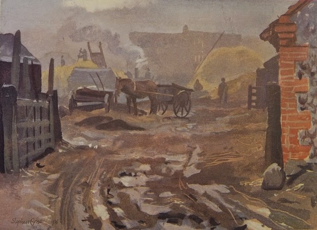
West Runton, Norfolk
Winter Morning in the Farmyard…Illustration of the month
This month’s illustration is a farmyard scene by Stephen Bone, painted in 1936. Although it doesn’t have much architectural content (apart from the corner of a building on the right, which looks as if it’s built of flint with brick quoins) I greatly admire the way it conjures up a place and a time.
Stephen Bone (1904–58) was the son of the Scottish artist Muirhead Bone and his wife Gertrude Helena Dodd. He was encouraged to draw by his father and taught as a boy by Stanley Spencer, who lodged for a while at the Bone family house near Petersfield. Bone went to the Slade, but left early, not liking the school’s academic approach to draftsmanship, and embarked on a career as a book illustrator, excelling as a wood engraver. He also travelled widely, notably with his wife and fellow artist Mary Adshead (they met at the Slade), and when he travelled, he painted, producing colourful landscapes on board. Some of these travels led to a book, Albion: An Artist’s Britain, from which my illustration is taken.
What a lot of atmosphere Bone conveys with his limited and rather muddy palette. It’s winter, and quite early in the morning. The farm is already hard at work – the threshing machine is steaming away, someone is on top of a stack, a horse waits patiently between the shafts. We observe all this through the gate, at one remove, as it were – and through the mist, which makes the scene less distinct but also encourages us to look into the picture and puzzle at what’s going on. Bone reported: ‘Dimly through the mist one sees threshing in progress. The January frost was thawing into mud and my feet were cold and wet.’
From Bone’s thick, painterly way with the mud and frost in the foreground to the looming shapes of stacks and buildings in the distance, from the vague figures to the precise lines with which objects such as ladders and cartwheels are delineated, it’s clearly a composition that has been put together with great care. At first glance it all seems to so casual – those thick foreground daubs of paint. But look for a minute or two. Look at the gate, for example, and the artful way a few strokes of the brush summon up the shadows on the uprights, the frost on the top rail. Look too at the combination of diagonals (ladders, cart shafts, the stack-man’s fork handle), again portrayed with a few slender lines. Marvellous.
Bone’s Albion was published in 1939, the year war came. Its author-illustrator joined up, serving in the camouflage unit before becoming an official war artist (his father had been the very first official war artist in World War I). After the war he continued painting his landscapes, but dealers found them uncommercial. Bone carried on painting the way he wanted to anyway – but forged for himself additional careers in illustrated books (working with Mary Adshead), as a broadcaster (on popular British radios shows such as The Brains Trust), and as an art critic. I think he’s probably still rather under-appreciated: my copy of Albion cost just £5.
Thursday, January 22, 2015
Woodbridge, Suffolk
On the water, by the shore…Illustration of the month
Here’s a new idea, new for the English Buildings blog, at least. When not looking at buildings or writing about them, I often have my nose in a book about architecture or about some place or other. Some of these books are illustrated with paintings or drawings. So I offer for your delectation the odd post about a drawing or painting of a building or a scene with some architecture in it somewhere.
As the first of what I hope will be an occasional series, here’s a picture of a Suffolk coastal scene at Woodbridge by an artist who’s not much known these days, Paul Sharp…
Paul Sharp (1921–98) was born in West Yorkshire, and studied at Leeds College of Art before serving in the RAF during World War II. He then went to the Royal College of Art before teaching at Farnham College of Art and building up a reputation as a printmaker and illustrator. He could work quickly, and it is said that he did pen and ink drawings of all of London's bridges in one day for a guidebook to London.
Paul Sharp's ability to capture a place in a few strokes of the pen is put to good use in the drawings he did for a short series of books for the National Benzole oil company. He also did colour illustrations, in watercolour and gouache for these books, and my example is one of these illustrations from the National Benzole Book Sailing Tours: Essex and Suffolk (1963).
I like the way he gets the essence of the coastal buildings with a few strokes of the brush (these weatherboarded structures, one a former tide mill, are white now and more picturesque, less industrial). His skill is also well applied to the boats and the sky. A few strokes for some pebbly tidal mud; a few more for the rough side of a hull; some streaks to give body to the water and perhaps to suggest the bottom, not all that far down; then some finer lines to portray rigging and the cross-braced strictures of cranes.
It's wonderful stuff, given life by all those swans and some people in the shadows in a small boat. How well does he draw boats? Someone who knows more of these things will be able to tell me, I'm sure. But he seems to me to get the feel of the place very well.
And it's very English too. The weather is dull; the patch of light and the orange paint aren't that bright (though maybe that is the fault of the printing). The muddy shore in the foreground and the texture on the lower part of the large boat’s hull have a hint of John Piper about them and although the sky is a far cry from John Piper’s inky blackness over Windsor Castle, one is reminded of the more famous artist and of George VI's remark: "You seem to have very bad luck with your weather, Mr Piper." Sharp, indeed, seems to have drunk a little at Piper's neo-Romantic spring. He's no worse for it.
Subscribe to:
Posts (Atom)