Showing posts with label Sussex. Show all posts

Tuesday, December 23, 2025

Berwick, East Sussex


A Bloomsbury Nativity

I wish my readers a happy Christmas with this unusual church wall painting, the 20th-century Nativity scene in the church at Berwick, not far to the west of Eastbourne in East Sussex. Commissioned in 1941, the paintings in the church are the work of Bloomsbury Group artists Duncan Grant, Vanessa Bell (the sister of Virginia Woolf), and Quentin Bell. They’re remarkable for being the only complete set of murals by major 20th-century artists in an English parish church.

Vanessa Bell’s Nativity scene is striking for its bold, direct style, although there’s something sombre about it – the colours are not as bright as in many of her works and the facial expressions are contemplative rather than joyous. The seriousness of the work no doubt relates to the story itself – the birth of Jesus is to be celebrated, but we know that his life on Earth will end in a brutal execution. Perhaps this quality in the painting also reflects the fact that the artist had lost not only her sister Virginia (who had taken her own life earlier that year) and her son, Julian, who was killed in the Spanish Civil War. Some say that she has painted the infant Jesus with similar features to those of Julian when he was a baby; the model for Mary was Vanessa’s daughter, Angelica. The sitters for the other figures were local farm workers and servants, so thet painting is steeped in the artist’s family and people she knew.

It is also very English (I am not only thinking of the clothes worn by many of the characters), and redolent of the local Sussex countryside in particular. The barn is probably based on one in the area; the view out looks towards the beautiful downland scenery that helped draw Virginia and Leonard Woolf, Vanessa and Clive Bell, and Duncan Grant to this part of the world. The lamb in the foreground is a Sussex lamb; the produce is in a Sussex trug; even the shepherds’ crooks are based on a local design.*

We are so used to plain whitewashed church walls punctuated with monuments and, just occasionally, a fragmentary medieval wall painting, that for many the extraordinary paintings in Berwick church must be something of a shock. As well as this Nativity, there’s an Annunciation, a Crucifixion, a Supper at Emmaus, a Christ in Glory, and much else. But I can’t help thinking that this location, this church, was right for a cycle of paintings by these British artists at the time of World War II. In spite of the solemnity, there is colour, optimism, renewal, and the faith in the future that must accompany the undertaking of any major project. They needed these things then, and we need them now. 

Season’s Greetings.

- - - - -

* I am indebted to the Berwick church website, and to its guidebook, for much of this information.


Friday, August 8, 2025

Lullington, East Sussex

Where was I?

Year: 1968. Scene: A red Humber Sceptre driving along a lane in remote Somerset, my father at the wheel, me in the passenger seat, trying to find where we are on an Ordnance Survey map. We are trying not to admit to each another that we are lost.

DAD: Well, I don’t think this can be the right road.

ME: I know. It doesn’t look right on the map.

DAD: Let’s carry on for now.

ME (excitedly): Look! There’s a post box. Let’s stop and see what it says.

DAD (braking): Good idea – son.

That last word was always said with a slight pause before it, ‘son’ being stressed in an unusual way, part in irony, part in praise, or, occasionally, if the emphasis was very strong, admiration.

Of course, what we both knew was that back then, post boxes carried information about their location on the panel that bore the collection times. So we stopped and discovered more or less where we were.

I thought of this when I saw this lovely signpost at a Sussex junction back in the spring. I found several things about it easy to like – its wooden construction, the tapering column, the black-painted finial, the shaped corners of the pointing arms, and the clear sans serif lettering. Also the way it told me the direction of Lullington church, which is what I was looking for. And the fact that the column spells out where you are: LULLINGTON. If you’re unsure of your bearings, it puts you right. Perfect.

This was useful when the signpost was erected and, it could be argued, it’s still useful today. Most of us find our way around these days with the help of apparently miraculous satnav devices.* They are usually pretty good at guiding us to our destination, but not very good at telling us where we are. We glance at the dashboard map and see we’re nearing a grey area signifying a settlement, but no name is attached to it. If some oaf has driven into the village sign and knocked it over, or if we miss it because we are dodging other dashing objects or are distracted for a split second by an interesting Georgian rectory, we have no idea. If we’re in a place like Lullington, too small to have many signs at all, we’re likewise likely to be foxed. Signs like this still have their uses.

- - - - -

* One of these days I’ll get round to doing a post about the virtues of OS maps when it comes to finding interesting buildings. Come to think of it, I’ve covered this ground already, in more than one earlier post. See this one from 2019.

Saturday, April 19, 2025

Bexhill-on-Sea, East Sussex

Memories of empire

It’s a surprise to arrive in Bexhill, prepared to take a look at one of the most famous examples of English modernism, the De La Warr Pavilion, all white walls, glass and steel, and to encounter a group of buildings with a whiff of the Mughal empire about them. Close to the seafront is Marina Court Avenue, a row of dwellings built in the early-1900s. These houses have Moghul-inspired details including windows with horseshoe arches (like those on the bandstand in my previous post), together with a minaret and an array of chimney stacks in the form of miniature onion domes. The nearby Marina Arcade, with its copper-domed entrances, is clearly a development of the same period and style.

The Maharajah of Cooch Behar moved into one of the houses in 1911 to convalesce when he became ill after attending King George V’s coronation. However, the presence of the maharajah does not seem to have inspired the architecture of these houses – they were built several years before he arrived. Back then, however, this style of architecture looked less out of place in this English seaside town, because Bexhill had a major building partly in the Mughal taste: the kursaal.

Kursaal is a term derived from two German words meaning ‘cure’ and ‘room’, and a kursaal was a prominent feature in Central European spa towns, places where you went to be cured of your ills. In fact such buildings were more about entertainment than medicine – they usually had a large hall for concerts and assemblies, together with side rooms for other functions, including at Bexhill separate reading rooms for ladies and gentlemen. More to the architectural point, Bexhill’s kursaal was adorned with large ‘oriental’-looking domes and a minaret. Built in the 1890s, they survived until the building of the De La Warr Pavilion, with its theatre, café, and sitting areas, led to its demolition.

In this context, the smaller buildings ofMarina Court Avenue and Marina Arcade would not have looked out of place, creating a small cluster of onion domes, horseshoe arches, and ornate glazing to give an impression that would have seemed exotic to British visitors. This kind of architectural borrowing of foreign styles is now looked down on as ‘cultural appropriation’, but back in the 1890s and early-1900s, Britain had an empire, having appropriated not just the culture but also the land of numerous foreign powers. Buildings influenced by the architecture of India would have reminded people of British global power. They might also have reminded the people of Bexhill that if Brighton, just along the coast, could have an outstanding ‘oriental’ building in the Royal Pavilion, Bexhill too merited its share of the action.
Dome-like chimney stacks and ‘oriental’ windows, Bexhill


Wednesday, April 16, 2025

Bexhill-on-Sea, East Sussex

Multifaceted

My liking for small, unusually shaped buildings meant that I was immediately drawn to this one, an octagonal structure near the sea at Bexhill. I wasn’t at first sure exactly what it was – a café? a meeting-place? a seaside shelter? It turns out that it is known as the Bexhill Coronation Bandstand, and was commissioned by the 8th Earl de la Warr in 1895, as part of various improvements that he made to the town, most of which his family owned. The listing description, however, suggests that it may originally have been a seaside shelter and became a bandstand later – apparently it is described as a bandstand on a photograph of 1927 and there are other early photographs of musicians playing inside it. The window back then looked slightly different, openable and with less woodwork, to let the sound out to listeners on the surrounding paved areas. Musicians still sometimes play in front of the bandstand, but these days it’s a multi-use building fulfilling all kinds of needs. When I was there, it seemed that its main purpose was to shelter people who were enjoying an ice-cream and admiring the view.

The structure looks good after its recent restoration, and its colourful paintwork is just the kind of thing that seems right for the seaside. Some of the decorative touches hint at an Indian source – the horseshoe arches of the window frames and the repeating star-like motifs that run along the lower walls. This reflects a number of buildings nearby in a similar, Mughal-inspired style, which I’ll cover in a separate post. But the bandstand is not a purely Mughal-style building. The roof tiles are typically Sussex in appearance, and the wavy bargeboard beneath them are the sort of thing one sees on ornamental buildings of many different styles Seasides need buildings like this, structures that provide a bit of decoration and a dash of the unusual. This one manages to achieve this by finding a middle way between the tawdry and the dull. Hoorah!

Friday, April 4, 2025

Lullingon, East Sussex

At home on the Downs

I turn south off the main road between Lewes and Polegate, through Wilmington and on to the Downs. After about a mile I see a sign to the church I’m looking for, but there just seem to be two houses and some garages with cars parked in front of them: there’s nowhere obvious to stop. So I carry on down the hill to a farm where there’s somewhere to pull in. There’s one of those reassuring Sussex fingerposts with the name of the location written up the shaft: Lullington. There does not seem to be much more to Lullington than a couple of houses and a farm. I walk back up the hill to the church sign, find a brick path past the garages and into a copse, and eventually I’m rewarded with a view of the tiny church.

I came here because the church was small and picturesque and, I thought, would probably be a pleasant and peaceful spot to break a morning journey. It was all of these things. Its small size (it’s widely noised as the smallest church in Sussex and one of the smallest in the country) is because it is merely the chancel* of what was once a larger church – part of the vanished section has been left to buttress the building at the front. The destruction of the rest of the building is attributed locally to the army of Cromwell in the 17th century, but I’ve not found any concrete evidence for this. Documentary evidence cited on the Suffolk Parish Churches website seems to point to destruction in the 1670s or 1680s, possibly as the result of a roof collapse. The fact that it was not rebuilt suggests that by that time the community had shrunk to something like its current size, possibly because of the Black Death or for some other reason.† The history of this place seems so elusive that not even the church’s original dedication was known. In a ceremony of 2000 it was rededicated to the Good Shepherd.

What’s left is indeed tiny – I counted 17 seats that one could comfortably sit in – and charming. The flint and stone walls are pierced by windows that look 13th and 14th century and there’s a very simple rough-hewn font that may be Norman. The use of flint is typical of the region and the 19th-century bell turret’s walls are weatherboarded, another local building material. Even the church’s modern dedication seems right for its location, paying tribute to the sheep farming that has been a mainstay of the economy of the Downs for hundreds if not thousands of years. This is a building that feels thoroughly at home.

- - - - -

* Or just part of the chancel

† Plague is often given as the reason for the desertion or depopulation of medieval villages, but causes just as common were to do with convenience (villagers sometimes ‘migrated’ to another site), the vagaries of landholding, or enclosure. 

Monday, March 31, 2025

Lewes, Sussex


Glowing in the sun

For a small island, Britain has a large number of local building styles, in large part as a result of the bewilderingly diverse geology. For most of human history, most buildings (with the exception of some churches and the houses of the rich, where funds were available to cover the cost of transporting stone) were made from locally available materials. Most of my readers will have travelled across England and noticed how the styles and materials of older buildings vary from one region to the next, a phenomenon I noticed for the umpteenth time driving from the limestone country of the Cotswolds to the very different architectural landscape of Sussex.

In southeastern England, where good building stone was limited, timber-framed houses were common. Towards the end of the 17th century, however, brick and clay tile became increasingly popular – for their cheapness, appearance and weather-resistant qualities. In counties such as Sussex and Kent, people took to hanging clay tiles vertically on the walls of houses, to protect the wood, wattle and daub from driving rain. Attaching the tiles was relatively easy – the builder nailed horizontal oak laths to the timber framework of the wall and attached the tiles to these.

Tile-hung houses are still common all over this part of southeastern England. My photograph shows a couple in High Street, Lewes, a street that boasts stone, brick, timber-framed and tile-hung buildings in diverse profusion. I noticed these two because they’re so different from each other (and because one of them houses a second-hand bookshop, which of course I had to visit). The two-gabled building on the right is the bookshop, and I admired its bright orange tiles and the way in which the sun has not only brought out the warm colour but also cast shadows between the rows of tiles, giving the surface of the wall form and pattern. The eaves of the roof now hardly overhang the wall at all, presumably because of the amount of room needed to accommodate not only the tiles themselves but also the wooden laths on which they hang.

The tile-hanging on the building to the left is altogether more showy. The two colours of tiles have been used to create diamond patterns and the shapes of the tiles themselves vary – there are curved, pointed and straight tiles, producing a more complex effect than in the simpler, all-straight tiled wall next door. A lot of trouble has been taken with this patterning, and it’s impressive, but personally I prefer the plain tiles, which, with together with their glowing orange hue, add something special to this delightful street.

Monday, March 24, 2025

Chichester, West Sussex

Another way

I’d seen and admired and scratched my head at Chichester’s Council House on several occasions before my recent visit the other week. On this occasion I had time to stand and stare until only a couple of people were passing, so I managed a virtually unencumbered photograph. The more I looked, the odder this building seemed, a remarkable hybrid between two variants of the classical style: the austere Palladian and the theatrical baroque.

The ground-floor brick arcade, quite plain and unadorned, has a Palladian feel to it. So does the giant Ionic order of four stone columns above. The niches on the upper floor and the trio of windows with the central one taller and arched are also features you see on Palladian buildings. But that enormous lintel, topped with a stone lion, is something else, a baroque touch if ever there was one. The large central window seems to be nodding to Gothic architecture in the way that the glazing bars intersect to produce the effect of pointed arches. And the sloping line of the roof on either side seems to suggest that there’s a pediment in there trying to get out, obscured by the masonry above the Ionic columns. As Ian Nairn puts it, writing in the first edition of the Pevnser Buildings of England volume on Sussex, ‘This is the baroque open pediment given a new twist with a vengeance!’

This impressive but outré design of 1731–33 is by Roger Morris, designer of such classic Palladian villas as Marble Hill House, Twickenham, and White Lodge, Richmond Park, as well as the main facades of Lydiard House near Swindon. These are sober designs that feature pale white or off-white walls, triangular pediments and rows of symmetrically arranged sash windows. Chichester Council House on the other hand is in a sort of pumped-up baroque style which, as Nairn says, would have developed into something special if the English baroque had not been ‘killed off by a kind of puritanism’.

The building houses the town’s council chamber. Assembly rooms were built on the back to designs by Wyatt in the 1780s. The public assemblies held here would not have been out of place in the novels of Jane Austen, but the Council House frontage would not, I’d have thought, been to her more conservative taste. Personally, I like it, and respect its unusual proportions and its determination to be different from the norm.

Tuesday, March 18, 2025

Hastings, East Sussex

Local heroes

I have strolled around Hastings on numerous occasions, on my own and with local friends, but in a town of any size there are always things you miss, or things that for what ever reason, your hosts don’t show you. So it was that this time, I was ushered into an unassuming pub, the General Havelock, where I had not been before, to find some of the best Victorian pictorial tiling you could hope to see anywhere. There must have been lots of pubs once with tiled interiors, just as there were many butchers, fishmongers and grocers who favoured this kind of decoration. But changing fashions have seen most of them undergo remodelling and redecoration. The General Havelock has seen many changes too, but four outstanding tiled panels survive.

These pictures in ceramic were produced by a firm called A. T. S. Carter, of Brockley, southeast London, who helpfully signed their work in more than one place. One is a portrait of General Havelock himself, who was well known in the 19th century for his role in recapturing Cawnpore during the Indian Rebellion in 1857. As a result of this action he became a Victorian hero, and there are quite a few streets and pubs named after him. The other panels take local themes, with depictions of the ruined Hastings Castle, of the Battle of Hastings, and of a sea battle between French and English forces, the latter represented by the crew of a Hastings ship called Conqueror.

In the image of the Battle of Hastings, swords, spears, and axes are wielded and arrows fly through the air. Saxons and Normans confront one another fearlessly, and when we look towards the ground we see that they are trampling on those who have fallen. The pub’s layout has changed since the tiles were fitted, with a corridor and small rooms being knocked into one large space, as is so often the case. I believe the tile panels (with the exception of the portrait of Havelock, which is at the entrance) were originally in a corridor. Now they’re the dominating feature of one long wall in the bar and not everyone will find this dramatic stuff entirely relaxing to contemplate when downing beer. But the draughtsmanship and the sheer teaming richness of it is impressive. I’d urge anyone who likes late-Victorian art and decoration to take a look.


Monday, May 30, 2022

Hastings, Sussex


Palace of the people

When I saw this building a bell rang in my memory. I’d noticed it before and admired it, but had forgotten for a moment what it was. The lettering on the front quickly reminded me: ‘Brassey Institute’. This time I let my eyes linger on its architectural details. I also tried to look at it as a whole, but this isn’t easy because the Victorian gothic pile is so crowded around by other buildings, and on such a narrow street, that it’s difficult to take in, and hard to photograph.* But here’s an image of much of the street front, to give you an idea of its mass of gothic detail – pointed arches, loggias, a landmark tower, and enough windows to make at least some of the rooms inside pleasantly light in spite of the densely packed buildings round about. And what is it for? Victorian institutes were usually multi-purpose buildings with some kind educational and community use. The Brassey Institute was built in the late-1870s to provide a library, assembly room, and school of art and science.

The name comes from the man who founded and paid for the building, Thomas Brassey. Brassey was the son of another Thomas, who amassed enormous wealth from the railways. Beginning as a surveyor, the earlier Brassey was involved in the construction of vast parts of Britain’s (and indeed the world’s) railway network and in the building of everything from steamships to sewers. He began to put up a palatial house near Hastings, but died before it was completed, leaving his son Thomas to complete the project. Thomas Junior, later Sir Thomas Brassey, became MP for Hastings and a notable philanthropist. His first wife Annie was a pioneering photographer, whose work is now being appreciated after being in the shadow of the achievements of her male relations. The Brassey Institute is an example of the way many of the Victorian newly rich put some of their money back into the places where they lived.

The architect Brassey commissioned for the institute was Walter Liberty Vernon. Although not one of the most famous Victorian architects, Vernon was clearly a man of great ability. Several features of this facade show the influence of the Gothic style of Venice: the large windows, the design of some of the arches, the small balcony on the left, the loggia on the upper floor – all are ‘Venetian’ features. Venetian Gothic was much in the air in the late-19th century. John Ruskin had published The Stones of Venice back in the 1850s and two decades on, the style was favoured by some Victorian architects as a form of Gothic they could adapt to domestic and civic buildings (leaving English or French Gothic for churches), lending a palatial aspect to public buildings. Vernon showed himself at home in the style, and he would be better known in Britain if he had not emigrated to Australia (for his health – he had athsma) in the 1880s. He produced for Hastings a building that is still used and valued, as the home of the town’s main public library.

- - - - -  

* The church in the left is Holy Trinity, designed by the Victorian architect S. S. Teulon, and the windows visible in my photograph give a hint of his ornate style.

Thursday, May 26, 2022

Hastings, Sussex

Ragged girls

Before the 1870 Education Act, education for children in England was patchy. Some areas had free schools run by charities or by the church, but many did not, so those who could not afford to pay for education saw their children missing out. One notable movement of the 1840s aimed to address this problem by providing free elementary schools for children aged between five and twelve in areas that lacked provision. These schools were aimed specifically at poor families and the people who set them up provided additional help such as food and clothing for families who were in the most desperate financial straits. Because of the worn clothes in which many of the pupils turned up, these charitable free schools became known as ‘ragged schools’; the name stuck.

Probably the first body to use the term ‘ragged schools’ officially was the London City Mission, which founded five schools in East London in the 1840s. I passed the one in my photograph when I was in Hastings recently. Although its Gothic architecture, with pointed windows and fancy bargeboards, is far from untidy, it was apparently a girls’ ragged school founded in 1863. It was opened on 29 October that year, a boys’ school having been established elsewhere in the town about three months earlier. The school was designed for 80 children, although the average attendance was closer to sixty – an indication probably not so much of a shortage of poor children as of varying attendance in families in which one crisis or another prevented children from going to school every day. After the 1870 Education Act, the ragged school would have continued, eventually being absorbed into the system of state-funded schools.

No longer used as a school, the building seems to have recently been restored and the sign at the entrance repainted. I have not been inside, but through the window I could glimpse the large, high schoolroom in which children would have sat in rows, often divided into groups under the supervision of ‘monitors’, older pupils who were sometimes charged with overseeing a group of younger ones while they completed tasks. I hope someone has found a use for the building, so that this bit of architectural history can remain.

Sunday, May 22, 2022

Winchelsea Beach, Sussex


Boxes by the sea

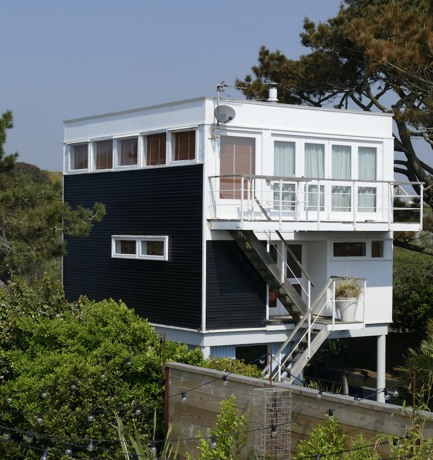
Not far from the railway carriage bungalow in my previous post, I admired a number of houses that displayed very different but equally distinctive designs. One, a large white box, struck me as something out of the UK television programme ‘Grand Designs’. My host and guide to this bit of coast immediately told me that that was exactly what it was. It was built in 2004 by Tom Watkins, former manager of the Pet Shop Boys and featured in that very programme. Only a couple of doors along from that one is the house in my photograph, a far smaller box, this time a box on legs.

Curiously, this more modest building called to me in a way that the more recent white box did not. Maybe exactly because it’s more modest. Perhaps also because it intrigued me with its demonstration of so many of Le Corbusier’s ‘Five Points of Architecture’. In the interwar period, Le Corbusier was a proponent of these five features: building the house on columns, which he called pilotis; strip windows; roof terraces or roof gardens; the ‘free facade’, meaning a facade that puts features like doors and windows where they work best, not where they need to be because of the constraints of structure or convention; and a ‘free plan’, in other words a floor plan that allows a flexible use of space not a plan that was drawn up to some standard predetermined idea of what should go where. Looking at this house from the outside, it certainly seemed to conform to several of the points – although one could only determine the plan by going inside.

So was this, unlike its recent neighbour, a genuine 1930s, Bauhaus period house, or a later recreation? Again, later, I was told – but from the 1950s or 60s rather than the noughties. While most 1950s builders were putting up buildings that looked less ‘modern’ (pitched roofs, brick walls, more restrained ‘modern’ elements), a few people still adhered to the old 1930s ways, as much because of what they looked like as anything else. Boxes like this, with flat roofs and many windows, can take a lot of maintenance to keep them weather-tight and pleasant to live in, but some think this is a price worth paying. After all, the sea views and balconies must come into their own in good weather. Even putting the main structure on stilts, in the light of recent coastal floods (and no doubt more to come), makes new sense of Le Corbusier’s love of pilotis. Maybe we’re not done with the 1930s quite yet.

Wednesday, May 18, 2022

Winchelsea Beach, Sussex

The Wild East

‘Show me shacks and houses made from old railway carriages!’ I said to Mr W, my host in Sussex the other weekend. And soon we were speeding towards Winchelsea Beach where it is still possible, he explained, to glimpse such things. The southeastern coasts of England, and some in Eastern England too, were once festooned with a host of such opportunistic self-built dwellings, which represented an escape from London for many families who otherwise could not hope to afford a home of their own. Landlords would sell off unproductive farmland and bits of terrain vague, and people would buy up a site, camp on it, and eventually build themselves a house using cheap materials such as wood or corrugated iron. Meanwhile, railway companies were selling off old rolling stock for a song, and redundant carriages were sometimes hauled to these sites and turned into houses. This was mostly in the 1930s, before modern planning legislation had developed and plotlands, as these settlements were called, were frowned on by planners, architects, and those who wanted to preserve their local view. The likes of Clough Williams-Ellis (creator of the outré Italianate Welsh village of Portmeirion and author of preservationist books such as England and the Octopus) inveighed against them, lumping them together with ribbon development (‘bungaloid growth’), corrugated iron garages, and general untidiness. While I’d not want the whole of England covered with them, I admire plotland buildings, cherishing the ingenuity and effort their builders and owners put into them.

So I was pleased when Mr W took me to Winchelsea Beach and showed me such sights as this. Surrounded on at least two sides by verandas that look, with their braces and palings, like something out of the Wild West, this is a wooden house that seems to have at its core a trio of carriages, the curving roofs of which are visible when you look at the building from a slightly elevated viewpoint, as in my photograph. I recalled a colleague telling me about someone he’d been working with who lived in a house made up of a U-shaped configuration of three linked railway carriages. Perhaps this was something similar. A little online searching* brings up a suggestion that in this case the carriages are actually tram bodies, perhaps originating on the Rye and Camber Tramway, an old narrow-gauge railway connecting Rye and Camber Sands, not far away.† Whatever the source, I can’t help admire the mix of inventiveness, opportunism, and hard work that must have brought this dwelling about. My admiration extends to those who own and look after such gems rather than tearing them down and replacing them with more conventional brick bungalows, which to my mind would be bungaloid growth indeed.

- - - - - 

* There are more pictures on this website, which is my source for the theory about the tramway origin of the rolling stock.

† The tramway closed in 1939.

Friday, April 29, 2022

Hardham, Sussex

Ribs, bellies, pointing fingers…

Andrew Graham-Dixon, in a recent talk I heard, engaged enthusiastically with English medieval art. He pointed out that 99 per cent of it has been lost, as a result mainly of the various depredations of the Reformation. But he quickly encouraged his listeners to look at the quality of what’s left. His energetic praise for astonishing remnants of large-scale medieval woodcarving (the Abergavenny Jesse, the Cullompton golgotha, both staggering) was infectious. I hope it made people want to make immediate pilgrimages to Gwent and Devon. And the wall-paintings, faded and defaced, are still there in their faint and sometimes barely distinguishable scores. They make one strain to make out details, and marvel.

There’s a marvellous group of churches in Sussex in which frescoes survive in surprising quantity. Occasional details emerge from them to give us an idea of their quality too. One of the best is the small church at Hardham, near Pulborough. I’d been meaning to go there for years, and was glad I visited a few days ago. It’s surprising, if you’ve not read about it, to come across this tiny church in which both spaces, nave and chancel, are full of wall-to-wall frescoes, and that these paintings date from around 1100. They’re very faded, but some of the subjects – a Flight into Egypt, an Annunciation – are not hard to identify.

One of the very best is the temptation of Adam and Eve, not least because the two main figures are bounded by strong outlines, enabling their graphic impact to hit us in the eyeballs. Ribs, bellies, pointing fingers, and Eve’s hand with which she is taking the apple, are all beautifully clear. Only the area around Adam’s groin has been defaced – the Puritans, no doubt, were here. Satan, a fat, coiled serpent, is less clear at the tail end, but has wings (well delineated) and passes the apple from his mouth to Eve’s hand. She points to the apple with her other hand, as if to encourage Adam.

It’s easy to become so carried away with some details that one misses others, some of which are very surprising. Above the painting of the Annunciation and the Visitation in the nave, for example, is an inscription in Latin, a hexameter, and in Lombardic capitals too: ‘VIRGO SALUTATUR STERILIS FECUNDA PROBATUR’ (The virgin is greeted; the infertile woman is shown to be fruitful’*). It’s wrong to think of medieval wall paintings as the unsophisticated products of an illiterate culture. Few medieval people could read and write, but some could, priests (generally) could do so, and would have explained to others what the words meant – as they would also have explained the stories behind the pictures,† whose quality need not astound us – though their preservation is a cause for wonder.

- - - - -

* I think. I have very little Latin and less Greek.

† It’s generally thought that sermonizing was not a major part of early medieval religion and the notion of their being ‘the Bible of the poor’ is, I think, only one aspect of wall paintings’ significance and use. But explanation, reflection, and literacy for some provided the key to meanings at which many, for all their literacy, have to struggle to understand today.

Sunday, April 3, 2022

East Wittering, Sussex


Surprise

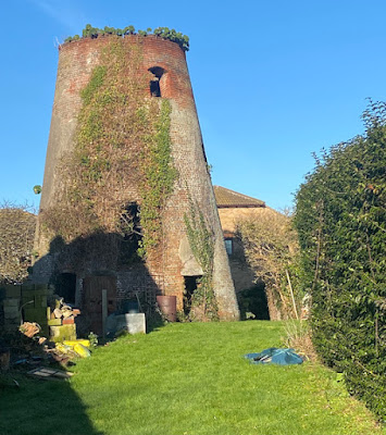
Passing through the Witterings, I was prepared to expect West Wittering to be the interesting one and East Wittering to be the preserve merely of modern houses and shops, hardly worth a glance. But I should know by now that nearly everywhere I go, there’s something to make me pause. So I shouldn’t have been surprised when, among the residential streets and get-rich-quick property developments, this popped up: what’s left of East Wittering windmill.

It doesn’t look much on the face of it:  the sails and cap have gone, the rendering that once covered the brickwork has partly peeled away, the stump of the tower mill sits quietly on a piece of private land. But it’s a reminder that once there were mills everywhere, grinding corn to make bread – watermills where there was a river or stream to power them, windmills where the terrain is open enough for the sails to catch the wind and turn. East Wittering is near the sea and the wind, as I soon discovered, can blow strongly there.

It’s not known how old this structure is – probably 18th century. It is known to have been working for most of the 19th century,* until the sails were removed in 1896. Perhaps it soldiered on under another power source (many windmills had oil engines installed), but it seems to have spent much of the 20th century derelict.† Nowadays the flour for our bread is as likely to be imported as to come from local fields. In many countries today, and in Britain in particular, foods such as bread are part of international trade networks and prices will increase as the effects of the war in Ukraine are felt more widely. This old mill is a timely reminder of how much agriculture, industry and trade have changed.§

- - - - -

* Online sources give 1810 as the date of the first written record of the mill.

† If anyone has further information about the mill’s later history, do please let me know via the ‘comments’ button below.

§ Although Britain imports very little wheat from Uklraine (the UK produces over 80 per cent of the wheat it uses), the war is affecting prices because globally the supply is reduced.

Wednesday, March 30, 2022

Chichester, Sussex

Spread generously

‘What is home without Plumtree’s Potted Meat?’ reads Leopold Bloom, the hero of James Joyce’s Ulysses, ‘Incomplete. With it an abode of bliss.’ It’s a fictional slogan, apparently, this jingle that he spots in his newspaper, although the product itself was a real one. Companies like Plumtree’s, Prince’s, and Shippam’s made large amounts of money making preserved and potted meat and fish products – everything from Galantine of Wild Boar’s Head with Pistachio Kernels to humble fish and meat pastes. Shippam’s was started by Charles Shippam, a grocer who set up shop in Chichester and added pastes and spreads to the usual grocer’s range of butter, cheese, eggs and bacon. Shippam’s began in the 18th century in West Gate, Chichester, but by 1851 they were in new premises in East Street (their factory was behind this building), which is the very site where the sign in my photograph still hangs.*

The sign is in a tradition of shop signs that lasted through much of the 20th century, consisting of the business name combined with a clock. It was a canny advertising move – if you looked up to check the time, you were reminded of Shippam’s brand and you might even pop in a pick up a jar of your favourite meat paste. A number of familiar UK companies have used clocks as signs – Marks and Spencer were particularly fond of them. The fact that clocks like this also protrude from the wall helps customers pick out the shop from a distance too. And what’s that hanging down from the base of the clock? Yes, it’s a chicken’s wishbone, or a sculpture one of one, hugely magnified. Shippam’s processed thousands of chickens and kept the wishbones, prized as a symbol of good luck, for any customer or passer-by to collect. A little bit of fun along with your meat-paste sandwiches. And well, you never know…

When I was growing up in the 1960s, Shippam’s meat pastes were a familiar feature of the table. British people liked to spread them on their sandwiches and in those days many people took sandwiches to work to eat at lunchtime – there were far fewer of those handy sandwich bars that became a feature of working life for so many in the 1970s and 1980s. Meat pastes were inexpensive, easy to spread, and kept well in their air-tight jars. The latter quality also made them especially appealing in the age before every home had a refrigerator. But changing fashions brought changes to Shippam’s fortunes: a succession of takeovers led eventually to a move of production to different premises. The brand at least remains, even if not everyone feels that it brings the domestic bliss attributed by Joyce to its rival Plumtree’s.

- - - - -

* For more on the company’s history, see Chichester’s Novium Museum website, here.

Tuesday, March 22, 2022

Chichester, Sussex


Don’t look up!

I’m always telling people to look up in towns – look at old facades above shopfronts, look at windows, look at old signs, look at roof lines, and so on. But what I should really say is ‘Look everywhere.’ In other words, one is liable to make a mistake if one becomes too preoccupied with looking in a single direction alone. I was reminded of this when walking along South Street in Chichester and admiring the White Horse, once a pub, now a Prezzo. Of course, I’d noticed that the brick frontage of the upper storeys looked Georgian (the building turns out to be much earlier, having been refronted in the 18th century). As I was taking this in, the Resident Wise Woman prompted me: ‘Have you noticed the glass?’. I had not, because I was looking up. From yet another era come the late-19th or early-20th century windows, with coloured glass used to delineate white horses.

This use of glass to decorate or advertise the name of licensed premises was quite common in the late-Victorian period and just after.* Coloured glass was also used to advertise the drinks available – sometimes you can find ‘Beers’ or ‘Wines and Spirits’ picked out in coloured glass lettering. Here it’s just white horses, in various depictions – here, on the move (trotting perhaps) in the fanlight; elsewhere at full gallop, or stationary. There are also white horses with flared legs, to indicate they’re shire or ‘heavy’ horses; there are even horses’ heads in some of the windows. They’re all in a white, almost opaque glass, but are mostly surrounded by patterns and scrolls in a mix of colours including amber, dark red and deep blue: the windows must lookl very appealing when the interior is lit up at night.

So when you’re walking along an urban street, by all means look up, but also look sideways, straight ahead, and down. And try not to do this while on the move – it can lead to pedestrian collisions, and worse! And if you start colliding, people might think you’ve had one or more too many at the White Horse…

- - - - -

* Pub architects also specified elaborate engraved glass. For an example of this, see a post I did a few years ago, here.

Monday, March 14, 2022

Weald and Downland Museum, Sussex


Drying not dying

A building like this has a very special effect on me. It’s large, but in a way it’s insubstantial because there are no walls: just oak posts and a roof of tiles. It provides a lot of shelter from the rain – but for what, or whom? The answer takes us back to 1733, when it was built in Petersfield, Hampshire. It’s a shelter for stacking newly moulded bricks, so that the clay could dry and harden before the bricks were taken to the kiln for firing. Bricks in this raw state are known in the trade as ‘green bricks’, although their colour at that stage would be the hue of the clay of which they’re made. And the story of this building’s use takes us back to the 18th century, not just because of the date of this particular example, but also because by the 19th century, hand-made bricks were starting to die out, to be replaced by mechanically made bricks, which could be produced in vast numbers and at speed.

This brick-drying shed at the Weald and Downland Museum was reconstructed on this site in 1988. Hand-made bricks did not completely die out in the 19th century. The one in Petersfield carried on until World War II, there still being demand for good quality hand-made bricks in contexts where the locality or building requires something with the look and texture of traditional local brickwork. Petersfield itself has many Georgian and later buildings that it would be sacrilege to repair or add to using hard-edged, standard-issue mass-produced bricks from somewhere outside the region; so the demand continues. But some traditional brickworks could not compete with the cheap prices of the big producers, while others closed during the war because the blackout demanded their open-topped kilns, burning through the night, showed no light. That was the case with the one at Petersfield.

About 80 feet long, the drying shelter is big enough for the brick-maker to set up his bench at one end, so he could shape the bricks, one by one, before an assistant (often a family member in the old days) could stack them nearby. Today, the museum uses the bulk of the space for an exhibition about brickwork, surely a good use for this modest but large-scale structure that stands among the other working buildings, from the carpenter’s ’shop to the pug mill, on the site at West Dean, which for my money is one of the best collections of vernacular buildings anywhere.

Thursday, March 10, 2022

Weald and Downland Museum, Sussex


Wooden buildings for woodworkers

The UK is fortunate to have several open-air museums that preserve old buildings, usually structures that have been dismantled and re-erected on the museum site, that would otherwise have been demolished. Some of these museums have large collections of dozens of buildings, gradually amassed and preserved over decades, and one of the best, in my opinion, is the Weald and Downland Living Museum, a few miles from Chichester in West Sussex, which preserves many buildings form Southeast England – mainly Sussex, Kent, and Surrey. They do an excellent job, and should be supported and visited now they are open again after the various lockdowns and restrictions that we’ve been living through.

Following on from my previous post about a plumber’s workshop, here are two more small working buildings from the Weald and Downland. The larger of the two is a joiner’s workshop originally from Witley, Surrey and the smaller structure is a carpenter’s ’shop, from Windlesham in the same county. Both have the generous glazing typical of such working buildings and they’re both made mainly of wood and built more for practicality than looks.

The carpenter’s ’shop belonged to a Mr Dale, who like many in his time traded as both a carpenter and an undertaker. It was reconstructed on the museum site in 1980, but I don’t know how old it is – the museum’s website doesn’t give a date, so perhaps its age is unknown. It’s very simple, with a wood-framed structure covered with boards and tarred to protect it from the weather. Mostly the carpenter’s materials and finished work came in and out of the door although there’s a small opening above the central window, through which he could insert and remove his ladders.

Inside, the tools left in the ‘shop when it was finally vacated are preserved. Saws and large drill bits hang from the roof beams; chisels, bradawls, and other smaller tools stand in racks; planes wait on the bench. There are pots and bottles of liquid, perhaps preservative oils. When it was still a workspace, there might have been a pot of glue on the go too. You could move in here and start working with wood, with only a few additions if you were able to work with traditional hand tools alone.

It’s very atmospheric and reminds me how accurate some of the 20th-century depictions are of such carpenters’ ’shops. I’m thinking particularly of the one by Edward Bawden in the King Penguin book Life in an English Village, which I blogged about here, mentioning my father’s boyhood memories of another carpenter’s workshop in rural Lincolnshire. Even the humble buildings need celebrating, something I try to do on this blog, and something open-air museums like the Weald and Downland do brilliantly.

Saturday, March 5, 2022

Weald and Downland Museum, Sussex


Call in the plumbers

These days when something goes wrong with a tap, or there’s a leaky pipe, or a ballcock, we call in the plumber. Plumbing is one of those trades that has been with us since ancient times and form the Romans to the early-20th century, water was carried in lead pipes. So plumbers were skilled in the working of lead – they could make lead pipes, mend them, install them. And they also got involved in trades in which lead was used – in glazing, for example, when panes of glass were set within strips of lead, as in the ‘leaded lights’ we still talk about when discussing windows in some churches or old houses. That’s what ‘plumber’ means (coming from the Latin plumbum, lead), a person who works with lead.

So here’s the plumber’s workshop at the Weald and Downland Open Air Museum. It’s a wooden building with large windows to provide plenty of natural light, and fitted with generous work benches. It was probably built in the late 1880s and was originally sited in Newick, East Sussex. It belonged to the long-established firm of W. R. Fuller, who were plumbers and decorators, another two trades often combined, and came to the Weald and Downland Museum after it was dismantled in 1985. It’s just the kind of building that’s at home in an open-air museum, and like some of the best working buildings that end up preserved, it came with a large selection of tools – for cutting lead, measuring it, and for forming and bending pipe. The museum has a large collection of artefacts used in various building-related trades. Many of these are in storage, but it’s good that some of them can be displayed, to give visitors an idea of how tradesmen worked.

And we need such an idea, because plumbing changed radically in the 20th century. When scientists realised that lead pipes could be harmful to human health, there was a changeover to pipes made of other materials, from copper to plastic. The trade changed, and workshops like this became a thing of the past. There must have been thousands of such workshops; now leadworking is a specialist craft, restricted to areas like the decorative leadwork sometimes seen on rainwater goods, and the repair of windows that have leadwork, so plumders’ workshops of this kind must be rare as hen’s teeth. Thanks to the Weald and Downland Museum, one at least has been preserved to throw light on a bit of a much-changed building trade.

Sunday, March 29, 2020

Lewes, Sussex


A swift half

It has become clear to me that I am long overdue a visit to Sussex, a fine county packed with architectural interest, famously situated, unlike my native Cotswolds, ‘by the sea’, and home to good friends, prized even higher than good architecture! So, as my day began with a conversation about alcohol, thoughts of Sussex also led to Sussex beverages, and to the architecture of the fine Brewery of Harvey’s in Lewes.

Now, careful readers of this blog (I know there are some!) may have noticed that I have a few favourite architects who, though not among the acknowledged greats, nevertheless produced work whose qualities I admire. Not the Soanes or Lutyenses, who seem to be able to handle everything – space, form, surface, facade, light, setting – to produce buildings that are both surprising and wonderfully satisfying – but minor masters who could do one thing well, in a way that tickles my fancy. Victorian rogues like S. S. Teulon, with his bizarre OTT decoration and arresting forms and spaces; or Cuthbert Brodrick, who could do grandiose like no one else and did it, magnificently, in Leeds; or really minor minor masters, like disappointed Peter Ellis of Liverpool, who tried, it seems, to invent modern architecture 50 years too early, and apparently gave up, ignored or crushed by criticism. And then – to get to the point – there are the specialists, such as man-of-many-theatres Frank Matcham and brewery whiz William Bradford.

I’ve had cause to admire William Bradford’s work before, at Cheltenham and, supremely, at Hook Norton. How pleasant, then, to encounter his work again in Lewes, as I did a few years ago. This is the place where one of my favourite pints is produced: Harvey’s Bridge Wharf Brewery. Bradford (1845–1919) may have worked in the brewing industry before turning to architecture, but was in practice in his own right by 1879. This was also the date of his earliest brewery work, although he seems to begin with to have specialized in designing and altering pubs. He notched up some seventy brewery jobs (not all new build – many were upgrades or expansions of existing breweries), and developed his own very special style. From the outside, his breweries can be recognised by their striking roofscapes (with towers often topped with wrought-iron crowns or finials), picturesque grouping of buildings or parts of buildings, and an interesting mix of materials – if he could combine brickwork, timber framing, plasterwork, weatherboarding, and dramatic glazing patterns in one building, he did. Harvey’s Bridge Wharf Brewery (1882) is a good example of this style, which also at its best involved the use of white-framed windows in the ‘Queen Anne’ manner.

Internally, the buildings are well and practically planned and his drawings reveal not only good draughtsmanship but also a clear concern for the most efficient placing of all the varied bits of machinery and equipment used in a brewery – tanks, mash tuns, coppers, hoppers, steam engines, pipes, ducts, and cocks. The picturesque placing of his buildings and towers, then, comes more often than not from putting the different brewing functions where they worked best. That, I think, was why he was so successful, and why brewer after brewer went to him for designs.

But Bradford knew too that a striking building was good publicity.§ Many brewers put an illustration of their brewery on posters, advertisements, and bottle labels. If their premises looked the part, so much the better. Bradford’s building at Lewes looks as good as its products taste. And its owners seem, in planning later alterations, seem to have done so in a manner in keeping with Bradford’s work.† I look forward to the time when I can both see the building again, and join ‘the men that live the South Country’¶ and taste its products on their home turf.

- - - - -

§ He seems to have liked an event that would make good copy. Lynn Pearson, in her book British Breweries: An Architectural History (1999), to which I am indebted, tells how in 1882, the year of the Harvey’s project, he climbed to the top of the 120-foot chimney of the Swan Brewery, Fulham, along with the brewer and contractors. At the top, they ‘christened’ the structure’s iron crown and drank ‘bumpers of champagne’. I hope they had some beer, later, when brewing had begun. 

† Some of what you see in my photograph dates from a later phase than the original Bradford building, but it is all very much is his spirit.  

¶ And the women too. See Hilaire Belloc’s poem, ‘The South Country’ for more praise of this part of the world.