Showing posts with label Tudoresque. Show all posts

Thursday, July 18, 2024

Northwich, Cheshire

When wood works

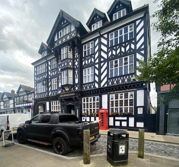
This building stands out on Northwich’s main shopping street like no other. It’s very large and exhibits the timber-framed structure that is so often seen in other Cheshire towns, such as Nantwich and Chester itself. It has the typical Cheshire elaborate magpie pattern of posts, beams and struts, and there’s a jetty, the arrangement by which an upper floor sticks out above the storey below. It doesn’t take long, though, for one to realise that this, like the pub in my previous post, is not an ancient structure of the Tudor period or earlier. The regularity of the timber work, the windows with their pivoting openings, the tell-tale uniform quality of the timber work – all point to a building of the 19th or 20th-century timber-frame revival, a way of building sometimes called ‘Tudoresque’.

It’s a pub now, but whatever was this dazzling structure originally built for? The clue is in the pub’s name, the Penny Black, the name of the first adhesive postage stamp. This building was originally the the town’s Post Office and it was built in 1914, although it did not actually open until the end of World War I, in 1918. The timber frame was not only a visual homage to this traditional Cheshire style of architecture. It was designed this way so that it could be ‘liftable’.

If liftability is a new concept to you, I should explain that Northwich was one of the centres of England’s salt industry. Underground brine was extracted and boiled in vast pans so that the water evaporated and the remaining salt crystals were gathered and processed for sale. Removing the brine caused voids to appear beneath the ground, and buildings subsided as a result. Suitably built timber-framed structured could be jacked up – lifted – and stabilised, whereas masonry buildings were at risk of severe damage or even complete collapse.

What a triumphant building for an early-20th century Post Office. How unlike Post Offices today, which tend to share space with other retail premises – even in large towns the Post Office occupies some counter space at the back of a shop such as a branch of W. H. Smith. This trend to downsize happened before the current scandals surrounding the false prosecutions and convictions of hundreds of Post Office staff, but these days it looks almost as if the organisation is trying to hide away in these low-budget, low-profile locations. How unlike the situation in 1914, when a building like this could act as a landmark on the high street, a three-dimensional piece of publicity and a premises that was built, in the most challenging geological situation, to last.

Sunday, July 14, 2024

Farndon, Cheshire

In black and white

There are countless timber-framed black and white buildings in Cheshire, some of them late-medieval, some much later. This one, The Raven in Farndon, is said on some websites to have been ‘originally built’ in the 16th century, but the excellent Farndon history website points out that the earliest documentary evidence for the pub is in 1785 and that it does not appear at all on a map of 1735. It’s likely to have 18th-century origins, then, but the present building is clearly late-19th century. Its ‘timber frame’ is actually decorative, being attached to solid walls of brick. People will say it’s a fake, but it’s a very engaging fake, with its pattern of cusps on the three sections between the upper windows (and elsewhere on the building) and its jazzy diagonal timbers in the gable.

My favourite part, though, is the sign. The pattern of plasterwork scrolls and straight lines around the name panel suggests similar patterns in Jacobean ceilings and above 17th-century fireplaces. The stylised raven, though is something else, the plasterer’s or architect’s own idea of conjuring up the eponymous bird in a simplified but graphic form. In its stylised, almost cartoon-like quality, t’s unlike anything I can remember in an inn sign, though my readers might know similar examples. It’s clear, simple, and effective, and it’s odd with such a distinctive sign that after a refurbishment in the late-20th century, the building should have had its name changed to The Farndon. Now it The Raven again, and its sign, not to mention its half-timbered design, look the business.


Saturday, April 1, 2023

Broadway, Worcestershire

Quirky things in quiet corners

I begin blogging again with this eye-catching little building, which is in the showpiece village of Broadway. Broadway is in Worcestershire, but it feels like an exile from Gloucestershire, being right on the northern end of the Cotswold Hills. Much of Broadway, true to this Cotswold location, is built of limestone, with stone ‘slates’ on the roof as well as the classic ‘honey-coloured’ walls* that help make the region so well known. But this structure, tucked away in Back Lane behind the Lygon Arms, not much more than a few yards from the manicured glory of the main street, is rather different. It’s a pleasing mélange of stone, brick, timber, and thatch. I thought it was a house, but someone said (and Pevsner confirms) that it was built by the owners of the hotel to accommodate staff – but the said staff were too busy, on the day I last visited, to answer queries of this kind.

I see it as probably a bit of architectural whimsy in a style that evokes – on the surface at least – the late phases of the Arts and Crafts movement. The thatched roof, with the ‘eyebrow’ window interrupting the thatch, is very much in the Arts and Crafts mode. So is the use of traditional materials. Except that the way some of those materials are used is to put a Tudoresque spin on the building. That timber framing at the front, with its brick infill in fancy herringbone pattern, isn’t really integrated into the structure of the whole building – it’s acting mainly as a screen to conceal and shelter the entrance steps.† The weatherboarding, too, seems simply to be a picturesque covering to perfectly good brick walls with stone quoins. There’s nothing wrong with this approach – I think the result is attractive and it makes me smile. It’s just not the ‘what you see is what you get’ kind of building that the followers of William Morris advocated.

But quirky and unusual are qualities that I like, and that I’ve been highlighting in this blog for around 15 years. As I resume, I resolve to feature at least a little more of the same.

- - - - -

• Honey-coloured? Well that’s the usual cliché, although the reality is that Cotswold stone comes in a range of hues, from grey to yellow – with a bit of brown in the mix on some areas too.

† The corner post does, of course, help to support the roof above, and so has a partly structural role.

Saturday, January 5, 2019

Cirencester, Gloucestershire


Above standard

I thought this building, just a couple of streets away from the timber-gabled, tile-hung pub in my previous post, would make a good follow-up to it. This is the former offices of the Wilts and Gloucestershire Standard newspaper.* It’s almost the same age as the pub – 1904 rather than 1902 in the case of the Brewer’s Arms – and also has timbered gables. But there the resemblance ends. The ground floor is in a sort of Cotswold Renaissance revival style – the mullioned window, Elizabethan-looking pilasters, and carved capitals would be at home in any Cotswold town, Painswick, Chipping Campden or Cirencester itself. But above, things change gear and the whole frontage is timber-framed, with big oriel windows and very fancy woodwork, from carved beams studded with Tudor roses to elaborate bargeboards. The upper floor is also jettied out to overhang the street.

This fine and rather surprising† building is the work of a Cirencester architect called Vincent Alexander Lawson, who worked in the town between 1885 and 1928. This example of his work is clearly very assured. He designed plenty of other buildings in the town and round about, and civil engineering work (he was a qualified civil engineer) as well as a lot of more straightforward Cotswold revival buildings. This striking office structure shows him exploring styles a bit more widely, if not wildly.
“Photograph it before it goes!” exclaimed the Resident Wise Woman, and she was right. The building is for sale, and though I’m sure the frontage will be preserved, the signage should be protected as well as the structure. The building is listed, and the signs are mentioned in the listing text, so there’s hope. That’s good because signs are often what go first from an old town-centre building, and the former newspaper office has not only some good lettering above the door and window but also a lovely hanging sign. This is shield-shaped, well lettered, and suspended from a very lively wrought-iron bracket with a touch of Art Nouveau in its curves. Information, craftsmanship, and enjoyment in one small package. Worth holding the front page for, I’d say.

- - - - -

* The building only ceased to be used by the newspaper in 2017, and for much of its life combined the editorial office at the front with a print works at the rear. 

† Surprising, that is, in the context of Cirencester, where one might expect that a fine building of this period would be built entirely out of stone.

Monday, March 12, 2018

Soho Square, London


Reminder

Last weekend I was due to drive down to Somerset to teach a course on Tudor and Stuart architecture. Somerset was one of the parts of Britain to receive the rare ‘red weather warning’, so the course was cancelled and none of us got stuck in the snow. One of the things I was going to talk about was the impact of the Great Fire of London and the fact that very few timber-framed buildings have been constructed in the capital since 1666.

Here is one exception, the hut in the middle of Soho Square. It might look like a survivor from the pre-fire era, but in fact it was built in 1925. Its original purpose was to disguise the entrance of an underground electricity substation, built for the Charing Cross Electricity Company. The substation is no longer active and the subterranean space was used as an air-raid shelter during World War II. Now the building is a gardeners’ hut, full of spades and the like. I’m not sure how the upper floor is used.

This little building feels visually generous – the arcades, pointed roof, bits of carving, and fancy bargeboards were hardly necessary, but provide just the right sort of fun for the centre of a busy square that’s now a popular place to relax. It’s here on the blog as a reminder – to me, to talk to the organisers about rescheduling my course, and to all of us, that after the snows, spring cannot be far away.

Friday, April 1, 2016

Ross-on-Wye, Herefordshire


Good views

The Resident Wise Woman and I have a particularly strong affection for Ross-on-Wye in Herefordshire. Various things about it appeal to us: the town’s lovely setting (and the wild daffodils that grow in the woods near Dymock, on the way), its secondhand bookshop,* and its buildings (naturally), which display a strong link to the Picturesque movement of the 19th century, to the early-19th century Gothic revival, and to an interesting historical story of local philanthropy.

There are quite a few buildings in Ross with pointed Gothic windows, and this house is one I’ve passed scores of times.† It began life as a hotel in 1838 at a time when Ross’s picturesque setting by the River Wye was making it especially popular with visitors. The building has lost its fancy bargeboards, but retains a big pointed window, a flattened Tudoresque arch above the doorway, a row of brick chimneys (also Tudoresque), and a fine collection of patterned glazing bars.

The house makes excellent use of its corner site, the sides splaying out to follow the line of two streets that come together at a junction, and the lower part stepping its way down the hill on the right.With the protruding entrance section, the building turns the tight corner gracefully and forms a landmark at this end of the town. It makes satisfying view – but the views from the back and side, looking out across the river and fields towards Wales, must be just as satisfying.

- - - -

* I’ve warmed to Ross as a book-buying place ever since I bought, on a stall in the market house, a four-volume copy of Vasari’s Lives of the Painters, Sculptors and Architects, in very good condition, for just one pound. Quite a few delights such as Shell Guides, numerous art books, and, curiously, Czech novels, have been purchased in the excellent Ross Old Books.

† I’ve photographed it more than once too, although this photograph was taken the other day by Zoë Brooks, to whom many thanks.

Thursday, August 20, 2015

Brockhampton, Herefordshire


Noisy Parker

Tucked away down a narrow lane amid lush evergreens and folded into a bend in the River Wye north of Ross is Brockhampton, home of a beautiful Arts and Crafts church that has repaid several visits and yielded a post on this blog some years ago. Opposite the church is the drive to the big house, Brockhampton Court, rebuilt in 1893 by George F Armitage in Tudoresque style. The big house can’t be seen from the road, but the North Lodge at the gate is a small landmark, a dazzling bit of Tudoresque timber work.

With its array of black wooden quatrefoils, lancets, struts, braces, and jetties, this lodge looks more Cheshire than Herefordshire and the overhanging roofs and porch look as if they derive as much from the cottage orné tradition (deliberately picturesque cottages dating mostly the from the early-19th century) as from any close imitation of Tudor building. What a dazzler, though: a noisy little building metaphorically sounding its trumpet at the distant gate.
And what a gate, all curly ironwork going this way and that. It’s a piece of work more in keeping with the Arts and Crafts church opposite and maybe is by one of the craftsmen who worked there. I don’t know who designed the gate but the lodge is by Barry Parker, who worked as Armitage’s clerk of works and stayed on to do this extra job. Parker was one of the team (Parker and Unwin) who planned the first garden city (Letchworth) and the exemplary garden suburb (Hampstead Garden Suburb). The year of the Brockhampton lodge, 1902, was the year before Parker and Unwin submitted their plan for Letchworth. The tree-lined roads and vernacular-inspired architecture of the garden cities have many antecedents; perhaps the leafy lanes of this remote spot of rural Herefordshire contributed its share of influence. 

Thursday, August 13, 2015

Sudbury, Suffolk


Craftwork

Look up. People are always telling me to do it. I am always telling people to do it. Look up above the tree line, at church towers, above the doors of houses, above shop windows. You often see something unexpected and rewarding. So when a splash of colour caught my eye above the modern shops of North Street in Sudbury I looked up and saw this: a bit of 1870s Arts and Crafts design that can still take your breath away about 140 years after it was built.

I’ve called it Arts and Crafts because it demonstrates so many crafts in such a small space: colourful floral mosaic, incised plasterwork, stained glass, ornate metalwork (those floral finials that tops the little hipped roofs of the oriels), and the use of neat openwork ridge tiles. All of this is set within a strong design, with the Tudoresque timber framing, the pair of tall, narrow oriels (topped and tailed with hipped roofs and plastered undersides), and the russet roof. It’s an impressive piece of work and in a different league from the upper fronts of so many shops, where you find a bit of brick wall and a couple of sash windows if you’re lucky. I don’t know who commissioned this facade or what business was first housed beneath these mosaic flowers and Tudorish windows, but it’s good to see such care being lavished on so small a frontage back in 1876.

Although the Arts and Crafts movement is often said to have got into full swing in the 1880s, William Morris’s firm was in full swing by the 1860s, and Morris and his colleagues founded the Society for the Protection of Ancient Buildings in 1877. Morris’s work, the interest in design fostered by the embryonic Victoria and Albert Museum, and, above all, the kind of ‘Free Tudor’ architecture of Norman Shaw (as in is famous 1860s house, Cragside), set the tone. So, if we’re surprised by the restrained richness of this facade, we should’t be surprised at the date, the curvaceous numerals of which are incorporated into the mosaic. This kind of design was in the air.

Saturday, December 15, 2012

Don't mock Tudor


Christmas books: 4

The fourth of my Christmas handful of books actually came out last year, but it struck me as so relevant to the concerns of the English Buildings blog that it easily earned its place here. It is about what for many is the quintessential English building style: Tudoresque...

Andrew Ballantyne and Andrew Law, Tudoresque: In Pursuit of the Ideal Home
Published by Reaktion

Tudoresque – shorthand for the architectural style typified by black and white walls and prominent gables – is something of a national obsession in Britain, and a symbol of our culture. But its modern incarnation, mock Tudor, is decried for the fakery of stuck-on beams and imitation leaded lights. So why are we so preoccupied by it – whether we're in love with it or, like many design professionals and architects, scornful of its suburban manifestations? This is among the questions that Andrew Balantyne and Andrew Law (professors respectively of architecture and town planning) seek to answer in this lively book. They trace the style's 16th-century roots, its various reincarnations – during the vague for the "Picturesque" in around 1800, as a revivalist style (influenced by the Arts and Crafts movement) in the late-19th century, and as mock-Tudor suburban architecture in the 1920s and later.

Fascinatingly, Ballantyne and Law also trace the style's meanings for its revivers – those values that it has seemed to embody and that have been attractive to lovers of Tudoresque down the ages. It turns out that these meanings are far from simple. On the one hand, there is the Tudor style as a symbol of paternalistic old values: of manor houses, aristocrats who look after their patch and their servants, benevolent industrialists housing their workers. This is one-nation Tudorism, if you like, with a lavish portion of the roast beef of old England. From another point of view, it's the style of self-reliance,  of the lower middle class making ends meet, of squatters putting up a timber-framed house on common ground overnight and claiming the right to live there, of the Elizabethan ideal of a cottage with four acres of land, of suburban owner-occupiers.

Ballantyne and Law tease out these meanings carefully, showing that if such subtexts are no longer directly relevant (few people build and squat nowadays) they are still there somewhere in our unconscious, and they contribute the way in which we see things. If Tudoresque cottages appealed to the creators of the Picturesque landscapes of the 18th and 19th centuries, symbolizing patriotism, they also embody values of tradition and Britishness to many dwellers in modern half-timbered homes.  The authors also look at the vogue for Tudoresque in other countries, where it is seen in part as a symbol of Britishness and British values, whether in the swanky abodes of early-20th century US industrialists or in smaller Manhattan apartment blocks, which occasionally resemble Tudor skyscrapers.

Tudoresque pulls all these threads together well. It encompasses real timber-framed buildings and faux-Tudor houses with boards nailed on to brick walls, and shows that what they have in common is more than skin-deep. It made me think more deeply about why people built these houses the way they did, about the gulf that sometimes opens up between architects and home-owners, and about what makes Britain British.