Showing posts with label font. Show all posts

Friday, May 28, 2021

Altarnun, Cornwall


The hard stuff


In the list of English building stones most familiar are the sedimentary rocks, such as limestones and sandstones, that are so widely found and widely used for building. In the Middle Ages, when so many of the country’s churches, castles, and other notable buildings were constructed, these stones were widespread, plentiful, and widely used. Many of them were also sympathetically yielding to the carver’s chisel, and whether for the hunky punks of Somerset or the glorious Romanesque carvings of Herefordshire or their contemporaries in many other places, often just as stunning, masons and carvers used these materials enthusiastically. But there are other stones with very different qualities. One such group are the granites of parts of Cornwall, Devon, and Lancashire, igneous rocks that are so hard they rapidly blunt any tool that one is rash enough to use on them.* Early builders were sometimes thankful to find ‘field stones’, chunks of granite that they could pick up and use with little or no chiselling. An entire church built of granite is a testimony to a lot of very hard work.

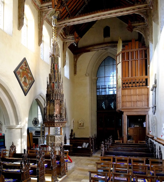
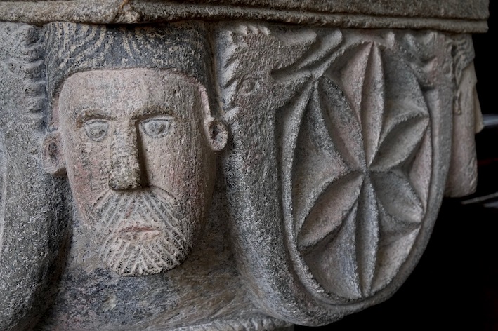
Such a church is St Nonna’s, Altarnun, in Cornwall. Not for this building are the glass-flat blocks of ashlar stone that we see so often on the limestone belt or in the sandstone country. The surfaces, though well worked, have a roughness that gives them a character of their own. My photograph shows a detail of the superb Norman font. There’s a carved head at each corner and in the middle of each side, a roundel with a six-petalled ‘flower’ motif, embraced by a some kind of two-headed serpent. It’s simply detailed – getting fine detail into this stone is a real challenge – but wonderfully strong. It would have been further enhanced with coloured paint, of which traces remain – a hint of red on the cheeks of the face and a little grey to suggest hair. Whoever carved this has not been cowed by the hard rock, but has gone with an approach that suits the quality of the stone. A lesson in making the best of a material, something that ancient craftsmen did magnificently.

- - - - -

* I once tried to drill a hole the granite wall of a house, to fit a curtain rail. My good quality hammer drill was defeated: once through the plaster surface, the tip of the bit just danced about on the surface of the rock, knocking away more and m ore surrounding plaster as it did so. We called in the professionals, who had a machine the size of my arm that did the job.

Sunday, February 2, 2020

Ufford, Suffolk


In love with building

Since the 13th century, when churches were ordered to keep their fonts securely covered to prevent people stealing the consecrated water,* font covers have been the norm. Often, there is a simple, lockable wooden lid; frequently the cover is a little more elaborate, a structure that complements the font on which it sits. In East Anglia, however, the font covers of the 14th and 15th centuries became memorable works of the wood carver’s art.

Rising some six metres towards the roof of the nave, the font cover of the church of the Assumption, Ufford, is one of the most magnificent of all. At about 20 feet tall, the cover is a stunning wooden confection made up of niches, arches, and pinnacles. It tapers to the point where a pelican stands, pecking at her breast to feed her young. The Pelican in her Piety is of course a symbol of the sacrifice of Jesus Christ and its reenactment in the Mass, and this would have been but the climactic symbol on a font cover that was once covered in statues of biblical figures and saints – these were all lost during the iconoclastic purges following the Reformation. Apparently the statues had already been removed when the notorious 17th-century destroyer of images, William Dowsing, visited the church and had oversaw the smashing of stained glass.

What is left is still breathtaking, an essentially architectural object, in which the niches and pinnacles taper towards the top so that the cover takes the shape of a spire. I can’t help being reminded, looking at structures like this, of the words of the Arts and Crafts architect and educator William Richard Lethaby, when he wrote about the architectural form that decoration so often took in the Middle Ages:

The folk had fallen in love with building, and loved that their goldsmiths’ work, and ivories, their seals, and even the pierced patterns of their shoes should be like little buildings, little tabernacles, little ‘Pauls’ windows’ .

Chaucer, too, described someone with the patterns of Paul’s windows on his shoes, by which he meant designs like the tracery of the rose windows in Old St Paul’s cathedral. This use of architectural motifs such as tracery, niches, and pinnacles, is seen throughout medieval art. There’s nothing typical about the sheer richness of grand Suffolk font covers, though.† They are outstanding, and Ufford’s is one of the best of all.

- - - - -

* For use in ‘black magic’ or other non-Christian rites, it was said.

† And occasionally elsewhere. For an Oxfordshire example with a Suffolk link, see my post here.

Wednesday, March 20, 2019

The Lea, Herefordshire


The elephant in the room, or, Odd things in churches (11)

Although it’s not at all odd for a church to have a font, this one is odd, as English fonts go. First of all, it’s Italian; secondly, it’s elaborately carved and inlaid; thirdly, it didn’t start out as a font at all, but as a stoup. That I was able to come across this exotic object in a church in Herefordshire, near the border with Gloucestershire, is due to a gift. The font was donated by a Mrs Hope-Edwards, as a memorial to her mother, and she got it from a London dealer who imported it for Italy. It’s said to be of the 12th or 13th century, and Mrs Hope-Edwards gave it to the church in 1909.

The round bowl is carved with various interlacing patterns and a number of small scenes – just visible in my upper photograph are a man in a boat (he’s holding an oar, but the vessel’s large sail is also visible), and a fox making short work of a chicken. Other scenes feature a dog attacking a ram, a peacock eating a fish, and a woman also with a fish. The bowl is set on a distinctive shaft that has a faux-knot halfway up and the staff is carried on the back of an elephant, a creature that seems to have ears very like human ones. As well as the carving, another delight of the font is the mosaic or Cosmati work running around the bowl and around the saddle cloth that is draped over the elephant’s body.
Scholars of medieval sculpture have made comparisons with work in such places as the cathedrals of Canosa di Puglia and Bari. I have seen ‘knotted’ shafts like this one at Modena cathedral. The meticulous mosaic work, with its tiny diamond-shaped and triangular tesserae certainly has an Italian feel too. In the right lighting conditions the golden tesserae must glitter attractively. Alas! England could not provide sunny weather on the day I visited, but the font still brightened a rather gloomy interior.

Monday, June 18, 2018

Hook Norton, Oxfordshire


The eyes have it

I wonder if Hook Norton, a large village in North Oxfordshire, can stand as a symbol of what I respond to in England’s rural settlements. So far, I’ve posted about this village’s remarkable brewery, about a Shell petrol pump globe, and about Hook Norton’s early, and lovely, Baptist chapel. Buildings and objects like these are very much the kind of things that appeal to me, and that have, I hope, animated the posts on this English Buildings blog for nearly 11 years. All I need is a parish church and a beautiful, hand-painted sign and I’ve got the essence of my interests. And Hook Norton is rich enough to oblige.

The parish church, then. I’ve visited St Peter’s Hook Norton (beautiful, large, airy, part-Norman, partly from the later Middle Ages) several times over the years, but only on the most recent occasion with the Resident Wise Woman. ‘You must come in here,’ I said to her. ‘There’s something you’ll really like.’ I knew that the primitive, but charmingly folkish carving on the Norman font would be up her street, and I hope it appeals to you too.

On the face of it, the relief decoration on the font is very simple: Adam, Eve, a centaur-archer, a figure carrying a water-bags, a lion-like creature, and a monster out of the bestiaries with two heads, one in his tail. But before we dismiss the simplistic carving, there’s much to keep us looking. ‘EVA’ and ‘ADAM’ are named, as is the archer, ‘SAGITARIUS’ and the latter identification encourages one to speculate that the lion could be Leo and the water-carrier Aquarius, though the two-headed monster (sometimes referred as an amphisbaena, although, strictly, an amphisbaena was a two-headed serpent) is in no zodiac that I know. The inscriptions also make one wonder if more people in the Middle Ages than we think could read – someone at any rate could spell out these words and tell others that here were the first man and woman. Adam has already begun to delve – he carries a rake in one hand and a spade in the other, and has dug into the band of ornament running around the base of the font. Eve has not, though, learned to spin, and seems more concerned with addressing her modesty.* The faces, apart from Eve’s rather pointed foxy visage, are charming, and some of the eyes have that tendency to look out at you directly from faces in profile that we see in many periods and genres of art, from ancient Egypt to the Cubists. I am charmed especially by the amphisbaena, in intimate conversation with himself, as many of us are. There is a much better photograph of it than mine, by John Piper, in the Tate collection, which is worth a look. He had a good eye for these eyes, did Mr Piper, as he did for the more general charms and visual interest of the English village.† I’m pleased to follow in his footsteps, even if my own photographic efforts are, compared with his, as crude as the work of the Hook Norton carver.

- - - - -

* At least I think that’s what she’s doing.

† People who visited the recent Tate Piper exhibition, which has also been at Warwick Arts Centre, might be forgiven for thinking, from a misleading caption there, that Piper took all his pictures with a box Brownie camera. John Piper wrote in a note on equipment prefaced to a book of his photographs that he started with a number 2 Brownie, but bought a secondhand ‘Ideal’ camera with a Zeiss lens in Broughton when he was about 18; this he used until he was 60, when he treated himself to a Hasselblad. See John Piper, A Painter’s Camera: Buildings and Landscapes in Britain 1935–1985 (The Tate Gallery, 1987).

Friday, May 13, 2016

Anstey, Hertfordshire


Fishy (1)

My recent visit to Anstey in Hertfordshire has already yielded one post, about the unusual lychgate at the entrance to the churchyard. One of the other surprises of the place was inside the church – this striking carved font, which probably dates to the very late 12th century or early 13th century.* The carving portrays a quartet of mermen with tails that divide in two and curl upwards so that the mermen can grasp the ends in their hands. This form of divided tail is quite common in medieval depictions of mermaids, but I don’t remember having seen mermen like this before, although apparently there’s a similar font in St Peter’s church in Cambridge, which I visited a very long time ago.

Mermaids are altogether rather more common in medieval art than their male counterparts. Often shown carrying mirrors and combs, they were symbols of vanity and were also seen as posing a danger to sailors.† So there are mermaids in roof bosses, in woodcarvings, and in the water through which St Christopher wades bearing the Christ child as he goes, in many a medieval wall painting.

Mermen didn’t carry such a heavy moral message and don’t appear to have been portrayed so often. They seem an odd choice for a font, where the decoration more often shows the sacraments, or a scene of Baptism, or simply abstract patterns or tracery. Perhaps some contrast is being implied between the wild creatures that dwell in the open ocean and the protected and sanctified bowl of the font, which will be filled with holy water.

Be that as it may, the mermen of Anstey, with their bold, if rather simple carving, make the font stand out.

- - - - -

*This is the date range given on the excellent Corpus of Romanesque Sculpture in Britain and Ireland website; the writers base their estimate on the style of the carving.

†There seems to have been some confusion between mermaids and the sirens of classical myth too.

Monday, February 1, 2016

Rendcomb, Gloucestershire


Pattern language

Boldly incised Norman piers, carved with patterns such as spirals and chevrons, occur only now and then in parish churches. Usually this kind of treatment appears in high-status churches – the famous nave of Durham Cathedral, the crypt at Canterbury, Norwich Cathedral, and so on. I’ve also noticed a Saxon version in the very special crypt at Repton. But by and larger one finds plainer piers in smaller churches, though perhaps their generous cylindrical surfaces were once enlivened with bold painted patterns.

How refreshing then, to come across such columns in a smaller church – but in miniature, in the carved relief around the Norman font at Rendcomb. This lovely font depicts eleven of the apostles plus a blank space for the twelfth, Judas, in Romanesque arches with incised patterns – chevrons, lozenges, spirals, and so on, very like their enormous cousins at Durham. The figures are boldly carved and their garments are carved with bold incised patterns that reflect and complement those on the columns. There is also some rather Classical framing ornament  – a version of Greek key and some stylised foliage that seems to have taken its inspiration from anthemion at the top and bottom of the font respectively.

The font has had a chequered history. It doesn’t seem to have started life in this church, but was brought here by the Guise family, who owned the great house (now Rendcomb College) nearby for use as a garden ornament. In the middle of the 19th century someone recognised its worth and the font was moved inside the church. It seems to have endured all this quite well, although the key pattern at the top looks as if it has been curtailed at some point. Overall though, this is still a belter of a font, and a joy to find in a small and little regarded church.

Monday, August 31, 2015

Langton by Spilsby, Lincolnshire


Out of time but not out of place

Among the box pews of the perfect Georgian interior of the church at Langton by Spilsby in my previous post is a object that has existed for much longer than the church itself. It’s the font, which must have been recycled from a medieval church, presumably on the same site, when the current building was put up in the early-18th century. This sometimes happened with fonts. As vessels of the sacrament of baptism they acquire a holiness of their own, which, combined with their aura of antiquity (generations have been Christened in that font), and sometimes their sheer beauty and craftsmanship, gives them a good chance of survival.

This one is a ‘pattern book’ font on which each face illustrates a design of window tracery, and it is similar to a font in Warwickshire that I’ve posted about before. It’s late medieval and bears tracery designs that are mostly in what we now call the Decorated Gothic style of the 14th century. But there’s one face with a design of the Perpendicular style that spread across England in the late-14th and 15th centuries, indicating that the font must be late-14th century at least. My photograph shows a couple of particularly crisp Decorated tracery designs. Although out of place chronologically, the font sits beautifully among Langton’s box pews and under its curvaceous, dome-like cover, presumably a contribution of the woodworkers who fitted out the church in the Georgian period.

Monday, February 2, 2015

Brailes, Warwickshire


Decorated

Now and then as I travel around the country I enter a church and I’m blown away not by the architecture, or the antiquity of the building, but by a single stand-out object – a bit of carving, say, or a stained-glass window – that makes my journey worthwhile. Things like this, as John Betjeman put it, hinting that you have to suffer for your art, are worth ‘cycling twelve miles against the wind to see’. Indeed – although I must admit I arrived in more comfort, on four wheels.

The church of St George in Brailes is a large building, mostly 14th-century but with a tall 15th-century tower. Inside, in spite of an interesting monument or two and at least one item that could qualify for one of my ‘odd things in churches’ posts, what got my attention was the font. Whoever carved this, some time in the 14th century, decided to use each of its eight sides as a showcase for a window design. These windows in stone are stunners, and present a round-up of 14th-century tracery in the style the Victorian antiquarians labelled ‘Decorated’, an appropriate term that’s still widely used.

So, in my first photograph, the carver illustrated on the left ‘reticulated’ (net-like) tracery, in the centre an interesting design with a pair of flame-like openings, and on the right a window incorporating the double-curved ogee arch that was so popular in this period. In my second photograph are three more designs: on the left trefoils, in the centre a wonderful whirling wheel, and on the right quatrefoils within a framework of intersecting tracery. Beneath the window designs are two bands studded with stylized flowers – four-petalled flowers and the round, incurved ballflowers, another very popular 14th-century motif that I’ve noticed before.


This kind of font (the one at Brailes is not unique, although such fonts are not common) is sometimes known as a pattern-book font, a term that suggests a mason providing a catalogue similar to those offered in printed books in the 18th century enabling builders and carpenters to run up the required kinds of fireplaces, doors, cornices, and so on. Not that a static piece of church furnishing from the Middle Ages could have quite the same purpose as a commercially available book – it’s a font, at the end of the day. But what a wonderful place to begin one’s journey through life. Or to end a 12-mile cycle ride.

- - -
Font-fanciers might like to know that I posted about a similar font, adorned with carved tracery but in the style prevalent a century or so later, in the church at Preston Capes, Northamptonshire.

Thursday, April 10, 2014

Preston Capes, Northamptonshire


Projection

It’s an experience that nearly every church crawler must know. You’re standing in a quiet country church on a dull day. Many of the windows have clear glass, with a smattering of stained glass, so the interior is not dark, but it’s not exactly bright either. Soft shadows brush whitewashed walls. Then outside the wind blows, the clouds part, and out comes the sun. Suddenly, inside, everything lights up and here and there patterns of stained glass are projected on to the stone-flagged floors and the white walls.

The moment can be magical, and when it happened to me at Preston Capes the other week the effect was so right it might have been stage managed. The yellows and blues of the glass fell beautifully on the white wall, the adjacent font, and the font cover. Not only that: the design of the glass made the outline of the two window openings clear on the wall, and their shape – tall, narrow, and with cusps pinching the top into a a tiny tear shape – roughly matched that of the tracery panels on the side of the font that was facing me.

The design of the tracery that decorates the font suggests that it’s 15th-century (the spire-shaped font cover may well be later). The font is a nice example of the late-medieval tendency to decorate architectural surfaces of all kinds with the sort of tracery patterns used in windows.* The stonework of the window might be of a similar date to the font (I didn’t check while I was there) but the glass is certainly post-medieval and not the sort of stuff one would spend much time admiring, were it not for this projection effect, that lasted for just a few minutes, before the wind blew clouds over the sun once more.

- - -

* It’s also an example of a later tendency to cover stone surfaces with stone-coloured paint, but we’ll let that pass.

Wednesday, April 29, 2009

Ewelme, Oxfordshire


Stepping westwards

Alice de la Pole of Ewelme was the grand-daughter of the poet Chaucer and the wife of William de la Pole, who was made Duke of Suffolk in 1448 for his loyalty to the House of Lancaster. It was said that the couple, when not at court or at the de la Pole estate in Suffolk, lived much at Alice’s home village, bringing with them East Anglian retainers whose descendants still live in the area. They probably brought Suffolk craftsmen with them too, because when they rebuilt the church in the 1430s in a rich mixture of flint, stone, and brick, an East Anglian layout was adopted, with wooden screens rather than masonry used to divide the various parts of the building's interior.

One of the treasures of Ewelme church is a font cover built like a staggering spire of wooden tracery. This too looks just like an import from East Anglia, where there are a number of such tall and intricate covers, connected like this one to a pulley, so that they may be raised when the font is needed for a baptism.


In the year William was made Duke, the couple established a chantry, a foundation under which two priests and thirteen poor men were to pray for their souls and celebrate Mass at Ewelme. The priests and poor men were accommodated in an almshouse that William and Alice built near the church and the beautiful south-east chapel of the church was set aside as the place where the cycle of Masses and prayers could be said.

Alice's tomb, now sited in a space between this chapel and the chancel of the church, was installed just before she died in 1475/76. It is one of the most impressive of all 15th-century tombs, with a lifelike alabaster effigy of the deceased, a cadaver beneath (staring at a picture of the Annunciation), a host of angels above, and a row of standing figures – many still with their original painted colour.

Those traces of colour, making vibrant this reminder of mortality, was just one thing that made this building special when I visited it the other day. As the flag flew in the brisk breeze at the back end of April (the Chaucerian month) and the sun blazed through the windows, a group of ringers came to put the bells through their paces, adding music to colour to bring the place sonorously alive.

Friday, January 9, 2009

Deerhurst, Gloucestershire


Saxon Severnside

This is the other Saxon church at Deerhurst, to which I referred in the previous post. It’s now the parish church of St Mary, though it began life as a Saxon minster, becoming a Benedictine priory a few years before the Norman conquest. The building has been much altered over the centuries, and architectural historians have traced many phases of construction, including several in the Saxon period as the church grew form a small, narrow building without a tower to the larger, wider structure, with its tall west tower, that we see today. The tower is a real local landmark, visible from a long way across the low-lying Severnside country.

From the outside, the building doesn’t look that much like a Saxon church, because most of the windows are late-medieval. But many of the walls they pierce are Saxon, and inside there are the outlines of numerous earlier blocked window openings that allow one to imagine what the building must once have been like.

The interior is full of fascinating details from the Saxon period and later. Here are just a couple, first a detail of the carved design on the font. This kind of spiral motif also appears on English manuscripts of the 9th century and before, and Anglo-Saxon jewellery of the same period, leading experts to date the font to before 875. I once read that it had disappeared for years before being found in a farmyard in use as a trough, but I’ve been unable to verify this story.

There are several other outstanding pieces of Saxon carving in the church, including an angel, a Madonna, and this animal head projecting from a wall at the west end. Those incised lines reveal a sure touch, as does the way the stone is slightly asymmetrical, in sensitive and lifelike counterpoint to the stylized lines. This may have been a remote, provincial church, but a thousand years or more ago it played host to some fine artists.

Tuesday, July 8, 2008

Brookland, Kent


Brookland has one of the most extraordinary churches on Romney Marsh, a place where several remarkable churches punctuate broad, windswept vistas of sky and greenery. The most unusual feature of the church is the one you see first, as you arrive: the belfry. This is wooden, shingle-clad, octagonal, and, as Pevsner rightly says, like three candle-snuffers stacked one on top of another. It is also detached from the main structure of the church.

A few other Kent churches have spires with a similar profile, but none a detached monster like this. What is it doing here? A good guess would be that the ground hereabouts isn’t very firm and the builders were unwilling to risk a heavy stone tower, which might have subsided and collapsed. The ancient arches of the church interior certainly lean a lot. A lightweight wooden structure was probably a safe option and the belfry seems to be as old as the church – the lower timbers of the octagon are apparently 13th century while the upper ones were added or renewed some 200 years later.

The church itself is as interesting as the belfry. A wooden porch leads into a large space, with two rows of outward-leaning arches (late-13th to early-14th century) lit by windows full of clear glass. Highlights in this light, spacious interior include a lead font (on which figures illustrate the Signs of the Zodiac and the Labours of the Months) plus 18th-century furnishings such as a large two-decker pulpit and box pews. The church escaped the more extreme restoration activities of the Victorians, and is still packed with interest, a wonderful tribute to the ingenuity of medieval carpenters and to the parishioners who have cared for it for more than 700 years.

Saturday, March 1, 2008

Castle Frome, Herefordshire


When not admiring Herefordshire’s black and white houses (see previous post), I’m diving into its churches to look for carvings. Herefordshire has its very own school of Norman sculpture, active between, say 1140 and 1190. This school produced work of outstanding vigour – figures, Biblical scenes, dragons, and beak-heads abound in that wonderful mixture of Christian and pagan that the Normans loved. The figures display deeply folded drapery, strong gestures, and, sometimes, unusual poses. This intense style of carving is not quite like anything else in Britain, but scholars have traced antecedents in various places on mainland Europe from western France and northern Italy to Compostela, where it is known that at least one local lord went on pilgrimage.

The font in the small, isolated church at Castle Frome is one of the masterpieces of this Herefordshire school. It depicts the symbols of the four Evangelists and, centre stage as it were, the Baptism of Christ. Christ has entered a rippling, fish-rich pool, St John stands by, the hand of God and dove of the Holy Spirit appear above. The scene takes one back, not just to the first century, but also to the Norman period, when a priest in a remote country parish about to baptize a baby could explain to his illiterate congregation their links to an event in the far western Mediterranean some 1200 years ago.