Showing posts with label window. Show all posts

Wednesday, November 5, 2025

Cotehele, Cornwall

The beauties of imperfection

Modern window glass is almost perfectly flat, flatter than any pancake. It also has few if any internal imperfections, making it perfectly transparent, and it can be manufactured in large pieces, making sizeable uninterrupted shop windows possible. Old glass, especially pre-19th century glass, is full of imperfections and generally came in quite small pieces. It was often made by blowing a cylinder of glass, which the glass-blower then cut along one side and flattened out to make a sheet. Another method was to spin a mass of molten glass, producing a disc, which the glass-maker then cut up into small usable sections. Windows from the stained-glass one in medieval churches to the small panes in Tudor or Georgian windows, are glazed with glass made by hand in these ways.

Most of the time, people don’t notice the imperfections in old glass windows. But if you look closely you’ll see that their surfaces have a pleasant and characterful unevenness – which also distorts slightly what we see through them. The ancient house of Cotehele in Cornwall was built in the Tudor period; the interiors were modified in the 17th century and the building remains Tudor and Jacobean in character. Many of its windows retain their early glazing. You can see how, in my photograph, the imperfections – a series of curved and linear unevennesses or more random patterns – can be made out by looking at the shadows they cast on nearby walls and window reveals. These effects vary according to the light’s direction and intensity, but are wonderfully clear in the photograph that I took on a recent October afternoon.

The architectural character of a building is often very obvious, but sometimes reveals itself in subtle ways, catching us by surprise when a particular feature, like this window, has its time in the sun.


Sunday, August 24, 2025

Arlingham, Gloucestershire

All about line

I’d planned to go over to Frampton-on-Severn, stroll along the enormous village green, and look at some favourite buildings. But as I approached the place I saw signs saying in large letters, ‘FRAMPTON VILLAGE FEAST – FUN FAIR’ and when I arrived the village green was full of roundabouts and dodgems ready for the big day. So I decided to push on to Arlingham, a village set deep in the River Severn’s most dramatic loop, and look at the church, which until now I’d not managed to get inside.

When I got there I found the church locked, but a telephone number on a noticeboard put me in touch with the key’s helpful custodian and I was soon inside. To me the most engaging of the many delightful things in the church were four panels of mid-14th century stained glass. Each panel shows a standing saint and the two in the photograph above* are St Mary and St John, both set against a rich red background within ornate white architectural frames. Both saints, especially John, display the slightly sinuous form of the body typical of the period: his head is tilted to the left, his upper body slopes slightly to the right, his abdomen is straighter, and one foot points to the right. This is not quite the stylised S-shape of some 14th-century figures, but definitely tends that way.

However, the feature of the figure drawing that particularly struck me was the depiction of John’s right-pointing foot and Mary’s hands. The foot has exaggeratedly long toes, unrealistic in their proportions but so carefully enough drawn that each toe has its nail delineated. Mary’s hands likewise have very long fingers and they are drawn with one continuous line to produce the effect of interlocked digits. I like this carefully executed but rather eccentric effect, as I do the other linear details, the face, the headdress, and the architectural adornments – crockets and finials.

And in this window there’s a lovely bonus. High up in the quatrefoil that fills the top of the window is a tiny but beautifully formed image of St Catherine, with her wheel (see my second photograph). This little portrait has more interesting line work, including the face (with its somewhat scornful glance at the instrument or torture), the patterns, and another long-fingered hand, holding the wheel. How pleased I was that my avoidance of preparations for the fun fair and feast and had led me to a small feast for the eye in these windows at Arlijngham.

- - - - -

* Please click the photograph to see the details more clearly.


Thursday, September 5, 2024

Clifton, Bristol

Life force

All Saints church, Clifton, was a Victorian building that was hit by an incendiary bomb in 1940. After World War II, a plan to rebuild the church ran out of steam after delays and the death of the architect, W. H. Randoll Blacking, and in the 1960s, Blacking’s partner, Robert Potter, produced a new design for a nave and sanctuary connecting the surviving parts of the old church (the tower, sacristy and narthex). I was especially eager to see the interior of the building when I read that it contained a large window by John Piper.

The Piper window, at the west end of the church, is huge and magnificent. It shows Piper’s familiar use of strong colours, but is different from other Piper windows I’ve seen – the design is very simple and bold, portraying two powerful symbols, the Water of Life and the Tree of Life with a directness that reminded me a little of the late work of Matisse. In the Tree image, especially, there is a lot of almost-flat colour – red, blue and yellow mainly – together with a slightly more varied range of green shades. The Water of Life, which emerges from a stylised yellow urn, flows down the window in a blue stream to the right of the urn and two sinuous orange rivers to the left. These orange streams, particularly, have a rich variation of hue and texture that I associate with the more typical work of the artist. The combination of flat and varied colour, together with the contrast between the upward thrusting branches and the downward flowing water, all on a background of deep blues, is to my eyes very successful.*

There’s something unusual about these windows that’s not at all obvious from my photograph above. They are not made of glass at all, but of translucent fibreglass, to which Piper applied coloured resins. The artist worked on the panels in situ, making the process completely different from the production of stained glass. The usual method in stained-glass work is for the artist to produce a drawing (the cartoon) and pass this to the glass-worker, who creates the window in their workshop before assembling it on site. The very different process with fibreglass – one artist working on site directly on the material of the window – may well have emboldened Piper to create this image of sweeping gestures and vivid colours, which suits the plain interior so well, a space that might have felt rather austere without it.

- - - - -

* One area in which the window is less successful is that its material s not as durable as glass. There are already some signs of deterioration, and I hope these do not create a maintenance headache for the church.

Thursday, December 21, 2023

Huish Episcopi, Somerset


With my best wishes

Casting around for something seasonal to post, I found this picture in my files. I’ve actually posted it before, but so long ago that I doubt anyone reading this now will remember it from back then. It’s a stained glass window designed by Edward Burne-Jones and made in the workshop of William Morris and it shows the Nativity scene in the stable at Bethlehem. As well as being a prominent member of the Pre-Raphaelite Brotherhood, Burne-Jones was also a founder member of Morris’s firm and the window is one of many wonderful examples of their bringing together of art, craft and design.

The host of angels, crowding beneath the roof of the stable and into the foreground, focus their gaze on Mary and Jesus. Mary is recumbent, as she often is in ancient images of the scene, and so she and the child form a long centre band across the window, with angels above and below. On the left-hand side of the picture, the Magi wait to present their gifts. I like everything about this window, from the colours and the composition to the tenderness with which the mother holds her baby and the way in which the heads of the figures in the side panels lean in towards the holy family. I hope you like it too.

Have a happy Christmas and may the new year bring peace, not least to the part of the world where this scene took place.

- - - - -  

Note You may be able to see a little more detail if you click on the photograph.

Monday, November 8, 2021

Leominster, Herefordshire


Incidental pleasures, 1: Fan mail

Are you are a fan of fanlights? I’m sorry, but the pun seems to want to be made.* I have always admired the semi-circular fanlights of the Georgian period, noticing the satisfying, cobweb-like layout of their glazing bars, dividing the little window in a way that justifies the name. And also reflecting how the entrance hall of a house can be its darkest area, and that a generous fanlight can help bring in some welcome natural light. So I’ve done posts about fanlights more than once before.

Scrolling through my pictures looking for something else, I came across this small gem. Not semicircular at. all, and not fan-like either, but more interesting than the simple rectangular windows that were often inserted above Victorian doors. The cue for the shape comes from the door’s canopy, with its shallow segmental curve, giving the fanlight a curved top too. And the pattern of the glazing nods towards this curve with four straight glazing bars radiating outwards, forming shapes that look as if they have been inspired by the tracery in Gothic stained-glass windows. So the shapes are all ogees and cusps, making a contrast with the simple, straight-sided panes of glass in the door below.

It’s modest, but visually satisfying. I have my doubts about how much light it lets into the interior, especially with the canopy producing shade as well as shelter. But if your front door faces directly on to the street, it’s pleasant to offer the street a bit of visual uplift, something to warm the heart of the observant passer-by.

- - - - -

* If it seemed so to me at least, perhaps it’s because I’m a bit of a paranomaniac at heart.

Thursday, May 7, 2020

Bishops Castle, Shropshire


Shop prop

This photograph was taken through a shop window in the small town of Bishops Castle in Shropshire. It’s a detail that opens up a whole aspect of shop design that most people don’t notice: how to hold up the building’s structure when almost the whole of the ground floor is glazed. Back in the Georgian period and before, shop windows were relatively small, and this wasn’t such a big problem. In the Regency period, windows got larger, and shops with rows of Classical columns became fashionable, creating a facade that looked a bit like an ancient Greek temple (there’s a detail of such a row of columns on a shop in Oxford here).

By the mid-Victorian period, however, shopkeepers were going for still larger windows, so that the shop front became made up of little but glass and glazing bars. And so it became the thing to prop up the front of the building with columns on the inside, just far enough from the glass to allow the window display to overlap them and make them disappear. Since the columns weren’t meant to be noticed, they are often quite plain, and these days end up being painted white, so that they blend quietly into any window display.

It’s the top of one these internal columns that is the subject of my photograph. But as you can see, the people who made this example weren’t content with a plain column. On the contrary, it’s very ornate, with a spiral band running up the body of the column and a decorative capital at the top. The capital isn’t from the standard range of Classical design (it’s not Doric, Ionic, or Corinthian) but is made up of a combination of standard motifs – scrolls, stylised leaves, a fleur de lys – combined together to created a design that a Victorian builder might simply have labelled ‘fancy’. ‘We could do a plain column, sir, but for a stylish shop like yours, I’d recommend the fancy.’ And with the client’s approval, the builder would order up a set of fancy columns from an iron foundry and the shopkeeper would be proud to have the latest thing in elegant shopfitting.

Such columns were not uncommon. I have seen similar, but not identical ones in the Kirkgate Market in Leeds, propping up the roofs of cast-iron stalls. Kirkgate Market was put up in 1901–1904, and I’d not be surprised if this column was of a similar date. It was still propping up the shop a couple of years ago, when I passed by and took my picture through the window, much to the surprise of the other pedestrians on the street, who, no doubt, had not seen this bit of architect’s or ironworker’s fancy.

Saturday, May 2, 2020

Ludlow, Shropshire


Building out of the box

No apologies in these travel-restricted times for going back to my archive once again to look at another place I’ve posted about a few times before: Ludlow, a small town with enough food shops and decent restaurants to satisfy the hungriest of visitors, and about 500 listed buildings as well. This time it’s the Angel, a building on Broad Street (where virtually every building is listed and quite a few, like this one, are timber-framed magpie structures from the 17th century or thereabouts. This one is 17th century too. It is basically a wooden box-framed building and has plenty of carved and enriched bits of old timber in it to interest even the most casual building-fancier.

But in many ways the stand-out feature is among the later modifications. The facade boasts a number of 18th- and 19th-century sash windows that would make any purist of early timber-framed buildings wince. Strictly, a building like this should have casement windows, not sashes.* But if my head questioned their presence here, my heart was won over by the two first-floor oriel windows, semi-circular and resting on rather Georgian-looking moulded bases, topped with leaded roofs, and sporting sets of sash windows that are curved to fit the rounded shape.

Adding features like this must have taken a lot of effort and skill – attaching the weighty structure to the timber frame, forming the bases, and doing the joinery to make the curved sashes. The result was a front that looked perhaps a little incongruous, but spoke of the owner’s awareness of current fashion, and of a desire to make the interior lighter and perhaps more airy. I’ll settle for that.†

- - - - -

* Sash windows came in during the late-17th century, but this would be a precocious provincial building if it had them installed originally.

† The building has had various uses over the years. I think it is currently a restaurant, although an online search also reveals a hairdressers at the same address. One hopes that these businesses will survive the current troubled times.

Wednesday, April 8, 2020

Longborough, Gloucestershire


Line and light 

A few weeks ago, as the gravity of the coronavirus outbreak seemed to become more grave, but before it had taken hold in this country, I found the need to go and sit somewhere quietly, and collect my thoughts. The garden room office where I write a lot of my books and blog posts would normally be the place for this but for some reason, a church seemed to call me and I made my way to Longborough on the Cotswolds a few miles from here. I’d visited before a couple of times, and I wanted to look again at one of the most impressive bits of window tracery in a small church and to contemplate some of the contents of the building, which has an interesting collection of monuments.
Longborough church, originally built in the Norman period, was made over and extended in the 14th century, when a south transept was added. The glory of this addition is the enormous south-facing window, which is so big it takes up practically the whole of the transept’s southern wall. This is masonry and design of a pretty high order – right at the top of the range (one might even say over the top) for a village church. The pattern of the tracery with its complex curves is the sort thing that mason excelled at in the 14th century – the first half of the century, especially, before the Black Death struck and building came to a halt (or at least a major slowdown) in the years after 1350. It’s what Victorian antiquarians (and the rest of us, for convenience) called the Decorated Gothic style, and it’s certainly decorative.* There’s another more complex but less curvilinear example of the style here. 


The window is a huge contrast – in both size and design – to the much smaller, plainer nave windows to the left. These were probably installed in the 15th century. Does the big window overwhelm the church, distracting us from the church’s other features, such as the tower? In a way, yes. But one can’t blame whoever the master mason was who created it, when he was given the chance to produce something truly memorable by a patron who, presumably, had a deep purse. It’s not known who these people were, and there would have been another, the person who filled the window with stained glass. The medieval glass has long gone, but even here there’s a gain in the face of this loss. With this big opening now glazed with clear or pale-coloured glass, the interior of the transept is flooded with light.

More on that in a couple of days...

- - - - -

* A reader quite rightly points out that it was a Georgian, Thomas Rickman, who invented the terms (Early English, Decorated, Perpendicular), which are now familiar in discussions of Gothic architecture. This is quite true and Rickman's book, An Attempt to Discriminate the Styles of English Architecture From the Conquest to the Reformation (1817), was reprinted many times. It was, though, in the Victorian period that the use of these terms became widespread, though not universal.

Wednesday, May 27, 2015

Louth, Lincolnshire


Round the back

As a small boy I remember being taken into this building by my maternal grandfather, who lived in a village a few miles from Louth. He went into the market hall to buy ginger biscuits for himself and sweets (in generous quantities that I never saw at home) for me. Needless to say, this place holds fond memories. There being serious sweet-buying work to do, I don’t remember thinking much about the architecture. I remembered the tower, though when I saw the building again the other day, that tower’s slender proportions and the cut brickwork around the windows were a surprise, one pulled off, I now read in Pevsner, as the result of an 1866–7 design by Rogers and Marsden, local architects who are not, as far as I know, well known outside Lincolnshire.

From the front, it’s an odd design, but with a reason, I think. The entrance is very deeply and narrowly recessed, the narrowness of the opening mirroring the slender proportions of the tower above. Making this entrance-way rather tightly proportioned gave the architects more floor and facade space for the short row of shops, fronting the market place, on either side. Rogers and Marsden gave the town added value, in the form of these shops, but at the expense of pushing the market hall back behind them. But as well as all this, the hall has a surprise to pull.


Go round the back, and the rear facade is completely different. Like the train shed of a Victorian railway station, it wears its arched structure on its sleeve, and provides, into the bargain, the most enormous semicircular window, through which one can make out the great metal arches inside, which support the roof. The plain pattern of the glazing bars is remarkably modern, but the doors at the bottom, which are topped with semicircular arches let into the great window, and iron hinges that have ornate spiral agendas of their own, provide some contrast. The effect is one of drama, brio, and rightness. And although I wouldn’t have thought about it in those terms, I do remember thinking, as a small boy carrying several paper bags full of pear drops and allsorts and sweet seafood, that this was simply the biggest window I’d ever seen.

Saturday, August 10, 2013

Guiting Power, Gloucestershire


It's not just about the architecture

I live just a few miles away from this small Baptist chapel in the Gloucestershire village of Guiting Power, and pass it quite often. For me, it's one of those landmark buildings – the ones that provoke a nod of recognition as we travel around on our regular routes, buildings that remind us that we're nearly home, or ones that are just reassuring because they're still there.

This is a simple building, but the first few times I passed it, I seemed to notice something different about it each time – the coursed rubble masonry, the large quoins, the neat bands of stone around the windows, and so on. Stopping and looking more closely, I saw at once that this is hardly great architecture. The large side windows certainly do their job – their clear glass must make for an interior with plenty of natural light, perfect for reading Bible and hymn book. The masonry bands that surround these windows might be a bit shallow and narrow, their keystones rather small and overshadowed by the roof overhang, but this is the kind of architectural restraint that's appropriate, I'd say, for a nonconformist chapel.

The entrance front, though, looks odd. The usual pattern here would be to have two further large, round-headed windows, one on either side of the doorway. Instead, there's a rather small and mean-looking Venetian window above the door. The reason for this curious arrangement is that the chapel contains an upper seating gallery at this end, with its floor just above the arch of the doorway. Tall windows would not work, as the gallery floor would bisect them. Hence the smaller window placed above the doorway.

A building like this, then, is a collection of compromises. On one level it shows a Cotswold builder of the early-19th century wrestling with the architectural conventions of the time and not always winning. On another, it reveals a happy set of answers to the question of how to produce a well-lit building with enough accommodation for the worshippers in a restrained style that respects the local villagescape. The date stone above the Venetian window reads '1835' and the chapel has been little altered since then. The design seems to have worked. 

Wednesday, March 13, 2013

Cambridge


Curves

Shopfronts are not the most obvious items in the cornucopia that is the architecture of Cambridge, but here is one that pulled me up short as I walked around the town in the rain last week. My first response to this building in Market Street was a question: could this really be an original art nouveau frontage? The glorious collection of curves described by its carved woodwork certainly seemed to point that way and I guessed that it was late art nouveau, a survival from perhaps the early 1920s. When I got home and looked it up, I found that the building's official listing put it at c 1910, whereas Kathryn A Morrison in her excellent English Shops and Shopping dates it to c 1923, when the front was made for Stetchworth Dairies.


The front repays a close look. The woodwork above the door is a stunning collection of stylized foliage and multiple curves that turn back on themselves in a way that we're now more used to seeing in Paris or Brussels than in England and the flowers and stems in the glass echo these curves beautifully. The door and the wooden panels on either side take up the theme of curves too, as does the extraordinary metalwork.


The building must have made a remarkable diary. The front seems to have been designed to catch the eye more effectively than the display of eggs, cream, butter, and cheese in the window. If it's not perhaps as effective in its new role fronting a gift shop (it seems to cry out for a more sensitive sign than the one currently in place), at least it is in use, a curvaceous and exotic reminder of the skill with which which shops were designed and fitted out in the days when frontages like this were made to last.

Thursday, April 5, 2012

Fairford, Gloucestershire


Focal point

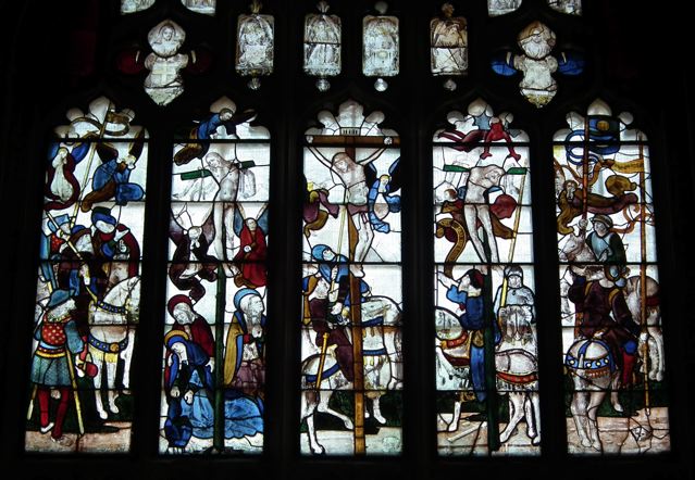
This stained glass window comes from Fairford church in Gloucestershire, a building that was rebuilt between about 1490 and 1510. The set of windows here is the most complete ensemble of late-medieval windows in any English parish church and is probably from the workshop of Barnard Flower, who worked on such high-profile projects as Henry VII’s Chapel in Westminster Abbey and the chapel of King’s College, Cambridge. These windows are among the glories of English art.

Jesus is shown in the central panel. The Roman centurion (called Longinus in some traditions) pierces his side with his spear, an incident described in the Gospel of John, who records that both blood and water flowed from Christ’s side. There is no trace now of blood and water (symbolic among other things of Jesus’ humanity and deity, and of his sacrifice and baptism) in the image in the window – the point of the spear seems to be entering the flesh, though, and perhaps the blood and the water have been lost to time.

In the panel to the left of the centre is the first thief, who is repentant, and on whom an angel looks down. At the base of his cross is the Virgin Mary, supported by Mary the wife of Clopas. Mary Magdalen, with her long hair and pot of ointment, is with them, and gazes at the figure of Jesus. In the panel to the right of the centre is the second, unrepentant, thief, who is accompanied by a devil, a figure with red skin (the devils in the Last Judgement window at Fairford are also red) and grayish, bat-like wings, hovering above the thief’s head. More Roman soldiers occupy the outer panels, and the bearded gesticulating figure on horseback in the left-hand panel is Pontius Pilate (another lower panel, not shown in my photograph, depicts him washing his hands).

There is one other important figure in this window, the foot soldier with the red hose on the bottom left, who is made to stand out with his patterned and brightly coloured clothes. Like many other figures in the window, his gaze is directed straight at Christ. Unlike the others, his collar bears an inscription: ‘IO SAVELE’, which is likely to be a shortened form of Sir John Savile, an associate of King Henry VII. His naming and his position suggest that he was the donor of the windows. His was a noble gift.

This beautiful window is a lovely example of the stained-glass-maker’s art at the point in history where, in England, the Middle Ages are waning and the Renaissance is arriving at last. It combines the traditional rich colours of medieval glass (the blues of Mary’s dress, the deep reds of the some of the solders’ garments, and so on) with sensitive drawing of the faces and lively poses. From the pointing Pilate to the hovering devil, from the observant soldiers to the caring Maries, there is a lot of life in this scene of execution. There is also a careful focus on the main figure, with the pointing hands, the spear, Savile’s gaze, and even the tilt of the flanking crosses, leading our eye towards Jesus. This is also, of course, the church’s east window, in the prime position above the altar, so the architecture and layout of the church draws us to this focal point in the building and the Christian story.

Wednesday, April 20, 2011

Blandford Forum, Dorset


Have you got the scrolls?

Pevsner’s Dorset volume says that the old Greyhound Inn, in the centre of Blandford Forum, takes façade decoration to ‘Bavarian extremes’. Although there’s a hint of Saxon (or even Lutheran) hauteur about that comment, he doesn’t mean that the gloriously named John and William Bastard, architect-builders of Blandford who reconstructed the town after the fire of 1731, had been at the beer when they conceived this building, but that the decoration is less restrained than the norm in this town and more like the ornate baroque pastel and white facades of Central Europe.

English Georgian architecture can come over as rather plain, getting its effect not from decorative curlicues but from order, proportion, and restrained classicism. We think of Georgian building in terms of simple brick walls and rows of sash windows, relieved by the occasional pilaster, stretch of rustication, or fancy fanlight, and given form, in the best examples, by craftsmanship of the highest quality – meticulous brickwork, fine carpentry, and so on.

The facade of the Greyhound seems indeed to come from a different world. The decoration around the triangular pediment is from the top drawer, an encrustation of classical details. The Corinthian capitals below it, too, are exceptionally ornate and full of delicate fronds and curves. And then there’s that central window: the big plain keystone at the top and the protruding ‘ears’ at the upper corners are the kind of things seen on many a Georgian window. But the generous scrolls up the sides, the lavish moulding around the sides and top, and the fancy-shaped apron below the sill set this window apart. Even better is the small face in the middle of the apron. Is it a drunken satyr, bearing grapes and welcoming us to the inn? That’s the answer, then: it was wine that the builders were drinking that day.

Friday, January 21, 2011

Ledbury, Herefordshire


Ballflowers

During the 13th century the Early English Gothic architecture described in the previous post became gradually more ornate, its surfaces and details more complex. Window tracery – the intricate patterns of stonework in the top of each window – developed and masons played increasingly elaborate variations on its design. Foliage carving became more naturalistic. There were new forms of arches and moulding. And vaults, in buildings that had them, got more complex too, their patterns of ribs mirroring the lace-like patterns of the window tracery. By the beginning of the 14th century, these developments had gelled to form the style that is now known as Decorated Gothic.

This window, in the parish church at Ledbury, is an example of the Decorated style in which the window tracery forms small pointed arches within the window’s larger pointed form, while in turn within these arches are fourfold lobed shapes called quatrefoils. This interplay of shapes and stone glazing bars of various thicknesses shows the 14th-century masons’ skill in creating patterns and rhythms.


Look closer, and it shows something else: their use of the spherical ornament called the ballflower. There must be hundreds of ballflowers on this window, running up the mullions, along the arches, and around the quatrefoils and other shapes. Their spherical bodies and three-lobed openings catch the sunlight and form strong shadows, breaking up the smoothness of the masonry and reminding us, if we need reminding, that Gothic architecture is always a matter of the play of light. The repetition of the ballflowers at Ledbury is almost obsessive, and one of the most extreme examples of a fashion common in this part of the west of England – such flowers run around the 14th-century windows of dozens of churches in Herefordshire and the neighbouring counties, from the humblest parish church to Hereford Cathedral itself. They form a signature motif of the western masons and a testimony to their artful manipulation of light and shade.

Monday, January 17, 2011

Uffington, Oxfordshire*


Pointed architecture

Read the architecture textbooks and they will tell you that Gothic architecture is a way of building that developed in France – specifically at the Abbey of St Denis near Paris – in the 12th century, spreading to England by the beginning of the 13th century. In its classic form it’s a way of designing churches with pointed arches and high stone vaults, supported by flying buttresses, and lots of stained-glass windows that flood the interiors with coloured light. That’s quite a good description of the way the Gothic cathedrals were built, from Notre Dame in Paris to Salisbury and York in England. But what about parish churches? In the countryside, few parishes had the resources to build ambitious stone vaults and flying buttresses – if there are stone vaults they are on a smaller scale than the soaring stone ceilings of the great cathedrals. So in most medieval parish churches, Gothic means above all the use of pointed arches.

The parish church at Uffington, built around 1240, is a typical and wonderful example of the first phase of parish church Gothic – the style that the Victorians called Early English. The dominant feature is the tall, narrow pointed lancet window. These lancets can appear singly or in groups – there are lots of pairs and trios of lancets at Uffington. From the outside, they look rather austere. But inside, they’re treated decoratively, with slender shafts on either side of each window. Uffington is unusual in having an octagonal tower. The upper section is an 18th-century addition – the lower section was originally topped with a spire which came down in a storm in 1740 – but the extended tower still provides a graceful focal point to the building.

* * *

Since writing this post, I've had some interesting comments, including one from Helen of Art and Architecture, Mainly, who asks who needs stone vaults and flying buttresses: 'Early English Gothic was about height and elegance, and the church dominating the townscape.' I agree, and I'd add that this way of building was also about line, as evidenced by all those interior shafts – and the shafts and mouldings at churches such as Eaton Bray, which I posted about a while ago. Height, elegance, line, and shadow: the essence of Early English architecture.

Uffington, chancel interior

*Although I still think of it as being in Berkshire, and it will be found in the Berkshire volume of Pevsner's Buildings of England series.

Thursday, December 23, 2010

Huish Episcopi, Somerset


Season's greetings

The more medieval parish churches I visit, the more I’m struck by the way their architecture and decoration varies form region to region. Often this is a matter of building materials, but just as frequently it’s a question of some local preference for a specific kind of feature or visual effect. And sometimes, this preference produces work of such quality that it stands out from the crowd – the graceful stone spires of Northamptonshire, the extraordinary decorative carving of the small Romanesque churches of Herefordshire, the woodwork – screens, font covers, angel-crowded roofs – of East Anglia are all memorable examples. So are the wonderful late-medieval towers of Somerset, of which Huish Episcopi is one of my favourite examples.

These tall and elaborate towers, built in the 15th century, dominate town centres and sometimes surprisingly small villages. They mostly follow a similar pattern, on which the masons played subtle variations. There is a large window above the doorway; above that, storeys are separated by bands of carving, and the upper levels have openings that look like windows but contain pierced stonework to allow the sound of the bells to carry. There are sometimes niches for statues. The tower is crowned with a lace-like openwork parapet and slender pinnacles. The tower at Huish Episcopi has all these features, arranged in a beautiful balance, so that we look up in admiration. The 100-foot tower is rather big for the church it crowns, but, no matter, it takes the breath away.


The interior of this church has one treasure from a later era that also stops visitors in their tracks. This is the stained-glass window of the Nativity, designed by Edward Burne-Jones and produced in the workshop of William Morris. Crowded round with onlooking and music-making angels, Mary reclines on the straw of the stable, cradling the infant Jesus in her arms. The Magi wait on the left to present their gifts. It’s an unusual composition, dominated by the pale robes and pinkish wings of the host of angels, topped by the stable roof and the hint of a starry sky, and the elongated figures are very much of their time. If the recumbent Mary seems odd to our eyes, she has a long pedigree: there are examples of this posture in Nativity scenes in medieval stained glass in Chartres and Cologne, worthy sources of inspiration for a window in this noble building crowned with its wonderful tower.

I hope you’ve enjoyed the blog this year. Season’s greetings to you all.

* * * *

Note: A commenter has pointed out that the Mary is often portrayed in a recumbent posture in Byzantine art. There are a couple of examples here.

Tuesday, December 29, 2009

Great Malvern, Worcestershire


A cold coming

Although England has thousands of churches dating from the Middle Ages, very few of them have more than a handful of fragments of medieval stained glass. The few places where there are substantial amounts of medieval glass – such as York Minster and the parish church of Fairford in Gloucestershire – are famous. One of the less well known places to admire the art of the Gothic glaziers is Malvern Priory.

The 15th-century stained glass in this building is some of the best English medieval glass to have survived. We do not know who made it, but similarities have been spotted with one of the windows in York Minster, the work of a glazier called John Thornton of Coventry. Whoever created the Malvern windows, they are the work of a master.

This Adoration of the Magi is one scene from the collection. It is a good example technically because it shows the way the 15th-century glaziers used lots of pale glass, so that plenty of sunlight got into the building, but highlighted these areas with rich accents of more deeply coloured glass, especially red and blue.

Mary sits with the Christ child on her lap and one of the kings, dressed in a rich red, fur-trimmed mantle over a blue tunic, kneels before them. He has removed his crown, which lies on the ground at the Virgin’s feet, and has taken off the lid of the cup he carries, revealing his to be the gift of gold. The infant Jesus reaches out for the gift with his left hand while raising his right in blessing. Behind, the other two Magi wait their turn, one in the act of removing his crown, the other raising his left hand. Joseph stands behind Mary and the thatched roof of the stable and the distant towers of a city make up the background. Shining with irregular rays that suggest its twinkling, the star completes the composition.

There is so much in this image, so many details that engage the viewer and encourage one to look for more. The faces, the interesting forms of the headgear of the Magi; the different-shaped vessels in which they bring their gifts; the way in which a cross has been concealed in the detail of the stable roof covering; the ermine trimming of many of the garments; the architecture of the distant city – all these are details to ponder in this moving depiction of a familiar subject, one that takes us straight back to the medieval world.

Saturday, December 27, 2008

Kean Street, London


Extreme windows

From the Cotswolds to London, the dormer window provides an excellent way of squeezing a little more accommodation out of a roof space. And so, in cottages, Georgian terraces, Regency villas, and flats above shops, builders put in dormers, and people sleep beneath the eaves. Now and then you see two rows of dormers, for yet more light and living space. But I don’t think I've ever seen anything like these massed ranks of windows looking out from a roof in a street behind Covent Garden.

Looking at the design of the window frames on this presumably Victorian or Edwardian building, the rows of windows must have been installed in at least two phases – the upper two rows look different from the others. The result is stunning to say the least, and the array of glass must constitute an efficient collector of solar heat. But what I really want to know is this: is five rows of dormers some kind of record?

Friday, November 14, 2008

Leamington Spa, Warwickshire


French curves

When someone says ‘Art Nouveau’, I automatically think of Paris Metro stations and large houses in Brussels, buildings put up around the beginning of the 20th century and decorated in a style that owes its extraordinary movement and plasticity to curving, sinuous lines. It’s a style that lends itself to pottery, glass lampshades, ironwork, and jewellery, but it doesn’t always sit happily on buildings, which tend to have lots of straight lines and rectangles in them. As if recognizing this fact, the architects of Vienna – and their great Scottish colleague, Charles Rennie Macintosh – developed a more rectilinear form of Art Nouveau, involving abstract patterns and geometrical shapes, that they applied to all kinds of buildings from houses to art galleries. In Central Europe this style is called Secessionist, after the group of Viennese artists who seceded from the establishment.

All of this means that Art Nouveau architecture isn’t a very English phenomenon. Edwardian architecture was a riot of styles, from Arts and Crafts to Bankers’ Baroque, and the delicate wave patterns of Art Nouveau got squeezed out rather. But now and then you spot these forms, especially at the point where architecture and decoration intersect, and one of these points is the shop front.

The picture shows part of a shop front in Leamington. These little curved mouldings caught my eye and immediately reminded me of the sinuous Parisian Art Nouveau. How satisfying that some shop designer should have thought to set off his glass window – itself a great curving swathe of transparency – with this small detail. High up above eye level, mouldings like this are ignored by most shoppers. Why look at the window frame when you’re interested in the goods inside? But no doubt the designer was after a subliminal hint of quality and European sophistication. Hence, for a moment, this fleeting imitation of the way they ordered these matters in France.

Tuesday, September 23, 2008

Ludlow, Shropshire


The Venetian window, also known as the serliana, after the Italian architect Sebastiano Serlio, was an invention of the Italians that first appeared in English buildings in the 17th century. This kind of window has three lights, the central one being wider than the other two and arched, to give a pleasing symmetrical design. Such a window often formed a centrepiece to a façade. There would usually be just one, in the middle of the main storey, generally the first floor where the grand reception rooms were. A Venetian window gave a sense of balance, focus, and sophistication to the front of many a Stuart and Georgian house.

On a really large country house front, with side wings, an architect might include three Venetian windows. It wasn’t quite the done thing to have a whole façade-full of them, as here in Ludlow. But whoever lived here clearly couldn’t have enough of them. Or perhaps they were trying to set some sort of record. And why not, for once? The interiors must be beautifully light and the exterior has that sense of difference, that disregard for the norm, that makes some English buildings stand out.