Showing posts with label ghost sign. Show all posts

Tuesday, April 7, 2026

Witney, Oxfordshire


Occasional haunts…

…that just keep on giving: there are certain small towns, mostly in Gloucestershire and Oxfordshire, that I visit quite often, and where I find myself staring at some architectural feature that I’ve not looked at closely before. Here’s an example in Witney: a probably 19th-century shop with a collection of ghost signs that I was aware of, but had not perhaps given the attention they deserved. Above the modern shop front one can see brick walls made up of a pattern of light and dark bricks – red or brown bricks with their long sides (the stretchers) visible and between them pale white or cream bricks laid so that their ends (the headers) can be seen. The resulting effect is pleasingly mottled, making the upper floors more appealing than the unfortunate shop front below. 

But what makes the building stand out for me are the painted signs. They’re faded, and when I first saw the building I noticed only the large letters across the front: GLO’STER HOUSE, the first word a once common contraction of Gloucester, in which the apostrophe, not always included, is just about visible here (clicking on the image should make it larger and clearer). The words on the corner are more informative, however. The fourth word down, just above the lamp, foxed me at first, because I thought it was HOTEL. But what the words on the corner actually say is, I believe: VINER’S FURNISHING STORES NOTED HOUSE FOR Bedsteads, MATTRESSES, BEDDING, TIN TRUNKS, CARPETS. I think there may once have been more – is that an AND below CARPETS? Even without the missing bit, we get a picture of a home furnishing and bedding store.

I’ve not found out much about Viner’s except that a photograph with the ghost sign in place and the business still open can be seen online, with a suggested date of c. 1964. It’s very blurred and looks as if it may have come from an old newspaper. Perhaps Viner’s, then, were in business through the first half of the 20th century and well into the 1960s. That decade marked my first personal knowledge of Witney, when I remember as a boy being driven by my father along the A40 road, which then passed straight through the middle of the town. I vaguely recall being struck by various shop signs, including, on a butcher’s a board painted with the slogan, PLEASED TO MEET YOU – MEAT TO PLEASE YOU. The locally made blankets were also featured on signboards – I expect Viner’s stocked them too. How good to be reminded of such things by the fading ghost sign of Messrs Viner. Though their wares are no longer sold here, the sign is still doing worthwhile evocative work.

Tuesday, March 4, 2025

Kidderminster, Worcestershire


Ghosts’ stories

I have spent my working life writing and editing illustrated books. Doing this meant paying attention not only to the form and content of the text but also to the appearance of the printed volume – its layout, typeface, paper, cover, and so on. Though not myself responsible for these visual aspects, I would work closely with the designers who were, and my interest in graphics was nurtured by these collaborations. A fascination with fonts on the page turned into a preoccupation with lettering on signs, and the relationship between signs and buildings is one that is revealed now and then in this blog. Ghost signs, those fading painted signs that have hung on after the people who put them there have moved on, are now fashionable, but I was captivated by them before they became popular things to post on social media.

People can get overly romantic about ghost signs – the elegant letterforms, the flaking paint giving us a faint glimpse into a past world, the enticement of what John Piper called ‘pleasing decay’. But this attitude can make us forget an important truth. Take this sign on a door in Kidderminster. By the look of the fading paint and the very closed doors, it’s unlikely that lorries are loaded very much, if at all, hereabouts. The building to which this sign is attached is, I think, the former Chlidema* Mill, named for a method of producing bordered squares of carpet invented by the proprietors of what was, from 1887 to c. 2000, one of Kidderminster’s numerous carpet factories.

By the turn of the millennium, the town’s carpet industry was in steep decline and mill after mill closed. In many cases, the large weaving sheds at the rear of each works were demolished, leaving only the office and warehouse buildings that fronted the street. These were often architecturally impressive, although that at the Chlidema Mill (or what is left of it) is actually quite modest, of two and three storeys with plain red and white brickwork and plain stone window sills. Go around the back and you find parked cars, temporary safety barriers, and (photograph below) an even plainer brick wall. This has been painted to show the outline of the roof of the demolished weaving shed, with its saw-tooth profile – sloping tiled sections and vertical windows, to provide even north light to aid the workers who wove luxurious carpets below.

It’s sad that the sheds found no further use and that no other industry arrived to take advantage of these work spaces. Though some of the old carpet factories in the town have been found roles (in retail, in vehicle repair, and other areas), many of the weaving sheds have gone, job opportunities have vanished, and it’s easy to see that the town lacks the prosperity it once had: the fate of so many implied by the flaking paint of a redundant sign.

- - - - -

* Chlidema comes from a Greek word meaning ‘luxurious’.


Monday, March 25, 2024

Stroud, Gloucestershire


Place and taste

I was recently reading Adam Nicolson’s Sissinghurst, about the beautiful castle in Kent restored and lived in by his grandparents, Harold Nicolson and Vita Sackville-West. Adam Nicolson is the third generation of his family to live there and its garden, also the creation of Vita and Harold, is world-famous. In the book, I found this very apposite observation about places: ’It is an article of faith with me that a place consists of everything that has happened there; it is a reservoir of memories, and understanding those memories is not a trap but a liberation, a menu of possibilities’.

This is very much how I think about buildings and its truth was exemplified when I saw this ghost sign in Stroud. Actually, it was the Resident Wise Woman who spotted it first, and I expressed surprise that, having been to Stroud dozens (at least) of times, I’d not noticed it before. ‘Pritchard’s delicious home-made what?’ we wondered, fancying that we could make out a hint of the first letter of the missing bottom line – could that be part of an ’S’, and could the answer be ‘Sausages’?

It does indeed seem to be the case that this was the premises of Walter Pritchard, butcher, and his two sons, Arthur and Jack, and that the family opened their business here in 1928, the sons carrying on into the 1960s. The shop front, with its elegant turquoise and cream tiles (a tiny bit of it is visible on the right-hand edge of my picture because the window extends around this side wall of the building), could well have been made for them – butchers often favoured attractive ‘hygienic’ tiles that could be wiped down with ease, though this one does not feature the animal tiles that some butchers went for.

For me, the shop has a more recent memory – it was until a few years ago a second hand bookshop, which always had a large selection of books on film and architecture. Quite a few volumes on my shelves came from here. So if some older residents think of it as ‘the old butcher’s’ and remember its sausages (for foods too are at their best local and distinctive), I remember it as a source of books about architecture. No doubt for some it has yet other associations, accruing to form the reservoir of memories that Adam Nicolson mentions.

Wednesday, June 28, 2023

Gloucester

Fragile with care

Back in 2008 I posted a picture of this ghost sign in Gloucester. I used the picture as a jumping-off point for a discussion of how such old signs accumulate meaning and significance. They represent the kind of craft that takes pains – with the choice of the letterforms, the way they are arranged, and the care with which the sign-writer painted them. They tell or remind us of long-forgotten industries. And in this case they summon up the way that beer might have been enjoyed, reminding us of the variety of different local brews that are no more. Signs like this, I thought then and still think, are worth taking notice of because they are triggers of memory, the sort of memory that tells us where we came from.

So whenever I’m in Ladybellegate Street in Gloucester, I remember to have a look at this sign, to help me summon up such memories, and to reassure myself that it’s still there. A couple of weeks ago it was still there, but in the 15 years since I took my original photograph, it has become more decayed and frayed around the edges, and looks as if there’s is risk of more of it parting company with the wall. That’s the sign as it was the other week in my photograph above; if you want to see the 2008 version and what I wrote about it back then, it is here. Both images are for me a reminder of something else: not only that these signs are fragile, but that their very fragility – the indistinctness of some of the letters and the way in which bits of plaster and paint have disappeared, is part of how we see them. The roughened surface and fragmentary text not only is more authentic than a repainted sign but looks the part too.

One day, the Talbot’s sign will be gone, like hundreds of others. Someone may choose to repaint it, as people have done with other ghost signs, and a repainted sign has some value. But much better in my view is the decayed original, still hanging on to the bricks that support it – hanging on, one hopes for another few years. Pay it homage, while it’s still there.

Thursday, April 20, 2023

Evesham, Worcestershire

Off piste in Evesham, 1

Sometimes, when I have time on my hands in a familiar place (or a place I think of as familiar) I give myself the simple task of walking around and trying to find some feature of the townscape or architecture that I’d not noticed before. Often, small gems are to found down alleys or in side streets I have no other reason to visit; sometimes it’s just a question of going a little further along a main street than I’ve done previously; and sometimes, of course, it’s a matter of looking a little harder in places I’ve been many times before, because we all miss things and we’re likely to overlook even the obvious when we think we know a place well.

In Evesham the other day, I decided to try some side streets, and it wasn’t long before I found this stone sign in a brick wall on a corner in Bewdley Street. The small building to which it’s attached doesn’t look industrial – I’d easily have mistaken it for part of a house. But clearly there was once a brewery here, a local concern that closed some time during the last century. The invaluable Brewery History Society website doesn’t say much about it, apart from noting the sign and adding that the other brewery buildings have been redeveloped.

I fancied I saw the remains of a polychrome brick tower not far away, with a factory-like building nearby: could this have been part of the old brewery? I think, looking online, that these buildings actually belonged to another company, probably brewers Sladden and Collier’s. Like many towns, Evesham had several breweries, all of which have gone, prey to takeovers or closed for some other reason. I cherish signs like this, faded and damaged but still in situ, as reminders of these forgotten industries, and of times when many trades were largely locally based. One of the cheering things about modern life (yes, there are a few!) is that parts of the brewing industry have again become more localised and diverse. Long may this last.

Monday, February 14, 2022

Petersfield, Hampshire

Reading matters

Even though I no longer use them very much (having more than enough books of my own to read) I am very much in favour of public libraries. It’s partly that I’m thankful for the way my local library helped me when I was a boy hungry for knowledge growing up in a household with few books. There all the books were. There seemed to be books about everything, and all the classics of English literature (and other literatures). And it was all free. Paradise.

Today, arguably, it’s different. Everything’s online, isn’t it? Well, no. And anyway not everyone has access to a computer. And not everyone knows how to find information. And for all kinds of good reasons many people still prefer to read a novel in a real volume with paper pages. One of my nieces worked for a while in a small branch library here in the Cotswolds and was amazed how many people needed her help to find things out – everything from the biographical details of an English poet to how to apply for a council tax rebate. ‘I’m a social worker, too, apparently,’ she told me. Libraries are still essential.

But what did people do before 1850, when the British Parliament passed an act enabling local authorities to levy a rate to pay for public libraries? Here’s one answer. They went to privately run libraries, which were owned by local businesses (or, less commonly, by private organisations such as the still wonderful London Library, where you pay to be a member, as I did when I lived in London).

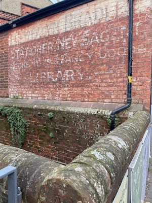
Most towns did not have a vast bibliographical treasure house like the London Library but they often had a private library run perhaps by a local stationer, where they could pay to borrow books. Boots the chemist had libraries in their large shops, too. And many of these privately run libraries survived well into the. last century because people liked them and they might have different books form those at the local public library. Here’s a ghost sign in Petersfield, advertising a local stationery business owned by one Llewelyn Bradley. Alongside the writing materials and newspapers there were also reading materials that you could borrow. Bradley was born in 1877 and probably sold up in the 1930s, after which the business – still with its library – was known as Austin’s.* An online source refers to a picture of c. 1955 but after that the trail goes cold, so I don’t know how long it survived. But there it was, another bit of history for which we have to thank a ghost sign, which, on the building at least, is the only bit of reading matter now offered hereabouts. No doubt the people of Petersfield were thankful for it, while it lasted.

- - - - -

* Austin’s, with its books, toys and ‘fancy goods’, is said to have been the inspiration for the children’s book The Little Wooden Horse, by Ursula Moray Williams.


Thursday, February 10, 2022

Gloucester


Not too distant

‘Decay is a kind of progress’, says Dorothy in Alan Bennett’s hilarious and thoughtful play People. It’s a play with an old building in it, and it’s one I often think about. That particular line comes into my mind mind sometimes when I look at ghost signs, those now-redundant bits of advertising that hang on, flaking but evocative, to walls in our cities. They’re bits of the past in the form of hand-painted lettering and they evoke past businesses and past times. As the paint grows less distinct and wears at the edges, they’re more evocative somehow, and oddly attractive – ‘pleasing decay’ as John Piper called it.

Something happens, though when, like Dorothy in the play, one reaches a certain age. You realise that the signs were advertising companies, brands, and products that are part of your own history. Here’s a personal example. I can remember Boselli’s ice cream van visiting streets in Cheltenham in the 1970s, when I was a teenager. No doubt the van was even more familiar in nearby Gloucester, where Boselli’s were based. The company vanished from my view at some point in the 1980s, by which time in any case, I’d moved away, first to university, then to London.

But there Boselli’s were, for a while, in my past. Better than nationally known brands like Wall’s (also made in Gloucester, as it happened). And now here’s their sign, now a familiar landmark for me as I drive past on a route near the city centre. And the sign is starting to decay, the background going, the lettering a bit frayed around the edges. And I’m its contemporary. It’s something that makes me pause, that’s all.

Meanwhile, I’m pleased to be reminded of Boselli’s, and pleased that ghost signs are not all for the great universal brands that we all know – Bovril, Hovis bread, Bass beer, Boot’s the chemist – but also for those small local businesses that can come back to life in the minds of locals who pass them. They’re messages from the past, and we should notice them while we can.

Monday, December 20, 2021

Ely, Cambridgeshire


Logistics, Regency style

Although repainted and sliced off on one side, this old sign is still worth pausing to look at. It begs several questions. How did it come to be missing its right-hand edge when the windows on either side look old? How old is it? Who were Isaac Marsh and William Swan? Answering the last question gives a hint of an answer to the second, at least.

There was a Marsh and Son operating wagons out of Cambridge in 1808, but by 1814 the company is called Marsh & Swan. They covered a range of Cambridgeshire and Norfolk towns, as well as operating their service to London’s Bull Inn, Bishopsgate Street, a major destination for London coaches and for vehicles carrying goods such as the flies, vans and wagons* that Marsh and Swan operated. But by 1845, the company was called Swan and Sons. So this sign must date to the period between the 1800s and the early-1840s.

They’d be called a logistics firm today and run a fleet of trucks and they were as essential to commercial life as the companies whose trucks carry everything from food to pharmaceuticals now. However, their modern equivalents do not leave behind them such well crafted signs as this one, which compares more than favourably not only with the lettering on most lorries but also with that on the modern sign below it.

The sign-writer who restored it seems to have done a good job of recreating the letterforms and ornaments of the original. The balance of thick and thin strokes in the capital letters, the fancy curlicues on the ornamental ’T’, ‘Y’ and ‘B’ , and the decorative arrangement of the ‘and’ between the proprietors’ names – all these, I hope, will meet with well deserved admiration .

- - - - -

* Wagons or waggons were large four-wheeled horse-drawn vehicles for carrying goods. A fly was a smaller wagon, although the term could also be applied to a horse-drawn passenger vehicle – the main feature of both was the ability to travel quickly. Vans were smaller still, with a permanent covered structure.

Monday, March 23, 2020

Park Street, London


Take Courage

This is one of my favourite London ghost signs, one that I’ve been meaning to post for a while: now seems like a good time. The plain brick structure is in the area of Southwark known as the Borough, and was once part of a brewery – the largest brewery in the world, I’m told.* It advertises the products of the brewers Courage, who once owned this building.

The sign is said to date from 1955, which which was when Courage (founded in 1787) merged with Barclay, Perkins and Company, who already owned the Anchor Brewery on this Southwark site. The building with the sign accommodated brewery staff. Brewing on this site stopped in 1981, when much of the land was sold for redevelopment – a common pattern with industrial buildings in central London in the 1980s, when many firms realised they could make money by selling their valuable properties and relocating on a cheaper site elsewhere. Mercifully the sign, although faded now, is still there.

The way the sign straddles the wall, the two gables crowning it and drawing attention to it, must have caught the eyes of thousands of people, including many passing to and from London Bridge station. When passing myself, I’ve heard others puzzling over its meaning and assuming that it’s simply an appeal to people to stiffen the upper lip and face misfortune bravely. But beer drinkers, especially those who live in London, know that it refers to their favoured tipple, and when I lived in the capital, Courage Best and Directors bitters were the standard pints in many a London pub. I expect they still are. In these tough times, when pubs are closed, we need courage as much as ever – and Courage too, many would add.

- - - - -

*It is actually on the corner of Park Street and Redcross Way, close to some of the many railway tracks that criss-cross this part of London, mostly elevated above the roads on brick arches.

Wednesday, March 25, 2015

Derby


Morning coffee

I've watched with interest the various initiatives over the last few years to record and appreciate the ghost signs that can still be found in many towns and cities. The way they recall lost businesses and forgotten brands is one reason for my interest; their decorative qualities, whether plain or fancy, are another; the window they open on to the advertising techniques of the past is a third.

This example, fading steadily away on the gable end of a building in central Derby, is actually very plain. But even a sign like this has visual qualities one can admire – its simple lettering and the way in which some of the letters follow precisely the height of a single brick, so that the sign seems to go 'with' the brickwork rather than against it. I'm impressed that a sign-writer took such trouble – and the sign's large size must have meant that he took a considerable amount of time on it too.

The brand the sign advertises, Lever's Morning Glory Coffee, is wonderfully named but presumably long gone. I have come across a reference to the same company selling tea, but I don't know whether they were tea and coffee merchants or retail grocers. Their sign, however, with its enticing slogan, 'Tastes as good as it smells', is still worth a second look.

- - -

Some other ghost signs I've posted over the years:
Landaus and wagonettes
Beer bottlers
Dinner services, photographic film