Showing posts with label Derby. Show all posts
Saturday, March 28, 2015
Derby
When brick works
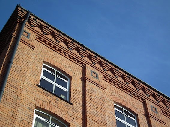
Just a short distance away from the ghost sign I noticed in my previous post is this building. I know a number of my regular readers appreciate a bit of brickwork, and the top of this structure seemed to fit the bill.
Now an office block, it began as Brown’s Barley Kernels Mill – barley-crushing being part of the brewing process – and was built for W. & G. Brown in the late 1880s. Although many of the more ornate Victorian industrial buildings used different colours of brick quite liberally and some are very plain, there are many that look plain at first glance but repay a second glance that allows you to take in the details. The Barley Kernels Mill is a good example. It shows only slight variations in colour – apart from the dark brick plinth and a very small amount of stone dressing, there are just a handful or two of blue bricks among the expanse of red. But up at the top of the walls, at cornice level, these bricks are handled with great vigour. The dentil course and the uppermost corbelled part with its ‘inverted triangle’ details exploit their material with economy but also, I’d say, considerable style. The brickwork seems designed to work well in good light and I was pleased I came across it when the sun was shining.
Wednesday, March 25, 2015
Derby
Morning coffee
I've watched with interest the various initiatives over the last few years to record and appreciate the ghost signs that can still be found in many towns and cities. The way they recall lost businesses and forgotten brands is one reason for my interest; their decorative qualities, whether plain or fancy, are another; the window they open on to the advertising techniques of the past is a third.
This example, fading steadily away on the gable end of a building in central Derby, is actually very plain. But even a sign like this has visual qualities one can admire – its simple lettering and the way in which some of the letters follow precisely the height of a single brick, so that the sign seems to go 'with' the brickwork rather than against it. I'm impressed that a sign-writer took such trouble – and the sign's large size must have meant that he took a considerable amount of time on it too.
The brand the sign advertises, Lever's Morning Glory Coffee, is wonderfully named but presumably long gone. I have come across a reference to the same company selling tea, but I don't know whether they were tea and coffee merchants or retail grocers. Their sign, however, with its enticing slogan, 'Tastes as good as it smells', is still worth a second look.
- - -
Some other ghost signs I've posted over the years:
Landaus and wagonettes
Beer bottlers
Dinner services, photographic film
Saturday, August 2, 2014
Derby
At the buffers
In Derby and a little early for my train I walked along the road near the station and came across this, looming out of the dusk: the cab of a Class 37 locomotive sitting quietly in the car park of the Alexandra Hotel. It’s clearly just one example of an enthusiasm for railwayana hereabouts, as the Alexandra has various railway signs and other bits and pieces in the adjoining garden, none of them as eye-catching as this. When I got over the surprise I looked it up online and it seems that the cab is being restored and will eventually be repainted.
Although the locomotive wasn’t, I think, actually built in Derby, it’s an interesting reminder of Derby’s railway heritage and in its stationary state is virtually a piece of architecture – a distant relative of those houses made from old railway carriages that I’ve noticed in the past. I look forward to returning and seeing the finished project, whether the restorers choose British Rail blue, EWS red and yellow, or some other colour scheme that might be appropriate. Whatever the colour, it will no doubt attract people in for a pint.
Wednesday, May 21, 2014
Derby
Insurance agent's baroque?
Here's a building arrestingly adapted to its site, the baroque structure that forms the continuously curving corner of Wardwick and the Strand in the centre of Derby. I know it as the Refuge Assurance Building, and that company certainly occupied it for a long while, although I don't know whether it was originally built for them. Its grand style, the high baroque of the late-19th century, is rather well adapted to follow this tight corner. The cornices, string courses, balustrades, and window ledges all go with the flow, taking the eye around the curve, while the windows – one lot plain and rectangular, the other lot more fancy, with semicircular tops, carved keystones, and little balustratdes along the bottom – form a steady rhythm punctuated by various upright pilasters. All these classical details give the place a kind of grandeur, which is augmented by the striking skyline, with its French pavilion roof crested with ornamental ironwork. The narrow profile of the building at the corner also adds to the effect of the height, making the building look taller than it is.
This is how the 1880s did urban grandeur and when they went for, they were cooking with gas, to use a figure of speech that might have been made for the Victorian era. It's roughly the style that has been dubbed 'banker's baroque' and the insurance-men of the late-19th century had it taped too. There are examples all over Britain's major cities, especially in London, but few are graced with such a dramatic shape. Here's to Victorian confidence!
Monday, December 30, 2013
Derby
New lease of life
Often in this blog I write about what many would call the incidentals of buildings – odd bits of ornament, signage, details, and so on – and about buildings that are so low in status that they are little regarded by most passers-by. A lot of what I notice is hardly architecture at all – which is one reason why this blog is called English Buildings and not English Architecture. But I'm ending the year with a no-nonsense bit of high-status architecture, a beautifully proportioned and recently restored Georgian house, in fact one of the best provincial Georgian houses you could come across. It's St Helen's House in the centre of Derby and it was built in 1766 by local architect Joseph Pickford for one John Gisborne. In 1801 William Strutt (son of Jedediah Strutt the industrialist, textile manufacturer, and associate of Richard Arkwright who was one of the key figures in the industrial revolution) bought the house and after several generations of Strutts had lived there, the building was used as a school. The recent restoration involved a conversion to office use.
The entrance front is an impressive piece of Classical design, with a triangular pediment and columns giving weight to the central portion and interest to the whole facade. There is also a satisfying balance between the ground floor, its windows set in semicircular arches, and the floor above, which has windows with more elaborate surrounds (the central ones having small pediments of their own), to emphasize the importance of the rooms they light. What one might call framing devices – the pilasters at either end and the cornice at the top of the facade – give the design further coherence, as do details such as the rustication, used in restrained fashion on the ground floor. The skyline is set off by a quintet of carved bulbous urns. This show front is, of course, faced in stone. The sides are of much plainer brick, as one can see, just, in the picture. But it's a restrained kind of showiness, and the house would have been at home in its original setting (80 acres of grounds, apparently), as it is in its urban surroundings now the city has spread around it. Derby can be proud, and pleased, that the building has found a new use, and its restoration has made St Helen's House a worthy winner of a Georgian Group award for a reused building. It deserves its recognition.
Subscribe to:
Posts (Atom)


