Showing posts with label Northampton. Show all posts

Sunday, August 13, 2023

Northampton


Big in brick, big in beer

Walking past the entrance to the Royal and Derngate Theatre in Northampton, I focused rapidly on the large building beyond and its tall, multi-windowed brick frontage. I’m fond of Victorian buildings of polychrome brick, the jazzier examples of which often date from the 1860s or 1870s. What was this one, I wondered, with its attractive mix of red, buff, and blue brickwork? Following the line of the vertical buff bands upwards, I noticed quickly how they end, above the top windows, in pointed arches, each pair united under a larger rounded arch. The dark triangular areas beneath each pointed arch seem to contain wooden louvres, for ventilation.

In the kite-shaped space between the pairs of pointed arches is an area of buff masonry, and I could just make out a carved date, 1876, in one such space and some initials, P & S, in some of the others. The P, at least, is a clue, since it turns out that this building belonged to Northampton’s biggest brewer, Phipps. They produced beer in nearby Bridge Street and the building in my photograph was their warehouse. What a scene of bustle this must have been in the late-Victorian period, with horse-drawn drays setting off from here to pubs not just in Northampton but also in towns and villages round about. In the 20th century, the local Cooperative Society put up a large building in this street, and nearby there was also a handsome Victorian hotel, to add to the hubbub. There is still much coming and going in the street, including people seeking out the Museum and Art Gallery, on the opposite side of the road from the Phipps building. The hustle and bustle continues.

Tuesday, August 8, 2023

Northampton

Lasting well

My time in Northampton the other day was spent in the centre of the town, and so I did not take in the remains of the town’s most famous industry, shoe-making. But on one street corner I came across a building that did relate to the business of shoes and leather goods. Being an enthusiast for architectural carving, I lingered by this doorway, fascinated by its combination of bulls’ heads, elegant women, fishes, stylized trees, and meticulously carved lettering. What on earth, I wondered, did it all mean? 

A little research told me that Malcolm Inglis and Co were leather factors, dealers in the material that was crucial for the town’s shoe manufacturers. What more appropriate business to be based in the centre of Northampton? The fact that Malcolm Inglis and Co could set themselves up so impressively – their building is mainly of stone, with a little brickwork here and there – suggests that they were doing very well here. The structure was their showroom and offices, so the unashamedly showy entrance, strategically placed on the corner of Fish Street and The Ridings, both looks good and makes sense.

A Glasgow architect, Alexander Anderson, supplied the design in 1900. The sculptor of the magnificent portal was Abraham Broadbent, a Yorkshireman from a family of stone masons. He won a studentship at the South London Technical School of Art in 1895. Once he was in London, it did not take him long to become a prominent architectural sculptor. Among other work, he produced sculpture for the facade of the Victoria and Albert Museum in London. In his carving for Malcolm Inglis, he shows the influence of the then-fashionable Art Nouveau style – the stylized trees and female figures are very Art Nouveau, while his clear lettering is more sober (and more legible) than Art Nouveau’s more elaborate examples. The result is a good bit of street-frontage art, of which Glasgow and Northampton (and indeed Yorkshire) should be proud.


Thursday, January 1, 2015

Revisits


A top ten of 2014

Before we advance into a new year of architectural encounters, it occurred to me to take a look at what my readers have found most interesting during the last year – or which of my 2014 posts, at any rate, have been viewed the most. I have compiled a top ten, and they are a mixed bunch indeed, featuring mostly modest buildings such as prefabs, a shop front, some almshouses, and a public lavatory. They also include some memorable architectural details and a couple of reviews (of the recent exhibition of Edwin Smith’s photographs and the reprint of Nairn’s London). Miscellaneous as they are, they seem to represent a reasonable if partial cross-section of my interests and, I hope, those of my readers to.

They are:

Far from ordinary: the story of prefabs in Catford, south London, notable examples of the glory of the ordinary.

A sort of Jacobethan: a whimsical but interesting bit of pseudo-Jacobean detail in Northampton. God, or the Devil as they say these days (and well they might in these unMiesian contexts), is in the details.

Hygienic high-style: a terrific Art Deco shopfront in Ashby de la Zouch, showing that Deco can be about restraint as well as showing off.

The essence of place: the stand-out exhibition of the photographs of Edwin Smith (closed now, but it’s still worth reading about this photographic master).

What we see, and when we see it: a meditation in Malmesbury about how photography often reveals what we don’t see.

Fifty years on: a personal memory of some almshouses in Louth and the architecture of James Fowler.

Old orders changing: an unusual classical order in Clifton (pictured above).

The ladies, vanishing: a memorable cinema in Cheltenham, which is no more.

Being moved in London: a review of my favourite book about London, which has recently been reprinted.

From the sun to the stars: a cast-iron public lavatory in Bath.

Happy New Year to you all.

Friday, August 29, 2014

Northampton


A ‘sort of Jacobethan’

This doorway in the middle of Northampton, sandwiched between two shops, is easy to miss. Easy to miss, that is, until you look up, when you realise that it’s part of quite a large corner building full (above the modern shopfronts) of big windows, banded masonry, and curvy gables. But what kept my eye engaged, and my mind boggling, was the busy collection of carved stone motifs above the doorway. Pevsner describes this 1902 structure as being ‘in a sort of Jacobethan manner’ and notes that the architect was J P Sharp of Birmingham.

The architect certainly threw the kitchen sink at this entrance. The carved crosses, roundels, and nail-heads certainly seem to be straight out of the pattern-book of standard Tudor-Jacobean patterns – but perhaps you’d be as likely to see them around a 17th-century fireplace as framing a doorway. There are classical motifs too and some of these, like the little Ionic capitals, are highly ornate, again in the manner of Jacobethan builders, who got their classicism as much from Renaissance buildings in France as from Greece or Rome. Put all these elements together and you have a very ornate, turn-of-the-century sort of Jacobethan.

This is confirmed by the lettering, which has eccentric touches (the bulbous lower portion of the B, the rather oddly proportioned M) that don’t look Jacobean at all. These forms are very much of their time: not quite Art Nouveau, but very nearly. This, and the curious cornice above, which comes to a sharp point but does not quite turn into a pediment, are the crowning touches – eccentric, to be sure, but offering a welcome bit of visual incident amidst the more commonplace shop fronts on either side.

Sunday, January 6, 2013

Northampton


Letter set (4)

To complete my short series about letters on buildings, here's an example of a fourth kind of lettering, the sort known generally and unflatteringly as the grotesque. These letters are distinguished by their total lack of serifs, the little end strokes that adorn Egyptian, Clarendon, classical and "English" letters† and in the world of print and type this class of letter is known simply as "sans serif".

At first glance you could almost believe that some gigantic stamping device has been at work to create this example beneath the pediment of the former Northamptonshire Union Bank in Northampton, but this is stone not concrete and it must have taken a lot of chiselling to incise the these large grotesque capitals. Their unadorned, businesslike quality contrasts with the more delicate carving of the composite capitals below them and the phoenix, with its flames and logs, above. In this context (classical architecture, classical mythology) one might have expected more classical or "English" letterforms, like the ones on Roman inscriptions perhaps, but these plainer ones certainly get the message across. Alan Bartram, whose short book, Street Name Lettering in the British Isles (1978)§, has been a useful guide for me, describes the grotesque letter as "in reality, an Egyptian without serifs", going on to remark that it's an adaptable form that can be used at a wide range of different weights.

These Northampton examples are nicely proportioned letters, although the P is rather high-waisted, making its bowl somewhat small and confined. On a modern inscription the letter would probably have a much fuller bowl. But this bank was built in 1841 and in those days that was often how they made, to adapt Shakespeare's phrase, their great Ps.

* * *

† Readers who would like to see examples of these other classes of lettering can see my other posts on Egyptians in Stroud, Clarendons in Devizes, and "English" letters in Leicester.

§ The companion volumes, Fascia Lettering in the British Isles and Tombstone Lettering in the British Isles are also both worth seeking out via ABE or used book stores.

Tuesday, January 24, 2012

Northampton


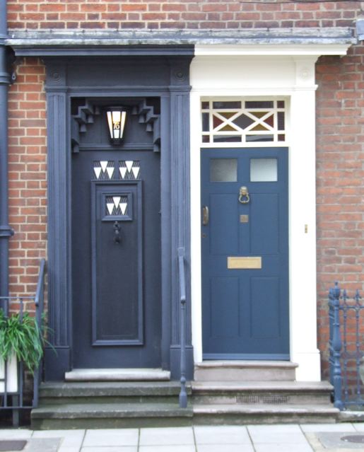
Perceptions of the doors (1)

Doors and doorways can tell you quite a lot about a building, or about the people who live there. I’m rather fond of my own front door, a lump of well seasoned oak that’s very old indeed – considerably older than the house to which it gives entry, in fact. And I like some of my friends’ doors, too, not only because of their design but also because they seem to symbolize the smiles and welcomes that I know are waiting when they’re opened – a pale wooden door in Oxfordshire, broad and inviting next to a narrow window that reveals two retreating cats and the owner’s vibrant abstract paintings; a glass door in a whole wall of glass in the Cotswolds, where the welcoming waves and grins can be seen well before you enter; a 19th-century Gothic front door leading straight into a room full of books. It doesn’t always work like this of course, but a door can be a powerful symbol of both house and owners.

So what are we to make of these two doors in an unassuming terrace of early-19th century houses in Northampton? On the right, there's an original-looking door with its neat stained-glass window above, circa 1815. On the left, a doorway and door transformed, that seem to invite us into another universe, a place in which architecture and design are so far from the mainstream that it’s hard to give it a label. It seems to belong to no movement, exemplify no style, attract no label. Which is fitting, since this doorway belongs to a house that bears the fingerprints of the architect Charles Rennie Mackintosh. It’s the doorway to 78, Derngate, the only house in England with an interior (and a door) designed by the Scottish master, whose work draws on Art Nouveau and on the Viennese Secession (of which he was a long-distance member), but is uniquely his own.

Mackintosh made over this house in 1916–19 for W J Bassett-Lowke, retailer and manufacturer of toys, especially model railways, when Bassett-Lowke got married. It’s not a big building, and this compact terraced house is very modest for the owner of an expanding company that already had at least one shop in London. But inside, the entire interior was redesigned – a dazzling black and gold living room full of Mackintosh’s trademark grid patterns and a surprisingly stripy guest room, anticipating op art, are among the highlights. So this unusual door is a fitting prelude to an unusual house, home to a man who did not want to show off with a mansion, but who cared about architecture and design – and wanted people to know it.

* * *

There are pictures of the interior of 78, Derngate here, plus lots of information about the house, and visiting times. It opens after the winter break on 1 February.

Wednesday, November 17, 2010

Northampton


Old principles, modern building

From its 19th-century roots in the Rochdale, the co-operative movement grew rapidly in the Victorian and Edwardian periods to become a force to be reckoned with on Britain’s High Streets. There were co-ops everywhere, and they were prized for their combination of quality and fair pricing, and also for their values – from ownership by the members and democratic member control to the support of education and community. These values, enshrined in a list known as the Rochdale Principles, still shape the co-operative movement today.

By the 1930s, although the really big expansion was over, co-ops big and small were still being built. The principal architects who worked for the co-operative movement, William A. Johnson of Manchester and Leonard G Ekins of London, were both enthusiastic modernists. The work of Ekins, for example, developed from an Art Deco not unlike the style of 1920s and 1930s factory architecture to a more hard-edged steel and glass modernism.

This co-operative store in Northampton shares several features with Ekins’ earlier work – the white walls with touches of green, the tall windows, the dark green plinth at the bottom and the stepped-back effect at the top. If it’s not actually by Ekins, it is probably the work of an architect who had studied his buildings. Whoever designed it, the building has proved durable. It’s now an arcade full of small independent shops, while the tiles of the street frontage still bear the name of the original owner, picked out in capitals.

* * *

Here's another example of Art Deco tiling on a co-op, this time in Tamworth, which I blogged about a while ago.

Saturday, September 13, 2008

Northampton


You could be forgiven for thinking that this has become the Scottish Buildings blog. But now and then a bit of Scottish-baronial-influenced architecture rears its turrets and pointed roofs south of the border. And the associations are immediate – even if you miss the Scottishness of a place like this, how can it fail to remind you of castles and fortresses? How can it not make you think of medieval banquets and chaps tearing around in iron suits? Even though, of course, no real medieval castle ever had windows the size of this one.Quite why Alexander Anderson, the architect of this 1919 Memorial Hall in a back street in Northampton chose this style, I don’t know. Round turrets, stepped gables, conical roofs, and rock-faced masonry certainly make their mark here. Anderson was a locally based architect and must have been well aware of the pressures of working in a town with its fair share of striking buildings – including several interesting churches and a Town Hall covered with outstanding relief carvings. In such eminent company, this one definitely and defiantly stands out.