Sign of which times?
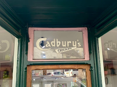
It’s always worth looking out for old signs on shops – not just the sign bearing the shop name or owner’s name, but also signs that advertise goods once sold there. There are still quite a few Hovis bread signs on buildings that are no longer bakers, and during years of blogging I’ve posted signs advertising goods such as Kodak film, Ariel motorcycles, Ty-Phoo tea and Ever-Ready batteries. Walking along the main street in Nailsworth a little while ago, another example caught me eye – this Cadbury’s chocolate sign above the door of a hairdresser’s.
I was particularly struck by this sign because it seems a cut above the usual stick-on plastic ones: separate letters clearly delineated in what looks to me a rather Art Deco (i.e. 1920s or 1930s) letter form, from a time before the familiar Cadbury’s script logo (with its curly ‘C’ and artfully joined ‘db’) appeared in around 1951. In the sign in my photograph, the word ‘chocolate’, with its capitals that diminish in size, also feels true to the 1920s. Looking online, I could find only few versions of this design among the many different Cadbury’s logos and packs that appear when you Google this subject. Online sources give dates as varied as 1906 and 1920. Whatever the exact date, I think this sign in Nailsworth is rather unusual. I wonder if any of my readers know of others like it still in their original setting?


No comments:
Post a Comment