Monday, September 21, 2015
Nottingham
As your lordship pleases
Eyes that look along High Pavement in the middle of Nottingham are naturally drawn to this imposing classical frontage, with pediment, pilasters, short Doric columns on the ground floor and some of the tallest sash windows you could wish for. It’s strong Greek Revival stuff. Redolent of the way in which architects of the early-19th century could use the plainest of classical details to make a facade that stands out, it has imposing proportions – and it is far from bland or boring.
So whatever is it? Some sort of Assembly Room? A gentleman’s club? No. It’s a house, which has a history going back to the late Middle Ages but was remodelled in 1833, specifically as judges’ lodgings (there are law courts in the Shire Hall, on the opposite side of the street). The unusual proportions are at least in part due to the fact that this front was attached to an older building. The big room behind the enormous sash windows is the judges’ dining room, where they could eat in grandeur. The architect was Henry Moses Wood, a prominent Nottingham figure, active as a banker as well as the designer of numerous buildings in Derbyshire and Notts. I find it difficult to dissociate this severely grand frontage from the image, summoned up by the writer John Mortimer, who put it into the mouth of his immortal character Horace Rumpole, of members of the judiciary passing death sentences and then retiring to their lodgings to enjoy muffins. Traditional and severe as it is, though, this facade makes use of what in 1833 was modern technology. Those columns on the ground floor are made of cast iron, like some similar ones in London I wrote about long ago in a post called Kicked a Building Lately?
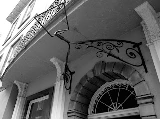
Walk a couple of yards along the street, immediately to the left of my first photograph, and you find the rest of the frontage, done in another kind of Regency architecture. It’s still classical and most of the front is very plain, with rows of sash windows and a deep cornice, but the centrepiece is very different from the formality of the front of the dining room. This is a more delicate style, with a curving balcony and a door with a rather feminine fanlight like something Robert Adam might have designed. The balcony is held up on brackets with stylised leaf decoration, the balcony has elegant ironwork that might be at home in Brighton. And the iron overthrow with its fitting for a lamp is another impressive bit of the blacksmith’s art, all scrolls and flowers and buds. This facade too is part of the judges’ lodgings and its combination with the dining-room part makes for a rather split architectural personality. But the fact that both are classical helps them live together peacefully, revealing the versatility of the classical style.
- - -
Note The right-hand part with the big windows dates to Wood’s remodelling of 1833. Authorities are rather imprecise about the left-hand part. It looks Regency too, and feels like a different phase, but also looks too late to be from an earlier remodelling of the building in 1742.
Subscribe to:
Post Comments (Atom)


2 comments:
Some buildings of the "Greek" period are rather unprepossessing, particularly where they seem to foreshadow the Functional style by presenting perfectly plain wide surfaces, but this seems to be an exception. Part of the effect is produced by not mixing the colours and textures: Greek Doric columns at Letheringsett Hall in Norfolk I noted recently, in one colour and texture, the main block in another and so on. Funny little building in the main street in Warminster does the same thing. No objection to good Greek Doric and the vernacular - but mixing up the two?
Yes, a lot of classicism is about light and shade rather than colour. As a result, it works best in the sunshine.
Post a Comment