There’s something satisfying about the fact that the Stratford-upon-Avon branch of W. H. Smith, newsagents, stationers and booksellers, should be housed in a timber-framed building that looks very much at home in this town of famous timber-framed structures. But this shop isn’t one of the celebrated ancient buildings of Stratford (Shakespeare’s Birthplace, Harvard House, Hall’s Croft, and the rest): it’s only about one hundred years old. So what’s the story?
In the early-20th century, W. H. Smith had its own Estates Department, led by the architect Frank C. Bayliss, which designed and developed new shops, refurbished old ones, and was responsible for such things as lighting, heating, and decoration.* By the early-1920s, when the Stratford shop was built, they’d developed a house style, with shopfronts in light oak, with many small panes of glass, classic Roman lettering (designed by Eric Gill) for the signage, and the frequent use of colourful tiling. The red ‘newsboy’ hanging sign (the work of Septimus Scott) was ubiquitous and the half-timbered look was often employed for the upper floors of the building. The 1920s were a busy time for Bayliss, so he often commissioned local architects to work on specific branches. The firm of Osborn, Pemberton and White was responsible for this one and they followed the house style.§
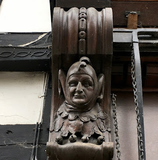
Smith’s weren’t new to Stratford when they built this shop. In fact they had occupied the property next door, a building once home to Shakespeare’s daughter Judith, before they moved to these larger premises. The architects added a couple of appropriate touches that have survived recent modifications to the frontage.† A panel above the shop sign contains a quotation from Shakespeare’s early play Titus Andronicus: ‘Come and take choice of all my library and so beguile thy sorrow’ – spot on for Stratford, of course, but also used by the company on their Kingsway branch in London. William Henry Smith, the man who built up the business in the 19th century using the profits he made from station bookstalls, was on a mission to sell good literature to the masses; his company produced pioneering cheap editions of literary classics and liked literary quotations – the branch in my home town, Cheltenham, used to have a line of Wordsworth on the shop front. The other unusual touch is provided by the carved heads on the consoles (the brackets at either end of the shop sign). One, the head of a jester (below), feels just right for the town of Shakespeare, whose plays often include a jester or ‘fool’. Shakespeare’s fools generally prove wiser than the kings, queens, and aristocrats that they serve. In this age of anonymous, plastic-fronted retailing, W. H. Smith’s are wise to have preserved shops such as this.
* I’m indebted for my information on the history of W. H. Smith’s shops to Kathryn A. Morrison’s excellent book, English Shops and Shopping (Yale University Press, 2003).
§ The best surviving example of this house style is the branch at Newtown, Powys, technically outside the scope of this English Buildings blog, but it’s so outstanding that one of these days I’ll have to post it anyway.
† The sign uses Smith’s current letterform, and I think there would originally have been small panes of glass lower down the window too.


3 comments:
If William Henry Smith was on a mission to sell good literature to the Great Unwashed, he should be both recognised and thanked. I am very glad he invested his own fortune, made from his station bookstalls, rather than drink the money away or gamble on horses. And happily his architects designed a style compatible with literature: light oak fronts, small panes of glass, classic Roman lettering and panels with literary quotations. Gorgeous!
There is also a nice 1920s / 30s staircase as you enter the shop on the left hand side, complete with backlit internal stained glass panels. I'm guessing this must be an original feature from when Smiths moved there, and it's so lovely it has survived the modern renovations.
Sartorial Rake: Thank you. The stained glass panels and staircase sound as if they are from that period, yes. Smith's paid a lot of attention to their interiors back then, but in most of their shops such original features have gone.
Post a Comment