Friday, June 28, 2024

Reading, Berkshire


Tea and biscuits

Walking around the centre of Reading, I was struck by the occasional architectural gem that survives among a crowd of tawdry modern shop fronts. One particular pleasure was this glorious facade of brick and terracotta, the W. I. Palmer Memorial Building in West Street. It is named for William Isaac Palmer, who became one of the partners in the firm of Huntley and Palmer in 1857, a company that was soon to be the world’s largest manufacturer of biscuits. Biscuits (along with the town’s two other principal industries, beer and bulbs*) brought many jobs and much wealth to Reading. W. I. Palmer became personally very rich, and spent some of his money on civic and philanthropic projects, from helping to fund the new Town Hall and library to his enthusiastic support of the temperance movement.

The Palmers were Quakers and although Quaker beliefs do not forbid alcohol, its followers in general either do not drink or do so very moderately. William Isaac Palmer was a leader of the Reading Temperance Society for much of the second half of the 19th century (he died in 1893) and this meeting place for the movement was rebuilt in 1880s and 1890s and dedicated to his memory. The architect of these improvements and embellishments was F. W. Albury, a local man who was elected Fellow of the RIBA in 1875, when one of his proposers was Alfred Waterhouse, himself a great exponent of this kind of terracotta decoration. Much of the terracotta on this building – moulded into the forms of leaves, classical columns, and inscriptions – was made to Albury’s specifications by Royal Doulton in London.

The temperance movement was successful in steering many away from ‘strong drink’ in the Victorian period and later, but by the 1950s was much more concerned with educating people about the dangers of alcohol. In Reading, the society also sold non-alcoholic drinks and started the Temperance Building Society to provide home loans. Eventually the society moved to different premises and the upper floors of the W. I. Palmer hall were converted to apartments. From the outside at least, it must make a splendid building to come home to.

- - - - -

* The horticultural kind, cultivated by Sutton’s Seeds.
Terracotta name plaque, W. I. Palmer Memorial Hall, Reading

Monday, June 24, 2024

Totnes, Devon


The attractions of Gothic

Again and again I feel drawn to houses with Gothic elements in their design – pointed windows, filigree tracery, battlements, and so on. Why should this be? Partly it's simply the delicacy of these designs – they seem have a fragility that’s wonderfully at odds with solid walls of bricks and mortar; Horace Walpole called his Georgian Gothic house Strawberry Hill a ‘paper house’, so fragile did it seem. Partly the attraction is that this aesthetic of pointed doors and windows is so different from the norm, which is all about straight lines, rectangles, box-like forms and sash windows.

The majority of these delicate Gothic houses date to the Georgian or Regency periods, from the 1740s to the 1830s. There are plenty of later examples too, but they tend to have a heavier, less filigree feel to them. Their inspiration, of course, comes from the Middle Ages, where we see Gothic most often in parish churches and cathedrals. The domestic architecture of the medieval period is now much rarer. Most small houses were rebuilt long ago, those that survive often altered beyond recognition. Medieval houses that do survive are frequently much plainer than churches, with square not pointed windows, although there are exceptions, like the wonderful Gothic hall of Stokesay Castle in Shropshire.

The truth is, of course, that Georgian Gothic houses aren’t really based on medieval houses at all – they take their inspiration from church architecture (from its dazzling variety of window tracery, for example) and from a refined and repurposed idea of what Gothic architecture can be: Gothic, if you like, seen through Georgian spectacles.

The small spectacle that results in this house in Totnes is delightful. The tall proportions, the ornate ground-floor bay window, the upper bays with their matching glazing bars, the battlements, even the cream finish of the walls, all elegant and pleasantly different from what surrounds it, as the array of sash windows on the building to the left shows. It’s also a welcome corrective to the current conception of Gothic as dark, gloom-laden, and possessed with death. Gothic can be light and bright and lively, and none the worse for it.

Monday, June 17, 2024

Bath, Somerset

Water is best

I go to Bath quite often and almost always, when I’m there, I admire the Georgian architecture that has made the place famous, but also look out for buildings and details that are either not Georgian or otherwise not typical of the city. Recently, walking along Walcot Street, the Resident Wise Woman and I spotted this small marvel. It’s a drinking fountain that once supplied water for humans and, via the trough to the right, for animals too, appropriately enough since it once served the city’s cattle market. Water, of course, was the thing that made Bath famous before the Georgian period, when the healing spa brought the Romans here. “Water is best” as it says on the walls of the Pump Room,* extolling the life-giving liquid.

Water once came to Walcot Street not in a classical pump room or a Roman bath, but via this Victorian fountain. It’s a Victorian creation, erected in 1860 by one Major Charles Davis, who was appointed city architect and surveyor a couple of years later.† By the look of it he’d been studying the work of John Ruskin, whose books, especially The Stones of Venice, are illustrated with the author’s beautiful drawings showing just this kind of architectural detail. What Ruskin admired in the architecture of Venice (especially its Gothic architecture) was the combination of craftsmanship and visual beauty. He drew arches sometimes with patterns carved into the surface of the stone, as in the outer arch here; sometimes with a zigzag pattern in two colours, as in the drinking fountain’s lower arch; often with shafts (miniature columns) in different materials, also as here. In 1860, bright, shining, and new, the arch would have gleamed, catching the eye with this combination of varied geology and delicate carving. The sound of running water would have added to the appeal.

It’s a shame that the fountain has seen better days – the weeds in the trough seem well established (was it once used as a planter?) and, because the structure is on the side of the road where there are no shops, few people walk along this bit of pavement to notice. Looking it up online, I found an article about restoring the fountain, but I’m not sure the date of this. I hope some cleaning and conservation work is possible, even if the fountain can no longer be connected to a water supply. Though the trickle of water would be an added attraction too.

- - - - -

* This motto is actually in ancient Greek, as it’s a quotation from the poet Pindar, put there, I believe, by temperance campaigners to encourage people to choose water over intoxicating liquors.

† Davis did a lot of work in the city, from the redevelopment of the Roman Baths to the building of the Empire Hotel. He would have needed to cultivate versatility to produce these diverse works, and the tiny project of designing the drinking fountain shows another string to his bow – Ruskinian Venetian design to add to his classical works in the Baths and the more generic Gothic and Norman that he needed for his church restorations.

Tuesday, June 11, 2024

Nailsworth, Gloucestershire


Sign of which times?

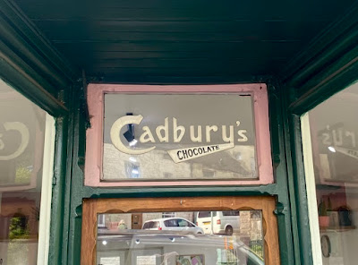
It’s always worth looking out for old signs on shops – not just the sign bearing the shop name or owner’s name, but also signs that advertise goods once sold there. There are still quite a few Hovis bread signs on buildings that are no longer bakers, and during years of blogging I’ve posted signs advertising goods such as Kodak film, Ariel motorcycles, Ty-Phoo tea and Ever-Ready batteries. Walking along the main street in Nailsworth a little while ago, another example caught me eye – this Cadbury’s chocolate sign above the door of a hairdresser’s.

I was particularly struck by this sign because it seems a cut above the usual stick-on plastic ones: separate letters clearly delineated in what looks to me a rather Art Deco (i.e. 1920s or 1930s) letter form, from a time before the familiar Cadbury’s script logo (with its curly ‘C’ and artfully joined ‘db’) appeared in around 1951. In the sign in my photograph, the word ‘chocolate’, with its capitals that diminish in size, also feels true to the 1920s. Looking online, I could find only few versions of this design among the many different Cadbury’s logos and packs that appear when you Google this subject. Online sources give dates as varied as 1906 and 1920. Whatever the exact date, I think this sign in Nailsworth is rather unusual. I wonder if any of my readers know of others like it still in their original setting?

Tuesday, June 4, 2024

Rock, Worcestershire


Watcher, cock, or, Odd things in churches (18)

For many of us, weathercocks are almost synonymous with churches. It was back in the 9th century that Pope Nicholas I decreed that a cockerel should be displayed at the uppermost point of every parish church, a reminder of the fateful triple crowing of the cock that signalled Peter’s betrayal of Christ. The practice of putting a rooster on every church long ago fell into neglect (if it was ever universal), but hundreds of churches still have weathercocks, combining the function of symbol with that of practical use. Know the wind direction and you’re part of the way to forecasting the weather. ‘If that cock’s pointing down the street and there’s a dark cloud over the hill,’ said an old gardener from our neighbourhood, ‘It’ll be raining here in an hour.’ He was right, and such knowledge is useful not only to gardeners but also to the farmers and farm workers who were for centuries the mainstays of the rural economy.

Nothing odd, then, about weathercocks on churches. But a weathercock inside a church is decidedly odd. And yet, what do you do with a rooster that has to be taken down from the tower? Throw him away or send him for scrap metal to be melted down? Maybe there’s a better way. Doesn’t it make sense to set him up inside the church, where his symbolic function survives and he represents a bit of church history? Or perhaps you should keep him safe, against the day when funds can be found to re-erect him on the tower, where he belongs.

Whatever the motivation for keeping this weathercock indoors, I was pleased to see him here, where he provided a few minutes’ distraction from Romanesque carvings and other delights in the church at Rock. Close-up, in spite or perhaps because of the repairs, bolts and rivets, he’s revealed as an appealing bit of folk sculpture, perhaps the proud work of a local blacksmith. The details of the head are sketched by way of telling cuts in the metal: eye, bill, comb, crest. The body is surprisingly slim, making me wonder if weathercocks (and maybe actual roosters) got plumper in more recent years. The tail is splendidly broad, its pattern of holes suggesting feathers and presumably leaving enough metal to catch the wind. In a collection of folk art like the wonderful one at Compton Verney, this would be a star exhibit. Here, in its rightful local setting, it’s a delight.