Sunday, July 28, 2024

Northwich, Cheshire


Ancient and modern

I’d read that there was an early cinema building in Northwich, but I wasn’t prepared for quite how handsome it is – one of the town’s few buildings that’s good enough to be listed, in fact. Its architects, William and Segar Owen of Warrington,* working in 1928, did not choose to produce some pastiche of Cheshire’s indigenous timber-framing, neither did they go for the latest Art Deco style, soon to become de rigeur for cinemas up and down the country. Instead, they adopted the vocabulary of neo-classicism: cornices, architraves, a central section that breaks forward decorated with swags, honeysuckle, and rosettes. Even the way in which the whole building is raised on a plinth, with the entrance up three steps from the pavement level, reminds one of ancient Greek temples. Beneath the neo-classical skin is a steel frame, perhaps to protect the building from the subsidence prevalent in the town due to the removal of subterranean brine by the salt industry.

One challenge for an architect designing the facade of a cinema is the lack of windows to break up the expanse of wall. The only place you want windows in a cinema is the foyer. The designer here avoided an uninterrupted blank wall by adding mouldings to the frontage to make a series of panels, which are now picked out in pastel shades.† The windows that flank the entrance are emphasized with striking diagonal glazing bars, recalling the design of gates and grilles in reconstructions of ancient Greek temples.

The central focus, only partly obscured by the building’s glazed canopy, is the large entrance arch, with its sculpture of a pair of putti (very classical) flanking a camera on a tripod (very Hollywood), a witty icon of the building’s function.¶ Early cinemas often combined ancient and modern (one thinks of the Art Deco inflected Egyptian and classical decoration of a building like the Forum in Bath, for example). Northwich’s Plaza achieves this with style. Back in 1928, the people of Northwich would have needed no reminder of what lay behind this intriguing facade – much of the population was drawn to the movies as the latest form of entertainment, and everyone would have known that this was a cinema. Today, after decades as a bingo hall, the Plaza is now a music venue, and it’s nice to have this small reminder of its original use.

- - - - -

* William Owen worked at William Lever’s model village at Port Sunlight, a very different but highly distinguished project. Segar and Geoffrey Owen were his architect sons. Some authorities suggest that the member of the partnership who worked on this building was in fact Geoffrey.

† Earlier images show brighter colours, but the current scheme looks in keeping with the building’s design.

¶ Please click on the picture to see the details more clearly.

Tuesday, July 23, 2024

Nantwich, Cheshire

Resurrection

Readers who would like to see some older timber-framed architecture, after two posts on half-timbered buildings of the 19th and 20th centuries, look no further.

Equally at the top of my list of priorities when visiting a town that’s new to me are historic buildings and local bookshops. Here in Nantwich then was nirvana: a bookshop in a historic building – the Nantwich Bookshop and Coffee Lounge. For the refreshments, I can forgive the fact that part of the lovely 17th-century facade is obscured by the tented gazebo out front – customers of the Coffee Lounge need to be accommodated and there were plenty on the day we were there. We could still revel in the dazzling patterns of the posts, beams, struts and braces of both the bookshop and the premises to the right. The ornate design of the timberwork is typical of the region, as are the front-facing gables that protrude over the street, the transition between the two surfaces made by a plaster cove. What’s more, there’s a delightful hand-made quality to all this, which, together with a hint of a little structural movement here and there, confirms that this is a building of the 16th or 17th century, not a Victorian imitation.

This is a jazzy building, a bit like a three-dimensional 17th-century equivalent of the paintings of Bridget Riley, and would have cost a lot of money to produce. The owner of the bookshop part when it was built was Thomas Churche, linen merchant, nephew to the still more prosperous William Churche, who built the portion to the right, and who was also the owner of the large Churche’s Mansion in Hospital Street in Nantwich. Both of the buildings in my photograph were almost certainly rebuilt after the great fire that destroyed much of the town in 1585. Investigations when the building was restored found that there had been some structural movement, probably soon after construction, and samples of the earth beneath the shop were taken. These revealed unconsolidated soil to a depth of 7 feet, and stretching back some 15 feet from the front of the shop. It’s suspected that the building was erected over the former castle moat.*

Another surprising discovery during the restoration was that the rear of the building is actually older than the front portion, and apparently by a different carpenter. Could this be because part of the structure escaped the fire? Or because the rebuild was done in two phases, perhaps as money became available?

While I was occupied in pondering these and other matters, the Resident Wise Woman got talking to a member of the shop staff. As a result I was permitted to climb the stairs into the attic (not normally open to the public) to inspect the substantial roof timbers of those impressive gables. On the way up, I passed through the middle floor (UK first floor, US second floor), where I saw Jacobean panelling on the walls and a beautiful piece of decorated plaster ceiling (see the photograph below).

Finding such interest and beauty on the inside as well as the outside of a building made my day, and I felt all the better because this had happened in a bookshop. I can say with the politician and writer Michael Foot that some of my happiest moments have been spent in bookshops.† This one was no exception. Thank you to the staff of the Nantwich Bookshop and Coffee Lounge for hospitality and coffee. And yes, of course I bought a book while I was there.

- - - - -

* I’m indebted to a report by the architect Jim Edleston, a copy of which is available for consultation in the bookshop.

† Michael Foot (1913–2010), Labour politician, journalist, and author of books on Jonathan Swift, H. G. Wells, and Lord Byron, among many others.
Detail of plaster ceiling, Nantwich Bookshop


Thursday, July 18, 2024

Northwich, Cheshire

When wood works

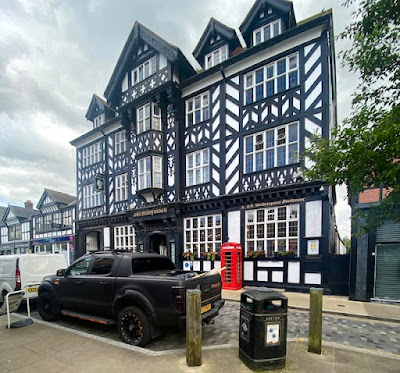
This building stands out on Northwich’s main shopping street like no other. It’s very large and exhibits the timber-framed structure that is so often seen in other Cheshire towns, such as Nantwich and Chester itself. It has the typical Cheshire elaborate magpie pattern of posts, beams and struts, and there’s a jetty, the arrangement by which an upper floor sticks out above the storey below. It doesn’t take long, though, for one to realise that this, like the pub in my previous post, is not an ancient structure of the Tudor period or earlier. The regularity of the timber work, the windows with their pivoting openings, the tell-tale uniform quality of the timber work – all point to a building of the 19th or 20th-century timber-frame revival, a way of building sometimes called ‘Tudoresque’.

It’s a pub now, but whatever was this dazzling structure originally built for? The clue is in the pub’s name, the Penny Black, the name of the first adhesive postage stamp. This building was originally the the town’s Post Office and it was built in 1914, although it did not actually open until the end of World War I, in 1918. The timber frame was not only a visual homage to this traditional Cheshire style of architecture. It was designed this way so that it could be ‘liftable’.

If liftability is a new concept to you, I should explain that Northwich was one of the centres of England’s salt industry. Underground brine was extracted and boiled in vast pans so that the water evaporated and the remaining salt crystals were gathered and processed for sale. Removing the brine caused voids to appear beneath the ground, and buildings subsided as a result. Suitably built timber-framed structured could be jacked up – lifted – and stabilised, whereas masonry buildings were at risk of severe damage or even complete collapse.

What a triumphant building for an early-20th century Post Office. How unlike Post Offices today, which tend to share space with other retail premises – even in large towns the Post Office occupies some counter space at the back of a shop such as a branch of W. H. Smith. This trend to downsize happened before the current scandals surrounding the false prosecutions and convictions of hundreds of Post Office staff, but these days it looks almost as if the organisation is trying to hide away in these low-budget, low-profile locations. How unlike the situation in 1914, when a building like this could act as a landmark on the high street, a three-dimensional piece of publicity and a premises that was built, in the most challenging geological situation, to last.

Sunday, July 14, 2024

Farndon, Cheshire

In black and white

There are countless timber-framed black and white buildings in Cheshire, some of them late-medieval, some much later. This one, The Raven in Farndon, is said on some websites to have been ‘originally built’ in the 16th century, but the excellent Farndon history website points out that the earliest documentary evidence for the pub is in 1785 and that it does not appear at all on a map of 1735. It’s likely to have 18th-century origins, then, but the present building is clearly late-19th century. Its ‘timber frame’ is actually decorative, being attached to solid walls of brick. People will say it’s a fake, but it’s a very engaging fake, with its pattern of cusps on the three sections between the upper windows (and elsewhere on the building) and its jazzy diagonal timbers in the gable.

My favourite part, though, is the sign. The pattern of plasterwork scrolls and straight lines around the name panel suggests similar patterns in Jacobean ceilings and above 17th-century fireplaces. The stylised raven, though is something else, the plasterer’s or architect’s own idea of conjuring up the eponymous bird in a simplified but graphic form. In its stylised, almost cartoon-like quality, t’s unlike anything I can remember in an inn sign, though my readers might know similar examples. It’s clear, simple, and effective, and it’s odd with such a distinctive sign that after a refurbishment in the late-20th century, the building should have had its name changed to The Farndon. Now it The Raven again, and its sign, not to mention its half-timbered design, look the business.


Tuesday, July 9, 2024

Farndon, Cheshire

Small mercy

‘We must be thankful for small mercies,’ my mother would say, keeping her spirits up in the face of what was sometimes a hard life. Perhaps she learned such maxims in the succession of small nonconformist chapels that she attended in her youth, where the architecture – sober, dignified, but often a bit dull – could match the sermons preached within. But now and then a sermon could take off into more exciting realms of eloquence or even passion, and that’s the case too with the architecture of chapels, which can afford much more than sober appreciation.

So it is, I feel, with this example in Farndon. Its name is Chapel House and it was built in the mid-17th century as a house – for a minister, presumably – with a chapel room at the rear. Nowadays it’s a house pure and simple, but the design of its facade is neither entirely pure nor merely simple. What caught my eye of course was that curly gable, with its mixture of concave and convex curves, straight lines and steps. On the east coast of Lincolnshire this sort of thing would elicit comments about trade with the Low Countries influencing the local architecture. Here in Cheshire, there’s not that direct contact, but news travelled, as did pattern books, and someone in Farndon liked this style as much as I do.* The addition of a circular window in the attic, a dentil course across the middle, and an assertive round-headed doorway, and you have a composition that turns heads in a street of small houses. If you want a label for the style of this kind of building, it’s artisan mannerism, a fashion in which builders took motifs from more pretentious buildings (especially ones in places like Haarlem, Antwerp, and French chateaux) that they knew from pattern books and reproduced them, usually in brick.

Villages like Farndon have more spectacular buildings than this – a church, a striking pub, and a medieval bridge across the river that divides England and Wales are the kind of structures that guidebooks will direct the visitor towards. But small mercies like this building are things that also make me thankful.

- - - - -

* Maybe more than one person. There’s at least one other similar gable in this village.

Wednesday, July 3, 2024

Chaddesley Corbett, Worcestershire

Polite but pragmatic

The buildings that attract me are sometimes the ones that don’t quite obey all the rules. Here, for example, is an example of an early-18th century house with many of the standard features of Georgian domestic architecture: sash windows, symmetrically arranged, brickwork with stone quoins, keystones and sills, a canopy over the door supported on scrolled brackets. The central ‘blind’ window may have been blocked at some point in its history or may simply have always been like that – blind windows are not unusual in this kind of architecture, because they look more interesting than blank stretches of wall and keep up the rhythm of rectangles across the facade.

What’s not quite from the pattern-book of ‘polite’ 18th-century architecture is the roof line and the ‘extra’ upper window. More standard would be a very low-pitched roof hidden behind a parapet, the whole facade ending roughly at the level of the top of the quoins. However, here a higher-pitched roof leaves attic space beneath, and the attic is lit by the central window. This lonely sash window, with an expanse of blank brickwork and sloping parapets on either side, looks odd, but fulfils a practical purpose – the extra accommodation squeezed into the roof space.

The side elevation displays another oddity – the lintel of another doorway, subsequently blocked, is visible between the ground-floor windows. The removal of the doorway is clearly an alteration – and whether the surviving lintel looks awkward or charming is a matter of personal taste. Personally, I like it, for its charm and for the way it reveals a stage in the building’s history. The whole house, I think, is a pleasant-looking building, with a seasoning of quirkiness that makes it, to this viewer at least, all the more appetising.