Friday, November 29, 2019

Snape, Suffolk


Was it for this the clay grew tall?

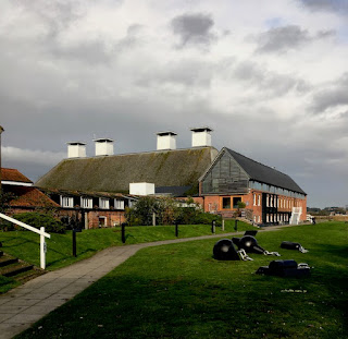
Another memorable visit we made when in Aldeburgh for the poetry festival was to Snape Maltings, five miles up the road from Aldeburgh itself. We went to Snape not for the music for which it is now so famous but for the architecture, for a coffee, and for an exhibition which made a deep impression on us both. The architecture is on such a large scale that I managed to drive past the entrance, in anticipation of yet more wonders of brick, slate, and weatherboarding. But I soon managed to turn round, park, and take in this complex site – there are about seven acres of buildings, apparently.

The place owes its scale to Newson Garrett, son of the Garrett engineers of my previous post. Newson Garrett bought the site in part because of its position on the Alde estuary: there was a port of some significance in the Victorian period. By the early 1850s he was in the business of malting, and was shipping huge tonnages of malt to breweries around the country, especially to those in London. Garrett throve, and the business continued for just over 100 years, finally running out of steam in the 1960s. That left a large group of vacant buildings – maltings, storage buildings, offices, and so on – in the middle of what was a mainly agricultural area of Suffolk. A local farmer, George Gooderham, bought the site and began to find uses and users for the buildings, and then Benjamin Britten turned up.

Britten lived at Aldeburgh and had been running the Aldeburgh Festival since 1948. The festival’s concerts took place in local churches and halls, but such was the quality of the events – featuring a galaxy of Britten’s starry colleagues from all over the world, as well as premiers of many Britten pieces – that these venues were often far from ideal. Britten and his partner Peter Pears quickly saw the potential of the big malthouse at the heart of the site: it would make an ideal concert hall. The maltings was converted by Derek Sugden of Arup Associates, who kept as much of the building as he could and refrained from embellishing what was left. The structure is visible inside in the form of bare brick walls and the framework of the enormous roof. Outside it’s also all about the roof, which sweeps dramatically down almost to the ground in a manner that would take my breath away if it wasn’t so familiar from Britten record sleeves. As is well known, the triumph of the concert hall turned quickly to a disaster when the structure caught fire in 1969, but the work of restoration was redone and one of the most successful concert halls of its time has continued to flourish.

Also apparently flourishing are numerous shops, eateries, and art galleries dotted around the Maltings site. We visited quite a few of these, and what stuck in our mind was the exhibition War Requiem by Maggi Hambling, in the Dovecote Gallery. This compact installation, in a single room plus mezzanine, consists of a couple of dozen paintings by Hambling portraying human heads (the victims of war) and devastated landscapes, done in oils with Hambling's characteristic thick impasto. These are hung in the most spartan of settings – a windowless room with walls lined with plywood. The Lacrimosa movement of Britten’s War Requiem* plays through concealed loudspeakers. This is bleak stuff, which I’ll not attempt to describe further. I merely want to add that we found it utterly compelling. The exhibition has closed now, but has been shown before in other venues, and may reappear: if you have the chance to see it, here or elsewhere, go.†

- - - - -

* Containing a setting of Wilfred Owen’s poem ‘Futility’, from which my heading is a quotation.

† There’s more on the exhibition here.
Monday, November 25, 2019

Leiston, Suffolk


At the Long Shop

The idea was to head for Aldeburgh. I’d been there before, but it was the Resident Wise Woman’s first visit and she was keen to go Poetry at Aldeburgh, the annual poetry festival there. For that matter, so was I. Over a long weekend, between poetic events we managed to do some exploring and I was eager to pop into the church at nearby Leiston, a masterpiece of Victorian architect E. B Lamb, but so dark inside it was virtually impossible to photograph. While we were in Leiston, however, we came across this building, the factory of Richard Garrett & Sons.

The name Garrett seemed to ring bells with me – and I soon realised that it was familiar in at least three ways. Most relevant to the bricks and mortar in front of me was the Garrett engineering company, manufacturers on this very site of agricultural machinery, steam engines, and, in later years, trolley buses. The trolley buses were electrically powered but what Garrett’s were mainly about was steam – steam engines, traction engines, steam-powered lorries. The 1850s structure in my photograph, the Long Shop, was where they made portable steam engines. It was well known in the Victorian period, because it had a very up-to-date layout. In 1851, Richard Garrett* went, like so many of his contemporaries, to the Crystal Palace in London to see the Great Exhibition. Among the things that impressed him there were some of the ideas about manufacturing that were being taken up in America – in particular the concept of what we now call an assembly line. So his Long Shop was designed to house a production process in which the embryonic engines began at one end of the lengthy building and were gradually moved along the floor as parts were added. This process happened in the centre aisle of the shop, and some of the parts, produced in galleries above, were craned down at the appropriate point on the line and fixed to the engine as it took shape.

The layout is expressed architecturally on the outside by the large middle window, lighting the central assembly line area, and the smaller windows on either side, which illuminate the upper galleries. The whole building was much admired in the 19th century, has great historical importance, and combines functionality and a certain ornamental polychromatic quality in a typically mid-Victorian way. It is rightly listed at Grade II*. My only frustration was that when we were free the museum was closed, so we didn’t get the chance to go inside.† Clearly the enticing mix of Victorian architecture and old machinery will have to wait for another visit.

- - - - -

* He was actually Richard Garrett III, the grandson of the company’s founder.

† You may wonder what my other two reasons for recognising the name of Garrett were. They were two famous pioneering women, Elizabeth Garrett Anderson, the first woman to qualify as a doctor in Britain, and Millicent Garrett Fawcett, political activist and campaigner for women’s suffrage, both daughters of Newson Garrett, who was a son of one of the engineering Garretts but did not go into the family business.


Thursday, November 21, 2019

Poole, Dorset


Joining and splitting

Columns and pilasters on the facades of buildings can be made of many different materials – wood, stone, plaster, even cast iron. But many are simply made of wood, like this example in Poole that I spotted during my visit last year, with the paint stripped away during a restoration. Multiple accumulated coats of paint, applied over years, can seriously blur the carved details on facades and it pays to remove the paint and start again, for a crisp, fresh finish.

Door surrounds, like this lovely Classical example, were often the job of the joiner, who was a woodworker skilled in fine work and trained to do the accurate cutting and fitting involved in making snug joints, hence the name. A joiner of the Georgian and Regency periods could expect to be asked to do this sort of job, based no doubt on a widely available pattern book, whose designs he would follow closely. Cutting flutes, carving capitals, and producing mouldings from the varied and adaptable vocabulary of classicism would be meat and drink to him.

But as James Ayres points out in his excellent book Building the Georgian City (Yale University Press, 1998), there could be drawbacks to doing this kind of work in wood. Splits in the timber, for example. Or mitre joints that proved less than durable – Ayres describes mitre joint as ‘little more than a slippery slope to disaster’, because it involved the use of unreliable glue, applied usually to end-grain. This particular bit of woodwork has a bad split, which I seem to have caught mid-repair. Perhaps it will all look better when tidied up and repainted. I must remember to look out for it when I next visit the town.

Thursday, November 14, 2019

Bridgwater, Somerset


Keying in

While admiring the brick-built houses in Bridgwater, I noticed this interesting bit of brickwork. It’s on one side of King Square, a development that was meant to form the climax of Lord Chandos’s work in the town, but was never finished. Many of the houses here are rather plainer than those in Castle Street, without the segmental-arched windows or fancy pilasters to the doorways, and quite a bit later. But they’re still admirable. What my picture shows are protruding corner bricks at the end of a facade, left like this so that when building work was resumed, the builders could ‘key in’ their courses to those that were already there.

People may think this all looks a bit untidy now, and indeed someone has grown some creeper up part of the corner to soften the effect. However, I think it’s interesting evidence of a bit of history. Lord Chandos sold off the redevelopment area of the town in 1734 and thereafter building in the square proceeded sporadically. Most of the square dates to the early-19th century, after which things came to a stop, rather as they did as funds dried up after the financial crisis of the late-18th century in places such as Bath. What’s left, though, is still some of the best town housing one could hope to see.

Sunday, November 10, 2019

Bridgwater, Somerset


Bridgwater brick

I’m impressed by the quality of some of the houses in this Somerset town. This is an example, from maybe the best street of all, Castle Street, which Pevsner calls ‘one of the finest early Georgian streets outside London’. It contains ten well proportioned five-bay houses built of brick – lovely local brick, which became the material of choice in the town from the late-17th century onwards. The brick walls are set off with white-painted quoins and, visible in my picture, segmentally headed windows. These windows are surrounded by moulded architraves; bracketed sills are another pleasant touch.

The doorways, in particular, stand out. There are several variations – some have Doric pilasters, some Corinthian, some, like number 10 in my photograph, Ionic.* The illustrated doorway also has a Gibbs surround, that band of alternating protruding and recessed blocks that gives it special prominence and goes with the ornate keystone at the top of the arch. The Duke of Chandos, who built this street as part of a larger development also featuring many brick houses of this period, must have been pleased. It’s not known who the architect was, but Pevsner and others point to the involvement of craftsmen who worked for the Duke on his properties in London and his famous, long demolished, country house, Canons in Middlesex. The houses they produced in Bridgwater still deserve our admiration.

- - - - -

* I recently posted this doorway and a couple of its neighbours using different classical orders on my Instagram page, @philipbuildings ; scroll down the Instagram page to find them.

Wednesday, November 6, 2019

Cheltenham, Gloucestershire


In situ

Theme and Variations, 1969–72 is a sculpture by Dame Barbara Hepworth fixed to the facade of a building in the centre of Cheltenham that was originally the headquarters of the Cheltenham and Gloucester Building Society. The 25-foot long piece was made especially for the building, has been part of the Cheltenham scene for well over 40 years, and was the artist’s last public commission. She made the sculpture to exploit the slightly curving frontage of the building – the relationship of the groups of semicircles is revealed more clearly as one walks along appreciating the artfulness of the way they are stacked. I think the work enhances the street and deserves to stay there.

However, a while ago the sculpture’s owner (not the same as the company that occupies the building) announced a plan to remove the piece and replace it with an exact replica. Many objected to this proposal, not because the appearance would change but on the grounds of integrity: Hepworth made Theme and Variations for the building and it should remain where it is. It is one of very few works Hepworth created to be attached to a building, which makes it still more important that it continues in situ.† Fortunately, Cheltenham Borough Council and the Twentieth Century Society agree. As a result of the Society’s work, the facade of the building with its integral sculpture have now been listed. It’s with pleasure that I report that this Hepworth is not going anywhere.

- - - - -

† The Twentieth Century Society says that her Winged Figure from ten years earlier, attached to the facade of the John Lewis store in London’s Oxford Street, is the only other work by Hepworth designed to be fixed to a building and still in its original position. It is listed at Grade II*.

Saturday, November 2, 2019

London, Western Avenue, travelling westwards


A different angle

I’ve read two recently published books that mention the old Hoover factory in Perivale, West London. Both books were good ones, but neither author had had the chance to cover at any length the building’s fast-changing fortunes. After Hoover left, Tesco eventually acquired the building and ran a supermarket there for some years. This is the stage it had reached when I lasted posted about it in 2010. Tesco pulled out and in 2017–18 the building was converted into 66 flats.

I’m all for finding new uses for old buildings – it’s often a way of saving therm from demolition. But when I passed the other day on the coach from London to Oxford, I thought the price of this change of use was a rather intrusive alteration – it seemed that the developer had very slightly increased the building’s height by adding a pitched roof behind the original sleek, white parapet. Looking into the history of the Hoover Building, however, I discovered that the roof line has been changing almost since the beginning. The Hoover factory was built in 1932 as a two-storey building with a front topped by a long white parapet, with a centre portion slightly taller than the rest. As early as 1935, the building was enlarged by adding another storey, its front windows set well back from the parapet. Soon after that, a gently pitched glazed roof was added, to let more natural light into the top storey, and some time later still, this roof became more substantial, reaching the form it takes today. Various photographs exist of these stages, and the first version of the pitched roof was there early on. But it’s not clear to me quite when the roof reached its current form.

The fact that I could see this roof so clearly, its grey slope detracting from the effect of the original white parapet, was due mainly to the fact that I was looking at it from an elevated position on the top deck of the Oxford Tube,* when I took the photograph above. I’m much more used to seeing it from the position of the driver of the silver car, or from pavement level. When the Hoover factory was designed in the early-1930s by Wallis, Gilbert & Partners, the last thing the architects were thinking about was what their building looked liked from the top of a bus. Their main thought would have been for the result when seen at ground level – that and the host of other things that preoccupy the designer of a large industrial building: everything from getting the interior spaces to work for their intended purpose to making sure the building is completed on time and within budget. They might even be surprised that their building, years after Hoover moved out, having undergone two changes of use, is still, triumphantly, there.

- - - - -

*The name of a coach service that runs between Oxford and London