Friday, May 28, 2021

Altarnun, Cornwall


The hard stuff


In the list of English building stones most familiar are the sedimentary rocks, such as limestones and sandstones, that are so widely found and widely used for building. In the Middle Ages, when so many of the country’s churches, castles, and other notable buildings were constructed, these stones were widespread, plentiful, and widely used. Many of them were also sympathetically yielding to the carver’s chisel, and whether for the hunky punks of Somerset or the glorious Romanesque carvings of Herefordshire or their contemporaries in many other places, often just as stunning, masons and carvers used these materials enthusiastically. But there are other stones with very different qualities. One such group are the granites of parts of Cornwall, Devon, and Lancashire, igneous rocks that are so hard they rapidly blunt any tool that one is rash enough to use on them.* Early builders were sometimes thankful to find ‘field stones’, chunks of granite that they could pick up and use with little or no chiselling. An entire church built of granite is a testimony to a lot of very hard work.

Such a church is St Nonna’s, Altarnun, in Cornwall. Not for this building are the glass-flat blocks of ashlar stone that we see so often on the limestone belt or in the sandstone country. The surfaces, though well worked, have a roughness that gives them a character of their own. My photograph shows a detail of the superb Norman font. There’s a carved head at each corner and in the middle of each side, a roundel with a six-petalled ‘flower’ motif, embraced by a some kind of two-headed serpent. It’s simply detailed – getting fine detail into this stone is a real challenge – but wonderfully strong. It would have been further enhanced with coloured paint, of which traces remain – a hint of red on the cheeks of the face and a little grey to suggest hair. Whoever carved this has not been cowed by the hard rock, but has gone with an approach that suits the quality of the stone. A lesson in making the best of a material, something that ancient craftsmen did magnificently.

- - - - -

* I once tried to drill a hole the granite wall of a house, to fit a curtain rail. My good quality hammer drill was defeated: once through the plaster surface, the tip of the bit just danced about on the surface of the rock, knocking away more and m ore surrounding plaster as it did so. We called in the professionals, who had a machine the size of my arm that did the job.

Monday, May 24, 2021

Grantham, Lincolnshire

Stone and angels

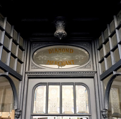
As a follow-up to the jeweller’s shop window in my previous post, here’s another rich bit of symbolic decoration, spotted in the same town on the same afternoon. The Angel and Royal Hotel is one of Grantham’s most famous buildings. It’s among England’s most celebrated inns, a stone structure in the form of a gatehouse, with a central archway. Before the Norman conquest, the site was occupied by a manor house belonging to an Anglo-Saxon queen; it was subsequently a hostel of the Knights Templar. When the knights’ order was dissolved in the 14th century, the hostel was rebuilt as an inn, and there was a further rebuilding in the 15th century, plus numerous additions in later eras. Quite a lot of the frontage is from the 14th and 15th centuries – the central flattened pointed arch is said to be 14th century.

Among several bits of medieval secular Gothic detailing (stone parapet, string courses and hoodmoulds, for example) is this carving, over the central arch. It’s testimony to the way in which Gothic, a style seen most obviously in churches, was also adapted for secular use. For this is very much a Gothic detail – a carved Christian symbol – adopted for secular use as the identifier of an inn. Back then, houses in towns and cities were often known by carved or pictorial symbols near the front door. When no house numbering system was in place and few people were literate, it was the obvious thing to do. Innkeepers, who were in the business of welcoming strangers, found this as useful as anyone, and the custom of calling inns with a name that could be represented by a sign has continued.

What is now the Angel and Royal was originally the Angel, tout court. It had a long history of royal connections, starting with that Anglo-Saxon queen and continuing with numerous rulers (from King John to Charles I) who put up there, journeying southwards or northwards on the Great North Road. More humble travellers on the coaches that went along the road in the 17th and 18th centuries also stayed here, increasing its popularity. But it remained the Angel until the visit of the future king Edward VII when he was Prince of Wales in 1866. Only then was ‘and Royal’ added to the name. The Great North Road (aka the A1) bypasses the centre of Grantham now, but the Angel and Royal remains, its angel glittering as effectively as the jeweller’s glazing in my earlier post.

Friday, May 21, 2021

Grantham, Lincolnshire

Bling and beer

Grantham when I last passed through (a few years ago on a summer evening), was as closed as it must have been recently: hardly any shops open, St Wulfram’s church closed, nowhere much opening hospitable doors. Drifting along the quiet High Street, I spotted this, above a shop door adjacent to the facade of what was once the George Inn, a building mentioned in Nicholas Nickleby and bearing a plaque to Grantham’s most famous son, Sir Isaac Newton. The front of this building looks much later than the George. It seems to speak of the fashion for small paned bow windows and restrained classical fancywork that was popular at the end of the 19th century and the beginning of the 20th. The shop window below fits with this but with more ornate detail including foliate carving and some eye-catching glass.

Back in the Victorian or Edwardian period, then, this place was a jeweller’s and one keen to display its upmarket credentials. ‘Goldsmith’, one panel says, while another declares ’Silversmith’. What more could an Edwardian with an appetite for bling require? Diamonds, naturally, and the glass panel in my photograph, directly above the door, reassures us that this is the place to get them. This kind of effect is made by either etching or cutting into the glass to create the lighter areas. The glassworker can then grind the surface to make it opaque, and then add gilding or colour to help the etched lettering stand out.* The result is redolent of the ideas of brilliance and the skilful working of hard, bright surfaces that’s common to diamonds, both glitzy and well made. It’s impressive, to be sure, although not perhaps as upmarket as it seems nowadays. But we get the jeweller’s message, especially when the glazing is backlit by the lights inside the shop so that it glitters invitingly. Who can blame later owners of the premises for retaining the panel?†

And yet this sort of decorative-informative glass was not so exclusive in the 19th century. It’s just the sort of thing we’re apt to find on the most loudly decorative of Victorian pubs, saying ‘Public bar’ or ‘Ales and stouts’ and often garlanded with etched images of flowers, foliage, and even songbirds. How appropriate, then, that this building was recently in use as a Pizza Express and glittering not with diamonds or best bitter but with the fizz and amber glow of Italian beer. Alas! I read online that this branch of the restaurant chain was closed permanently last year. Quiet again.

- - - - -

* For more on these glass techniques and their use in 19th-century public houses, see Mark Girouard, Victorian Pubs (Yale Uinversity Press, 1984).

† The building seems to be listed as part of a group with the George, but the shop front is not mentioned specifically in the text of the listing.

Monday, May 17, 2021

Broadway, Worcestershire


Shapely

Approaching the village of Broadway (one of those places periodically named as ‘Britain’s most beautiful village’) on the road from where I live across the border in neighbouring Gloucestershire, it doesn’t take long before my pleasure sensors are being tickled, figuratively at least. As the road called Lower Green curves gently, a view of this charming structure opens up, a shapely gazebo with views out on to the road and the other way into the private garden of the house to which it belongs. The building is designed very much to look good on this roadside aspect: there’s a curvy gable bearing a carved quatrefoil and topped by a chimney with a generous flared cornice; two pairs of lancet windows, their glazing bars displaying a design of intersecting tracery; and a ground floor with a blocked ogee-arched doorway and two small blocked lancets.

It’s clear even from the angle of my photograph that the gable is all for show – the actual roof has a much shallower pitch – and that the builders weren’t really kidding anybody when they constructed it. But whoever created this gazebo had two things in mind. The building contains a well lit upper room reached from the garden by an external staircase, no doubt an ideal space for relaxing, entertaining, and viewing the garden itself. That’s the practical side of things, if you like. The other side is making a good-looking sight on the roadside – hence the gable, ogee arch, and all the rest. You could call it showing off, but it’s also a what one might think of as a ‘visual amenity’, something we can all admire and derive pleasure from as we pass. So while the occupants eat, drink, or gaze from the gazebo on to their garden, we gaze at the gazebo. And everyone’s eyes can feast.

Friday, May 14, 2021

Trowbridge, Wiltshire

House of holes

A while back I wrote a blog post about Herefordshire barns with walls of pierced brickwork to provide ventilation. Imagine my pleasure, then, when on a recent visit to Trowbridge in Wiltshire I came across this, a structure that looks like a patriarch among pierced brick buildings, a house of holes. It is a legacy of Trowbridge’s cloth manufacturing industry, which flourished in the 18th and 19th centuries, when the town was known as ‘the Manchester of the West’. The pierced brick structure, squeezed into a space near a former woollen mill – it’s actually built on a bridge over the River Biss – is called the Handle House and its use requires a little explanation.

One of the finishing processes in the manufacture of woollen cloth is known as ‘raising a nap’. The nap is the furry finish that makes many cloths soft and pleasant to the touch. A traditional way to raise a nap was to stroke the fabric with the seed heads of the teasel plant, which bear dozens of naturally barbed or hooked spikes. The spikes catch in the fibre and pull it up, producing the nap. A number of teasel heads were mounted on a wooden handle and dragged across the cloth – at first by hand, later using a machine. The process was generally done when the cloth was wet, because its fibres are less prone to damage then. But the teasels would get soggy and soft when they became damp, and so were less effective. So they have to be dried. One way to do this was to suspend them in a building like this, when the cross-draught would dry them, restoring their strength.†

That’s where the Handle House came in. It was probably built in the 1840s and is very impressive indeed. There must have been quite a few buildings like this, but this is only one of a very few left (some sources say there is only one other in the country). The pierced walls must have made them very difficult to use for anything else once they were no longer required for their original purpose; additionally, the way they’re built hardly makes them the most robust structures in the world, so some examples probably fell quickly into dilapidation. This one is hanging on, and being very unusual is listed at grade II*, a testimony to the ingenuity of the woollen business that has long since left the town.

- - - - -

† I once blogged a heated building for teasel-drying here.

Monday, May 10, 2021

Bath, Somerset


Matters of taste

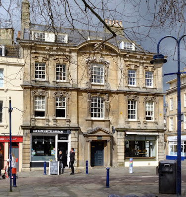
Kingsmead Square seemed to be the perfect spot for a socially distanced cup of coffee on a recent visit to Bath. Our seat was also a good place from which to admire the entrance front of Rosewell House, named for the person who had it built, one Thomas Rosewell. Rosewell’s architect was Nathaniel Ireson of Wincanton who developed part of this square in the 1730s – there’s a carved datestone inscribed ‘1735’ at the very top of the house’s facade. By this time, John Wood Senior had already set the style for Georgian Bath with developments such as the grand, palace-fronted Queen’s Square. But Wood’s style was less reliant on ornament and more on proportions than this house. Ireson’s mode was more akin to the lively baroque of the beginning of the 18th century – so there’s plenty of carving, more curves, more elaboration.

You can see this wherever you look. The windows all have fancy surrounds – the first-floor ones with carved busts in the keystones, the big central windows even more elaborate, one with a surround of curves and scrolls, one flanked by upright figures. There are lots of pilasters dividing up the frontage and book-ending it, those on the ground floor with banded rustication. The whole is topped by a deep cornice and segmental pediment that contains the carved datestone, which is concealed behind a tree branch in my photograph. Presumably the ground floor would originally also have had sash windows, but the spaces now accommodate shop windows.

I find all this detail fascinating. It’s even more elaborate than the beautiful stone facades in a smaller Georgian town like Stamford in Lincolnshire, another place where the provincial taste for baroque elements lingered longer than they did in more ‘progressive’ and ‘sophisticated’ cities like Bath. John Wood, in the vanguard of sophistication, did not care for this sort of thing, which he referred to as ‘ornaments without taste’. Well, Wood built some fine houses, and I have some respect for him as an architect, but I’ll happily look at this example of what he saw as bad taste all day. There is more than one way to design a classical town house, and Bath has room for several different approaches.

Friday, May 7, 2021

Temple Guiting, Gloucestershire


Tradition and the individual

This chunky tower had me scratching my head when I first saw it standing out across the fields. The tower’s position at the church’s west end and its diagonal buttresses are just the sort of thing seen time and time again on Cotswold churches. Usually these towers were added in the 15th century, when the region was prospering from the wool trade. But few of the other details look much like 15th-century Gothic. In particular, the collection of openings – the very plain semi-circular arched doorway, the odd squat pointed window just above it, and the rather more elegant two-light opening near the top – did not seem like typical medieval work. Neither did the very stubby pinnacles with their almost pyramidal finials.*

Seeing it up close, appended to the small church of Temple Guiting in the Cotswolds, it made a little more sense. Temple Guiting was a medieval church: the village name reveals an ancient connection with the order of the Knights Templar, but this is not evident in the architecture and as far as the tower is concerned is a red herring. The history of the tower begins much later. It seems to have been added to the church in the 17th century and is thus an example of the survival of Gothic architecture into a time when Classical styles had become fashionable. This is not at all unusual, especially in rural areas where masons carried on building in a version of the style that had been passed on from master to apprentice, father to son, through the generations. So it’s an eclectic mix of motifs from here and there, and no less charming for that, and for the sense that the structure shows the sort of originality that can emerge when a 17th-century provincial mason blends what he has learned from tradition with the strength of purpose to go his own way.

- - - - -

* Pevsner has a go at this part of the tower, sneering at the ‘clumsy top stage, naive gargoyles and big square pinnacles’. But I don’t mind either the rather bulky pinnacles or the gargoyles – aren’t most rural gargoyles naive, and isn’t this part of what makes them effective visually? 

Monday, May 3, 2021

Cropthorne, Worcestershire


Catslide

Cropthorne lies in the orchard-rich country around Evesham, an area full not just of fruit trees but also of houses built with frames of oak. Some have thatched roofs, often with attic windows peeping out under ‘eyebrows’ of thatch, like the ones on the house to the right in my photograph. Thatch lends itself to these sculptural forms, and also to the roof feature that caught my eye in the house on the left: the catslide.

A catslide is a roof that sweeps down almost to the ground over a single-storey extension. If you add a room on to the side of a building, the thatcher can continue the slope of the main roof at the same angle in one continuous run. You end up with a much lower ceiling height inside, but often this did not bother the occupants – people’s average heights were shorter in past centuries, and if you were going to use the room mainly for storage, or for a bedroom, headroom was not the main requirement. The advantage of this type of roof was mainly an economic one. If you’d built the side wall to full height, to keep the same angle of slope you’d need a higher ridge for the whole roof, meaning more money spent on roof timbers and more thatch on the other side of the house too. So many people favoured the catslide.

The name is wonderfully evocative. One can imagine a roof-climbing cat losing its footing, sliding down the slope to the eaves, and falling only a short distance to the ground before walking off with typical feline nonchalance. As satisfying for the animal as for the thatcher completing a smooth continuous slope, capping the whole roof with ornately cut reeds on the ridge, and standing back in admiration.