Sunday, August 30, 2020

Llanwarne, Herefordshire


Ionically…

The variations on the classical orders of architecture – Doric, Ionic, Corinthian, Composite, Tuscan – are legion. They’ve been the subject of posts on this blog before, but I don’t think I’ve covered a Jacobean variation. This is from a wall monument inside the ruined church at Llanwarne that I featured in my previous post. Maybe some dedicated pursuivant of heraldry could work out whose monument it was from the coats of arms on it. Perhaps it commemorates the person who paid for work on the church in the 17th century, including the south porch – but that’s speculation and in this post I’m concentrating on one small detail of the monument’s design.

Even now the stonework is weathered, the amount of effort expended by the carver is clear, and one focus of that effort was to delineate a variation in the Ionic order that’s very much of its time. Even the shaft is distinctive, with its deep, curving convex mouldings, in contrast to the concave flutes that are more usual on classical columns. There’s additional fine detailing between each moulding that looks as if the sculptor has created a series of miniature flutes topped with tiny roundels. The necking ring above is very deeply moulded, and above it is a band ornamented with tiny hemispheres in groups of five, arranged in a pattern that’s repeated in the capitals above. Between the capital’s spirals is what looks like some egg and dart decoration, but this has worn rather flat. Adjoining the shaft and capital to the right are the rolls and scrolls and flat patterns we now called strapwork, something typical of 17th century English interiors.

In other words, this detail shows an English carver doing what English carvers so often did – taking a classical motif that we associate with ancient Greece or Rome and giving it a character that’s both more local and very much of its time. True, some of the ideas may come from pattern books published in France or the Low Countries, go-to sources for much English Renaissance design. But the effect – vigorous, rural, but showing visual flair – is very English, and shows, as so often, that the orders were an adaptable starting point for craftworkers who’d learned the classical ropes.


Thursday, August 27, 2020

Llanwarne, Herefordshire


Floods and fragments

Ruined churches. When I come across one in the countryside I naturally think their ruination has been caused by rural depopulation or population movement. The old church of St John the Baptist at Llanwarne in Herefordshire – a place I was quite unaware of until the other day – was abandoned for another reason. The building, which stands close to a brook, suffered repeated flooding, so in the Victorian period a new church was built on a higher site across the road. The old church still stands, minus its roof, an ornamental and tranquil place in which to contemplate the transience of the works of humankind and the visual qualities of weathered stone.

This building is fragile. Some of the mullions and tracery in the windows seem to be supported by the ironwork that must originally have held panes of glass in place; signs tell us not to climb on the walls. There’s a part of me that likes my ruins unkempt and desolate and productive of the sort of emotions that are summed up in the term ‘Romantic’ and in the useful German word Ruinenlust. That word can be translated as ‘Pleasure of ruins’, which is the title of a fascinating book about ruins by Rose Macaulay. Ruinenlust involves taking pleasure in something that also invokes dread or sadness. The melancholy aspect of ruins like this is obvious enough, but there are delights too – the vistas of trees and sky above and through window openings, the sense of a quiet haven that’s becoming part of nature, the softening effects (so admired by Ruskin) of time on stone.

As you can see from my photographs however, this is not the kind of ruin one sometimes sees slipping rapidly back to nature and surrounded by tall grass and drifts of nettles. It is looked after. The grass is trimmed and the latch on the gate still works. So although I can enjoy the ruin’s fragility, the fluid quality of some of its worn window tracery, the patina of its stonework, I can also appreciate the care and effort of the people who look after buildings like this, cut the grass, thoughtfully provide garden benches, and ensure the structure is stable.

Looking at the church is even more than usual an effort of piecing together the building’s story from a collection of assorted architectural fragments: a nave and arcade of the 13th century; a 14th-century aisle and graceful 14th-century window tracery; a tower of the same century, much the most solid-looking part of the building; a later porch, probably 17th century. Walking around inside an oddity becomes clear. At some point the ground level both inside and outside the building has been raised, so that now some of the window sills are not far from the turf and the capitals of the arcade piers are only a couple of feet from the floor. Why? Is this the effect of accumulated silt from centuries of flooding? One derivation of the name Llanwarne is ‘the church by the swamp’.

The inner doorway of the porch bears fragments of a carved inscription. The difficulty of reading this is demonstrated by the conflicting opinions of a 1931 RCHME survey and Pevsner. Pevsner thinks it’s in Latin. The 1931 account sees in it English words such as ‘[fad]eth – soe doth Man’s. . . . the [h]ouse of God’, as if a message about decay or ruination is trying to get out. Reading a medieval building can be baffling, but bafflement can be pleasurable, and the quiet enjoyment of a peaceful ruin can be too.


Sunday, August 23, 2020

Harrogate, Yorkshire


High up in Harrogate 3

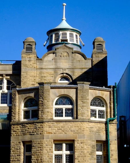
Harrogate’s Royal Hall, my third striking skyline structure in the Yorkshire spa town, actually has three towers topping its entrance front, a rather squat square one in the middle and two round ones, one at each end. I like the design of the circular end towers – they’re actually quite plain, but the ring of windows offers ventilation, light – and, presumably, could be illuminated at night too, to add interest to the evening skyline.

This large building fulfilled several functions, as hinted by its original name, still carved into the face: Kursaal. If you look up the word ‘kursaal’ in a dictionary, you’ll find it defined as ‘a public room at a spa’. The word comes from the German, and is made up of words for ‘cure’ and ‘hall’. But curative functions were far form the only ones in most kursaals – balls, entertainments, theatrical performances, those were the kinds of things that might take place there, and today buildings known as kursaals are given over to all kinds of uses, cinemas and theatres being the most common, although the most famous kursaal, the one at Southend-on-Sea, is the main building of an amusement park and was designed to house a range of activities from balls to billiards.

The Kursaal at Harrogate houses a large theatre and performance auditorium. This is surrounded by an ambulatory, a space around which people could stroll and socialise, not the least important function of the building. You could also take the waters here. This multitude of functions, and the building’s size, made it an important one for Harrogate when it was erected in 1903. A competition was organised to find the best design, and well known theatrical architect Frank Matcham was hired to assess the entries and act as consulting architect. He chose a design by an architect called Robert Beale. However, the council judged that Beale’s design wasn’t entirely practical – it couldn’t be built with the available budget – and Matcham was asked to revise the designs. It’s said that the final result owes more to Matcham than Beale.

Matcham is best known for his theatre interiors, which are typically highly ornate and admirably practical. The Royal Hall is certainly both of those things – its highly decorative auditorium is looking good after a lengthy restoration in 2000–2008, and its entrance front is certainly inviting and striking. Like my other Harrogate towers, those of the Royal Hall pinpoint a building that’s both interesting to look at and an asset to the town.


Thursday, August 20, 2020

Harrogate, Yorkshire


High up in Harrogate 2

For the second in my trio of Harrogate towers (all of them from the town’s heyday at the end of the 19th century), I’ve chosen the Westminster Shopping Arcade. When this was built in 1898, shopping arcades were enjoying something of a golden age. The Victorians loved arcades, because they gave pedestrians an escape route from the noise, smell, and bustle of the streets. By presenting themselves as elegant or exclusive, arcades shunned the lower classes and did their best to keep out anyone who might be a pickpocket. Middle-class and upper-class shoppers felt safe and able to shop and window-shop in comfort and at ease. 

An arcade was an interesting challenge for an architect. Inside there would be elegant shopfronts (think rich, dark woods, gilded lettering), and a well-lit central walkway (often achieved with an iron and glass roof). But outside? The frontage was often quite small, and the challenge was to make it look at once inviting and upmarket. Norwich’s Royal Arcade (blogged long ago here) is a small masterpiece in this regard, with its curving frontage and colourful tiles. The architect of the Westminster Arcade, perhaps inspired by the name, with its hint of the Houses of Parliament, went for a faux late-medieval look – stone walls, vaguely Gothic (or Tudor Gothic) windows, battlements, protruding corner turrets, and a wooden ‘belfry’ topped with a pointed spire-like roof. Quite a lot of care was given to the details of the belfry. Openings, shafts, crenellations, and the pattern of the roof slates and leadwork are all designed with care, and the whole thing is topped with a wrought-iron crown and finial, a detail seen on several buildings in these parts. No doubt few shoppers even glanced at all this detail once they’d got used to the building. But it turns what could be an anonymous plain frontage into something memorable. It’s an entertaining addition to Harrogate’s varied skyline and well worth an upward glance.

Monday, August 17, 2020

Harrogate, Yorkshire


High up in Harrogate 1


Although Harrogate was established as a spa by the early-18th century, it had its great boom in the late-19th century, when it became a favoured resort of the upper classes from Britain and abroad. This boom is reflected in the town’s architecture, with various grand buildings put up for the benefit of the rich who frequented the place, and for the profit of the locals – improved spa facilities, theatres, shops, all featured. Many of these buildings were architecturally ornate, and one way for a building to make its mark in this hilly town of dramatic prospects and skylines was for it to incorporate at least one tower. When you walk around Harrogate and look up, the chances are that one of these towers will punctuate the view.

This one is a wonderfully effective piece of architectural advertising. Stained glass lettering that is designed to be lit up at night immediately alerts us to the presence of the Grand Opera House – it’s the Harrogate Theatre now, but the old name survives on the tower. The opera house opened on 13 January 1900 and was designed by Frank Tugwell, who was also the architect of Scarborough’s Futurist Theatre.

Original front-of-house fittings survive inside the building, but what particularly interested me was this tower. It’s a combination of diverse elements – a bit of an eclectic mixture – but the brick parapet, tapering slate roof, lantern with its stained glass, curvy cupola, and wrought-iron crown combine to happy effect, with just the right amount of swagger for a theatre in a prosperous town at the dawn of the famously optimistic Edwardian era.

Architecturally, the tower has another role. Drawn to the building by the lantern, one finds that the tower is actually on a corner, where two merging streets force the building into quite an acute angle.* The octagonal tower, made still more memorable by stone quoins and some pretty circular windows on the upper floor, helps the building turn this tight corner with grace and flair. On the skyline and on the street, it’s a winning bit of Edwardian whimsy.

- - - - -

* There’s a picture of the corner view here.


Friday, August 14, 2020

Westwell, Oxfordshire


Country classicism

My photograph shows what I saw when peering through the churchyard hedge at Westwell, a small village in West Oxfordshire. My first thought was that this building was substantial enough to be the manor house, but actually it’s the former rectory. The Church of England quite often accommodated its incumbents in houses of this size and pretension between the 17th and early-20th centuries. The clergy were usually second in status to the Lord of the Manor and often had large families and more than one servant, so a big house was not seen as inappropriate. But by the mid-20th century the church was selling off many of its big rectories and housing rectors and vicars in smaller houses that were easier to care for, cheaper to heat, and generally more suited to the needs of a modern family. 

This example was built at the beginning of the 18th century in that simple but satisfying style that I think of as rural classicism – regular rows of mullioned windows, stone quoins, a wooden eaves cornice, and a hipped roof with dormer windows. There’s also a pleasant stone doorway with an open pediment supported by curvaceous consoles. The protruding wing on the right is later – mid-19th century – but in the same style and materials.

The church and most of the tombstones in the churchyard are of similar creamy limestone. Altogether, it’s a pleasing ensemble, one that has plenty of age, but is still a fitting and one hopes comfortable home – for the living and the dead.

Tuesday, August 11, 2020

Weston-super-Mare, Somerset


Click on image for more detail
More than skin deep

Not long ago the building housing W H Smith’s shop in Weston-super-Mare was listed. That, in my opinion, is a cause for celebration, because it’s a rare example of how magnificently this company decorated their shops in the interwar period, a time when they were expanding and upgrading many branches, using a repertoire of techniques that included tiling and classical style lettering, the latter designed by Eric Gill. The Weston shop is a rare remaining example of the decorative leadwork they sometimes used – the upper floor is covered with leadwork coats of arms and heraldic symbols representing Bristol, Bath, Taunton, and the county of Somerset – everything, you might say, except for Weston itself, which didn’t have a coat of arms until 1928, two years after this shop was rebuilt. The facade includes the same Shakespeare quotation (‘Come and take choice of all my library / And so beguile thy sorrow’ from Titus Andronicus) that was used on the branch at Stratford. The lending library in this branch was upstairs, and the room that housed it still has decorative plasterwork featuring figures such as a man carrying a leather-bound book, another reason for preserving the building.

All this decoration was of course a very effective piece of advertising. But it’s also testimony to the quality of the goods Smith’s sold. Many branches of Smith’s are today dominated by stationery, newspapers, and magazines. They have always sold goods like these (the Smiths made their first fortune out of railway stalls selling newspapers), but they were just as committed to bookselling, as well as to their lending libraries. Even when I was growing up in the 1960s, the local W H Smith’s was a good place to go for books. I had quite a few children’s books that came from Smith’s (Ladybirds, Observer’s books, that kind of thing) and later I bought a few shelves of Penguins and Pelicans from Smith’s, some of which I still have. The range was wide, and the attractions for a book lover with little money who didn’t live in a place with a big specialist bookshop were obvious. So if you look up at the fancy leadwork and the Shakespeare quotation and think it’s all a bit much for a shop stocking mostly magazines, stationery, and a few mass-market paperbacks, remember that once upon a time, you could almost educate yourself at Smith’s.

- - - - -

Note on the photograph The last time I visited Weston it was a dull day and the light wasn’t very good. I’ve therefore increased the brightness and contrast in the picture, in an attempt to make the design of the leadwork clearer. Clicking on the picture will enlarge it and make it clearer still.

Saturday, August 8, 2020

Page Street, London


Fit for service

In the years before World War I, few people could afford to run a car. Most car owners were rich, and many were rich enough to employ their own chauffeur, who’d usually double as mechanic – which was important, since motor vehicles were nowhere near as reliable as they are today. If you didn’t have a chauffeur, it was as well to have at least basic maintenance skills, but, in larger towns especially, there was enough demand for the first garages to start in business. Many mechanics worked in a large shed – maybe a wooden or corrugated iron structure – with enough space to work on a car and to store tools. But some garage owners went for something bigger.


One such firm was Charles Jarrott & Letts, who built their garage in London’s Page Street in 1913. Amazingly, the building is still there and traces of the owners’ names are still visible on the front. I didn’t know what it was when I first saw it, but the open door provoked my interest and I did wonder if it was a place where cars were once repaired. It seemed to have what was needed – plenty of space inside without columns getting in the way, so that you could drive cars in and turn them around; good headroom to accommodate larger vehicles and to allow air to circulate and fumes to find their way out; decent lighting (although this was provided by modern strip lights when I passed by).


Browsing through the excellent English Heritage book Carscapes,* I found a little more out about the building and its owners. Charles Jarrott was one of Britain’s first racing drivers, and one of the most successful of the period. Sir William Letts was chairman of Crossley Motors of Manchester, a company that had begun by making engines and industrial machinery, branching into car manufacturing in 1903. They had showrooms in the heart of London, in Great Marlborough Street. The Page Street premises were where vehicles were repaired and serviced.


Like many a garage, it’s not a beautiful building. A substantial cornice and pediment are the main architectural ornament. The rest of the visual interest would have come from the signage – the owners’ names above the double doors and in the pediment above, the single word ‘GARAGE’ in large, widely spaced capitals. Just a little more than the basics, then, but enough to ensure that the building paid its way long after Crossley Motors ceased to be an independent company in the 1940s. Above all, this not quite basic building shows how even such a structure can embody interesting history, reminding us that the early development of the motor car involved a variety of personalities – not just a prominent industrialist and a successful racing driver, but also the many anonymous mechanics who got the cars on the road and kept them there.


- - - - -


* Kathryn A. Morrison and John Minns, Carscapes: The Motor Car, Architecture and Landscape in England, Yale University Press, 2012

Tuesday, August 4, 2020

Highley, Shropshire


Job done

These are probably the humblest of all railway buildings. They’re lamp huts or tool sheds, and these corrugated iron versions, just 6 ft wide by 9 ft long, were ubiquitous on the Great Western Railway, and no doubt on other lines too. You found them by the trackside, near stations, signal boxes, and anywhere else where lamps, tools, and other small items needed to be stored. They were cheap, utilitarian, and supplied in flat-pack form, for easy erection on a prepared base in a matter of hours. Corrugated iron made assembling these structures quick and easy. Prepare a base, order up the flat pack, assemble, add a coat or two of paint – and the job was done. Whether they were building the roof of a large train shed in a city or putting up a little shed at a country halt, the Victorians looked on corrugated iron as a marvel of the industrial age.

Usually you find these huts on their own – if you needed more space, the flat-pack building firms like Boulton & Paul of Norwich or Samuel Taylor of Birmingham could supply something larger. But here on the Severn Valley Railway at Highley there are a couple, close together, painted in GWR colours, like the little platform shelter I posted recently on the Gloucestershire Warwickshire Railway at Hailes. Most of them are admirable examples of the way heritage railways find old, worn-out structures, restore them, and give them new life.

People used to look down on corrugated iron structures, especially small ones like this. ‘It’s just a tin hut’, they’d say. ‘What’s so special about that?’ But they were economical, readily available, easier to put up than a chest of drawers from IKEA, long-lasting, and simple to customize with a coat of paint in your railway’s livery. These days, more people appreciate these qualities of corrugated iron, and more and more I notice garages, sheds, and fences in the gardens of private houses, even in the cosseted Cotswolds where I live, many of them put there by people who haven’t necessarily chosen this material because it’s cheap. From a lamp hut to a barn for your 4 x 4, this Victorian wonder material is quietly but effectively doing its job.

Saturday, August 1, 2020

Stroud, Gloucestershire


Facing up to it

There has been much talk recently about Britain’s past involvement in slavery. The immediate focus for this discussion has been statues of slave owners and slave traders, but in this post I want to highlight a different kind of monument: this arch in Stroud commemorates the passing of the Abolition of Slavery Act in 1833. It was built in 1834 by Henry Wyatt, a local businessman and supporter of the Stroud Anti-Slavery Society, and it formed the entrance to Wyatt’s estate on the edge of the town.

Abolition was slow in coming. Britain abolished the slave trade – the buying and selling of slaves – in 1807, but British people continued to profit from slavery, especially in the form of sugar plantations in the Caribbean.* The steady rather than swift process of abolition. was in part due to pressure from slave owners and in part to the national Anti-Slavery Society, which included, as well as famous abolitions like William Wilberforce and Thomas Clarkson, Jamaican campaigners of mixed race such as William Hill and Louis Celeste Lecesne. This society initially argued for gradual reform, starting with improving the conditions endured by slaves, followed by emancipation over an extended period, followed finally by the abolition of slavery. But by the 1830s, those who wanted abolition to come more quickly prevailed, helped by local anti-slavery groups, who sent more than 5,000 petitions to Parliament between 1828 and 1830.

Pride when this goal was finally achieved led Wyatt not only to erect this arch as a memorial to the antislavery movement, but also to build it a the entrance to his estate. It’s a grand, classical arch but it’s not designed like a Roman triumphal arch – it’s more modest than that, lacking the massive superstructure of buildings like the Arch of Titus in Rome. At first glance it looks like many an entrance arch to the grounds of a country house, now placed rather incongruously next to modern houses, but with the old entrance lodge nearby and the hills in the distance. At the top, though, there’s a plaque explaining the role of the arch ‘Erected to commemorate the abolition of slavery in the British colonies the First of August A. D. MDCCCXXXIV.’

The house, Farmhill Park, was demolished in the early-20th century, and a housing estate and a school built in the former grounds. The school, called Archway School, seems especially appropriate today. We need to understand the history of slavery and the impact it has had. Education is vital for this, as it must be if racism is to be tackled. As James Baldwin put it, ’Not everything that is faced can be changed, but nothing can be changed until it is faced.’

- - - - -  

* Please see the Comment section for further information on this.