Wednesday, October 11, 2023

Croome, Worcestershire

A glance into the past

Early on in the history of this blog, I did a couple of posts about Croome Court, the 18th-century house of the earls of Coventry. What especially interested me was the number and variety of buildings in Croome’s landscape garden and the surrounding countryside, from the classical ‘Temple Greenhouse’ by Robert Adam to a circular panorama tower. Croome is a place I’ve been meaning to revisit for a while now, and I planned to do a post about the house and its 18th-century architecture but, as usual, something unexpected caught my eye. So, much as I enjoyed looking at the Georgian architecture of the great house, designed by Capability Brown and with interiors partly by Robert Adam, here at the heart of this 18th-century building is, of all things, a bit of timber-framed wall.

The 6th Earl built Croome Court as we know it, an elegant Palladian house with corner towers and a central classical portico, in the 1750s. But the central part was actually a rebuilding of the family’s earlier 17th-century brick-built house – the architect, Brown, rebuilt it using the old foundations, facing it in stone, laying out new rooms inside, and adding the corner towers and portico. The 17th-century house, however, had an even earlier, timber-framed house at its core, and it’s a fragment of this that I noticed as I walked around the building’s basement. One of the National Trust’s helpful guides, seeing me looking at this, pointed out details on the floor that showed the lines of early, long-demolished walls among the floor tiles.

And so Croome Court, so classically perfect, turned out to be a bit of an architectural jigsaw, as so many buildings do when you look carefully. I don’t know if it was a member of the Coventry family or one of the house’s later owners* or the National Trust who now run and maintain the building who left this small section of timber-framing exposed. But I was pleased that they’d done so, because it made me think of the house in a different way, one more true to its complex history.

- - - - -

* The ownership history of the house has been varied since the 1940s. Sold off by the family after World War II, it became successively home to a school, to the UK headquarters of the International Society for Krishna Consciousness, to a property developer who planned to turn it into a hotel, and to another developer who lived in it for a while. The Croome Heritage Trust then took over the house in tandem with the National Trust, ensuring its survival.

Friday, October 6, 2023

Leamington Spa, Warwickshire

The angular meander

Is there a pattern that says ‘Greece’ louder and more clearly than the ‘Greek key’? This motif takes the form of a continuous line that bends back on itself through a series of right-angles, before bending again to resume its forward course. It’s sometimes called the Greek fret, sometimes the meander, and some say its form derives from the Greek River Maeander (or Meander). It was widely used in the architecture of the Greek revival, a style popular in Britain during the decades on either side of 1800.

Here it is in the iron supports of the veranda that runs along the front of the houses in Lansdowne Crescent, Leamington. They were built in the mid 1830s to designs by local architect William Thomas. The uprights with their Greek key design ensure that the canopy above the veranda is held up securely, while also proclaiming the classical heritage of these town houses. The verandas were not so much for sitting out on – they are quite narrow – but more to provide shade for the almost south-facing rooms while also ensuring that if the floor-to-ceiling window is open, no one absentmindedly steps out and tumbles into the area below.

Soon after the residents moved in, Queen Victoria was on the throne and the fashion for elegant middle-class houses would turn from the classical to other styles – Italianate, Tudor revival, or Gothic. But the people who lived in Lansdowne Crescent in the mid-1830s (whether they were permanent residents or visitors who rented a house for the ‘season’, in order to make use of Leamington’s spa) must have delighted in their homes, which were both chic and Greek, courtesy of the angular meanders of their exterior ironwork.

Sunday, October 1, 2023

Leamington Spa, Warwickshire

Tea in the park

Visiting Leamington Spa recently, I was particularly struck by the decorative ironwork on many of the buildings. Much of this was from the town’s Regency heyday – the iron balconies that resemble those in Cheltenham and Brighton, although in many cases with different designs. One example from a later period, however, stands out: the ironwork that makes the Aviary Café in Jephson Gardens so special.

Several of the structures in this beautiful urban park have a serious memorial purpose. This paragon of ornamental park structures is different. It was built in 1899 simply to house tea rooms – there’s an Edwardian-looking photograph online showing elegantly dressed people relaxing in front of the café amid a small copse of umbrellas that shade outdoor tables from the sun. At some point in the 20th century, the café closed and was turned into an aviary, but by the last decades of the 20th century this had closed and the building fell into disuse and disrepair. As part, I believe, of a millennium project to enhance the park, it was restored and turned back into a café, in which form it still seems to be thriving.

At the front, the roof is held up by slender iron columns, allowing it to overhang and shelter a narrow porch or veranda, which now houses several small café tables. Look up, and you see the splendour – several metres of intricate iron latticework filling the spandrels, cornices, and the space beneath the central gable. Look closely, and you see multifoil arches, patterns of circles and scrolls, and iron finials at the ends of the eaves and at the gable’s peak.

The whole thing is a showpiece of the Victorian metalworker’s art and the epitome of the ornamental public park building of the period. It’s up there with the best bandstands and other pleasure buildings, with decoration that at once enhances the view and catches the eye, beckoning us in to sample the delights within. To my mind, it’s a small architectural triumph.


Tuesday, September 26, 2023

Nottingham


The long view

Among the multitude of things that pop up on social media, one I take notice of is a blog produced by Historic England. For each post it takes a theme or an architectural style and gives a handful of outstanding examples. The theme the other day was Art Nouveau architecture in England, and I was pleased to see that Historic England’s gurus had picked four of my personal favourites: the elegant if eccentric Turkey Café in Leicester (all pale stripes and gobblers), the Royal Arcade in Norwich (with its air of Edwardian luxury) and the glorious former printing works of Everard’s in Bristol (with a facade that illustrates two luminaries of the craft of printing, Johannes Gutenberg and William Morris). All of these have featured on this blog in the past and all, by the way, are adorned with tiles designed by W. J. Neatby of Royal Doulton. However, another favourite of mine selected by Historic England was a building I’ve not blogged until now.

When I last passed by this imposing shop in the centre of Nottingham, it was a branch of the women’s clothes store Zara. It started out as something quite different, because it belonged to Boot’s the chemist – in fact it was their largest Nottingham branch in the early 1900s when it was built. As Boot’s was a Nottingham company, it was what modern retailers might called their flagship store. The upper part of the building at first glance looks like a baroque palace, with a dome to make the corner into a landmark. However some of the detailing, including the youthful figures hat support the balcony and cornices, together with some of the terracotta foliage, and the gently swelling columns that frame some of the window openings, are all of their time. It’s the ground-level shop front, though, that really looks Art Nouveau. This was the style of the sinuous curve, and the wooden window frames have curves in abundance, especially in the transom lights, the upper sections of the window, which have heart-shaped and tear-shaped panes, supported by a framework that’s both curvaceous and richly carved. Looking up as one enters, a similar pattern of glazing bars , this time with mirror glass, fills the ceiling, making the lobbies lighter.

It’s a lavish design, showing how Boot’s and their architect, Albert Nelson Bromley, made a special effort for this important store. The building was subdivided to accommodate the company’s variety of departments – everything from photographic processing to a lending library, as well as Boot’s core business of pharmaceuticals and cosmetics, but this interior was reconstructed in 1972 after the chemists had vacated the building. The shop front remains, showing how it was built to last by a company that, unlike so many modern retailers who put up flimsy frontages because they known everything will be redesigned in a few years, took the long view.
Looking up in the lobby, Boots, Nottingham (now Zara)


Thursday, September 21, 2023

Birmingham

Turning a corner, 2

Few buildings turn a corner with such grandeur as this one in Birmingham’s Constitution Hill. It dates from the 1890s and was designed architects William Doubleday* and James R. Shaw for H. B. Sale, a firm of die-sinkers. The plan was to have offices and shops on the ground floor with each upper floor taken up by one large workshop, plus an office in the corner tower. Five floors were planned, but the fifth was not added until the mid-20th century, hence the difference in style.

The exterior is built of red brick with a rich array of terracotta dressings – foliage, flowers, and medieval-style heads all feature and the top of the building as originally constructed was given some distinction with the row of small curved gables still present in front of the 20th-century top storey. The stylistic label given by English Heritage’s short ‘Informed Conservation’ book about the district is Spanish Romanesque-style. The stand-out feature is the tower, which is still a landmark on the junction of Constitution Hill and Hampton Street. Each storey of the tower has a different kind of opening, from the first floor† upwards: trefoil, slightly wasp-waisted arches; flat-topped openings; windows topped with ogees; semicircular openings; and quatrefoils in the tiny gables around the dome. The tower also displays the owner’s name,¶ standing proud from the band of foliate decoration – a popular late-19th century effect that I always admire. Finally, the ogee dome at the top, with its fish-scale surface, provides a pleasing climax, although it’s slightly hidden by the gables and finials that surround it. What a glorious building. I hope its owners are soon able to remove the plants that are taking root towards the top of the tower, so that it can continue to provide the area with a landmark and an admirable collection of exuberant architectural decoration.

- - - - -

* William Doubleday was based in Wolverhampton when this building was designed; he later moved to Birmingham.

† American second floor.

¶ You can enlarge the picture by clicking on it, which might make this a little easier to see.

Saturday, September 16, 2023

Birmingham

Turning a corner, 1

This is one of my favourite buildings that I saw on a stroll around Birmingham’s jewellery quarter a while back. It’s not a factory or anything to do with the jewellery business, however: it was built as a pub at the end of the 1860s, that decade when Victorian architecture became more jazzy, colourful and free than most of what went before. The style of Gothic is described by the Pevsner City Guide to Birmingham as ‘very Ruskinian’. In other words there are lots of pointed arches in rows, built in a polychrome mix of red, white and grey (aka ‘blue’) bricks; there are natty details like the small oriel window at the corner and the octagonal turret just visible in my photograph; and there are twin openings divided by slender shafts with carved capitals. All of these details were in the architectural air at this time thanks to the writings of John Ruskin, whose accounts of Venetian Gothic (in books such as The Stones of Venice, which came out in the early 1850s) were increasingly influential.

So far, so good. Whether Ruskin would have approved of this building is another matter. He seems to have had a downer on the kind of dissipation sometimes associated with pubs and taverns, and on genre artists, such as Jan Steen, who painted tavern scenes. But many of us will take a different view. Why should a pub not have a stunning facade, designed with flair, built with care, and enhancing the streetscape? If places of worship or education can have glorious polychrome brick frontages, why not places of hospitality too? I thoroughly approve, and I approve too of the fact that the building has been restored to make the most of its glorious exterior.

Another thing I admire about this building is the swagger with which it occupies a corner plot that is challenging architecturally. Corner plots are good for business, because a site on a junction allows the building to be seen and approached from several different directions. But a tapering cake-slice of a plot like this one is not always easy when it comes to designing the building – how does the structure ‘turn the corner’ visually, and what do you do with the tiny sliver that faces directly on to the junction? Placing the entrance there can be a good solution. Giving the entrance a bit of emphasis by adding the oriel window above (with its cusp-headed opening to make it extra ornate, a pattern echoed in the window on the upper floor) is highly effective visually. Here’s to Victorian brickwork, ingenuity, and that quality of vigour and distinctiveness they called ‘go’!

Thursday, September 7, 2023

Muchelney, Somerset

Devoted to baser things

Dedicated as they were to higher things – prayer, the celebration of the Office at the canonical hours, the copying of books, especially holy scripture, and so on – monks needed also to cater for the needs of their bodies, from healthcare and food to lavatories and drains. Monastic drains often leave their traces, because they were carefully built and engineered, and set at or below ground level, so drainage channels often survive where standing buildings have disappeared. The lavatories that connect to these drains, by contrast, usually vanish. This makes the medieval lavatory building at Muchelney Abbey, probably built some time after 1268*, a rare survival.

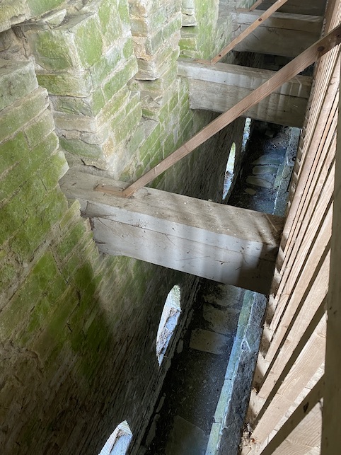
The latrine block stands out because it’s two storeys high and has a striking thatched roof, although it is said that the roof was probably originally covered with slates.† The upper floor has a gap all the way along one side, where the wooden structures of the lavatories, together with partitions between each one, were fixed. This arrangement allowed the waste material to fall to the drain directly below, where it was flushed away using water from the abbey’s conduit. However, the flow from the conduit was probably not very fast, as a look from the upper flor down to the drain (as in my second photograph) shows a row of arches at the bottom, through which the monastic servants, or the monks themselves, could clean the drainage channel.

When it was built, the latrine block formed one end of the eastern range of the cloister. Next to it on the upper floor was the monastic dormitory or dorter – this proximity of lavatory and dormitory was standard, and the lavatory is often known as the reredorter. The abbey’s dissolution in 1538 led to the decay of most of the buildings, but this block was retained and used as a farm building. The change of use ensured its survival, giving us a special insight into one way in which medieval monks catered for the more mundane aspects of their everyday life.

- - - - -

* This date is based on tree-ring analysis of ancient timbers.

† I’m indebted to English Heritage’s guidebook to the monastery for much of my information about the building.