Wednesday, April 29, 2020

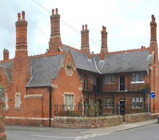
Louth, Lincolnshire


Indoors, outdoors

I’ve mentioned in previous posts that one of the pleasures of blogging is receiving additional information about the buildings in my posts. Here is a case in point. When I posted a picture of these almshouses in Louth, back in 2014, I mentioned that a great aunt of mine had lived in one of them at the end of her life. So these are buildings I recall seeing as a small boy, before I knew anything about their architect – the prolific Fowler of Louth, lover of the Gothic style, restorer of churches, and builder of hospitals and schools as well as houses. In my post, I expressed the hope that these tiny Bede Houses (they’re apartments, really) had by now been modernised, as the accommodation they offered was very basic. 

Not so long ago, a reader found this post and left a comment, telling me that his aunt had been a warden for the Bede Houses in the late-1970s and that the accommodation was indeed modernised at around that time. A major part of this was the provision of modern bathrooms, in most cases added in an extension at the back of the building, and also by the removal of one dwelling to give room for some bathrooms that wouldn’t fit in the extension. It’s great to learn that the charm of the Victorian buildings has been preserved while also giving the occupants much better facilities. I have friends who are trustees of almshouses in another old building, and I know how difficult it can be to modernise while maintaining architectural integrity and character. 


Another thing I recall from visits to my great aunt long ago, was that in the summer, quite a bit of the life of the occupants was lived outdoors. There were benches in the courtyard, and plenty of space for those who wanted to get some fresh air and chat to their neighbours. It is good too, looking at my photographs, that there still seem to be pleasant flowerbeds as well as space for sitting and exercise. Here’s hoping that it won’t be too long before outdoor socialising will be possible once more.

Sunday, April 26, 2020

Eye-opener


Readings and rereadings (3): John Betjeman, First and Last Loves

Since the lockdown began and I’ve been indulging myself by rereading some favourite books, I’ve been intending to reread something by John Betjeman. His work means a lot to me – especially his prose (I like some of the poems a lot too, but not all of them), particularly because he was one of the authors who first stimulated my interest in architecture. Years ago, the introduction to his Collins Guide to English Parish Churches helped me towards both an appreciation of church architecture and to a basic understanding of the history of church buildings – how the way they’re used has effected their fabric and furnishings. Later, his book on railway stations introduced me to another branch of architecture, and his essays on Victorian architects opened up still greater vistas. All of these subjects, and more, were also illuminated by Betjeman’s numerous television programmes, films that let him use his good nose for places – their character, landscape, history, and people.

A book that’s rich with the taste of all these preoccupations is First and Last Loves, a collection of essays that Betjeman had written in the 1930s and 1940s and gathered together in 1952. In many ways, it represents, in just 244 pages, the essence of Betjeman. Three essays on churches (Blisland in Cornwall, Mildenhall in Wiiltshire, and St Mark’s Swindon) are highly evocative, describing the setting, history, and furnishings of these churches as well as their architecture. There are also pieces that do something similar for Victorian architecture, nonconformist chapels, and London railway stations. When he’s writing about railway architecture, for example, we learn a lot about the stations’ histories, but Betjeman also conjures up a picture of the kind of people that typically use each one – from the army men and high-ranking civil servants travelling from Waterloo to the lower ranks of the civil service on the Metropolitan line to Rickmansworth or Northwood.

An old favourite of mine is the piece called ‘Antiquarian Prejudice’, in which the author makes fun of the blinkered views of antiquarians who will only take something seriously if it’s old, and take many old things (such as aumbries and piscinas in churches) much too seriously. Some of this is written with great wit.* But there’s also a seriousness behind it – if we don’t use our eyes and realise the aesthetic value of things, they’ll be gone, and all we’ll have will be supercinemas, dull office blocks, concrete lampposts, and telegraph wires – and everywhere will look the same as everywhere else.† Already, he notes in another piece, we’re losing piers, bandstands, music halls, and other undervalued bits of popular architecture so that only funfairs remain of this kind of thing.

Best of all are the essays that describe favourite places. These places can be large towns, such as Cheltenham or Aberdeen, or smaller settlements, especially but not only seaside ones: Lyndhurst or Port Isaac, Sidmouth or Highworth. These pieces are full of classic Betjeman perceptions: the sadness of closed amusement parks out of season; the manifold scents of the New Forest (you can smell the place before you can see it); the ‘tangible’ climate of Sidmouth and its glorious flowers; the colours of Cornish slate; the vital importance of exploring every alley in Highworth (and everywhere else). This stuff is full of pure joy, and packed with personal reminiscence: of seeing St Endellion’s church and realising it looks like a crouched hare; of the different routes into Padstow; of unrequited love in Weymouth; and of New Forest ponies invading the quiet streets of Lyndhurst (one wonders whether they are back there again now).

This is not nostalgia, even if it’s sometimes expressed with a certain wistfulness. Betjeman was aware, writing in the 1930s and 1940s, of a sense of urgency: he had to write about these things, now, because tomorrow might be too late: developers with wrecking balls might be moving in. To say that he dislikes planners with no sense of place, or people who knock down good historic buildings for no reason except to make money, or antiquarians who won’t look, is an understatement. He loathes them, exuding a quality that I think of as ‘regulated hatred’.¶ Hatred of this kind is sometimes necessary. But it is nothing without its obverse quality, love, and when Betjeman is using his own eyes and writing about places he loves – about Port Isaac or Highworth, say, he’s revelatory, and makes one want to get out and open one’s own eyes. One day, soon, I hope.

- - - - -

* Betjeman’s talk of blinkered professor-doctors has been taken as a swipe at his friend and occasional rival, Nikolaus Pevsner. There is something in that, but I think Betjeman might also be thinking of the dons who sent him down from Oxford without a degree.

† There are odd and haunting pre-echoes of Ian Nairn here.

¶ I have appropriated this term from the literary critic D. W. Harding, who used it in an article called ‘Regulated Hatred: an Aspect of the Work of Jane Austen’. 
Thursday, April 23, 2020

Balham Hill, London


Light exercise

Sometimes I deliberately get off at the wrong tube station. But it’s not what you think. I’m neither covering up my geographical incompetence with the cloak of deliberation, nor am I on a ruthless quest for exercise. I get off and walk because you never know what you might see on the way. So one fine day, en route to visit friends who live near Balham underground station, I get off at Clapham South instead, and schlep my bag southwards, along Balham Hill.

I’ve not gone far before this hoves into view. ‘Of course,’ I think. ‘I’ve seen this in books. Books about cinema architecture.’ It’s the former Balham Odeon,* was designed by the Odeon’s house architect, George Coles, and opened in 1938 with the film Blondes for Danger. If the title of that film is very much of its time, so is the architecture of the cinema: large and tiled, with curved corners and a rather chunky tower. It’s Art Deco, but not the highly ornate Deco of some examples, certainly not with any hint of the historicising decoration of cinemas like the one in Essex Road or the extraordinary interior of the Granada, Tooting, which was the nearest big cinema to this one. The Balham Odeon is just huge, 1930s-modern, and rather lumpish.§

But to think of it simply as a lump is to miss its point. It was designed to be seen at its best at night, when film-goers would turn up to be greeted by bands of neon stretching horizontally along the facade and vertically up the tower. The name ODEON was lit up in neon too and the lights make the building look much less lumpen than it seems by day. Its hilly location and illuminated tower meant that it could be seen for miles too – an effective if brazen advertisement for the cinematic joys within.† There are, I know, people who will think that its night-time illumination is insufficient excuse for the daytime appearance of this building. I have a certain sympathy for this opinion, but I offer the after-dark view as a reminder that things are not always, 24/7, what they seem. And that there is more than one way to look at a building.

Balham Odeon at night. Photograph © English Heritage

- - - - -

* The name of Oscar Deutsch’s company, Odeon, derives from an ancient Greek word for theatre. It was only after the company had adopted it that a clever member of the firm’s publicity department realised that its letters could provide the initials of a catchy slogan: Oscar Deutsch Entertains Our Nation.

§ And encumbered with telecommunications equipment. Only connect.

† There are no longer neon lights and the building’s front of house, in normal times, is given over to the useful business of selling wine; there are apartments to the rear.

Monday, April 20, 2020

Frampton on Severn, Gloucestershire


Aide memoire

Going through my photographs to pull out some to share, I came across the first digital photograph I took, or at any rate the first I thought at all fit to preserve. As you will see straight away, it’s far from an ideal picture, an ‘over the wall’ job, showing what can be seen of a building on private land from a public road. The building in question is the orangery at Frampton Court, Gloucestershire, and when I took the picture it was to jog my memory to go back on one of the occasions when the grounds of Frampton Court are open and it’s possible to see the this building – and the impressive architecture of the main house – clearly. Years later, I’ve still not made this visit, so the image above remains my only photograph of the orangery. Carpe diem.

Over the wall we see the building from the side, almost end-on but at a slight angle. Viewed from the front, it’s symmetrical and consists of a pair of matching octagons with ogee windows all round, joined in the middle and complemented by a central octagonal turret. In my picture the two matching octagons and turret can be seen, the turret topped by a tiny cupola. Pinnacles and crenellations crown the skyline, ogee-topped windows with glazing in a pattern of hexagons and diamonds dominate the walls. Indeed the walls, made of very high quality ashlar, are minimal, so many and so large are the windows. The stonework is finely detailed, with lovely curvy hoodmoulds. If you click on the picture, it might just be possible to make out tripartite ‘skirts’ beneath the window sills, carved in very shallow relief.

Reference books tell us that this building’s exquisite Gothick* architecture dates from the late 1740s and may be the work of William Halfpenny, who drew heavily on drawings in Gothic Architecture Improved (1747) by Batty Langley.§ This filigree architecture is in marked contrast to the Baroque and Palladian cocktail of the main house. It must make a wonderful garden feature – and is likewise enchanting if tantalizing when viewed, as in my photograph, over the garden wall. A future visit will be something to look forward to…

- - - - -

* I use the 18th-century faux-archaic spelling for this fanciful 18th-century version of Gothic architecture.

§ Halfpenny was probably based mainly in Richmond, Surrey, or London, but spent some time in Bristol. He was both an architect and the author of numerous architectural pattern books that showed a strong interest in the Gothick style as well as in Chinoiserie. William Halfpenny, Batty Langley: mid-18th century building could be both architecturally and onomastically lively!

Thursday, April 16, 2020

Wellington Place, London


Taxi!

Most of my friends read a lot, and quite a few of them write books too. One of the most frequent mustn’t-grumble-glass-half-full-look-on-the-bright-side remarks I’ve heard from them since the virus made itself felt and we began to face up to time in isolation is along the lines of, ‘Well, at least I have lots of books to read’. Thinking about this the other day, I glanced along some of my shelves to reassure myself – as if anyone with thousands of books needed any reassurance – that there’s plenty that I’d like to read or re-read. At one point in this process, I looked at the handful of books I have by the journalist and travel writer H. V. Morton.¶ One, The Nights of London, fell open at a page describing a visit to a cabmen’s shelter. Of course! Something else I’d not got round to blogging about.

Green, wooden, and topped with rather fancy half-hipped roofs with a central ventilation louvre, cabmen’s shelters are easy to recognise – a small but distinguished building type that works, looks good, and is distinctive without sticking out like a sore thumb. They’ve existed since 1875, when the Cabmen’s Shelter Fund* was set up to build them, the purpose being to supply refreshments to cab drivers – originally the drivers of horse-drawn Hansom cabs – who could not park outside pubs and go inside without paying someone to mind the cab while they ate.

The size of the shelters was limited – they’re not supposed to be larger than a horse and cart, so as not to pose too much of an obstruction on the roads. In all, 61 were built, although now only 13 remain. The first was in St John’s Wood, not this one, which stands near St John’s Wood High Street, but in Acacia Road, to the northwest. The idea was that the shelters were for the use of cab drivers only – they only have room for ten or a dozen people inside – and I have never been inside one.§ My friend Peter Ashley, who can charm his way into all kinds of interesting situations, once got invited inside one, finding it both welcoming and cosy.†

Cab drivers are among the many groups whose work is ebbing away as a result of the virus. There are already plenty of examples of them helping the community. One hopes that they will continue to receive the support pioneered by organisations such as the admirable Cabmen’s Shelter Fund.

- - - - -

¶ Morton was famous as the first journalist to report the discovery of Tutankhamun’s tomb, and for driving around Britain in a bull-nosed Morris and writing about what he saw in newspaper columns and books.

* Their initials, CSF, are usually visible in the decoration under the eaves.

§ I think some have occasionally been open on London Open House Weekends. The one in my photograph is apparently now a café open to all, but I didn't realise this as I photographed it early in the morning when it was closed for business.

† See his book London Peculiars (ACC Art Books, 2019). Peter also posts his beautiful photographs on Instagram: @unmitigatedpete

Sunday, April 12, 2020

A way of seeing


Readings and rereadings (2): Richard Mabey, The Unofficial Countryside

I’ve spent quite a lot of my life writing about buildings, especially old buildings, from castles to cathedrals. But I also have an abiding interest in the architecturally out-of-the-way – a term that suggests for me everything from buildings that did not even get built to the architecturally small, neglected, and apparently insignificant. It’s the second category that’s a major preoccupation of this blog – shacks, lock-ups, telephone boxes, outside privies: regular readers will know what I mean. People sometimes ask me how I became interested in this sort of thing. One answer is that I seem to be naturally disposed to favour underdogs of all sorts. Another reason is the influence of certain books, and one of these books might strike you as surprising.

Richard Mabey’s The Unofficial Countryside* is not an architecture book at all. In a bookshop you’d find it in the Natural History section – it chronicles the author’s explorations of edgelands, wastelands, and other bits of urban land that turn out to be havens for wildlife of all sorts. This unofficial countryside includes old gravel pits, canals, railway sidings, vacant lots, and rubbish tips, while also embracing golf courses, parks, gardens, and graveyards. In observing the plants, birds, and animals that colonise these spaces, Mabey develops a distinctive way of seeing, with all the naturalist’s usual alertness, curiosity, and sensitivity to place applied to a new and, it turns out, fascinating set of habitats.†

Mabey’s descriptions of the rich bird life to be seen in flooded gravel pits, of resourceful birds making nests out of wire in industrial sites, of botanising expeditions to rubbish tips and the ‘rough’ around golf courses, are all gripping. His explorations of the relationships between humans and kestrels, foxes, blue tits, and ‘weeds’ like thorn apple, are fascinating. And his enthusiasm for the places and their plant and animal inhabitants is infectious; all the more so, I think, because he doesn’t romanticise things, and knows that some of these habitats are by definition ephemeral.

This way of seeing things, this looking with an inquisitive interest at the apparently marginal and generally neglected, suggested to me a way of approaching my own areas of interest, buildings in particular. There are actually hints in The Unofficial Countryside of a relevance to architecture, for example when Mabey points out that buildings and plants have things in common, especially that both exist in a context; or when he writes about parish churches as bat roots, or ledges on buildings as gathering-places for pigeons, or temporary sandbanks on construction sites being taken over for a season by nesting sand martins.

I’d urge anyone with an interest in natural history, or with curiosity about places, or who just likes really good non-fiction writing, to read The Unofficial Countryside. The photograph of the book’s cover above is of the 1990s paperback copy on my shelves, but enterprising and on-the-ball publishers Little Toller Books have reprinted the book in a handsome new edition. I see that the Little Toller edition has a new introduction by Iain Sinclair, another writer about places who has influenced me.¶ What I have to say about him must wait for another post. Meanwhile, confined mainly to my house and garden, I have noticed that there seems to be more birdsong audible in these quiet times.§ Nature, places, open eyes and alert ears: they all offer consolations.

- - - - -

* Richard Mabey, The Unofficial Countryside, first published 1973; further reprints subsequently.

† The stream of now-fashionable books about urban edgelands hadn’t started in 1973, when Mabey ’s book came out.

¶ Newcomers to Iain Sinclair should be warned that his fiction is often challenging to read. His non-fiction is more accessible, however, and excellent. A good place to start might be Lights Out For the Territory (1997).

§ Wood pigeons, a blackbird, and a thrush have been at it while I wrote this, and other birds I can’t identify. Perhaps the birds were singing as much all along, but now, my locked-down ears are more attuned to their music.

Friday, April 10, 2020

Longborough, Gloucestershire


Dazzled

The huge southern window at Longborough featured in my previous post makes the church’s south transept gloriously light, especially on a sunny day like the one when I last visited. The downside is that this makes the two monuments placed beneath the window very difficult to photograph. My image shows the older of the two, a medieval knight, whose armour dates him to around 1325, when this part of the church was built. Could he have been the patron who paid for the extension to the building? Perhaps.

His image is very stylized and there’s not a lot of detail. It’s not – or at least not in its present state – outstanding sculpture in the way that the south window (see my previous post) is outstanding stonework. So when I aimed my camera at it, I went for atmosphere rather than detail, and made the image as contrasty as I could.

Wednesday, April 8, 2020

Longborough, Gloucestershire


Line and light 

A few weeks ago, as the gravity of the coronavirus outbreak seemed to become more grave, but before it had taken hold in this country, I found the need to go and sit somewhere quietly, and collect my thoughts. The garden room office where I write a lot of my books and blog posts would normally be the place for this but for some reason, a church seemed to call me and I made my way to Longborough on the Cotswolds a few miles from here. I’d visited before a couple of times, and I wanted to look again at one of the most impressive bits of window tracery in a small church and to contemplate some of the contents of the building, which has an interesting collection of monuments.
Longborough church, originally built in the Norman period, was made over and extended in the 14th century, when a south transept was added. The glory of this addition is the enormous south-facing window, which is so big it takes up practically the whole of the transept’s southern wall. This is masonry and design of a pretty high order – right at the top of the range (one might even say over the top) for a village church. The pattern of the tracery with its complex curves is the sort thing that mason excelled at in the 14th century – the first half of the century, especially, before the Black Death struck and building came to a halt (or at least a major slowdown) in the years after 1350. It’s what Victorian antiquarians (and the rest of us, for convenience) called the Decorated Gothic style, and it’s certainly decorative.* There’s another more complex but less curvilinear example of the style here


The window is a huge contrast – in both size and design – to the much smaller, plainer nave windows to the left. These were probably installed in the 15th century. Does the big window overwhelm the church, distracting us from the church’s other features, such as the tower? In a way, yes. But one can’t blame whoever the master mason was who created it, when he was given the chance to produce something truly memorable by a patron who, presumably, had a deep purse. It’s not known who these people were, and there would have been another, the person who filled the window with stained glass. The medieval glass has long gone, but even here there’s a gain in the face of this loss. With this big opening now glazed with clear or pale-coloured glass, the interior of the transept is flooded with light.

More on that in a couple of days...

- - - - -

* A reader quite rightly points out that it was a Georgian, Thomas Rickman, who invented the terms (Early English, Decorated, Perpendicular), which are now familiar in discussions of Gothic architecture. This is quite true and Rickman's book, An Attempt to Discriminate the Styles of English Architecture From the Conquest to the Reformation (1817), was reprinted many times. It was, though, in the Victorian period that the use of these terms became widespread, though not universal.

Sunday, April 5, 2020

Dartmouth, Devon


Lionwork

In the list of things I’ve meant to post, for ages, but not got round to, the south doorway of Saint Saviour’s church, Dartmouth, must be near the top. As so often with medieval church doors, it’s the ironwork that stands out. Indeed ‘stands out’ is putting it mildly. This ironwork gets up and roars at you, ‘Look at me! Have you seen the like?’*

What we’re looking at above is the the top half of the door, which shows one of two strap hinges in the shape of stylised heraldic lions. As well as incorporating the working hinges (at the tail end), the lions help tie together the half dozen wooden planks that make up the door. They stand in the branches of a tree, and their extended bodies look heraldic.

This lion’s face is crudely drawn and, frankly, not very leonine, although there are traces of jagged lines, presumably to indicate a mane, incised on the creature’s chest. The tail, doubling back on itself, its thin length ending in a tufted tip, is clearly a lion’s tail, however. Such tails (and the raised front paw) are very much drawn from heraldic convention, witness the three lions passant guardant on the English royal arms.§

The tree the lions stand in has gently curving branches and a few charming notched and serrated leaves. It’s the style of these leaves that suggests to most authorities† that this ironwork is medieval, and probably 15th century. The date on the door, 1631, may indicate when a major repair was carried out. Whatever the date, this ironwork is a terrific example of English craftsmanship producing something satisfying – a strong image that also makes for a strong and effective door.

- - - - -

* Special thanks are due to the Resident Wise Woman, who got busy with her camera while I just stood there in amazement.

§ They’re certainly not literal copies of heraldic lions – there are lots of details that would make a herald send them back to the drawing board – but surely that’s where the inspiration came from.

† Such as the inspector who wrote the listing text for the building, and the most recent edition of the Pevsner volume for Devon.

Wednesday, April 1, 2020

New Cavendish Street, London


A kind of looking

This is a brick building on the corner of Great Portland Street and New Cavendish Street in central London. I’d passed it before, so rather than being a ‘Blimey! I hadn’t noticed that’, it was a ‘I really mean to look at that more closely and take a photograph’. On this occasion, I wasn’t rushing to a meeting, or to lunch, and I wasn’t in a hurry to catch a train, so I took the photograph.

Taking a photograph is a different kind of looking, and can work in several ways. One is the look that concentrates so closely on a specific detail – like the curvy, Art Nouveauish name panel on this building – that I don’t notice what else is in the frame: I remember with amused embarrassment how I once looked through my viewfinder with a sort of antiquarian tunnel vision at an archway and totally missed the man putting up a deckchair in the far right-hand part of the frame. On such occasions I remember some text I once edited for a book about taking photographs. The author, a professional photographer and teacher of photography, explained how the controls of an old-fashioned sheet-film camera with a bellows and a big focusing screen encouraged the user to work slowly, scan the image after each adjustment, and check many times before pressing the shutter. The cost of sheet film probably encouraged such a method too.

It’s all a bit different these days, when one holds up a smartphone, strokes the screen gently, and walks on. Often, I remember that bellows camera, try to slow down, and study my screen. And on this occasion, when I zoom out a little I see three different kinds of lettering, and frame the picture so that a good sample of the other two signs can be seen too, while still giving prominence to the one I’m most interested in.

So what do we have? On the left, a standard City of Westminster street sign. This design was created by the Design Research Unit in 1967–8 for the newly formed Borough of Westminster and is familiar to anyone who knows London.* Sans serif capitals in black for the street name, red for the postal district and, beneath a black rule, smaller red capitals for ‘CITY OF WESTMINSTER’. It’s simple, and conveys three levels of information clearly. No wonder this way of showing a street name is familiar all over the world. To many it means London.

Running along the bottom is the name of the café that occupies the ground floor. The letterform used for this sign is a far cry from the mostly very traditional typography of the books in which I’ve made my working life. I guessed that the letters were designed some time in the 1960s or after and they turn out to belong to a font called ITC Bauhaus. This font was designed in the 1970s.† It seems to say that it’s modern, a bit different, and easy-going, but that’s just my take on it. It looks of its time and it’s clear and different enough to stand out and tells us where we are.

Something similar might be said of the ‘Cavendish House’ name panel. The curvy path the letters take, and their similarly curvy double cross-bars are very much redolent of the 1890s. The curves suggest a hint of Art Nouveau, but the overall impression, from the classical form of the frame to the way the capital C embraces its neighbouring letter, would not, I think, have seemed especially outré, even in the previous decade – there’s a period feel, but it’s not specific. The separation of ‘AD’ and the date is a little absurd, and doesn’t quite achieve the balance that was probably intended, because the top-left-hand corner of the panel is a bit cramped. But I could go on all afternoon (about the N’s high cross-bar, the narrow V…). But anyone with a sense of proportion has moved on by now, stopped staring at their screen, and pressed the button. One way or another, they certainly know where they are.

- - - - -

* For a further example, see another of my posts, here. The font in Univers.

† The link to the Bauhaus, the prewar school of design founded in Germany, is that ITC Bauhaus is based on (but rather different from) the ‘universal typeface’ designed by Herbert Bayer, who worked on it while he was director of printing and advertising at the Bauhaus in the 1920s.