Showing posts with label Gothic. Show all posts

Thursday, June 11, 2026

Somerton, Oxfordshire


A moment of confusion

Standing in St James’s church, Somerton* recently, I was amazed, Why was this not more famous: a 14th-century reredos consisting of a depiction of the Last Supper, with intact figures of Jesus and the apostles in a row of niches. The architecture of the niches is exactly right and the carving has that element of wear that is testimony to the age of the piece. This is as rare as hens’ teeth, I said to myself. And the figures are characterful and ooze charm – Jesus sits with the head of the apostle he loved best (normally said to be St John the Evangelist) on his lap; one diner seems to be refusing a drink; another pours from a jug; yet another gesticulates, as if in conversation. The faces, some with curly hair and beards, are delightful. The story is that the reredos was removed from its place behind the altar at the time of the Reformation and hidden away. It was, say different accounts, reinstalled during a restoration of the church in 1822, or after another in the later-19th century.

And in the back of my mind there’s a nagging doubt. If something seems too good to be true, as they say, it probably is. Setting aside such normally authoritative sources as Pevsner and the listing description of the church, I do another Google search. This time I find a short piece on a website called The Antiquary. Here, the historian Dr Allan Barton gives a different story. That the figures, damaged beyond repair during the Reformation, was at some point restored. The restorer remade the faces and other details (handles, vessels, etc) using plaster of Paris attached to the surviving 14th-century stone (the arches, table, the bodies of the figures) by means of wooden dowels.

Barton does not give a source for his account, although it would no doubt be possible to tell the difference between stone and plaster on very close examination. But this version of events seems plausible. It would account for the style of the facial sculpture, which is rather more like Romanesque sculpture than 14th-century Gothic. And it would account for the good condition of the faces, which are surprisingly crisp for medieval survivors that had been removed, hidden and reinstalled.

There are problems with this kind of restoration. It is, of course, going against longstanding principles of historic buildings conservation to replace old work with new, and if damaged medieval carving was destroyed in the process, this would be cause for great regret. However, if the iconoclasts of the Reformation had hacked off whole faces and limbs, one’s attitude to a later sculptor adding new work would be more accepting. Even so, disguising the difference between old and new is also a problem. It should be clear what has been done and where the original ends and the repair begins. 

The usual 21st-century attitude to such items is to condemn them as fakes or forgeries. But we are where we are. Simple pleasure at what we are left with now is also a legitimate response.† It would be fascinating to know more, however. How does Barton know what material the additions are made of, and how they’re attached? Who modelled these faces and when, and was their intention to pull the wool over our eyes or just to renew something in their own way? What did the reredos look like in its damaged state? Oh to know more.

- - - -

* The Somerton in Oxfordshire; there are others.

† Albeit with questions about what if any medieval work was sacrificed during the restoration. 

Sunday, June 7, 2026

Liverpool, St John's Lane


Liverpudlian Goth-ish

St John’s Lane in central Liverpool is dominated by St John’s Gardens and one end of St George’s Hall on one side; the other side is made up mostly of recent developments – St John’s Precinct and a large, glass-fronted office building, the Observatory. Standing in splendid Victorian isolation is the former office of the Pearl Assurance Company, which catches the pedestrian’s eye with a very ornate corner entrance. It’s a phantasmagoria of arches, shafts, and Gothic details such as trefoils, stubby pinnacles, carved capitals and openwork parapets in a mixture of grey granite and buff-to-reddish stone. Over the door, a semicircular tympanum bears the name of the company in green and gold mosaic. Look up, and this entrance is crowned by a tower and spire. Beyond, four sets of office windows with gables above lead the eye down St John’s Lane while a slightly shorter facade of three gables stretches along Queen Square.

This building was designed by Alfred Waterhouse in 1896–8. It’s a relic of a time when many large insurance companies had offices in large provincial cities as well as headquarters in London. Waterhouse’s bread and butter was designing such structures for Prudential – most of those are in bright red brick and terracotta and many, like the huge Prudential HQ in London are still there, occupied by other companies. For Pearl, Waterhouse used stone. Struck first by the entrance, I mentally filed the building under ‘Liverpudlian Gothic’, like the office block in my previous post. But a quick look made me realise that it’s more complicated than that. The details on the corner are Gothic, sure enough. But the arches are all semicircular, not pointed as one would expect in a Gothic building. And the side windows and gables seem to speak more of a Jacobean revival style.
View of the building showing the facades on St John’s Lane and Queen Square

By the 1890s, many architects were leaving behind the kind of strict, would-be accurate revivalism adopted by their predecessors earlier in the Victorian period – especially in secular buildings but even in churches too. The more vernacular building of the Arts and Crafts movement had arrived; Art Nouveau was just around the corner; and for designers like Waterhouse, working for clients who wanted buildings that were part landmark (the spire), part status symbol (the decoration), and part economical use of space, an eclectic kind of architecture was a good solution. Although Pearl Assurance has disappeared (after a takeover in the late-1980s), this building carries on, a tribute to an architectural blend of ideas and requirements that led to something practical, but hardly a visual compromise.

Note Thank you to my regular readers for indulging me in my splurge of Liverpool buildings over the last few weeks. I had not visited the city for years and it was even more architecturally rich than I remembered. My next few posts will be from elsewhere, but I plan to do more Liverpudlian posts in the future.

Wednesday, June 3, 2026

Liverpool, Bixteth Street

Liverpudlian Gothic

There are still a large number of good 19th-century commercial buildings in central Liverpool, and some of them are highly decorative, as if to emphasise the prosperity of the city in this period. Some of these structures are enormous, but even relatively small ones can be visually exciting, and Gothic, a style primarily but by no means exclusively associated with churches, lends itself well to showy facades. Here’s a good example, an office building, dating probably to the 1860s.

This building is called Lombard Chambers, but its architecture is the Victorian version of Venetian Gothic – polychrome masonry (red brick with stone dressings and a grey stone plinth), with lots of pointed arches and a distinctive gable with a row of tiny arches beneath the cornice. The central shafts of the pairs of windows on the second floor are made of iron although they could easily be mistaken for grey stone.* Some of the pale stone is carved with intricate foliage designs and creatures curled around one another (see my photograph below). 

I say it’s probably an 1860s design not only because that’s the verdict of the Pevsner guide to Liverpool,† but also because it was in the 1860s that this kind of highly ornate, rather jazzy, facade became fashionable. Venice, once the base of a maritime trading empire, appealed to businessmen in Britain’s big commercial ports like Liverpool. John Ruskin had compared the empires of Britain and Venice in his monumental book The Stones of Venice in the 1850s, and he loved the Gothic architecture of the city.

Ruskin’s admiration of Gothic architecture, and of Venetian Gothic in particular, was influential, and Venetian Gothic offices and even factories popped up in many English cities. Industrialists generally liked them not for Ruskin’s refined moral and aesthetic reasons, but because you could make a colourful splash with polychrome brickwork, pointed arches, and crisp carving. A building like this could act as a landmark and an advertisement for the owner. I don’t know who built this particular example, but the result still catches the eye and lodges itself in the memory.

- - - - -

* I count the floors upwards from the lowest visible level thus, in English fashion: basement, ground floor, first floor, second floor, third floor; above the latter a modern attic floor, set back from the front, is just visible.

† Joseph Sharples, Liverpool (Yale University Press, 2004)
Lombard Chambers: carved details

Wednesday, March 11, 2026

Manchester, Kennedy Street


Venice in the North

Drawn along Manchester’s Kennedy Street by the sight of an interesting looking pub, I followed my nose and ended up in front of one of the most surprising bits of 19th-century Venetian Gothic architecture I’d seen in a long while. The least Venetian part of the facade, the stone band about three-quarters of the way up, is the most informative. It bears the words ‘MANCHESTER LAW LIBRARY’, which are emblazoned across the building to tell us the place’s original purpose: it was, in fact, one of the first specialised law libraries outside London when it opened in 1885. It must have been a boon to local solicitors and barristers who needed to look up a bit of obscure law. It continued in its original use until relatively recently.

The architect was Manchester man Thomas Hartas, a young architect for whom this was his first major commission – and, alas, his last since he died in his early thirties, about a year after it was built. The front is virtually completely covered in Gothic tracery – a mixture of tall, cusped windows and roundels expressed as quatrefoils or divided up into a number of flower-like tracery patterns. At the centre is an oriel window, which lights the large first-floor space that made up the library’s reading room. 

The facade is divided vertically into three bays, each made up of trios of windows. These bays are separated by stone uprights that project towards the street, making them more substantial, as they must need to be to support this lace-like frontage and the floors behind. Within, there are no doubt various columns and load-bearing walls that hold the structure together, as well as helping to bear what would have been a considerable weight of shelved books.

As the light began to fail on the winter afternoon when I took my photograph, the interior lights shone out, revealing ceilings and supporting arches within. Back in the 1880s, the effect of the whole building lit up at night must have been striking: a beacon of law and of Venetian architecture, although no canal laps in front or behind and this mock-Venetian palace is book-ended by more conventional Victorian office buildings. A welcome sight, now and then.

Wednesday, February 25, 2026

Dennington, Suffolk


One foot or two?

When you hear that a church is furnished with medieval benches, you wonder what to expect. They were often an extensive canvas for woodcarvers. Bench ends alone offered vast scope for a talented carver. In the past I have noticed on this blog a bagpiper in a Cornish church and a fox dressed as a bishop in Somerset. Here’s another unusual subject from the church at Dennington in Suffolk – a mythical creature called a sciapod.* The usual definition, drawn from classical sources such as the ancient Greek dramatist Aristophanes (in The Birds) and Pliny the Elder (in his Natural History) and medieval bestiaries, describes a human figure with a single leg ending in a very large foot. The creature is portrayed lying down and using its foot as a sun shade. Its name comes from the Greek ‘shadow-foot’.

All the depictions I’ve seen show a creature with a single leg and foot. A British example is the famous medieval map of the world (Mappa Mundi) in Hereford cathedral, where these single-legged humanoids are shown in India and in the far south of the inhabited world. However, looking closely at the Dennington sciapod he appears to have a pair of legs and feet, both of the same form. This seems to make him unorthodox, but we are in the world of myth and legend after all, so why should there not be variations in iconography?

What is such a weird beast doing in a church? There are interpretations that attempt to place sciapods in the context of arguments against sin – they are ‘deformed’ beings whose bodies show the results of sin. Other writers simply saw them as monsters that we should fear. St Augustine applied the criterion of rationality – if they were capable of rational thought, he believed, they were human, have a soul, and deserve to be treated as such. Whether they’re meant to remind us of the dangers of evil, or to point out that appearances can be deceptive, or to protect us from evil spirits, or whether they were valued mainly for amusement value, like the figures and creatures drawn in the margins of many medieval religious books, they warrant our notice, and their creators command our respect.†

- - - - -

* I know of only one other example in a English church, although there may be others.

† For a good account of the marginal figures in medieval manuscripts and similar images, see Michael Camille, Image on the Edge (Reaktion Books, 2019).

Wednesday, January 7, 2026

Down Ampney, Gloucestershire

Crockets

The architectural feature known as the crocket is something that is often viewed from afar. If you don’t know what a crocket is and can’t reach for a convenient copy of The Penguin Dictionary of Architecture and Landscape Architecture, I’ll do that for you. ‘A decorative hook-like spur of stone carved in various leaf-shapes and projecting at regular intervals from the angles of spires, pinnacles, gables, canopies, etc., in Gothic architecture.’* That’s how Penguin’s exemplary reference book defines a crocket, although in the vernacular, as it were, I might say, ’The knobbly bits that stick out of the edges of church spires’, and you’d get the idea.

The crockets on church spires are by definition far from the ground and it’s difficult to see their details. When you get your eye in, however, it’s quite often possible to spot crockets near to ground level, as is the case on the pinnacle in my photograph, which adorns a tomb recess in the church at Down Ampney in Gloucestershire. Close-up, you can see that a well carved crocket is far from being a simple ‘knobbly bit’: it’s a flowing, organic-looking decoration that must have demanded considerable skill on the part of the carver. Great precision and a combination of delicacy and strength were required to carve the 20-odd crockets on this pinnacle and the matching finial on the top. To make the whole thing yet more intricate, the lower part of the pinnacle takes the form of a narrow, straight-sided arch, beautifully formed and set off with pairs of human heads that peer at us from the late-14th or 15th century.†  

There was a lot of this sort of thing about from the mid-14th century onwards, as English architecture entered the phase known to historians as Decorated Gothic. Much of it has been lost to the effects of iconoclasm and time – in particular, anything with an image of a human was likely to face the wrath of 17th-century Puritans and be defaced or simply lopped off. This makes the small heads on this example particularly precious survivals. Since much medieval stone carving was also painted in bright colours, there may have been another loss. However, light from the nearby stained-glass window has supplied a hint of colour, bringing a glow to a small marvel of the carver’s art.

- - - - -

* John Fleming, Hugh Honour and Nikolaus Pevsner, The Penguin Dictionary of Architecture and Landscape Architecture, Penguin Books (5th edition, 1999)

† If you click on the image, a larger version should appear, making some of the details clearer.

Thursday, September 18, 2025

Great Malvern, Worcestershire

An enduring tradition

To Malvern, to browse in the secondhand bookshops, to look around, and to pay a visit to the Priory. It’s a terrific building with a tower resembling the one at Gloucester cathedral, some outstanding stained glass (both medieval and recent), and a superb collection of medieval tiles. The examples in my photograph began life as floor tiles in the 15th century, but during restoration work in the 19th century they were taken off the floor and mounted on the wall that separates the sanctuary from the ambulatory. This has protected them from further wear and makes them very easy to see and admire.

The selection in the photograph shows the delicacy of the designs that the makers (who apparently were based on site and also supplied tiles to other churches, including Gloucester cathedral) could achieve by combining red and buff clay. Many of the patterns contain flower or leaf motifs arranged in quatrefoil frames or in circles subdivided with designs that are similar to medieval window tracery. Yet more like tracery is an abstract design (the second tile in the top row, and another in the third row) that is reminiscent of a rose window. Other tiles bear inscriptions or heraldry. These were in a sense humble objects, designed to be walked on every day, but their sophisticated decoration marks them out as high-status items, of the sort you’d seen mainly in large churches and the houses of the royal family or aristocracy. Monasteries, according to tile expert Hans van Lemmen,* were some of the best customers of the medieval tile-makers.

The influence of these craftsmen lived on for centuries. When Malvern Priory was being restored in the 19th century, the tile manufacturer Maw & Co were commissioned to make copies of some of the church’s ancient tiles, so that part of the building could be paved as it had been 400 years before. Contemporary tile companies, such as Craven Dunhill use the same technique of combining colours to make tiles today.

- - - - -

*See Hans van Lemmen, Medieval Tiles (Shire, 2004)

Tuesday, September 2, 2025

Fretherne, Gloucestershire

A class act

Visiting Arlingham the other say (see my recent post here) reminded me of an occasion maybe eight or ten years ago when the Resident Wise Woman, our son and I celebrated my birthday with an excellent lunch at The Old Passage, an outstanding fish restaurant (it closed after covid, alas!) by the River Severn not far from the village. On the way home we stopped at the church of St Mary, Fretherne, which was on our route. My memory of the visit comes back to me through a haze of good food and wine, but we were all mightily impressed by this glorious building, packed with stunning craftsmanship – stone sculpture, woodcarving, painting, tiling, metalwork. To me, there’s something hard and cold about many Victorian churches – the architecture may be very correct Gothic, but the result lacks the irregularities, winning oddities and rough surfaces that make many older churches so delightful. Now and again, however, I find a church that turns these ideas inside out. Such a building is St Mary’s, Fretherne.

From the outside it’s dominated by a wonderful crocketed spire, upward-pointing pinnacles, and steeply pitched roofs. The two-tone stonework is a mixture of toffee-coloured Stinchcombe sandstone and Bath stone dressings, the latter lending itself well to window tracery, carved detail, crockets and other ornaments. Most of these details are exuberant imitations of the architecture of the 14th-century as reimagined by the local architect Francis Niblett in 1846–47. Niblett is not well known outside Gloucestershire. He was the younger son of the owner of Haresfield Court, a few miles to the east of Fretherne, and did quite a lot of church and other work in the county. Fretherne, where he had a sympathetic patron in the upper-class clergyman the Rev. Sir William Lionel Darell, is his masterpiece. Niblett was a dedicated follower of the work of A. W. N. Pugin, who advocated ornate 14th-century Gothic as the style in which to embody ‘the beauty of holiness’. These were also the ideas that the influential clergy of Oxford and Cambridge were behind: out with Classicism (the style of paganism) and in with Gothic (the style of catholic Christianity*); out with the old spartan preaching churches of the 18th century, in with beautiful buildings that were fit for the sacraments and could move you to prayer.

Inside St Mary’s there is beauty everywhere you look. The intricately carved pulpit and font cover; the painted organ case and pipes; corbels and brackets carved with foliage or with angels playing musical instruments; colourful Minton floor tiles; a reredos dripping with miniature arches and shafts and framing a pyrographic picture of the Supper at Emmaus done by a local clergyman; a painstakingly painted and stencilled roof; elaborate hinged metal grilles that allow doors to be left open for ventilation; innumerable details meaning that there’s always something to see that you’ve missed before. This is a very special building.

For all this high-Victorian glory, the place certainly does not feel stuffy. The parish has embraced the eco-church movement. There is community planting in the churchyard – cherry tomatoes were on offer when I was there and parts of God’s acre are kept wild. And amongst the wildness the crocketed lines of Niblett’s beautiful spire rise above the yew trees, thrown into relief by the sunshine and leading the eye upwards to the clouds and the patches of deep blue in the summer sky.

- - - - -

*By ‘catholic’, the Anglican campaigners of the 1830s onwards meant true to the doctrines of the ancient, undivided Christian church. They believed the Church of England to be a truly ‘catholic’ church.

Angel mural, Fretherne church, Gloucestershire

Sunday, August 24, 2025

Arlingham, Gloucestershire

All about line

I’d planned to go over to Frampton-on-Severn, stroll along the enormous village green, and look at some favourite buildings. But as I approached the place I saw signs saying in large letters, ‘FRAMPTON VILLAGE FEAST – FUN FAIR’ and when I arrived the village green was full of roundabouts and dodgems ready for the big day. So I decided to push on to Arlingham, a village set deep in the River Severn’s most dramatic loop, and look at the church, which until now I’d not managed to get inside.

When I got there I found the church locked, but a telephone number on a noticeboard put me in touch with the key’s helpful custodian and I was soon inside. To me the most engaging of the many delightful things in the church were four panels of mid-14th century stained glass. Each panel shows a standing saint and the two in the photograph above* are St Mary and St John, both set against a rich red background within ornate white architectural frames. Both saints, especially John, display the slightly sinuous form of the body typical of the period: his head is tilted to the left, his upper body slopes slightly to the right, his abdomen is straighter, and one foot points to the right. This is not quite the stylised S-shape of some 14th-century figures, but definitely tends that way.

However, the feature of the figure drawing that particularly struck me was the depiction of John’s right-pointing foot and Mary’s hands. The foot has exaggeratedly long toes, unrealistic in their proportions but so carefully enough drawn that each toe has its nail delineated. Mary’s hands likewise have very long fingers and they are drawn with one continuous line to produce the effect of interlocked digits. I like this carefully executed but rather eccentric effect, as I do the other linear details, the face, the headdress, and the architectural adornments – crockets and finials.

And in this window there’s a lovely bonus. High up in the quatrefoil that fills the top of the window is a tiny but beautifully formed image of St Catherine, with her wheel (see my second photograph). This little portrait has more interesting line work, including the face (with its somewhat scornful glance at the instrument or torture), the patterns, and another long-fingered hand, holding the wheel. How pleased I was that my avoidance of preparations for the fun fair and feast and had led me to a small feast for the eye in these windows at Arlijngham.

- - - - -

* Please click the photograph to see the details more clearly.


Sunday, July 20, 2025

Wooler, Northumberland

In continued admiration

Up a street leading away from the town centre of Wooler I glimpsed the needle-like spire of a church. Intent on architectural wonders after the Black Bull Inn in my previous post, I climbed the upward-sloping street and quickly found that this was no ordinary church or at least no ordinary church tower, for the rest of the building in truth did seem rather ordinary, a plain nave with a flat wall to the street and a row of simple pointed windows. The tower, however, was something else.

I think of the style of this tower as Arts and Crafts Gothic with a dash of Art Nouveau. That’s to say, the architect (it’s George Reavell again) has taken the basic elements of the Perpendicular Gothic of the 15th century (pointed arches, window tracery with pronounced vertical elements but also transoms,* stone panelling that looks like blind windows, gargoyles, crenellations) and added other features that you’d never seen on a medieval building. Chief of these added things are the chunky pinnacles that lack the spirelets that top medieval pinnacles having instead little roofs with a curvy profile. Another such feature is the way in which the crenellations have tops that curve and dip towards the middle of each section. The curves up here are less Gothic than Art Nouveau and add a fin-de-siècle twist of lemon Victorian Gothic. 

Hats off, then, to George Reavell, who made this building over and gave it its outstanding tower in 1904 for the Congregational (now United Reformed) Church. There’s almost a touch of the admirable late Gothic of J. D. Sedding’s magnificent Holy Trinity Sloane Square, dubbed ‘the cathedral of the Arts and Crafts’ by John Betjeman. Not quite a cathedral, but an outstanding bit of architecture of which this modest Northumberland town should be proud. *

- - - - -   

* Apologies for the less than perfect picture. It was impossible to photograph this tower without at least one car and one overhead wire getting in the way. From this angle, the tower conceals another pleasing Reavell detail: a small louvre and spirelet crowning the nave roof. 

Wednesday, May 28, 2025

Hampton Lucy, Warwickshire


Industrial Gothic

Thomas Rickman (1776–1841) is best known today as the author of a book with the lengthy title of An Attempt to Discriminate the Styles of English Architecture from the Conquest to the Reformation, first published in 1817 and reissued many times. This work was the first to use the names Norman, Early English, Decorated and Perpendicular for the different phases of English architecture between 1066 and the beginning of the Tudor era, names that are still often used today.* Rickman stumbled into his deep interest in medieval architecture after two disastrous events in his life, the failure of his business and the death of his first wife. He took to taking long walks in the English countryside and became fascinated by the many medieval churches he saw on his travels. His studies and drawings of these buildings led to his book and to his career as a designer of buildings – houses, at least one town hall and numerous parish churches.

I visited Hampton Lucy to see St Peter’s church, built to designs by Rickman and his architectural partner Henry Hutchinson in 1822–26§ for Rev. John Lucy, a member of the family who owned the nearby country house, Charlecote Park. I found a church that’s surprisingly large for a small village and built in glowing Cotswold stone. The style is what Rickman called Decorated, the idiom of the first half of the 15th century, characterised by rich carved ornamentation and elaborate, curvaceous window tracery. The south elevation in my photographs shows the tracery of the aisle windows with its two different patterns, using a range of curvy shapes. The pinnacles and parapets above create a skyline that’s typical of Decorated carving.

The stonemasons of the 14th century, and their successors in the 19th century, handled stone beautifully. But Hampton Lucy has a trick up its sleeve. That window tracery is not stone at all – it is actually made of cast iron. Thomas Rickman, a stickler for reproducing medieval details, did not mind using ‘modern’ materials to achieve this. He developed a fruitful working relationship with at least one ironmaster,¶ which allowed him to use high quality ironwork in several of his churches. This use of one material to look like another is the kind of architectural ‘dishonesty’ that many Victorian architects and writers rejected – if it looks like stone, they’d have said, it should be stone. However, Rickman died before this kind of purism became not just fashionable but morally axiomatic. And the results here at Hampton Lucy are impressive. I’m sure most people who see the church assume that this tracery is stone, like most other window tracery, in spite of the fact that the paint is slightly paler in colour than the true masonry. Personally, I respect the craft of the stonemason,† and when one looks closely at hand-carved work, there are always minute variations between apparently ‘identical’ windows that give pleasure to those with eyes to see it. I do find, however, that 19th-century handwork is often much more mechanical in appearance than medieval carving and in this case I’m happy to find the cast-iron tracery of Hampton Lucy not only acceptable but also ingenious.

- - - - -

* I own a battered copy of Rickman’s book and admire its many engravings of medieval architecture; the book is well worth looking out for. Rickman’s four styles and their names, though not perfect for the shifting modes and evolving patterns of medieval building, are still useful.

§ The chancel was built later, after a request for a still more elaborate setting for the church’s high altar in the 1850s. Its design is by Scott.

¶ John Cragg of Liverpool, who worked with Rickman on several churches, including St George’s, Everton, which I hope to see on my next visit to Liverpool.

† Much of the stonemason’s art and craft is visible in this church, not least in the parapets and in other windows made the conventional way.
Detail showing aisle windows, Hampton Lucy

Thursday, May 15, 2025

Saintbury, Gloucestershire

Relic of the Arts and Crafts movement

St Nicholas’s, Saintbury, is a medieval church sitting high up in the Gloucestershire Cotswolds. As well as its medieval architecture, which includes a spire, unusual in the region, it’s known for its beautiful setting and some interesting 17th-century wall inscriptions. In spite of all this I’d not visited it before – on one occasion, I found the building closed because some restoration work was underway; one two others I couldn’t park nearby. It seemed the moment to try again. This time I found a space in the tiny parking area near the churchyard, left a note in the windscreen to explain where I was in case anyone needed me to move, and climbed the steps towards the church and its welcoming north door.

As usual when looking at a medieval church, my eye was caught by a few things I wasn’t expecting: some pleasant early-19th century pews with Gothic carving, a beautiful medieval font with an 18th-century cover (a potential subject for another post), a mysterious stone panel carved with flowers and crossed bones. There was also evidence that this church had been touched by the Arts and Crafts movement. In 1902 the church was restored by the Arts and Crafts architects Arthur S Flower and Guy Dawber, who worked widely in the Cotswolds.

Saintbury is not far from Chipping Campden, a cradle of the Arts and Crafts and home to the Guild of Handicraft led by architect and designer Charles Robert Ashbee. Ashbee also worked at Saintbury, reroofing the building and adding some gilded bosses and designing a fine chandelier, which is now on display at the admirable small Court Barn Museum in Chipping Campden. Ashbee’s follower Alec Miller carved the relief figure on Saintbury’s north door, shown in my photograph. Miller studied at the Glasgow School of Art and when he left in 1902, came to Campden to join the Guild of Handicraft. He taught his art in Campden and carved this small figure of St Nicholas in 1911. It’s a 20th-century version of the carvings of dedicatory saints (common in the Middle Ages), most of which were destroyed during the Reformation.* Nicholas is dressed as a bishop (his see was Myra in Lycia, on the southern coast of Turkey) and holds his crozier and his symbol, a ship in full sail, indicating that he is patron saint of sailors and those who travel by sea. The carving is unassuming but crisply executed and it’s a delightful touch, an indication of the dedication of the church and a reminder of both how important the Arts and Crafts movement was in the northern Cotswolds in the early 20th century and how the movement’s artists and architects saw themselves as working in a tradition stretching right back to the Middle Ages.

- - - - -

* A figure of the dedicatory saint was often on display in the chancel.

Friday, April 4, 2025

Lullingon, East Sussex

At home on the Downs

I turn south off the main road between Lewes and Polegate, through Wilmington and on to the Downs. After about a mile I see a sign to the church I’m looking for, but there just seem to be two houses and some garages with cars parked in front of them: there’s nowhere obvious to stop. So I carry on down the hill to a farm where there’s somewhere to pull in. There’s one of those reassuring Sussex fingerposts with the name of the location written up the shaft: Lullington. There does not seem to be much more to Lullington than a couple of houses and a farm. I walk back up the hill to the church sign, find a brick path past the garages and into a copse, and eventually I’m rewarded with a view of the tiny church.

I came here because the church was small and picturesque and, I thought, would probably be a pleasant and peaceful spot to break a morning journey. It was all of these things. Its small size (it’s widely noised as the smallest church in Sussex and one of the smallest in the country) is because it is merely the chancel* of what was once a larger church – part of the vanished section has been left to buttress the building at the front. The destruction of the rest of the building is attributed locally to the army of Cromwell in the 17th century, but I’ve not found any concrete evidence for this. Documentary evidence cited on the Suffolk Parish Churches website seems to point to destruction in the 1670s or 1680s, possibly as the result of a roof collapse. The fact that it was not rebuilt suggests that by that time the community had shrunk to something like its current size, possibly because of the Black Death or for some other reason.† The history of this place seems so elusive that not even the church’s original dedication was known. In a ceremony of 2000 it was rededicated to the Good Shepherd.

What’s left is indeed tiny – I counted 17 seats that one could comfortably sit in – and charming. The flint and stone walls are pierced by windows that look 13th and 14th century and there’s a very simple rough-hewn font that may be Norman. The use of flint is typical of the region and the 19th-century bell turret’s walls are weatherboarded, another local building material. Even the church’s modern dedication seems right for its location, paying tribute to the sheep farming that has been a mainstay of the economy of the Downs for hundreds if not thousands of years. This is a building that feels thoroughly at home.

- - - - -

* Or just part of the chancel

† Plague is often given as the reason for the desertion or depopulation of medieval villages, but causes just as common were to do with convenience (villagers sometimes ‘migrated’ to another site), the vagaries of landholding, or enclosure. 

Friday, March 14, 2025

Kidderminster, Worcestershire

Public utility

My last post about Kidderminster for now shows a Victorian drinking fountain against the background of one of the town’s carpet buildings. That background structure was built as the offices for H. R. Willis’s Worcester Cross carpet factory in 1879. Birmingham man J. G. Bland was the architect and he chose a plain red brick that looks sober in comparison with some of the town’s polychrome brick structures, albeit given interest by a very large central window and some curvy Flemish gables; behind was the usual single-storey north-light shed for the carpet looms. Willis’s business did not flourish and the building was sold to another Kidderminster manufacturer and carpet production continued there until the beginning of the 1970s.

In contrast to the big red-brick offices is the small stone Gothic drinking fountain, which was given by John Brinton, one of the town’s most successful manufacturers and donor of Brinton Park in the town. In 1876, when the fountain was built, supplies of clean drinking water were still not always reliable and generally in private hands. Then, as now, people complained that water companies were more interested in profit than in the public good and in 1876, cholera epidemics were recent history and germ theory only recently established. People everywhere welcomed reliable sources of clean water. Architect J. T. Meredith gave the fountain enough height, with its tall, spire-like roof, to make it into a landmark, and a touch of colour comes from the red granite shafts that support its pointed arches. Quatrefoils, small ornate gables, and Gothic arches abound. A detail shows the bands of ball-flower ornament, a motif drawn straight from English 14th-century Gothic, together with one of a series of grotesques that cling to the eaves.

All this rich detail, together with the clock faces on four of the eight sides, make this into a delightful little building that was once truly useful too. Now we’re less in need of public clocks and drinking fountains (although many are dissatisfied with our current water companies’ management of their pipe networks, supply, and changing regime). But a structure that affords a bit of beauty in a Midlands town that’s not universally beautiful cannot be altogether bad.


Wednesday, February 26, 2025

Kidderminster, Worcestershire

A small glory

Yesterday some inner imp in me made me decide to visit Kidderminster. It’s a sad place, hardly designed to improve one’s mood, where Victorian civic buildings abut large-size charity shops, where once magnificent Victorian carpet factories overlook vacant lots, where an inner ring-road slices through the townscape. And yet there is magnificence (not least those carpet factories, one of which houses the Museum of Carpet), if you look for it.

Here’s one building stuck between shopping centres and car parks that deserves a second look. It’s currently behind a locked gate and signs warning one to keep out, but I could still see enough to make me stare. A church, clearly, but of what denomination? I found myself speculating whether it might be Catholic or perhaps rich carpet-manufacturers’ Methodist. But no, this place of worship, originally built in 1782 but given this impressive front in 1883, is actually Unitarian. What a splendid display of Gothic revival with its 14th-century touches – those pointy buttresses, the horizontal band of quatrefoils running below the big windows, and all those curvy ogee canopies (mostly adorned with crockets) above every opening. All particularly effective when the sun chooses to shine on it, bringing out the ruddy colour of the rock-faced sandstone walls.

It was once more magnificent still – there was a stone parapet running along the top of the gable and that lump of stone in the gable’s centre, as well as bearing an inscription with the dates of foundation and rebuilding, supported a central turret that has gone. What a pity those elements have bitten the dust. I also mourned the closed gate and doors. I’d have fancied a look inside (the church contains a 17th-century pulpit once in the parish church and some late-Victorian stained glass, among other things. Maybe one day.

Tuesday, November 26, 2024

Bradford, West Yorkshire

Victorian Cromwell

Wondering around the centre of Bradford, I spent some time staring at the huge City Hall (designed as the Town Hall in 1869 and completed in 1873), trying to take it all in. The tall central clock tower, the grand iron-gated entrance, the rows of Gothic arches, the decoration, the heraldic shields, the many of statues of kings and queens, there was so much for eye and brain to take on board. Here was a building that was the equal of other Victorian town halls I’d seen on previous northern forays – Gothic pinnacled Manchester, classically columned Leeds, for example. It may well be that the choice of the Gothic style was in part due to the wish of the town’s authorities and their architects Lockwood and Mawson to do something different from the gigantic town hall at Leeds. The influence of John Ruskin’s eloquent boosting of Gothic would also have been in influence – he had lectured in Bradford a few years earlier. The tower, modelled on Florence’s Palazzo Vecchio, and the abundance of carving, certainly feel Ruskinian.

The range of architectural detail made it feel perhaps still more engaging than either Leeds or Manchester town halls, and I was absorbed in examining the statues of monarchs – Elizabeth I and Victoria at either side of the main doorway, a run of others up above, all larger than life-size,* when I became aware of a man standing next to me. ‘Can you see who they’ve put up there?’ he said, and there was surprise in his voice. ‘Well, pretty much everyone,’ I answered. He replied: ‘Look next to Charles I. There’s Oliver Cromwell. How did they get away with that?’ The man who presided over regicide and became the leader of England’s only republic seemed an odd – even outrageous – choice to my interlocutor.

Thinking about this afterwards, it didn’t seem so strange. From the late-17th to the early-19th century, Cromwell had widely been regarded as a nasty piece of work – a hypocrite who had mouthed Puritan religious views and denounced (and obliterated) the power of the monarchy, only to seize power himself and wield it ruthlessly. In the Victorian period, however, thanks in large part to the advocacy of Thomas Carlyle,† Cromwell had been rehabilitated as a sincere Protestant, whose religious beliefs had underpinned his actions, who had thwarted tyranny, and who fought, in a way Victorians could understand, on God’s side.

Whether we agree or not with Carlyle’s view of Cromwell (or the extent to which we admire the monarchs whose statues surround his) matters little. The extraordinary array of 7 foot tall statues is not just impressive. It’s an attempt to put the building and the place it represents, I think, on a footing of national importance. Let other town or city halls have statues of local bigwigs or rulers who had a specific local connection. Bradford proclaims its connection with the entire country, and through monarchs such as the prominently displayed Elizabeth and Victoria, with British imperialism and the world. So rich was Bradford’s cloth trade, and so wide-reaching, that this was a connection that was to the Victorians entirely credible.

- - - - -

* They were made by ta London firm of architectural sculptors, Farmer & Brindley, who were responsible for a wide range of projects including the Albert Memorial and statues on the exterior of Manchester Town Hall.

† Thomas Carlyle’s influential Oliver Cromwell’s Letters and Speeches came out in 1845.
                                   Statue of Oliver Cromwell, centre


Thursday, October 10, 2024

Chester

Strangely compelling

Back in August, I posted about an extravagant garden ornament at Peckforton, Cheshire in the form of a large stone carving of an elephant bearing a turreted castle on its back. I mentioned that the symbol of the elephant and castle was a medieval motif (which survives, for example, in the names of some pubs) and that one example of the medieval period was a wood carving in the choir stalls of Chester cathedral. Going through my photographs today, I found an image of this carving and thought it was worth a post of its own.

The stalls at Chester were made in the late-14th century (1380 is the usual date given by historians) and, although they were restored in the Victorian period by George Gilbert Scott, still retain much of their medieval woodwork, including misericords and striking carvings at the ends of the rows of seats. It’s clear straight away that whoever carved the elephant in my photograph knew a lot about contemporary stonework and fortifications – as how could they not, working on high-status buildings such as Chester cathedral. The carved castle has a clearly delineated entrance arch with portcullis and corner buttresses; this rests on a substructure adorned with a pair of cusped blind arches – just the sort of forms that the carver could see all around him in the cathedral. Beneath this a strap extends around the animal’s girth to secure everything place. If you were a medieval artist carving the castle-like howdah on an elephant, this is pretty much what you’d come up with. But how would you think an elephant should look if you’d not seen one, and had been told that it was a beast of burden big and strong enough to carry a castle on its back? This carver conjured up a body that looks rather horse-like, a strange smallish head with an outsize eye, and a trunk looking like an overgrown worm. The creature is bizarre, but not quite in the way that an elephant is bizarre.

How did contemporaries see the elephant? No doubt the monks who commissioned the carving knew how medieval bestiaries describe the elephant as chaste, courteous, and helpful to mankind. He was also seen as a symbol of Christ because of his ability to raise men up, but he was a worldly helper of humankind too, because he could carry men at arms into battle in his castle. Chester’s elephant keeps good company with the dragons, wyverns, unicorns and wodwoses that can be found nearby, placed there either for instruction or simply for delight.

Monday, June 24, 2024

Totnes, Devon


The attractions of Gothic

Again and again I feel drawn to houses with Gothic elements in their design – pointed windows, filigree tracery, battlements, and so on. Why should this be? Partly it's simply the delicacy of these designs – they seem have a fragility that’s wonderfully at odds with solid walls of bricks and mortar; Horace Walpole called his Georgian Gothic house Strawberry Hill a ‘paper house’, so fragile did it seem. Partly the attraction is that this aesthetic of pointed doors and windows is so different from the norm, which is all about straight lines, rectangles, box-like forms and sash windows.

The majority of these delicate Gothic houses date to the Georgian or Regency periods, from the 1740s to the 1830s. There are plenty of later examples too, but they tend to have a heavier, less filigree feel to them. Their inspiration, of course, comes from the Middle Ages, where we see Gothic most often in parish churches and cathedrals. The domestic architecture of the medieval period is now much rarer. Most small houses were rebuilt long ago, those that survive often altered beyond recognition. Medieval houses that do survive are frequently much plainer than churches, with square not pointed windows, although there are exceptions, like the wonderful Gothic hall of Stokesay Castle in Shropshire.

The truth is, of course, that Georgian Gothic houses aren’t really based on medieval houses at all – they take their inspiration from church architecture (from its dazzling variety of window tracery, for example) and from a refined and repurposed idea of what Gothic architecture can be: Gothic, if you like, seen through Georgian spectacles.

The small spectacle that results in this house in Totnes is delightful. The tall proportions, the ornate ground-floor bay window, the upper bays with their matching glazing bars, the battlements, even the cream finish of the walls, all elegant and pleasantly different from what surrounds it, as the array of sash windows on the building to the left shows. It’s also a welcome corrective to the current conception of Gothic as dark, gloom-laden, and possessed with death. Gothic can be light and bright and lively, and none the worse for it.

Monday, February 12, 2024

Ewelme, Oxfordshire


God’s House

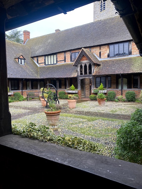
Alice de la Pole (1404–75), granddaughter of the poet Geoffrey Chaucer and Countess of Salisbury then Duchess of Suffolk, was a member of England’s rich and powerful upper class, who had several homes. Her favourite was at Ewelme, in Oxfordshire. Her house has gone, but the church, school, and almshouse she built remain, standing in a tight cluster above the river valley where the village grew up. The almshouse is one of the most beautiful medieval domestic buildings, consisting of dwellings for 13 residents (originally all men), who, in return for their accommodation, were tasked with praying for the souls of Alice and her family, thereby easing their benefactors’ passage through Purgatory into Heaven. In other words, this foundation was a chantry. Henry VIII abolished chantries, but in this case, although the prayers for Alice’s soul ceased, the almshouses themselves remained.

The dwellings are arranged around a quadrangle, which can be entered through several doors, one close to the church, others giving access to the gardens. My first photograph shows a magnificent brick doorway, complete with stepped gable, gothic cusped arch, and buttresses. Its a grand piece of architecture, reminding one of the building’s importance to Alice de la Pole and evoking its serious purpose as a chantry, but the houses themselves, visible to the left, are architecturally quite modest.

This combination of modesty and elaboration is also seen in the quadrangle (below). Here the structure of the building is revealed as a timber framework with brick infill, with access to the individual doors via a lean-to covered cloister onto which the nearby church tower looks down. In the middle of each range is an opening leading to the central cobbled courtyard, and lovely carved wooden Gothic arches top each of these openings, an appealing bit of decoration and visual punctuation. The resulting combination of the domestic and the holy is summed up in the name of the building: God’s House. It’s worth a pilgrimage.

Tuesday, January 9, 2024

Hadleigh, Suffolk

Clinging on

I do like an old wall. Walls around the gardens of town houses, kitchen garden walls, churchyard walls, crinkle-crankle walls in orchards. A 19th-century brick wall marks the western edge of the churchyard at Hadleigh. Pleasant enough in itself, this wall seems to have offered the chance for an interesting bit of antiquarianism – two late-medieval stone doorways and some very decayed niches from the same period are incorporated into the brickwork. My photograph shows the doorway nearest to the Deanery Tower featured in my previous post. It has a later, Gothic-style door leading to the land adjacent to the tower and its stone surround is now very worn. Above the arch, one can just about make out a row of seven carved quatrefoils. The arch itself has carefully carved mouldings.

I don’t know where this bit of medieval masonry came from. Was it part of the Deanery that William Pykenham was building when he died, of which the tower is the survivor? Was it a doorway in the nearby church that was later replaced? Did it come from some other vanished structure? Who knows? But I’m glad the 19th-century builders, so often too eager to replace rather than preserve, spared this doorway and the other architectural fragments in this wall.