Showing posts with label station. Show all posts

Sunday, December 21, 2025

Needham Market, Suffolk


Embarrassment of riches?

This is the magnificent railway station building at Needham Market, an impressive Jacobean revival design by Frederick Barnes, who designed numerous stations on the Ipswich and Bury Railway. It’s one of the most outstanding stations on the line, a visual feast of towers, gables and mullioned windows – I think only Bury St Edmunds competes with it in this neck of the woods. The impressive, partly diapered brickwork is enhanced by dressings in Caen stone, a material sometimes found in medieval English cathedrals. Needham Market station closed in the great station cull of the 1960s, but by 1971 it had opened again, although this building had been let to tenants. It is, after all, on the large side for a small town.*

When the station was built – during the railway boom, in 1846–7 – it was still more magnificent than it is today. The square end towers had curvaceous ogee roofs and the three gables were in the Dutch style, also with multiple curves. At some point in the station’s history, these features were modified, giving the end towers crenellated parapets and the gables straight sloping edges. It’s not clear exactly when these alterations were made. Gordon Biddle, in his book Britain’s Historic Railway Buildings, cites a photograph of 1912, which shows the station in its original form. An Aerofilms image of 1928 shows it the way it looks today, so the changes were made long before the station’s short-lived closure.

Whatever the reason the building was altered, it’s still worth noticing. It speaks of a time when a station was not something that was thought best to hide away behind other buildings. Frederick Barnes and the Ipswich and Bury Railway did Needham Market proud.

- - - - -

* The most recent census put the population at around 5,000.

Thursday, May 1, 2025

Euston, London

They have their exits and their entrances

I don’t often go to London’s Euston station, because my travels don’t take me along the line that terminates there and the station itself has little to attract me architecturally. Indeed among people interested in historic architecture one of the main points of interest is something it lacks, the great monumental gateway or propylaeum, popularly known as the Euston Arch,* that formed the entrance of the station but was demolished in the redevelopment of 1962. On the face of it, a grand gateway in the classical style might seem to have little to do with a world of tracks, points, locomotives and big iron engine sheds – classical architecture seems a world away, in fact. And yet Philip Hardwick, the architect of the arch, knew that it could be powerfully suggestive. This was a grand gateway not just to a major railway station, but to all the places to which you could travel – Birmingham, Liverpool, Manchester, Glasgow, and so on. The grandest of entrances thus formed the beginning of a world of travel possibilities, all reached at a speed that was impossible by horse-drawn transport. Only the most monumental architecture, the classical style and especially the Doric order, was a worthy symbol of something of such import and amplitude. The arch was not only a symbol but also an advertisement for and a signpost to this array of journeys and destinations.

The demolition was controversial from the start – there was a campaign to save it, spearheaded by experts and enthusiasts including John Betjeman. But the campaign was unsuccessful and Philip Hardwick’s grand entrance of 1837 was removed. The tortuous story of the various attempts to save the arch, either in situ or reconstructed elsewhere, have often been recounted.† But, even though the demolition contractor numbered all the stones so that the arch could be rebuilt, there was no stay of execution, no rebuilding. More recently, campaigners have put plans in place to rebuild the arch if and when Euston is again reconstructed as the terminus of the HS2 line, but the redevelopment of the station has been delayed.

Meanwhile…I discovered when cutting through the station to get to Drummond Street the other day that there’s a pub in the station complex called the Doric Arch, complete with a sign commemorating the vanished monumental gateway. It’s not a bad image of it, as pub signs go.¶ There it is, with its fluted Doric columns, its architrave bearing the name of the station, its frieze with its pattern of triglyphs, its triangular pediment. The huge size of the gateway is made clear by the way it dwarfs the cabs that pass through it. ‘This railway,’ it seems to say, ‘is really something’ – as it was in the 1830s, when the ability to travel at speed for tens or hundreds of miles was nothing short of astounding. The inn sign is modest compared to the piece of architecture it represents, but it too is both advertisement and symbol. Look on my works, ye mighty…

- - - - -

* It’s not, strictly, an arch. An arc h is usually made up of a number of wedge-shaped stones or bricks held together in compression to form a curve (although it is also possible to build a horizontal arch). The Euston entrance, like other classical structures, is made up of straight vertical sides bridged by a horizontal lintel. And yet, the designation ‘Euston Arch’ has stuck, and I do not shy away from it in this blog post.

† See, for example, the Wikipedia entry and this blog post.

¶ I can’t see the gates, though.

Wednesday, October 30, 2024

Huddersfield, West Yorkshire

Statement station

Railway station architecture developed during the rail boom of the 1840s and its heyday ended as the 19th century came to its close. It thus spanned the high Victorian period, when British architecture was at its most varied and eclectic. So railway stations, which after all range from vast termini in major cities to tiny halts in the middle of nowhere, can be in any style, especially when we think of the buildings beyond the standard railway structures of train sheds and platform canopies, which developed their own kinds of shapes and forms. Stations can be Gothic extravaganzas like London’s St Pancras or pared-down engineering masterpieces like King’s Cross; they can be cottagey creations like Matlock Bath, fantasias of decorative ironwork like Great Malvern, or tiny corrugated-iron huts like many stations on Great Western branch lines. Or they can be like Huddersfield, statement stations, pinnacles of proprietorial pride in the most correct classical style.

John Betjeman called the front of Huddersfield station the most splendid station facade in England. It was designed by the York-based architect J. P. Pritchard, and opened in 1847. The frontage is actually much longer than what can be seen in my photograph above: on either side of the grand porticoed central structure are nine-bay Corinthian colonnades to which are attached end pavilions, much smaller than the central bock and of one storey, but still impressively classical (see photograph below). The central block itself, with its giant Corinthian columns and rows of windows, would not look out of place as a country house surrounded by acres of parkland.

There are two reasons for the size and elaboration of this station. Firstly, it originally served two separate railway companies whose lines met here: the Huddersfield and Manchester Railway and the Lancashire and Yorkshire Railway.* The end pavilions were built as booking offices for these two companies, while the central section was originally a hotel. Eventually the combined booking offices were accommodated in the central building and the pavilions were given over to buffets and bars. Second, the centre of the town was being largely rebuilt when the station was being planned, and the owners of the manor of Huddersfield (the trustees of the Ramsden family), apparently wanted a grand station to complement the large square that was planned – the facade extends all the way along one side of this open space. Its neighbours on the square include Britannia Buildings, a palazzo-like block designed as a warehouse, showroom, and offices for woollen manufacturer George Crosland, and the Italianate George Hotel, built soon after the station, no doubt as it became clear that the accommodation in the station building was not adequate to meet the demand. The station’s other famous neighbour is a statue of celebrated Labour Prime Minister Harold Wilson – a local man portrayed striding purposefully along. He’s in silhouette in my photograph,† because on this blog, it’s the architecture that matters.

- - - - -

* For the full story of the amalgamations and taker-overs involved as these lines evolved, see standard reference books. One of the most helpful for those interested in railway architecture is Gordon Biddle, Britain’s Historic Railway Buildings (Oxford University Press, 2003).

† There are plenty of photos of the statue online, for example here.


Thursday, September 8, 2022

Matlock Bath, Derbyshire


Postcard from Switzerland

Arriving at Matlock Bath, I parked in the ‘overspill’ area of the full station car park and waded through mud in this summer of drought, to get out of it.* This found us almost on the doorstep of the railway station, set, like the rest of the place, amongst the wooded slopes of the River Derwent’s gorge. Scenery, fresh air, and healing water brought people here in increasing numbers form the 1770s onwards, and the numbers grew yet again when the railway arrived in 1849. Today, after a period of closure (1967 to 1972), the railway is back, and seems to bring many people in, to add to the crowds coming, like us, in cars and clogging up the car park.

When they expanded the station in the 1870s, the railway company built a Swiss-cottage style station to go with the setting, known to some as ‘Little Switzerland’. For the Victorians of Matlock Bath, the term ‘Swiss cottage’ meant a timber-framed building with patterned brick infill between the timbers, eaves with a big overhang, and wooden brackets. An added touch is a Midland Railway speciality: iron framed windows with striking lozenge-shaped panes. The result is an eye-catcher, to traveller and platform-gazer alike.†

Inside, the station was quiet, but was serving tea and cakes, giving us further excuses to linger. In between sips of my tea, I looked up and took the photograph of the roof, below. A very satisfying start to a short visit that produced still more interest.

- - - - -

*It was only muddy in the overspill area; the rest of the car park is tarmac-covered and civilised.

† Timber-framed stations in a cottage-orné manner, similar to this but in a different, more ‘old-English’ style, are also to be seen at places such as Woburn Sands and Fenny Stratford on the Marston Vale line in Buckinghamshire and Bedfordshire.


Monday, April 25, 2022

Great Malvern, Worcestershire

The Worm

Years ago, when I started this blog, Great Malvern station was one of the buildings I wanted to include. Its combination of impressive sandstone masonry, typical of its architect E. W. Elmslie, and ornate ironwork makes it one of my favourite stations. But back then, there was one feature of this station I did not know about. My recent photograph shows the view towards the tracks from the railway bridge in Avenue Road, close to the station. Next to the tracks, and curving away from them, is a structure of masonry, wood and corrugated iron. It’s a walkway linking Platform 2 with the building that was the Imperial Hotel, on the other side of the road.*

This extraordinary passage – which as far as I know is unique – was a concession to visitors, because you do not come to the West of England for the weather and there is a good chance of getting rained on if you leave the station and cross the road to your hotel. It’s wet here in the West, so if you were more hoity-toity than hoi polloi, you could get straight off your train and walk the short distance to your hotel without getting wet. This direct route is also quicker than going out of the main entrance and doubling back before crossing the road. Exclusivity, comfort, and convenience, Great Malvern Station offered it all.

The locals would look down from the bridge (as visitors travelling through it did not) and marvel at the elegance of its corrugated iron roof, with its slight curving dip towards the eaves. With its clever use of the flexible quality of corrugated iron, combined with the ornate cresting on top and the ornamental supporting framework beneath, it might have made them proud. But they had a sense of humour, and coined a nickname for the posh passengers’ pathway: they called it ‘the worm’.

It must be at least 50 years since the worm has been used, during which time the hotel closed, its building taken over by a school. Rusty and largely unregarded, the structure clings on, amid periodic schemes to restore it. It’s listed, so there’s hope. Long may the worm wriggle.

- - - - -

*The hotel and bridge are by Elmslie too.

Tuesday, August 4, 2020

Highley, Shropshire


Job done

These are probably the humblest of all railway buildings. They’re lamp huts or tool sheds, and these corrugated iron versions, just 6 ft wide by 9 ft long, were ubiquitous on the Great Western Railway, and no doubt on other lines too. You found them by the trackside, near stations, signal boxes, and anywhere else where lamps, tools, and other small items needed to be stored. They were cheap, utilitarian, and supplied in flat-pack form, for easy erection on a prepared base in a matter of hours. Corrugated iron made assembling these structures quick and easy. Prepare a base, order up the flat pack, assemble, add a coat or two of paint – and the job was done. Whether they were building the roof of a large train shed in a city or putting up a little shed at a country halt, the Victorians looked on corrugated iron as a marvel of the industrial age.

Usually you find these huts on their own – if you needed more space, the flat-pack building firms like Boulton & Paul of Norwich or Samuel Taylor of Birmingham could supply something larger. But here on the Severn Valley Railway at Highley there are a couple, close together, painted in GWR colours, like the little platform shelter I posted recently on the Gloucestershire Warwickshire Railway at Hailes. Most of them are admirable examples of the way heritage railways find old, worn-out structures, restore them, and give them new life.

People used to look down on corrugated iron structures, especially small ones like this. ‘It’s just a tin hut’, they’d say. ‘What’s so special about that?’ But they were economical, readily available, easier to put up than a chest of drawers from IKEA, long-lasting, and simple to customize with a coat of paint in your railway’s livery. These days, more people appreciate these qualities of corrugated iron, and more and more I notice garages, sheds, and fences in the gardens of private houses, even in the cosseted Cotswolds where I live, many of them put there by people who haven’t necessarily chosen this material because it’s cheap. From a lamp hut to a barn for your 4 x 4, this Victorian wonder material is quietly but effectively doing its job.

Wednesday, May 13, 2020

Hailes, Gloucestershire


Halting for a moment

One of the consequences of the coronavirus pandemic for our household has been a change in the way we buy our food. We have avoided large supermarkets, all of which are anyway at least 15 minutes by car from where we live, opting instead to visit small local shops within walking distance of our house or, in one case, just outside the small Cotswold town where we live. This latter is the local fruit farm, from which we’ve been buying apples and other fruit and vegetables for years, and which runs a good farm shop selling all kinds of food – meat, bread, cakes, muesli, dairy produce, ice cream, etc, etc – mostly supplied by local producers.¶ It’s a good way, I think, to support local businesses while also avoiding physical contact (I order by email and collect from an agreed place on the farm).

In celebration of all this, I thought I’d share three of the architectural sights I see on my short car journey to the farm. First, Hayles Abbey Halt, the tiny station on the Gloucestershire Warwickshire Railway, a heritage line that runs between Cheltenham Racecourse and Broadway (many of the trains are hauled by steam locomotives). The original station opened in 1928, allowing passengers to alight and walk the short distance up the lane to Hailes Abbey.* It was lit only by oil lamps and on each side of the track was a small corrugated iron building offering shelter for waiting passengers. The little station was closed in 1960, and British Railways closed the line in 1976. When the heritage railway took it over, they did not reopen Hayles Abbey Halt (the volunteers who run the line had work enough to do laying track, building or restoring several other stations, and caring for rolling stock, after all). So it was only in 2017 that the halt was reopened, with a new platform, a neat little corrugated iron shelter and some cast iron signs. My photograph shows a view of the halt from the nearby road bridge. The shelter is about as basic as they get – there is not even the concave-curving ‘pagoda’ roof of many of the platform buildings favoured by the Great Western. But it’s functional, and, as my regular readers know, I have a weakness for corrugated iron.

The tiny station is quiet for now. As I drive over the road bridge there’s no sign of puffs of steam, no distant railway whistle, no people arriving to look at the abbey and then perhaps take the footpaths back to Winchcombe, no waiting passengers about to get on a train and head back the easy way. It’s all very Adlestrop, with the local birds singing their hearts out to show that their voices are as loud as those of their relations over by the line that Edward Thomas celebrated in his poem – as loud and strong as all the birds of Oxfordshire, and Gloucestershire, and Warwickshire.

- - - - -

¶ Hayles Fruit Farm, website here.

* This place has two spellings. The settlement is officially Hailes and this is also the spelling used by those who care for Hailes Abbey, but the railway and the fruit farm opt to use the more antiquated form, Hayles. Hence the confusion of getting off at Hayles Abbey Halt to visit Hailes Abbey.

Saturday, December 14, 2019

Worcester


The room now standing on Platform 2

The Resident Wise Woman tells me that in her youth, taking the train home to the Cotswolds from Oxford, she would hear the guard on Oxford station announce her train: ‘Calling at Charlbury, Kingham, Moreton-in-Marsh, Evesham (Capital of the Vale), Worcester Shrub Hill, and Worcester Foregate Street’.* And so it was that the litany of stations on the ‘Cotswold Line’ traced the train’s journey across the hills, down to the Vale of Evesham and on towards the River Severn at Worcester. And being a hill person, the Resident Wise Woman knew that, as she stepped up from the windy platform on to the chugging diesel multiple unit, she’d soon be on her home turf.

Worcester Shrub Hill, back then, was just a name to her and to me too. So we didn’t know that this station, perched high among factories on the edge of the city centre, housed a rare and unexpected bit of Victorian luxury. In the 19th century, it was not unusual for railway stations to have a ladies’ waiting room where female travellers could sit in comfort and safety before their train arrived. And the lucky ladies who travelled from Worcester Shrub Hill station could wait in the magnificent setting of this room on platform 2. Built in c.1864, the ladies’ waiting room is clad on the outside in glorious majolica tiles made by Maw & Company of Broseley (originally the firm was based in Worcester). The rich red columns and arches surrounding them are part of the room’s cast-iron facade, made by the Vulcan Iron Works of Worcester. The overall effect – especially since the waiting room was restored about ten years ago – is one of polychromatic magnificence outside, clean pale walls inside.

No one knows the full story of this structure. No comparable waiting room, with iron walls and tiled facade, has survived. It seems to have been a one-off, and an informative notice on the station speculates that it may have been built for exhibition purposes, to show what could be done with the most up-to-date Victorian materials. The mid-19th century, after all, was a golden age of ironworking, with foundries supplying all kinds of building materials, from enormous columns and beams for giant train sheds to delicate shop fronts. And tiles were becoming increasingly popular for facades – soon, there would be tiled shops, tiled pubs, even office blocks with ceramic cladding. Maw’s were pioneers of using these brightly coloured tiles for architectural use.

The stylistic inspiration is a typically Victorian hotch-potch. Some of the ornament looks Islamic, some Classical, some medieval. But the decoration does hang together visually, while also giving travellers – and potential clients – a sense of what can be achieved with these materials. For waiting passengers, the room is more than fit fo purpose, and must raise, at the very least, an appreciative smile.

- - - - -

* Evesham, by the way, is pronounced by local people as something like ‘EEV-uh-shum’, with three syllables, and this is what I hear in my mind’s ear when I remember this story.

Sunday, April 22, 2018

Gloucester Road, London


On the tracks of old railways (2): Mosaic

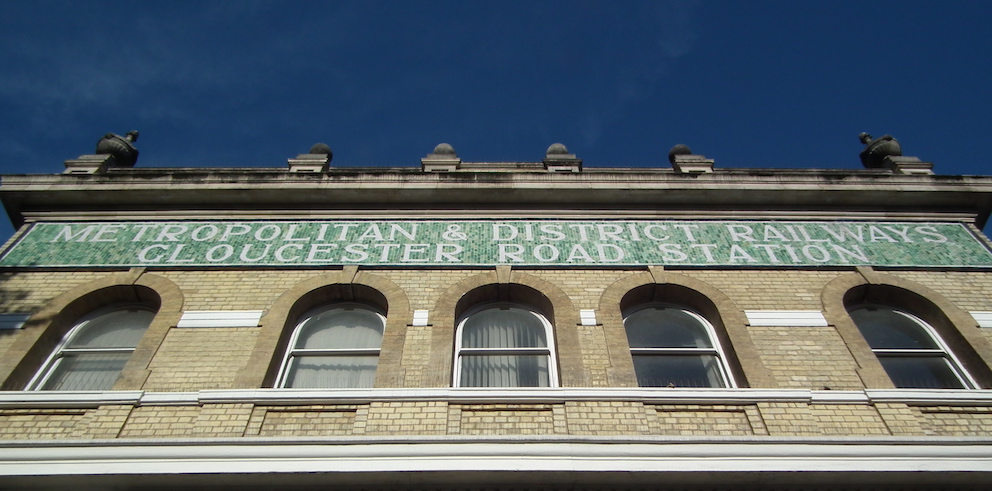
The London underground network developed and grew long before Leslie Green designed his distinctive tiled stations for London (see my previous post). The first line opened in 1863, and by 1868, this station was built on Gloucester Road to accommodate lines run by the Metropolitan Railway and the District Railway (later the word ‘Line’ replaced ‘Railway’ in the names). This part of the station, on Gloucester Road itself, has a Classical facade of cream coloured brickwork topped with ball finials and stone urns.

What sets off this frontage, though, is the large and excellent sign, just beneath the cornice. I suppose nowadays few people look at it. Their eyes are drawn to the signage down at pavement level, which clearly identifies the building as an underground station. But when I’m passing, I always look up and admire the effort that went into this sign: its pleasant lettering (with rather a top-heavy ‘R’ but a lovely extra curly ampersand) and its pale green mosaic, the green tiles varied enough in hue to give the background some interest. It’s worth anyone’s glance.

The photograph of the whole facade, above, is by A. Brady; the one of the mosaic sign, at the top of the post, is by me.

Wednesday, April 18, 2018

Down Street, London


On the tracks of old railways (1): Identity

Go on. You know what this is, or what it was, don’t you? If you’ve lived in London, or been to London, and you’re not rich enough to ride around all the time in taxis, you’ll recognise the style straight away. Oxblood-coloured tiles, semicircular windows a bit like the Diocletian windows used in Roman and Palladian architecture, classical details like the dentil course at the top, the occasional Art Nouveau curlicue. But especially those oxblood tiles. It’s an underground station, of course, or, in this case, Down Street Station having closed in 1932, a former underground station. It was never heavily used, being close to other stations on the network and in a well-to-do area in which relatively few people took the tube; those who wanted a train could easily get one at nearby Hyde Park Corner or Dover Street (now Green Park).

That we know immediately what this building is or was is down to Leslie Green, architect to the Underground Electric Railways Company of London, who was tasked in 1903 with designing new stations on lines then opening that later became parts of the Piccadilly, Bakerloo, and Northern lines on the modern tube network. Green designed all these stations, about 50 of them, between 1903 and his death in 1908 at the tragically early age of 33.

He chose the shiny tiles for these facades because he knew they would be easy to keep clean and their uniform colour would be easy to identify. That would help travellers searching for a station, and so greatly increased the usefulness of the underground network. I remember my mother telling me about making her first trip to London from rural Lincolnshire in the 1940s. She was frightened of getting lost in the capital’s maze of streets. ‘You need never get lost in London,’ said the friends she was going to see. ‘Just find a station and take the tube to where you want to go.’ And so she could orient herself and find her destination, wherever it was, from Oxford Circus to Kentish Town.

With these innovative and enduring station designs, Leslie Green also started another ball rolling. He gave London’s underground network something akin to a three-dimensional corporate identity. That wasn’t a familiar concept in 1903, but it soon would be. He was a pioneer, then, in more ways than one. It’s pointless to speculate, but one can’t help wondering what else he could have achieved if he’d lived longer.

Friday, March 16, 2018

Surbiton, Surrey


Southern Electric

A while back I renewed my acquaintance with Surbiton station, and was struck again by its white walls and its design that seems to exemplify what was seen as modern in the 1930s. What does it remind you of? An Odeon? A 1930s radio set? At any rate it’s a symbol of how the Southern Railway saw themselves in 1938: as sleek, forward-looking ’Southern Electric’, keen to tell you that the railways were the modern, convenient way to travel.

The station is the outstanding work of J R Scott and he threw the modernist works at it – flat roofs, white walls, tall window openings, fins, the very simple clock dial, the sans serif lettering – everything, as railway historian Gordon Biddle points out, except for concrete platform awnings.* If this white, flat-roofed building is an interloper in the middle of Surbiton (cliché adjectives: leafy, quiet, prosperous…) it stands back from the road and holds its own without intruding. As I hastened to the platform to catch the 0911 to Waterloo, I appreciated its light interior and generous circulation space too. And today’s equivalent of Southern Electric† got me to my appointment with time to spare.

- - - - -

* Gordon Biddle, Britain’s Historic Railway Buildings (OUP, 2003)

† A good train but not in the smart green livery of 1938. For railway colours, see my post of long ago here.

Saturday, February 3, 2018

Highley, Shropshire


The signs of yesteryear

In the words of Chard Whitlow, Henry Reed’s amusing parody of T. S. Eliot, ‘As we get older we do not get any younger’. As I get older, I can’t say I experience outright rudeness that often, although the world is not short of oafish behaviour, as a swift walk through any provincial town on a Friday night will reveal. I wonder, though, whether in days gone by it wasn’t worse. One certainly might think so, looking at old notices aimed at improving people’s behaviour. You didn’t have to go far before encountering a ‘COMMIT NO NUISANCE’ (low down, where an inconvenienced ‘gentleman’ might ‘aim’), an ‘ANYONE SMOKING WILL BE PROSECUTED’ (more likely at eye level), a ‘PLEASE REFRAIN FROM SPITTING’ (on buses), a ‘GENTLEMEN RAISE THE SEAT’¶ (on trains), or even an ‘ANY PERSON WILFULLY INJURING ANY PART OF THIS BRIDGE WILL BE GUILTY OF FELONY AND UPON CONVICTION LIABLE TO BE TRANSPORTED FOR LIFE’ (on bridges, in Dorset).

Oh, the signs of yesteryear. So people really had to be told not to spit on the bus or piddle in the corner? I suppose they did, oafs being as thick on the ground then as now, and hygiene being as important then as ever. So the Victorians and Edwardians got on and told them, in bold painted notices and cast-iron signs. Maybe some people even took notice of the notices. But above all, I suppose, it’s the language that marks them out, with its bracing mixture of euphemism (‘nuisance’) and dire warning (‘transported for life’).

A sign of the euphemistic sort that I’d never seen was ‘PLEASE ADJUST YOUR DRESS BEFORE LEAVING’. How can I have missed that one? Too busy admiring the plumbing in the Gents? I don’t know. I became aware of the existence of such signs years ago, reading an excellent book, The Faber Book of Parodies.* This contains not only the poem quoted at the beginning of this post, but a further go at T. S. Eliot, a sort of synoptic parody, called Sweeney in Articulo, attributed to Myra Buttle.† One section of this mock-epic concludes with a random-seeming bunch of quotations, in allusion to the allusive way in which Eliot’s The Waste Land ends. There’s one from Baudelaire, a bit of Latin, some Chinese characters, and then, mixing the highfalutin with the lowly:

‘Love thy neighbour as thyself,’
‘Couldn’t you bring better weather with you?’ and,
Above all,
‘Please adjust your dress before leaving.’

Like anything about T S Eliot, the poem has to have footnotes, and the final line is glossed, ‘Reproduced by permission of Westminster City Council’.

I was thrilled, therefore, some forty years on from reading the parody, to visit the railway station at Highley on the Severn Valley Railway§ and find, not only a ‘Paisley’ water cistern by Doulton and Co, looking like a large butler’s sink painted black, held above my head on two very sturdy iron brackets, but also this notice, a cast-iron plate with letters picked out in white on a black background. Thank you to the Severn Valley Railway for paying attention to the small things. As one must do when adjusting one’s dress before leaving…

- - - - -

¶ Jonathan Miller, in Beyond the Fringe, offered the suggestion that this might be a loyal toast.

* Dwight MacDonald (ed), The Faber Book of Parodies (Faber and Faber, 1961)

† After wondering for a minute whether ‘Myra Buttle’ might be a pseudonym of one of my Oxford tutors, Marilyn Butler, I read that Myra Buttle was a Cambridge don, a Sinologist called Victor Purcell. Anyone who likes parodies might also want to search out Myra Buttle, The Sweeniad (Secker & Warburg, 1958), which contains the Sweeney epic. 

§ Like many preserved railway lines, the Severn Valley is a good hunting-ground for sign-fanciers: it has an abundance of old enamel advertising signs.

Wednesday, June 21, 2017

Balham, London


Spreading it around

The stations on the Morden extension of London’s Northern Line were designed by Charles Holden. They were the architect’s first job for the Underground (he later went on to design more stations, including textbook examples of station modernism, such as Arnos Grove on the Piccadilly Line). Balham’s station, which opened in 1926, has two ground-level buildings, both on corners at the same road junction, both clad in white Portland stone, and both displaying the Underground roundel prominently.

The central roundel, clearly visible in my picture, is in the glass of the large window that lights the double-height ticket hall by day and sends light out on to the street at might. What I’d not noticed until I looked closely when taking the picture was the design of the pair of columns that divide the window in three. These are very plain and square except at the top, where something charming happens. Instead of a capital at the head of the column there’s a three-dimensional stone version of the roundel, with a sphere instead of a disc. This ‘3D roundel’ appears on the other Holden stations on the Morden extension too.
No doubt Frank Pick, the Underground director* who commissioned Holden to design the station, appreciated this detail. Pick was the man who masterminded the design of the Underground, making the look of the network consistent – not just the stations, but all the publicity, the signage, the schematic map† of the lines, and so on. Pick made sure that the roundel was used widely – in stations and on platforms, trains, posters, advertisements… This subtle addition to the collection of roundels must have pleased him. 

- - - - -

* He was Joint Assistant Managing Director when Balham station opened, and still had several promotions ahead of him. Even when a senior director he maintained the interest in design and publicity that he had always had.

† Or diagram, as its creator Harry Beck insisted it should be called. The famous diagram first appeared in 1931.

Tuesday, February 7, 2017

Tottenham Court Road, London

A short afterword

Yesterday I did a post about the tiled decoration by Eduardo Paolozzi at Tottenham Court Road underground station in London. At the end of the post is a link to a YouTube video about the alterations to the decoration and the restoration of the tiles that remain. Unfortunately, those of you who subscribe to my posts by email may be unable to see or access the link.

So, if you are receiving this by email, the original post and link are here.

And, for those who cannot access the video, it is on YouTube here.

Or, on the blog's home page you can just scroll down to find the original post.

Monday, February 6, 2017

Tottenham Court Road, London


Murals on the move

One would have to be unobservant (or very lucky) to have spent any time in Central London over the last few years and not come across the Crossrail development. This enormous underground engineering project has disrupted the capital in all sorts of ways, and one of the centres of this disruption is the complete rebuilding and massive expansion of Tottenham Court Road underground station.

One thing that I’ve been aware of for some time is that the unique and very special tiled decoration by Eduardo Paolozzi is being altered in the process. These murals are perhaps the greatest work of public art by this pioneer of Pop Art, a riot of colour* in the sometimes dull world of the underground, and, at about 23 years old, part of our history already. Some parts of the station with Paolozzi tiles are being demolished or rebuilt, so some sections of the mural have been removed to Edinburgh, where the National Galleries already have a large Paolozzi collection and where Paolozzi was a student and, later in life, a teacher. The rest of the tiles are being cleaned, restored, and in some cases moved from one part of the station to another.

This has been done with great care, and the video to which I link below, produced by Transport for London, shows something of the enormous effort in planning, engineering, and work involved. True, part of the intention of the video is PR for TfL. But it shows that the professionals who have worked on the project are just that, professionals, and their devotion to the project, their commitment to the murals, and the pains they have taken shine through. What’s more, the video gives a better impression of this enormous work of art than I can in one or two photographs. The artist’s feel for colour, his sense of musical and visual rhythm and syncopation, his inspiration from all kinds of places and things from jazz to sweetshops, is vividly caught. This station is going to be impressive and the Paolozzi murals will play their part. And that will be some recompense for the inconvenience that, as they say, this work may have caused.


- - - - -

*And a feast of monochrome pattern on the Northern Line platforms.

Monday, April 11, 2016

Highbury and Islington, London


An afternoon on the tiles

To London for the day, to have a look at Historic England’s excellent exhibition Out There (post-war public sculpture in England, just ended) and to catch up with my son and his girlfriend. As usual when I visit London, there were incidental architectural discoveries and a few passing glances towards buildings and features I’ve admired many times before. As my son lives in Islington, one of these admiring glances was in the direction of the tiles on the platforms of Highbury and Islington Underground Station (above), which were designed by Edward Bawden.

Each of the Victoria line stations has its own distinctive tile artwork in the seating recesses on the platforms, and each one reflects, comments, or riffs on the station’s name or locality. So there are crowns arranged crosswise at King’s Cross (a design by Tom Eckersley), a maze (or warren) at Warren Street (by Crosby Fletcher Forbes), a grid of dots (modern art, you see, chez the Tate) at Pimlico (by Peter Sedgely) and so on.* Bawden did the designs for three stations. His cameo of Queen Victoria at Victoria station is unexceptionable but also unexceptional I think and not especially Bawdenesque. His other two I really like: a castle for Highbury and Islington and a woman being ferried across a river for Tottenham Hale.† The first is to represent the ‘High Bury’, or borough, or castle, in the locality; the castle was destroyed during the Peasants’ Revolt in 1381. The second commemorates the old ferry, alluding to the theory that the ‘Hale’ in Tottenham Hale derives from either ‘Haul’, which is what the boat did, or ‘Hail’, which is what you did to attract the attention of the ferryman, I suppose.
Both designs have a clarity that reminds me of Bawden's work as a printmaker, particularly his linocuts. The Tottenham Hale image reminds one of Bawden’s skill in capturing figures in a few strong lines, and in getting in telling and affecting detail – the dog, a box of chickens, and an egg basket. The Highbury and Islington picture combines some key elements of a castle (solid masonry, towers, a portcullis, battlements) into a strong symbolic design: the essence of a castle. It’s on a mound too, a miniature city (or borough at least) on a hill, ripe for our examination, and admiration.

- - -

•The Victoria Line Tiles website shows all of the designs on the line, from Brixton to Walthamstow Central.

†Tottenham Hale is a station I’ve only ever stopped at once, so I’ve taken the picture from the internet. It’s by Oxyman, and is licensed for reuse under the Creative Commons Attribution-ShareAlike 2.0 license. The Highbury and Islington picture is my own.

Monday, September 14, 2015

Bury St Edmunds, Suffolk


Bells and railway whistles

Before we leave the world of Victorian brickwork, which has been occupying me for the last few posts, may I offer for your delectation the railway station at Bury St Edmunds.

I was in Bury a couple of months ago and though I didn’t get there by train I’m certainly an admirer of the railway station. It was designed by Sancton Wood, an architect with a large and diverse practice who is especially known for his railway work in eastern England. Wood had an unpromising start. He was educated at a progressive school in Birmingham, where children were encouraged to work as much or as little as they liked. Sancton Wood admitted that he worked very little, and what to do when he left was a puzzle. But the boy had shown an aptitude for drawing, and his mother was related to the architect Sir Robert Smirke, so the young Wood was sent off to Smirke’s office as an apprentice and studied drawing at the Royal Academy too. Luckily, he found that architecture was his métier.

By the time Wood went into practice in his own right, the railway system was expanding and offered opportunities for a young architect. He was soon preparing designs for buildings on the Eastern Counties Railway, and a few years later was also at work in Ireland, doing stations between Dublin and Cork amongst others. More stations (on the Midland and North Western Railway) followed, as did houses, schools, churches, and warehouses.

Stations such as Stamford (in stone for that stone town) and Ipswich show his talent for designing stations in a variety of suitable and engaging ways. Bury is particularly striking – brick with stone dressings, eye-catching gables, a strong-looking triple-arched entrance, and, on either side of this, attractive brick side bays with oeils de boeuf and stone pediments that break into a curve at the top, taking on a life of their own. There are lots of attractive details. The end wing in the foreground for example reveals neat brick detailing around the doorway and arch, some rather assertive mouldings, and a characterful corner treatment in stone, as well as the pediment and oeils de boeuf already mentioned. Another stand-out feature is the slender cupola-topped tower (there’s actually another matching one, on the other side of the tracks, but not visible in the photograph). All this makes not only a very satisfying and enduring building, but one on which the eye can linger, picking out details and admiring the inventive way in which they have been used and combined. It’s a station of which the railway company – and now, one hopes, the town – could take some pride.

Saturday, June 6, 2015

Maida Vale, London


Happy birthday

London's Maida Vale underground station celebrates its one hundredth birthday today, Saturday 6 June 2015. It's one of the many stations designed in the style developed by Leslie Green, the Underground's short-lived architect of the first years of the 20th century. The trademark manner that Green developed became a kind of three-dimensional corporate identity for the capital's underground railway. It's not just the familiar oxblood tiles, but so many of the other details – segmental arches, ornate glazing bars, signs made up of big tiles containing one or sometimes two individual letters each, the flat roof designed to accommodate development above if desired – that make these station instantly recognisable. And of course the Underground roundel. Maida Vale has a particularly decorative glittering mosaic version of this inside the station, which I've posted about before.

This station's other claim to fame is that when it opened it was staffed entirely by women – apparently it was the first tube station to have an all-female staff. This was no doubt a result of the way in which World War I was draining potential male staff members away at a rapid rate, bringing many women into waged employment for the first time. Thoughts of the war provoke mixed feelings, then, but the architecture and its survival are something, at least, to be thankful for.

- - -

Ian Visits has more about the station here.

Tuesday, March 17, 2015

Kidderminster, Worcestershire


Winter warmer

I and many of my readers like a good enamel advertising sign, and I’ve not yet tired of seeing old favourites such as signs advertising Palethorpe’s Sausages or Lyons’ Tea. But here’s one I’d not seen before: a cheerful red sign for the Ronoleke hot-water bottle. It takes us back in so many ways. First of all it recalls the times before central heating when British people slept in unheated bedrooms, a heap of blankets and a trusty hot-water bottle being the first lines of defence against the cold. Was that frost on the inside of the bedroom window? Yes, it was.

The sign also takes us back to a forgotten brand – forgotten by me at any rate. The unique selling point, apparently, memorialized in the name, was the leak-proof top. The Chemist and Druggist explained, in an issue dating back to October 1922:

The patent neck is a great improvement and will give satisfaction to your customers. Instead of wiring, you get a solid rubber neck built in the bottle itself. There is no washer to perish. The flange of the screw top engages with a solid rubber platform shaped in the neck. The Ronoleke is the only perfectly water tight rubber bottle and, of course, it is infinitely stronger and will outlast any ordinary make. In every way, it is a high quality production.

The Ronoleke, says The Chemist and Druggist, was backed up with a national press advertising campaign. They don’t mention enamel signs, but this survivor gives us an idea of the approach: bright colour, bold lettering, and an appeal both to those suffering from a multitude of cold-related ailments and to people who want a bottle that lasts for years and doesn’t leak. It’s a busy sign, full of words, but the red background, striped edge, and clear lettering are effective and the brand name stands out loud and clear in its outlined script.

Hats off, then, to the Severn Valley Railway, for finding this sign and putting it up at their Kidderminster station. The heritage railways do so much good work, in so many ways. As well as restoring track, rolling stock, and railway buildings, their efforts to show their stations in period style result in the preservation and display of countless bits of incidental equipment and visual detail, including many of the old signs that were once all over railway stations. Pacing the platform at Kidderminster or Bridgnorth is a real pleasure for anyone interested in the history of design and graphics, or anyone whose imagination is gripped by the social history of bed-warming or smoking or food and drink. It’s all well worth missing a train for.

- - -

Afterword Where are the hot-water bottles now? They are gone mostly, gone like counterpanes, nylon sheets, Goblin Teasmades, and other bedtime impedimenta, although teasmades, apparently are enjoying something of a revival. Anyone who fancies reading an elegy for such vanished things (digs, Ronco, Meccano, proper banks, proper doctors, Kunzle cakes, the Idea of the University), a taxonomy of loss, no less,  should buy a copy of Michael Bywater's Lost Worlds: What Have We Lost, & Where Did It Go? (Granta Books, 2004). The entry on Bottles, Water, Hot is, in my opinion, worth the price of admission alone.

Thursday, January 8, 2015

Maida Vale, London


Roundel, deluxe version

London’s roundel symbol, conceived for the underground but also used on buses and coaches from the 1930s onwards, is one of the most successful logos in the world. When shown bearing the word UNDERGROUND it alerts us instantly, and combined with the underground’s typical architecture (oxblood-tiled early-20th century stations by Leslie Green, 1930s ones by Charles Holden and his colleagues, for example) it quickly becomes part of the visual vocabulary of anyone visiting or living in the capital.

The roundel appears in various forms – painted, reproduced in tiles, or printed, for example – but I know of only one station (maybe there are others) where it’s reproduced in the form of a mosaic. This is at Maida Vale’s station (opened in 1915), where two big mosaic roundels, their red tesserae glinting slightly, greet the passenger at the top of the stairs. The roundel is complemented by the off-white tiles around it, and the elegant linear pattern of off-white and green tiles, a lovely touch. It’s an early version of the roundel, with the red disc that preceded the now-familiar red ring (it’s actually one of the last to have the disc) and with non-standard typography, but still striking.

I don’t know why Maida Vale station was singled out for this visual treatment, but it’s an absolute treat. Excellent as the exterior is – it’s one of the oxblood tiled ones, with segmental-arched windows and bold white diamond glazing bars – it doesn’t prepare one for these mosaics. A pleasant visual surprise for the visitor and a feature in which locals can take justified pride.