Showing posts with label Decorated. Show all posts

Wednesday, January 7, 2026

Down Ampney, Gloucestershire

Crockets

The architectural feature known as the crocket is something that is often viewed from afar. If you don’t know what a crocket is and can’t reach for a convenient copy of The Penguin Dictionary of Architecture and Landscape Architecture, I’ll do that for you. ‘A decorative hook-like spur of stone carved in various leaf-shapes and projecting at regular intervals from the angles of spires, pinnacles, gables, canopies, etc., in Gothic architecture.’* That’s how Penguin’s exemplary reference book defines a crocket, although in the vernacular, as it were, I might say, ’The knobbly bits that stick out of the edges of church spires’, and you’d get the idea.

The crockets on church spires are by definition far from the ground and it’s difficult to see their details. When you get your eye in, however, it’s quite often possible to spot crockets near to ground level, as is the case on the pinnacle in my photograph, which adorns a tomb recess in the church at Down Ampney in Gloucestershire. Close-up, you can see that a well carved crocket is far from being a simple ‘knobbly bit’: it’s a flowing, organic-looking decoration that must have demanded considerable skill on the part of the carver. Great precision and a combination of delicacy and strength were required to carve the 20-odd crockets on this pinnacle and the matching finial on the top. To make the whole thing yet more intricate, the lower part of the pinnacle takes the form of a narrow, straight-sided arch, beautifully formed and set off with pairs of human heads that peer at us from the late-14th or 15th century.†  

There was a lot of this sort of thing about from the mid-14th century onwards, as English architecture entered the phase known to historians as Decorated Gothic. Much of it has been lost to the effects of iconoclasm and time – in particular, anything with an image of a human was likely to face the wrath of 17th-century Puritans and be defaced or simply lopped off. This makes the small heads on this example particularly precious survivals. Since much medieval stone carving was also painted in bright colours, there may have been another loss. However, light from the nearby stained-glass window has supplied a hint of colour, bringing a glow to a small marvel of the carver’s art.

- - - - -

* John Fleming, Hugh Honour and Nikolaus Pevsner, The Penguin Dictionary of Architecture and Landscape Architecture, Penguin Books (5th edition, 1999)

† If you click on the image, a larger version should appear, making some of the details clearer.

Sunday, August 24, 2025

Arlingham, Gloucestershire

All about line

I’d planned to go over to Frampton-on-Severn, stroll along the enormous village green, and look at some favourite buildings. But as I approached the place I saw signs saying in large letters, ‘FRAMPTON VILLAGE FEAST – FUN FAIR’ and when I arrived the village green was full of roundabouts and dodgems ready for the big day. So I decided to push on to Arlingham, a village set deep in the River Severn’s most dramatic loop, and look at the church, which until now I’d not managed to get inside.

When I got there I found the church locked, but a telephone number on a noticeboard put me in touch with the key’s helpful custodian and I was soon inside. To me the most engaging of the many delightful things in the church were four panels of mid-14th century stained glass. Each panel shows a standing saint and the two in the photograph above* are St Mary and St John, both set against a rich red background within ornate white architectural frames. Both saints, especially John, display the slightly sinuous form of the body typical of the period: his head is tilted to the left, his upper body slopes slightly to the right, his abdomen is straighter, and one foot points to the right. This is not quite the stylised S-shape of some 14th-century figures, but definitely tends that way.

However, the feature of the figure drawing that particularly struck me was the depiction of John’s right-pointing foot and Mary’s hands. The foot has exaggeratedly long toes, unrealistic in their proportions but so carefully enough drawn that each toe has its nail delineated. Mary’s hands likewise have very long fingers and they are drawn with one continuous line to produce the effect of interlocked digits. I like this carefully executed but rather eccentric effect, as I do the other linear details, the face, the headdress, and the architectural adornments – crockets and finials.

And in this window there’s a lovely bonus. High up in the quatrefoil that fills the top of the window is a tiny but beautifully formed image of St Catherine, with her wheel (see my second photograph). This little portrait has more interesting line work, including the face (with its somewhat scornful glance at the instrument or torture), the patterns, and another long-fingered hand, holding the wheel. How pleased I was that my avoidance of preparations for the fun fair and feast and had led me to a small feast for the eye in these windows at Arlijngham.

- - - - -

* Please click the photograph to see the details more clearly.


Wednesday, May 28, 2025

Hampton Lucy, Warwickshire


Industrial Gothic

Thomas Rickman (1776–1841) is best known today as the author of a book with the lengthy title of An Attempt to Discriminate the Styles of English Architecture from the Conquest to the Reformation, first published in 1817 and reissued many times. This work was the first to use the names Norman, Early English, Decorated and Perpendicular for the different phases of English architecture between 1066 and the beginning of the Tudor era, names that are still often used today.* Rickman stumbled into his deep interest in medieval architecture after two disastrous events in his life, the failure of his business and the death of his first wife. He took to taking long walks in the English countryside and became fascinated by the many medieval churches he saw on his travels. His studies and drawings of these buildings led to his book and to his career as a designer of buildings – houses, at least one town hall and numerous parish churches.

I visited Hampton Lucy to see St Peter’s church, built to designs by Rickman and his architectural partner Henry Hutchinson in 1822–26§ for Rev. John Lucy, a member of the family who owned the nearby country house, Charlecote Park. I found a church that’s surprisingly large for a small village and built in glowing Cotswold stone. The style is what Rickman called Decorated, the idiom of the first half of the 15th century, characterised by rich carved ornamentation and elaborate, curvaceous window tracery. The south elevation in my photographs shows the tracery of the aisle windows with its two different patterns, using a range of curvy shapes. The pinnacles and parapets above create a skyline that’s typical of Decorated carving.

The stonemasons of the 14th century, and their successors in the 19th century, handled stone beautifully. But Hampton Lucy has a trick up its sleeve. That window tracery is not stone at all – it is actually made of cast iron. Thomas Rickman, a stickler for reproducing medieval details, did not mind using ‘modern’ materials to achieve this. He developed a fruitful working relationship with at least one ironmaster,¶ which allowed him to use high quality ironwork in several of his churches. This use of one material to look like another is the kind of architectural ‘dishonesty’ that many Victorian architects and writers rejected – if it looks like stone, they’d have said, it should be stone. However, Rickman died before this kind of purism became not just fashionable but morally axiomatic. And the results here at Hampton Lucy are impressive. I’m sure most people who see the church assume that this tracery is stone, like most other window tracery, in spite of the fact that the paint is slightly paler in colour than the true masonry. Personally, I respect the craft of the stonemason,† and when one looks closely at hand-carved work, there are always minute variations between apparently ‘identical’ windows that give pleasure to those with eyes to see it. I do find, however, that 19th-century handwork is often much more mechanical in appearance than medieval carving and in this case I’m happy to find the cast-iron tracery of Hampton Lucy not only acceptable but also ingenious.

- - - - -

* I own a battered copy of Rickman’s book and admire its many engravings of medieval architecture; the book is well worth looking out for. Rickman’s four styles and their names, though not perfect for the shifting modes and evolving patterns of medieval building, are still useful.

§ The chancel was built later, after a request for a still more elaborate setting for the church’s high altar in the 1850s. Its design is by Scott.

¶ John Cragg of Liverpool, who worked with Rickman on several churches, including St George’s, Everton, which I hope to see on my next visit to Liverpool.

† Much of the stonemason’s art and craft is visible in this church, not least in the parapets and in other windows made the conventional way.
Detail showing aisle windows, Hampton Lucy

Friday, April 4, 2025

Lullingon, East Sussex

At home on the Downs

I turn south off the main road between Lewes and Polegate, through Wilmington and on to the Downs. After about a mile I see a sign to the church I’m looking for, but there just seem to be two houses and some garages with cars parked in front of them: there’s nowhere obvious to stop. So I carry on down the hill to a farm where there’s somewhere to pull in. There’s one of those reassuring Sussex fingerposts with the name of the location written up the shaft: Lullington. There does not seem to be much more to Lullington than a couple of houses and a farm. I walk back up the hill to the church sign, find a brick path past the garages and into a copse, and eventually I’m rewarded with a view of the tiny church.

I came here because the church was small and picturesque and, I thought, would probably be a pleasant and peaceful spot to break a morning journey. It was all of these things. Its small size (it’s widely noised as the smallest church in Sussex and one of the smallest in the country) is because it is merely the chancel* of what was once a larger church – part of the vanished section has been left to buttress the building at the front. The destruction of the rest of the building is attributed locally to the army of Cromwell in the 17th century, but I’ve not found any concrete evidence for this. Documentary evidence cited on the Suffolk Parish Churches website seems to point to destruction in the 1670s or 1680s, possibly as the result of a roof collapse. The fact that it was not rebuilt suggests that by that time the community had shrunk to something like its current size, possibly because of the Black Death or for some other reason.† The history of this place seems so elusive that not even the church’s original dedication was known. In a ceremony of 2000 it was rededicated to the Good Shepherd.

What’s left is indeed tiny – I counted 17 seats that one could comfortably sit in – and charming. The flint and stone walls are pierced by windows that look 13th and 14th century and there’s a very simple rough-hewn font that may be Norman. The use of flint is typical of the region and the 19th-century bell turret’s walls are weatherboarded, another local building material. Even the church’s modern dedication seems right for its location, paying tribute to the sheep farming that has been a mainstay of the economy of the Downs for hundreds if not thousands of years. This is a building that feels thoroughly at home.

- - - - -

* Or just part of the chancel

† Plague is often given as the reason for the desertion or depopulation of medieval villages, but causes just as common were to do with convenience (villagers sometimes ‘migrated’ to another site), the vagaries of landholding, or enclosure. 

Tuesday, November 16, 2021

Hereford

Pigs in blankets

Strolling around Hereford cathedral the other week, once again impressed by the richness of detail almost everywhere, we came across a monument consisting of a recumbent effigy set in a niche. The style of the arch and the ballflowers decorating it suggest a date somewhere in the first half of the 14th century, but the ballflowers are outnumbered by tiny carved pigs – sixteen of them – each wearing on its back a heraldic blanket and each snuffling its way towards a carefully carved acorn. These contented swine suggest that the monument commemorates a member of the Swinefield or Swinfield family. There was a Bishop Richard Swinfield, successor to the famous and saintly Thomas Cantelupe and a man who successfully prepared the case for Thomas’s canonisation. But it’s not this Swinfield: he has his own monument elsewhere in the cathedral.

The monument of which I show a detail is said to belong to John Swinfield, who died in 1311 and was the cathedral’s Precentor. Clearly a member of the bishop’s family, he may have been one of Richard’s nephews, real or metaphorical. The precentor was the member of the chapter responsible for overseeing the musical side of worship.* He was thus a very important figure in the daily life of the cathedral, and could also deputise for the dean on occasion.§ Swinfield’s position, then, certainly merited a monument as large and prominent as this one. Few monuments, though, have such charming details as this. 

- - - - -

* And, sometimes, for wider respsponsibilities in the organisation of worship in the cathedral.

§ The heraldry on the pigs relates to the arms of the Deanery.


Tuesday, March 30, 2021

Brampton Bryan, Herefordshire


Tracing the lines, tracking the curves

I rather admired the tracery of this window when I first saw it – the large east window of a rather small church in Herefordshire – but part of me wished it wasn’t there. Allow me to explain. This church is one of the few that was built in the 1650s, in the Commonwealth period, this country’s brief go at being a republic. However, it was restored twice in the 19th century, at which time the originally rectangular windows were replaced with Gothic ones and most of the 17th century fittings were removed from the interior. Part of me thinks this is a shame, as such interiors are rare. And yet I don’t dislike this east window, attributed to J. S. Crowther of Manchester, the architect of the second restoration in 1887–8.

The tracery design of this window is interesting because it doesn’t seem to conform to one of the standard patters beloved of Victorian church restorers who wanted to bring a ‘correct’ form of Gothic to an earlier church. By this, they usually meant a fairly straight-laced version of one of the three main varieties of English Gothic – Early English with its lancet windows; Decorated typified either by repeating patterns of quatrefoils or by more flowing, curvilinear tracery; or Perpendicular, in which the vertical mullions extend right into the top of the window. In this window, there are some full-length mullions, but these are combined with four quatrefoils and a pair of sexfoils, the six-lobed relatives of quatrefoils. It’s a pleasant variation (tagged by Pevsner as ‘Dec-Perp’), and those sexfoils do give a sense of the decorative to the sometimes rather plain and repetitive patterns in medieval Perpendicular windows.

What I also like about this church is that the churchyard is partly bounded by the most curvaceous hedge I’ve ever seen. It goes on and on, marking the boundary of the nearby big house, for hundreds of yards, forming lumps here, bumps there, curving around a corner, periodically tucking in what looks like a monster’s rear end or poking out a snout and undulating away into the distance like a living abstract sculpture – which I suppose is what, in the hands of someone wielding hedge-trimmer and shears, it has become. I hope to return to this place when the church is open, look inside, and see if this living thing has evolved.


Thursday, February 18, 2021

Hailes, Gloucestershire


Well connected 

Hailes is a tiny, remote place I’ve featured here several times before. It gets my attention often because it’s close to where I live, indeed the church was one of the last I visited before the current lockdown. It’s one of those with medieval wall paintings, images that have faded and that put the modern viewer in a combined state of fascination and puzzlement. The paintings in the chancel – the detail in my photograph is a tiny fragment of three walls full of fragments and fading wholes – must have been very lavish. Large areas beneath and between the windows are covered with square and diamond grids contain heraldic symbols. If nowadays it seems odd that such a small and isolated place should display so much aristocratic symbolism, it’s because in the 13th century the church acquired a new neighbour, the large Cistercian abbey of Hailes, founded by Earl Richard of Cornwall (King of the Romans* and younger son of King John of England) to house a relic said to be the blood of Christ, which was to attract pilgrims from far and wide. The little church by the abbey appears to have become of the gate chapel of the larger foundation. The decoration in the church reflects this rise in the building’s status. 

The heraldic devices on a display include a large pride of lions rampant (visible here) and the occasional spread eagle: both are devices used by Earl Richard. Most of the other heraldry is said to belong to Richard’s wives – he had three, two of whom predeceased him. In the upper areas of the walls, above the windows, are scenes that are difficult to decipher possibly portraying the death of the Virgin, plus saints and Apostles. Another feature of these upper areas are grotesque and mythical beasts, such as the pair in my photograph. On the left is a dragon-like creature: its reptilian wing has faded but is still there in outline. On the right is another winged beast with a rather canine head. I’m really not sure what these creatures are doing here. There are plenty of explanations for images in this vein in sacred spaces – they’re survivors of pagan religion, they’re apotropaic images, meant to keep out evil spirits (often placed at ‘vulnerable’ points like doors or, as here, windows). But we can’t be sure, and scholars like Professor Paul Binski, who has been studying medieval imagery for years, advised in a recent lecture† that one should beware of overthinking them. Images like this, he argues, could just as likely be bits of fun, like the marginalia in Medieval psalters. And that is precisely what the Hailes images resemble.  

- - - - - 

* This medieval title means, in modern terms, king of Germany. 

† In a recent lecture for the Churches Conservation Trust in their excellent series of online talks; most can be found on YouTube at the time of writing.


Monday, February 1, 2021

Leiston, Suffolk


Secluded

Back in November 2019, the Resident Wise Woman and I made a trip to Suffolk to visit the Aldeburgh Poetry Festival, look at some old buildings, visit Sutton Hoo, and gorge on some very good fish and chips. Orford Castle, which I featured in my previous post, was one place on my itinerary. Quite early on the Sunday, before the poets started reading, we visited Leiston Abbey to wander among its 14th-century ruins and enjoy a little of the seclusion that the medieval canons who lived there must have enjoyed or endured as they followed the regime of prayer, study, and work that was imposed on them by the Premonstratensian rule that they lived by.

The abbey was founded by Ranulf Glanville, justiciar of Henry II, in 1182 but the original site proved impractically swampy. So they moved to the location of the present ruins, taking some of the materials of the original building with them when they built anew. This, together with the austere values of their rule, may account for the fact that the architecture that’s visible on the ground is mostly very plan: round piers, arches with very simple mouldings.† This is the kind of architecture that can be seen in the view from a transept through a chapel to the sanctuary in my photograph above. If there were any more decorative details from the 14th century, they’ve gone, although there’s a littler ornate Gothic ornament in some brickwork from a later repair.

We had the ruins to ourselves on our visit, but the abbey did not feel quite as secluded as I expected because there were people in residence. At the dissolution the building passed to Charles Brandon, Duke of Suffolk, who built a farmhouse along one side of the nave; some of the monastic buildings were used agriculturally. The house was refronted in the Georgian period and is now the quite substantial home of the Pro Corda music school. As we walked around, peering through arches and working out where we were in terms of the monastic layout, the air resounded with fragments of Brahms from a clarinettist and something mellifluous but unidentifiable† on the violin. An example of what I call ‘accidental music’, that’s to say, music that I encounter by accident, which for its unexpectedness is often some of the most enjoyable of all.

- - - - -

• On the hand, it is probably also the case that some or more decorative stones were removed after the dissolution. 

† I mean unidentifiable by me – there was nothing wrong with the playing, just a gap in my musical knowledge.

Thursday, August 27, 2020

Llanwarne, Herefordshire


Floods and fragments

Ruined churches. When I come across one in the countryside I naturally think their ruination has been caused by rural depopulation or population movement. The old church of St John the Baptist at Llanwarne in Herefordshire – a place I was quite unaware of until the other day – was abandoned for another reason. The building, which stands close to a brook, suffered repeated flooding, so in the Victorian period a new church was built on a higher site across the road. The old church still stands, minus its roof, an ornamental and tranquil place in which to contemplate the transience of the works of humankind and the visual qualities of weathered stone.

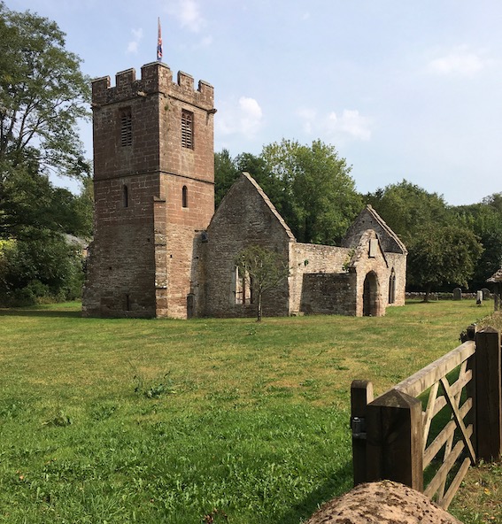
This building is fragile. Some of the mullions and tracery in the windows seem to be supported by the ironwork that must originally have held panes of glass in place; signs tell us not to climb on the walls. There’s a part of me that likes my ruins unkempt and desolate and productive of the sort of emotions that are summed up in the term ‘Romantic’ and in the useful German word Ruinenlust. That word can be translated as ‘Pleasure of ruins’, which is the title of a fascinating book about ruins by Rose Macaulay. Ruinenlust involves taking pleasure in something that also invokes dread or sadness. The melancholy aspect of ruins like this is obvious enough, but there are delights too – the vistas of trees and sky above and through window openings, the sense of a quiet haven that’s becoming part of nature, the softening effects (so admired by Ruskin) of time on stone.

As you can see from my photographs however, this is not the kind of ruin one sometimes sees slipping rapidly back to nature and surrounded by tall grass and drifts of nettles. It is looked after. The grass is trimmed and the latch on the gate still works. So although I can enjoy the ruin’s fragility, the fluid quality of some of its worn window tracery, the patina of its stonework, I can also appreciate the care and effort of the people who look after buildings like this, cut the grass, thoughtfully provide garden benches, and ensure the structure is stable.

Looking at the church is even more than usual an effort of piecing together the building’s story from a collection of assorted architectural fragments: a nave and arcade of the 13th century; a 14th-century aisle and graceful 14th-century window tracery; a tower of the same century, much the most solid-looking part of the building; a later porch, probably 17th century. Walking around inside an oddity becomes clear. At some point the ground level both inside and outside the building has been raised, so that now some of the window sills are not far from the turf and the capitals of the arcade piers are only a couple of feet from the floor. Why? Is this the effect of accumulated silt from centuries of flooding? One derivation of the name Llanwarne is ‘the church by the swamp’.

The inner doorway of the porch bears fragments of a carved inscription. The difficulty of reading this is demonstrated by the conflicting opinions of a 1931 RCHME survey and Pevsner. Pevsner thinks it’s in Latin. The 1931 account sees in it English words such as ‘[fad]eth – soe doth Man’s. . . . the [h]ouse of God’, as if a message about decay or ruination is trying to get out. Reading a medieval building can be baffling, but bafflement can be pleasurable, and the quiet enjoyment of a peaceful ruin can be too.


Wednesday, April 8, 2020

Longborough, Gloucestershire


Line and light 

A few weeks ago, as the gravity of the coronavirus outbreak seemed to become more grave, but before it had taken hold in this country, I found the need to go and sit somewhere quietly, and collect my thoughts. The garden room office where I write a lot of my books and blog posts would normally be the place for this but for some reason, a church seemed to call me and I made my way to Longborough on the Cotswolds a few miles from here. I’d visited before a couple of times, and I wanted to look again at one of the most impressive bits of window tracery in a small church and to contemplate some of the contents of the building, which has an interesting collection of monuments.
Longborough church, originally built in the Norman period, was made over and extended in the 14th century, when a south transept was added. The glory of this addition is the enormous south-facing window, which is so big it takes up practically the whole of the transept’s southern wall. This is masonry and design of a pretty high order – right at the top of the range (one might even say over the top) for a village church. The pattern of the tracery with its complex curves is the sort thing that mason excelled at in the 14th century – the first half of the century, especially, before the Black Death struck and building came to a halt (or at least a major slowdown) in the years after 1350. It’s what Victorian antiquarians (and the rest of us, for convenience) called the Decorated Gothic style, and it’s certainly decorative.* There’s another more complex but less curvilinear example of the style here


The window is a huge contrast – in both size and design – to the much smaller, plainer nave windows to the left. These were probably installed in the 15th century. Does the big window overwhelm the church, distracting us from the church’s other features, such as the tower? In a way, yes. But one can’t blame whoever the master mason was who created it, when he was given the chance to produce something truly memorable by a patron who, presumably, had a deep purse. It’s not known who these people were, and there would have been another, the person who filled the window with stained glass. The medieval glass has long gone, but even here there’s a gain in the face of this loss. With this big opening now glazed with clear or pale-coloured glass, the interior of the transept is flooded with light.

More on that in a couple of days...

- - - - -

* A reader quite rightly points out that it was a Georgian, Thomas Rickman, who invented the terms (Early English, Decorated, Perpendicular), which are now familiar in discussions of Gothic architecture. This is quite true and Rickman's book, An Attempt to Discriminate the Styles of English Architecture From the Conquest to the Reformation (1817), was reprinted many times. It was, though, in the Victorian period that the use of these terms became widespread, though not universal.

Saturday, September 29, 2018

Gloucester


On the move (2): The King’s Board

My second example* of a building on the move is a small building known as the King’s Board, which now stands in Hillfield Gardens in Gloucester. You can just see it from the road as you pass the gardens and when I’d driven past previously I’d taken it for some elaborate garden seat or gazebo built by the owners of Hillfield House, Gloucester’s grandest Victorian house and now occupied, I think, by offices – an effective and unusual garden feature, indeed, which it still is.

However this little building did not begin life as a gazebo. Originally it was in the centre of the city and looked quite different, because the arches, which now make up the sides of a polygon, were once arranged in a straight line along the front of a rectangular building. This rectangular building can be seen in Kip’s engraving (c. 1710) of Gloucester and had been in Westgate Street (one of the city’s four main streets named for points of the compass). It had been a butter market and was reputed to have been given to the city by Richard II. By Kip’s time the roof had been altered to house a water cistern but by 1750 it had been taken down and relocated. After several more relocations, including a spell in the grounds of Tibberton Court, northwest of Gloucester) it was moved yet again to its current site in 1937. It’s not known for sure at which of these moves it was remodelled as a polygon rather than a rectangle.

No doubt its polygonal form, the fact that it once had a cross on the roof, and the religious relief carvings it bears fuelled the tradition that it began life as a preaching cross, though the rectangular layout shown in the 1710 engraving – and the fact that archaeology has confirmed this – put paid to that theory. Medieval markets often bore crosses and religious imagery too. The sculptures are charming. They cover the story of Christ’s Passion, including the entry into Jerusalem, the Last Supper, the Resurrection, and other subjects. Although partly restored and even so highly worn, they preserve plenty of detail – the crenellated walls of the city, the monkey, St Peter’s keys, for example are all visible in the image of the entry into Jerusalem in my lower picture. The King’s Board is still highly effective in offering interest and shelter, some 80 years after it was re-erected here.


- - - - -

*Following my post about Carfax Conduit, in Oxfordshire, here.

Tuesday, February 20, 2018

Hanwell, Oxfordshire


February carvery (5)

I’d thought that my previous post would be the last of this month’s short ‘carvery’ pieces, but then I remembered Hanwell. This is one of the churches in North Oxfordshire that have distinctive carvings from the fourteenth century. Like Adderbury, it has a range of figures, beasts, and other carved subjects, both indoors and out. Some of them are of the ‘linked arms’ type on capitals, the kind I’ve previously noticed at another North Oxfordshire church, Bloxham, and elsewhere.

The heads at Hanwell are if anything even better than those at Bloxham – individual, crisply carved, and full of character. This bearded face is one of my favourites. His hair, beard, nose, and mouth are well done, I think, although the eyes are rather small and mean. The overall effect though is good, and makes one smile. Nikolaus Pevsner says in his book The Leaves of Southwell (to which, I hope, I’ll soon return) that capitals mark a structural junction between two functions (column and arch) and ornament marks this important transition while also masking the joint. In this case, the figures also look as if they are doing some of the structural work, by bearing the weight of the arch on their arms and shoulders. They look none the worse for their effort. 

Tuesday, February 6, 2018

Navenby, Lincolnshire


February carvery (1)

Life is very busy at the moment, so for the next two weeks or so, I’m going do to some short posts. I thought a common theme, medieval church carving, might be entertaining, and would enable me to share a few more pictures from some recent discoveries and rediscoveries.

To begin with, a bit of early-14th century Gothic from the chancel at Navenby. This is what 14th-century Gothic is meant to look like: lots of little arches and niches, so smothered with ornament that you can hardly see the structure – crockets, finials, pinnacles everywhere. But here, as so often, there’s also a human touch – little heads that make it all less serious, one sticking its tongue out, another with a rather grumpy expression. This visitor went away far from grumpy.

Thursday, October 19, 2017

Navenby, Lincolnshire


Top Dec.

Seen from across neighbouring gardens, the church almost disappears behind greenery. But the east window still stands out, and I think: ‘Yes! More glorious Lincolnshire tracery.’

Lincolnshire is a county full of churches with elaborate curvaceous 14th-century window tracery. At big parish churches like the ones at Sleaford, Grantham, and Heckington, the tracery curves this way and that in a series of patterns of sometimes dizzying complexity and variety – curvilinear tracery of the most inventive kind. This is a smaller church, but the east window is as wonderful as those of its larger cousins. The tracery pattern here is dominated by two mouchettes – the shapes that look like gigantic skewed commas, their tails pointing down and outwards, their heads nodding towards each other and touching at the centre. Within each mouchette are other shapes – large multi-cusped trefoils in the heads, elongated ‘daggers’ in the tails.
This is all very showy and was designed to hold stained glass which has not survived. The glass is clear now, so the sunlight pours into the chancel, as it was doing on the day I visited recently. And what the light falls on is equally remarkable: a series of niches, sedilia, and a piscina, all surrounded and topped with highly ornate 14th-century carving. Pinnacles, crockets, foliage, figures, human heads – this carving has the lot. A high-class carver has been here and has thrown the kitchen sink at this job. You can see why this style was labelled Decorated Gothic (often abbreviated to ‘Dec.’) in the 19th century.
The niche to the right of the door is what eccesiologists used to call an Easter Sepulchre, which was thought to be a niche used in an Easter ritual in which the Crucifixion and Resurrection were symbolically re-enacted by ‘entombing’ a cross in the niche and removing it on Easter Day. Historians now question this, suggesting that niches like this were more likely used all year round for reserving the consecrated bread and wine. The imagery is certainly linked to the Resurrection – three Maries at the top with an angel, the Roman soldiers at the base. Whichever it is, the the carving is outstanding – it’s suggested that it was done at the behest of William de Herleston, who was rector here in the 1320s and was closely connected to the royal court. I can well believe that this work had such a high-status patron.

Monday, August 31, 2015

Langton by Spilsby, Lincolnshire


Out of time but not out of place

Among the box pews of the perfect Georgian interior of the church at Langton by Spilsby in my previous post is a object that has existed for much longer than the church itself. It’s the font, which must have been recycled from a medieval church, presumably on the same site, when the current building was put up in the early-18th century. This sometimes happened with fonts. As vessels of the sacrament of baptism they acquire a holiness of their own, which, combined with their aura of antiquity (generations have been Christened in that font), and sometimes their sheer beauty and craftsmanship, gives them a good chance of survival.

This one is a ‘pattern book’ font on which each face illustrates a design of window tracery, and it is similar to a font in Warwickshire that I’ve posted about before. It’s late medieval and bears tracery designs that are mostly in what we now call the Decorated Gothic style of the 14th century. But there’s one face with a design of the Perpendicular style that spread across England in the late-14th and 15th centuries, indicating that the font must be late-14th century at least. My photograph shows a couple of particularly crisp Decorated tracery designs. Although out of place chronologically, the font sits beautifully among Langton’s box pews and under its curvaceous, dome-like cover, presumably a contribution of the woodworkers who fitted out the church in the Georgian period.

Monday, February 2, 2015

Brailes, Warwickshire


Decorated

Now and then as I travel around the country I enter a church and I’m blown away not by the architecture, or the antiquity of the building, but by a single stand-out object – a bit of carving, say, or a stained-glass window – that makes my journey worthwhile. Things like this, as John Betjeman put it, hinting that you have to suffer for your art, are worth ‘cycling twelve miles against the wind to see’. Indeed – although I must admit I arrived in more comfort, on four wheels.

The church of St George in Brailes is a large building, mostly 14th-century but with a tall 15th-century tower. Inside, in spite of an interesting monument or two and at least one item that could qualify for one of my ‘odd things in churches’ posts, what got my attention was the font. Whoever carved this, some time in the 14th century, decided to use each of its eight sides as a showcase for a window design. These windows in stone are stunners, and present a round-up of 14th-century tracery in the style the Victorian antiquarians labelled ‘Decorated’, an appropriate term that’s still widely used.

So, in my first photograph, the carver illustrated on the left ‘reticulated’ (net-like) tracery, in the centre an interesting design with a pair of flame-like openings, and on the right a window incorporating the double-curved ogee arch that was so popular in this period. In my second photograph are three more designs: on the left trefoils, in the centre a wonderful whirling wheel, and on the right quatrefoils within a framework of intersecting tracery. Beneath the window designs are two bands studded with stylized flowers – four-petalled flowers and the round, incurved ballflowers, another very popular 14th-century motif that I’ve noticed before.


This kind of font (the one at Brailes is not unique, although such fonts are not common) is sometimes known as a pattern-book font, a term that suggests a mason providing a catalogue similar to those offered in printed books in the 18th century enabling builders and carpenters to run up the required kinds of fireplaces, doors, cornices, and so on. Not that a static piece of church furnishing from the Middle Ages could have quite the same purpose as a commercially available book – it’s a font, at the end of the day. But what a wonderful place to begin one’s journey through life. Or to end a 12-mile cycle ride.

- - -
Font-fanciers might like to know that I posted about a similar font, adorned with carved tracery but in the style prevalent a century or so later, in the church at Preston Capes, Northamptonshire.

Monday, October 6, 2014

Thorpe Mandeville, Northamptonshire


Brief encounter

On my way to an important meeting over lunch in a pub, my eye was caught by this small church, dating mostly to the early-14th century. The thing that particularly attracted me was the tower. This has a small pitched roof, a design known in archi-speak as a saddleback tower. But while the saddlebacks that I’m used to (on the Cotswolds, like this example) have a roof that overhangs the walls like any other pitched roof, this one is tucked behind a parapet. The masons who built it also added a small collection of rather large pinnacles, richly ornamented with crockets, in typical 14th-century style. 14th-century style, but some of the details may be Victorian, as the tower was restored in 1898.

These pinnacles, together with corner gargoyles and a tiny carved figure on the tower’s east wall, just above the nave roof, set this tower apart and help what is otherwise a simple-looking little church stand out. My appreciation is only from the outside, however. The church was locked on the day I passed by and I didn’t have time to contact the keyholder. One day I must return and try to get inside. Returning to old buildings, after all, is usually a good idea. You nearly always see something that you missed the first time round.

Sunday, September 9, 2012

Bloxham, Oxfordshire


Together again

Some time ago I posted a curious capital from the church at Ludgershall in Buckinghamshire in which, instead of the usual plain mouldings or carvings of foliage there were figures with linked arms. I hinted in that post that there were other churches in this part of England with similar capitals – and in fact I remembered that many years ago I'd been in the grand church in Bloxham in Oxfordshire, where I remembered something along the same lines.

I finally returned to Bloxham to check my memories, and this is what I found. This 14th-century capital is more ornately carved than the one at Ludgershall, but shows a similar design, with linked arms, However, the male figure also has a shield bearing a cross and the female wears a floral head-dress, is surrounded by leaves, and is being assailed by a beast of some kind. The column, with its cluster of attached shafts is highly elaborate too, and there is a further touch of ornament around the top of the capital – a band of moulding decorated with bellflowers (a favourite 14th-century motif) and tiny heads.

So is the male figure, with his crossed shield and the staff weapon just visible in his right hand St George? And is the odd beast by the lady's head some provincial carver's idea of the dragon that the saint has come to slay? I don't know. As is so often the case, medieval church carving has left me pondering, but visually nourished.

Saturday, April 28, 2012

Mountsorrel, Leicestershire

 
-->
A place in the sun

Long ago when I was a teenager, I occasionally accompanied a relative of mine on journeys to do with his business, taking the opportunity to discover bits of the country I’d not normally have known about in the process. One regular trip was to Loughborough, and the last leg was up the A6 from Leicester. We didn’t have much time for places like Mountsorrel, a small town on the A6 that I remember as being full of grime, noise, and fumes from the cars and lorries on the main road, which carved its way straight through the centre. ‘A decayed market town,’ Pevsner called it, and no wonder. And as for the church. Well, who would bother to pay attention to a building so pulled about, patched up with brick, apparently unloved, its walls of local granite graying over with dust? Added to which, it always seemed to be raining.

When I revisited Mountsorrel a couple of weeks ago I was amazed how different my impressions were. The main road now skirts the town, the place has been cleaned up, and, wonder of wonders, the sun was shining. The granite buildings were glowing with a pinkish hue and even the brick patching on St Peter’s church had a warmth to it that made me want to look, not turn away. The building is still a strange mixture – the gable, aspiring to be a classical pediment but not quite making it, sits oddly with the Gothic windows (in the Decorated style of the 14th century) – a state of affairs that is the result of successive remodellings (in 1794 and the 1880s) of an originally medieval building. But I like the way that its chequered history is visible in the morning light, the lines of brickwork embodying in a ghostly fashion the shapes of past windows and doorways, and I was pleased that when I passed by, the building had found its place in the sun.

Wednesday, November 16, 2011

Broughton, Oxfordshire


Tracery

In compensation for the gloomy picture in the previous post, here’s a more sunny image from earlier this year. It’s the parish church of Broughton, Oxfordshire, near to Broughton Castle, about which I posted back in April. I chose this picture partly because of the sunshine and partly because of the window tracery.

The use of window tracery, the intricate stonework in the heads of Gothic windows, was one way in which the masons of the Middle Ages could put an individual decorative stamp on their churches. Tracery developed steadily during the medieval period. In the 13th century it was usually made up of quite simple patterns, with standard elements such as circles or quatrefoils repeated in a symmetrical fashion. By the 14th century, though, tracery had got much more elaborate. 14th- century windows are often a riot of multiple curves, with stonework making exotic shapes and designs reaching sometimes dazzling complexity. It’s no wonder that the Victorians, classifying medieval architectural styles, called this kind of Gothic “Decorated”.*

These two windows at Broughton have outstanding tracery of the early-14th century, one ornately geometrical the other curvilinear in the classic Decorated style. The window on the left is a beautiful bit of geometry raised to the level of art. The circle at the top is divided by two triangles to form a six-pointed star, the points of which are themselves small triangles arranged around a central hexagon. But none of these shapes is left plain – they’re adorned with little stone flourishes called cusps, which break up al the straight lines.

In the top of the right-hand window there are hardly any straight lines at all: everything looks as if it’s about to melt. Every line curves restlessly this way and that, producing in the head of the window a collection of shapes ranging from ellipses and squashed circles to forms that look like flames or tears. The whole design threatens to fall apart, but it doesn’t, because the layout of the tracery is symmetrical and everything is held together by the emphatic overall pointed shape of the window.

We know nothing about the people who built this church, but perhaps they were brought here, or attracted here, nearly 700 years ago by the rich family living in the neighbouring castle. They brought with them skills in geometry and pattern-making together with great visual flair, Add warm morning sun and you have a treat indeed.

- - - - -

* A reader correctly points out that the term was invented by the antiquary Thomas Rickman in the Georgian period. I meant to suggest here that it was in the Victorian period that Rickman's classification of Gothic architecture became popular. Rickman's book, An Attempt to Discriminate the Styles of English Architecture From the Conquest to the Reformation (1817), was reprinted many times.