Showing posts with label Brailes. Show all posts

Tuesday, November 15, 2016

Shakespeare's county


The next of my handful of new book reviews is of the latest addition to Pevsner’s Buildings of England series. For many, these books are self-recommending. But now the revised editions are coming out, many of them getting on for twice the length of the original books, it seemed a useful idea to have a closer look at the benefits of revision – and it’s certainly not just a case of deleting demolished buildings and adding newly built ones...

Chris Pickford and Nikolaus Pevsner, The Buildings of England: Warwickshire
Published by Yale University Press


The arrival of a new revised edition of one of Pevsner’s Buildings of England volumes has me rubbing my hands with glee, especially when it’s on a county in my local area. As I live in north Gloucestershire, not so far from the border with Warwickshire, the new edition of Warwickshire is right up my street.

Pevsner’s original Warwickshire came out in 1966, so a full update was due. As seems usual these days, the new Warwickshire has 800 pages (there were just 529 smaller pages in the 1966 edition), but unlike its processor it doesn’t include Birmingham, which will appear in a forthcoming volume on Birmingham and the Black Country. There’s plenty of space, then, for new extended entries on Warwick and Coventry Universities, and for many individual new buildings (Pevsner’s account of Coventry Cathedral, a new building in 1966, is reproduced with little change, apart from some notes on recent minor alterations and additions). The old buildings (and there are some belters in this county: Warwick and Kenilworth Castles, Baddesley Clinton and Stoneleigh Abbey) are covered in more detail. The book also includes much more information about many places – small towns such as Bedworth and Atherstone, for example, are covered in much greater depth. We get a richer picture of this fascinating county as a result.

One huge gain in the revision process is the scope to draw on the results of new research about all kinds of buildings. Recent books on the architect Sanderson Miller (very active in his native Warwickshire) are a case in point. Andor Gomme’s work on the architect and builder Francis Smith of Warwick is another. Recent research also throws light on the designers of important houses such as Compton Verney. And on rediscoveries. Why didn’t the 1966 Pevsner tell me about the wonderful Norman tympanum in the church at Billesley, I wondered? Answer: because it was only rediscovered in 1988! The new book includes it, and provides a photograph of it too.

It didn’t take long before I got out and about with the new Warwickshire in my hand. It throws light even on places that are familiar to me, as I discovered when I took it on a journey through parts of the south of the county. There was much more than in the original book on the large village of Brailes, for example, and about smaller ‘hidden’ places like Idlicote, with its church, house, and dovecote, and about places I’d driven through hundreds of times, like Halford, a village on the Fosse Way with a good church (another bit of excellent Norman carving (who said Herefordshire had all the best Norman sculpture?) and some elegant early-19th century houses. I finished my trip in Shipston-on-Stour, which I thought I knew like the back of my hand. But the Pevsner encouraged me to explore more closely a former nonconformist chapel I’d overlooked before, and introduced me to a bit of the town I’d not visited, where it pointed me towards an extraordinary former police station with, of all things, 19th-century Gothick ogee windows.

So Warwickshire doesn’t disappoint with the familiar places. And I’m already noting down buildings I don’t know that I want to see. I think the list will continue to grow for some time. Anyone with any kind of interest in Warwickshire, its history, and its buildings, will I’m sure react in the same way. There’s no need to hesitate to buy this latest Pevsner.

Wednesday, February 25, 2015

Brailes, Warwickshire


Have you got the scrolls?

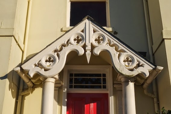
Very often when I do a post a reader or two makes a comment, or sends me an email, and one of the pleasures of the process is that the comments make me think again, or think further about a parallel theme or similar subject. Some of the comments on my recent Hertford post, Red, orange, Strawberry, set me thinking about porches on buildings and their decoration. Not just delicate Georgian or Regency porches like the one in Hertford, but also chunkier Victorian ones. It was not long before I was remembering this example, with its lively ornamentation, from my recent visit to Brailes in Warwickshire.

The pair of pillars may be plain. The modern guttering may be underwhelming. But what a pair of bargeboards! Those sweeping supersize S-scrolls, the quatrefoils (ubiquitous, of course), and that central pendant pointing down at the visitor like some suspended sword of Damocles (or like nothing so much, frankly, as an upside-down finial): it certainly stops you in your tracks. Great design? Hardly. But somebody took the trouble to put this together and deserves some credit for it. That someone, I think, was a local carpenter who liked this kind of work, because there are several other examples in this village in similar quatrefoiled style. None I saw, though, were quite as grand as these monster bargeboards. Salute the scrolls!

Monday, February 2, 2015

Brailes, Warwickshire


Decorated

Now and then as I travel around the country I enter a church and I’m blown away not by the architecture, or the antiquity of the building, but by a single stand-out object – a bit of carving, say, or a stained-glass window – that makes my journey worthwhile. Things like this, as John Betjeman put it, hinting that you have to suffer for your art, are worth ‘cycling twelve miles against the wind to see’. Indeed – although I must admit I arrived in more comfort, on four wheels.

The church of St George in Brailes is a large building, mostly 14th-century but with a tall 15th-century tower. Inside, in spite of an interesting monument or two and at least one item that could qualify for one of my ‘odd things in churches’ posts, what got my attention was the font. Whoever carved this, some time in the 14th century, decided to use each of its eight sides as a showcase for a window design. These windows in stone are stunners, and present a round-up of 14th-century tracery in the style the Victorian antiquarians labelled ‘Decorated’, an appropriate term that’s still widely used.

So, in my first photograph, the carver illustrated on the left ‘reticulated’ (net-like) tracery, in the centre an interesting design with a pair of flame-like openings, and on the right a window incorporating the double-curved ogee arch that was so popular in this period. In my second photograph are three more designs: on the left trefoils, in the centre a wonderful whirling wheel, and on the right quatrefoils within a framework of intersecting tracery. Beneath the window designs are two bands studded with stylized flowers – four-petalled flowers and the round, incurved ballflowers, another very popular 14th-century motif that I’ve noticed before.


This kind of font (the one at Brailes is not unique, although such fonts are not common) is sometimes known as a pattern-book font, a term that suggests a mason providing a catalogue similar to those offered in printed books in the 18th century enabling builders and carpenters to run up the required kinds of fireplaces, doors, cornices, and so on. Not that a static piece of church furnishing from the Middle Ages could have quite the same purpose as a commercially available book – it’s a font, at the end of the day. But what a wonderful place to begin one’s journey through life. Or to end a 12-mile cycle ride.

- - -
Font-fanciers might like to know that I posted about a similar font, adorned with carved tracery but in the style prevalent a century or so later, in the church at Preston Capes, Northamptonshire.