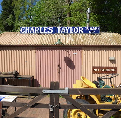
Any excuse…
…for a bit of corrugated iron and an old advertising sign. Yes, they’re things I am particularly drawn to. I like corrugated iron because it’s adaptable, can take colours well, and can form the material of serviceable, attractive working buildings. I like old signs because I’m fascinated by the visual effects of their colours and letterforms, and also because they recall historical products and businesses, many of which have not made it into the 21st century. Both wrinkly iron and old signs are in abundance on preserved railways lines, notably the two closest to where I live, the Gloucestershire Warwickshire Railway and the Severn Valley Railway.
This shed is at Highley Station on the Severn Valley Railway, where it is used, I believe, as a workshop. The line was once part of the Great Western Railway network, so the shed is painted in the GWR’s usual muddy light brown. The enamel sign running along the top is a particularly large and handsome example of the sort of metal sign popular in the early decades of the last century. The deep blue background was often used on enamel signs and works well with white lettering, as here. The letters in the name are both bold and well proportioned, and well spaced too: I’d say it was a very effective sign.
It comes from the factory of Charles Taylor of Birmingham. Taylor’s made things like lathes and machine tools. Taylor’s started in 1860. The founder died in 1899 but the firm continued through the 20th century. The excellent Grace’s Guide records them as being prosecuted for keeping a dirty factory in 1874. However, a series of advertisements through the early-20th century suggests an increasing range, so that by 1937 they list lathes, chucks, cutting machines, jigs, vices, and sawing and bending machines among their products. They also introduced new innovations: they filed patents for improved chucks and pedal mechanisms in 1920 and 1954. Their factory was finally pulled down in 1999 and the sign was rescued and has ended up here, where the railway mounted it on top of this workshop building. It’s just the place for it to catch the eye of travellers and tourists on the Severn Valley Railway, an audience very likely to appreciate the bit of engineering history that it evokes.
Showing posts with label enamel. Show all posts
Monday, June 20, 2022
Sunday, December 21, 2014
Ross-on-Wye, Herefordshire
Bombarded
Back in March 2008, when I first posted a photograph of this shop in Ross-on-Wye, I felt rather apologetic about my picture, because it had been taken quickly with the camera in my mobile phone. The other day when I was in Ross I did what I’ve always meant to do, and took another picture with a bit more detail and a view of the whole shop and all the signs, from Player’s on the left to Palethorpe’s on the right. This photograph has, as usual, been reduced in size to make it more web-friendly, so you still can’t see all the detail (even if you click on it to expand it), but it does now give a better sense of this wonderful collection of street jewellery.*
I’m impressed by the variety of lettering, from plain vanilla sans serifs (e.g. Goodard’s), through sans serifs with a shadow (Tizer), ornate sans (Sunday Dispatch: extraordinary), various versions of serifed capitals, to curvaceous script lettering (Maynard’s). Text arranged on a curve seems to have been particularly popular, as seen in the Sunday Dispatch, Fry’s, and News of the World signs (I remember the latter being especially widespread in my youth). Many signs make their effect through lettering alone, though a few bear images that were also familiar long ago – the Black Cat, of course, recalls for architecture buffs the outstanding and feline architecture of the old Carreras factory near Mornington Crescent underground station in London.
And then there are the slogans, not all of which are legible on an internet-friendly, low-resolution photograph. Everyone seemed to need a slogan. There are the enticing: Player's Navy Cut, "Beautifully cool and sweet smoking"; Park Drive: "For pleasure”. The rhyming: Tizer, "Drink Tizer the Appetizer”. The commanding: Goddard's Embrocation, "Rub it in!”. The grand: News of the World, "The largest weekly paper”. The punning: Maynard's Wine Gums, "By gum! They're good”. The mysterious (to me): Tug-o-War Plug, "It's made by the 'Mick McQuaid' people”.† And the assertion of ubiquity: R. White’s Ginger Beer, "Luncheon, dinner & supper".
Pundits are fond of saying that today we are “bombarded with advertising”. But this selection of slogans shows that, in the heyday of enamel signs as now, we can be tempted, cajoled, ordered, seduced, inveigled, coaxed, and enticed. We can be serenaded and our fancies can be tickled as well as our senses bombarded – the medium is both the message and the massage, as they say.§ Looking at this selection of superannuated slogans and lost brands, I found the whole process, I have to say, rather pleasurable…
- - -
* The various editions of the book The Art of Street Jewellery, by Christopher Baglee and Andrew Morley, are wonderfully enlightening on this subject.
† Mick McQuaid was (and is) a type of tobacco produced originally in Ireland. It's named after a character in a popular Irish magazine, The Shamrock.
§ Marshall MacLuhan was responsible for the phrase "the medium is the message", which, when garbled by a misprint into "the medium is the massage" he let stand as the title of a famous book.
Subscribe to:
Posts (Atom)
