Showing posts with label Hertfordshire. Show all posts
Friday, May 13, 2016
Anstey, Hertfordshire
Fishy (1)
My recent visit to Anstey in Hertfordshire has already yielded one post, about the unusual lychgate at the entrance to the churchyard. One of the other surprises of the place was inside the church – this striking carved font, which probably dates to the very late 12th century or early 13th century.* The carving portrays a quartet of mermen with tails that divide in two and curl upwards so that the mermen can grasp the ends in their hands. This form of divided tail is quite common in medieval depictions of mermaids, but I don’t remember having seen mermen like this before, although apparently there’s a similar font in St Peter’s church in Cambridge, which I visited a very long time ago.
Mermaids are altogether rather more common in medieval art than their male counterparts. Often shown carrying mirrors and combs, they were symbols of vanity and were also seen as posing a danger to sailors.† So there are mermaids in roof bosses, in woodcarvings, and in the water through which St Christopher wades bearing the Christ child as he goes, in many a medieval wall painting.
Mermen didn’t carry such a heavy moral message and don’t appear to have been portrayed so often. They seem an odd choice for a font, where the decoration more often shows the sacraments, or a scene of Baptism, or simply abstract patterns or tracery. Perhaps some contrast is being implied between the wild creatures that dwell in the open ocean and the protected and sanctified bowl of the font, which will be filled with holy water.
Be that as it may, the mermen of Anstey, with their bold, if rather simple carving, make the font stand out.
- - - - -
*This is the date range given on the excellent Corpus of Romanesque Sculpture in Britain and Ireland website; the writers base their estimate on the style of the carving.
†There seems to have been some confusion between mermaids and the sirens of classical myth too.
Friday, April 8, 2016
Anstey, Hertfordshire
Dual-purpose
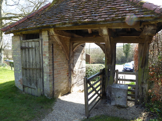
I really enjoyed my visit to the church at Anstey, which took place as the ringers were at work before a wedding, making it memorable sonically as well as visually and historically. But even before I got inside and started to look at the wonderful font, medieval graffiti, and other delights, the interest had started – right at the entrance to the churchyard.
This lychgate, said to be 15th-century or even older in its original form, is a timber-framed structure with a beautiful red-tiled gabletted roof, set on a gently rising footpath and framed by banks of grass dotted with primroses. So far, so marvellous. But what’s the bit walled in with flint and brickwork on the right-hand side? Once you’re through the gate, things become clear – it’s the village lock-up! It’s rather utilitarian from the other side, but no doubt served its purpose. The lock-up or “cage” was added to the lychgate in 1831 and kept drunks and other minor malefactors off the streets until, apparently, the beginning of the 20th century.
I’ve not come across a lock-up combined with a lychgate before. No doubt my readers will supply me with other examples, if any exist. For such are the pleasures of blogging: sharing your enthusiasms and learning about one’s readers’ enthusiasms too.
Tuesday, November 11, 2014
Hertford
Angles and curves
This former seed warehouse, resplendent with glowing brick and gilded lettering, was built in the mid-19th century for seed merchants Alfred McMullen's and partly rebuilt in 1944 after bomb damage. Tucked away not far from the town’s Mill Bridge, it’s now I think used variously as offices and a store for Hertford Museum. Hertford Town Council also offers this part of the structure – the Mill Bridge Rooms – as a community facility for hire.
There's some lovely brickwork here – mainly yellow brick with some details including a diaper pattern and segmental arches above the windows in red brick. The way the brickwork curves to turn the corner* is striking, especially the way the curves contrast with the varied sharp angles and straight lines of the rest of the structure. This was the feature that caught my eye as I passed – that, along with the way in which the gold lettering shines in the sun.
It's not all brick, though. Typically of central Hertford, which exhibits a variety of brick, stone, stucco, weatherboarded, and timber-framed buildings, there are several different materials on display here – hammered sandstone around the doorway, slates on the roof and cladding the hoist chamber that sticks out above the doors to the right, even a bit of pebbledashing along the eaves course. It's a rich mixture that works, and is a tribute both to the flair of Victorian builders and the efforts of those who have conserved and maintained the building more recently.
- - -
* Regular readers will know that I have a particular liking for buildings that turn tight angles with curved walls, as exemplified here and here.
Saturday, February 8, 2014
Ware, Hertfordshire
Watching the river flow
A long time ago I lived in house with a garden going down to the bank of a canal. Sitting outside and watching the passing canal traffic, not to mention the swans, was an agreeable way to waste time. How much better would it have been to have a little room, right on the canal bank, from which one could watch the water? A similar thought seems to have occurred to the people of Ware in the 18th century – and they acted on the idea. In their long, narrow gardens – probably originally burgage plots – that stretched down to the River Lea, they built little square gazebos overlooking the water. Some of these pavilions are still there, and one of my readers kindly sent me some photographs of them, which I reproduce here, for your delectation.
Brick walls, weatherboarding, canted bay windows overlooking the river, hipped roofs, in some cases with details such as a ball finial on the top – all this adds up to something transparently right. And the white weatherboarding and generous windows seem to belong to an architectural style that's perfectly suited to leisure. The big windows must make the rooms light inside and the pavilions combine the functional and the ornamental: their bay windows reach out over the water, inviting those inside to look out, admire the view, and watch – or even perhaps chat to – those who pass by in their boats. It seems that some of these buildings have been here at least since the 18th century, although many of their details, from tiling to weatherboarding, have been renewed over the years.
Some of the buildings to which these gazebos belonged were coaching inns, so guests could have the pleasure of Ware's riverside views while they enjoyed a drink. Many of the long gardens to which they belonged have now been divided up, so presumably the pavilions don't necessarily belong to those original houses or inns. But by the look of things they are well cared for. They must be admired by those who pass them on the water too.
With thanks to Tom Raw for the photographs
Sunday, December 15, 2013
Bishop's Stortford, Hertfordshire
Round we go
Sometimes the way a building turns a corner can be the best thing about it. I remember in a past post describing a particularly noticeable corner tower on a building in London – a 1930s version of many such markings of the junction between one street and another. This house in Bishop's Stortford is almost the opposite, small where the other building was grand and statement-making. Presumably there was a triangular site, where two roads, Basbow Lane and King Street, met at an acute angle. The builder (probably in the early-19th century) made full use of the plot, creating a triangular building with this beautiful curve at the junction. The bricklayer obliged with some careful brickwork.
Even if the house is only about six feet wide at the apex, it does the two things it should – makes full use of the available land and turns the corner gracefully. Steps, bricks, and trees make an interesting bit of urban scenery too, rendering a small building dramatic and turning a change of level into an architectural surprise. Modest? Yes. Unregarded? Probably. But sometimes, in townscape as in life, it's the small things that matter.
Sunday, August 19, 2012
Badmin's England (1)
When I'm not actually looking at buildings or reading about them, I often seem to find myself looking at pictures of them. One of the artists whose work I have admired for longest is S R Badmin (1906–89), a British painter whose artistic responses to landscape were celebrated because of their clarity, detail, and sensitivity to the character of places – and because they were much used to illustrate the covers of magazines such as the Radio Times and British editions of the Reader's Digest. I first came across Badmin as the illustrator of the Shell Guide to Trees and Shrubs, a classic of the 1950s. But I didn't realise until later that the hand that could delineate both arboreal verdure and the architecture of branches and twigs was also at home with actual architecture. If Badmin was brilliant at trees, he was also rather good at buildings.
The books that brought this home to me were two that Badmin illustrated for the children's series Picture Puffins – Sir George Stapledon's Farm Crops in Britain (which includes a striking depiction of an upland northern farm – and the lovely book Village and Town, which Badmin both wrote and illustrated. Here are a couple of illustrations from Village and Town, a book that is much concerned with the ways in which traditional architecture varies from place to place.
A Timber, Plaster and Thatch Village, from Village and Town
These villagescapes are generic: they don't, I think, represent specific places, but bring together examples of the building types and styles of particular areas of England. This first is titled "A timber, plaster and thatch village". It is of a place somewhere in eastern England – in Essex, perhaps, or the eastern part of Hertfordshire – where the lack of good local stone meant that people used timber for framing and thatch for roofs. In some of the houses, the timber frameworks have been left exposed, but in many buildings the frame is hidden behind a coat of plaster, which is sometimes coloured pale pink, sometimes, as in the house on the left, white and decorated with the moulded patterns known as pargetting. Some of the buildings – such as the shed or small barn in the foreground and the church tower in the distance – are boarded, and the tower is topped with a kind of splay-footed spire found quite widely in the south and east. If there is any stone, it's flint, as in the flint and brick wall next to the pargetted house.
A Brick and Tile Village, from Village and Town
The other picture shows "A brick and tile village" and must be in Sussex or Kent, another area where there is not much good stone (though, again, there is some flint, as in the wall behind the pigs), but where there is plentiful clay for brick- and tile-making. Some houses are brick-walled, some have timber frames with brick filling the gaps between the timbers, and some have tile-hung upper storeys. Other wall finishes on display include weatherboarding, this time painted white, as is the stucco-fronted shop towards the top of the street.
These two illustrations wonderfully show how use of local building materials gave places in different parts of the country their own visual character. But they also show what is less often noticed: that vernacular and traditional architecture are not just about materials but also concern local fashions and aesthetic preferences. The timber, plaster and thatch village shows a love of plaster decoration that is much more common in eastern England than in the Midlands or west. The close-set vertical timbers of the central building – apparently now a pub – are another visual feature common in the eastern counties. In the brick and tile village, on the other hand, delight has been taken in the patterns of hung tiles and the clean lines of white-painted boarding. All these features, from the plasterwork to the white boarding, show local visual sensibilities at work. People in past centuries were not slaves to their materials and made aesthetic choices just as we do – and S R Badmin clearly realised this too.
Labels:
artist,
brick,
Essex,
Hertfordshire,
Kent,
plaster,
Puffin,
S R Badmin,
shell guide,
Sussex,
thatch,
tile,
timber,
Village and Town
Tuesday, July 17, 2012
Bishop's Stortford, Hertfordshire
Right stuff, White Stuff
“Ah, I know what that will be,” I thought to myself, looking up above a shop called White Stuff in the main street in Bishop’s Stortford. I was thinking that the building must have been a pub called the White Hart – a common pub name after all – and that I was looking at its former sign. Big 3-D signs like this are uncommon, but they do exist, and I was pleased to find another.
How wrong could I be? This magnificent beast is in fact the emblem of a volunteer regiment, the First Hertfordshire Light Horse. It was made in 1862 for the regiment’s barracks, but a few years later (some sources says in 1868, others 1872) the regiment disbanded. Major William Holland rescued the stag and had it mounted above the window of a shop he owned, where it stayed until the shop was pulled down in 1983.
Then the hart was restored and installed on this shop in 1986, where it has been ever since. It’s seriously large, this stag – it towers over the adjacent sash window, which must be well over 4 feet tall – and its shaggy coat is vigorously rendered. It’s an asset to the streetscape, a reminder of a bit of 19th-century history, and an object lesson in the way some features survive, as if truly alive and kicking, against all the odds.
Saturday, July 14, 2012
Bishop's Stortford, Hertfordshire
A bold front
Pargetting, decoratively moulded exterior plasterwork, is a technique I associate with Suffolk, where plastered walls bear images of flowers, fruit, heraldry, and all kinds of abstract patterns. But decorative plasterwork is also found farther west, and here it is in Hertfordshire, adorning the front of the former White Horse pub in Bishop's Stortford, a building that’s now a restaurant.
The White Horse was a pub for most of its life, closing in the 1930s, after which it was home to a succession of different shops. It has been a restaurant since the 1990s. The yard at the back, which housed the inn’s stables, has also been home to activities as diverse as a poultry market, a slaughterhouse, and a small brewery. So the building had a chequered history behind its bold and striking frontage.
The plasterwork on the facade is modern (I’ve seen early-20th century photographs of the building with plain plaster) and conceals a timber frame that dates back to the 16th century. The design is quite simple – mostly abstract patterns set off by bands of bunches of grapes – but it makes the building stand out and was catching the sun beautifully on the day I passed by.
Subscribe to:
Posts (Atom)