Showing posts with label plaster. Show all posts

Tuesday, May 26, 2026

Liverpool, Hope Street

Listed

When visiting a city I don’t know very well, I make lists of major buildings that I want to see, but once I arrive I’m constantly on the lookout for unexpected delights – the assorted unregarded shopfronts, pubs, sheds and shelters, many of which make up the subject matter for blog posts. In Liverpool, I made a bee-line for two pubs that can hardly be described as ‘unregarded’ – they’re among the most memorable drinking-places in Britain, a must for anyone who revels in the excesses of Victorian or Edwardian architecture and decoration.

The first is the magnificent Philharmonic Dining Rooms, a pub so ornate that my usual blog formula of one (or sometimes two) pictures and a commentary simply isn’t enough. You can see it’s a remarkable place before you enter. The exterior is a riot of freestyle details of 1900, the work of architect Walter Thomas for Liverpool brewers Robert Cain & Sons. Stepped gables, finials, turrets, balconies, and a big protruding corner feature all vie for attention – but somehow manage to cohere into a whole. You see the stand-out feature as you go in: a set of Art Nouveau gates in black iron and gleaming gilded copper.
Gates: by Henry Bloomfield Bare; Liver bird, gazelles, women’s heads, and the motto of Cain’s brewery, Pacem amo (I love peace).

Step inside, and you’re in another world. An intricate plaster ceiling, carved mahogany fittings, a mosaic-fronted bar counter and stained glass panels immediately catch the eye. The sheer quality is obvious at once – the crisp lines of those ceiling pendants, the beauty of the woodwork (many of the joiners also worked on the interiors of great ocean liners, swapping between architectural and marine jobs according to the availability of work). 
Mosaic-fronted bar, mahogany fittings, heraldic stained glass, and Jacobean revival ceiling. The interior work was supervised by George Hall Neale and Arthur Stratton of Liverpool’s School of Architecture and Applied Arts.

Repoussé copper panel by Henry Bloomfield Bare, reflecting the pub’s musical links. 

Then as you grasp your pint and settle at one of the tables, you take in a variety of other decorative touches that go in quality and quantity way beyond what anyone has any right to expect in even an elaborate Victorian gin palace. Repoussé copper panels, etched glass, decorative mirror glass, tiles, a vast room (referred to as the Billiards Room, though some say it may have been a restaurant) with a plaster frieze, even the marbles and tiles of the gents toilets* – there seems to be no end to it.
Plaster frieze in the Billiards Room. Major figure work is by the sculptor Charles John Allen (his friend, a Mrs Ryan, modelled for the caryatid figures); other plasterwork was by a talented Irishman, Pat Honan.

This magnificent pub surpassed the expectations I had when I put it on my list. It’s a testimony to the huge prosperity of Liverpool, which was at its height in 1900 when the Philharmonic was built. I noted when I read about the building in Geoff Brandwood’s excellent book Britain’s Best Real Heritage Pubs, that it was listed by English Heritage at Grade II* – an exceptional rating for a pub. However, I noticed on checking the current listing that it’s now actually listed at Grade I, the top listing reserved for the country’s most exceptional buildings. Rightly so. I’d encourage anyone who likes this kind of thing to put it on their personal list, head to Liverpool, stand themselves a pint, and toast Robert Cain & Sons and the team of architects and craft workers who made this place possible.

- - - - -

* There’s an old post about the lavatories here.

Friday, September 15, 2017

Bristol


Sledgehammered

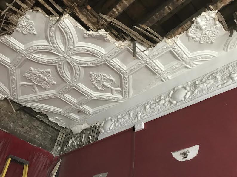
I was saddened to read about the demolition of a Jacobean plaster ceiling in a building in Bristol the other day. This beautiful piece of craftsmanship, which was neatly 400 years old, was in a building in Small Street which had been a bar and which a developer is converting into student flats. The removal of the ceiling was quite legal, but an application had been made to protect the building by listing it and the destruction of the plasterwork was carried out before the listings officers from Historic England had been able to inspect the building and carry out their assessment.

This sort of thing is not unusual. My mind went back to one of the most famous cases, the Firestone factory in West London, which was bulldozered over a Bank Holiday weekend in 1980, hours before a listing was due to come into force. The Bristol case is different – even if they’d had the chance to look at it, the inspectors may have decided not to list the building – but just as deplorable: 400 years of history gone with a few strokes of the sledgehammer.

There is a way of making pre-emptive demolition more difficult: introducing interim protection of buildings while the listings assessment takes place. Such a system already operates in Wales and in the opinion of many it’s time it did in England too. A petition, supported by groups such as the C20 Society, has been started to urge the government to bring in such a measure. I’d encourage readers who can do so to sign the petition here.

- - - - -

The picture above comes from the SAVE Britain's Heritage website, where there is more about the ceiling here. 

Sunday, August 19, 2012

Badmin's England (1)

When I'm not actually looking at buildings or reading about them, I often seem to find myself looking at pictures of them. One of the artists whose work I have admired for longest is S R Badmin (1906–89), a British painter whose artistic responses to landscape were celebrated because of their clarity, detail, and sensitivity to the character of places – and because they were much used to illustrate the covers of magazines such as the Radio Times and British editions of the Reader's Digest. I first came across Badmin as the illustrator of the Shell Guide to Trees and Shrubs, a classic of the 1950s. But I didn't realise until later that the hand that could delineate both arboreal verdure and the architecture of branches and twigs was also at home with actual architecture. If Badmin was brilliant at trees, he was also rather good at buildings.

The books that brought this home to me were two that Badmin illustrated for the children's series Picture Puffins – Sir George Stapledon's Farm Crops in Britain (which includes a striking depiction of an upland northern farm – and the lovely book Village and Town, which Badmin both wrote and illustrated. Here are a couple of illustrations from Village and Town, a book that is much concerned with the ways in which traditional architecture varies from place to place.

A Timber, Plaster and Thatch Village, from Village and Town

These villagescapes are generic: they don't, I think, represent specific places, but bring together examples of the building types and styles of particular areas of England. This first is titled "A timber, plaster and thatch village". It is of a place somewhere in eastern England – in Essex, perhaps, or the eastern part of Hertfordshire – where the lack of good local stone meant that people used timber for framing and thatch for roofs. In some of the houses, the timber frameworks have been left exposed, but in many buildings the frame is hidden behind a coat of plaster, which is sometimes coloured pale pink, sometimes, as in the house on the left, white and decorated with the moulded patterns known as pargetting. Some of the buildings – such as the shed or small barn in the foreground and the church tower in the distance – are boarded, and the tower is topped with a kind of splay-footed spire found quite widely in the south and east. If there is any stone, it's flint, as in the flint and brick wall next to the pargetted house.

 A Brick and Tile Village, from Village and Town

The other picture shows "A brick and tile village" and must be in Sussex or Kent, another area where there is not much good stone (though, again, there is some flint, as in the wall behind the pigs), but where there is plentiful clay for brick- and tile-making. Some houses are brick-walled, some have timber frames with brick filling the gaps between the timbers, and some have tile-hung upper storeys. Other wall finishes on display include weatherboarding, this time painted white, as is the stucco-fronted shop towards the top of the street.

These two illustrations wonderfully show how use of local building materials gave places in different parts of the country their own visual character. But they also show what is less often noticed: that vernacular and traditional architecture are not just about materials but also concern local fashions and aesthetic preferences. The timber, plaster and thatch village shows a love of plaster decoration that is much more common in eastern England than in the Midlands or west. The close-set vertical timbers of the central building – apparently now a pub – are another visual feature common in the eastern counties. In the brick and tile village, on the other hand, delight has been taken in the patterns of hung tiles and the clean lines of white-painted boarding. All these features, from the plasterwork to the white boarding, show local visual sensibilities at work. People in past centuries were not slaves to their materials and made aesthetic choices just as we do – and S R Badmin clearly realised this too.

Sunday, July 17, 2011

New Cavendish Street, London


Full rig

The Ship is a pub of the 1880s in a brick and stucco Italianate style that fits well with the look of late-Victorian and turn-of-the-century London. But, in true public house fashion it stands out from the crowd with ornate pilasters, capitals, pediments, scrolls, and other details that make the building shine.

And, as a business that was part of the massive construction boom that hit the capital in the late-19th century, a pub certainly needed to stand out to attract custom. What above all helps this building achieve this is the plaster sign, showing the ship in almost full sail, slicing its way across the waves in front of a pale but grimy sky. It’s carefully framed by the architecture, vigorously modelled, and an eye-catching alternative to the conventional hanging pub sign. Splice the mainbrace!