Tuesday, September 26, 2023

Nottingham


The long view

Among the multitude of things that pop up on social media, one I take notice of is a blog produced by Historic England. For each post it takes a theme or an architectural style and gives a handful of outstanding examples. The theme the other day was Art Nouveau architecture in England, and I was pleased to see that Historic England’s gurus had picked four of my personal favourites: the elegant if eccentric Turkey Café in Leicester (all pale stripes and gobblers), the Royal Arcade in Norwich (with its air of Edwardian luxury) and the glorious former printing works of Everard’s in Bristol (with a facade that illustrates two luminaries of the craft of printing, Johannes Gutenberg and William Morris). All of these have featured on this blog in the past and all, by the way, are adorned with tiles designed by W. J. Neatby of Royal Doulton. However, another favourite of mine selected by Historic England was a building I’ve not blogged until now.

When I last passed by this imposing shop in the centre of Nottingham, it was a branch of the women’s clothes store Zara. It started out as something quite different, because it belonged to Boot’s the chemist – in fact it was their largest Nottingham branch in the early 1900s when it was built. As Boot’s was a Nottingham company, it was what modern retailers might called their flagship store. The upper part of the building at first glance looks like a baroque palace, with a dome to make the corner into a landmark. However some of the detailing, including the youthful figures hat support the balcony and cornices, together with some of the terracotta foliage, and the gently swelling columns that frame some of the window openings, are all of their time. It’s the ground-level shop front, though, that really looks Art Nouveau. This was the style of the sinuous curve, and the wooden window frames have curves in abundance, especially in the transom lights, the upper sections of the window, which have heart-shaped and tear-shaped panes, supported by a framework that’s both curvaceous and richly carved. Looking up as one enters, a similar pattern of glazing bars , this time with mirror glass, fills the ceiling, making the lobbies lighter.

It’s a lavish design, showing how Boot’s and their architect, Albert Nelson Bromley, made a special effort for this important store. The building was subdivided to accommodate the company’s variety of departments – everything from photographic processing to a lending library, as well as Boot’s core business of pharmaceuticals and cosmetics, but this interior was reconstructed in 1972 after the chemists had vacated the building. The shop front remains, showing how it was built to last by a company that, unlike so many modern retailers who put up flimsy frontages because they known everything will be redesigned in a few years, took the long view.
Looking up in the lobby, Boots, Nottingham (now Zara)


Thursday, September 21, 2023

Birmingham

Turning a corner, 2

Few buildings turn a corner with such grandeur as this one in Birmingham’s Constitution Hill. It dates from the 1890s and was designed architects William Doubleday* and James R. Shaw for H. B. Sale, a firm of die-sinkers. The plan was to have offices and shops on the ground floor with each upper floor taken up by one large workshop, plus an office in the corner tower. Five floors were planned, but the fifth was not added until the mid-20th century, hence the difference in style.

The exterior is built of red brick with a rich array of terracotta dressings – foliage, flowers, and medieval-style heads all feature and the top of the building as originally constructed was given some distinction with the row of small curved gables still present in front of the 20th-century top storey. The stylistic label given by English Heritage’s short ‘Informed Conservation’ book about the district is Spanish Romanesque-style. The stand-out feature is the tower, which is still a landmark on the junction of Constitution Hill and Hampton Street. Each storey of the tower has a different kind of opening, from the first floor† upwards: trefoil, slightly wasp-waisted arches; flat-topped openings; windows topped with ogees; semicircular openings; and quatrefoils in the tiny gables around the dome. The tower also displays the owner’s name,¶ standing proud from the band of foliate decoration – a popular late-19th century effect that I always admire. Finally, the ogee dome at the top, with its fish-scale surface, provides a pleasing climax, although it’s slightly hidden by the gables and finials that surround it. What a glorious building. I hope its owners are soon able to remove the plants that are taking root towards the top of the tower, so that it can continue to provide the area with a landmark and an admirable collection of exuberant architectural decoration.

- - - - -

* William Doubleday was based in Wolverhampton when this building was designed; he later moved to Birmingham.

† American second floor.

¶ You can enlarge the picture by clicking on it, which might make this a little easier to see.

Saturday, September 16, 2023

Birmingham

Turning a corner, 1

This is one of my favourite buildings that I saw on a stroll around Birmingham’s jewellery quarter a while back. It’s not a factory or anything to do with the jewellery business, however: it was built as a pub at the end of the 1860s, that decade when Victorian architecture became more jazzy, colourful and free than most of what went before. The style of Gothic is described by the Pevsner City Guide to Birmingham as ‘very Ruskinian’. In other words there are lots of pointed arches in rows, built in a polychrome mix of red, white and grey (aka ‘blue’) bricks; there are natty details like the small oriel window at the corner and the octagonal turret just visible in my photograph; and there are twin openings divided by slender shafts with carved capitals. All of these details were in the architectural air at this time thanks to the writings of John Ruskin, whose accounts of Venetian Gothic (in books such as The Stones of Venice, which came out in the early 1850s) were increasingly influential.

So far, so good. Whether Ruskin would have approved of this building is another matter. He seems to have had a downer on the kind of dissipation sometimes associated with pubs and taverns, and on genre artists, such as Jan Steen, who painted tavern scenes. But many of us will take a different view. Why should a pub not have a stunning facade, designed with flair, built with care, and enhancing the streetscape? If places of worship or education can have glorious polychrome brick frontages, why not places of hospitality too? I thoroughly approve, and I approve too of the fact that the building has been restored to make the most of its glorious exterior.

Another thing I admire about this building is the swagger with which it occupies a corner plot that is challenging architecturally. Corner plots are good for business, because a site on a junction allows the building to be seen and approached from several different directions. But a tapering cake-slice of a plot like this one is not always easy when it comes to designing the building – how does the structure ‘turn the corner’ visually, and what do you do with the tiny sliver that faces directly on to the junction? Placing the entrance there can be a good solution. Giving the entrance a bit of emphasis by adding the oriel window above (with its cusp-headed opening to make it extra ornate, a pattern echoed in the window on the upper floor) is highly effective visually. Here’s to Victorian brickwork, ingenuity, and that quality of vigour and distinctiveness they called ‘go’!

Thursday, September 7, 2023

Muchelney, Somerset

Devoted to baser things

Dedicated as they were to higher things – prayer, the celebration of the Office at the canonical hours, the copying of books, especially holy scripture, and so on – monks needed also to cater for the needs of their bodies, from healthcare and food to lavatories and drains. Monastic drains often leave their traces, because they were carefully built and engineered, and set at or below ground level, so drainage channels often survive where standing buildings have disappeared. The lavatories that connect to these drains, by contrast, usually vanish. This makes the medieval lavatory building at Muchelney Abbey, probably built some time after 1268*, a rare survival.

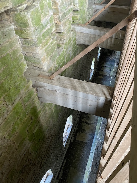
The latrine block stands out because it’s two storeys high and has a striking thatched roof, although it is said that the roof was probably originally covered with slates.† The upper floor has a gap all the way along one side, where the wooden structures of the lavatories, together with partitions between each one, were fixed. This arrangement allowed the waste material to fall to the drain directly below, where it was flushed away using water from the abbey’s conduit. However, the flow from the conduit was probably not very fast, as a look from the upper flor down to the drain (as in my second photograph) shows a row of arches at the bottom, through which the monastic servants, or the monks themselves, could clean the drainage channel.

When it was built, the latrine block formed one end of the eastern range of the cloister. Next to it on the upper floor was the monastic dormitory or dorter – this proximity of lavatory and dormitory was standard, and the lavatory is often known as the reredorter. The abbey’s dissolution in 1538 led to the decay of most of the buildings, but this block was retained and used as a farm building. The change of use ensured its survival, giving us a special insight into one way in which medieval monks catered for the more mundane aspects of their everyday life.

- - - - -

* This date is based on tree-ring analysis of ancient timbers.

† I’m indebted to English Heritage’s guidebook to the monastery for much of my information about the building.

Thursday, August 31, 2023

Muchelney, Somerset

A glimpse of the heavens

En route across Somerset, I decided to stop at Muchelney, where I’d not been for years. I planned to revisit the medieval abbey, but was also drawn to the adjacent but quite separate parish church of Saints Peter and Paul. The church is late-15th century, like so many in Somerset, but what I most wanted to see again was a later embellishment, the 17th-century ribbed and boarded ceiling of the nave, with its wonderful painted panels of angels looking down from the clouds.

I have not seen anything else quite like this ceiling (the angels in the church ceiling at Bromfield, Shropshire, come closest, but I’d say they are slightly later and in a different style). Each panel at Mucheleny is edged with clouds, which swirl like cotton wool or whipped cream, but are edged in darker shades. English clouds, of course, often combine the hopeful white with the threatening grey, but not quite in the stylized way of these ceiling paintings, and the stylization is part of their charm, which is easier to appreciate if you click on the image to enlarge it.

I find the angels charming too. They stand behind the clouds, and look down through the gaps between them; behind each figure is blue sky dotted with tiny stars, suggesting the angels are in a heavenly realm far above the clouds, farther still from us earthbound humans. They’re a far cry from medieval angels of any kind; neither are they like chaste Victorian angels. They have boldly painted faces, shoulder-length hair, and perky wings and they are are clothed in something like Elizabethan or Jacobean dresses, but in what Pevsner describes as ‘extreme décolletage’. The contours of their breasts vary – some look markedly rounded and suggest the human female form, some are less so. Those who feel compelled to explain such things suggest that their revealing costumes suggest their innocence, which sounds like a modern explainer trying very hard to justify what they see as inappropriate. Authorities such as Pevsner and the people who wrote the listing description for the church, avoid explanation altogether. I’d say anything that purports to be an explanation is at best informed guesswork.

The messages spoken by the angels, written on scrolls that they hold, are clear enough. ‘Good will towards men’, ‘Wee praise thee O God’, ‘All nations in the world…praise the Lords Name’, and so on. The sun, a golden roundel set at the intersection of four panels, looks on approvingly. From the floor below, I look up with similar approval at the whole ceiling – with more than approval indeed and with pleasure at another example of how the art of English churches can be colourful, unexpected, and full of joy.

Thursday, August 24, 2023

Stanton, Gloucestershire


Sheepdogs, or, Odd things in churches (16)

I can’t remember when I first went inside the church of St Michael and All Angels, Stanton, in the north Cotswolds, but I think I already knew the story behind the bench-end in my photograph. Perhaps I knew the story from the Gloucestershire volume of Arthur Mee’s series, ‘The King’s England’, probably the only book that my parents had that would have held such a historical tidbit: ‘It may be that when Wesley preached in this place there listened to him shepherds from the hills who would tie their dogs to the ends of the benches, which still have the marks of the chafing of the chains which held the dogs.’ Such marks can certainly be seen on the bench end in my picture, perhaps from the chains themselves or from a metal ring to which chains were attached.

Can this be true? It’s certainly plausible. For centuries, Cotswold farms were the sheep farms par excellence of England. For years I’ve lived in this part of the country and there are still plenty of sheep farmed around here. Shepherds might these days ride around on quad bikes or in 4 x 4s, and wherever they go their dogs go with them. In church, in the 18th century or earlier, one can imagine the chained dogs excited on their weekly meeting with the neighbours pulling on their chains and chafing at the woodwork before settling down quietly by the time the service began. We’re often told that Cotswold churches (like many in Suffolk and other areas) were built from the proceeds of the wool trade. It’s good to be reminded that none of that money could have been made without the people who raised the sheep – and the animals that rounded them up.

Tuesday, August 22, 2023

Withypool, Somerset


Pump heaven

I’m not quite sure why I like old petrol pumps and garages. As far as the pumps are concerned it’s partly, I think, nostalgia and partly design – the lovely advertising globes on the tops of the pumps and the lines of the pumps themselves, which altered from one decade to the next as fashions changed. I think these Beckmeter pumps in the village of Withypool are probably from the 1960s. The shape, all straight lines, and the frames of chrome around the dials certainly look as if they’re from that decade, and online sources suggest I’m right. These pumps would be at home in front of a flat-roofed building with a large area of plate glass on the front. By the 1970s, similar-shaped pumps were still fashionable, but they increasingly had digital displays – the ones in which the digits were set on cylinders that rotated, bringing the next number gradually to the front. The star system for rating petrol (the pump in the foreground has two stars) came in during 1967, so that fits too, although the panel at the top where the stars are located was probably something that the garage owner or petrol company could change with ease. The shell-shaped globes, of course, are throwbacks to an earlier era. Shell globes in a similar design go back to 1929; the details of the design evolved, and the Shell globes were fitted to all kinds of different pumps.

Beckmeter pumps were ubiquitous back in the sixties and seventies. The company was founded as a general engineering concern in the Victorian era, and they gradually came to specialise in water meters and vales. When cars became increasingly common, in the interwar period, Beck’s adapted their water meter designs for use with petrol and soon manufacturing petrol pumps was a major part of their business. Of course these pumps lasted for years, and it was possible in, say, the 1980s, to find 30- or 40-year old pumps dispensing fuel. Hence their survival at filling stations like this one, long closed, in a remote Exmoor village.

I find the sight of them still lined up at a stone-built filling station, its woodwork painted to match the red of the Shell colours, very satisfying. Even more satisfying is that there’s an even older (1940s or 1950s) Avery-Hardoll pump (photo below) just across the road. Again, this one, now missing its globe, appears typical of its time – the tapering shape of the pump body and the script-style lettering of the Avery-Hardoll name look the part and the period.

Now there’s as much of a demand for coffee as for petrol, the forecourt with the Beckmeter pumps at Withypool has been taken over by a table, and refreshment is available from the building next door. So there’s a good reason for cyclists and walkers to stop here as well as motorists, and a good reason, I’d argue, for all of them to admire these examples of historical engineering and design.