Showing posts with label Post Office. Show all posts

Friday, December 12, 2025

Framlingham, Suffolk


First post

I’d been to Framlingham before, but was not switched on enough to look properly at the post boxes. What a sadly missed opportunity! 

Now, I know that for many people even a slight preoccupation with post boxes is thought to be the preserve of the anorak.* And yet I’d argue (hoping not to get too dull about it) that these small items of street furniture both look good in our towns and villages and provide some insight into social history.

So, in Framlingham the other week, I paused to appreciate one of two such boxes in a very rare early design – octagonal boxes with vertical slits, probably dating to about 1856. This is really early in the history of the post box. When the standard penny post for letters was introduced in 1840, there were no post boxes at all. To post a letter you had to take it to a ‘Receiving Office’ or wait for a man ringing a bell to walk down your street and give your letter to him.

In 1852, the first free-standing post boxes were installed on Jersey; these proved successful and the following year the first of (eventually) thousands of boxes began to be seen on streets on the British mainland. They were all made of cast iron and took a column-like form,† with a vertical slit for the letters. There was no standard design,¶ but this example in Framlingham is one of the earliest still in use. It exhibits many of the features common to later boxes – the initials or cipher of the monarch, a display panel for collection times, a locking door, and so on. It was made by Andrew Handyside, ironfounder of Derby, and probably dates to 1856 or 1857 – Handyside began to produce boxes with horizonal slits in 1857. Horizontal letter slots became the norm, and by 1866 the first national standard box was introduced.

If all this is much too like anorak-speak for you, you’ve probably stopped reading by now. But if you’re still with me you’ll appreciate that such rare early boxes illuminate a bit of postal history and enhance the handful of streets and lanes where they still exist.

- - - - -

* Informal British English. Anorak: person who has an obsessive interest in something generally thought to be ‘dull and unsociable’ (thanks to Chambers Dictionary for the last phrase).

† Some resembled columns very closely, like the fluted one in Malvern, subject of an earlier post.

¶ To begin with, there was no uniform colour either. Red became the standard hue in 1884.

Thursday, July 18, 2024

Northwich, Cheshire

When wood works

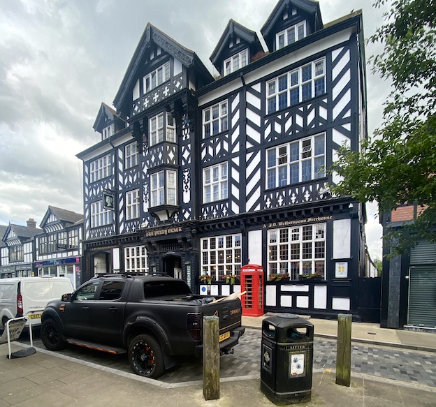
This building stands out on Northwich’s main shopping street like no other. It’s very large and exhibits the timber-framed structure that is so often seen in other Cheshire towns, such as Nantwich and Chester itself. It has the typical Cheshire elaborate magpie pattern of posts, beams and struts, and there’s a jetty, the arrangement by which an upper floor sticks out above the storey below. It doesn’t take long, though, for one to realise that this, like the pub in my previous post, is not an ancient structure of the Tudor period or earlier. The regularity of the timber work, the windows with their pivoting openings, the tell-tale uniform quality of the timber work – all point to a building of the 19th or 20th-century timber-frame revival, a way of building sometimes called ‘Tudoresque’.

It’s a pub now, but whatever was this dazzling structure originally built for? The clue is in the pub’s name, the Penny Black, the name of the first adhesive postage stamp. This building was originally the the town’s Post Office and it was built in 1914, although it did not actually open until the end of World War I, in 1918. The timber frame was not only a visual homage to this traditional Cheshire style of architecture. It was designed this way so that it could be ‘liftable’.

If liftability is a new concept to you, I should explain that Northwich was one of the centres of England’s salt industry. Underground brine was extracted and boiled in vast pans so that the water evaporated and the remaining salt crystals were gathered and processed for sale. Removing the brine caused voids to appear beneath the ground, and buildings subsided as a result. Suitably built timber-framed structured could be jacked up – lifted – and stabilised, whereas masonry buildings were at risk of severe damage or even complete collapse.

What a triumphant building for an early-20th century Post Office. How unlike Post Offices today, which tend to share space with other retail premises – even in large towns the Post Office occupies some counter space at the back of a shop such as a branch of W. H. Smith. This trend to downsize happened before the current scandals surrounding the false prosecutions and convictions of hundreds of Post Office staff, but these days it looks almost as if the organisation is trying to hide away in these low-budget, low-profile locations. How unlike the situation in 1914, when a building like this could act as a landmark on the high street, a three-dimensional piece of publicity and a premises that was built, in the most challenging geological situation, to last.

Thursday, November 19, 2020

Great Malvern, Worcestershire


What shall we do at quarter to two…


Although I’ve passed it dozens of times, I’ve never photographed the front of the Post Office in Great Malvern. That’s surprising in a way, because it’s a memorable neo-Georgian building, mostly of brick, with a big hipped roof and a central section with three large stone semicircular arches that breaks forward on the ground floor. The contrast between the grand arches – two with windows, one with the doorway – of the central section and the modest remainder of the building makes it all look a bit awkward. But there’s something civic and satisfying about it nonetheless, as there often is with the many neo-Georgian Post Offices built in the 1930s.

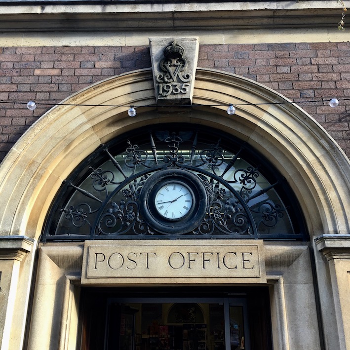
As I was passing a few weeks ago, it occurred to me that, even if the front was too cluttered with cars to make a photograph worthwhile, I could at least take a detail of an arch or two. Above the doorway, the classical lettering (not the usual Post Office letterform, but still effective), the big keystone with date and royal monogram, the ironwork, even the little clock all work together. Maybe the clock is too small – I’d guess there was one with a slightly larger face there originally. Maybe the lettering would be clearer with a broader stroke width. But it’s all better than the plastic signage – or, worse, a Post Office stuck in a corner of a high street shop – that we get today. And look at the window arches: little reliefs of Mercury to signify in another way the building’s purpose and to delight the eye.


A quick web search yielded a decent photograph of the whole building. There are still cars outside, true, but the photographer struck lucky with the middle one. It’s a Morgan, a beautiful hand-made English sports car with a classic design. And it was made in Malvern, in a factory that still produces cars with a similar traditional design – it’s the car to see in this town. Meanwhile, as I sit indoors (where I am too often these days) I offer my thanks to the Post Office for its part in keeping the mail coming. This year, mail deliveries have been bringing a rich and strange assortment of goods – from printer paper to teabags, secondhand books to cleaning products – to our door. Such deliveries are just as much a lifeline now as when this Post Office was built in 1935.

Photograph below of Great Malvern Post Office by Bob Embleton CC BY-SA 2.0


Wednesday, November 14, 2018

Taunton, Somerset


Georgian Art Deco

Here is something I have little to say about – with the exception of single a observation. This Post Office in Taunton was built in 1911 in the neo-Georgian style (red brick with stone dressings on the upper floors, stone on the ground floor) then popular for Post Offices. I have noticed before how this style was popular in the early-20th century, and seemed to work well.

But look at the letterforms used on the identifying 'Post Office' sign above the door. Cut carefully into the stone, the letters look nothing if not Art Deco – those elongated letters popular on shop fronts in the 1920s. I am thinking of the Fs and Es with cross bars near the top of the letter, the enlarged bowl of the P, the slightly forward-sloping S. Is the lettering later than the rest of the building, or unusually forward-looking? I really don't know, but I like the way the two things work together – and how they made me pause and ponder as I walked along the street.

Monday, May 7, 2018

Pershore, Worcestershire


Stamp of approval

I suppose quite a few people must have looked at the front Pershore’s Town Hall on the town’s High Street and thought that its neo-Georgian style was not inappropriate for a place with quite a few Georgian brick buildings. It’s well proportioned, substantial without being overwhelming, and seems to have a air of authority about it. But this building hasn’t always been the Town Hall. It was built in 1932 as the Post Office – and the qualities seem just as fitting to its original purpose. When you’re there you can guess the building’s former use from the royal monograms and crowns on the keystones above the doorway.

In the interwar period, and again for a few years after World War II, this kind of neo-Georgian was used widely for town Post Offices. If they hoped to convey such virtues as reliability and authority by using neo-Georgian, the style also went well with Royal Mail’s the signage – now gone, of course, from this particular building – with its Classically inspired lettering.* Now, when many of the GPO’s originally services have been hived off, many Post Offices in major towns are mere counters in branches of the Co-op or W H Smith. In such a context, Post Offices like Pershore’s seem to come from another world.

It’s good that this example has found another role. It would be a shame to loose that neat Flemish bond brickwork, all those glazing bars (especially the ones on the ground floor, with the central window subtly different from those flanking it), the segmentally headed dormers, the elaborate tops to the doorways with their carved keystones. I’m sure most Pershore residents give the building their stamp of approval.

- - - - -

* There is an example of the lettering in a previous piece I wrote about Post Offices, here.

Tuesday, October 3, 2017

Lincoln


First post

Just inside the entrance to the Museum of Lincolnshire Life in Lincoln is this post box. It was made in 1856 at the Handyside foundry in Derby and installed the following year at Gosberton Bank near Spalding. In 1969 is was moved to the museum, as an example of a very early type of post box – from the time before there was an accepted standard design. A number of the early post box designs were octagonal like this one and like the Penfold, of which a number survive. The Lincoln example, ten years earlier than the Penfold, is rarer still and almost as striking.

With its vertical slot and octagonal shape, it looks quite unlike modern cylindrical boxes and as the red finish wash’t standardised until later, it might originally have been a different colour too. But many features – the royal monogram, the panel showing collection times, and the words ‘Post Office’ are all similar to those on the boxes we use today.

I don’t often feature here items from museums, but there are so few opportunities to see these early boxes on the street that I didn’t want to let this one slip by. And there’s a twist. Although it’s in a museum, this post box is still in use, and visitors are encouraged to post their letters in it – this is Lincolnshire’s oldest working post box. As the first post box appeared on the British mainland in 1853,* it is also one of the oldest in the country. Mr Handyside did the Post Office proud.

- - - - -

*The Channel Islands got them the year before.

Saturday, June 10, 2017

Great Brington, Northamptonshire


Hub

In the town where I live (population roughly 6,000) the Post Office has closed and we now have a Post Office counter in the town’s branch of the Co-op. The Co-op staff do very well in the small space allocated to this in my view important function, and they open longer hours than the Post Office did, but it’s still not the same.

How refreshing then, to find small villages where the Post Office still functions. Here’s the Post Office in Great Brington, which seems to be going strong, the archetypal village Post Office with stone walls under, thatched roof, and tiny shop window – presumably it was once a cottage but no matter, its central location is the most important thing. Post Offices are local hubs, places where people meet, talk, exchange news, read notices, and network, and this function is nearly as important as the posting of letters and parcels, and the doing of the many other small financial and administrative tasks that Post Offices still perform, even in their somewhat diminished modern form. Perhaps the fact that a bench has generously been provided on the pavement outside reflects this role of the Post Office as a local centre.
Clearly this Post Office has been doing the business for decades. I found a 1922 photograph of it online, with its Post Office sign up and another sign telling customers that the services on offer then included ‘money orders, savings bank, parcel post, telegraph, insurance and annuity business’. That sign has gone, but the worn wooden Post Office sign, also visible in the 1922 photograph, is still there, faded but just about legible. It’s not exactly essential – the letter box (a George VI era wall box) and red sign above the door tell us where we are. But it is pleasing that it’s still here to remind us of the office’s long history.

Monday, January 11, 2016

Martock, Somerset


Edward, Edward…

The first time I went through Martock, I paused for just long enough to notice the bold black lettering painted around the curving corner of the Post Office. It looked like a nice touch in a small town that seemed proud to have retained this key local service when so many places have lost their Post Offices since email replaced letter-writing for so many people and some of the services provided by Post Offices moved elsewhere or declined in popularity. My eye having been caught by this strong lettering, I started to look at it a little more closely (noticing how that final ‘E’ looks a little cramped, and how the effect varies slightly as you move around and the curve) and then realised I soon needed to be somewhere else. So I took a swift photograph, jumped in the car, and drove away.

Later, looking at the photograph, I kicked myself for not examining more closely the post box to the left of the door. The splash of red with a white plate above told me that it must be a Ludlow – a type of box, distinguished by this white enamelled plate, the lack of a rain hood over the slot, and, if one could see how it’s made inside, a wooden inner body. I’ve noticed Ludlow boxes (named for their manufacturer) before. Months later, I was talking to someone who knew a lot about the history of post boxes and she mentioned this box in Martock as an uncommon example of one made and installed in 1936 with the monogram of King Edward VIII, who was king so briefly that he was not even crowned. When I was passing near Martock more recently, I stopped again and saw that there’s an ‘E R’, in a very curvaceous, ornate letterform. 

But which Edward does this monogram refer to? Now, I’m no expert in the minutiae of post-box design. This ‘E R’ is certainly different from the plainer, more classical one used in connection with a Roman number ‘II’, on the boxes marked with the monogram of the current queen, Elizabeth II. However, the curvy letterform on the Martock box is similar to that on some boxes said to be of the earlier Edward VII period, whereas most Edward VIII pillar boxes have a still more curly E made up of two loops. Online sources seem to disagree about all this. But it’s a charming bit of lettering anyway, and worth a pause. I’m pleased I managed to go back and see it.


Monday, December 9, 2013

Barbican, London


Turned on
The other week I walked up London's Farringdon Street, hoping to find and photograph a series of tile murals made by Dorothy Annan for the Central Telegraph Office, a building housing a large telephone exchange that was built in about 1960. When I got there I found nine boarded-up spaces along the ground floor of the building: the murals had gone and the building, empty, dusty, and forlorn, looked ripe for demolition. I soon discovered that the tile panels, thanks no doubt to the recent campaigning on behalf of such architectural art by the Twentieth Century Society, had been saved. They have been installed on one of the High Walks in the Barbican complex and I quickly found them, not far from the Guildhall School of Music and Drama, which was emitting seductive high-pitched flute and violin sounds as I settled down to have a good look.

Overseas Communication Showing Cable Buoys
 
Annan's tile panels have names like Cross Connection Frame and Lines Over the Countryside. They make evocative compositions out of arrangements of aerials, cable buoys, switches, wires, and bits of circuit diagrams, all of which Annan researched carefully before turning them into semi-abstract compositions which – as the accompanying caption remarks – are part Ben Nicholson, part Joan Miró. Looking at the panels (the two most clearly visible in the photograph at the top of this post are Radio Communication and Television and Cables and Communications in Buildings) it would be easy to make remarks about the optimism of the 1960s and the then Prime Minister Harold Wilson's famous enthusiasm for 'the white heat of technology'. But in the restrained palette and artful rhythms of these panels (the Ben Nicholson aspect of them, as it were), there is something less insistent, less frenetic. Their lovely handmade textures are beautifully crafted, too. There is tension in the spiralling wires and chunky aerials in these panels, it's true. But there is also landscape in them, hints in the colour and texture of the tiles of grass and sea and sky; cables that flow like rivers or rise and dip like hills and valleys. I think they're turned on to nature as well as to technology. And for that reason they seem to me to sit rather well in the Barbican, where water and planting complement the chunky hammered concrete, where your feet are always on tiles, and where intriguing sonic signals emerge from student musicians in their practice rooms to captivate the ear.

 Cable Chamber With Cables Entering From Street, detail

* * *
Thanks to one of my readers for pointing out that the blog Spitalfields Life has also covered these panels. I was pleased to see that the Gentle Author, proprietor of the Spitalfields Life blog, also appreciates the combination of technology and organic forms that's evident in these works. The Gentle Author illustrates all the panels here.


Friday, January 6, 2012

Shaftesbury, Dorset


Fit for purpose

Post Offices. It is easy to conclude that they’re not what they were. A few decades ago in my local big town, the main post office was housed in a grandiose and spacious former hotel building in the town’s most elegant street. From there it moved to a cramped but serviceable High Street location with shelves for stationery and similar goods at the front, and Post Office counters at the back. From there it has migrated to part of the upper floor in the town’s branch of W H Smith. It’s all rather sad, and reflects the Post Office’s loss of its former grip on our lives.

Back in the 1930s and 1940s, on the other hand, the Post Office was very much at the centre of things, and if an important new Post Office was built, it was likely to be a building of some consequence, probably solid-looking and traditional in appearance, like this example in Shaftesbury. With its stone walls, big gables, mullioned windows, and Tudor-style doorway, it wouldn’t look out of place in a Cotswold town, and it fits in well here too, turning the street corner with some style. It all adds up to the kind of Tudor revival style that, along with neo-Georgian, was popular for Post Offices in the interwar years. This one was built, so a plaque on the wall tells us, in 1946, so it’s very much harking back to the time before World War II. This was still a time when a lot of thought went into the design and functioning of Post Offices. Julian Stray, in his useful Shire book, Post Offices, quotes Lord Gerald Wellesley writing in the Architectural Review, around this period, telling his readers what a Post Office should be like:

A Post Office must be in a prominent position. It should look dignified and permanent, and should, as far as possible, harmonize with its surroundings…the public office, which should, of course, be of a size adequate to the number frequenting it, should, in the larger instances, have doors giving on to the streets at both ends…must be very well lit, and this may mean windows on the ground floor which ideally speaking, are disproportionately large compared with those in the upstairs offices. A clock and prominently displayed letter-box are also features of a Post Office front.


The Shaftesbury office ticks nearly all of Wellesley’s boxes. It is on the site of the Angel Inn, which was the home of the town’s first postmaster in the 1660s. Early post offices were often in inns, which could easily accommodate horses and carts delivering mail. Today this Post Office today is kitted out with a red oval sign and one of those brown metal built-in post boxes, helpfully labelled “POSTING BOX” in elegant capital letters. High on the wall, more capitals tell us that this was both a Post Office and Savings Bank. Ah, of course. Banks. It is easy to conclude that they’re not what they were…