Showing posts with label neo-Georgian. Show all posts

Thursday, November 19, 2020

Great Malvern, Worcestershire


What shall we do at quarter to two…


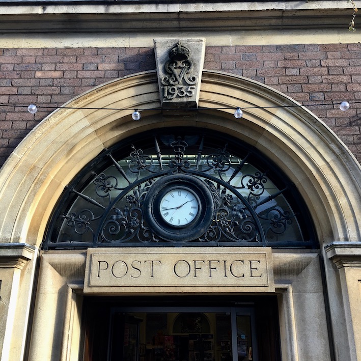
Although I’ve passed it dozens of times, I’ve never photographed the front of the Post Office in Great Malvern. That’s surprising in a way, because it’s a memorable neo-Georgian building, mostly of brick, with a big hipped roof and a central section with three large stone semicircular arches that breaks forward on the ground floor. The contrast between the grand arches – two with windows, one with the doorway – of the central section and the modest remainder of the building makes it all look a bit awkward. But there’s something civic and satisfying about it nonetheless, as there often is with the many neo-Georgian Post Offices built in the 1930s.

As I was passing a few weeks ago, it occurred to me that, even if the front was too cluttered with cars to make a photograph worthwhile, I could at least take a detail of an arch or two. Above the doorway, the classical lettering (not the usual Post Office letterform, but still effective), the big keystone with date and royal monogram, the ironwork, even the little clock all work together. Maybe the clock is too small – I’d guess there was one with a slightly larger face there originally. Maybe the lettering would be clearer with a broader stroke width. But it’s all better than the plastic signage – or, worse, a Post Office stuck in a corner of a high street shop – that we get today. And look at the window arches: little reliefs of Mercury to signify in another way the building’s purpose and to delight the eye.


A quick web search yielded a decent photograph of the whole building. There are still cars outside, true, but the photographer struck lucky with the middle one. It’s a Morgan, a beautiful hand-made English sports car with a classic design. And it was made in Malvern, in a factory that still produces cars with a similar traditional design – it’s the car to see in this town. Meanwhile, as I sit indoors (where I am too often these days) I offer my thanks to the Post Office for its part in keeping the mail coming. This year, mail deliveries have been bringing a rich and strange assortment of goods – from printer paper to teabags, secondhand books to cleaning products – to our door. Such deliveries are just as much a lifeline now as when this Post Office was built in 1935.

Photograph below of Great Malvern Post Office by Bob Embleton CC BY-SA 2.0


Wednesday, November 14, 2018

Taunton, Somerset


Georgian Art Deco

Here is something I have little to say about – with the exception of single a observation. This Post Office in Taunton was built in 1911 in the neo-Georgian style (red brick with stone dressings on the upper floors, stone on the ground floor) then popular for Post Offices. I have noticed before how this style was popular in the early-20th century, and seemed to work well.

But look at the letterforms used on the identifying 'Post Office' sign above the door. Cut carefully into the stone, the letters look nothing if not Art Deco – those elongated letters popular on shop fronts in the 1920s. I am thinking of the Fs and Es with cross bars near the top of the letter, the enlarged bowl of the P, the slightly forward-sloping S. Is the lettering later than the rest of the building, or unusually forward-looking? I really don't know, but I like the way the two things work together – and how they made me pause and ponder as I walked along the street.

Friday, May 11, 2018

Ledbury. Herefordshire


Well worth the trouble

The shops of F W Woolworth were a feature of British high streets until they closed, during the financial crisis, in 2008. Quite a few Woolworth’s shop fronts remain, albeit adapted with new signs and often new colour schemes. Once you get your eye in, you start to spot signs that a building used to be a Woolworth’s – floor mosaics by the door with the Woolworth’s ‘W in a diamond’ symbol, lion masks, sometimes the lovely early-20th century doors with polished finger-plates and kick-plates. Some of their fronts were Art Deco designs from the 1920s or 1930s, but the company also built neo-Georgian facades in some towns – perhaps mindful of the need to fit into streets where there was plenty of historic architecture.

That’s the case in Ledbury, where historic buildings abound and Woolworth’s built this brick frontage in 1937. Although I could see no floor mosaics or lions, the shop window, with its broad lobby, narrow mullions, and stall riser clad in polished granite are very much the kind of thing the Woolworth’s went in for. The glazing bars must have been repainted bright red – many Woolworth’s window frames were done in a bronze finish.

The neo-Georgian part above the shop window is neat and polite, in the sense that it doesn’t impinge on the character of the street, which includes a mix of Tudor timber-framed, Georgian, Victorian, and later buildings. A very Woolworth touch is that the sash windows have opaque glass, as usual for an upstairs floor in one of their stores, because the stockroom was generally on this floor. The company that took the shop over have knowingly capitalised on Woolworth’s heritage by adopting a similar name. They have been here a while now: no doubt their former Woolworth’s premises have proved a good home.

- - - - -

For more on the history of Woolworth’s, see Kathryn Morrison’s excellent book Woolworth’s: 100 Years on the High Street, which I reviewed here.

Monday, May 7, 2018

Pershore, Worcestershire


Stamp of approval

I suppose quite a few people must have looked at the front Pershore’s Town Hall on the town’s High Street and thought that its neo-Georgian style was not inappropriate for a place with quite a few Georgian brick buildings. It’s well proportioned, substantial without being overwhelming, and seems to have a air of authority about it. But this building hasn’t always been the Town Hall. It was built in 1932 as the Post Office – and the qualities seem just as fitting to its original purpose. When you’re there you can guess the building’s former use from the royal monograms and crowns on the keystones above the doorway.

In the interwar period, and again for a few years after World War II, this kind of neo-Georgian was used widely for town Post Offices. If they hoped to convey such virtues as reliability and authority by using neo-Georgian, the style also went well with Royal Mail’s the signage – now gone, of course, from this particular building – with its Classically inspired lettering.* Now, when many of the GPO’s originally services have been hived off, many Post Offices in major towns are mere counters in branches of the Co-op or W H Smith. In such a context, Post Offices like Pershore’s seem to come from another world.

It’s good that this example has found another role. It would be a shame to loose that neat Flemish bond brickwork, all those glazing bars (especially the ones on the ground floor, with the central window subtly different from those flanking it), the segmentally headed dormers, the elaborate tops to the doorways with their carved keystones. I’m sure most Pershore residents give the building their stamp of approval.

- - - - -

* There is an example of the lettering in a previous piece I wrote about Post Offices, here.

Sunday, October 7, 2012

Brighton, Sussex


Building society

I wonder if I would have noticed these carvings if I'd not been alerted to their presence by Nicholas Antram and Richard Morrice's Pevsner Architectural Guide to Brighton and Hove. Possibly not, as they adorn a 1930s neo-Georgian building and my eyes would probably have been distracted by Regency onion domes and other fancies. So I'm grateful to Antram and Morrice for pointing me in the direction of the former Citizens' Permanent Building Society.

Building Societies. If you are inclined to think of them in the way we think of banks, financial institutions offering a range of financial "products" from loans to insurance, think again and think back. Building was originally much closer to the heart of what building societies did – holding deposits from some of their members and lending other members money to build houses.


So when he designed the Citizens' Permanent Building Society J L Denman got Joseph Cribb to carve a series of relief panels depicting the building trades and set these panels around the three large windows on the ground floor. Capped and overalled tradesmen mix mortar, saw wood, attach roof tiles, and build walls, and Denman himself appears in one panel, unfurling a plan and discussing progress with another man (a foreman or clerk of works?).


 Joseph Cribb began as apprentice and assistant to Eric Gill, remaining at Ditchling to work independently when Gill left Sussex for Wales in 1924. His work is in numerous churches and I'd not expected to find his carvings in this context. They rise to the challenge of squeezing their subjects into the spaces and curves around the windows and pick out details, from roofing battens to pulleys, in a satisfying and realistic way. Their concentrated view of life on site also reminds us of what building societies were about. The building, however, is now occupied by a bank.